Hi! I’m Drew. I’m a passionate and creative designer with an interest in all aspects of design, especially branding and editorial design. My time at the University of Reading has not only helped me develop my skills and deepen my understanding of design, but it has also taught me how to centre design around users and what they want and need. I want to continue developing my skills and learn how I can make a difference to the world around me through my designs.
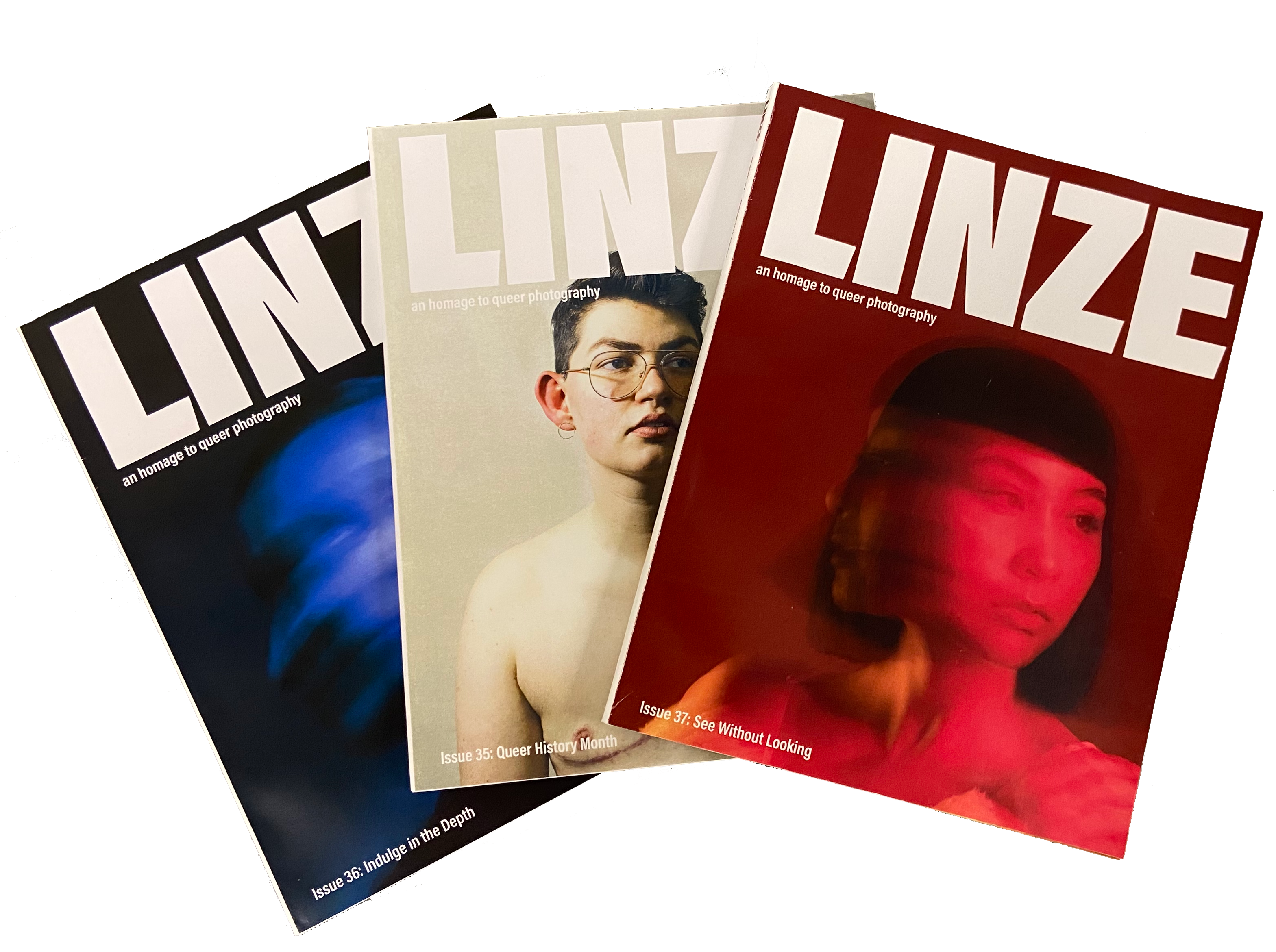
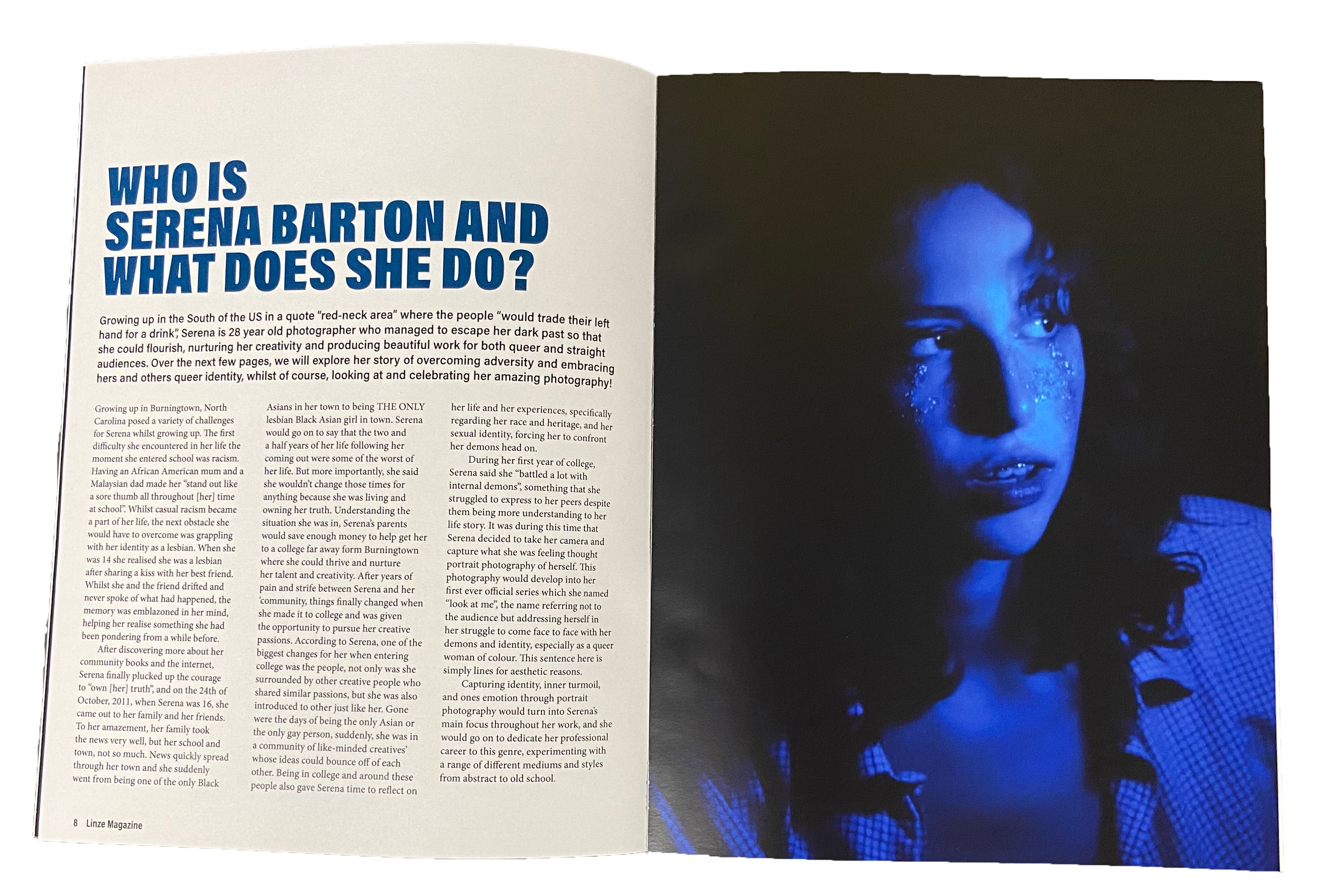
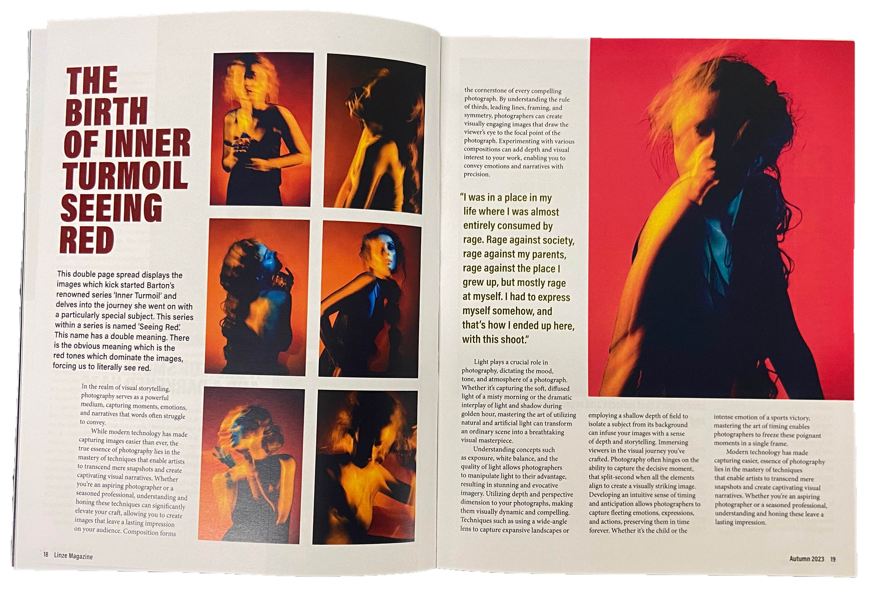
Linze magazine
Linze is a magazine for those with a passion for photography and who are part of or connected to the queer community, with the content serving as an homage to queer photography. This seasonally released magazine contains a variety of content ranging from interviews to reader competitions to long articles about queer photographers and their work. Using a simplistic and limited colour scheme and keeping the typographic variation to a minimum, I ensured that regardless of the contents of the magazine, the imagery would always be the centre of attention, as Linze is after all, dedicated to the work of these photographers.
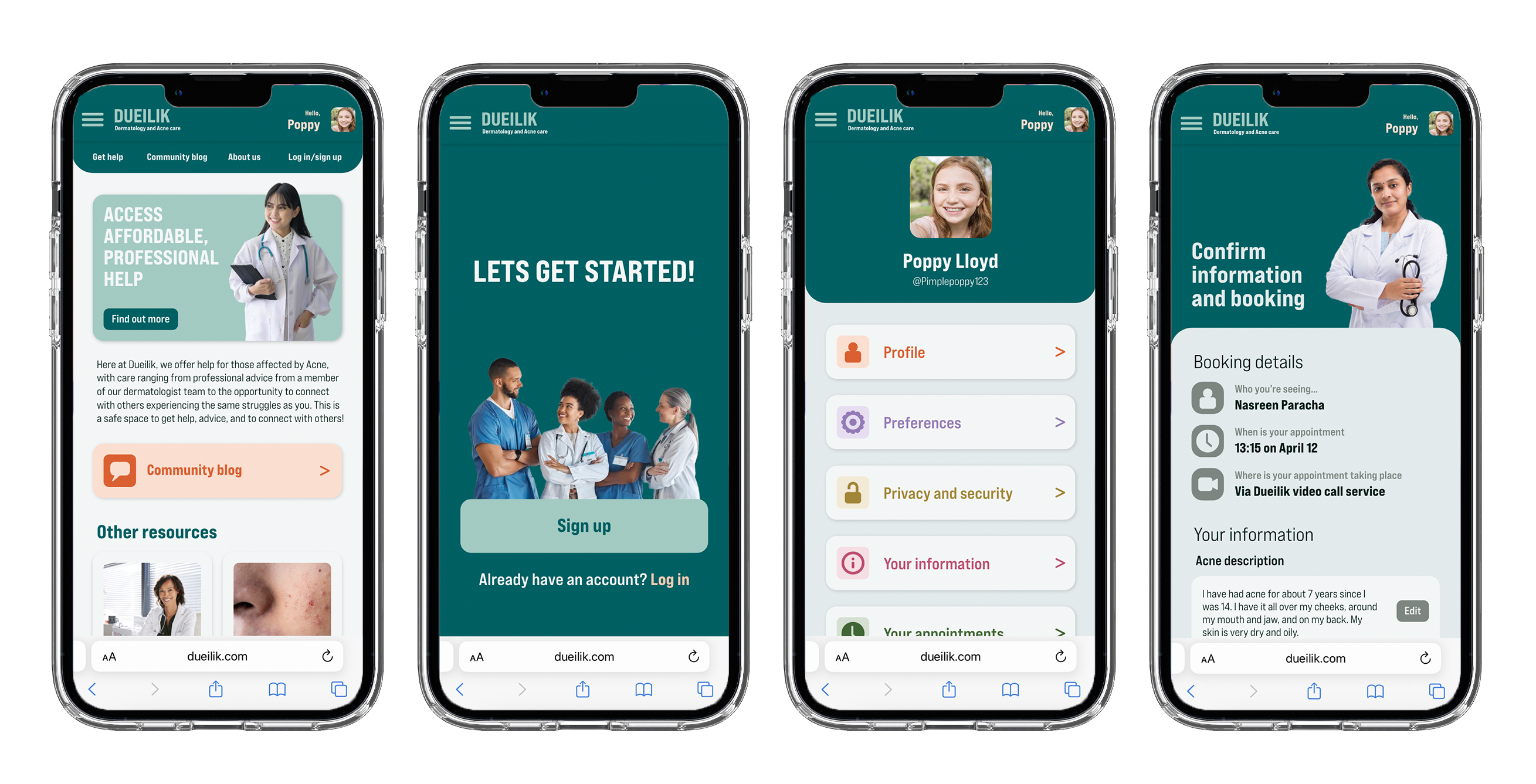
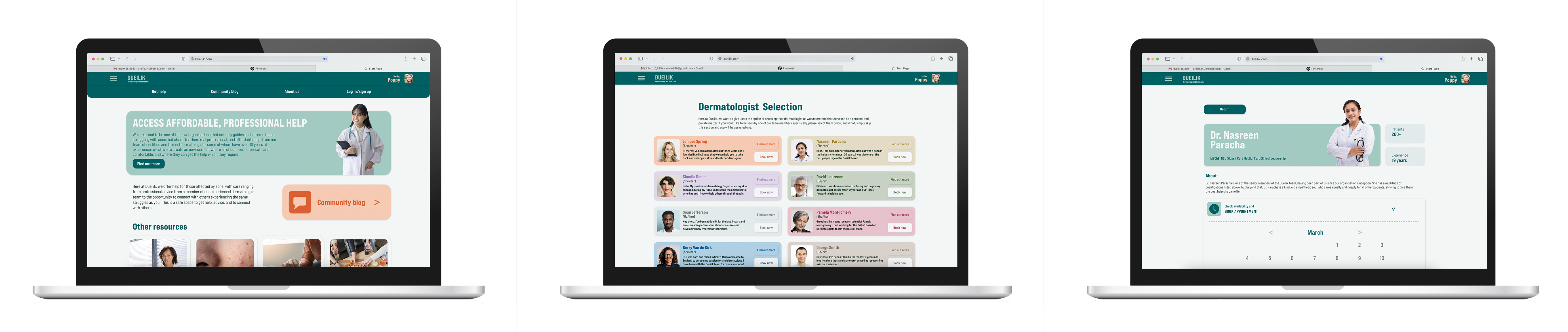
Dueilik web app
My web app ‘Dueilik’ targets users who struggle with acne and getting access to professional and affordable care for it. My web app helps users access professional and affordable care for their acne. It gives them an opportunity to speak with experts and get proper treatment at an affordable rate and with little hassle. Not only this but it will provide a platform and space for users to connect with others facing the same struggles as them and share advice, stories, and more, easing the mental burden caused by acne. Dueilik uses soft shapes and visuals containing happy medical professionals to create a less harsh and medical atmosphere, helping to ease the users stress and anxiety around seeking help.
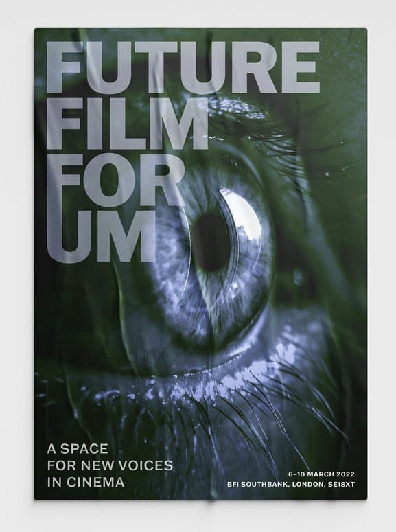
Film festival poster
This poster was one that I created in second year for our Design Practice module. The film festival was meant to primarily feature niche and underground directors who create indie films, with many of them depicting the darker and less commonly viewed parts of the human experience. Initially setting out to capture the themes of the films in my poster, I eventually decided to use an eye for my main visual instead. I chose this because I felt a close up of a human eye captured the rawness, exposure, and emotional intimacy that the films depicted, thus capturing the essence of the films and directors.