I am driven by a passion for creativity and pushing my boundaries; I always strive to deliver more than what is expected of me. My approach to design is all about strategic thinking and aiming for the best user experience. My deep understanding of design principles and softwares allows me to craft new solutions and think outside of the box. Above all, communication and availability are always expected of me. I’m not afraid to own up to my mistakes and improve based on feedback and insights. “Design is intelligence made visible” – Alina Wheeler
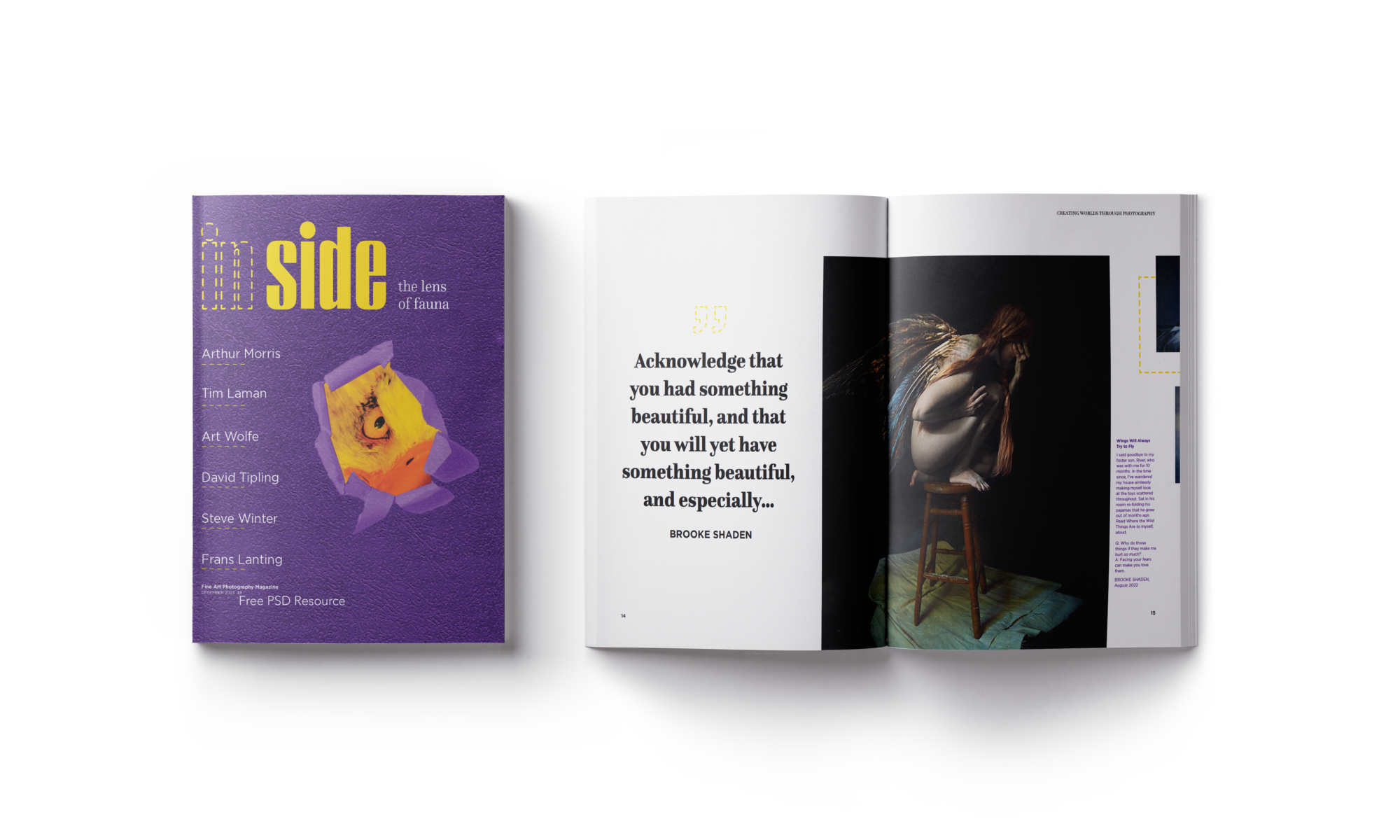
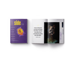
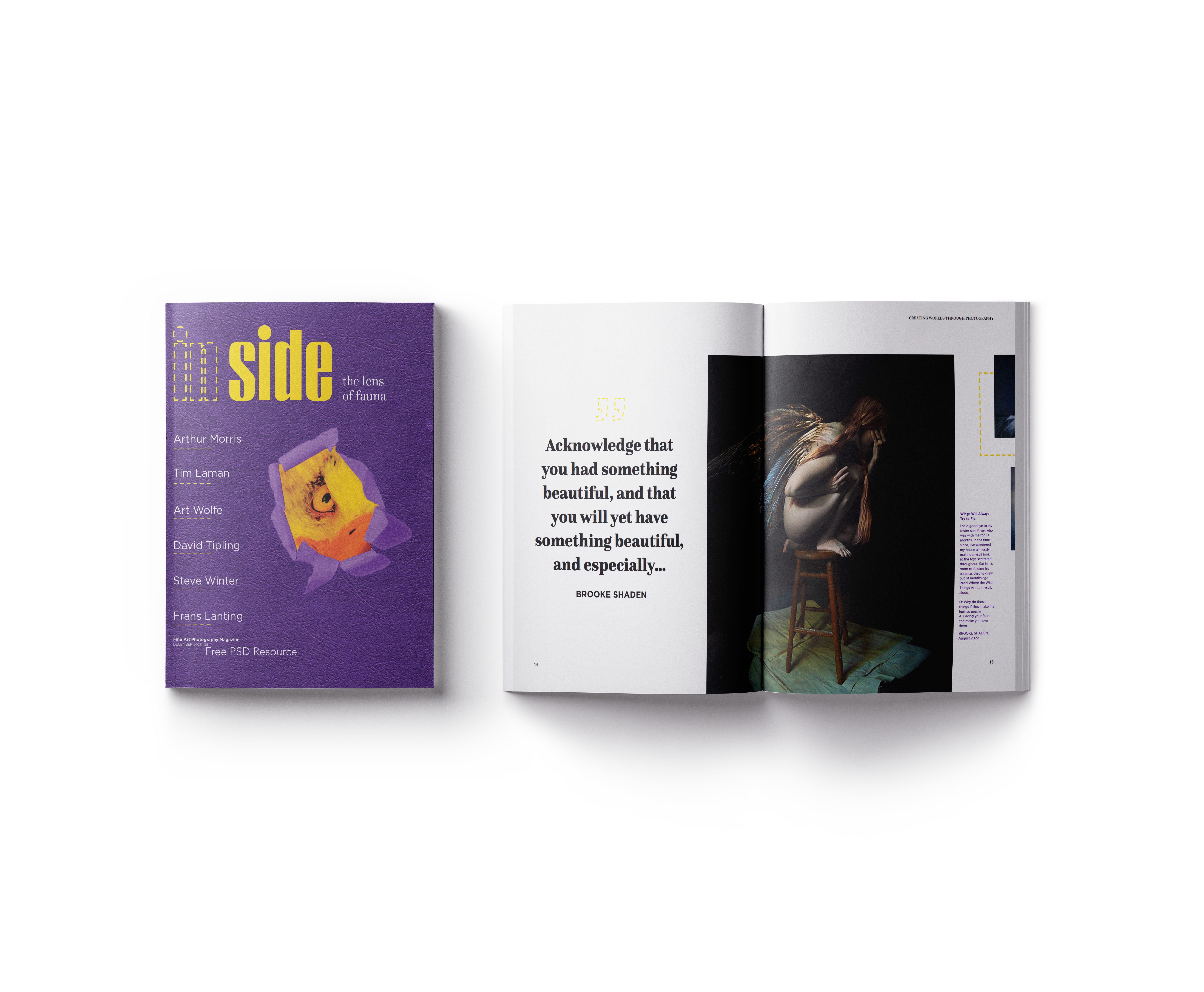
In Side magazine
I designed a photography magazine that explores unusual and creative photographic art. In Side magazine is dedicated to people who are passionate about exploring the surreal through the camera lens.
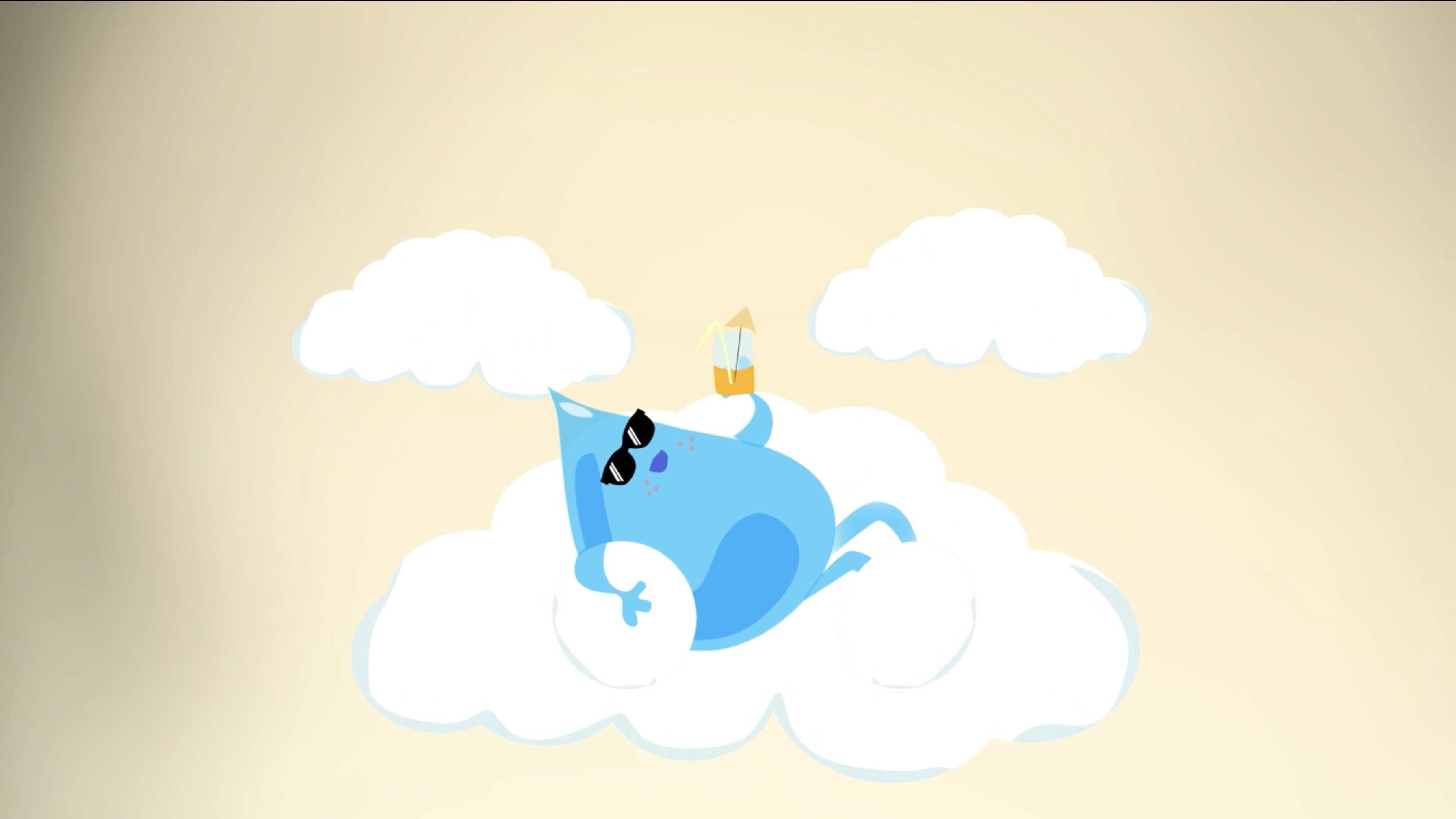
Educational animation
I designed and animated a 2 minute educational video for kids. This animation explains how water goes through different steps to reach our tap.
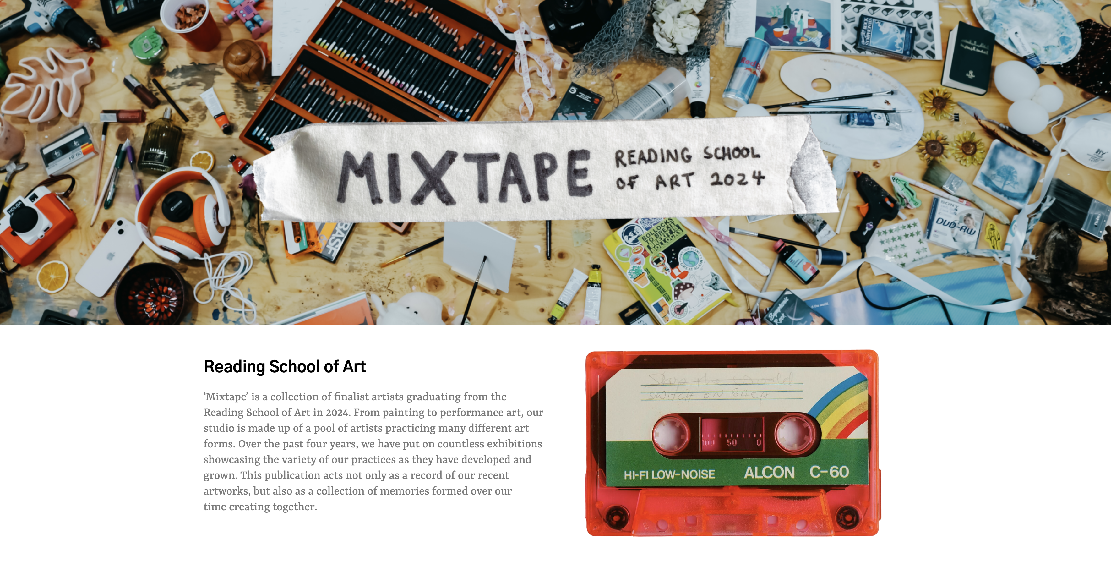
Reading School of Art Degree Show website
I designed a website for the art students to display their work. This website's objective is to provide a space for art students to display their work and connect with potential clients and collaborators.
Hi, I’m Nelly! I have had a passion for creativity from an early age. My 3 years at Reading have been a transformative experience offering me the chance to develop and build on my skills. Above all, the Real Jobs Scheme has provided me with a number of opportunities to gain professional experience with real clients. This has given me an insight into the creative challenges of delivering a brief and a wider understanding of the overall dynamics within the industry. I pride myself on my attention to detail. I’m quick to adapt and eager to learn. I’m constantly seeking new opportunities and pushing myself to explore new things.
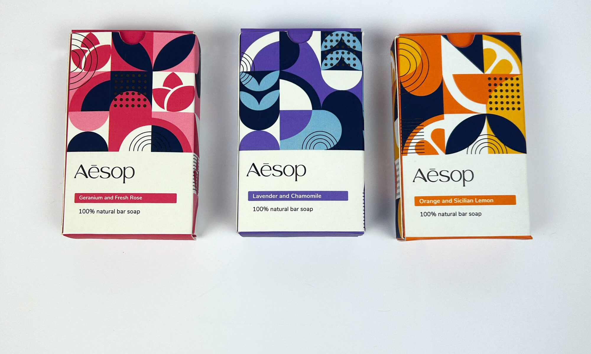
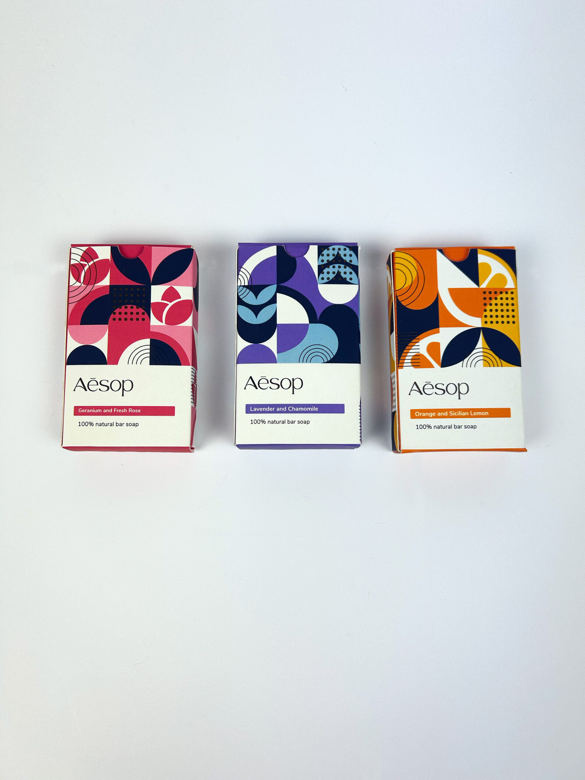
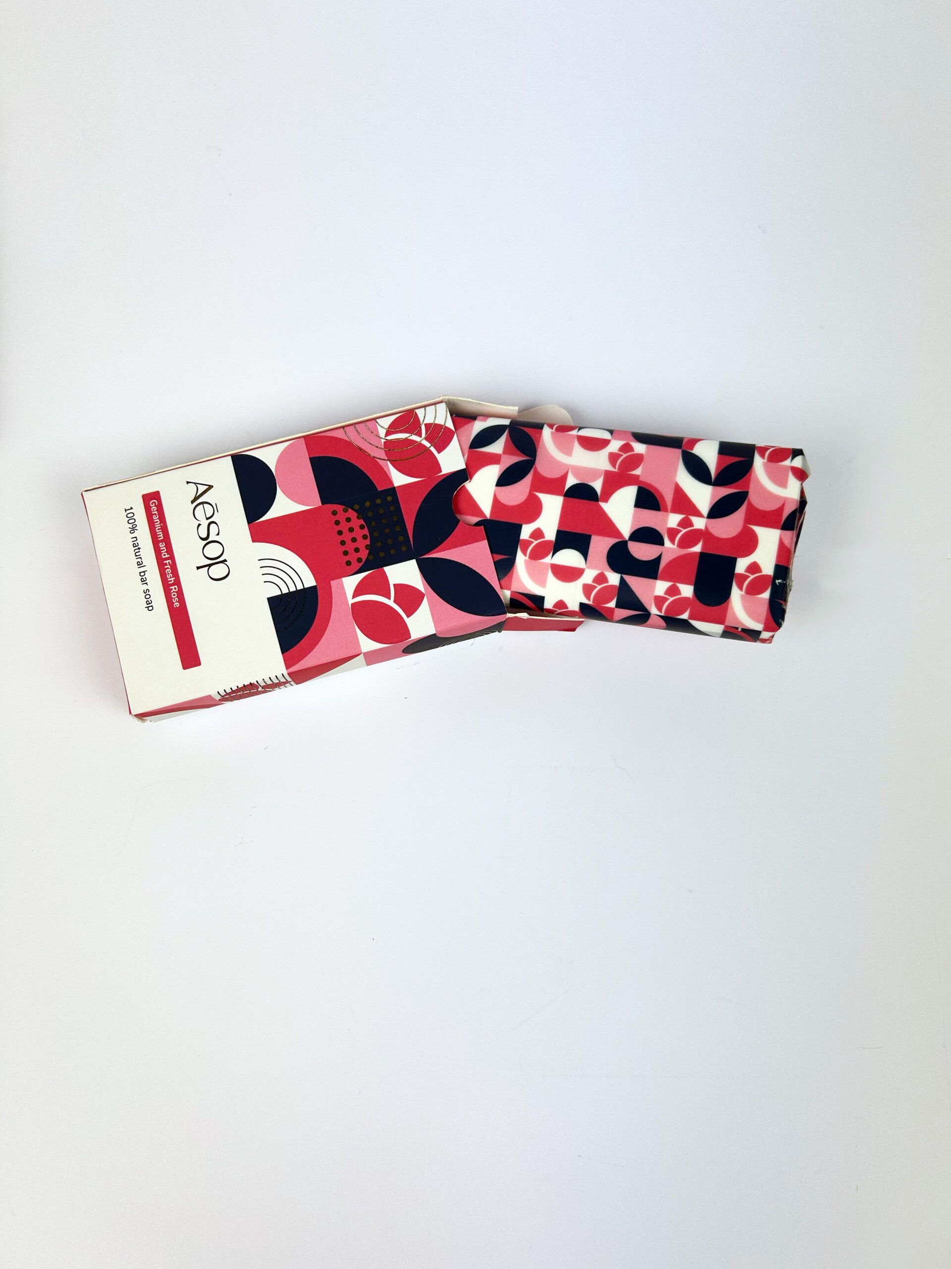
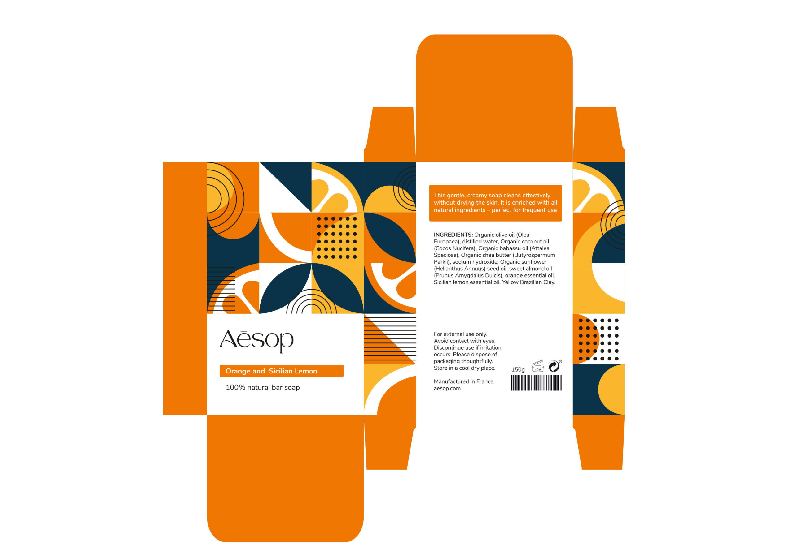
I undertook the challenge of redesigning Aesop's packaging with a specific focus on their bar soaps. The current packaging, whilst functional, lacks character. For this packaging project, I proposed a redirection for the brand to commit to using all-natural ingredients and work towards sustainability. The new packaging design embodies this shift through the use of geometric style patterns that evoke natural elegance. Each soap bar features refined gold foiling details to highlight the brand’s luxury.
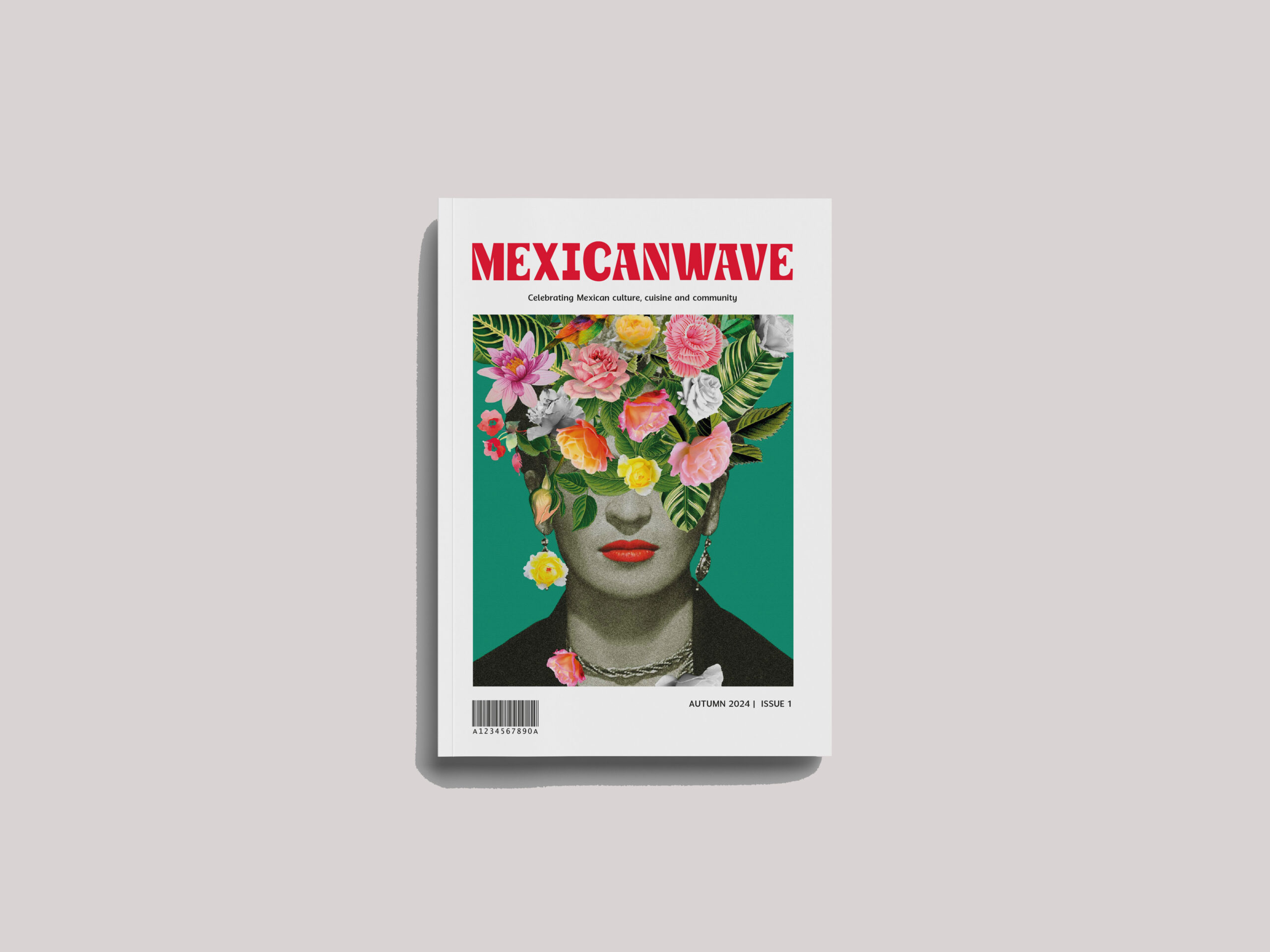
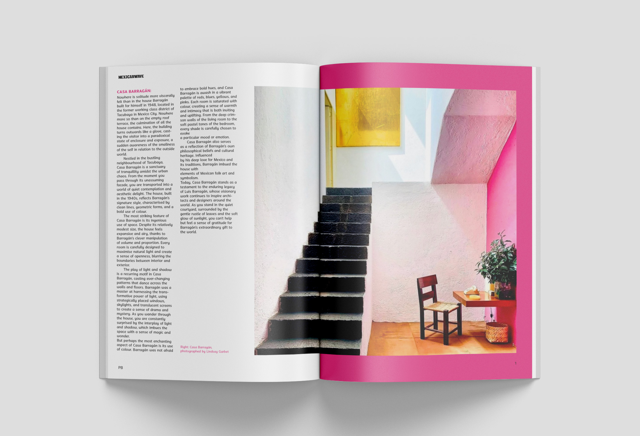
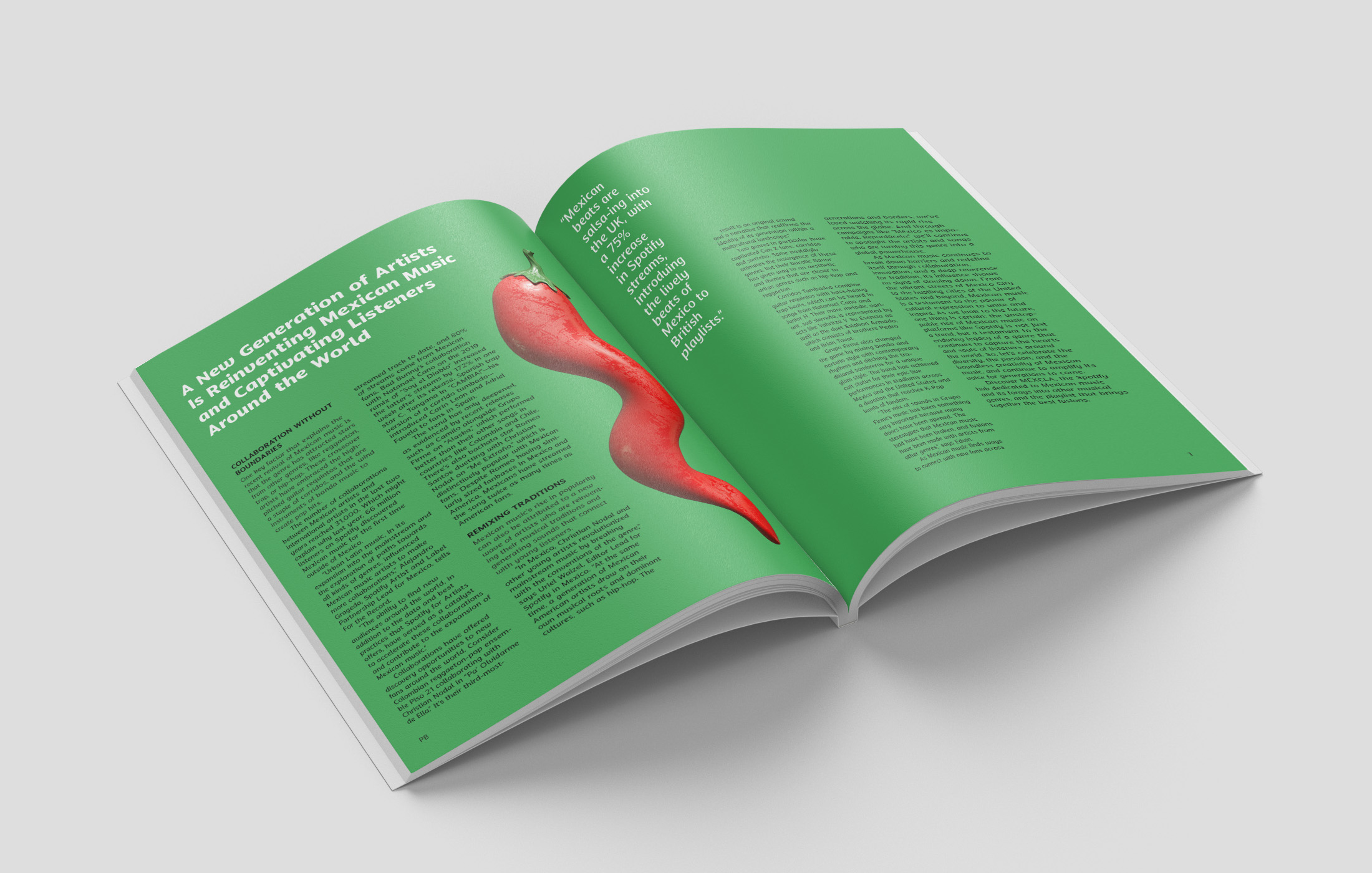
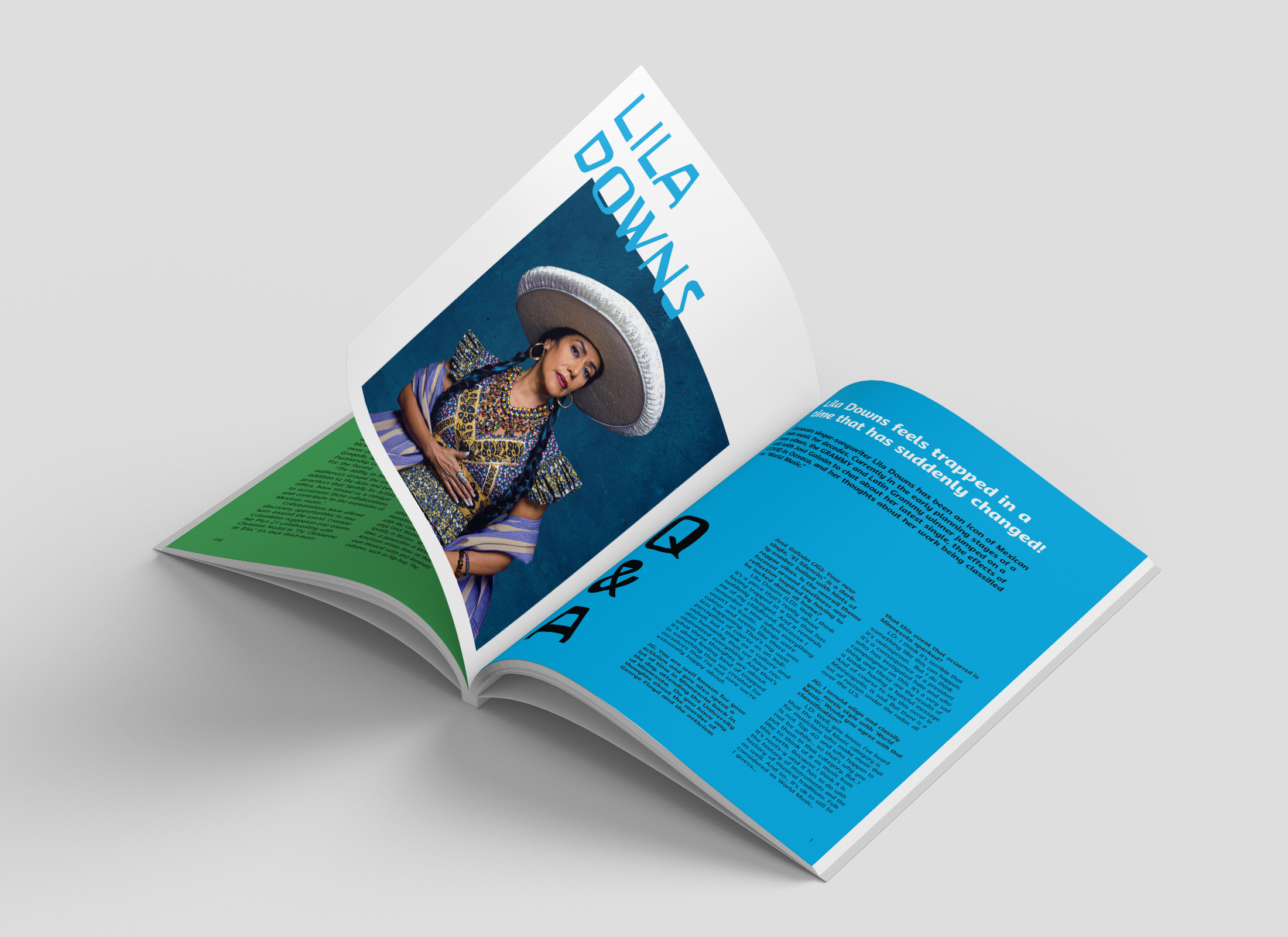
Mexicanwave magazine
Mexicanwave is an independent magazine that celebrates Mexican culture, cuisine, and community. It is driven by a desire to share the wonders that Mexico has to offer by immersing readers into the colourful world of Mexico and highlighting appreciation for its people and culture. Mexicanwave is designed for the culturally curious and for those who have a taste for authenticity.
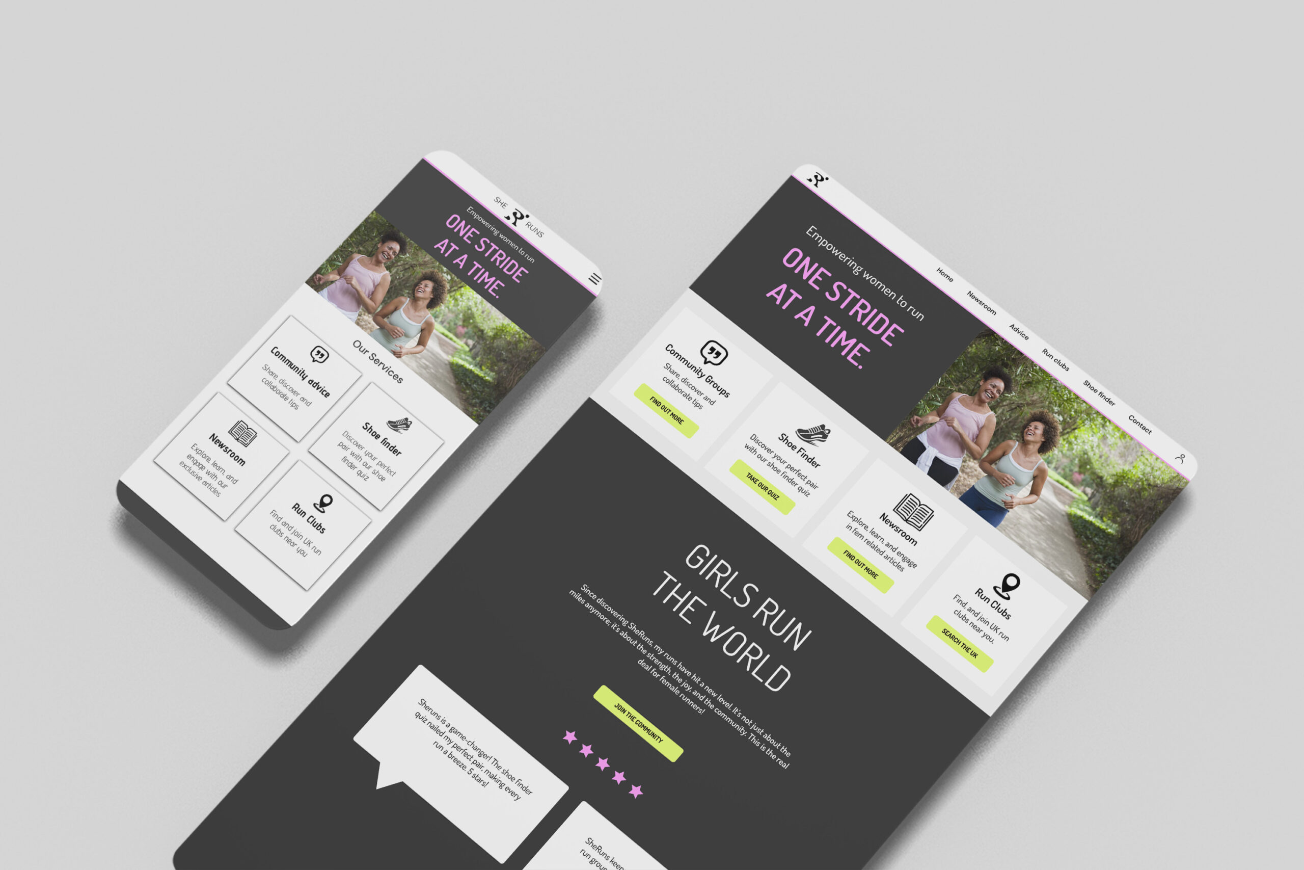
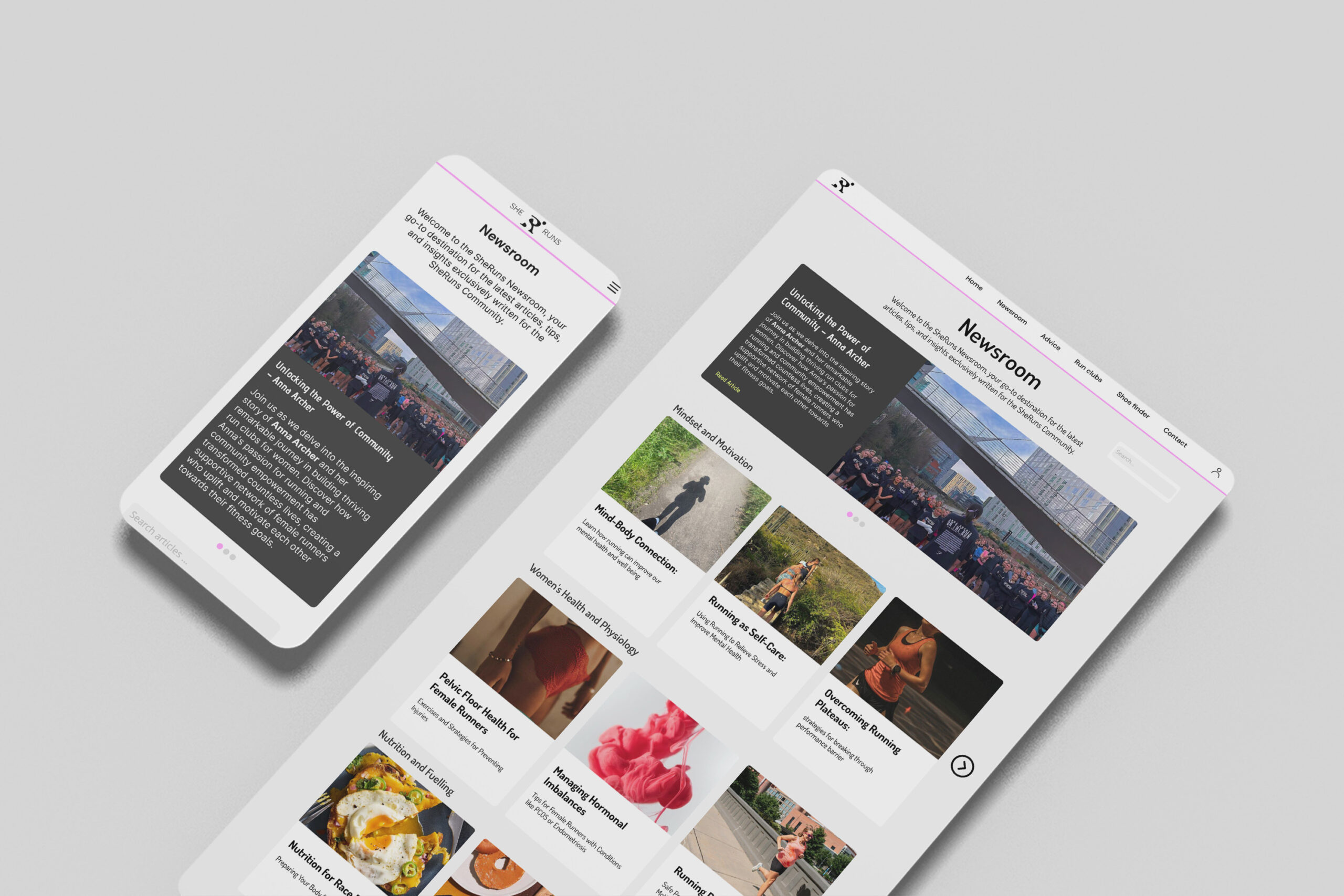
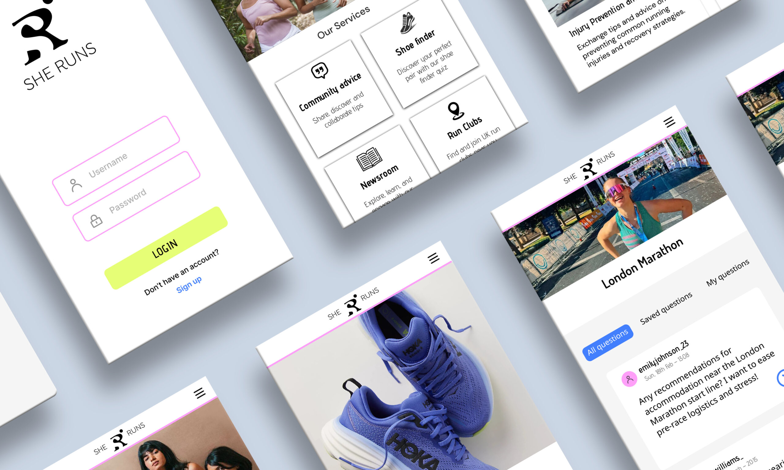
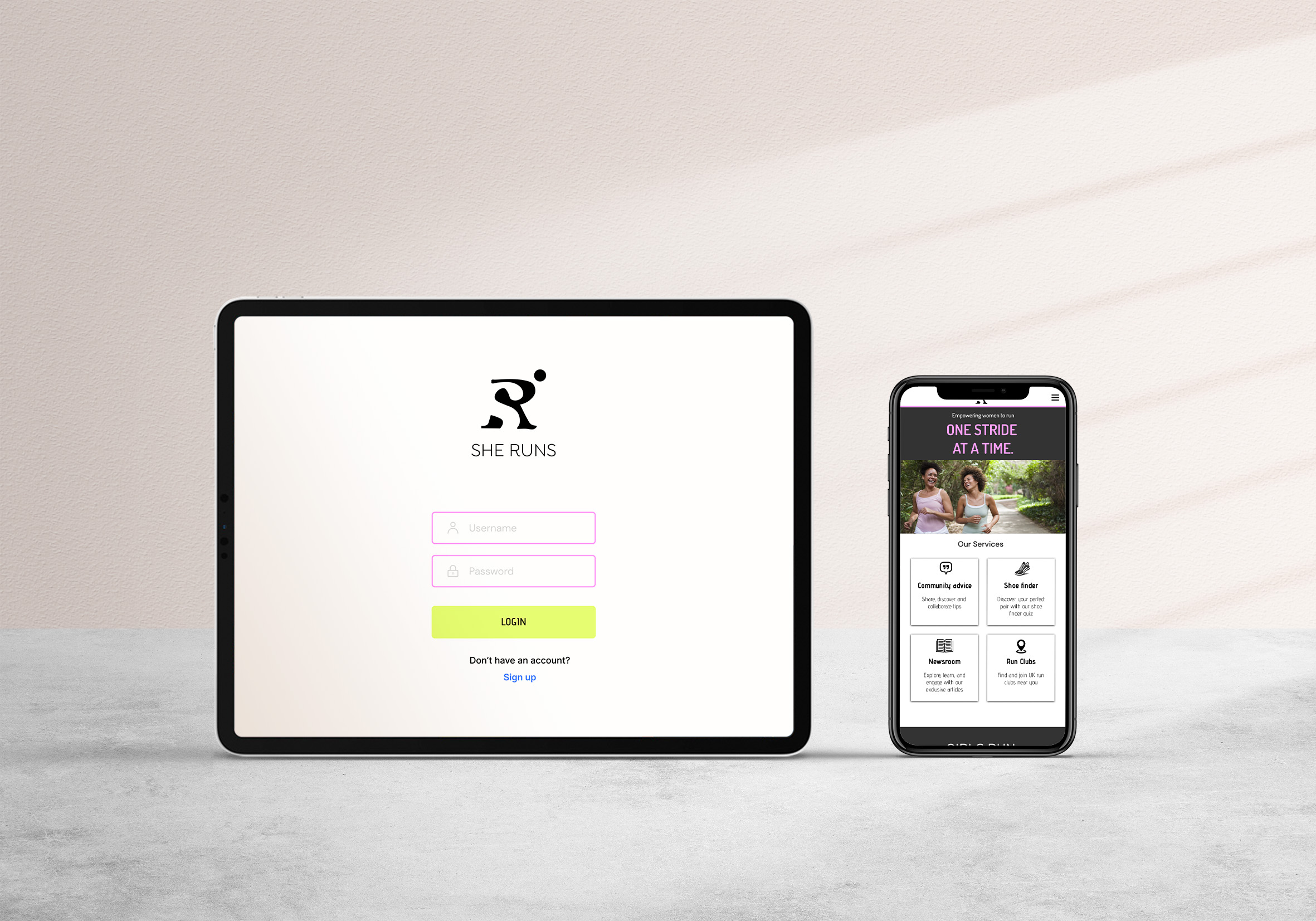
SheRuns web app
SheRuns is a web app designed specifically for female runners, it focuses on inspiring and empowering women to run. It was prevalent from research into the current market of running apps, that many do not cater to or consider the unique needs of female runners. SheRuns is the missing female-only platform that provides all sorts of features that female runners need. It has been created to fill this void by addressing these needs and creating a more supportive environment for women.
Hi, I’m Natalie. I consider myself as a patient and driven person, constantly pushing boundaries and seeking out new sparks of inspiration. I have particular passions for publication and typography design, UI Design, and packaging design, where I enjoy infusing diversity into my work to connect with a wide range of audiences. I believe that effective design goes beyond aesthetics, prioritising functionality and enhancing user experience. In my future career, I’m eager to contribute my skills to projects that demand both creative ingenuity and practical problem-solving, striving to make a meaningful impact with every endeavour.
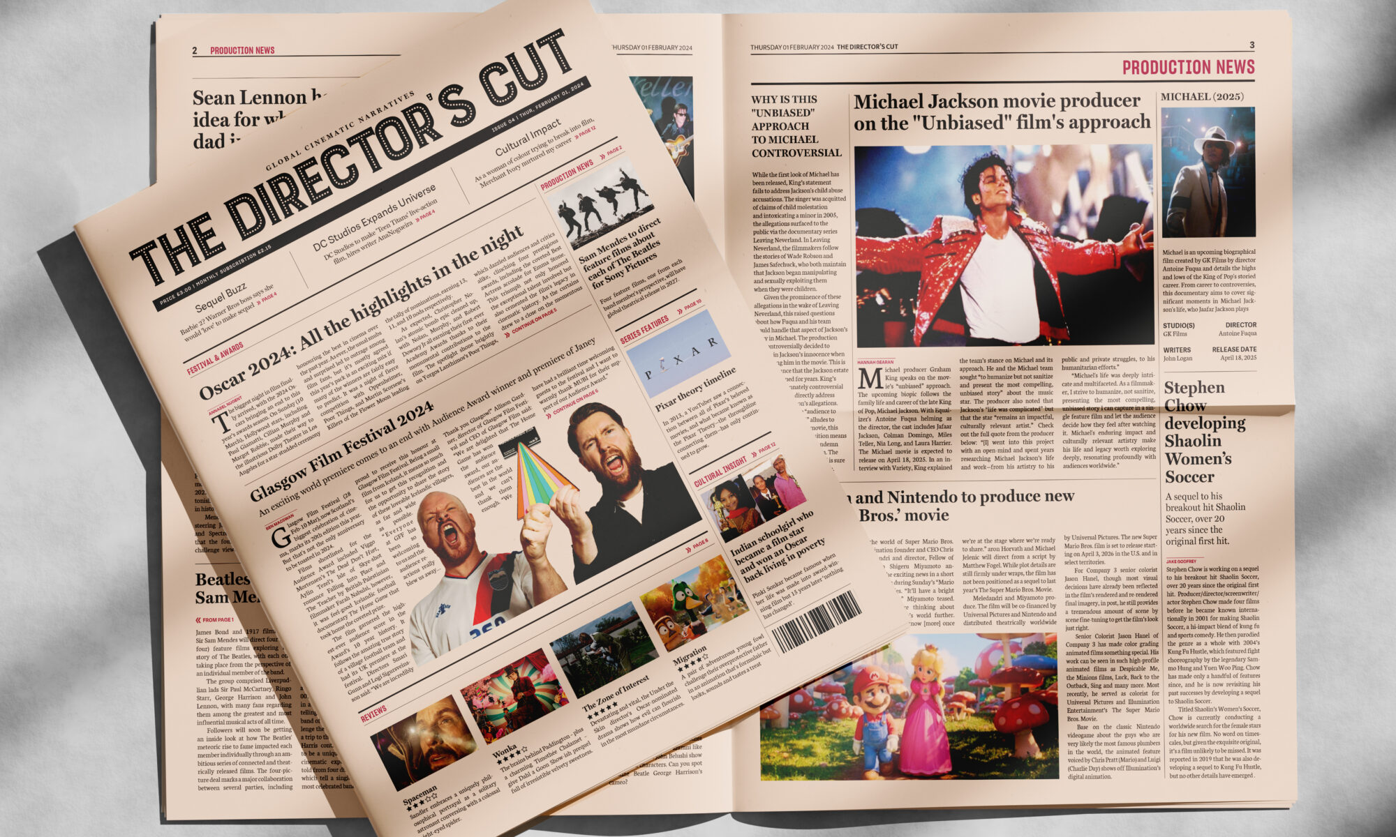
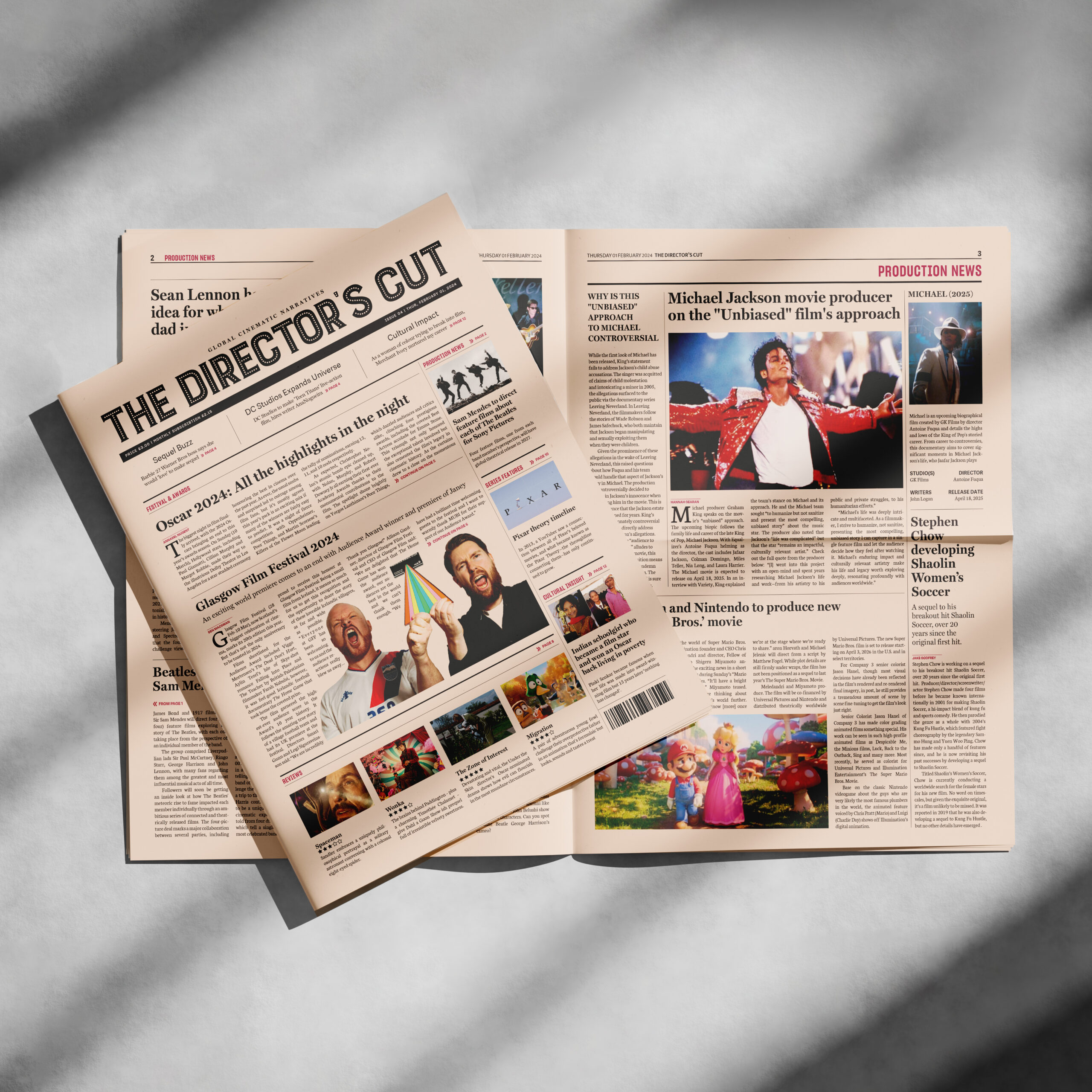
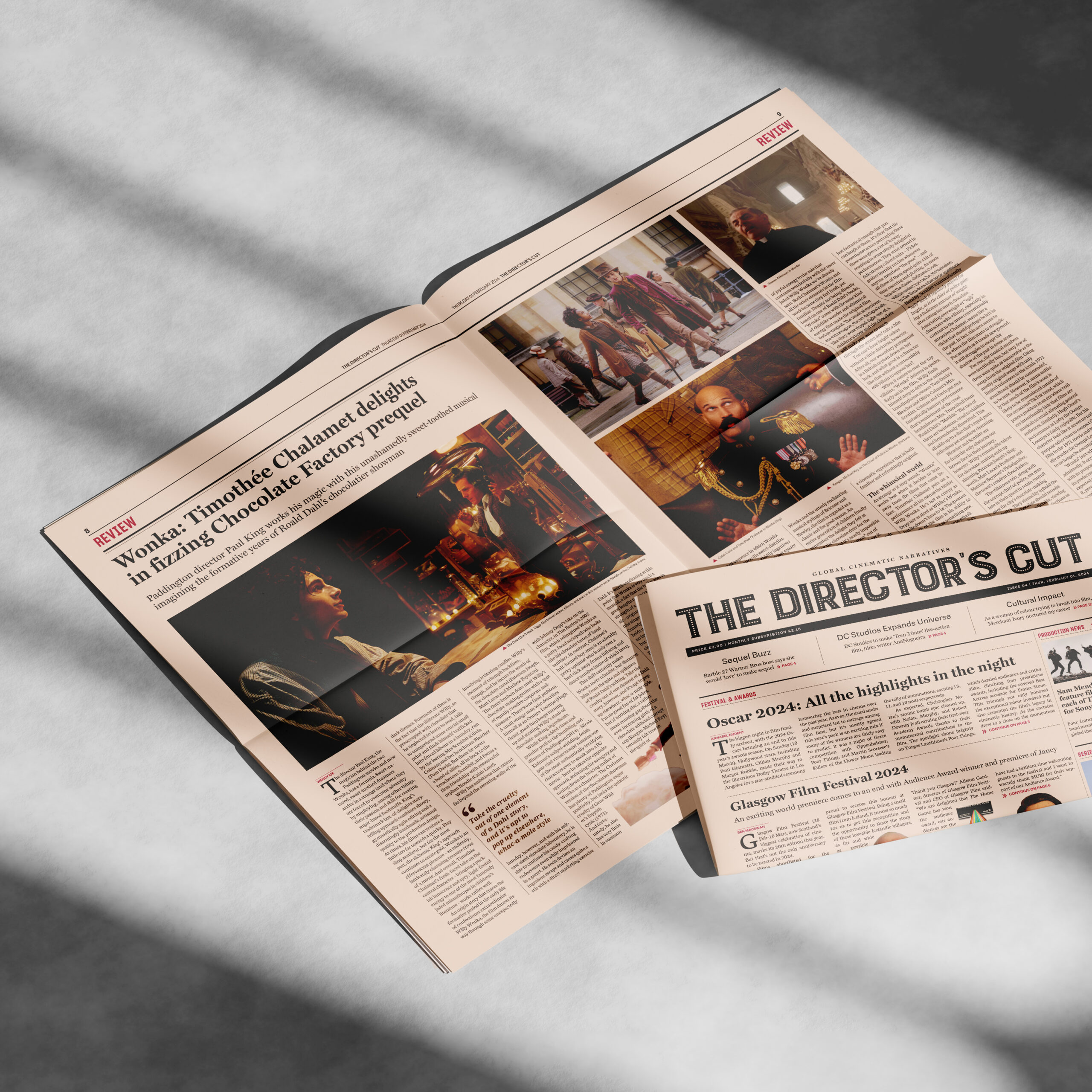
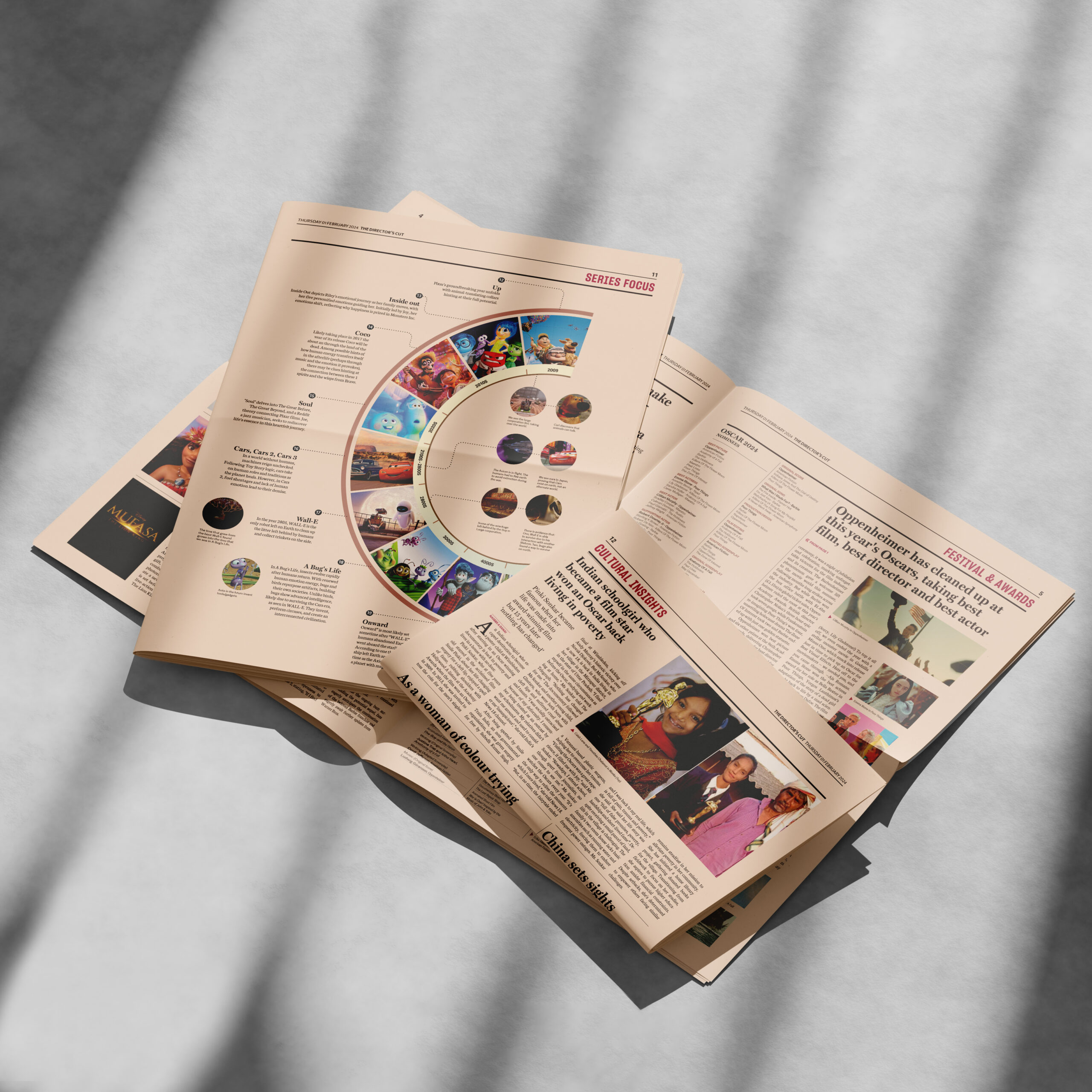
The Director's Cut is a proposed newspaper publication designed as a celebration of the silver screen. With the latest film awards, news, reviews, and narratives, it allows audiences and readers worldwide to immerse themselves in the dynamic film industry. This project was in our Advanced Editorial module, which allowed me to create a professional newspaper, and understand the details of typographic decisions for newspapers. The most challenging part was to make the piece distinctive in a way that fits the theme of film.
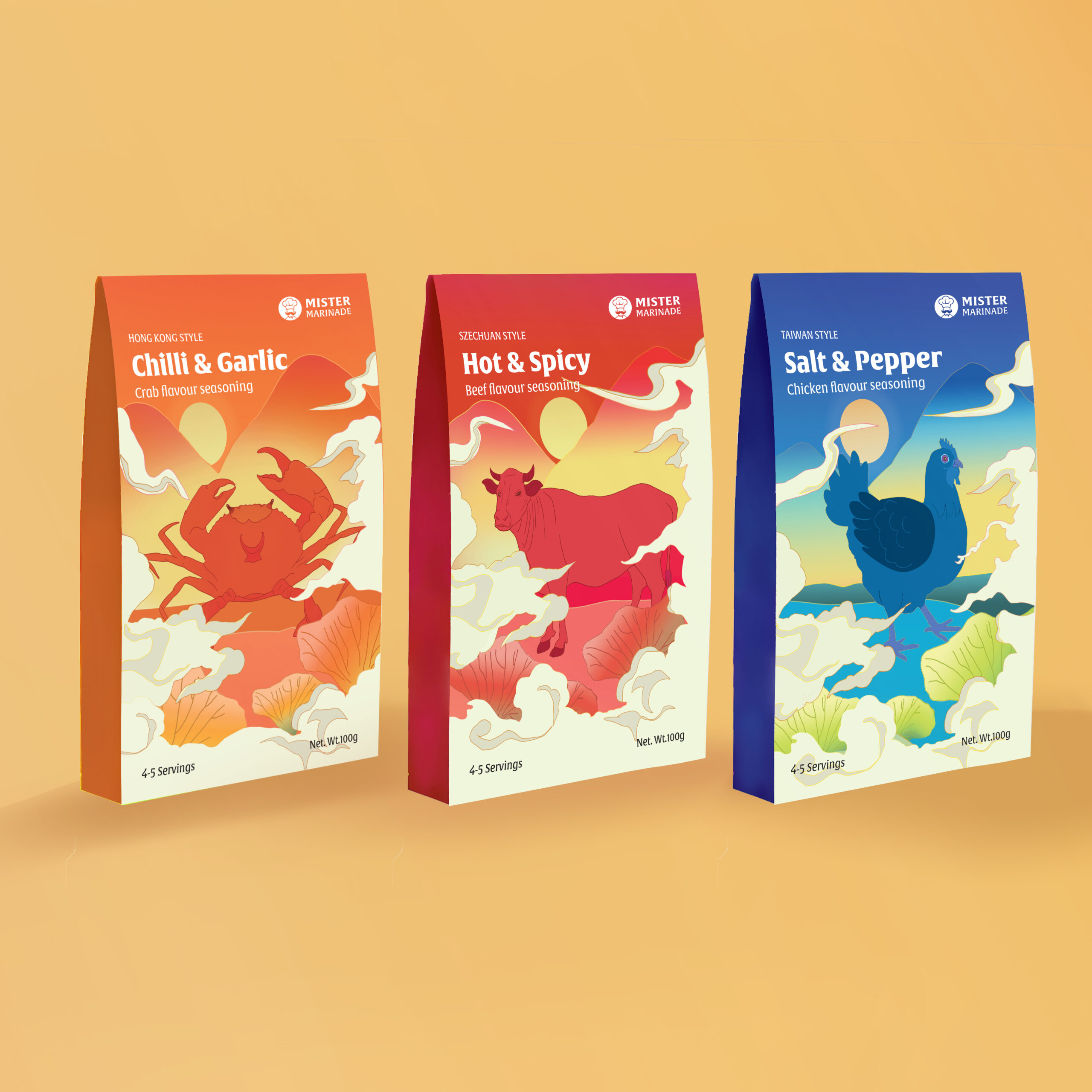
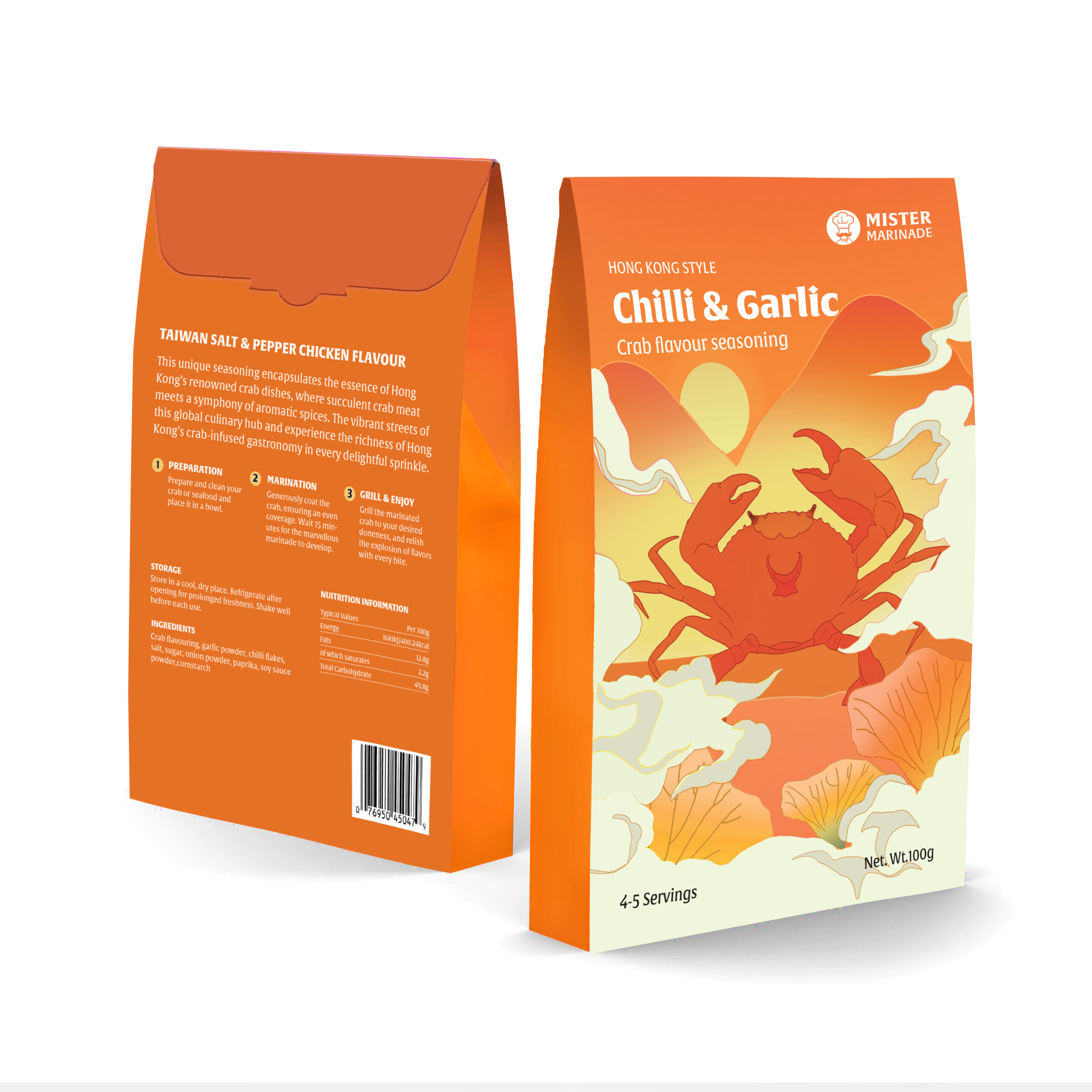
Mister Marinade packaging
This is a re-packaging project for Mister Marinade, an online brand that sells marinades and seasonings in the UK. The brand is committed to inviting both novice and experienced home cooks to explore diverse flavours. The re-packaging design suggests a new series of Chinese regional flavours seasoning, aiming to create a new and fresh appeal for the brand. The redesign tells the story of home cooking and Chinese taste through an engaging storytelling approach. It features the three regional Chinese authentic flavours of Sichuan, Hong Kong, and Taiwan, encouraging experimentation, and savouring the joy of new seasoning flavours for culinary.
Better Sleep web app
Better Sleep is a web application for people suffering from persistent insomnia or who struggle with sleeping problems, who lack motivation, and who want to take control of their sleep problems. Unlike common insomnia websites that involve complicated and overwhelming textual information, our website provides four-week sleep courses to encourage behaviour change and guide the user through the designated journey of better sleep. With practical bedtime resources such as video practices and audio, the sleep course will guide users to empower and visualise the milestones of progress, keeping track of progress through features like sleep diary entries.
I am an analytical designer focussed on solving problems in a dynamic, exciting way. My strengths are design thinking and creative direction: I enjoy experimenting and being intentional in my design approach, creating meaning with each decision, and find visual analysis at the core of my process. I am detail oriented and enjoy projects such as packaging, campaign work and editorial design. I am confident in Photoshop, Figma and After effects but primarily in InDesign and Illustrator. I have a passion for typography and illustration with a growing interest in motion graphics, but I am always looking to learn and grow my skillset.
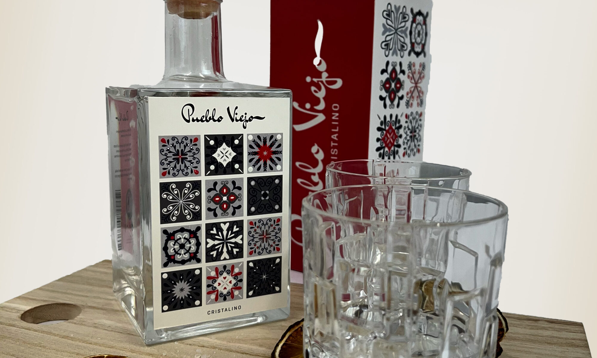
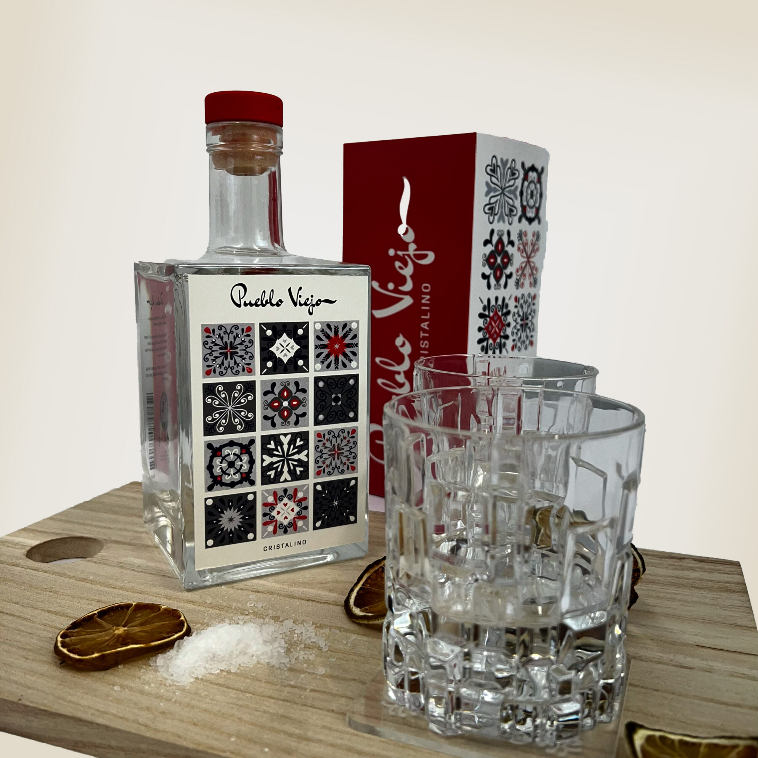
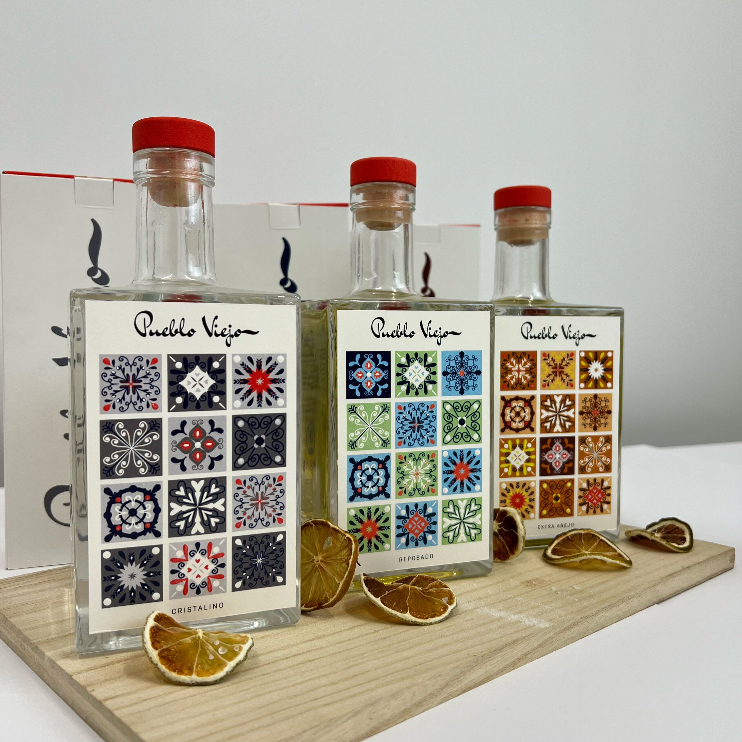
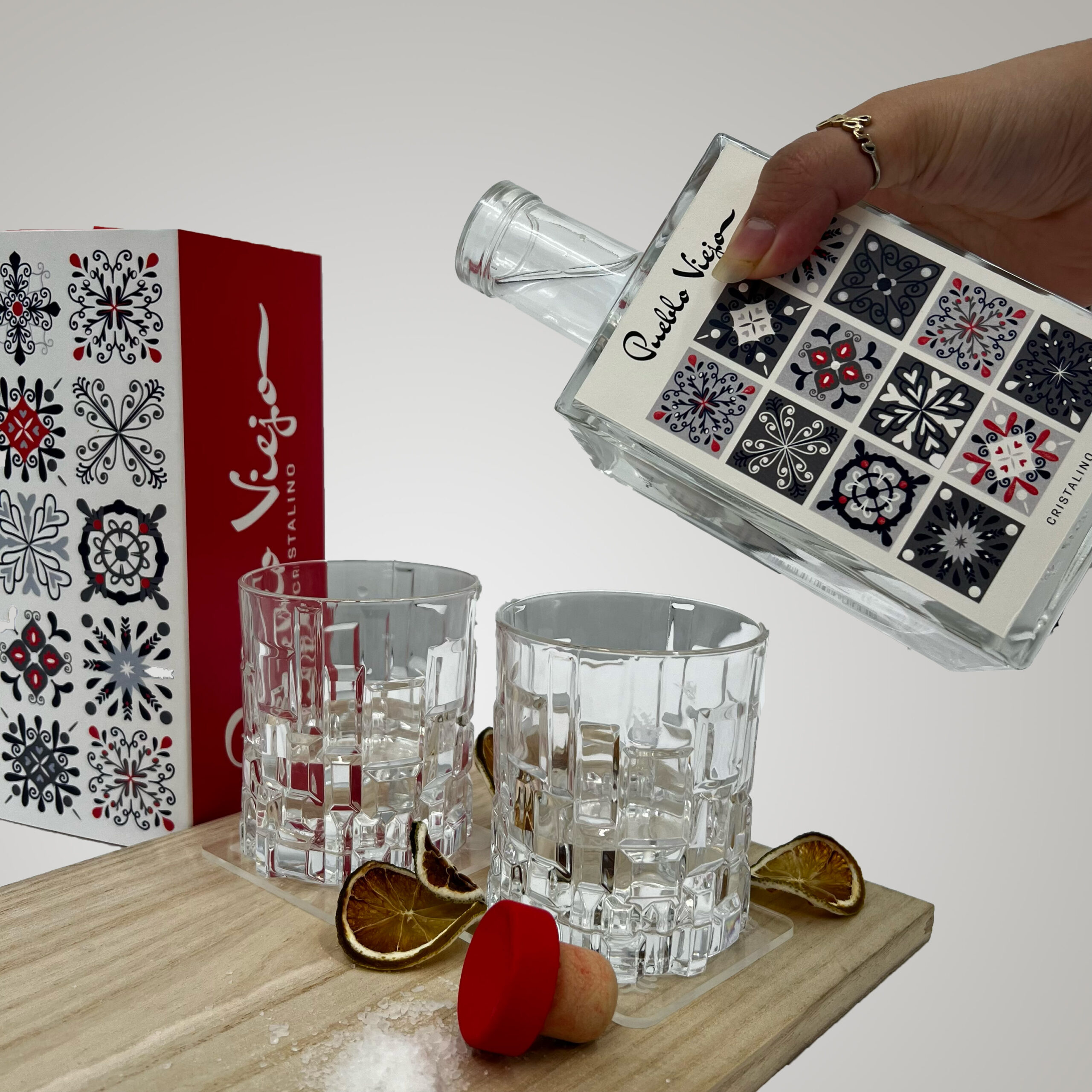
Pueblo Viejo is a Mexican tequila brand, who focus on their authentic production and traditional methods. This relaunch brings Pueblo Viejo to the premium market, using Mexican inspired motifs of Talavera tiles and hand-lettering typography to represent the company values. Each tequila has colours to represent the processes involved in the production or ingredients used.
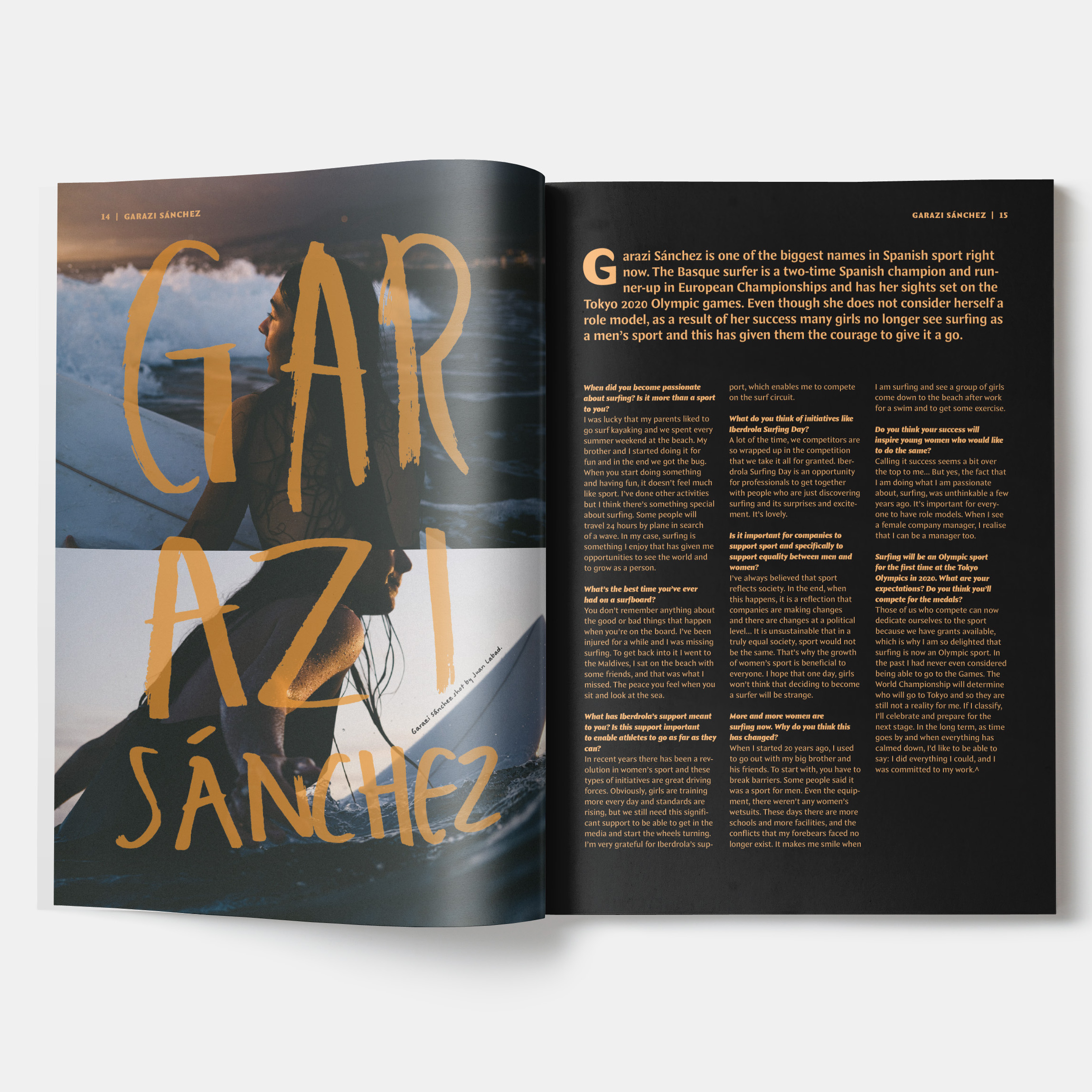
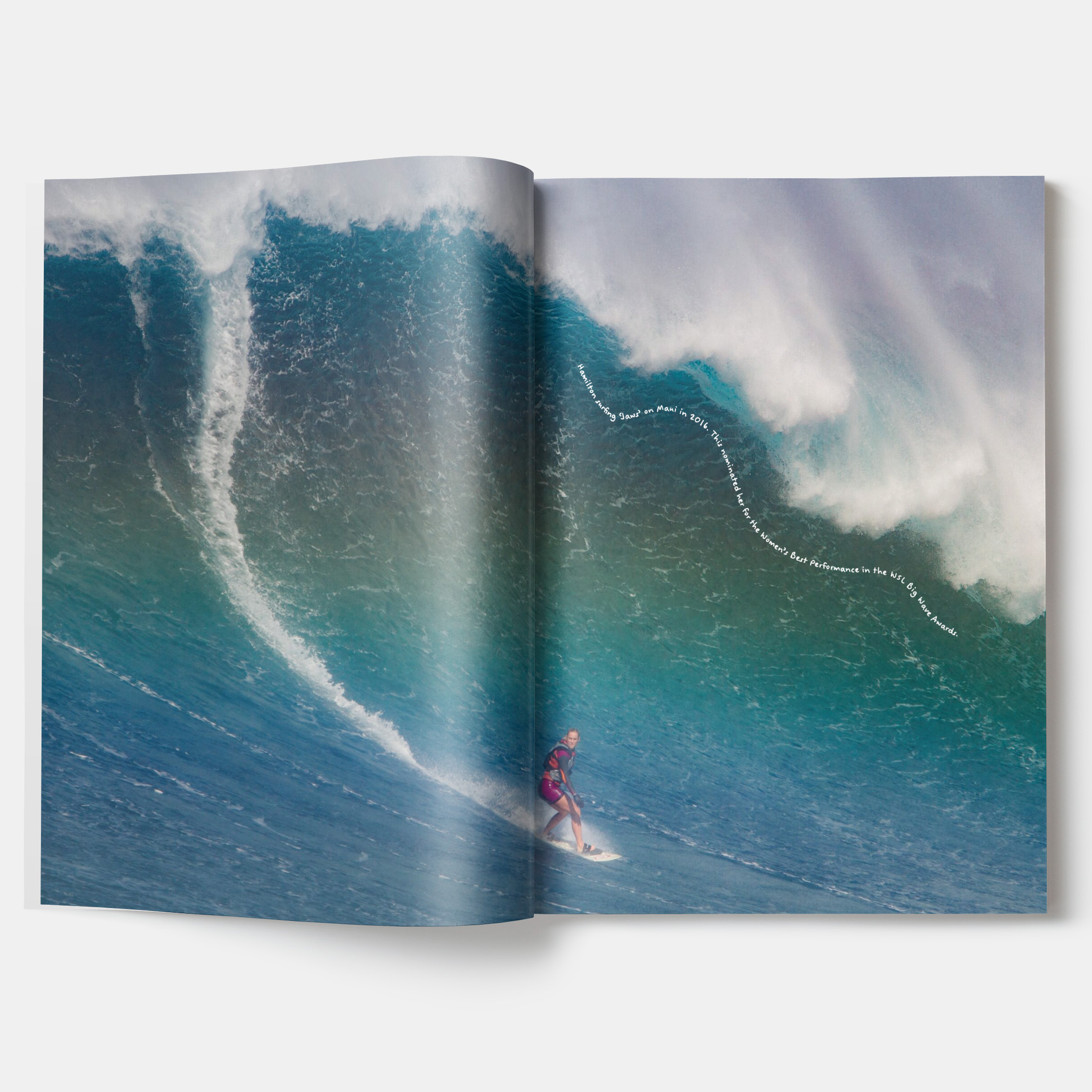
Neried magazine
Neried magazine is an independent, female-focussed, surf magazine. Created by and for women, Neried aims to create a space where women and other minorities can feel comfortable and valued within the surfing community. Inspired by the Ancient Greek ‘Nerieds’ (daughters of the sea God, Nereus), the magazines play on feminism in the waves, amplifying voices across different skillsets and backgrounds. Working with the European seasons, Neried is a quarterly magazine. Although based in Europe, the magazines share stories from global events and individuals to build an international community.
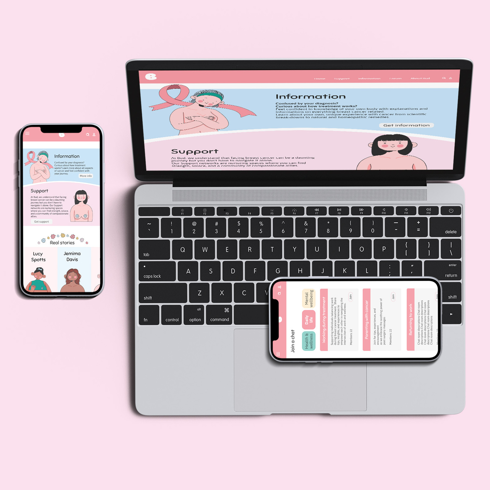
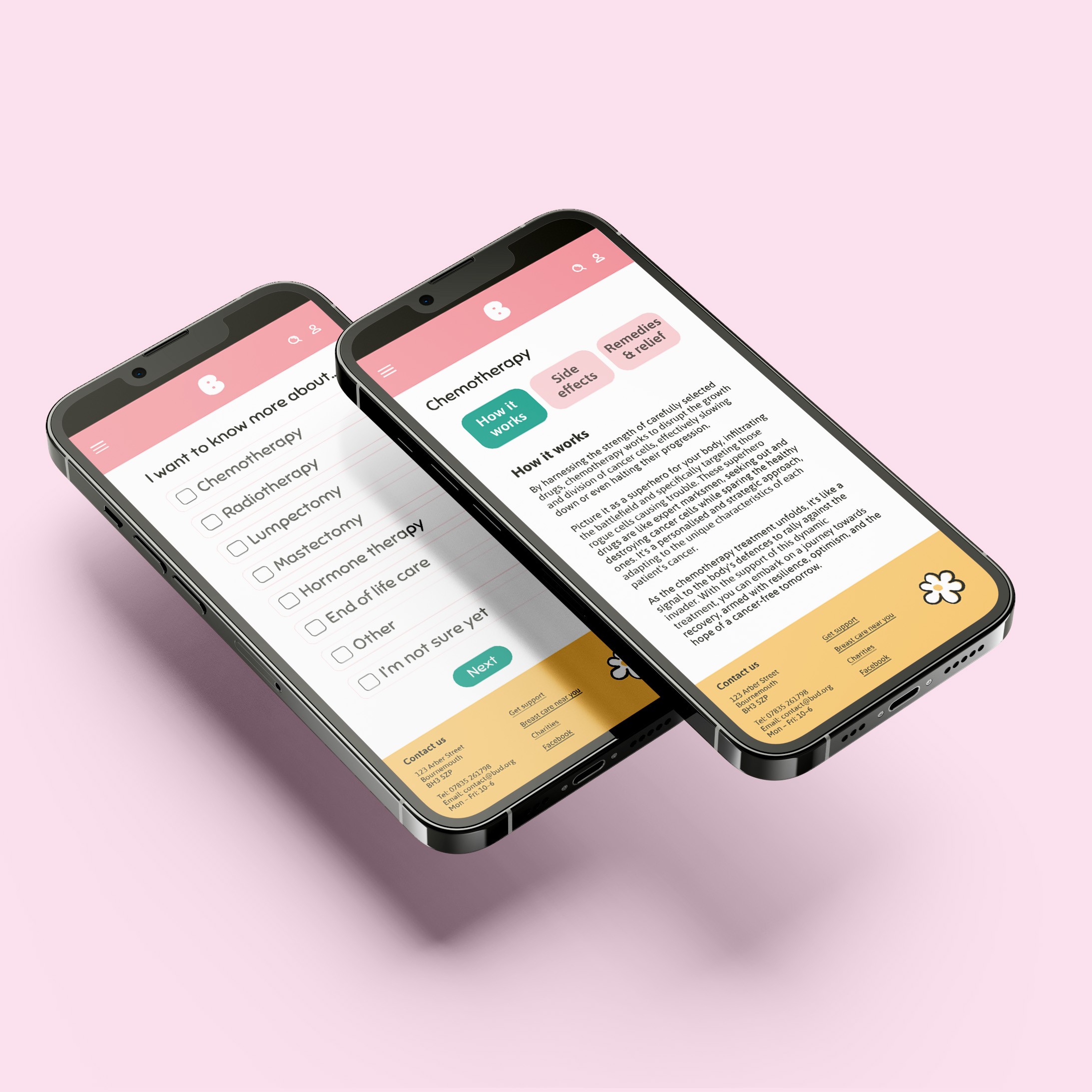
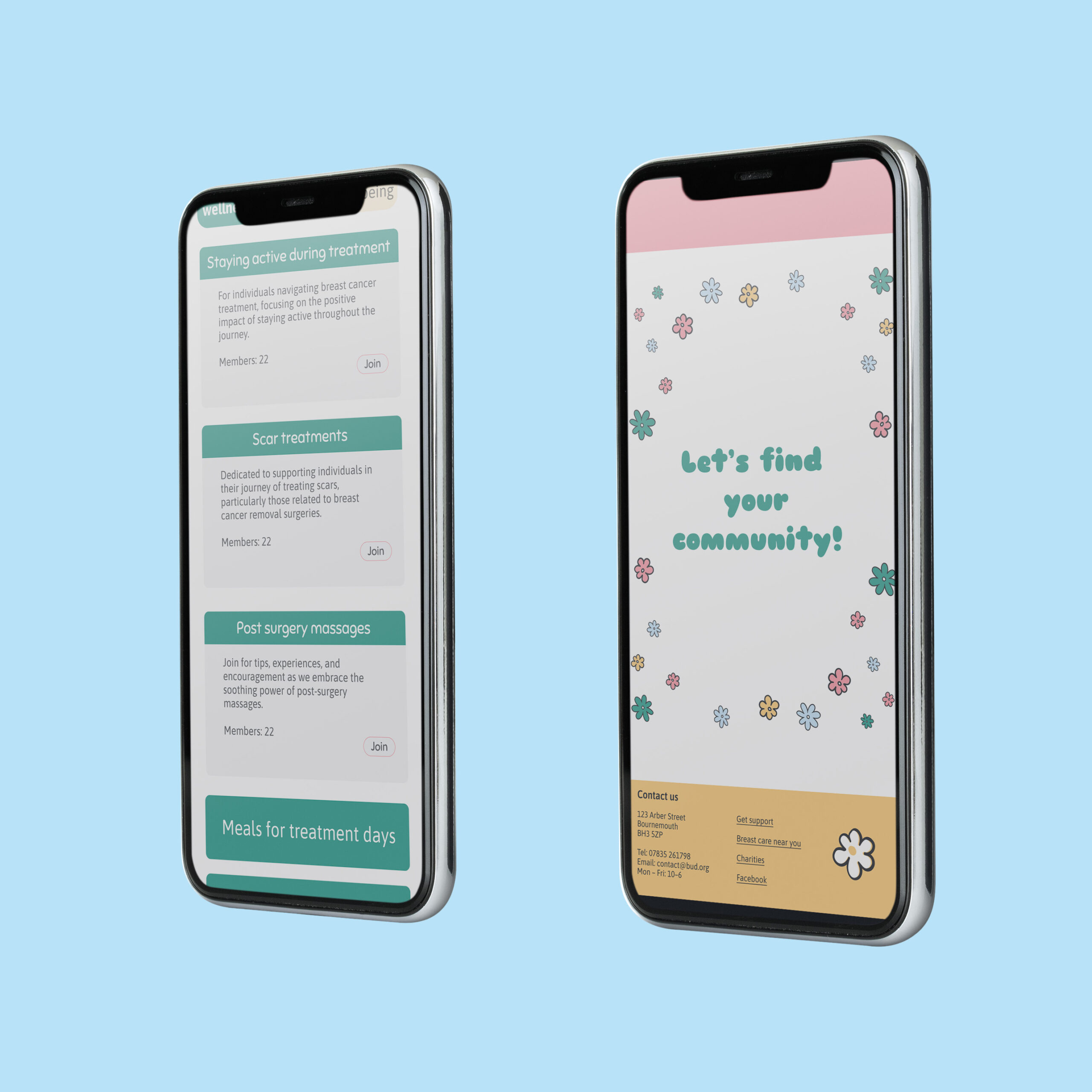
Bud website
Bud focusses on providing a softer, more personable source of breast cancer information and support. Many cancer information websites are clinical and overwhelming or draining to read at the best of times, let alone when concerned about breast health or dealing with cancer. Bud aims to resolve this by breaking information down into more palatable and simpler formats. Bud aims to be accessible from home, to help people wherever and whenever they may need it.
Hi, I’m Matt, an ambitious designer with an eye for detail. I enjoy being able to create innovative and creative solutions to design projects, particularly within advertising, packaging, and branding. My experience completing a variety of freelance projects, from branding businesses to merchandise for international musicians, has allowed me to work closely with clients, giving me an array of real-world experiences. These opportunities have allowed me to be a proactive and versatile creative, being able to learn new software and skills to best complete these projects and meet client’s needs. Having skills in communication and time management, developed through my university studies and freelance design work, allows me to work as an effective and professional designer. My motivation to grow and improve, both as an individual and as a professional, leads me to create innovative, engaging, and successful designs.
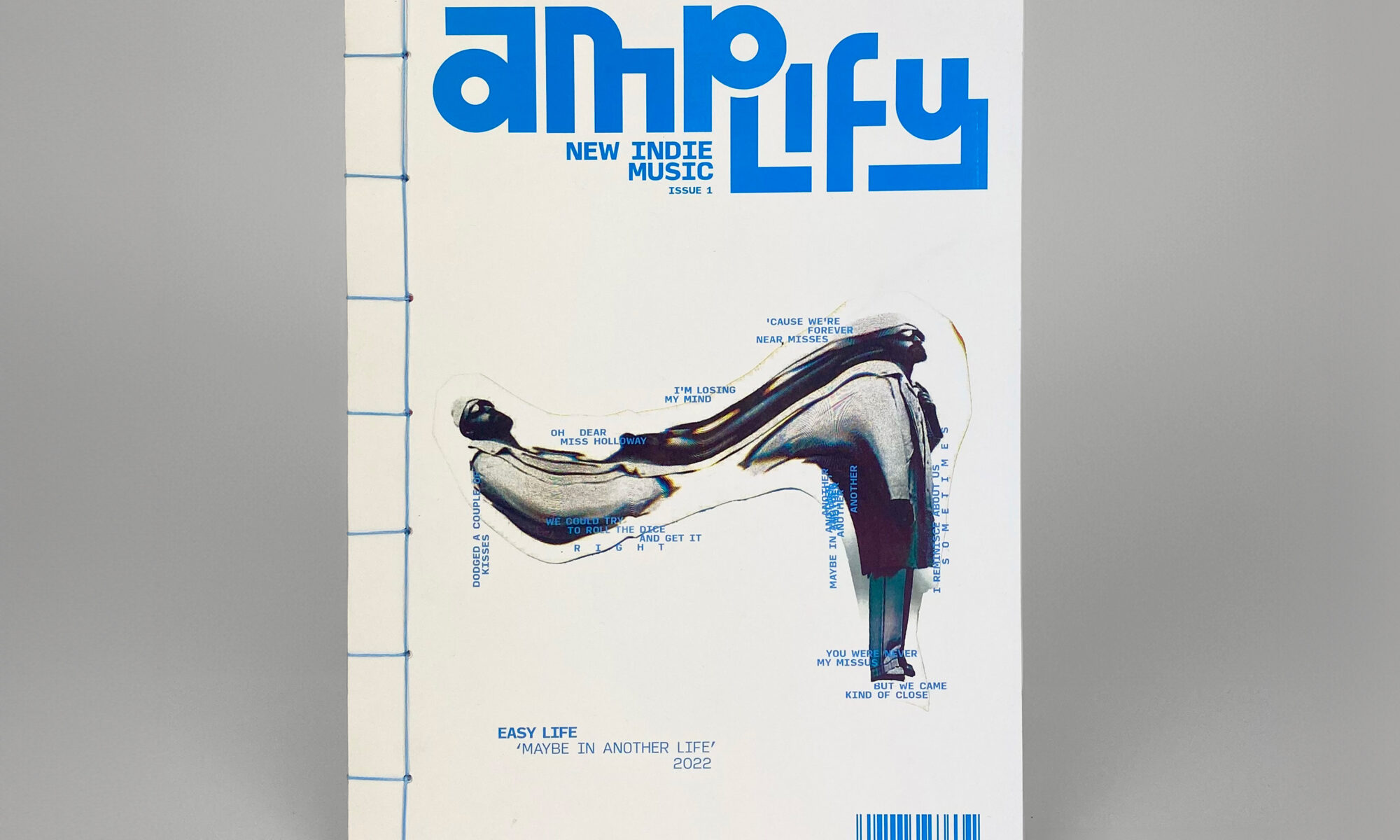
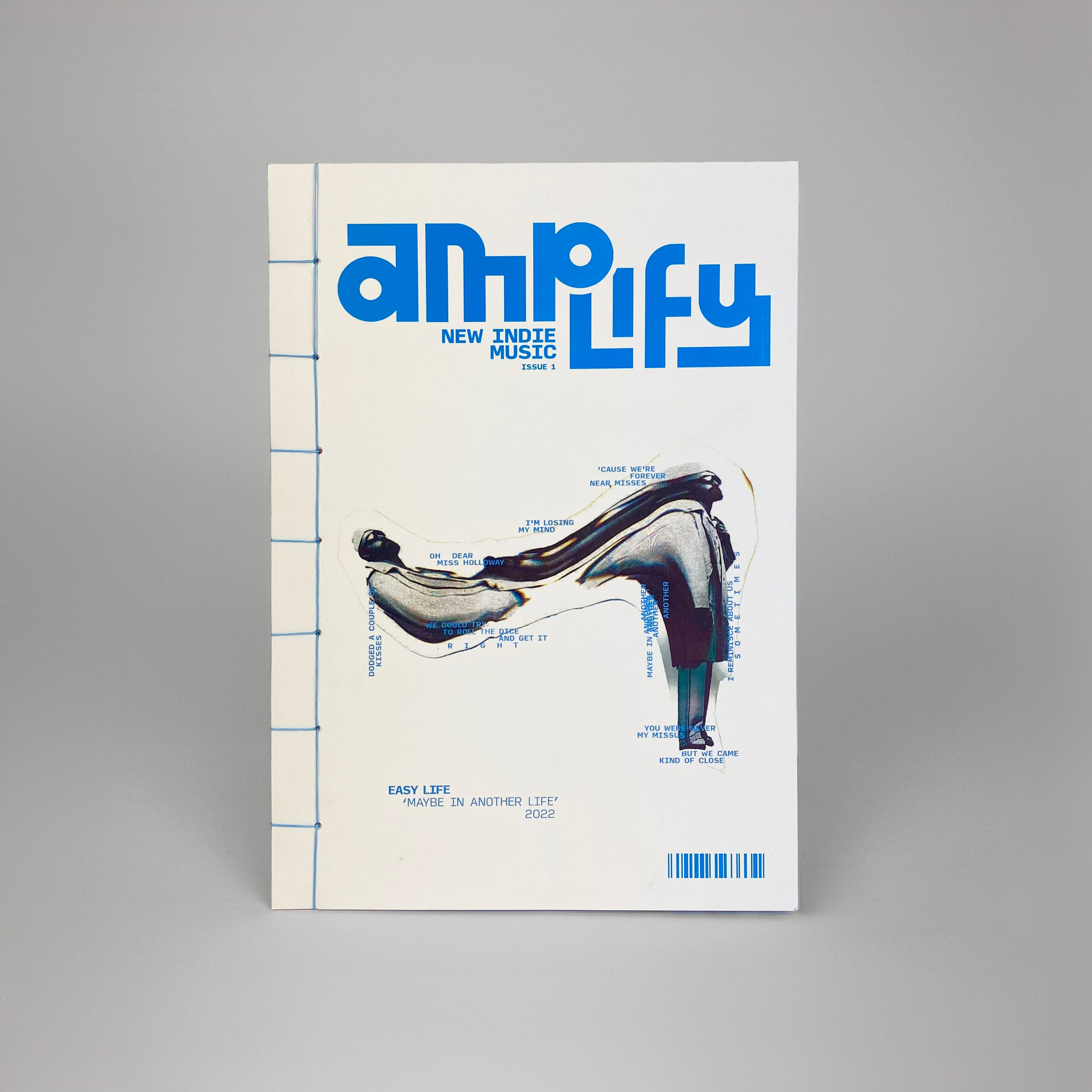
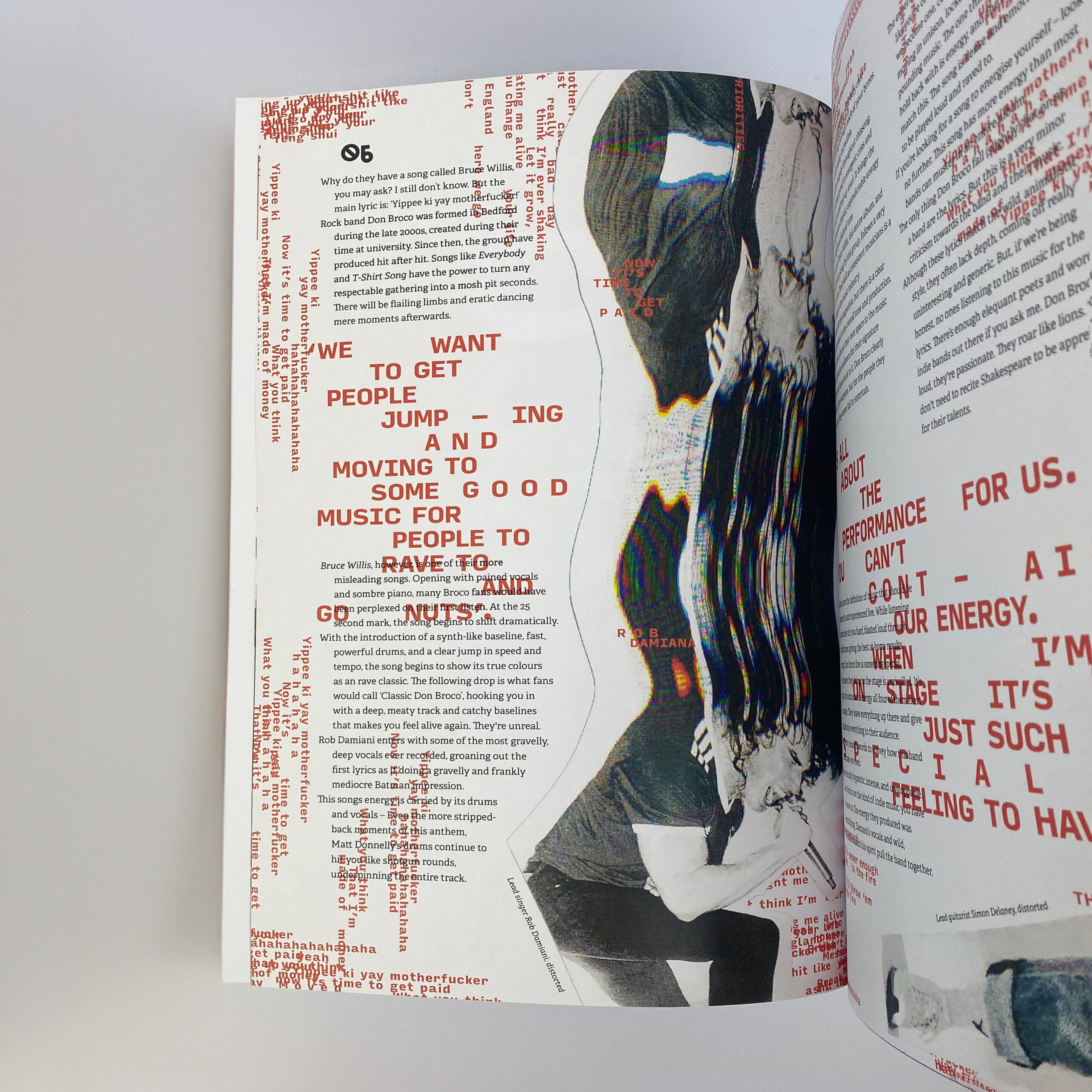
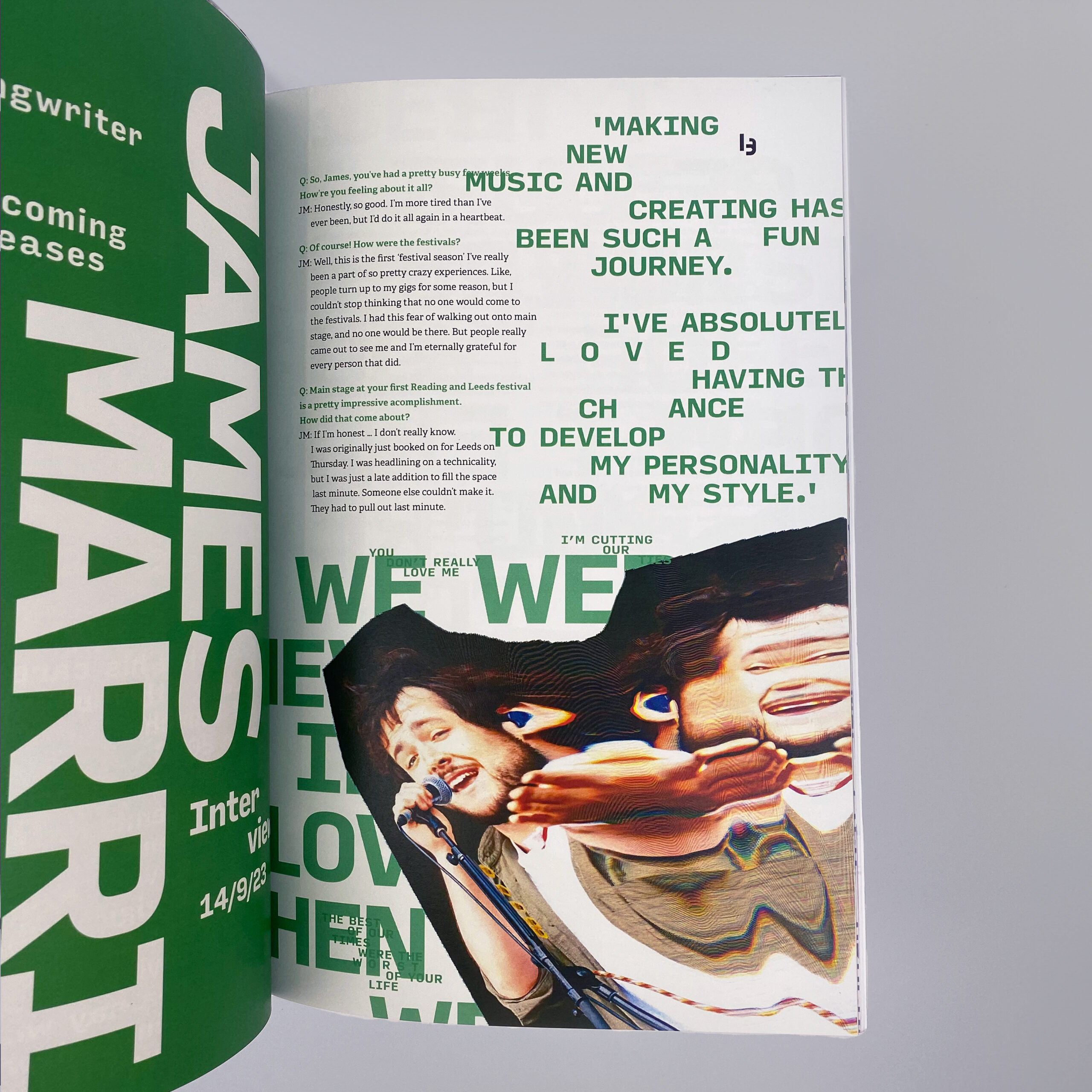
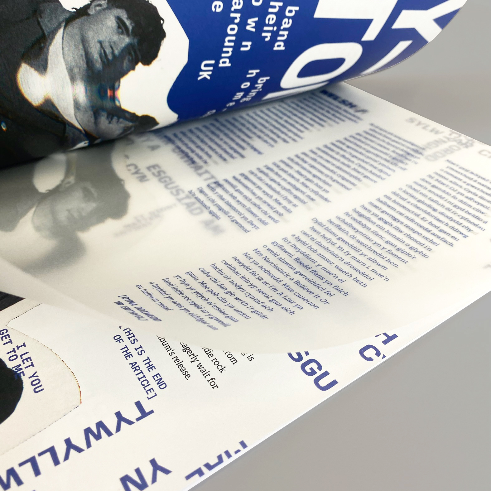
Creating Amplify, a new indie music magazine focussed on connecting small artists with passionate fans. This product and its brand are centred around being independent and standing out. Using a photocopier to distort images creates an incredibly distinctive image treatment, with each article’s style being reflective of the artists and their music. The format itself aims to be tactile and exciting – The stab-stitched binding embodies the personality of indie music, with the dynamic, experimental structure keeping this periodical dynamic and fresh.
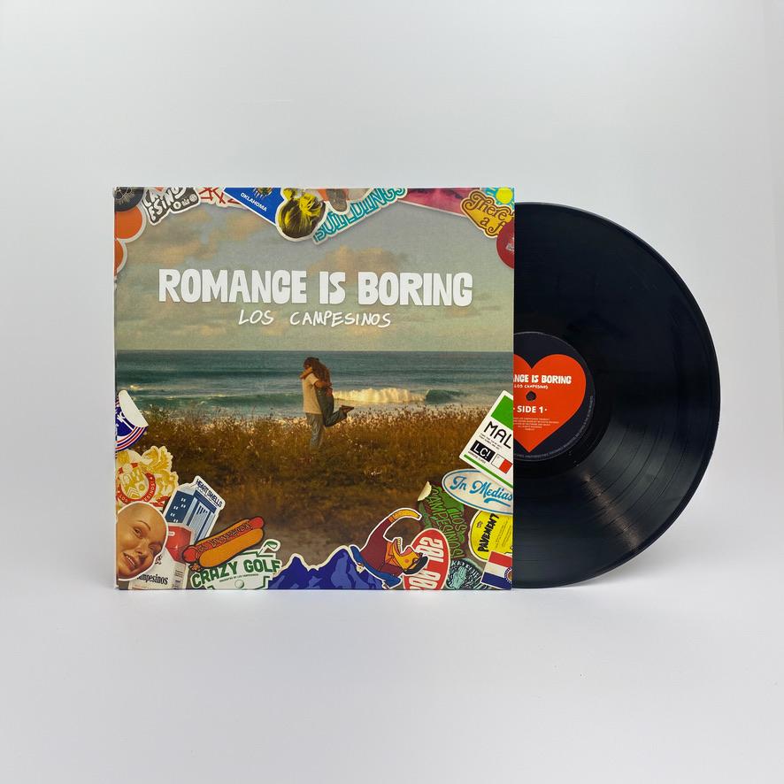
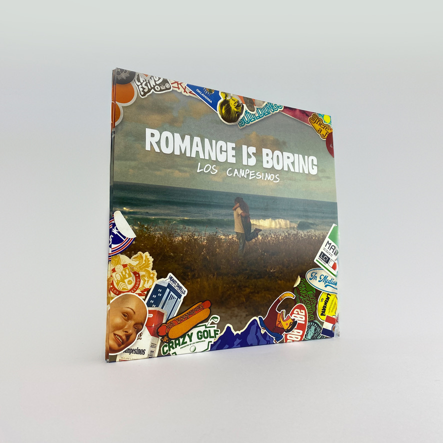
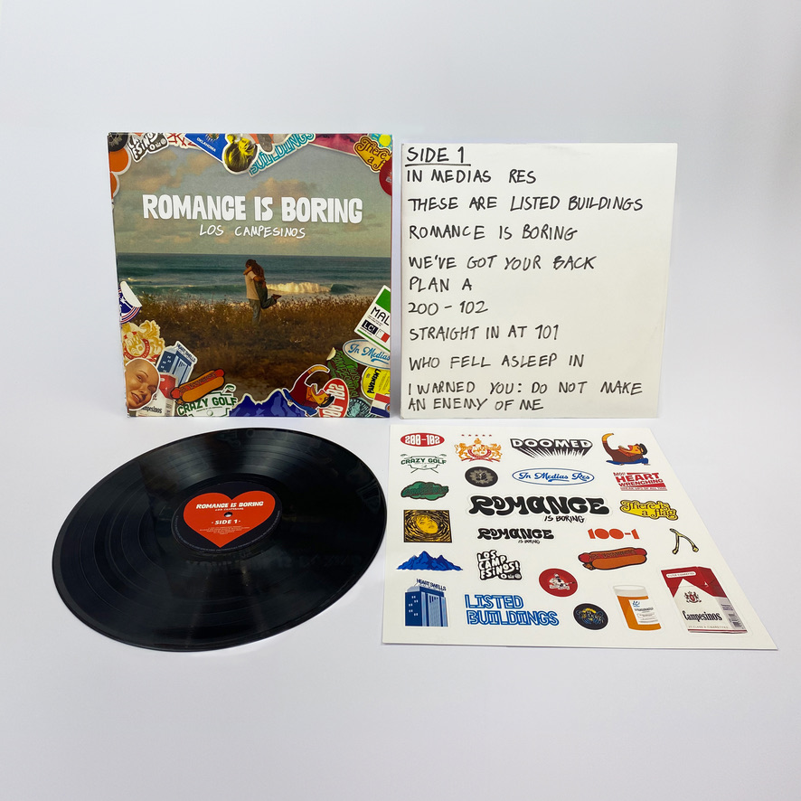
Romance is Boring Album design
Redesigning an existing vinyl record cover for ‘Romance is Boring’ by Los Campesinos. This project focussed on visually representing the album’s unique blend of pessimism and sentimentality, while adhering to conventions of indie music. The sticker elements used throughout this work have heavy links to touring musicians, with each one connecting to the band or songs on this album. This process has been incredibly rewarding, giving me time to consider every aspect of a user’s journey and the physicality of this product to make a more successful response to the brief.
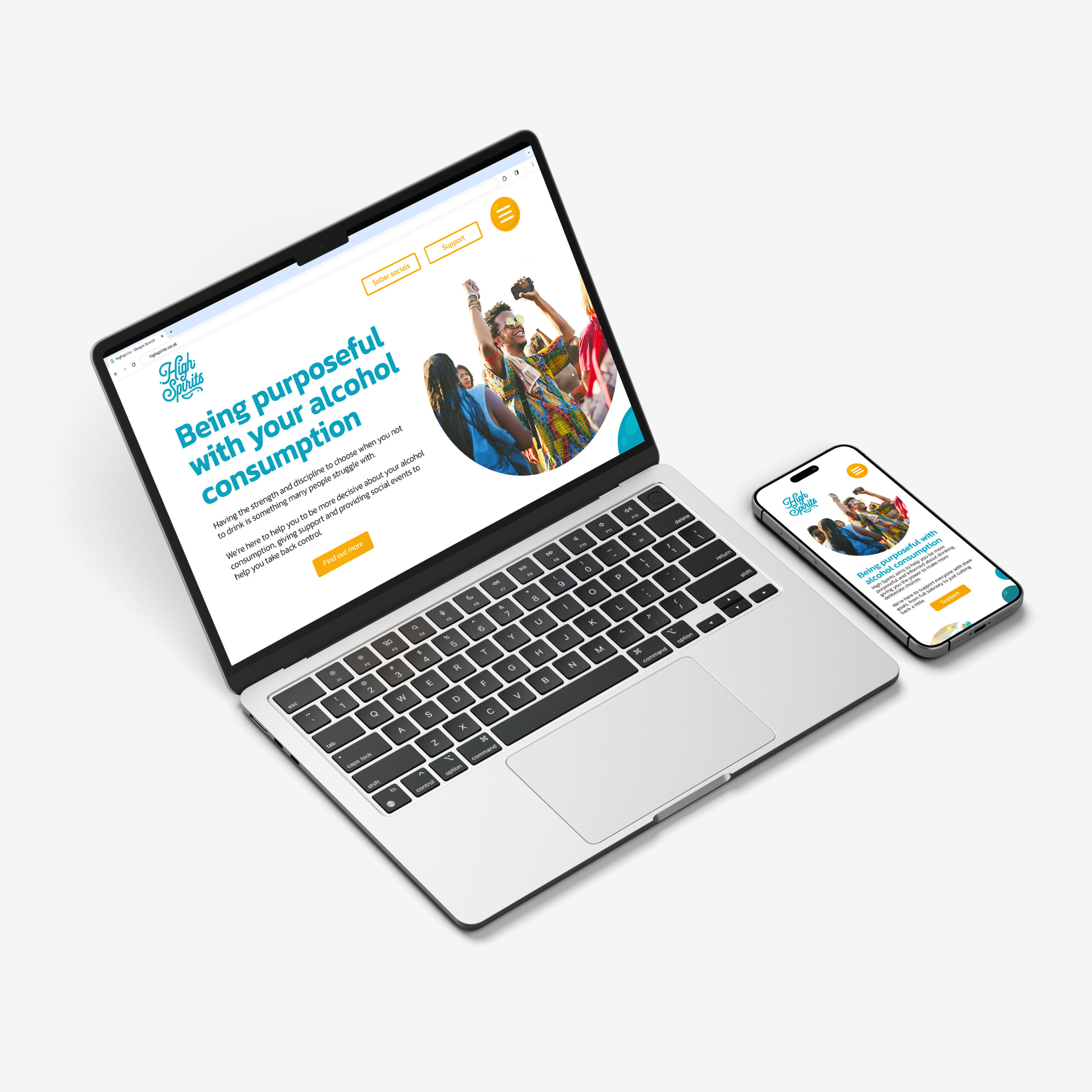
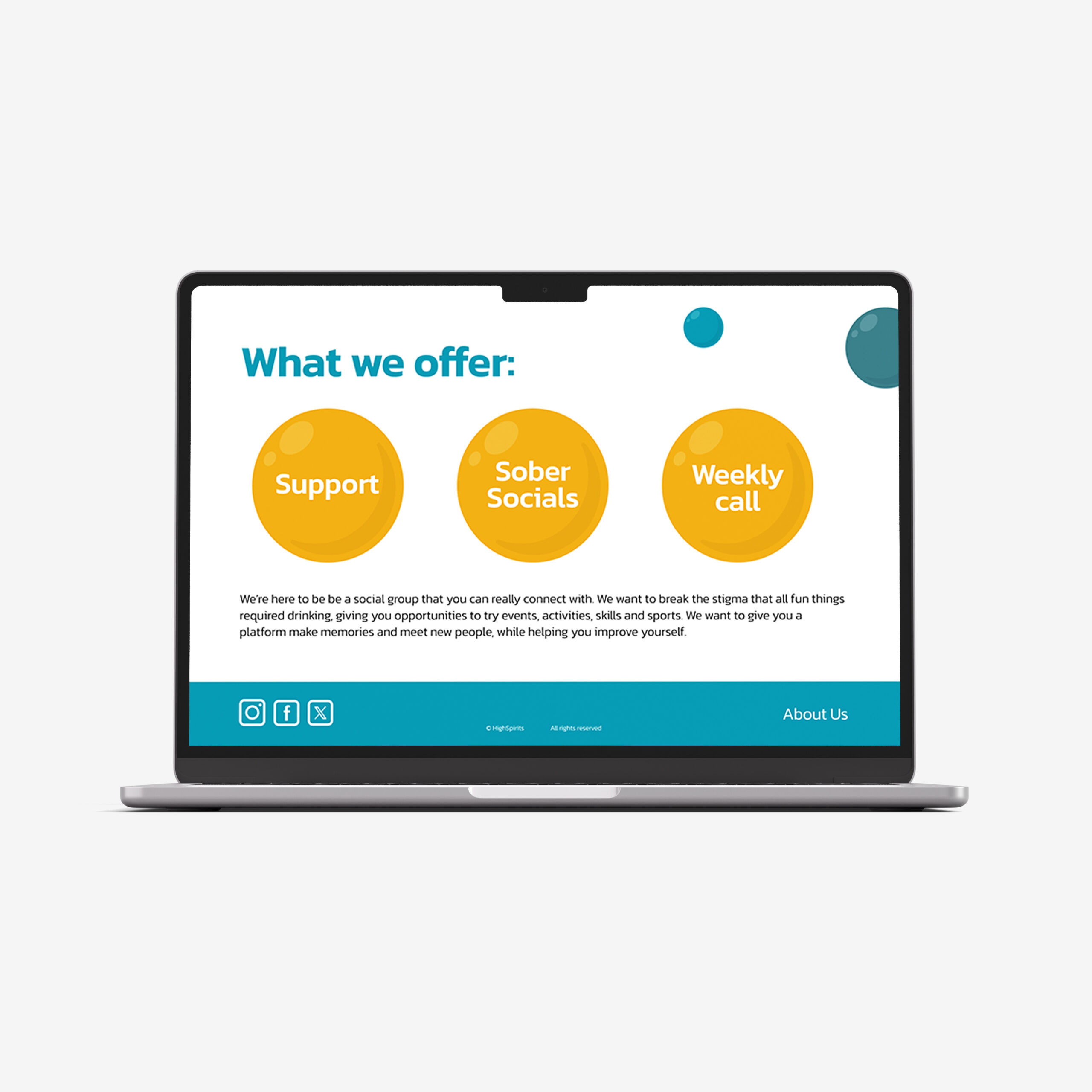
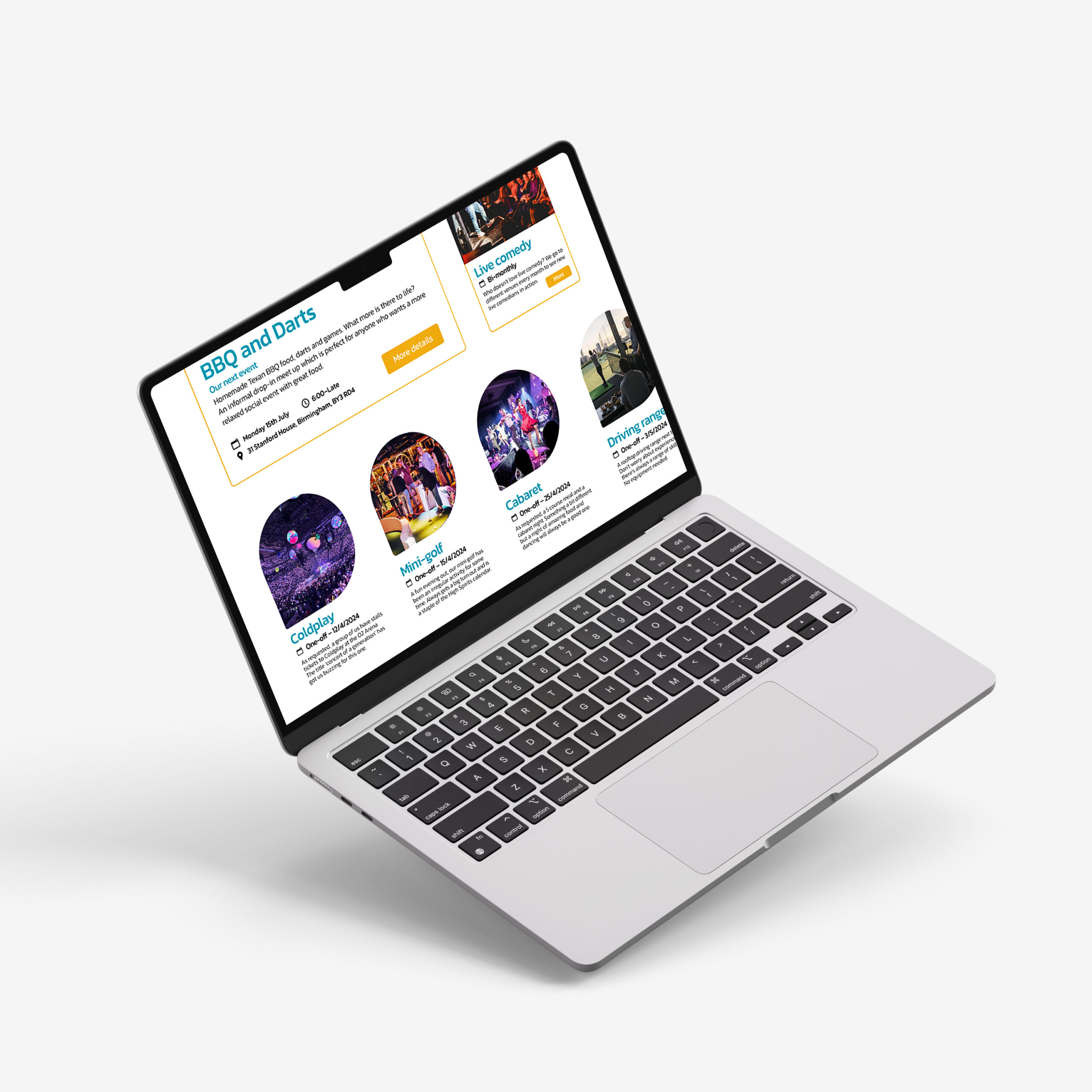
High Spirits website
High Spirits is a social group dedicated to promoting alcohol moderation and removing the pressure of other anti-drinking organisations, focussing on consuming less rather than becoming sober. The branding and style are much more dynamic, taking a positive approach to the often-sombre topic, benefitting the personable nature of High Spirits. The energetic imagery and vibrant colours keep this website fresh and inviting, helping to create a supportive community and help people connect through their shared ambitions.
Hi, I’m Georgina, and I have an interest in campaign design and designing to make a difference. I enjoy creating innovative design concepts and using my design skills to educate myself on new topics. During my time at the University of Reading, I’ve learnt that design is more than a visual aesthetic. Instead, design is a tool that can be used to positively impact the world and make a difference. As I enter the professional industry, I look forward to developing new skills and growing as a designer.
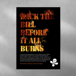
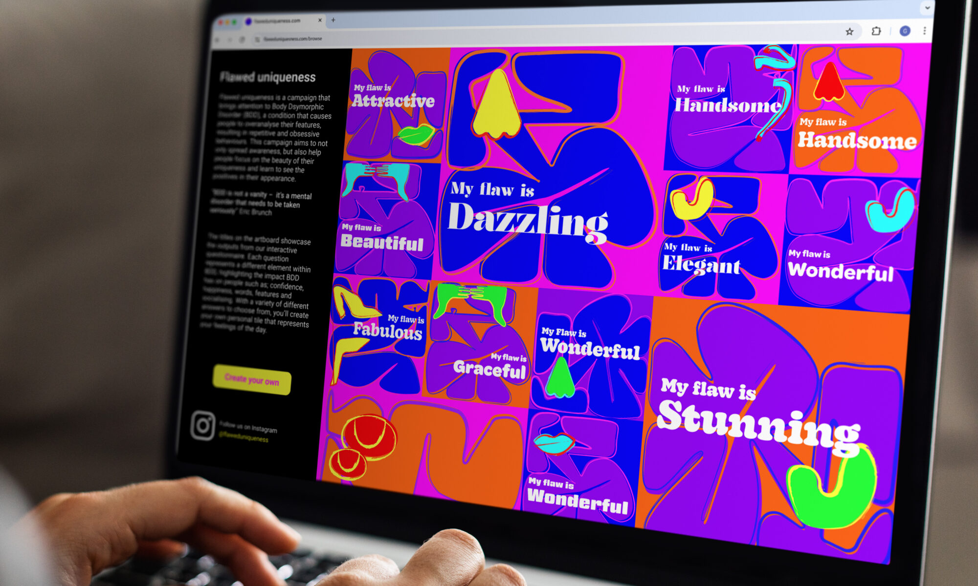
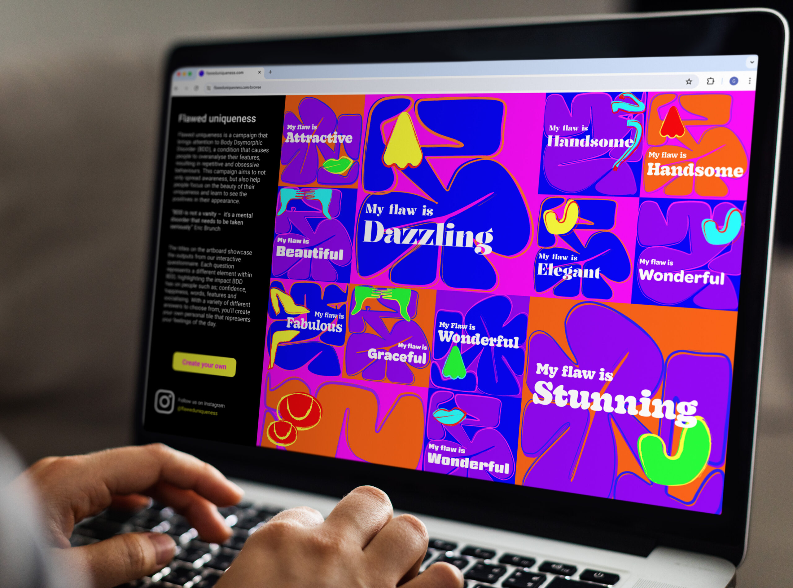
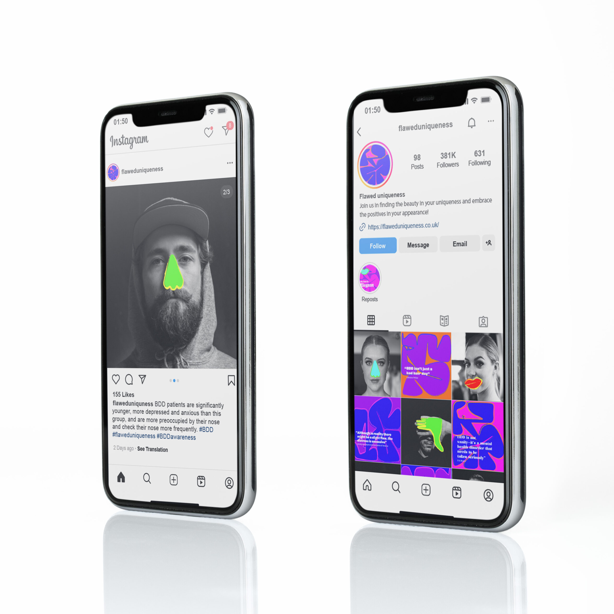
Flawed Uniqueness is an interactive campaign that brings attention to Body Dysmorphic Disorder (BDD), a condition that causes people to overanalyse their features, resulting in repetitive and obsessive behaviours. The campaign is made up of an underlying matrix, determined by the users' chosen answers, making each answer tile unique to that individual.
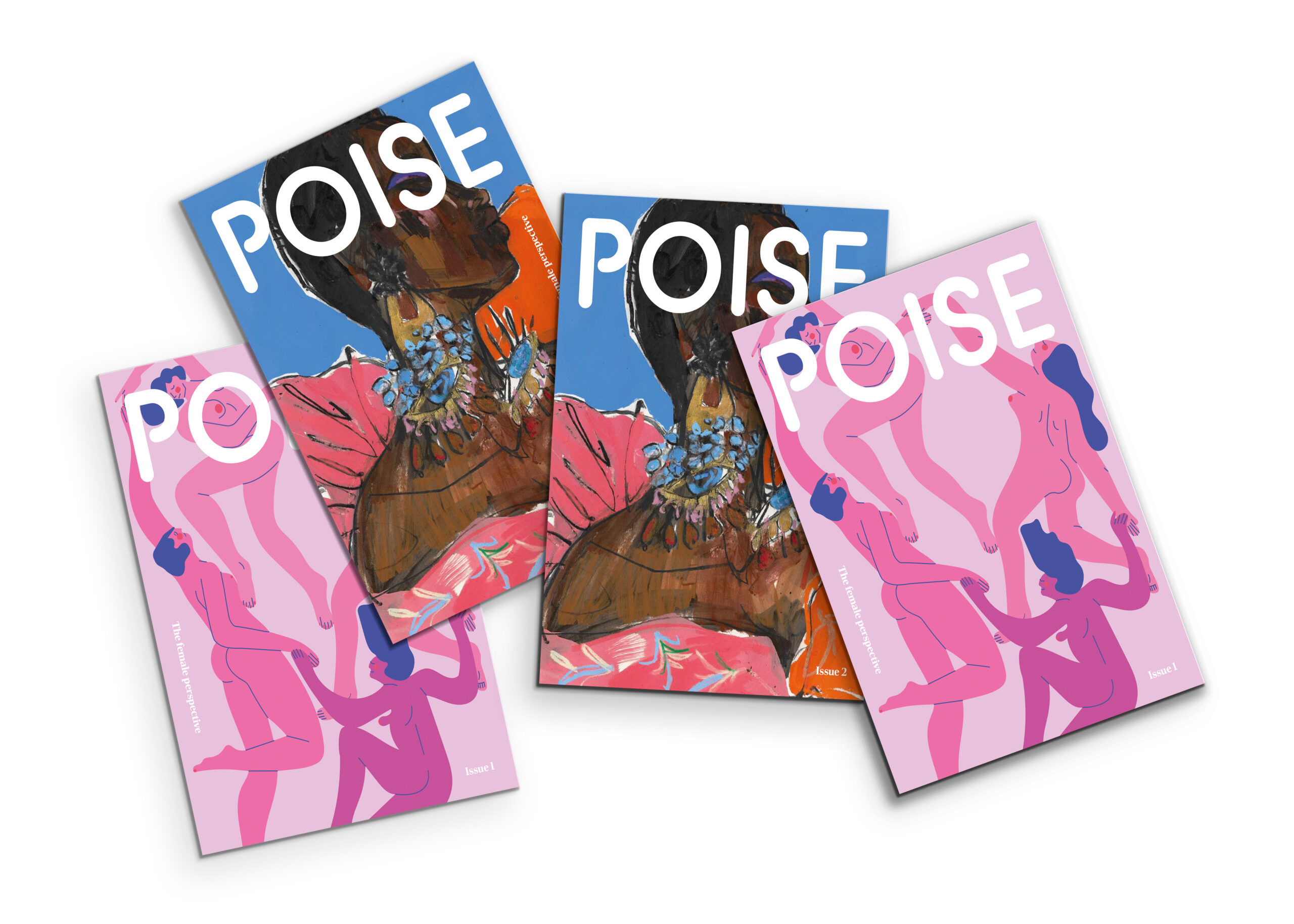
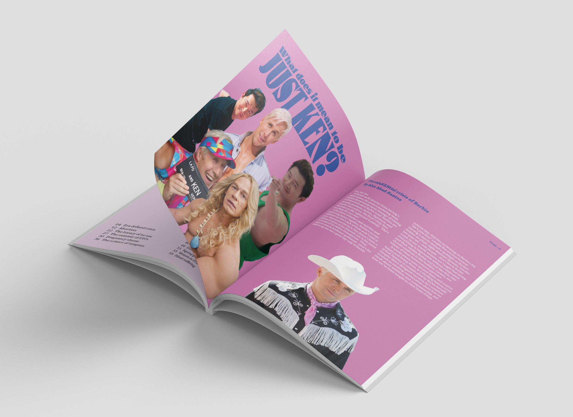
POISE magazine
POISE is an independent female-led magazine, written and designed from the female’s perspective. The magazine is issued quarterly on historic days for women, covering topics written by both POISE team members and the audience to create more diverse and inclusive perspectives.
Zen web app
Zen is a responsive web app for people with anxiety. Whether its social or generalised anxiety, Zen aims to help users find suitable coping strategies. Users are accompanied by Zen’s mascot, Theo the Triangle, throughout the website helping the users emotionally connect with the website.
Editorial design, digital design, packaging design
Growing up, creativity has always been a passion of mine and it has continued to grow over the past 3 years at university. Throughout my degree, I have gained a broad skillset in a range of different platforms and have explored design in various different avenues from print to digital design. I have developed a good understanding about using design as an approach to solving social and environmental issues, but most importantly ensuring that the final outcome is functional and serves its purpose. As I enter the professional industry, I look forward to applying my skills and knowledge in real-life projects as well as learn from other educated designers.
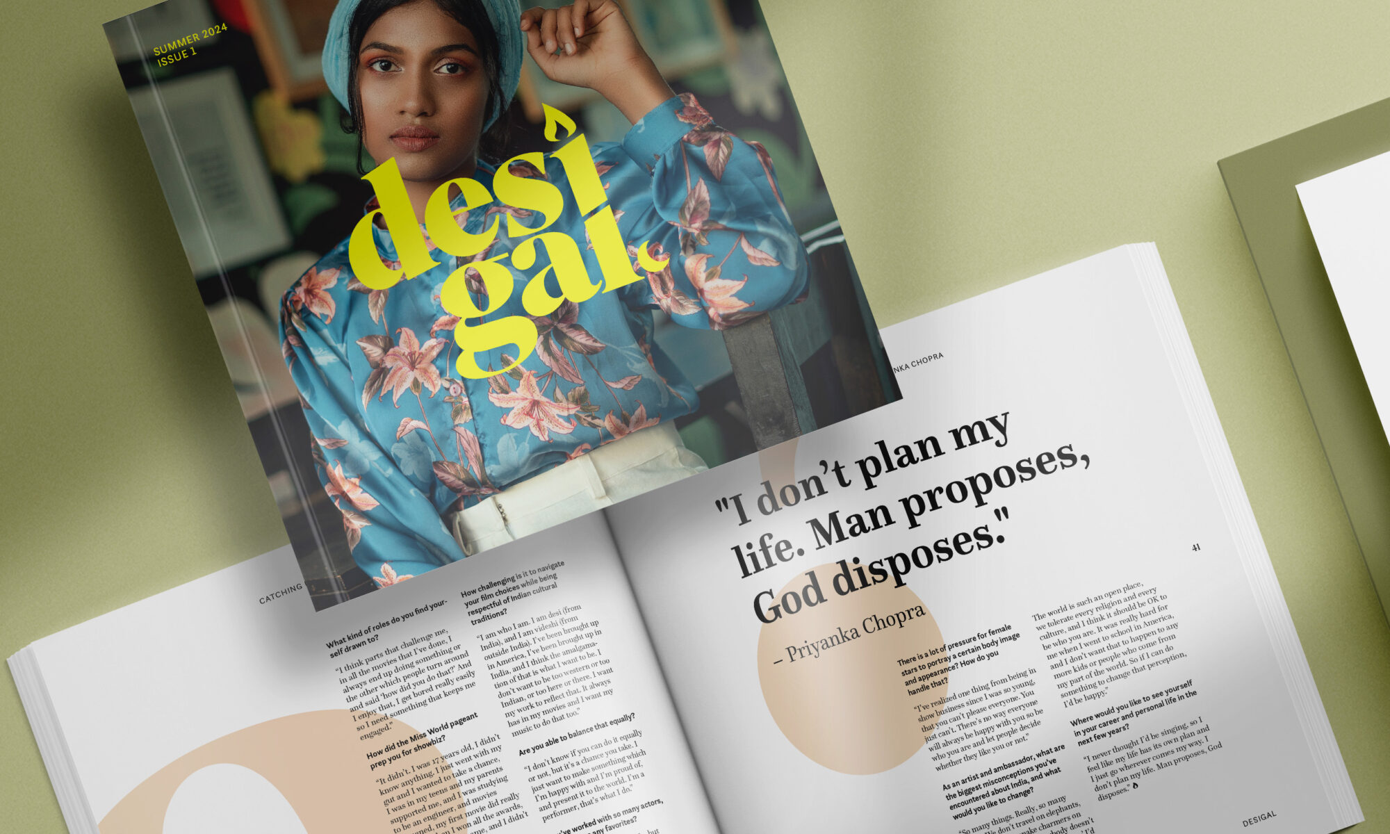
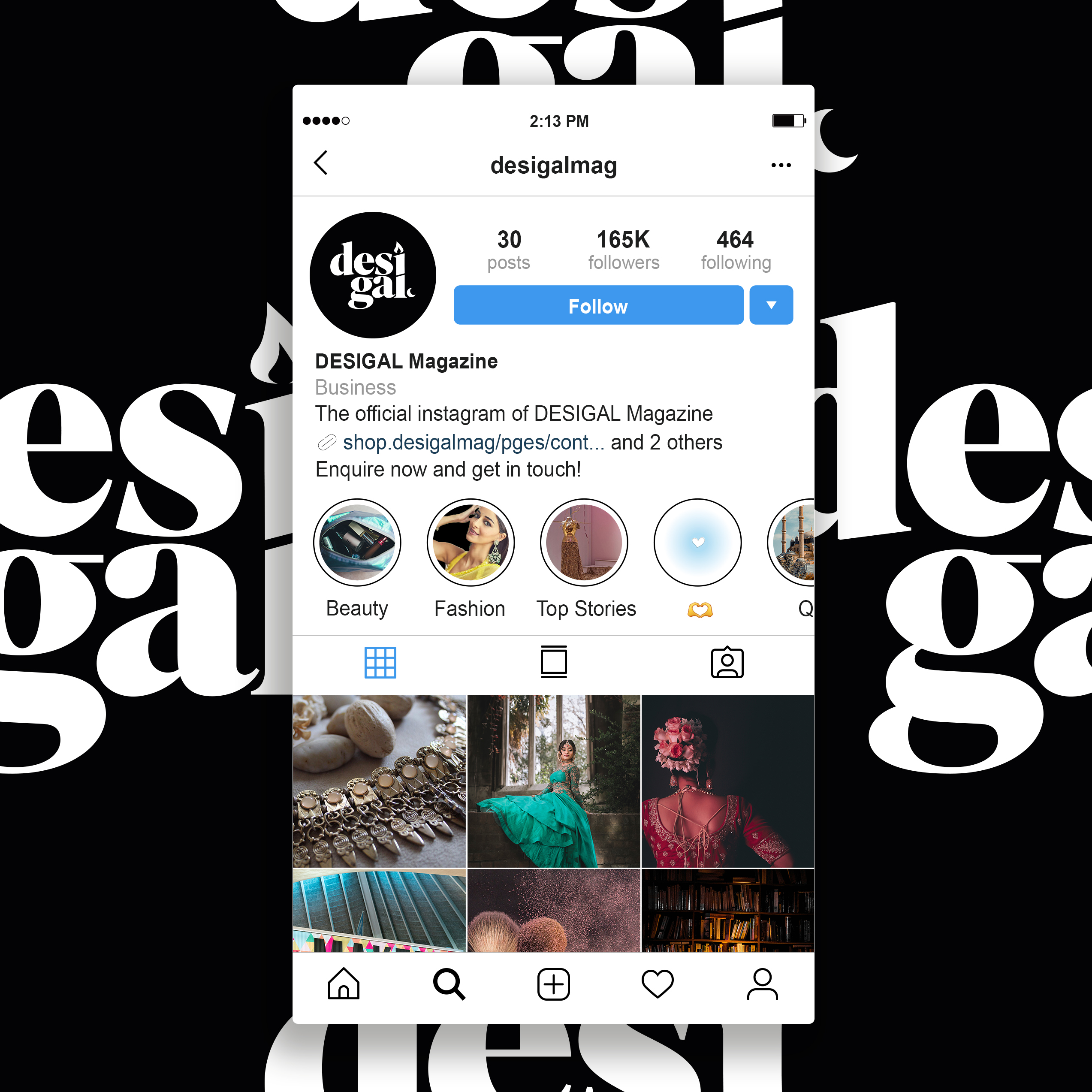
Desigal is an independent magazine with a fashion, beauty and lifestyle focus. The read is jam packed full of tips, tricks and advice from leading individuals and brands in the South Asian community, as well as shedding light to new and upcoming individuals! The overall tone of the magazine is to reflect the persona of every South Asian girl out there. The aim is to not confuse the audience with extravagant words, but act as though they are talking to one of their close friends. This is how the publication seeks to instil a stronger bond with the readers.
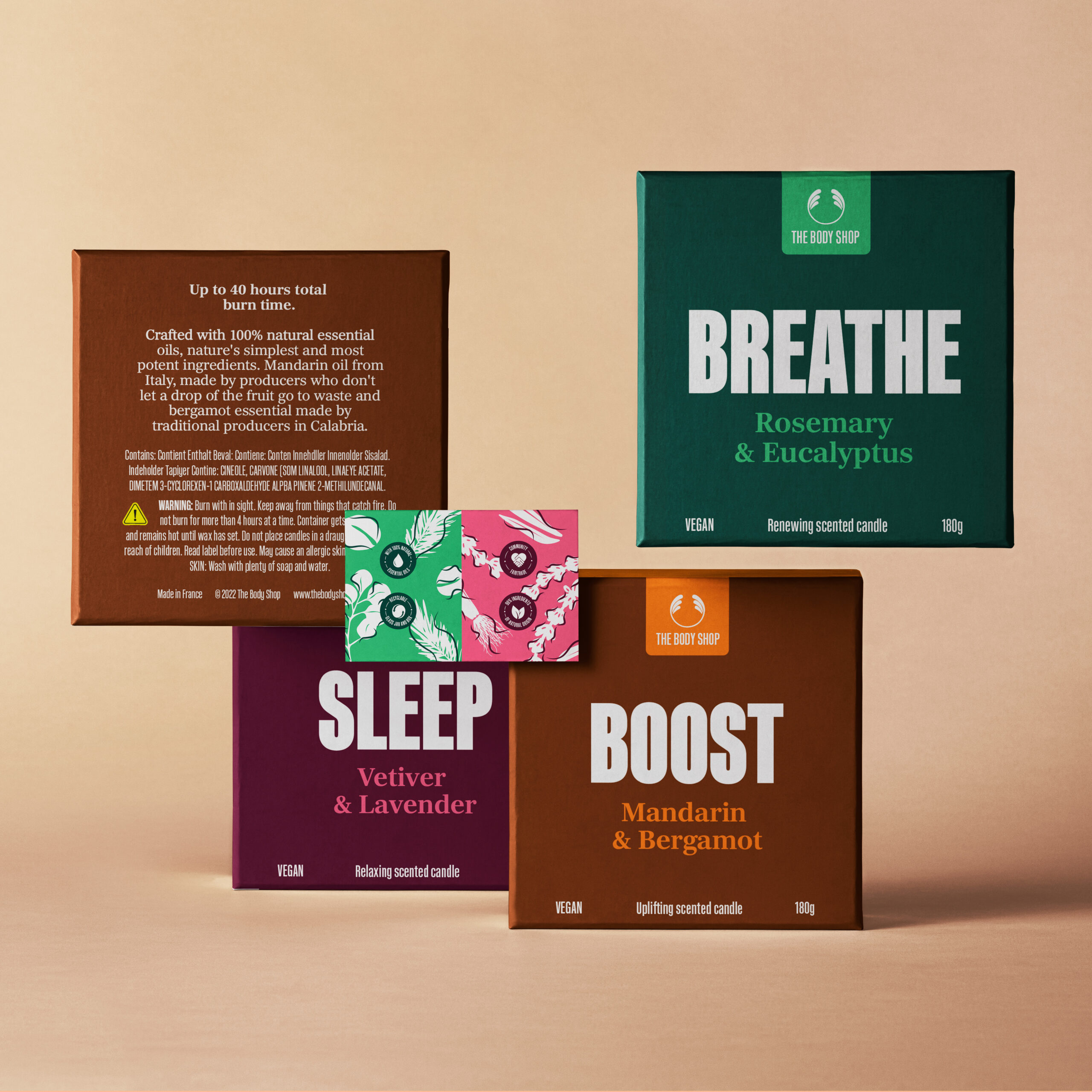
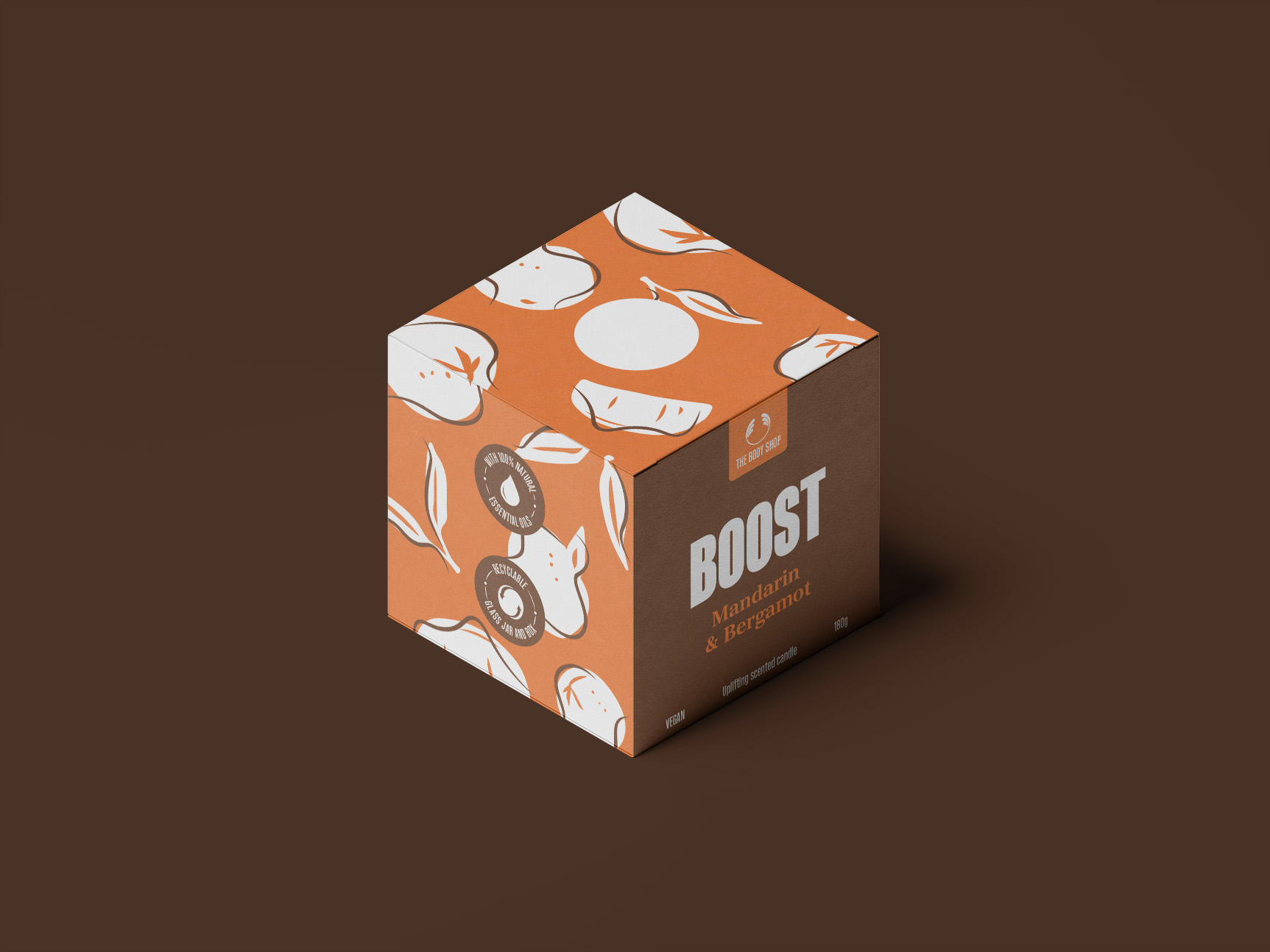
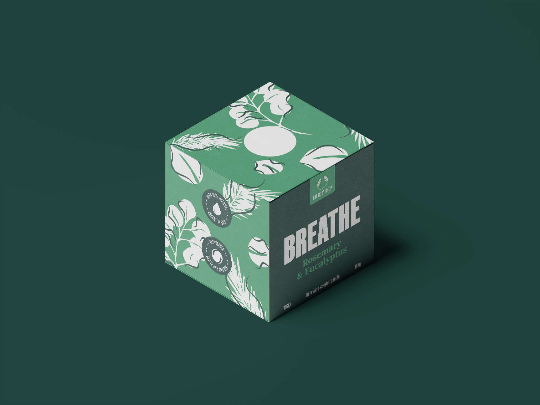
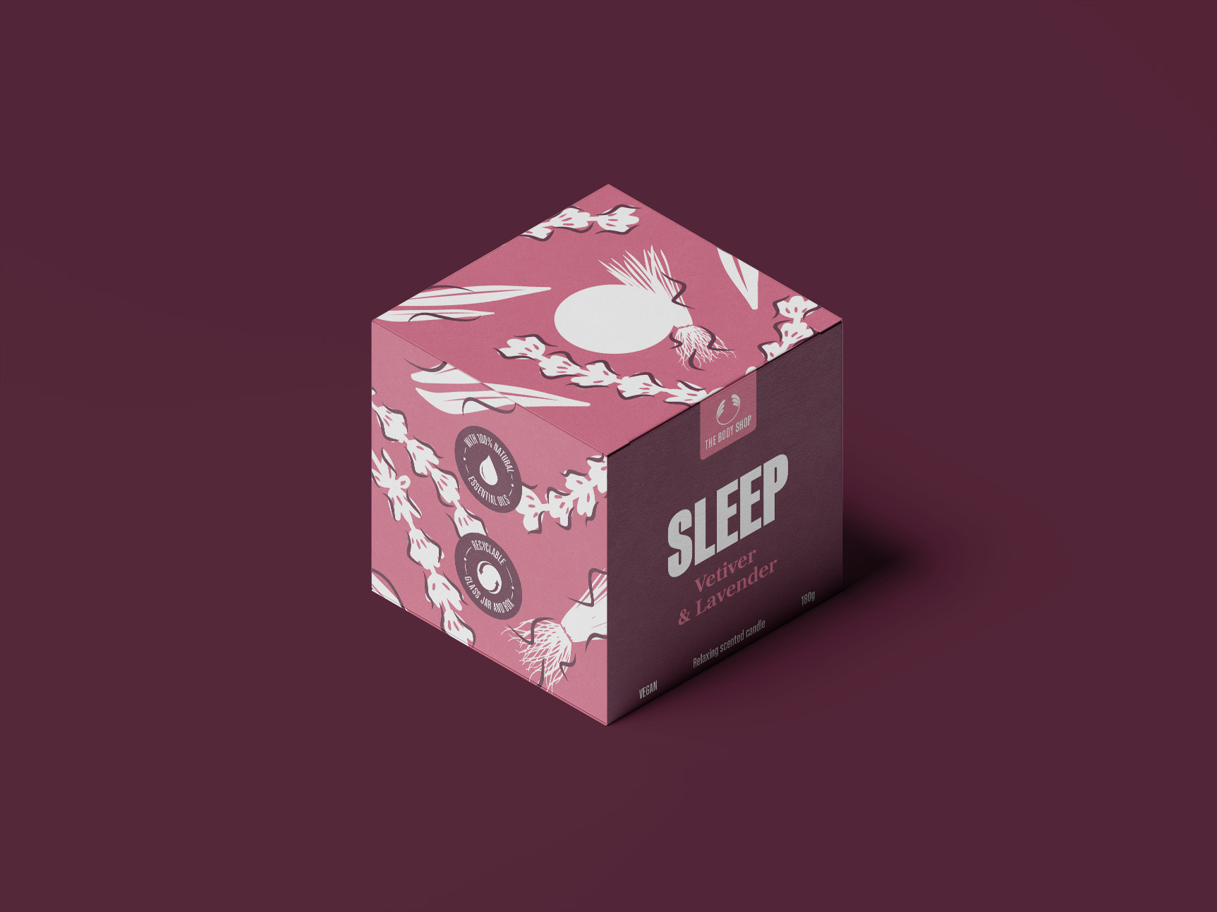
Body Shop packaging
The existing Body Shop candles hold a different design identity compared to the other items in-store, in the sense it is less vibrant and eye-catching. The new iteration of the candle box packaging exhibits a lively and colourful approach. The design represents the brand’s core values of being natural, bold and sustainable. There are three different scents in the range. The illustrations developed during the design process, alongside the colour choices, reflect the natural ingredients used in the essence of the candles. Boldness is the product of the colour palette used, coupled up with the large and impactful typography.
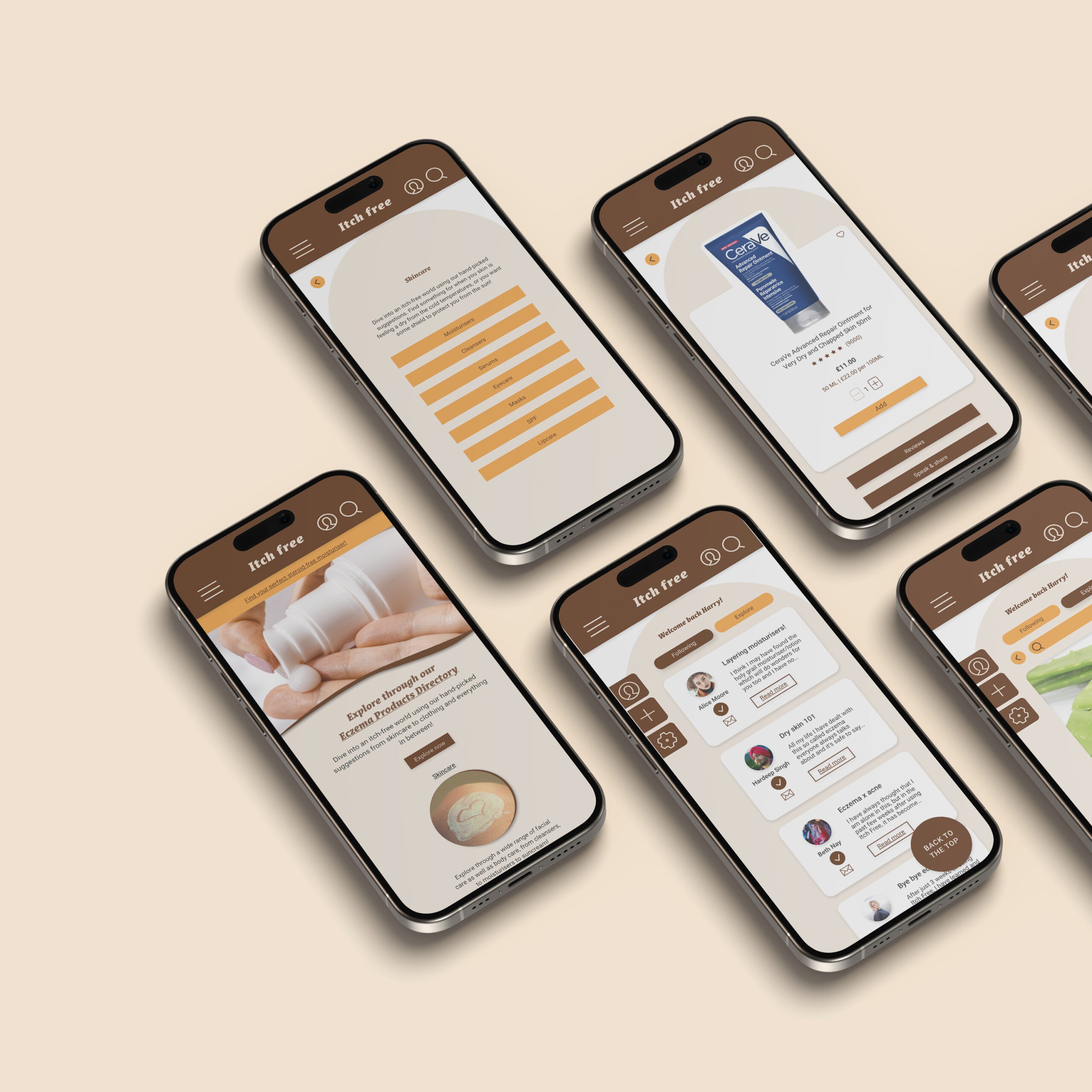
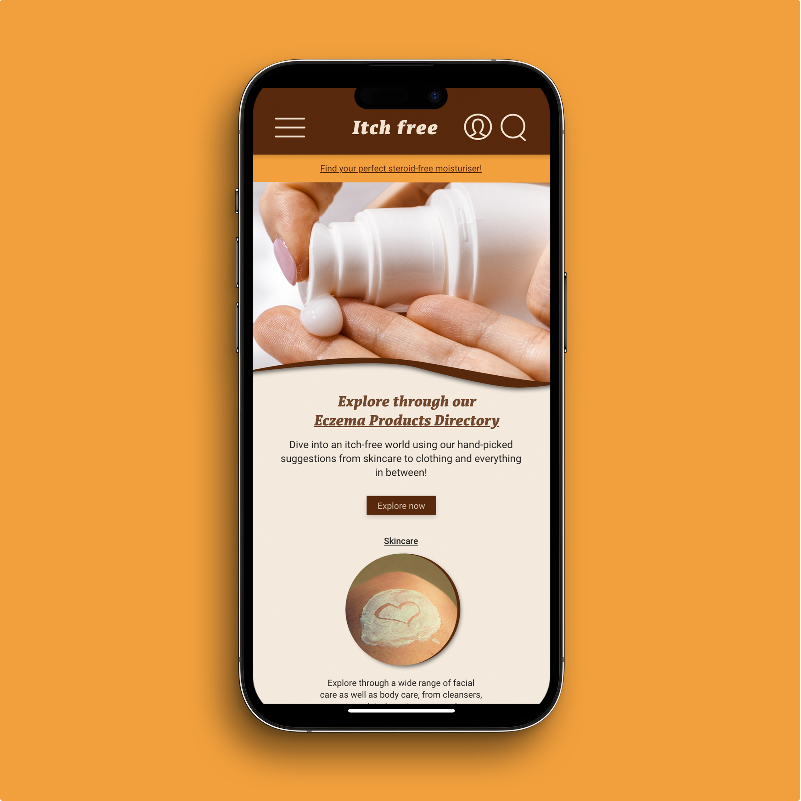
Itch Free website
Itch free is a website/web app which targets users who suffer from Atopic Eczema, commonly known as Eczema. As the user enters the site, they are welcomed with a link to browse through an Eczema Product Directory page all catered for eczema patients, which covers everything from skincare, to haircare, to even what laundry detergent to use for clothing. The core features aid the three users established in the earlier design process, Anjali, Poppy and Ana. Their pain points have informed the UI/UX design of both the mobile and desktop website.
Hi! I’m Drew. I’m a passionate and creative designer with an interest in all aspects of design, especially branding and editorial design. My time at the University of Reading has not only helped me develop my skills and deepen my understanding of design, but it has also taught me how to centre design around users and what they want and need. I want to continue developing my skills and learn how I can make a difference to the world around me through my designs.
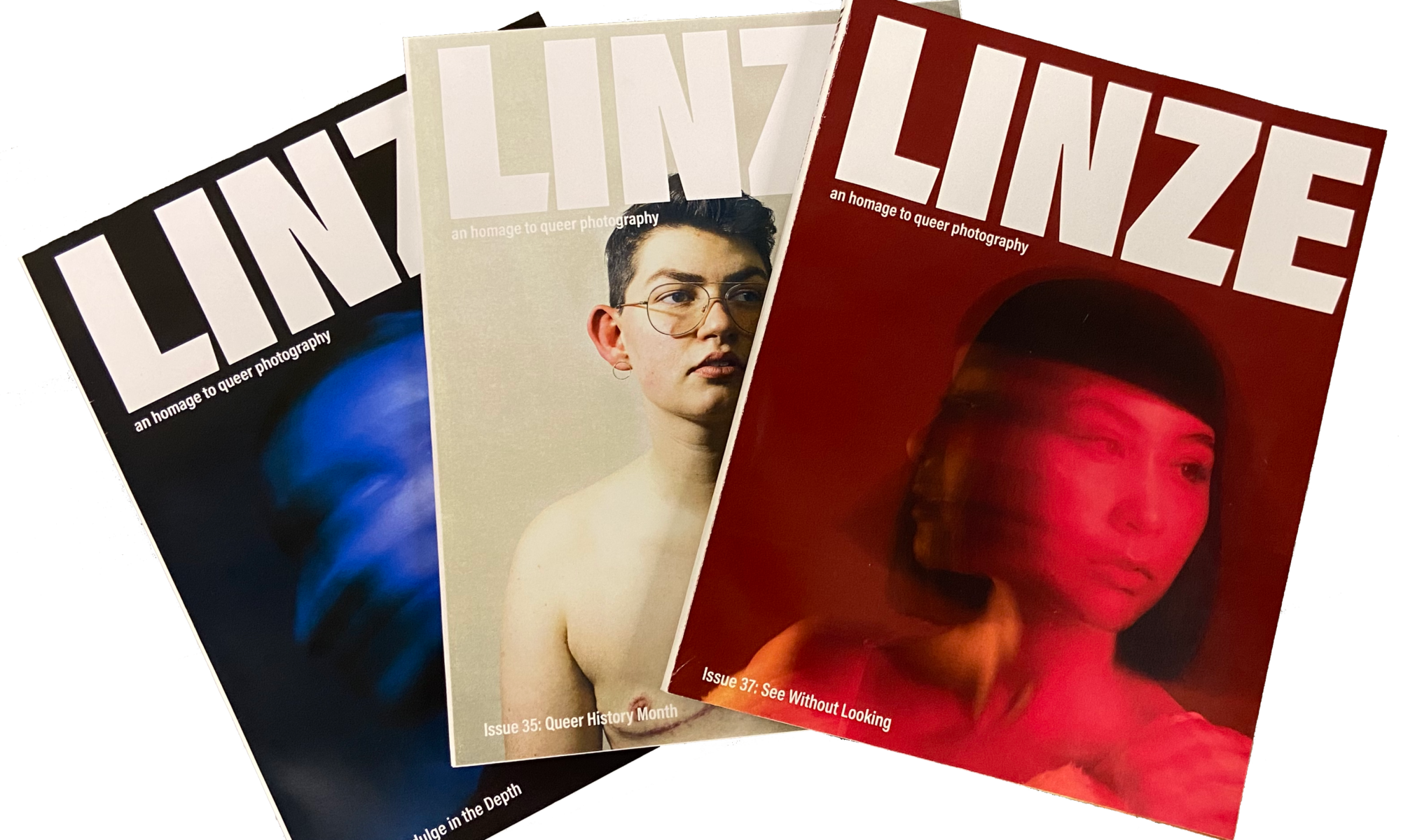
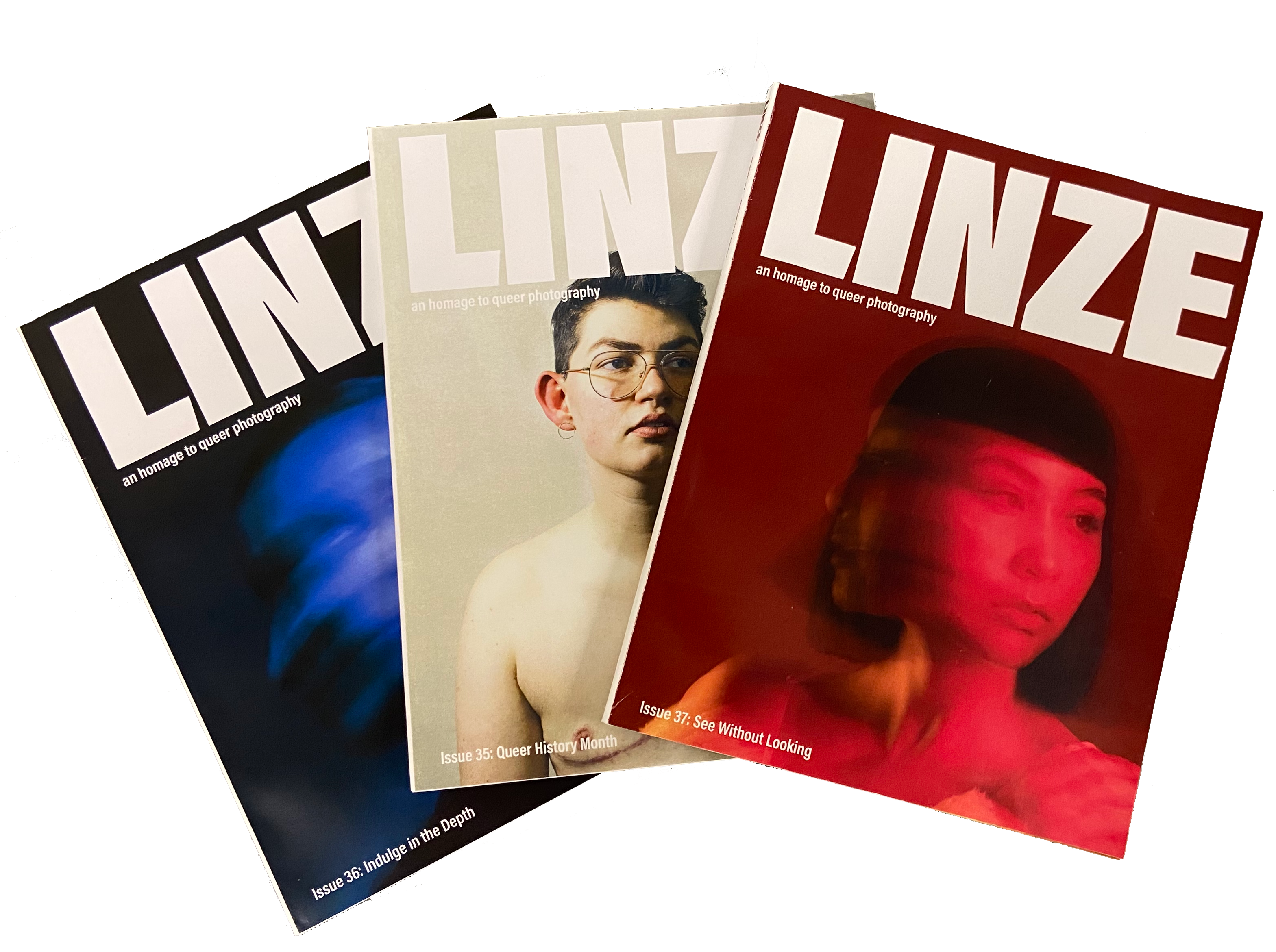
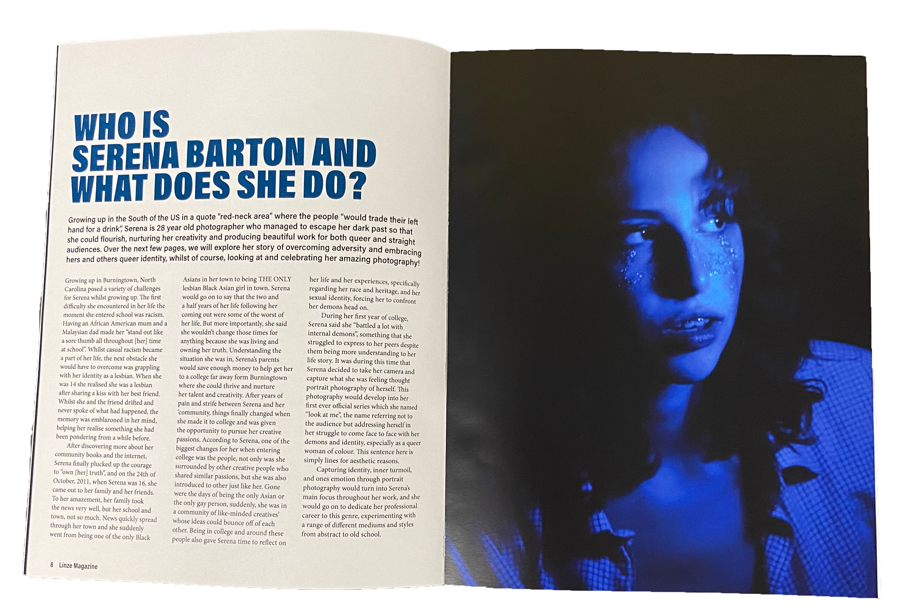
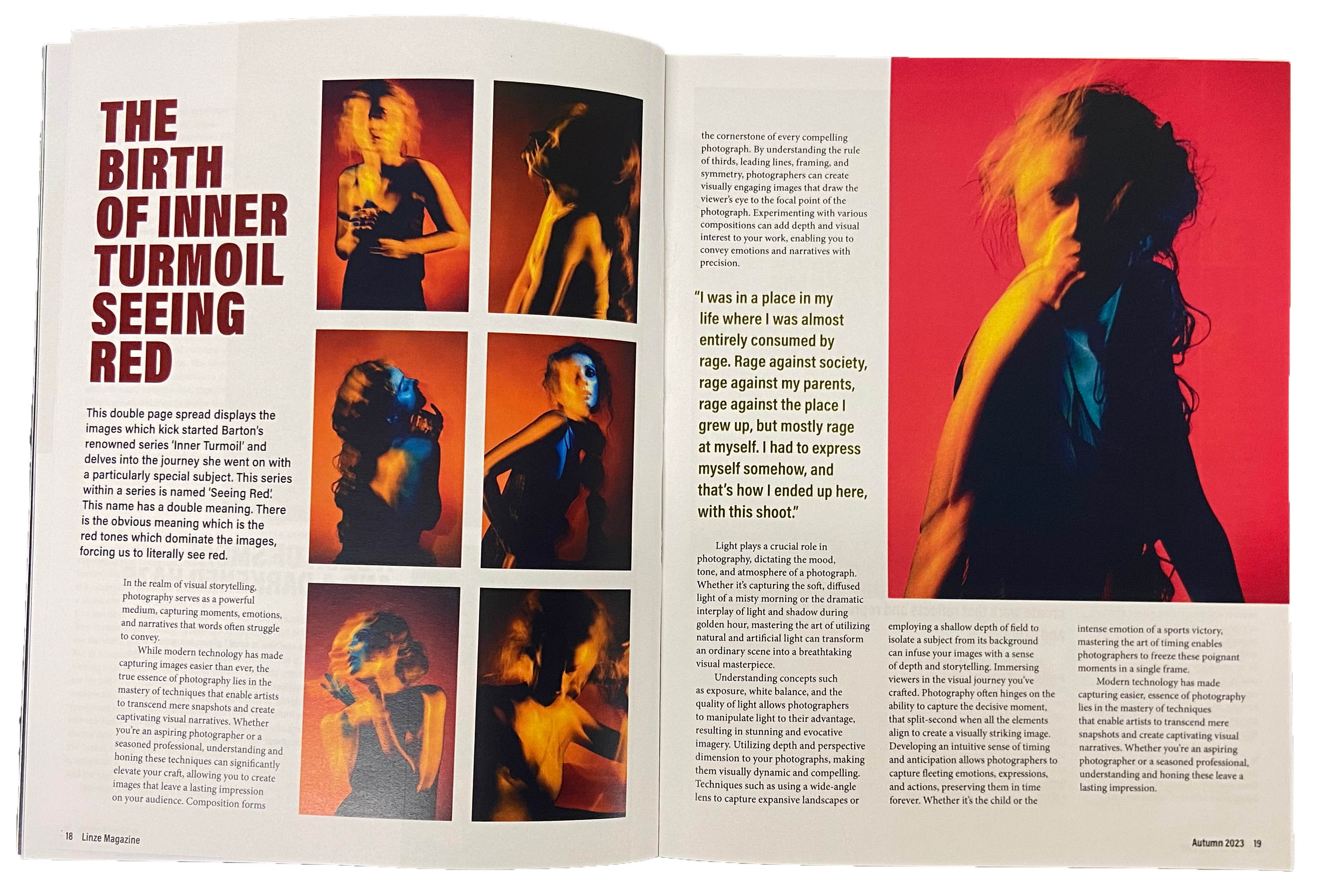
Linze magazine
Linze is a magazine for those with a passion for photography and who are part of or connected to the queer community, with the content serving as an homage to queer photography. This seasonally released magazine contains a variety of content ranging from interviews to reader competitions to long articles about queer photographers and their work. Using a simplistic and limited colour scheme and keeping the typographic variation to a minimum, I ensured that regardless of the contents of the magazine, the imagery would always be the centre of attention, as Linze is after all, dedicated to the work of these photographers.
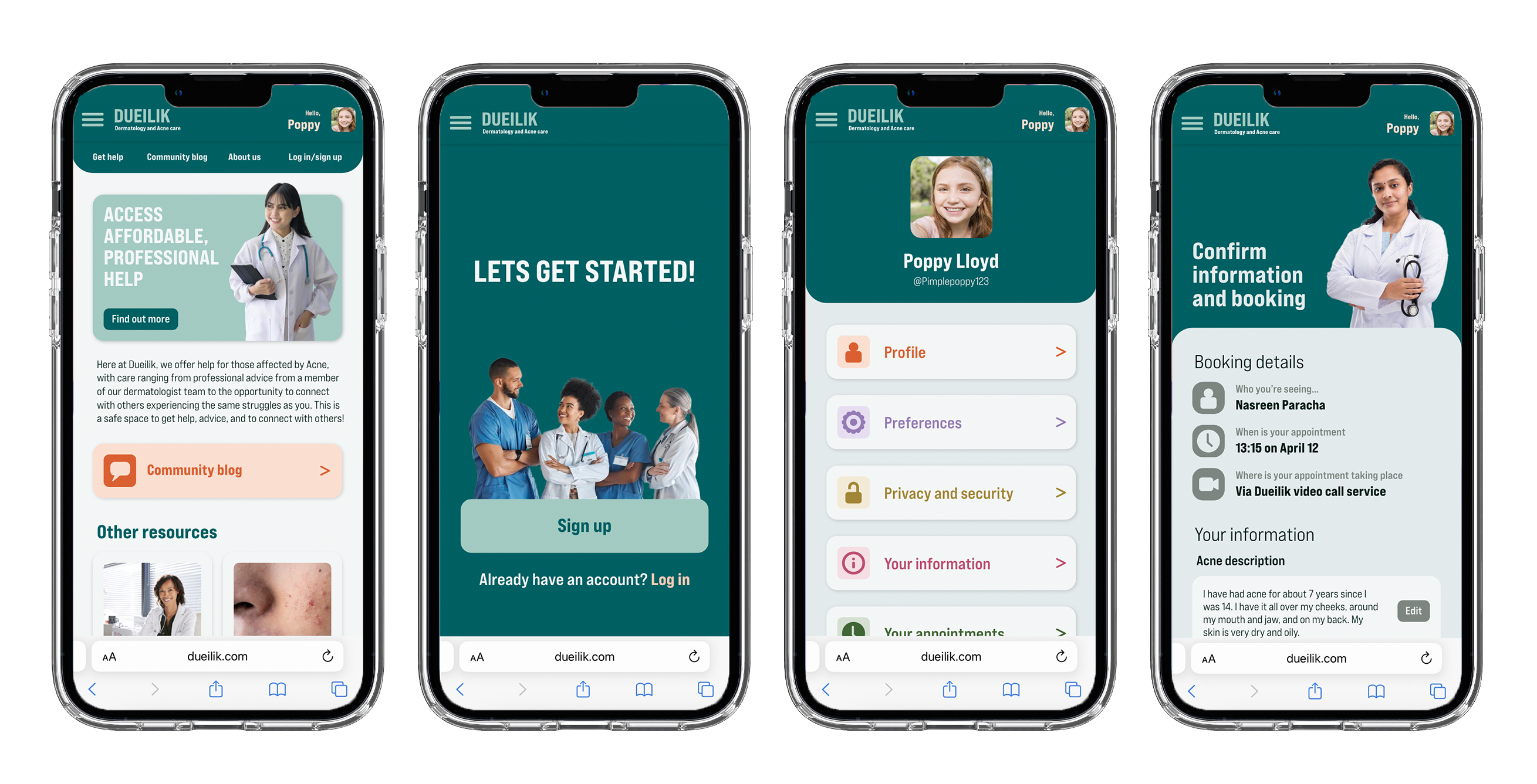
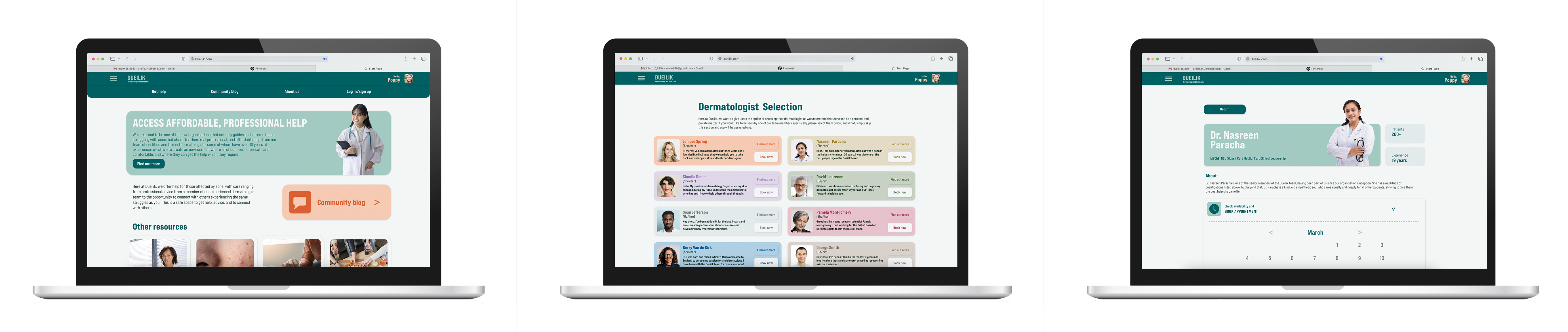
Dueilik web app
My web app ‘Dueilik’ targets users who struggle with acne and getting access to professional and affordable care for it. My web app helps users access professional and affordable care for their acne. It gives them an opportunity to speak with experts and get proper treatment at an affordable rate and with little hassle. Not only this but it will provide a platform and space for users to connect with others facing the same struggles as them and share advice, stories, and more, easing the mental burden caused by acne. Dueilik uses soft shapes and visuals containing happy medical professionals to create a less harsh and medical atmosphere, helping to ease the users stress and anxiety around seeking help.
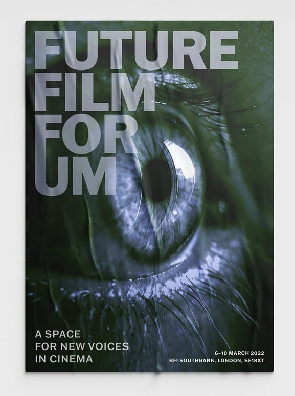
Film festival poster
This poster was one that I created in second year for our Design Practice module. The film festival was meant to primarily feature niche and underground directors who create indie films, with many of them depicting the darker and less commonly viewed parts of the human experience. Initially setting out to capture the themes of the films in my poster, I eventually decided to use an eye for my main visual instead. I chose this because I felt a close up of a human eye captured the rawness, exposure, and emotional intimacy that the films depicted, thus capturing the essence of the films and directors.
Hi, I’m Clara. I am a hardworking, creative, and adaptable designer who is interested in the packaging, branding, and video editing industries. I am eager to achieve not just aesthetically pleasing designs, but also something that effectively communicates a message to aid users. I am a quick learner and have already developed skills in software such as Adobe InDesign, Illustrator, Photoshop, AfterEffects, XD, Figma, and Final Cut Pro. Additionally, I have gained skills in communication, organisation, leadership, teamwork, and problem-solving throughout my years at university. I look forward to using and further developing my skill sets in the opportunities presented after graduating.
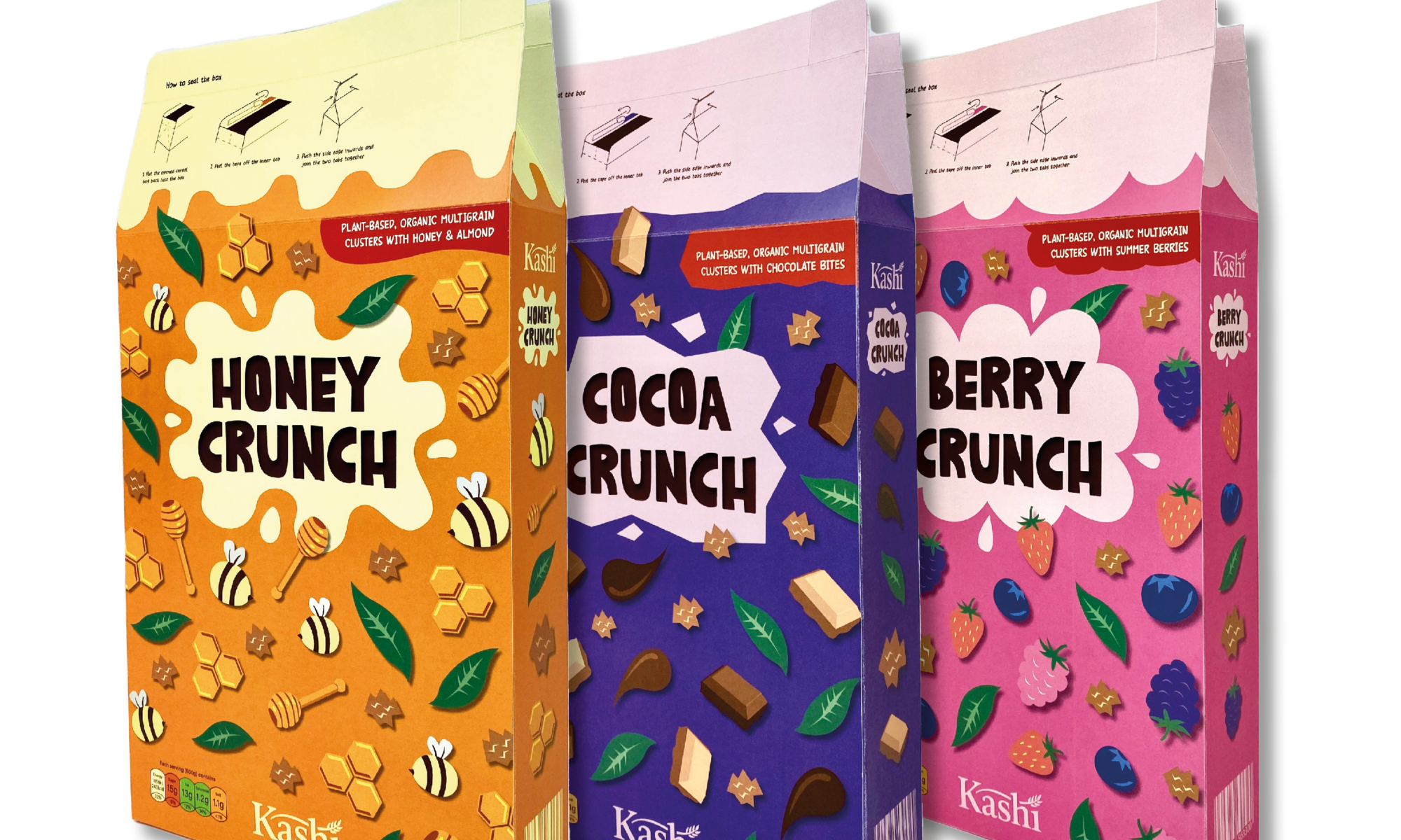
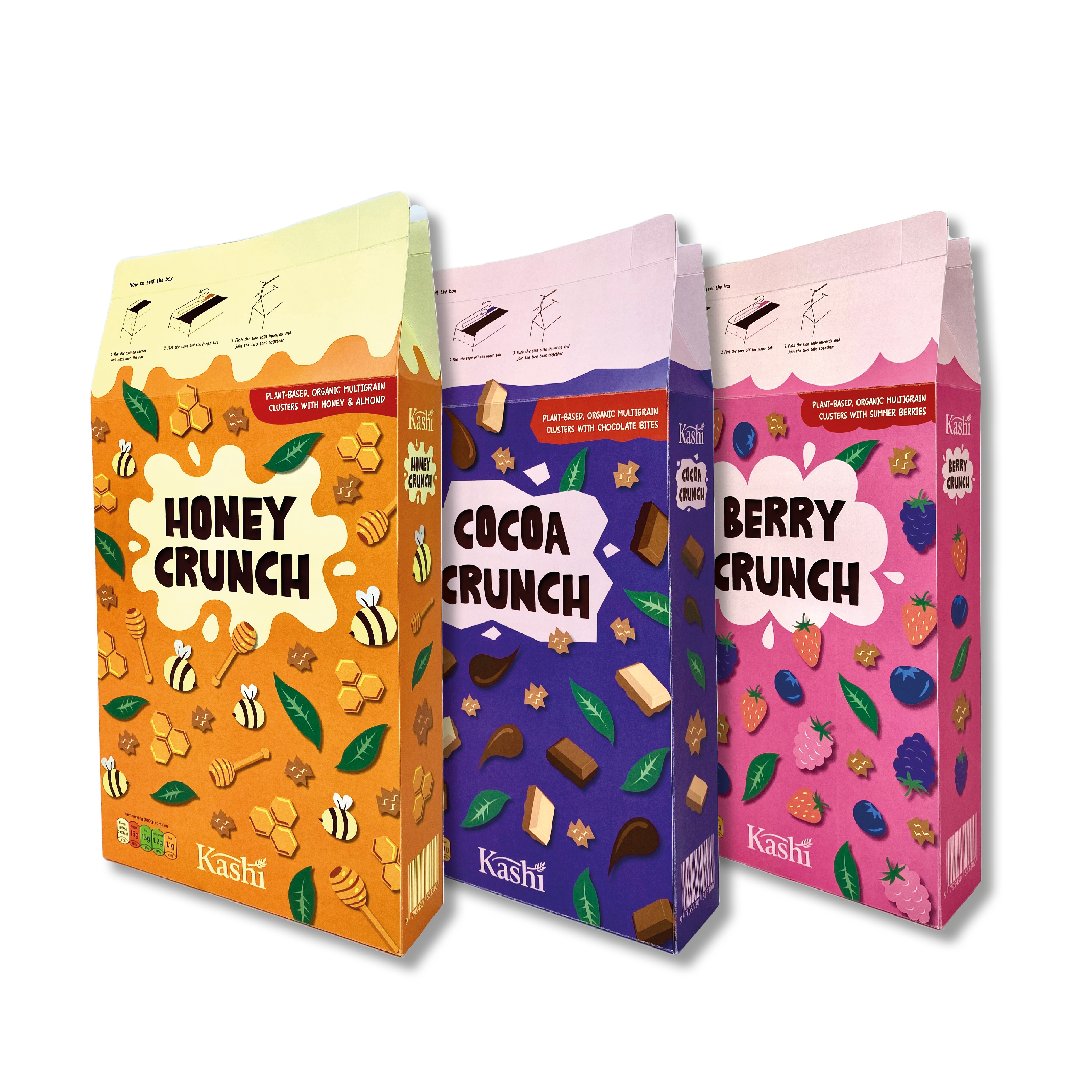
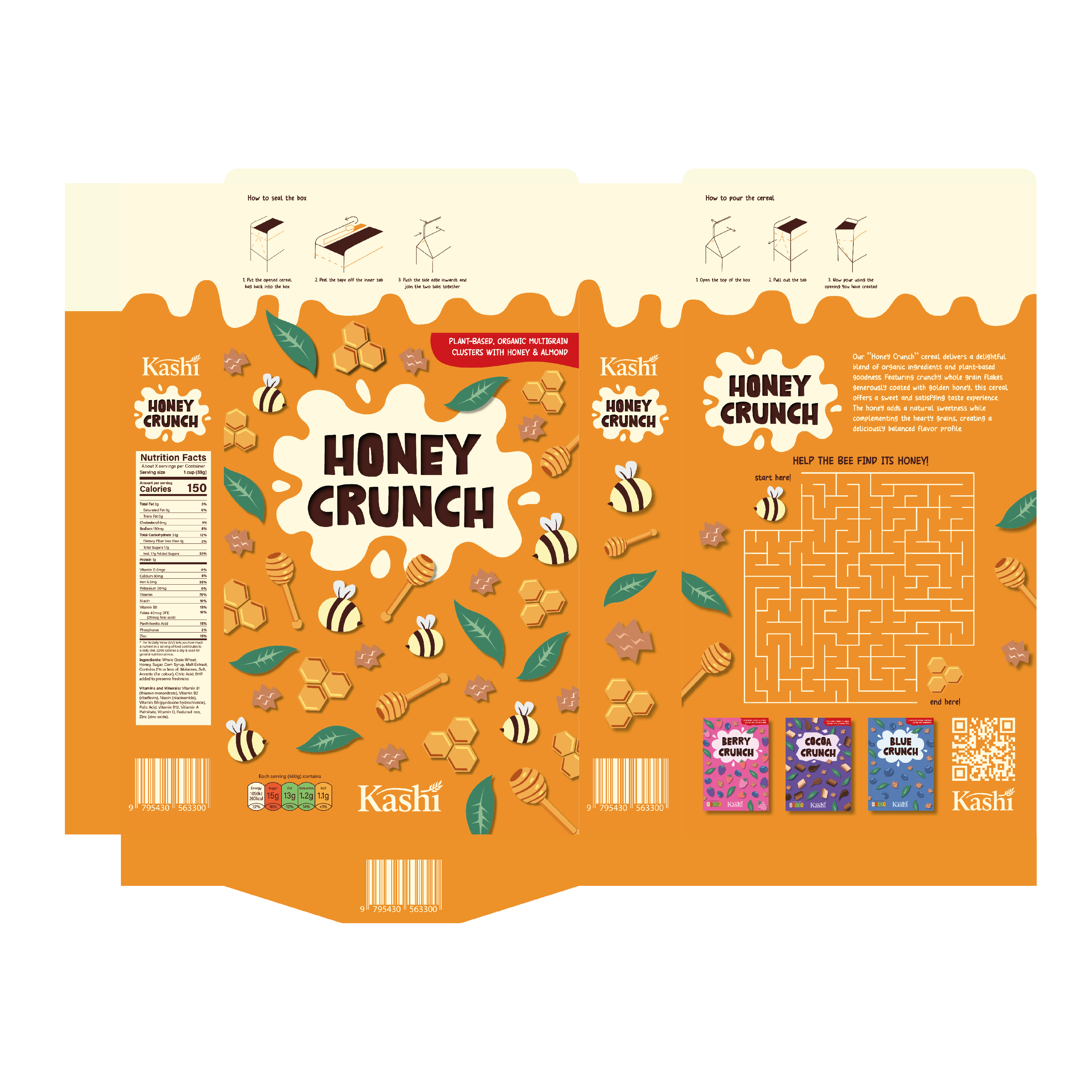
Kashi is a cereal brand that produces whole grain cereals and other plant-based foods sourced from regular farming practices. They emphasise on the terms, “natural”, “organic”, “macrobiotic diet” and “plant-based”. From researching their information, I decided to pick the words, organic, plant-based and fun to focus on when designing its new packaging.
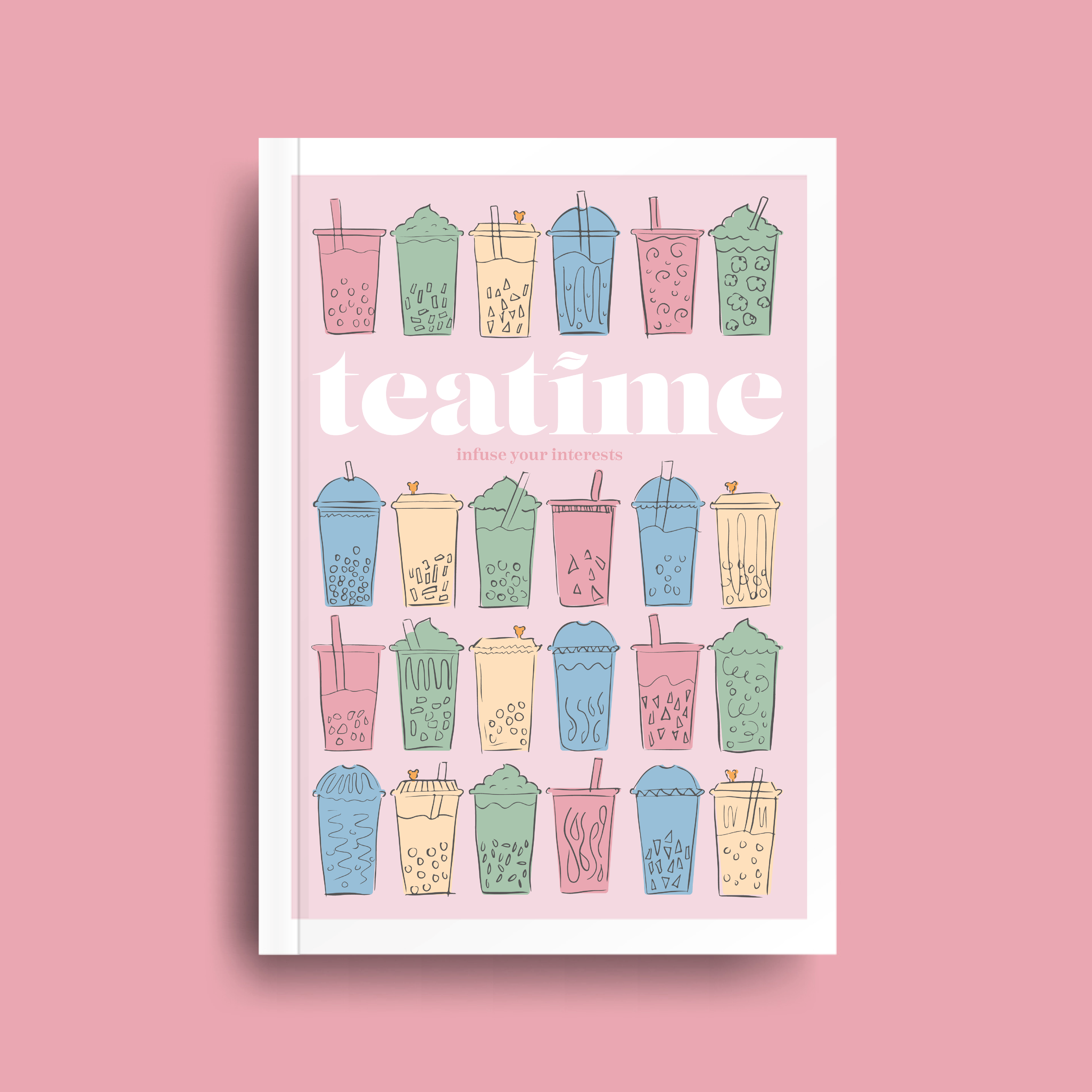
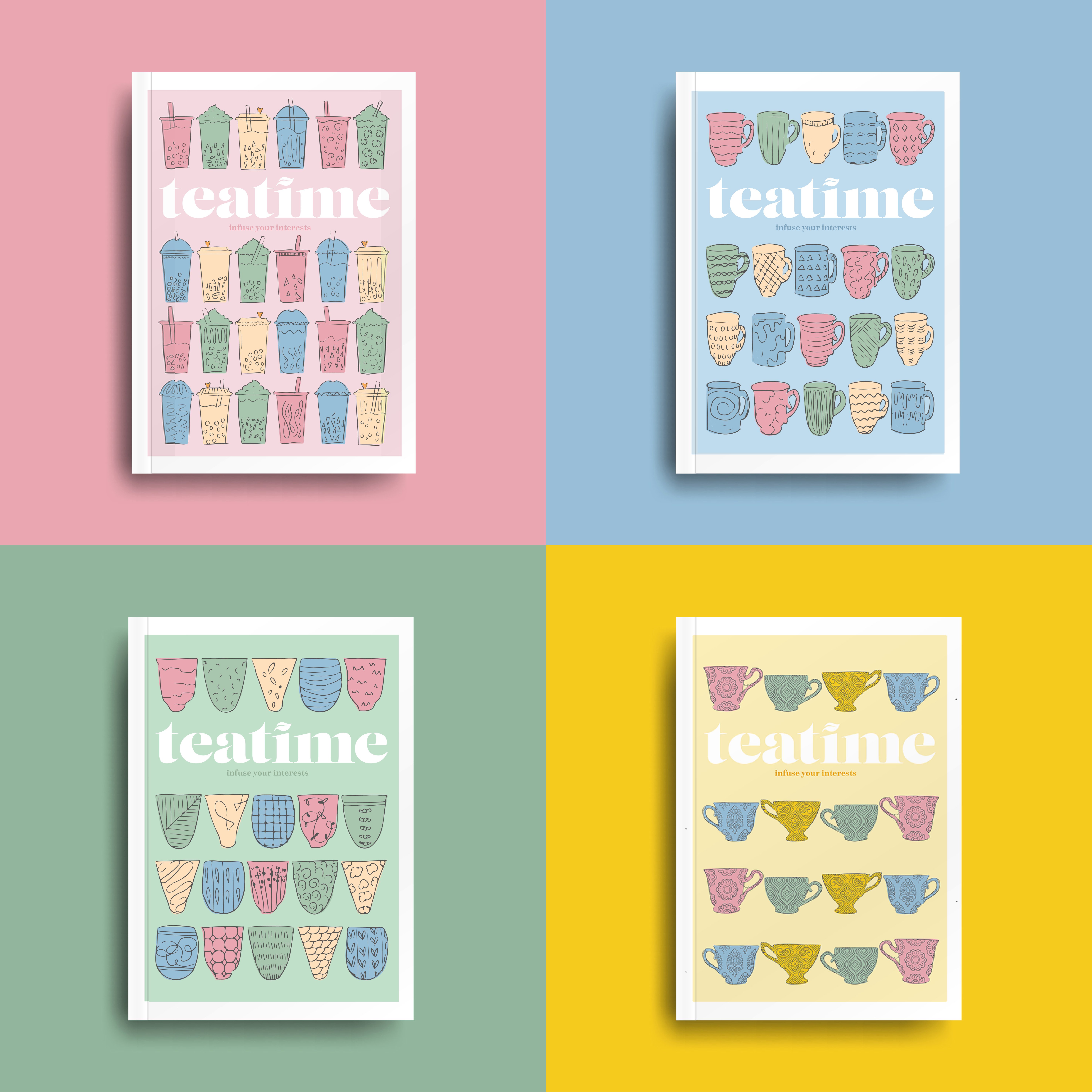
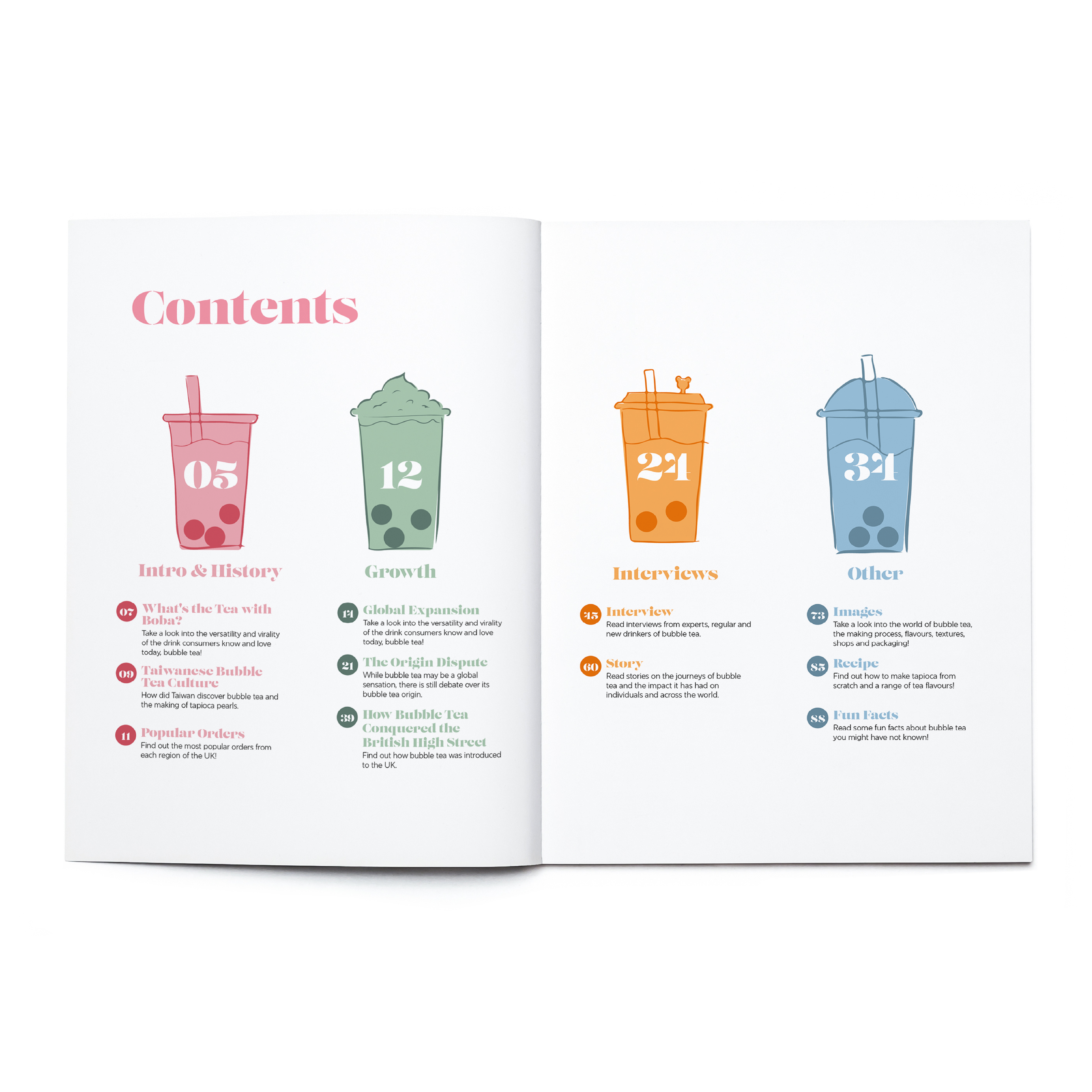
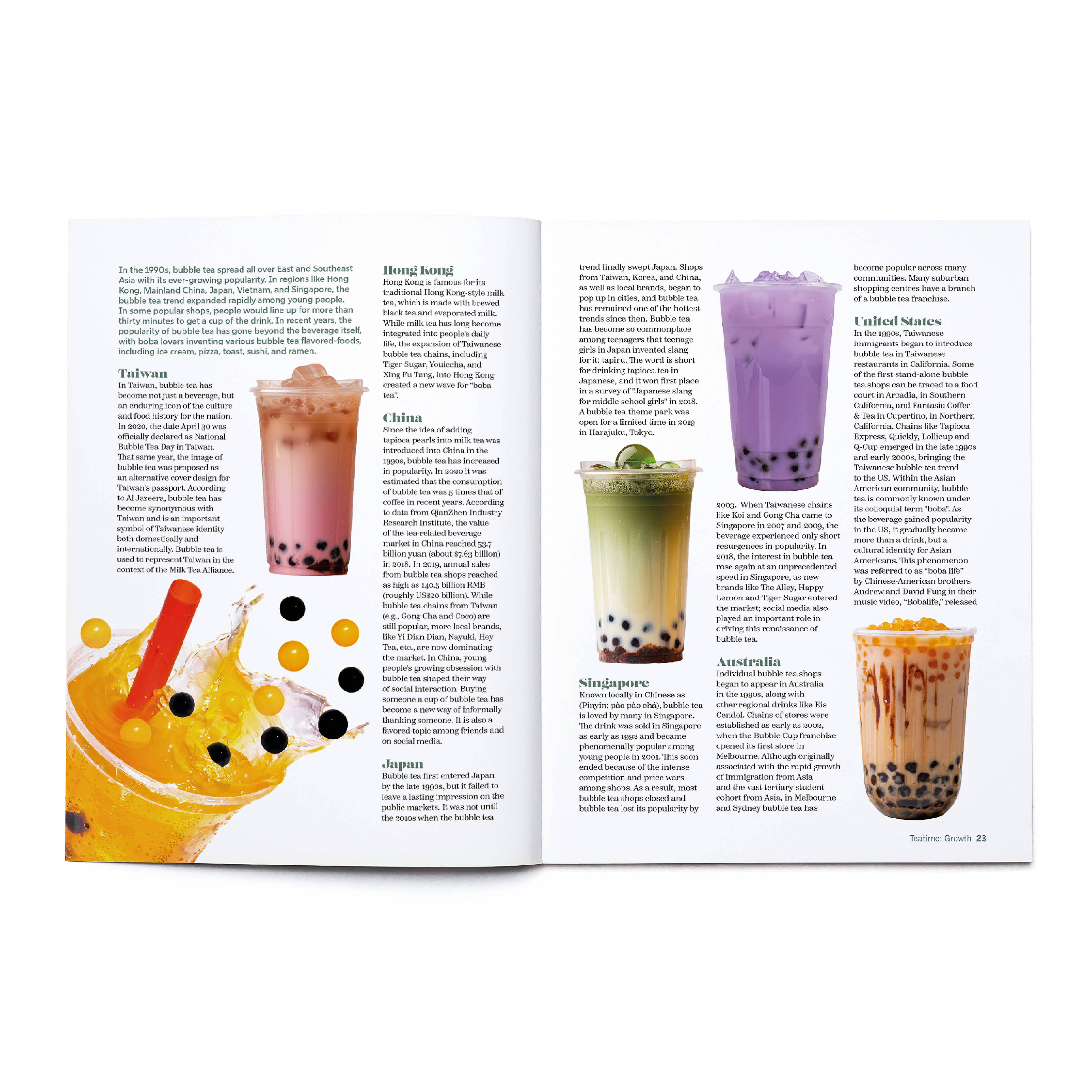
Teatime magazine
Teatime is an independent tea magazine which explores and celebrates different tea cultures all around the world. It looks into the history and origins of the particular tea, flavours, drinking traditions, stores as well as interviews with experts, recipes and fun facts. Each issue will come out twice a year to allow readers to become fully invested in a tea culture and trying it out before moving onto the next. Teatime has its own website and social media which are used to promote the magazine. It also gives previews to current and future issues and has a shopping page where readers can get a closer look of the magazine and eventually purchase.
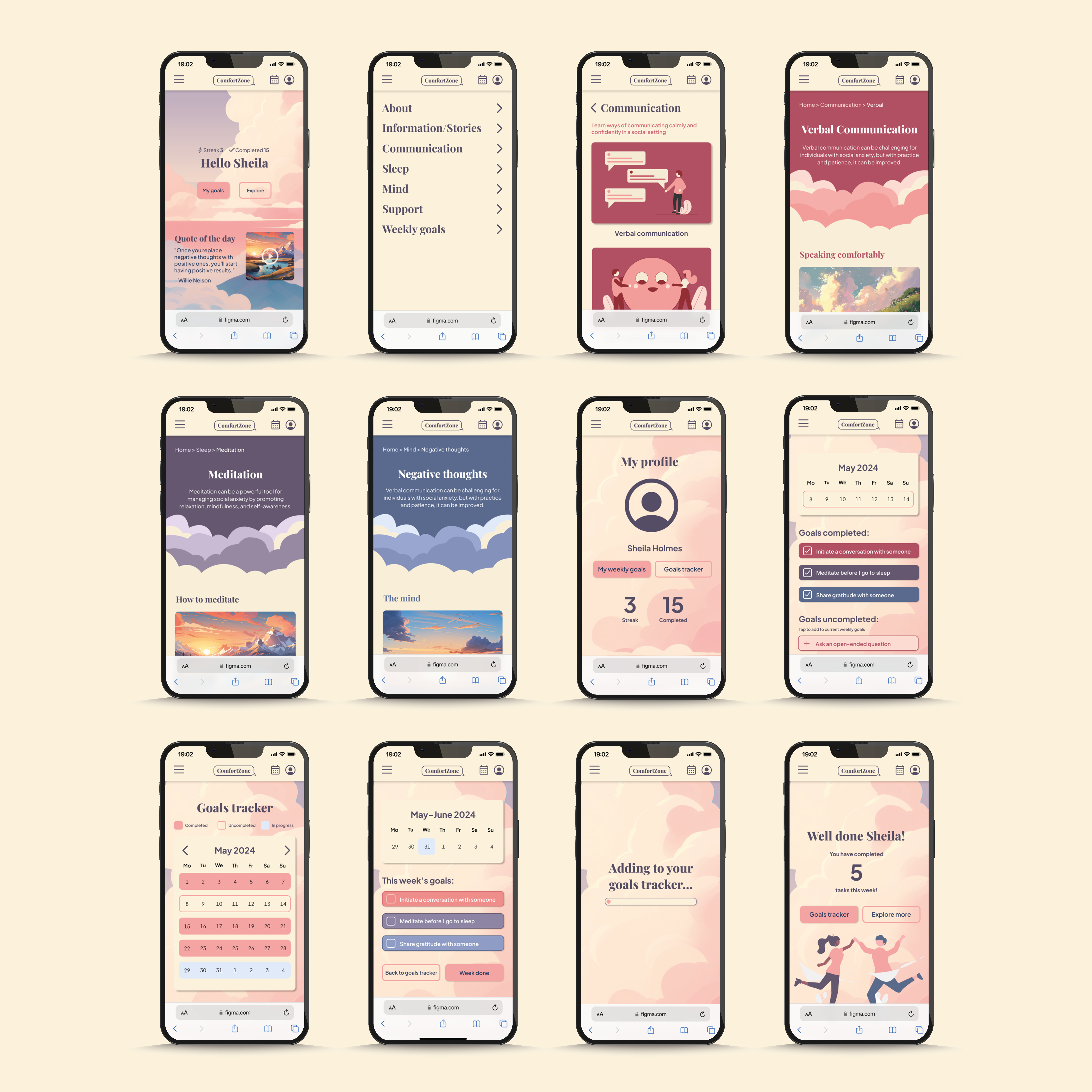
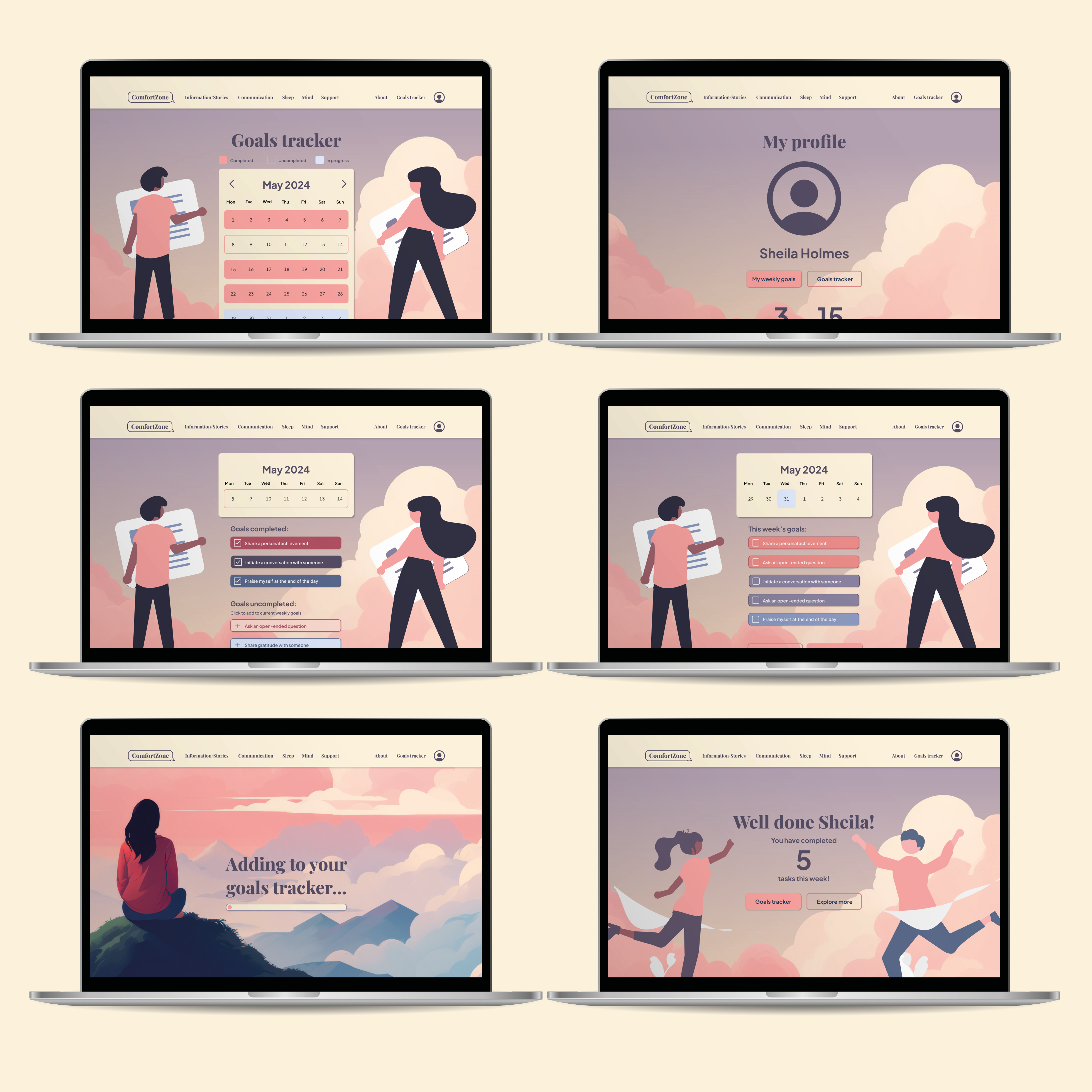
ComfortZone website
ComfortZone is a website that provides information, tips and exercises to help tackle social anxiety. While its primary focus is on social anxiety, its resources are valuable for individuals dealing with general anxiety as well. One distinctive feature that sets ComfortZone apart from other websites is its goal-setting functionality, where users can set weekly goals to complete and maintain a streak. This unique feature not only motivates users and provides a useful purpose to the website, but also encourages them to apply what they’ve learned from the website into their daily lives, promoting personal growth and progress.
Hi, my name is Charley. I have a background in fine art which has heavily influenced my design work, I love being able to showcase my illustration skills within my projects. Throughout this degree I have also fallen in love with UX design. Having completed part of this degree at Sungkyunkwan (성균관대학교 ) in Seoul, I have an understanding of how design works around the world. With lessons from professors at SKKU and several American institutions, I have really come to understand the value of learning from others. I am a passionate designer excited to explore my skills in all areas of Graphic Design.
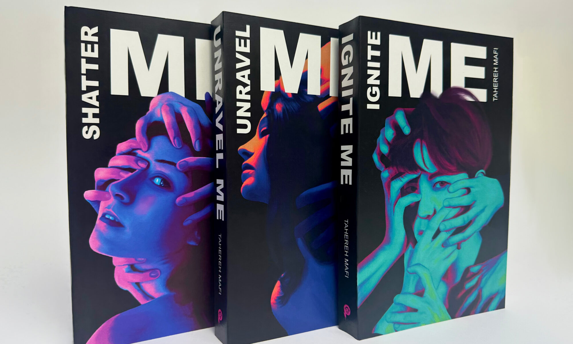
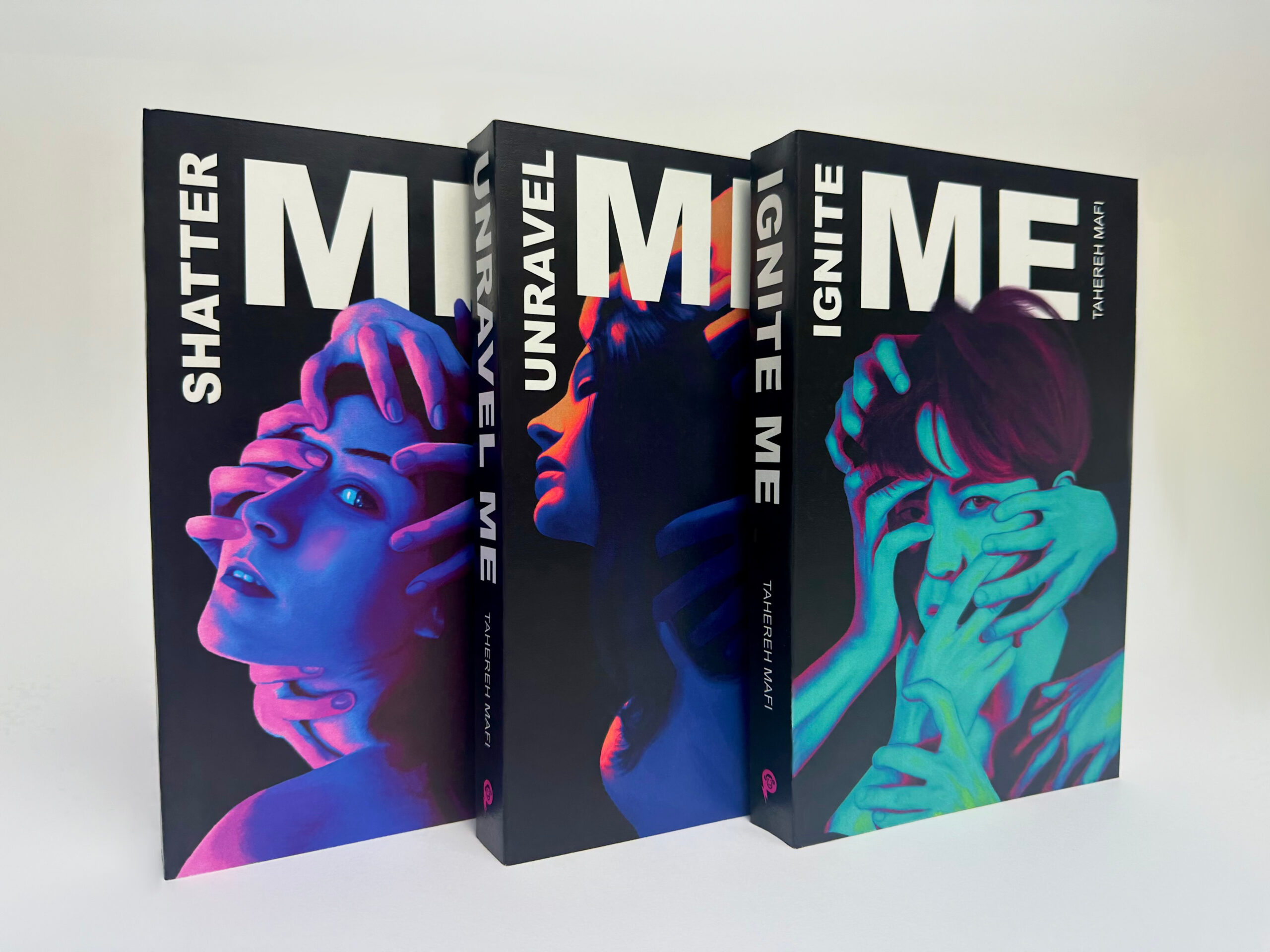
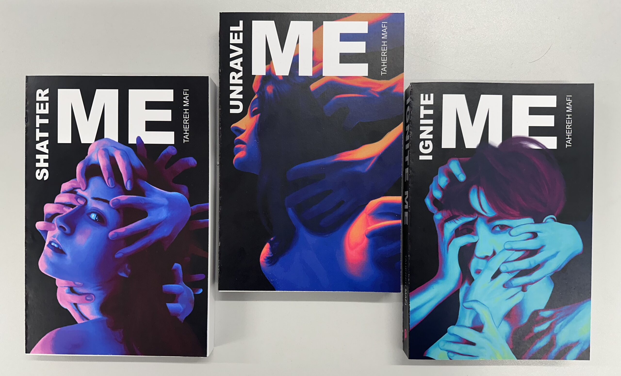
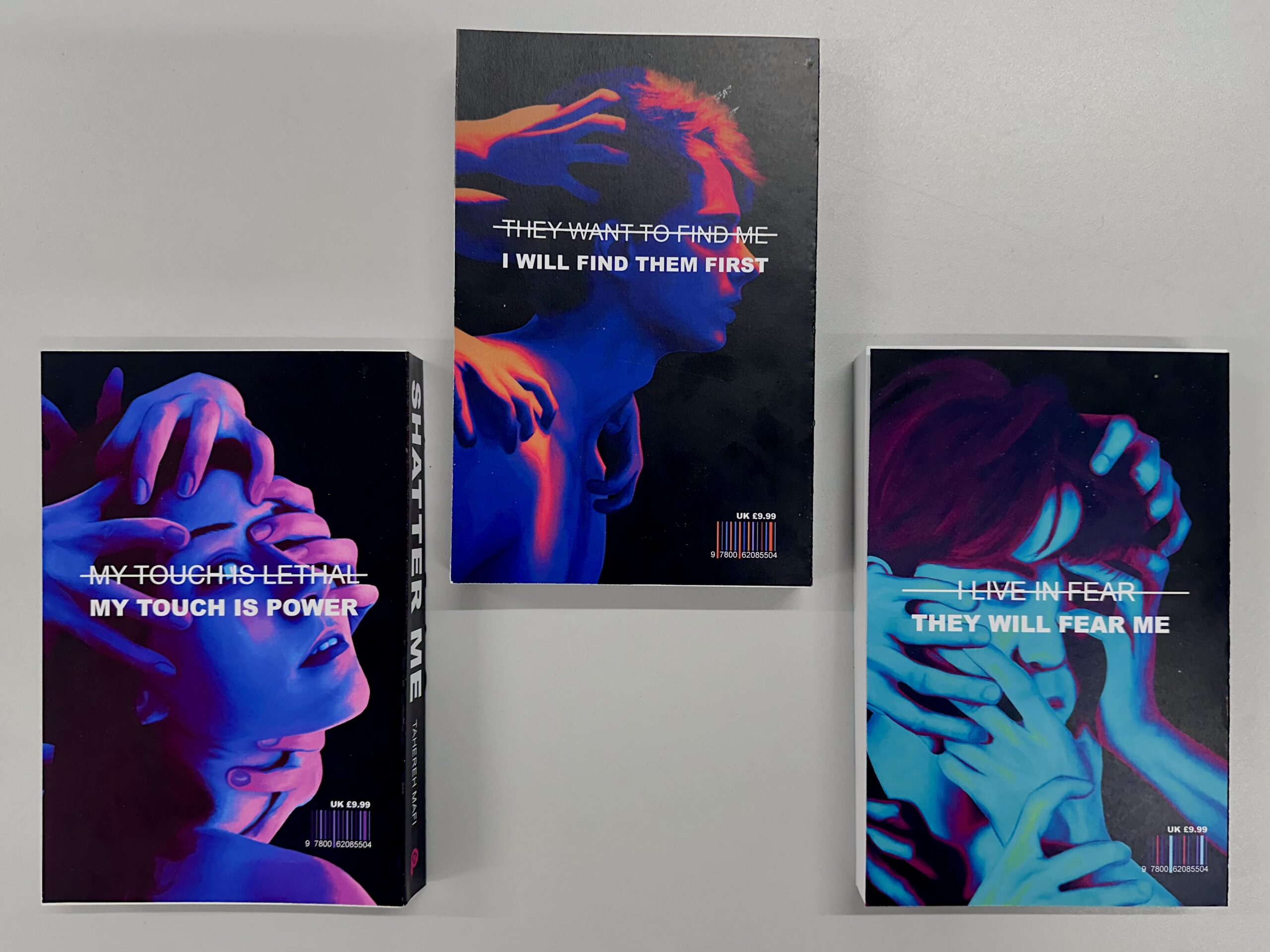
The Shatter Me books by Tahereh Mafi are incredibly popular and yet the covers do not match the contents of the books at all. This was a project to re-design the existing covers of this amazing trilogy. They are designed to appeal to the current market and to better showcase the genre of the books themselves.
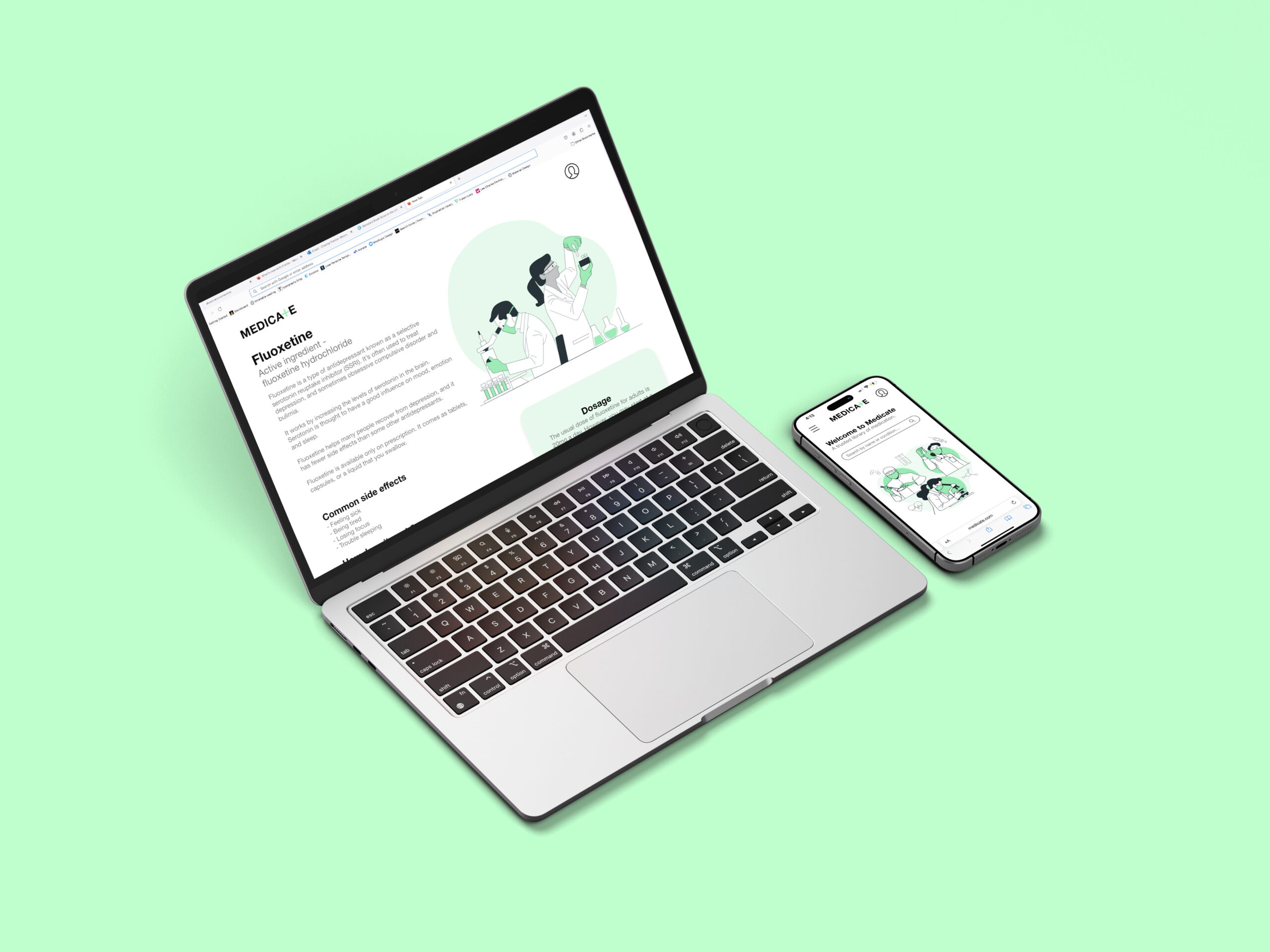
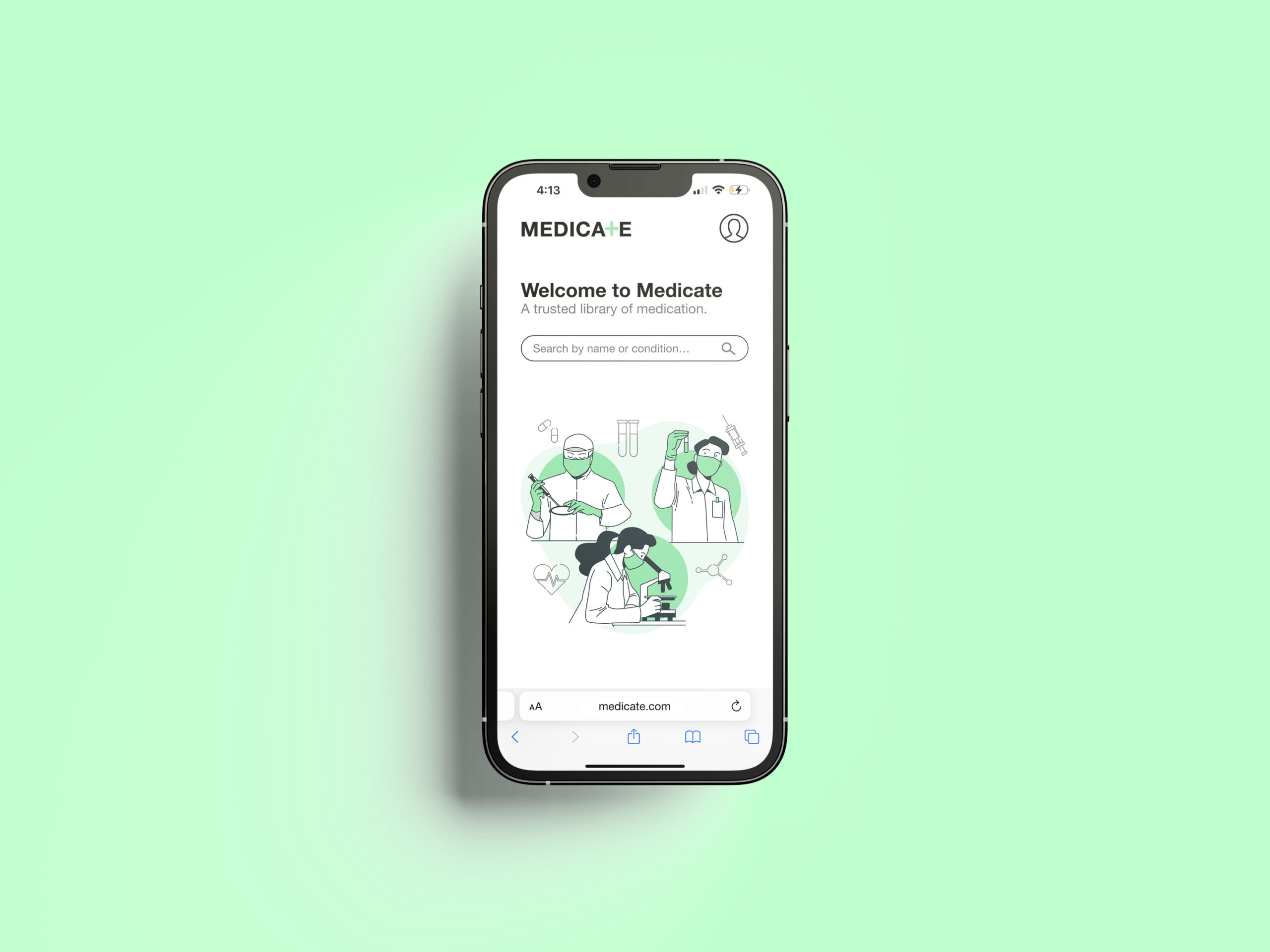
Medicate website
Medicate is a library of medication that was designed to help people become more informed about their health.
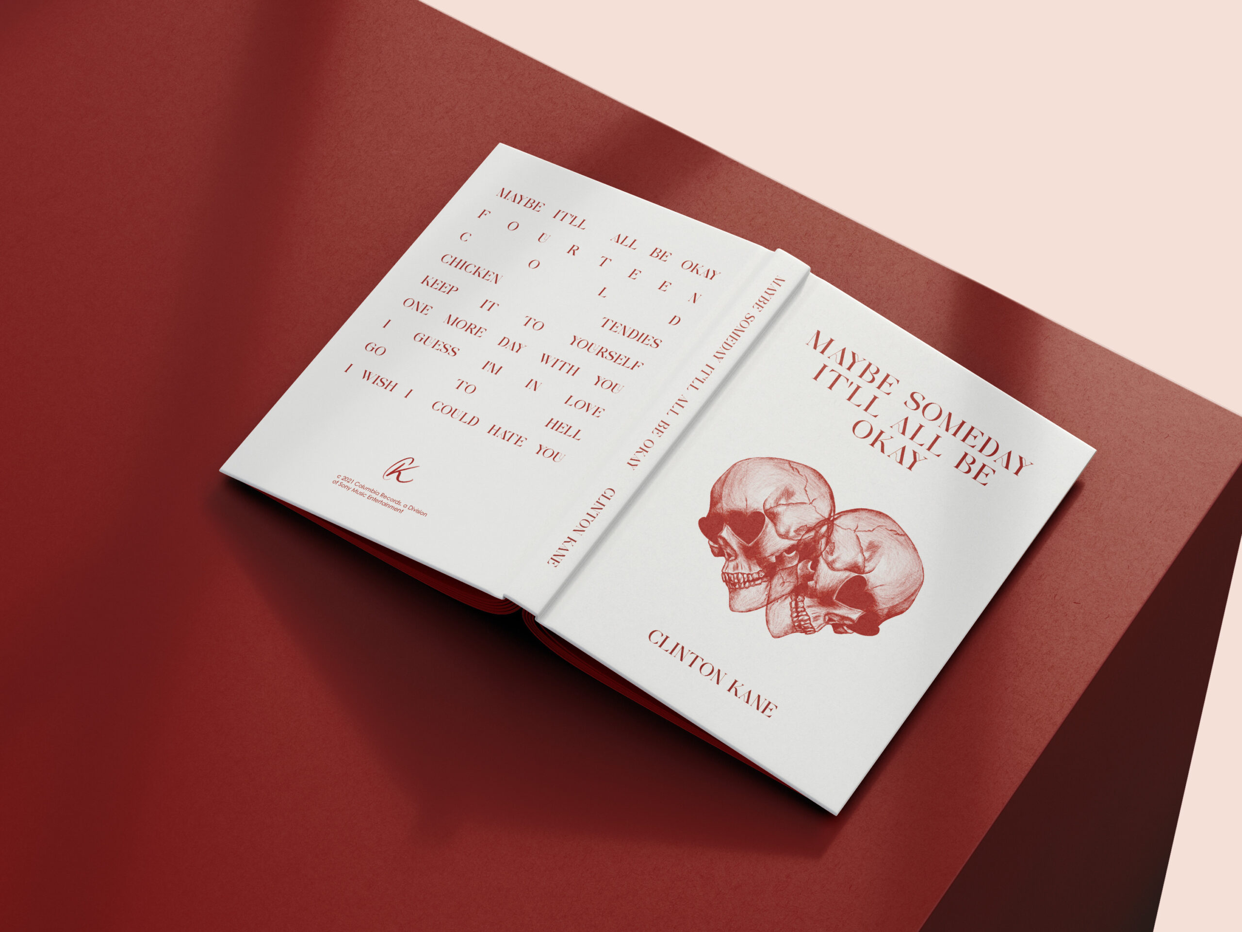
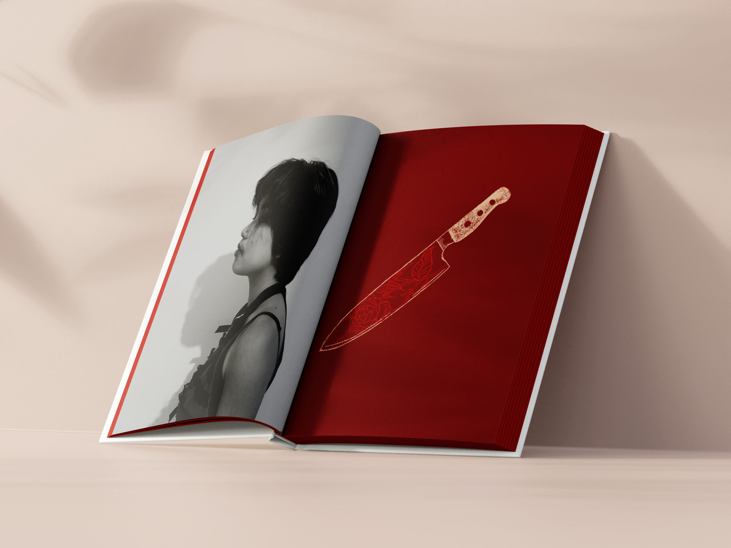
Clinton Kane photobook
This was a photobook designed to go along with the release of Clinton Kane's first album. It takes inspiration from KPOP albums and the detailed concepts they bring to each album.
