Asalaamualaikum (peace be with you)! I am Zeenah, a well organised and creative designer who has a driven passion for all aspects and areas of design. As a graphic designer, I am extremely organised, focused, and put great effort and attention into everything I do. I have a great eye for detail and have considerable creative qualities which I incorporate into all my designs. I have a heavy interest in editorial and magazine design, which allows me to express myself and others in various different ways. It allows me to tell stories, ones that are not often heard, and give those in need a spotlight to tell their truth through design and inclusivity. It is always a humbling and empathetic experience. I am always self-improving and expanding my knowledge of design and in the future, I want to use my abilities as a way of communication, self-expression and to stand up for what’s right 🙂
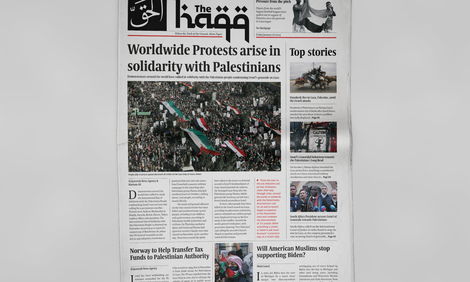
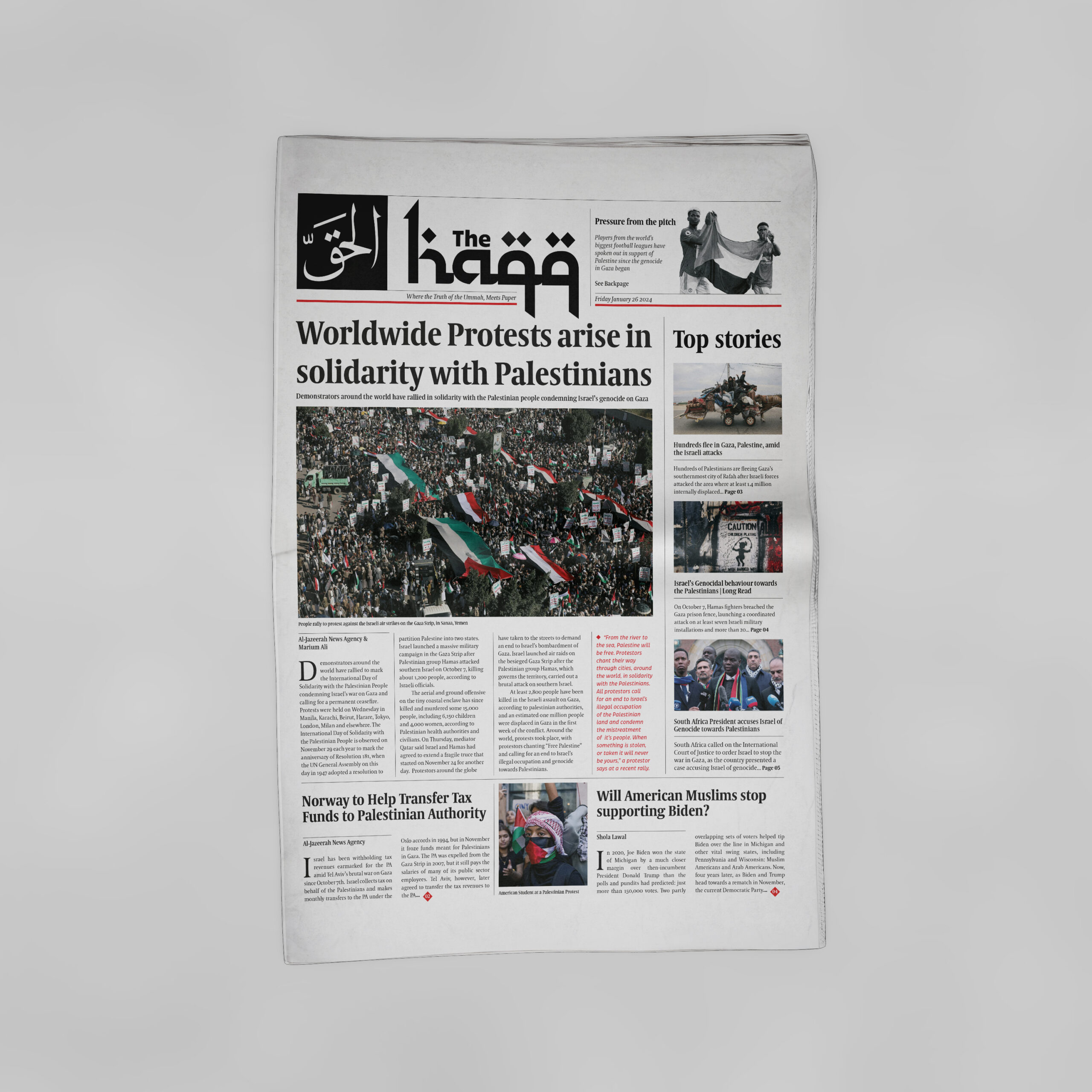
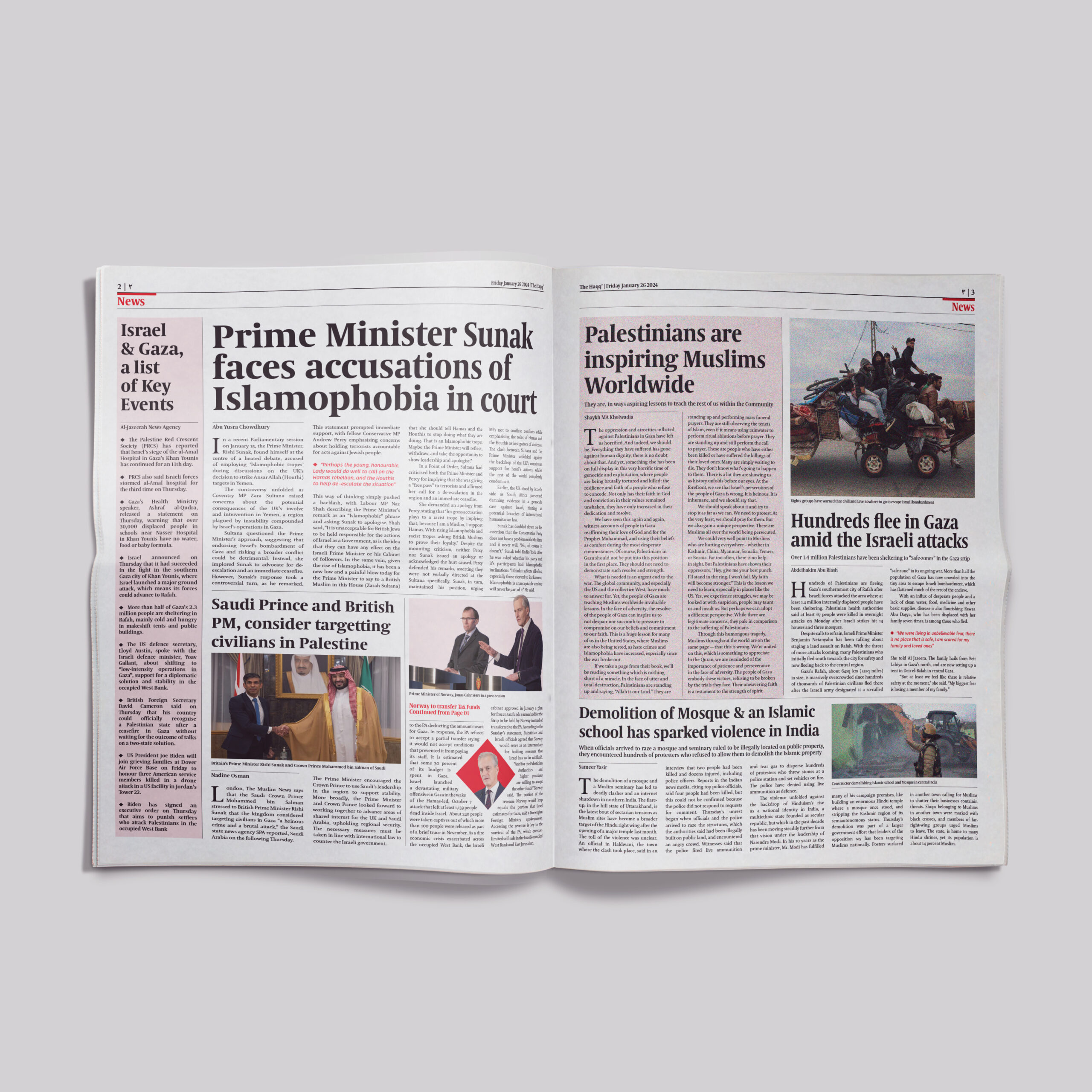
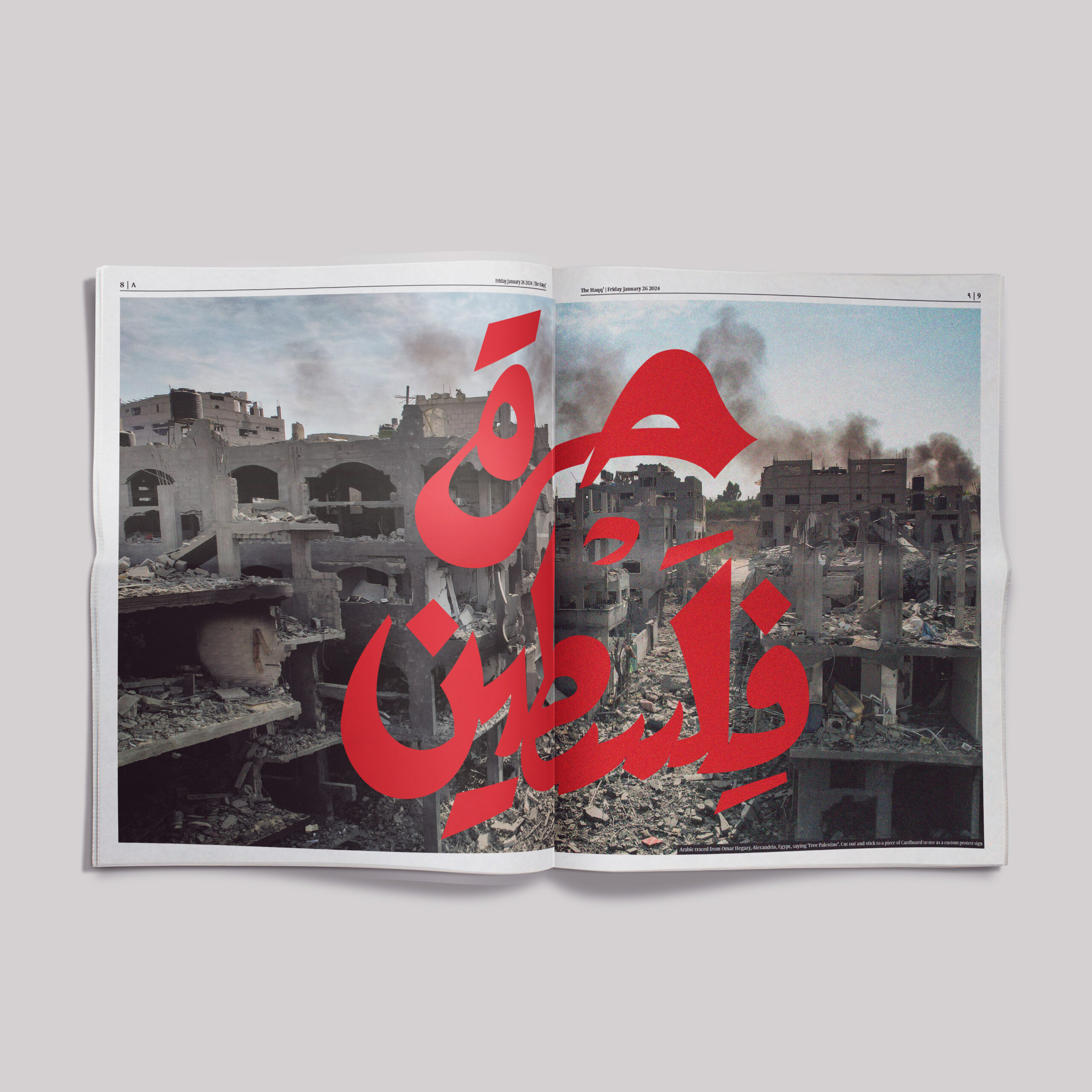
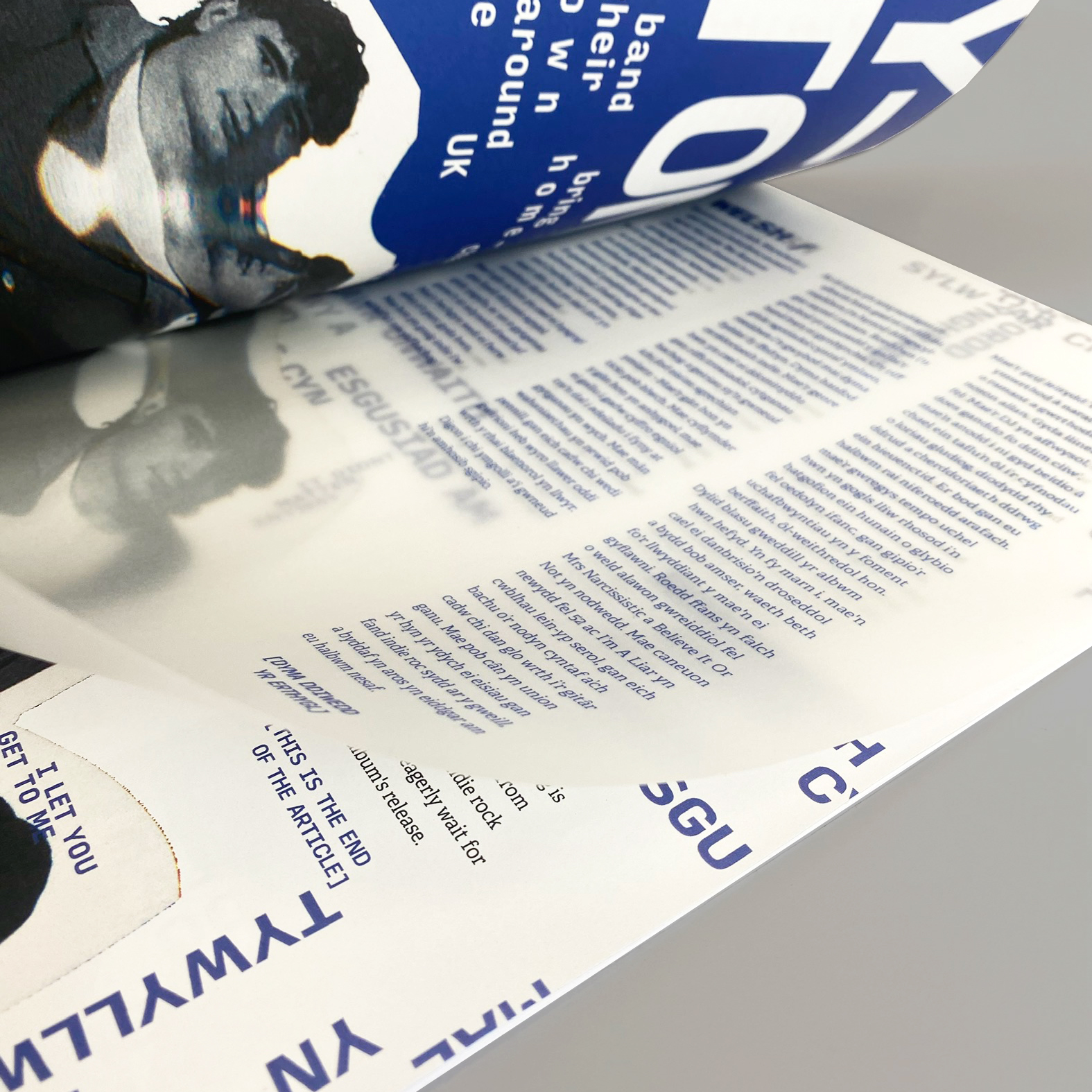
This project was designed as part of my University studies, for our chosen elective projects, Advanced Editorial. The brief was to create a newspaper platform and design accordingly based on our audience. This newspaper is called The Haqq, an editorial piece aimed mainly towards British Muslims and others who want to educate themselves or agree with our views. Focusing on the genocide of the Palestinian people, it gives those a voice to speak out and show necessary support. It’s a way in which others can connect with serious world issues and push forward a message of truth and peace.
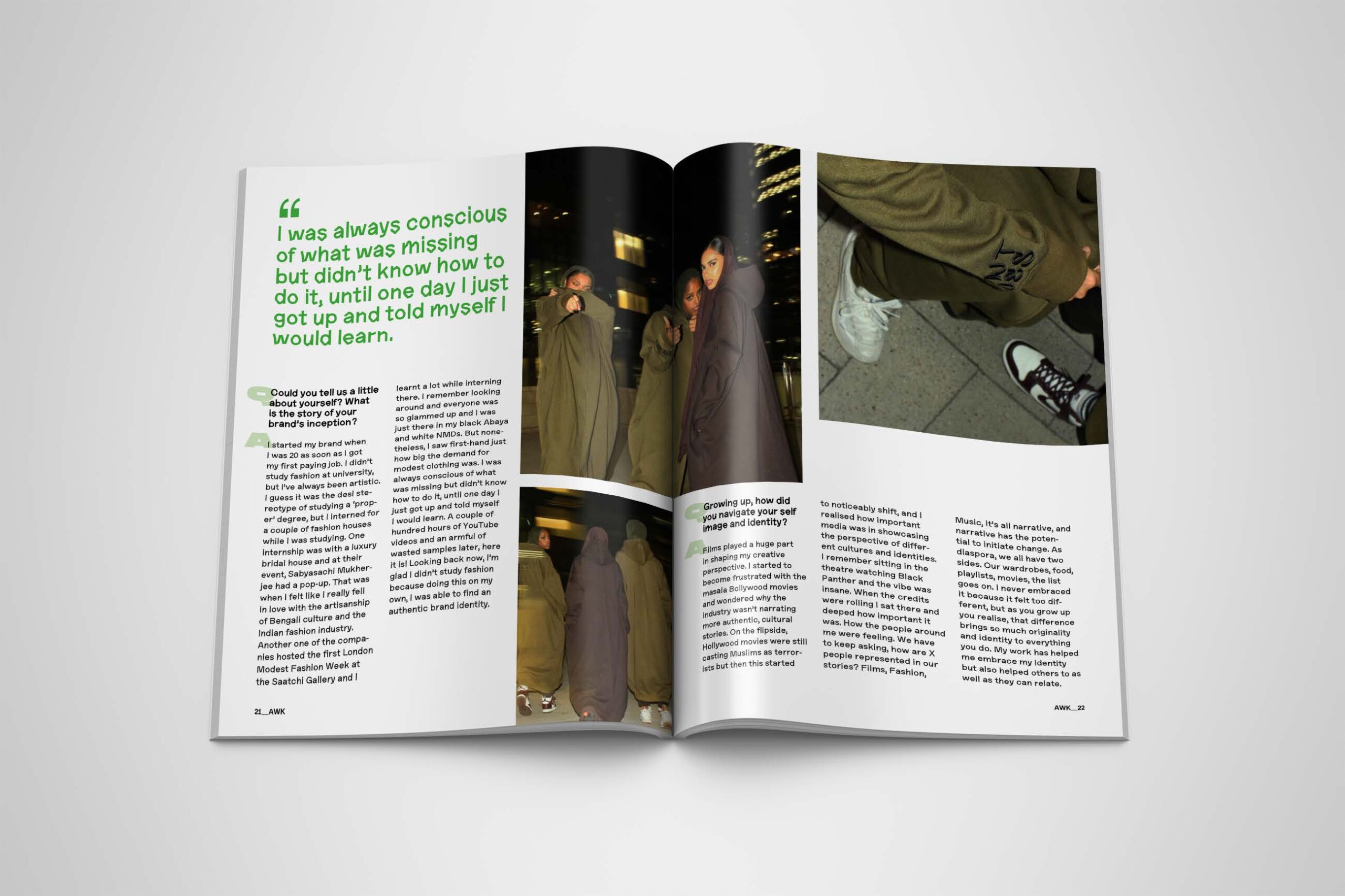
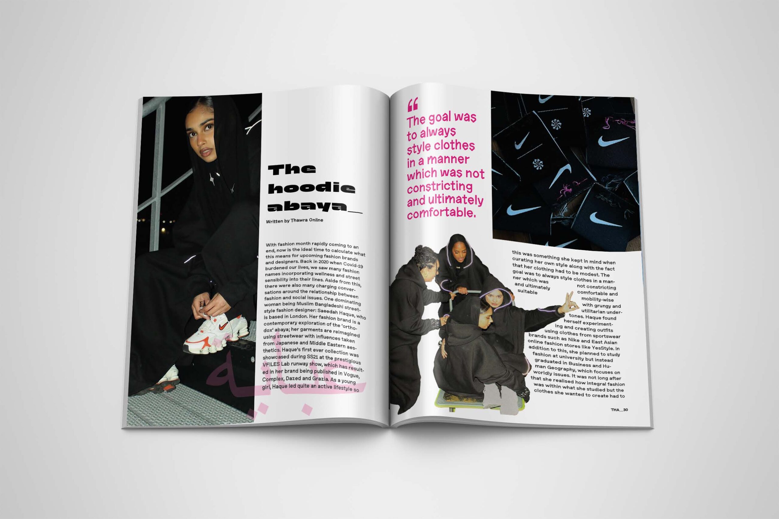
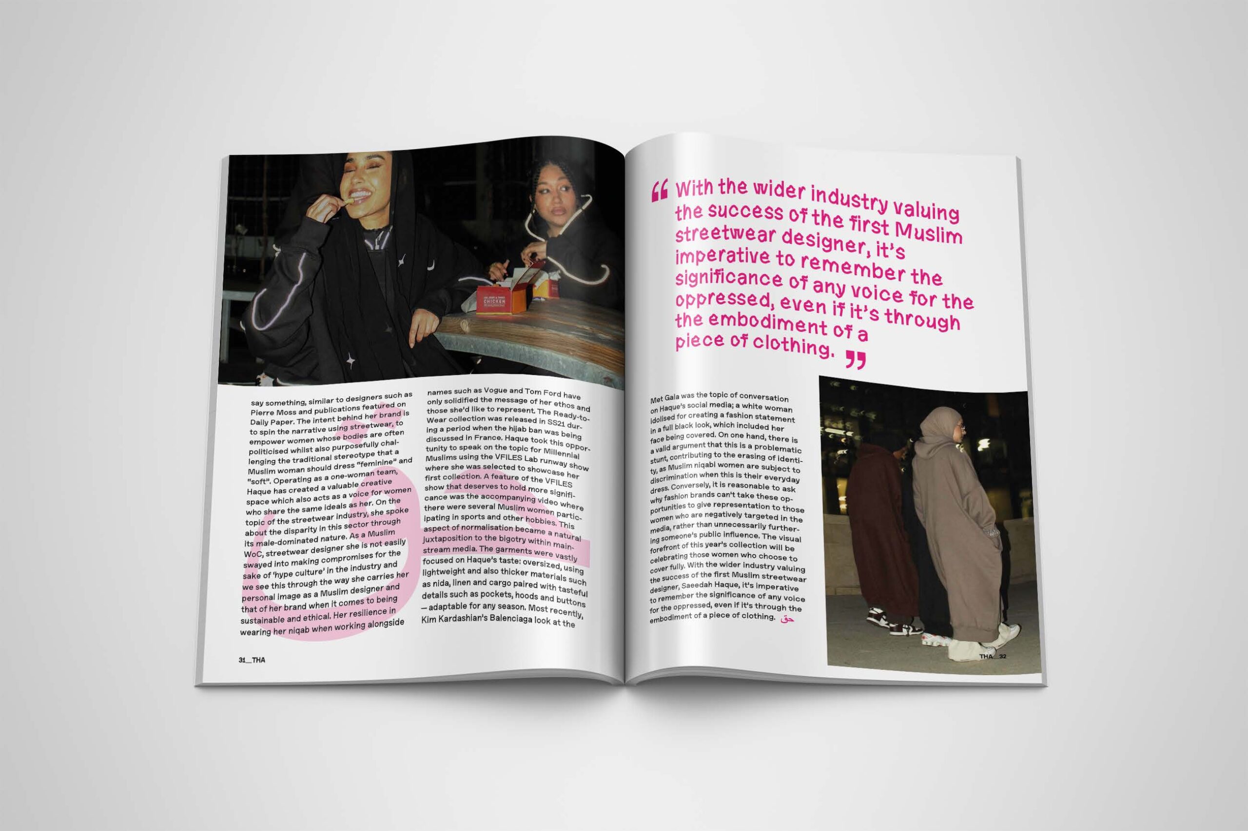
Street_Wear magazine
This project was designed as part of my University studies, for our design practice module, Publishing Platforms. For this module we had to design a magazine and find different, creative ways to display articles whilst keeping it coherent throughout. Street_Wear is a magazine which focuses on @saeedahhaque, a Muslim fashion designer that creates modern modest wear. The magazine showcases powerful imagery from her Instagram page whilst portraying Muslim women in a way which is not usually seen and giving them the spotlight. It’s a magazine for self-expression and to normalise a way of dress that is not always embraced.
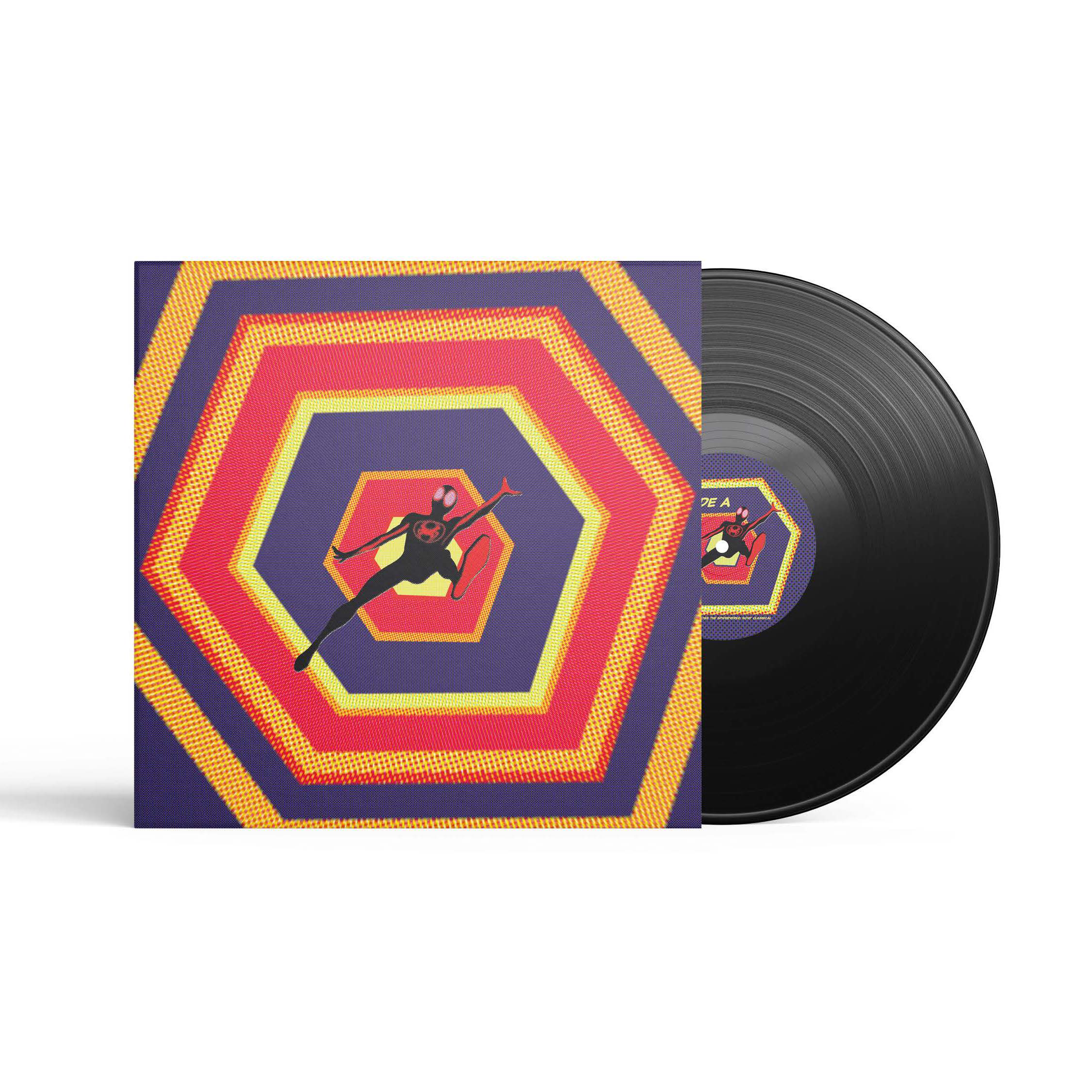
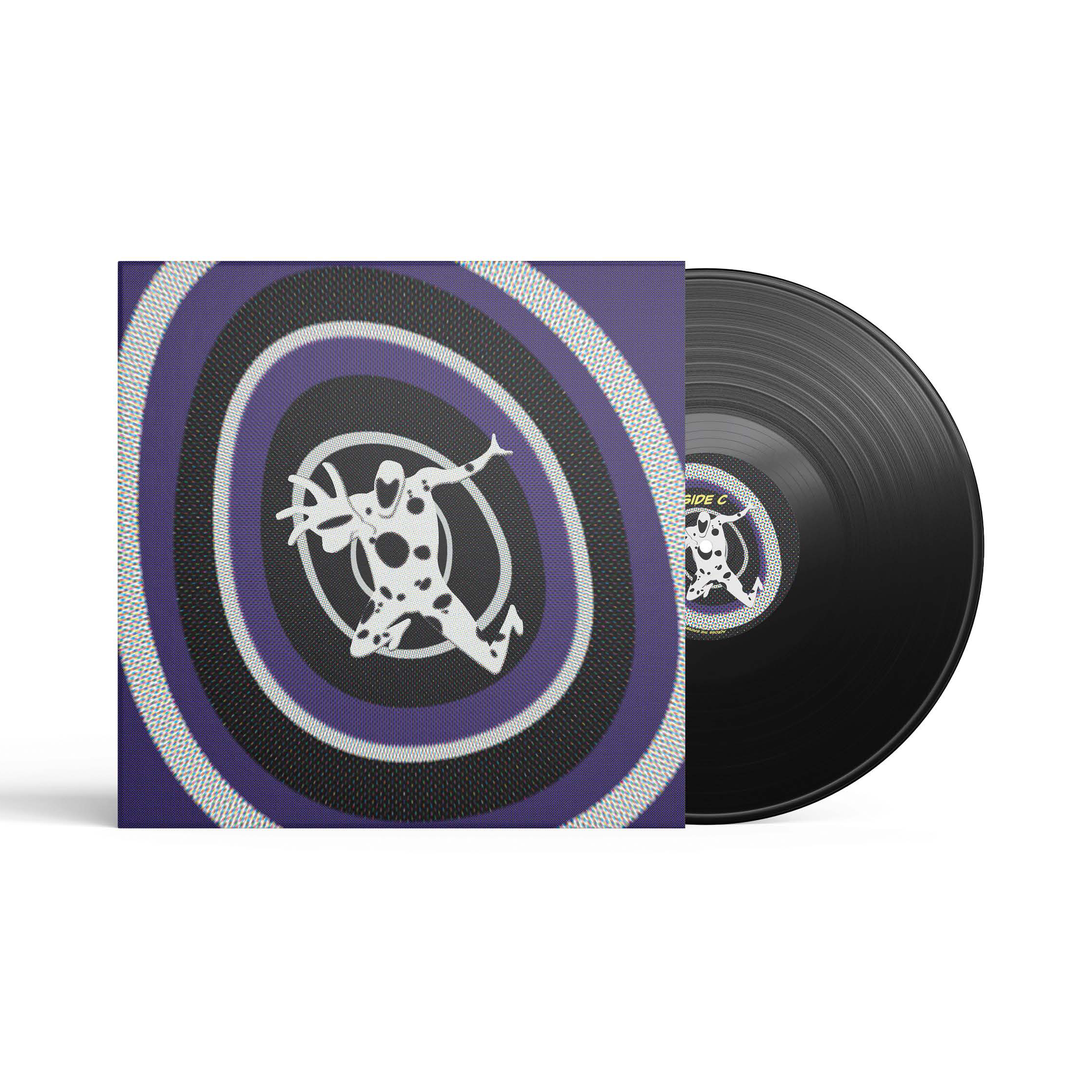
Across the Spider-Verse Vinyl Cover
This project was from an elective project called Packaging. We were tasked with designing a series of ‘something’ and producing three different outcomes that belonged together as a set. For my first and main outcome, I designed a vinyl cover based off the 2023 Spider-man movie: Across the Spider-Verse. As a huge Marvel and Sony fan, I created two vinyls which reflected the two main characters within the movie. The design portrayed a ‘good vs evil’ narrative whilst not giving away too much and allowed my audience to submerge themselves into the Spider-Verse through the portal-like design.
I’m a designer with a keen interest in editorial book design, as well as bottle packaging and album covers, all being areas that I’ve pushed myself towards during my degree and excelled in. I’ve often found myself enjoying more minimalist designs but I also find branching into other styles fun and have involved myself in illustrative, typographic, and many other approaches across my work. I especially enjoy finding inspiration on sites like Pinterest and behance to flesh out my ideas and approaches. Alongside my studies, I’ve been working in a data visualisation role for a non-design company located in Sheffield, and also have been pushing myself to improve my design skills through personal projects, such as practicing illustration which has been useful recently on a web design project where I was able to utilise my illustrations in ways I hadn’t before.
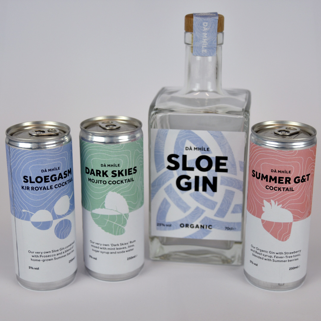
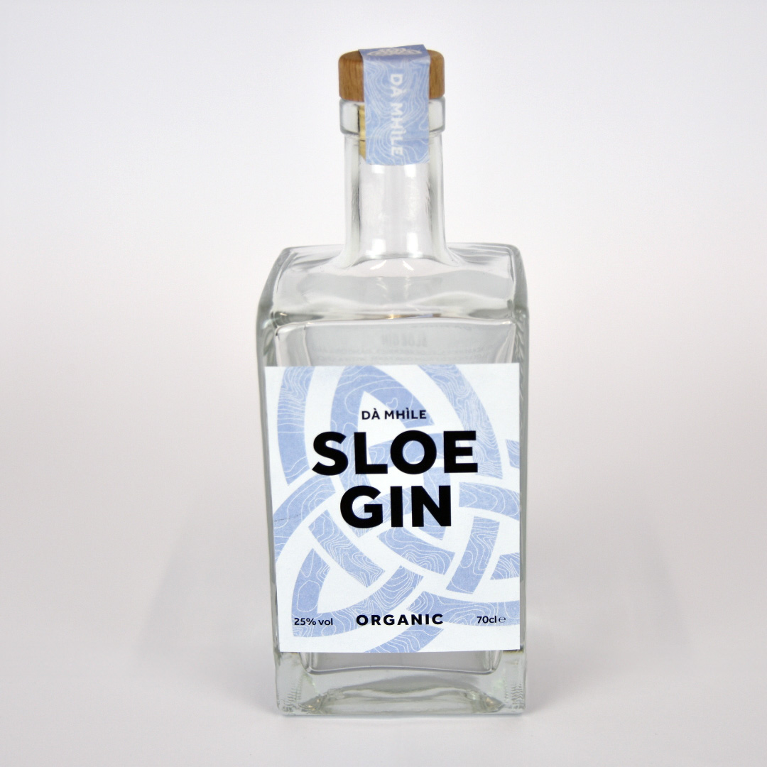
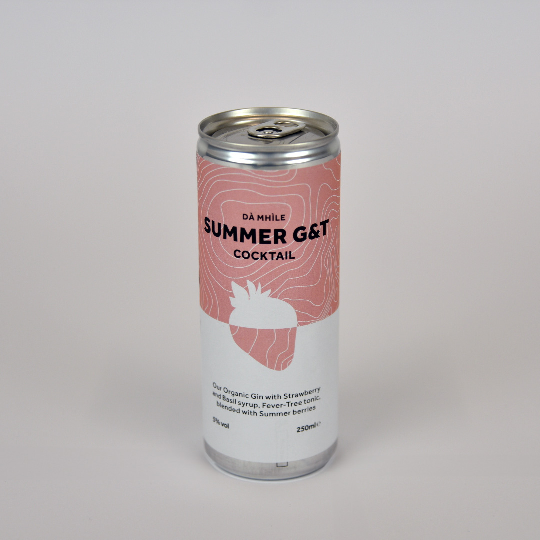
For this project, I chose to do a redesign of Dà Mhìle’s gin bottle labels, my goal was to transfer their core values to a more modern, clean looking design. Dà Mhìle highly value the history and location of their farm and distillery and the organic ingredients involved in the process of making their drinks.
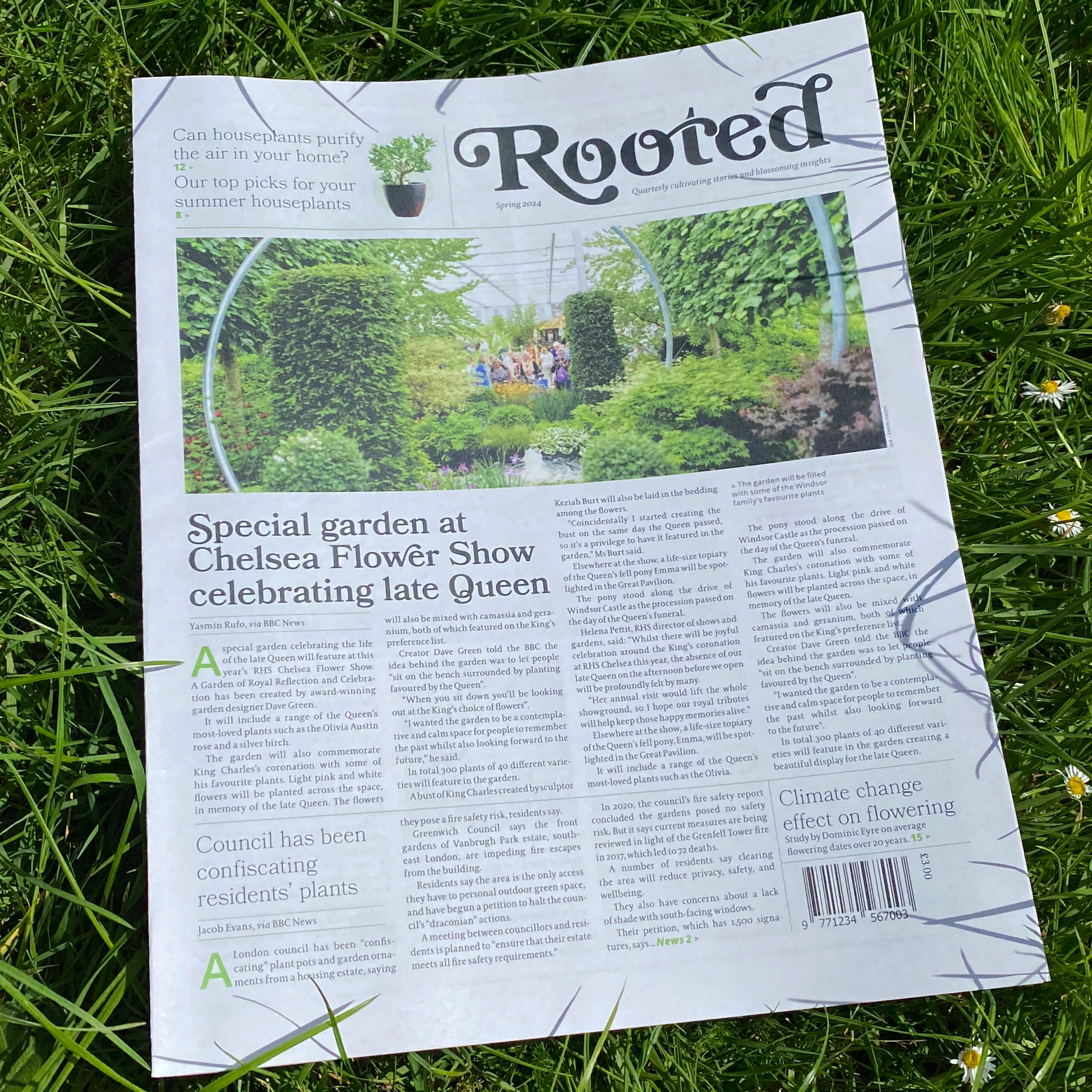
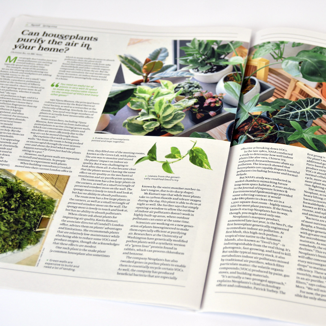
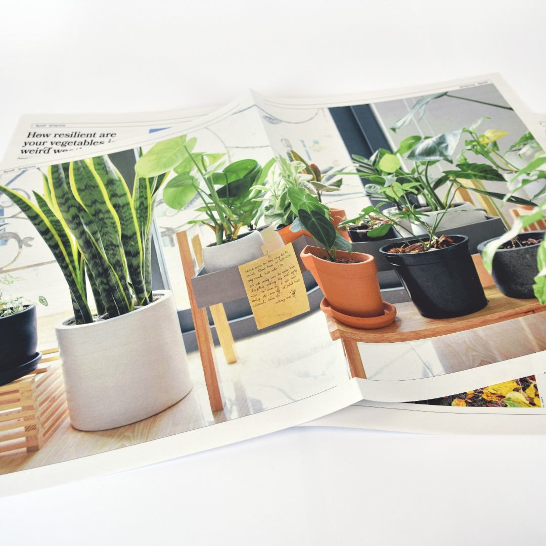
Rooted newspaper
For this project, I chose to design a newspaper, and all its systems, for plant-lovers called ‘Rooted’. I used plant-themed aesthetics and visuals alongside the articles surrounding recent plant news, tips for gardeners and houseplant owners and plant top picks for upcoming seasons.
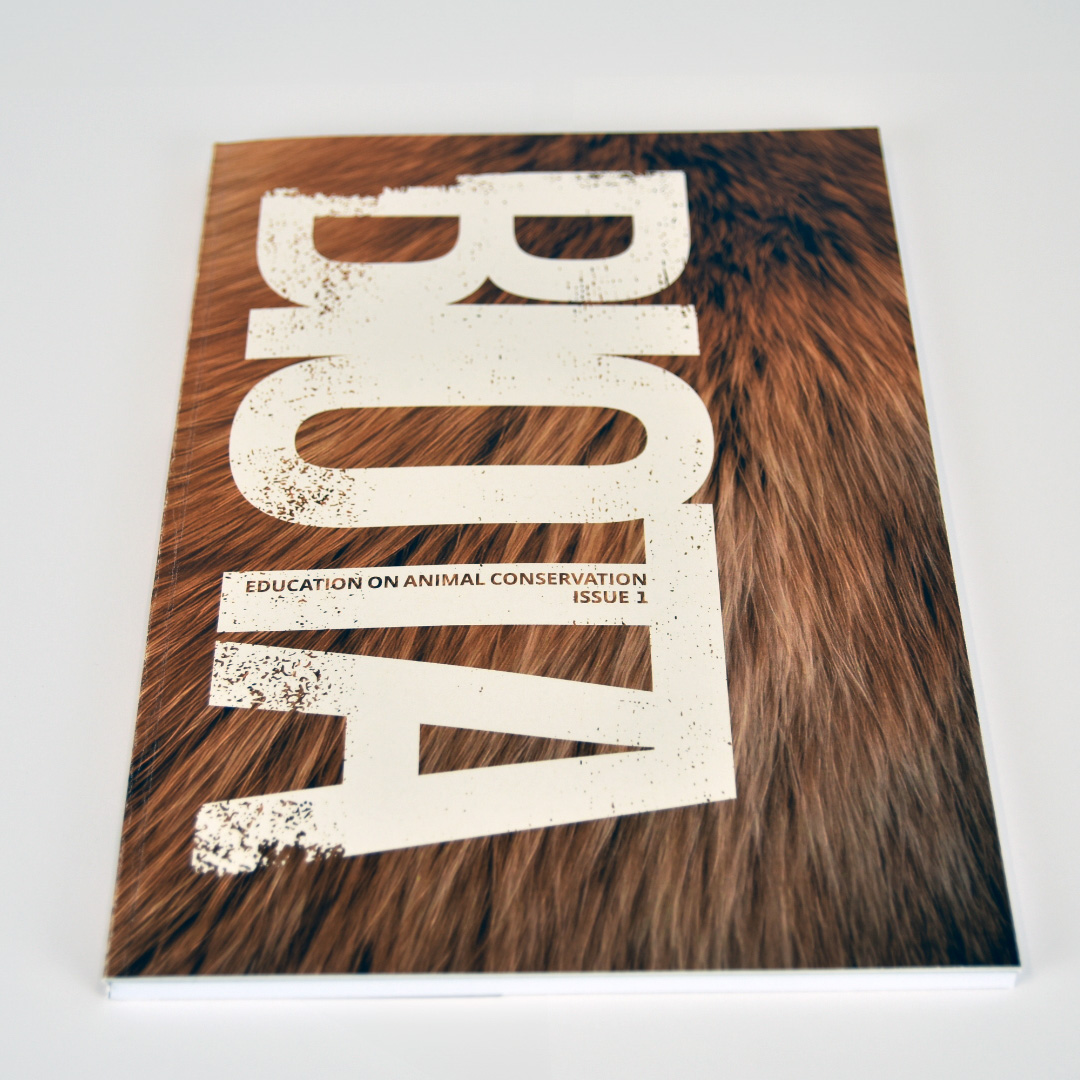
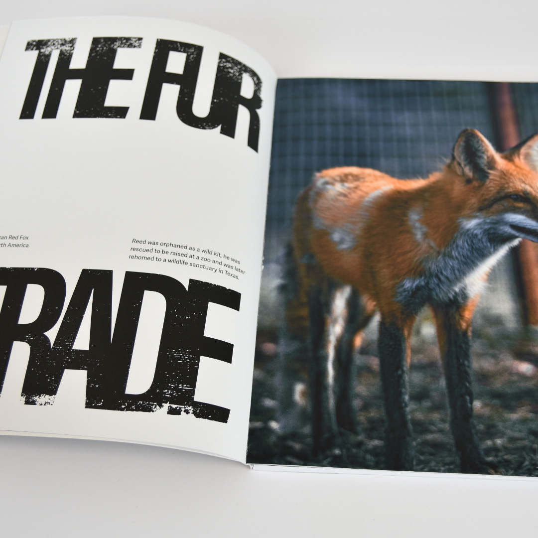
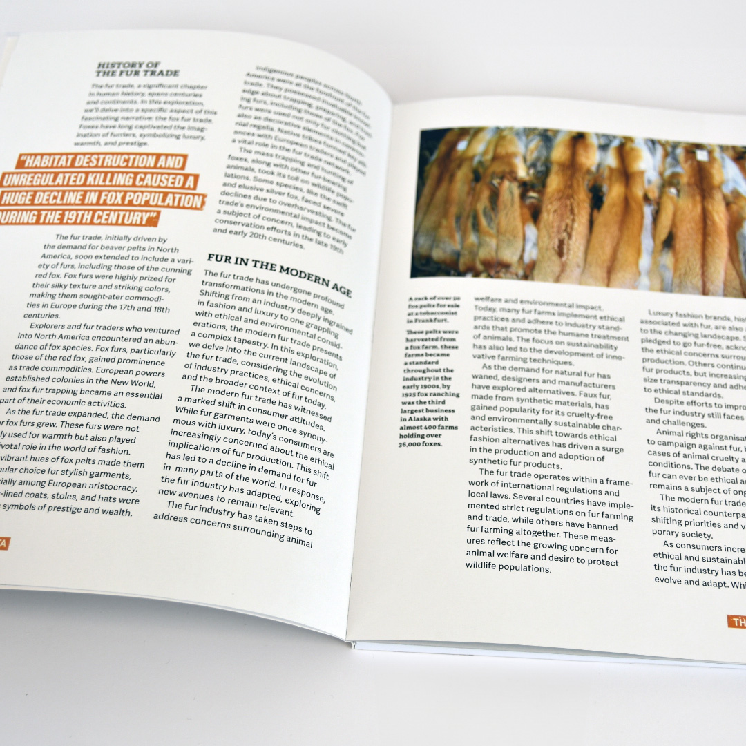
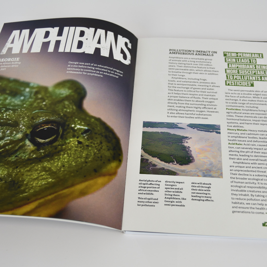
Biota magazine
I created a magazine that shares information and education on animal conservation, called ‘Biota’. The magazine would include stories on issues animals face, interviews with experts, current conservation news and photo essays.
Hi, I’m Tristan and over the past 3 years I’ve loved being part of such a dedicated community of designers where I’ve been able to develop many of my visual design skills over a range of fascinating software’s – from Adobe softwares like InDesign to Figma. Being able to develop both a keen eye for striking visuals and a strong understanding of function and purpose throughout my design process was an integral part of learning the craft of graphic design and a skill I intend to take forward into my career. Throughout my time in the Reading design community, I have also been able to develop my client-facing skills through a range of client-based projects. Organising face to face meetings to understand the clients core needs, to successfully pitching entire re-brands for existing organisations. It always feels great for both parties when the designer can truly understand the client’s needs.
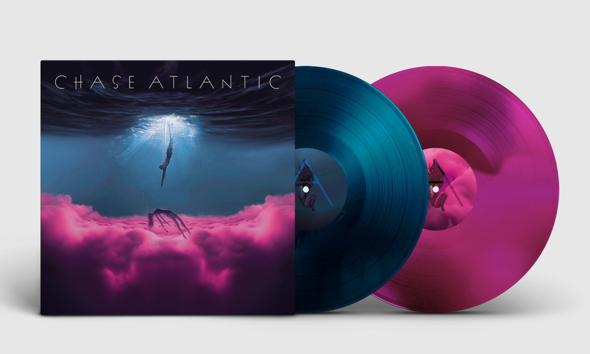
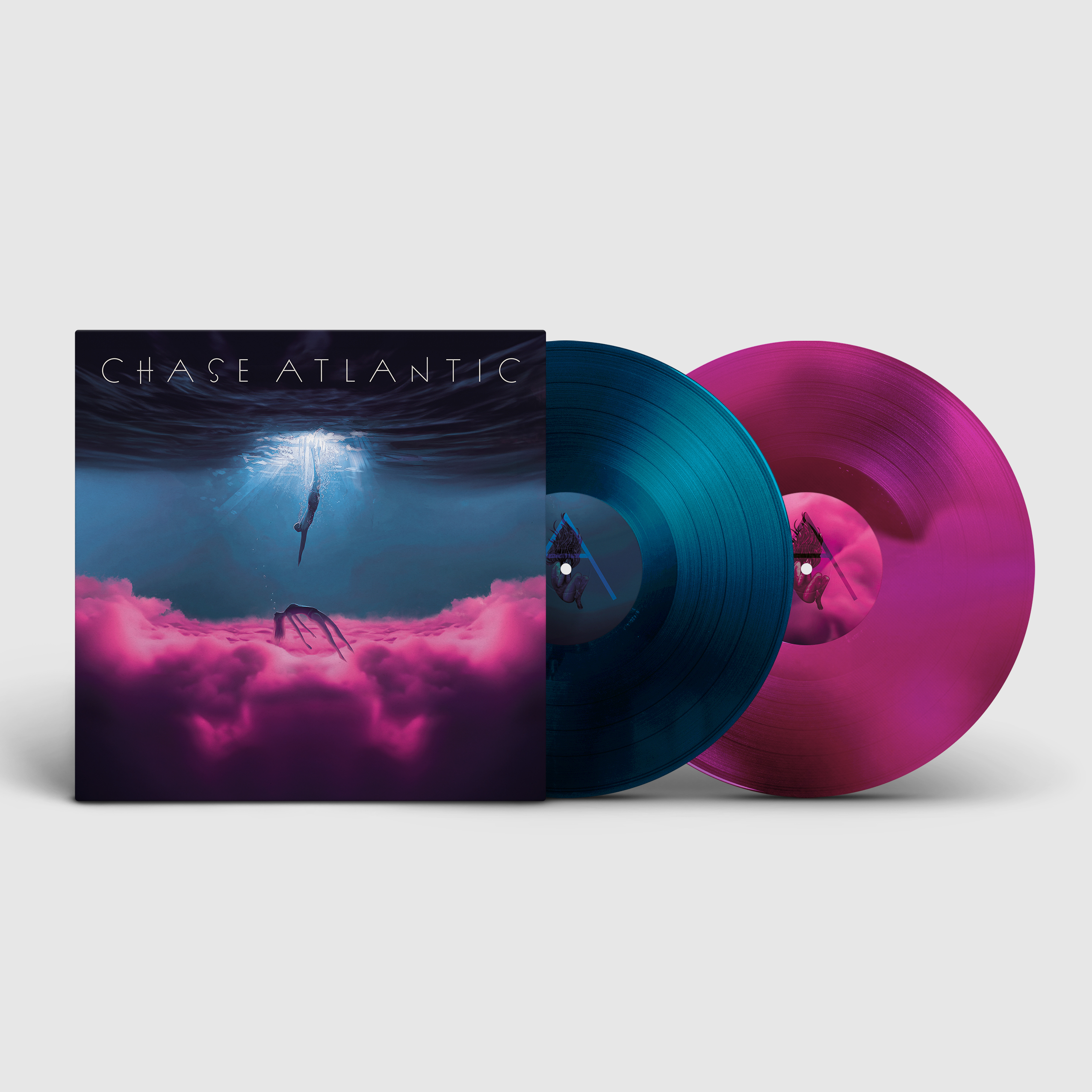
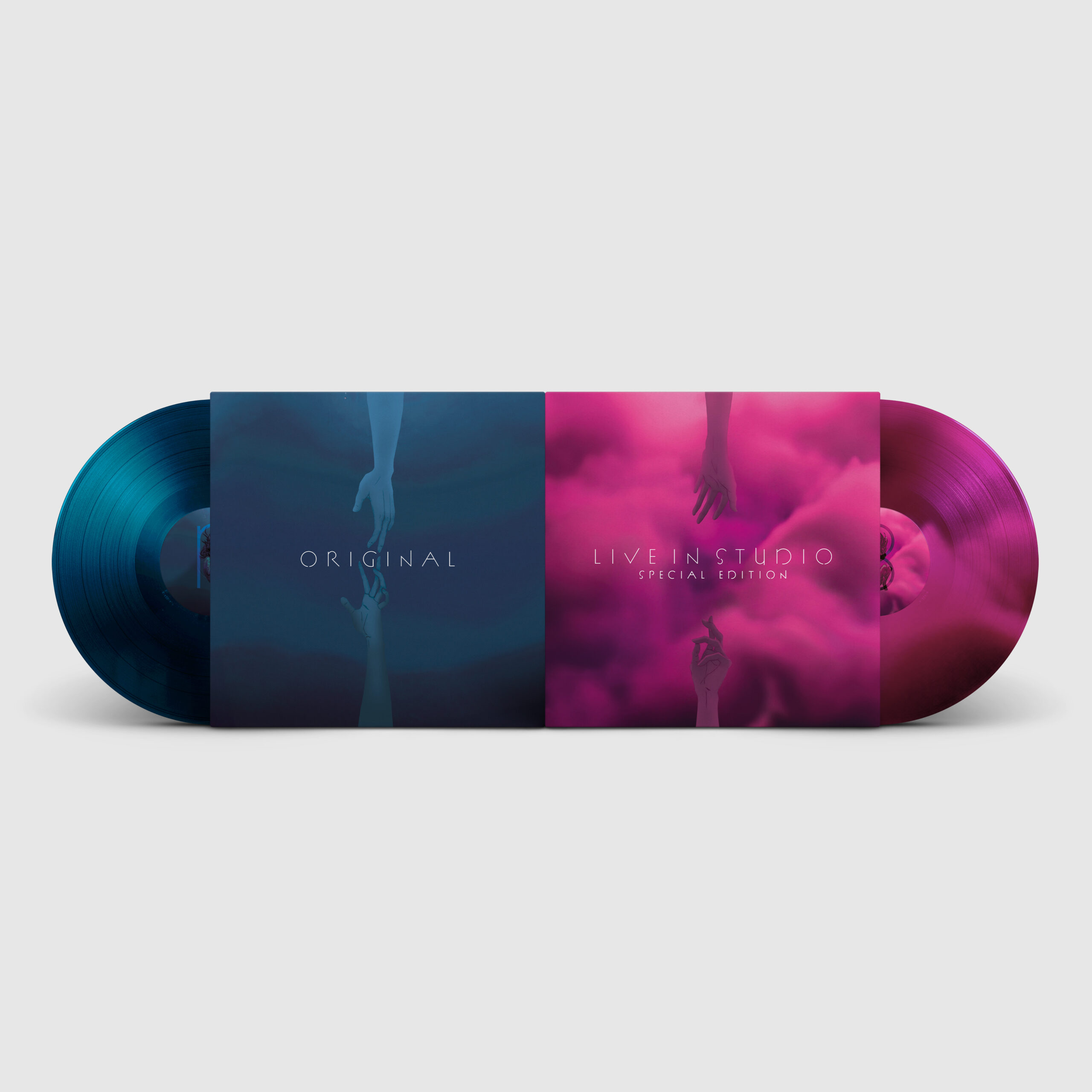
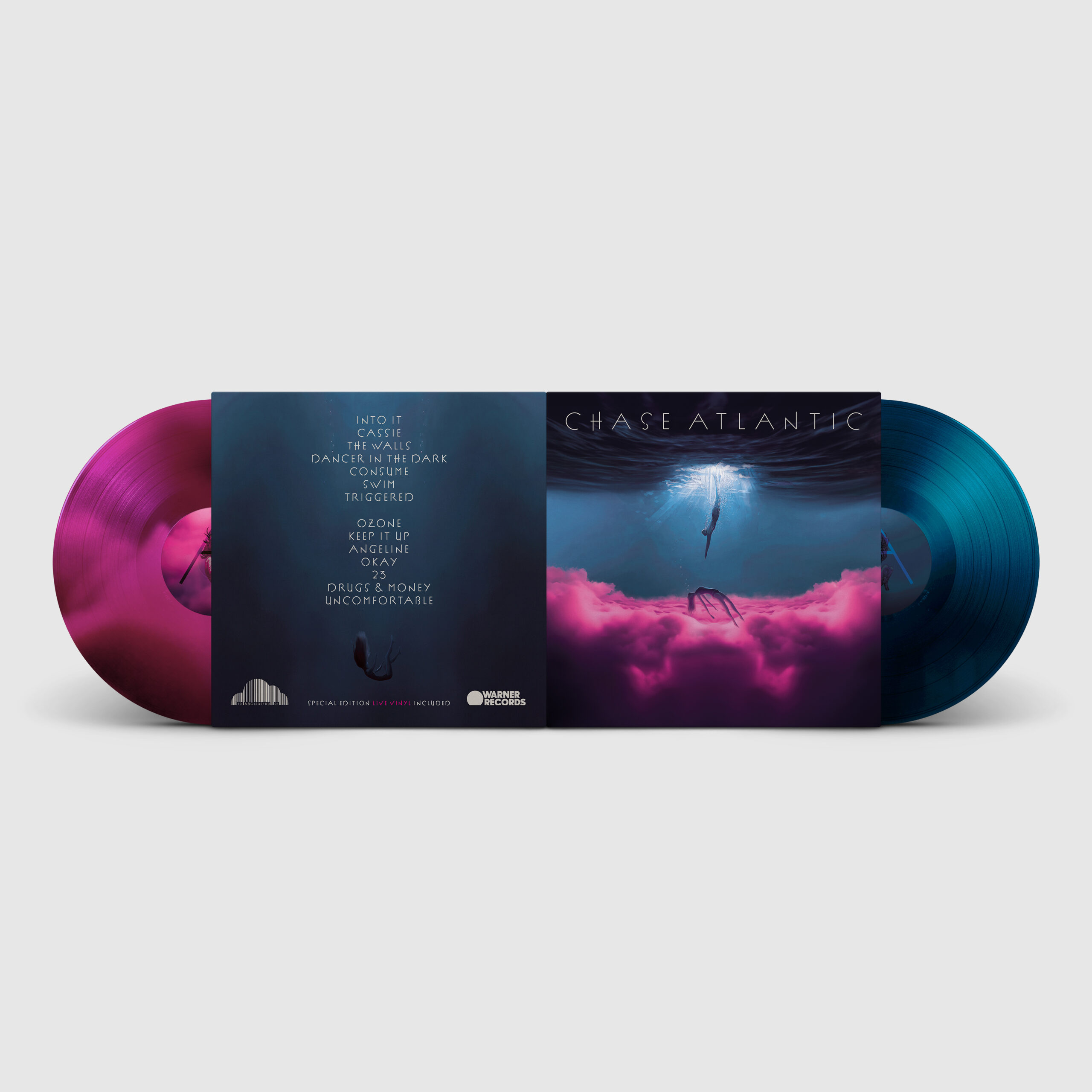
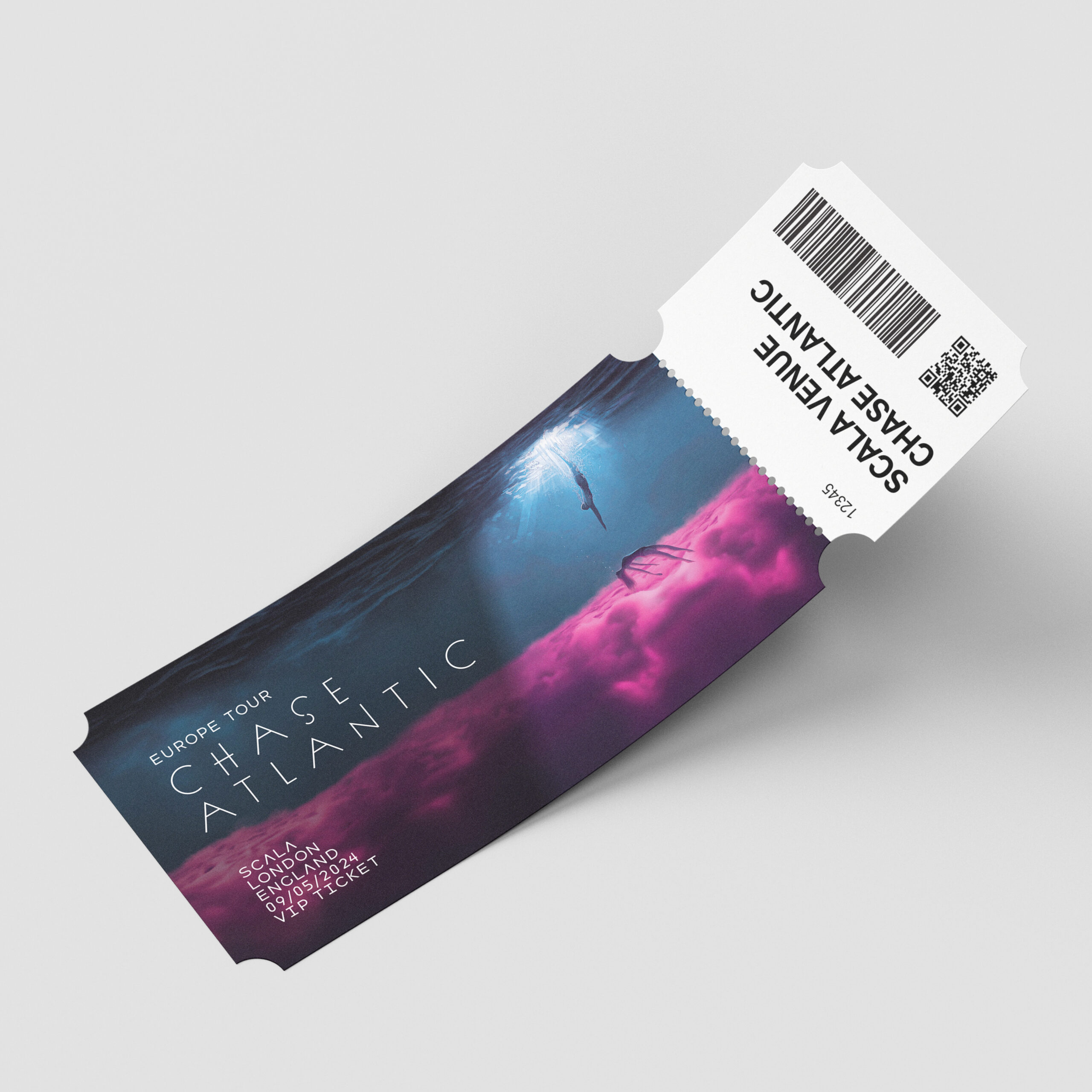
Here is my redesign of Chase Atlantic’s 2017 album. The album contains the vulnerable storytelling of themes such as over-indulgence, pleasure, and self-destruction as the characters fall into the depths of substance abuse. For the redesign, I wanted to encapsulate the raw and emotional storytelling of this album using the visual metaphor of drowning. My designs story follows two main characters becoming further and further apart from each other while the female character drowns in a blissful pink cloud of pleasure, eventually becoming unreachable. The story is expanded upon throughout, from the inside spread to the back cover.
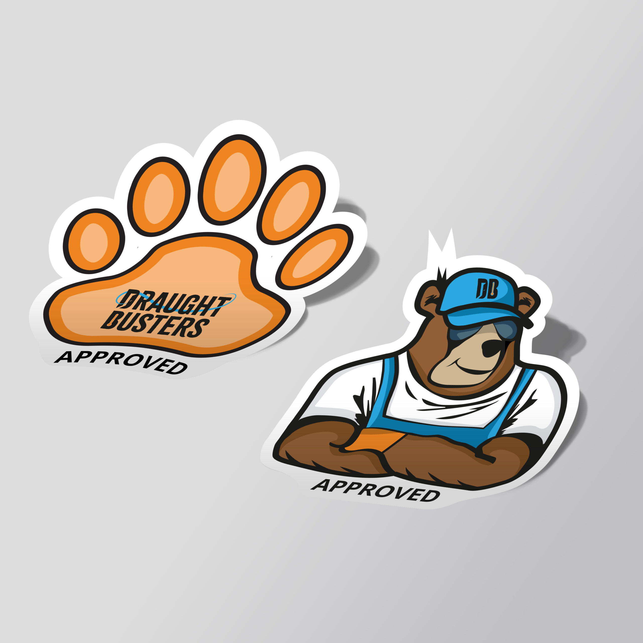
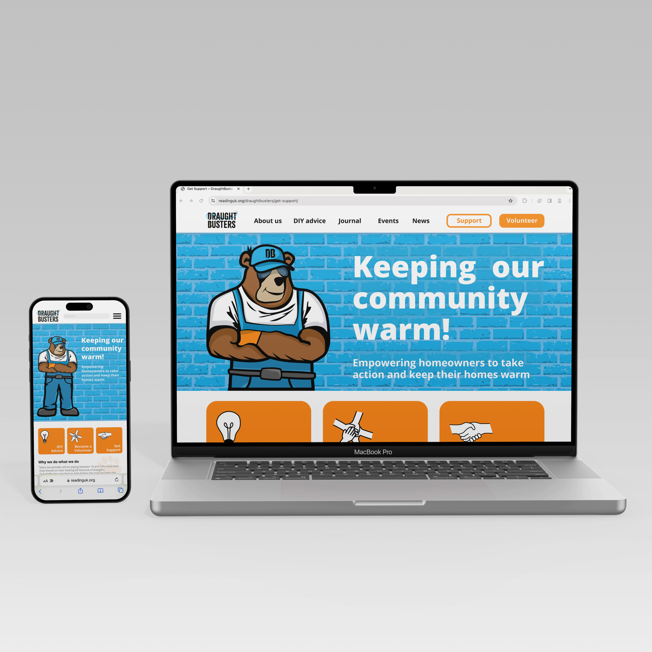
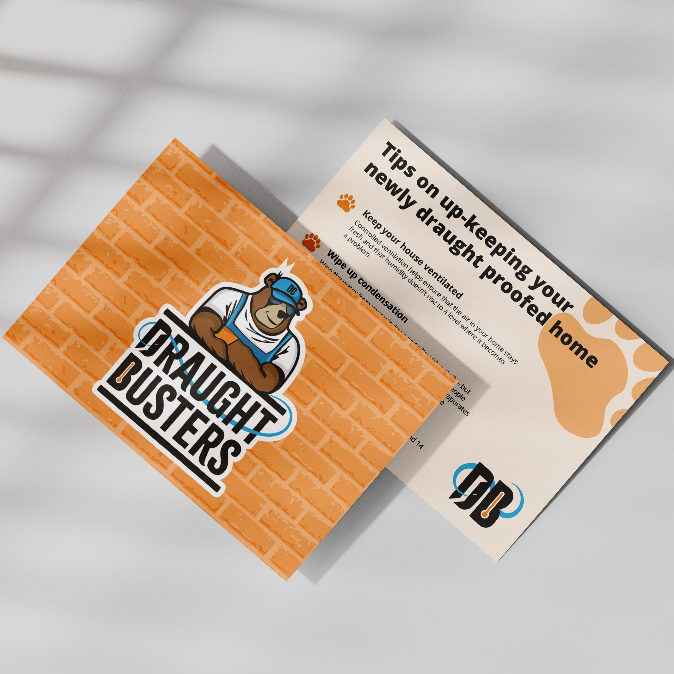
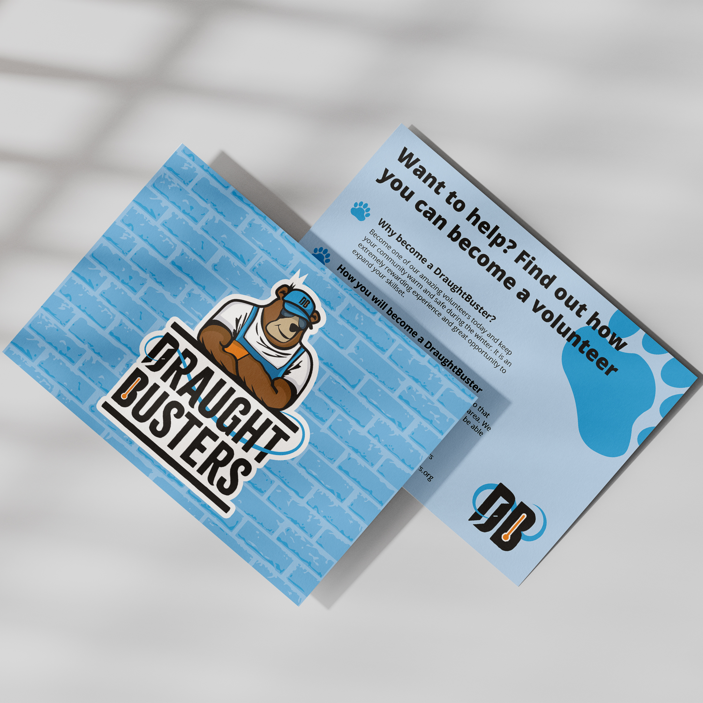
DraughtBusters branding
Here is the rebrand of DraughtBusters– a Reading based non-profit organisation that aims to keep everyone warm and comfortable in their own home. The main charm of this rebrand is the mascot ‘Buster the Bear’, a friendly ‘handy man next door’ character who wants nothing more than to keep the cold out and the community warm. The logo sports a strong, rugged typeface with swirled wind like serifs and a large gust of wind exiting the door in the ‘D’. These decisions tie nicely into DraughtBusters fight against cold windy draughts.
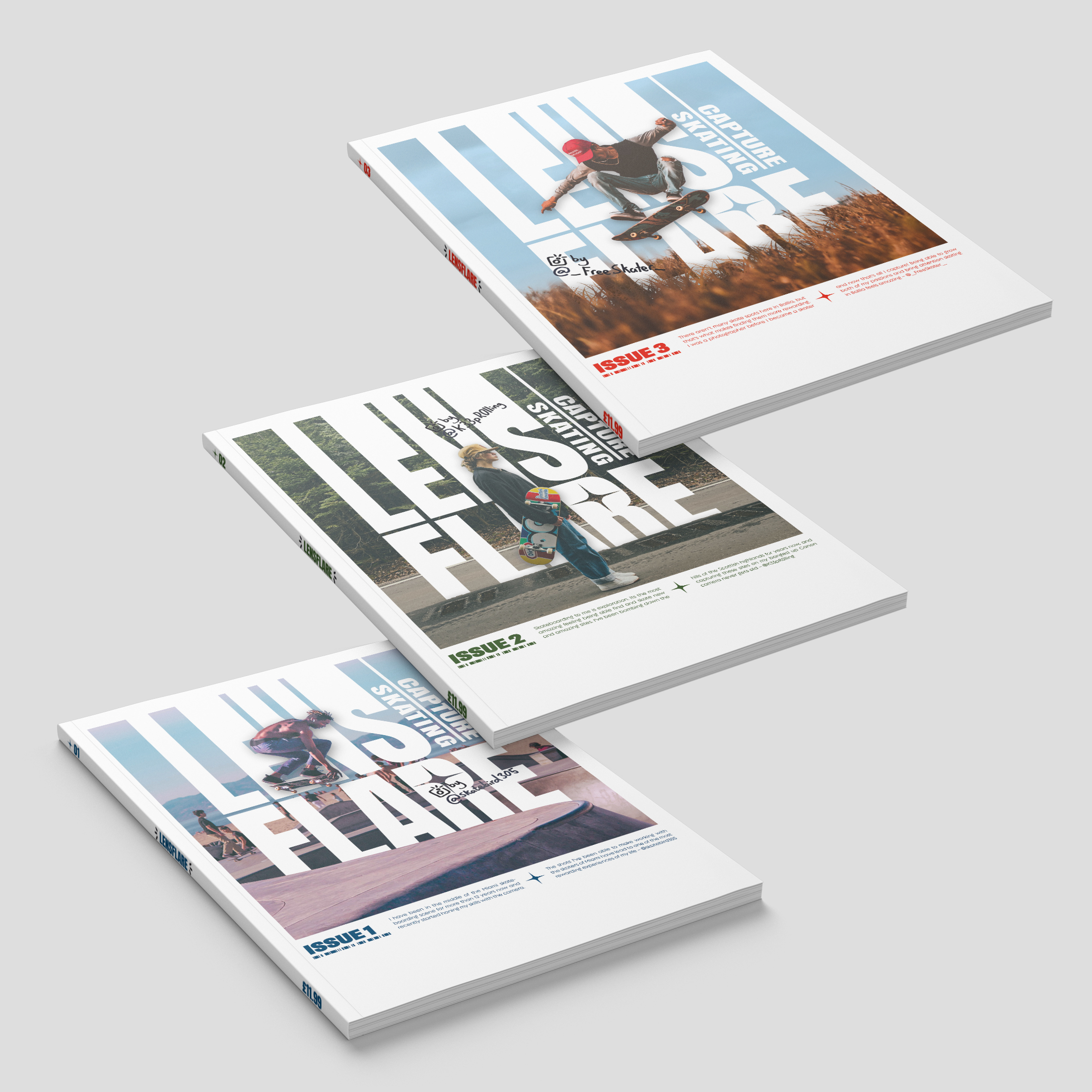
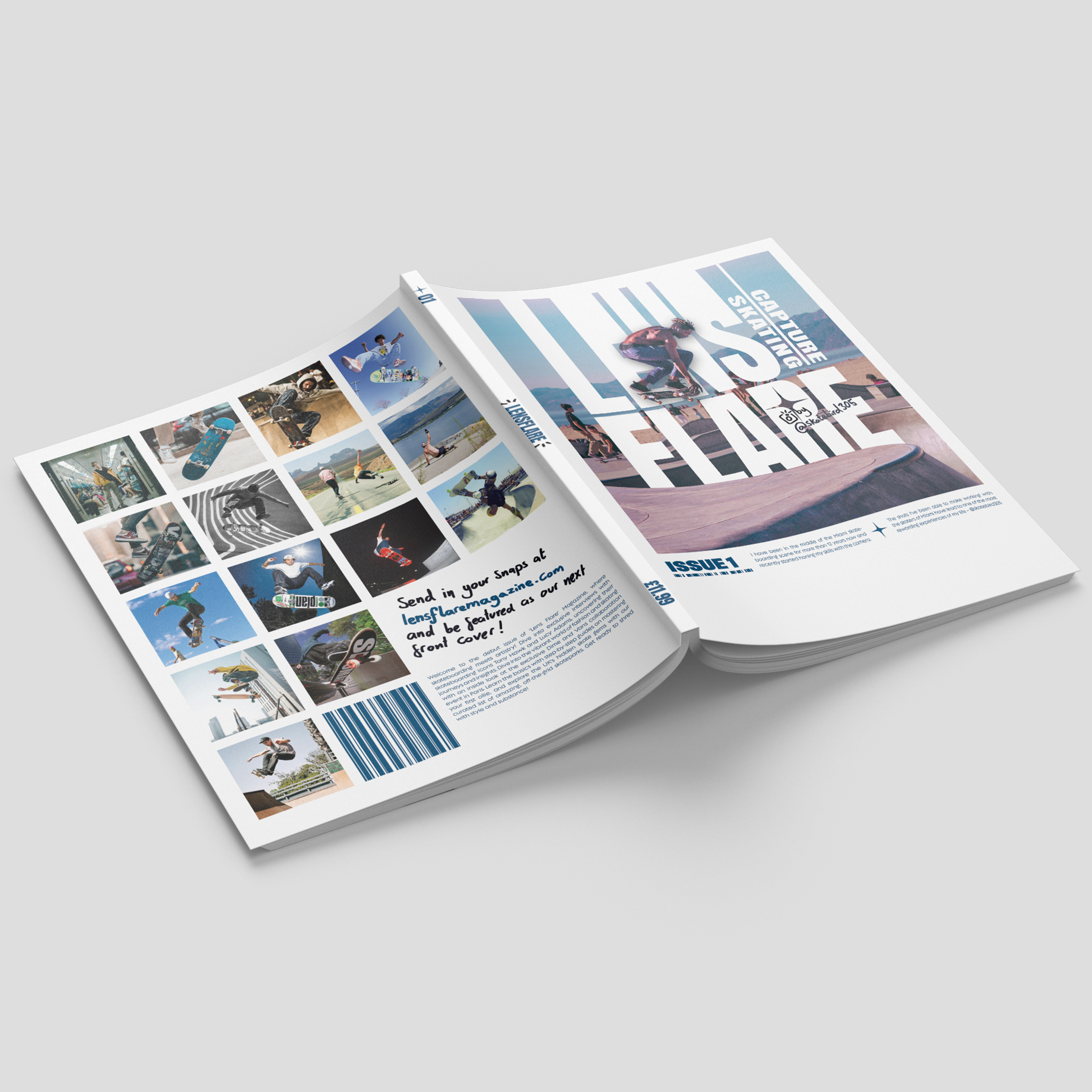
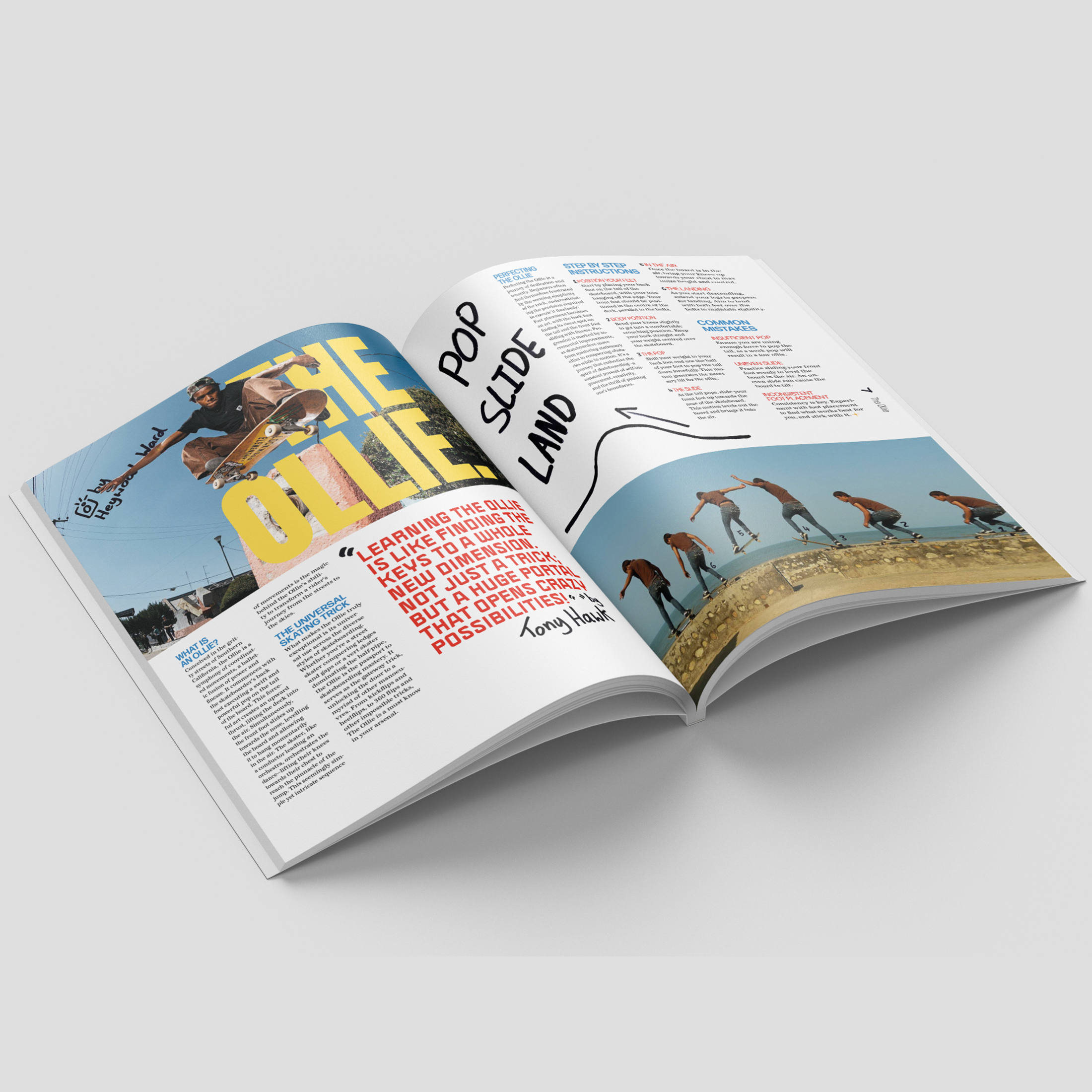
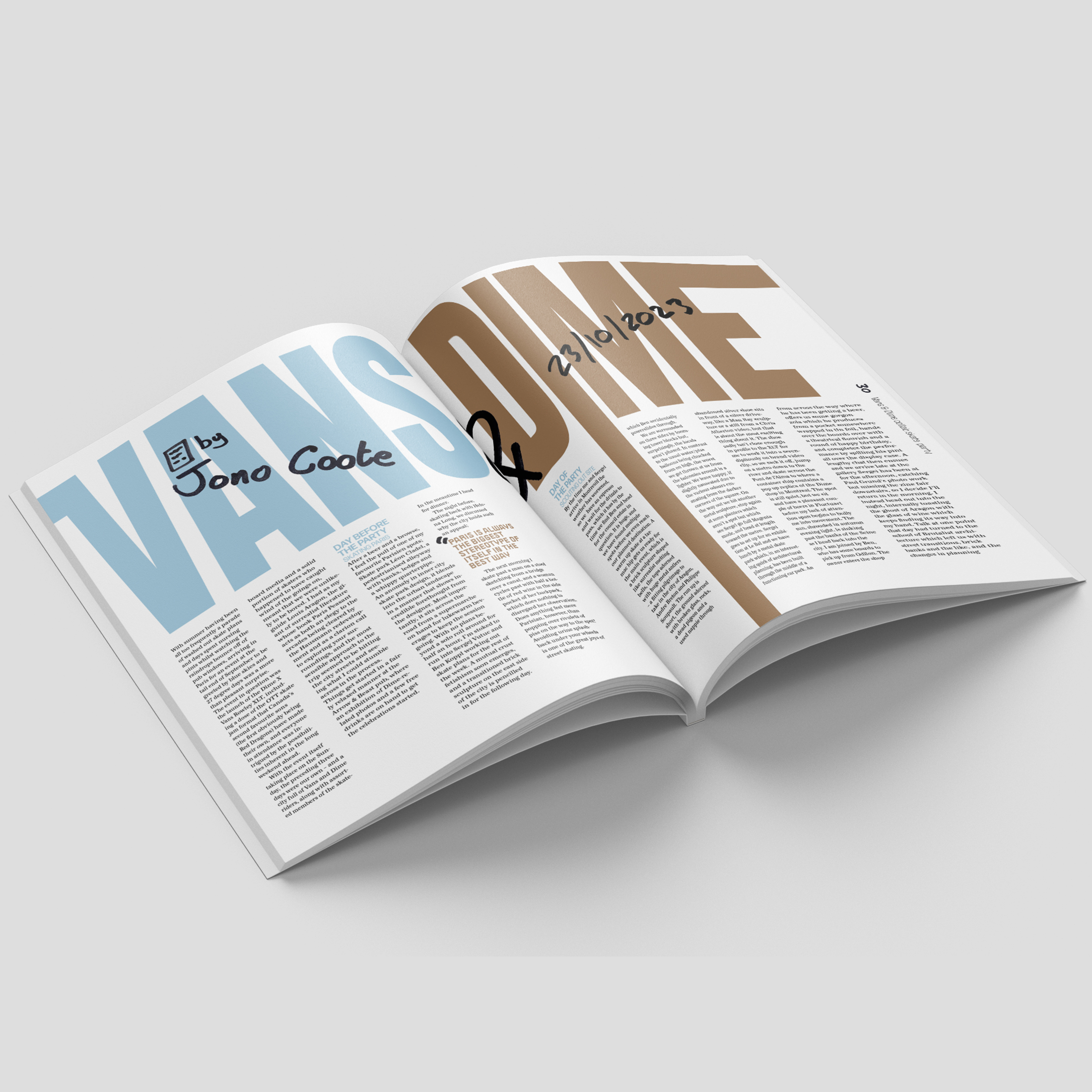
Lens Flare magazine
Lens Flare Magazine aims to capture both the Lens of the camera and the Flare of the trick. The concept of this magazine simultaneously promotes the unique aesthetic of skate culture whilst merging photography and typography into an exciting and dynamic visual feel. The contrast between heavy sans serif type and hand-written Sharpie emphasises the creative individuality within the subculture of skaters. This creative individuality is further pushed through the concept of reader involvement with the photography for each of the covers – sharing the same dimensions as a Polaroid – being sourced through audience submissions.
Hi, I’m Neve. I have always had an eye for creativity and am passionate about pursuing a career in design. Over the past three years, I have had the opportunity to design for real clients, broaden my digital skillset, and learn how to create impactful designs. I value approaching projects with empathy and a critical mind, and hope to continue growing my skill set in future collaborative projects and respected work environments.
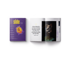
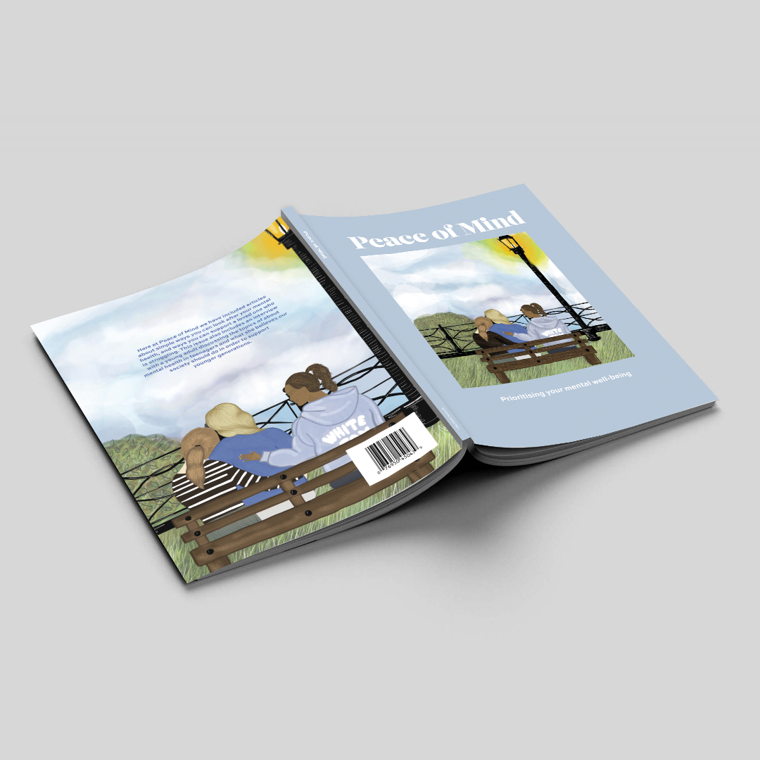
This project consisted of us designing and crafting a magazine about a topic close to our hearts. Peace of Mind is a magazine dedicated to helping young adults with their mental health. It includes articles from specialists on the small steps you can do every day to look after your mental well-being, and ways you can help a loved one that is struggling. I wanted my magazine to have a calming and personable feel, so I illustrated all images and spreads to create a peaceful, sensory experience for readers who are experiencing a difficult time whilst reading.
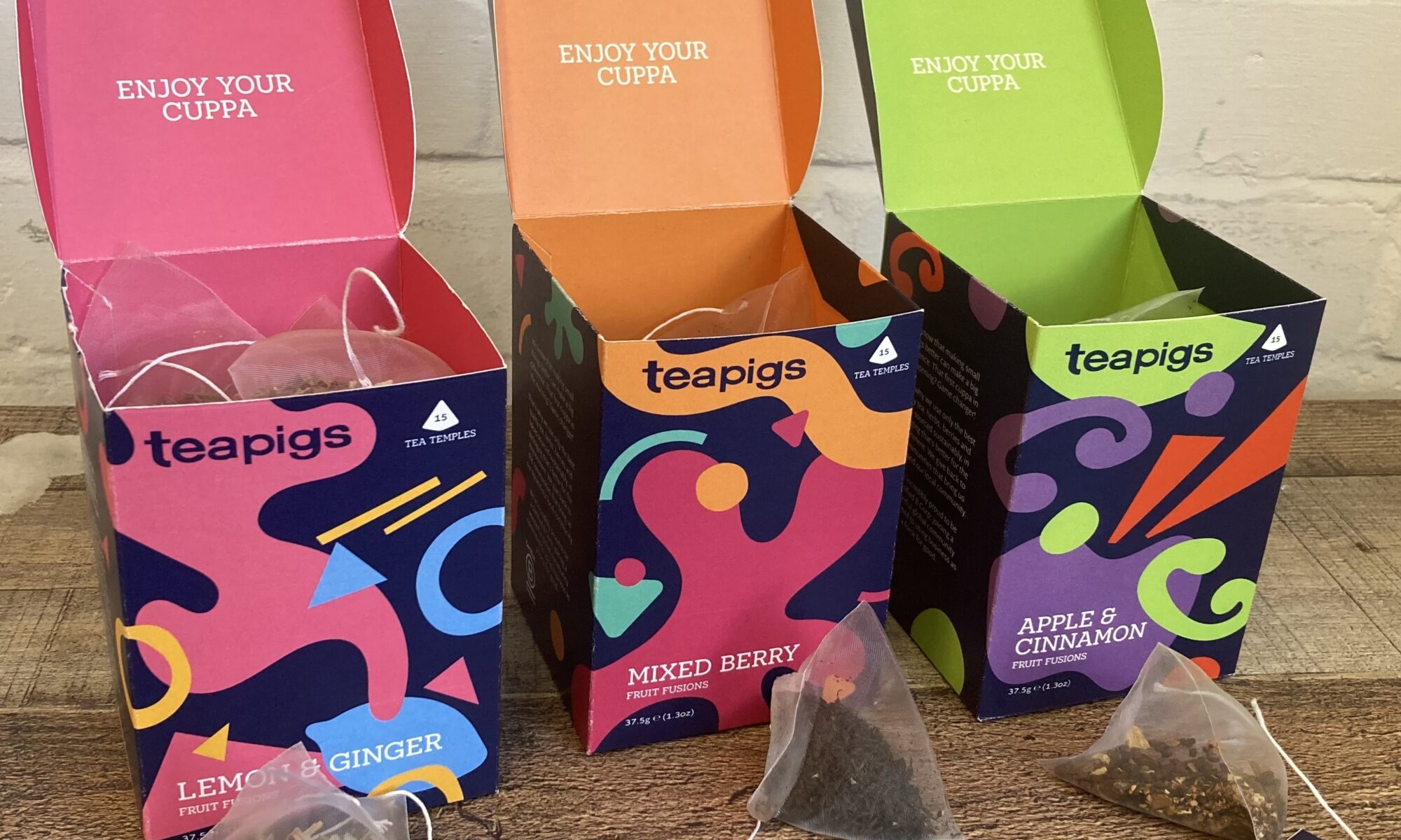
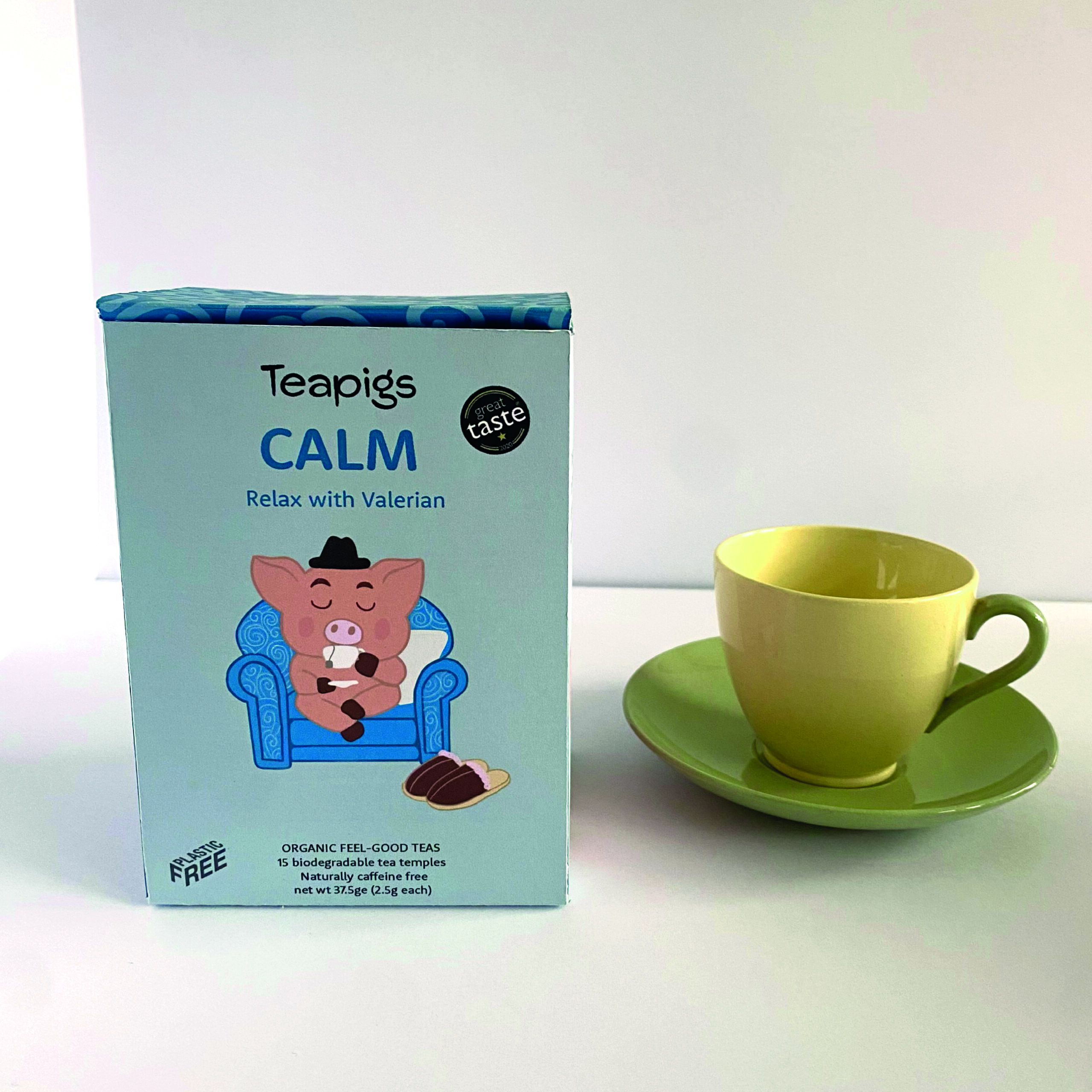
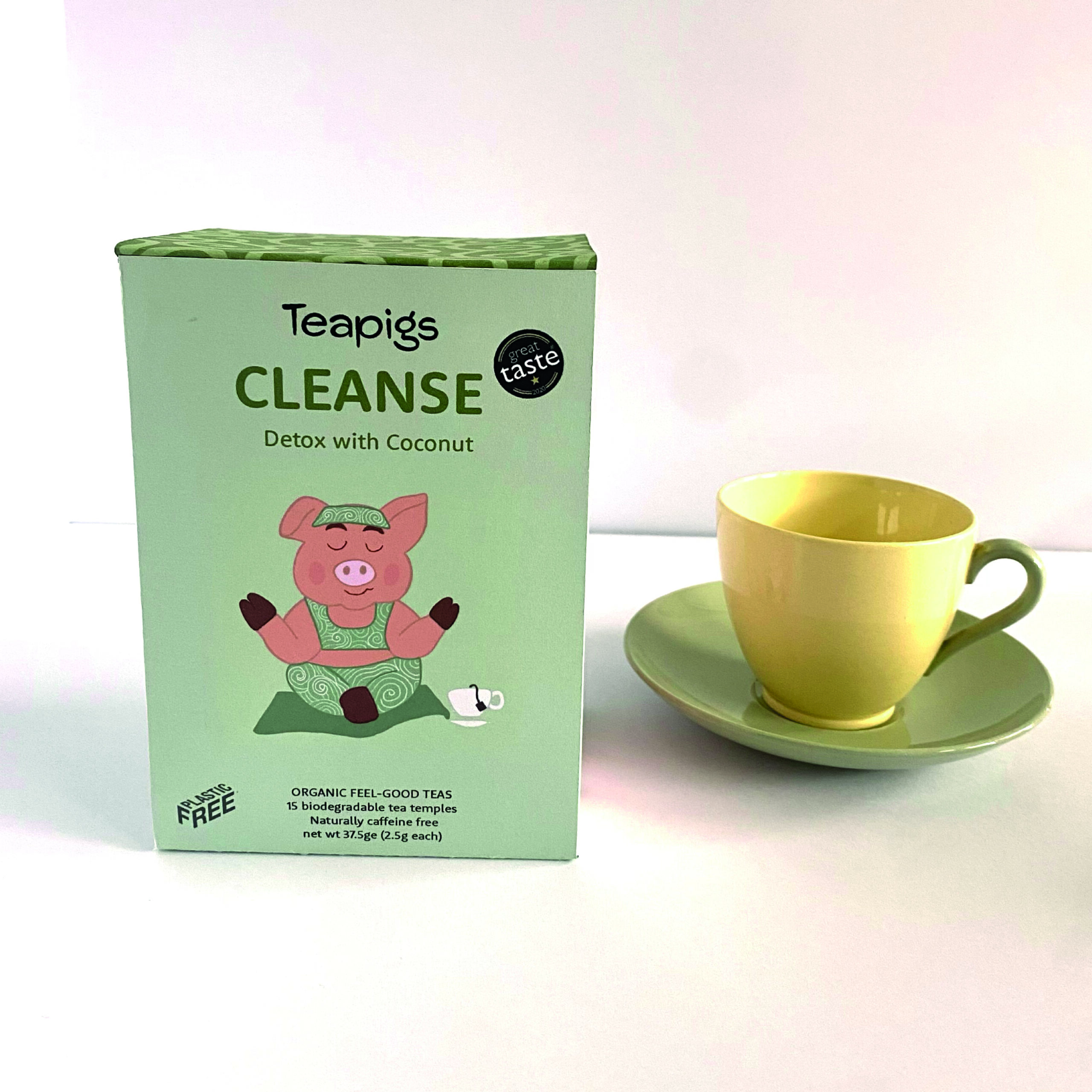
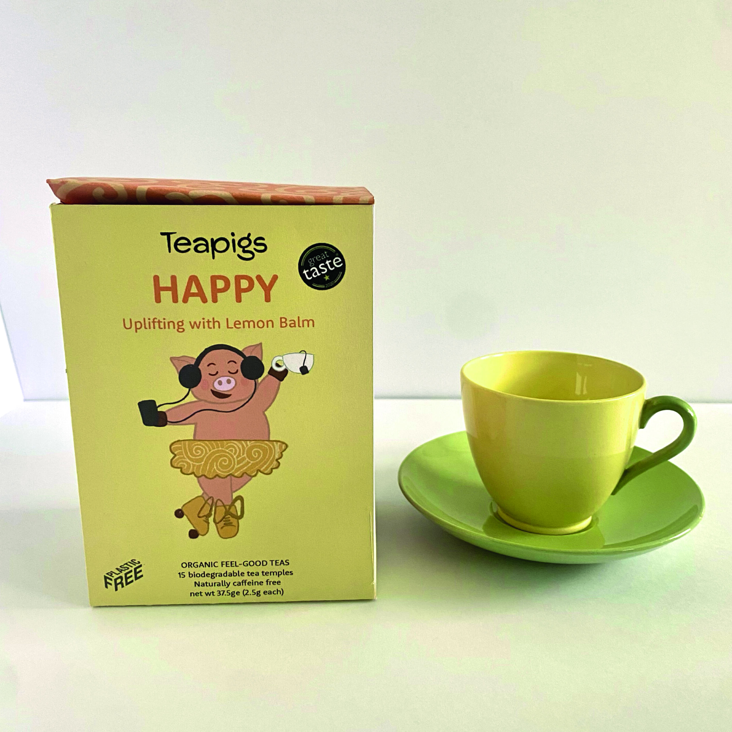
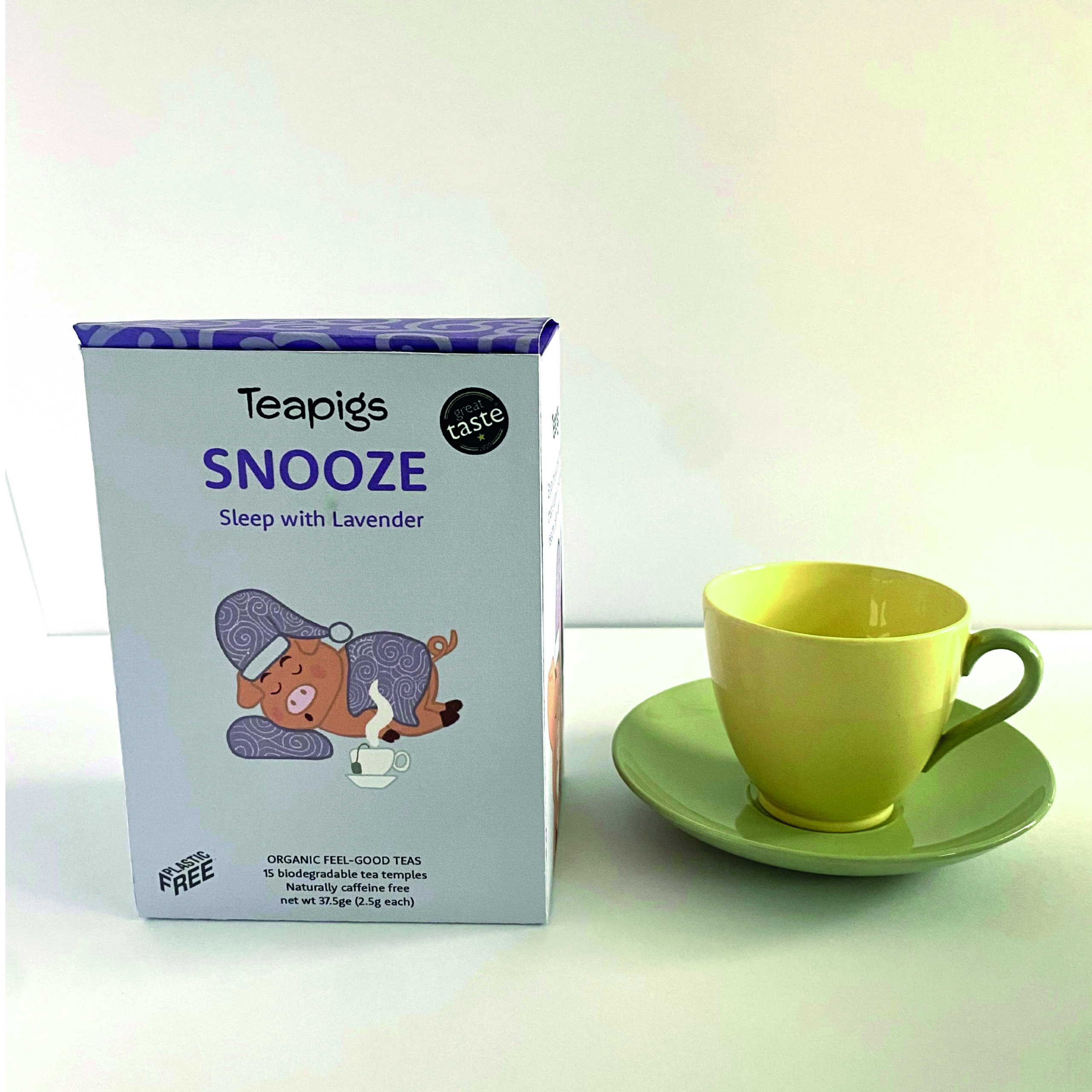
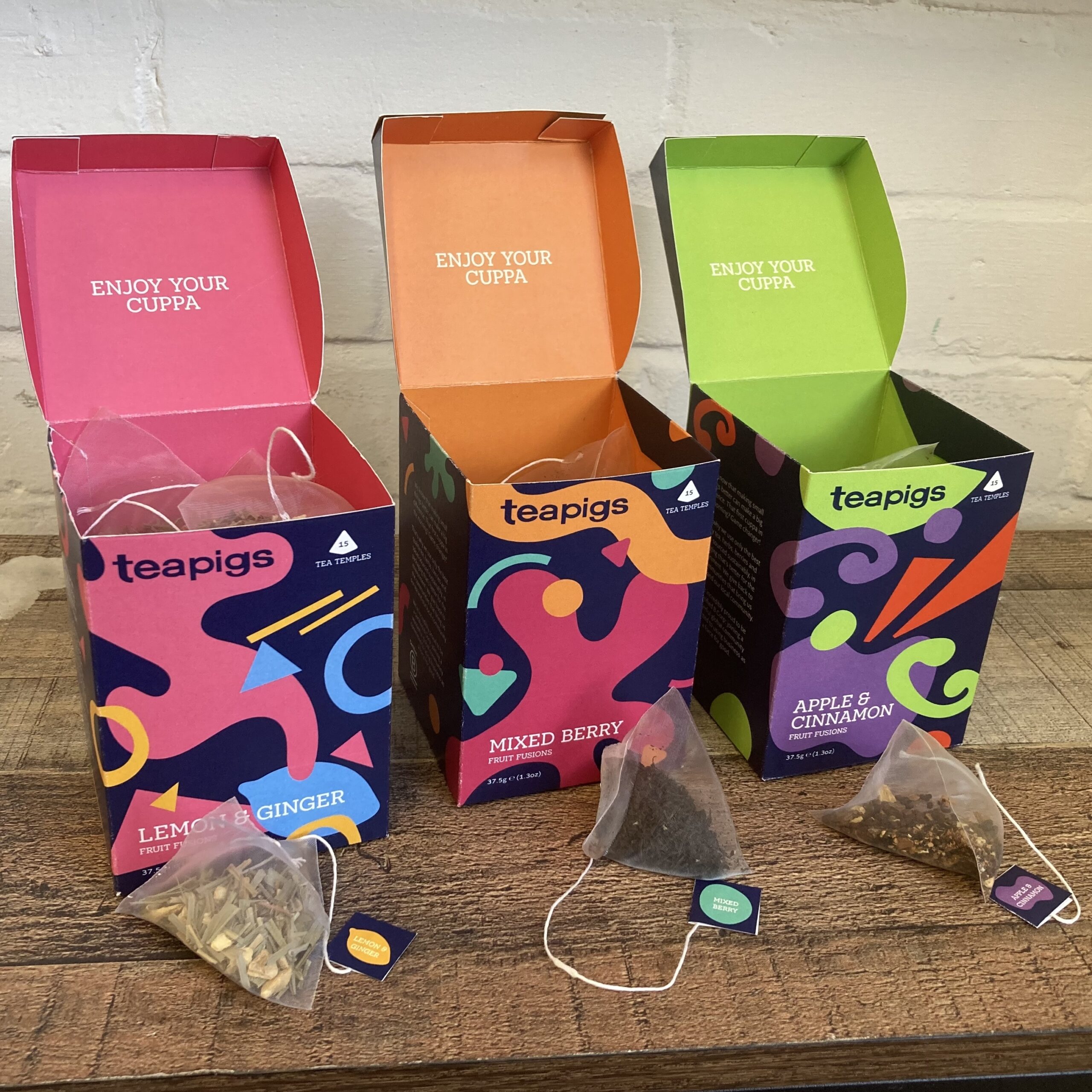
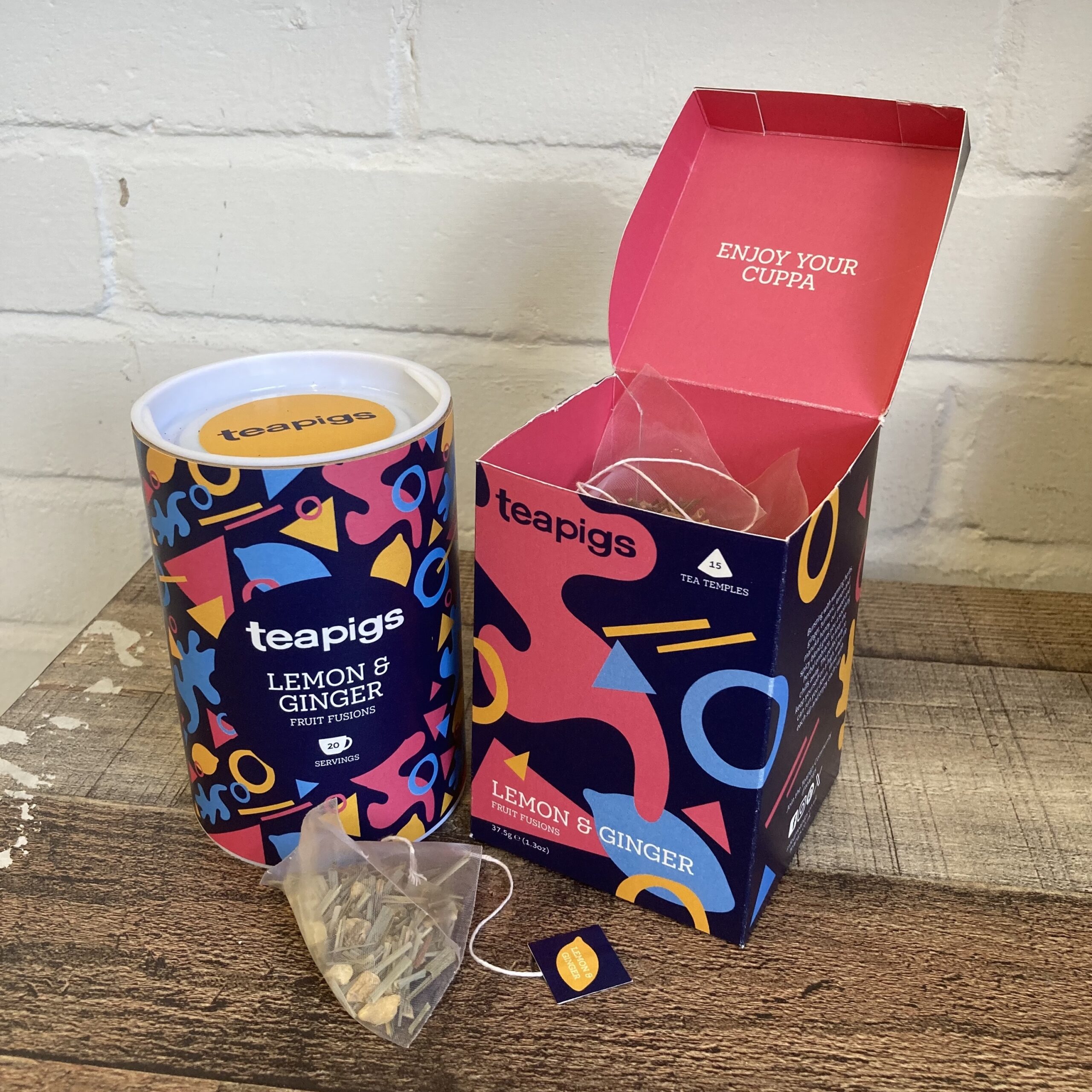
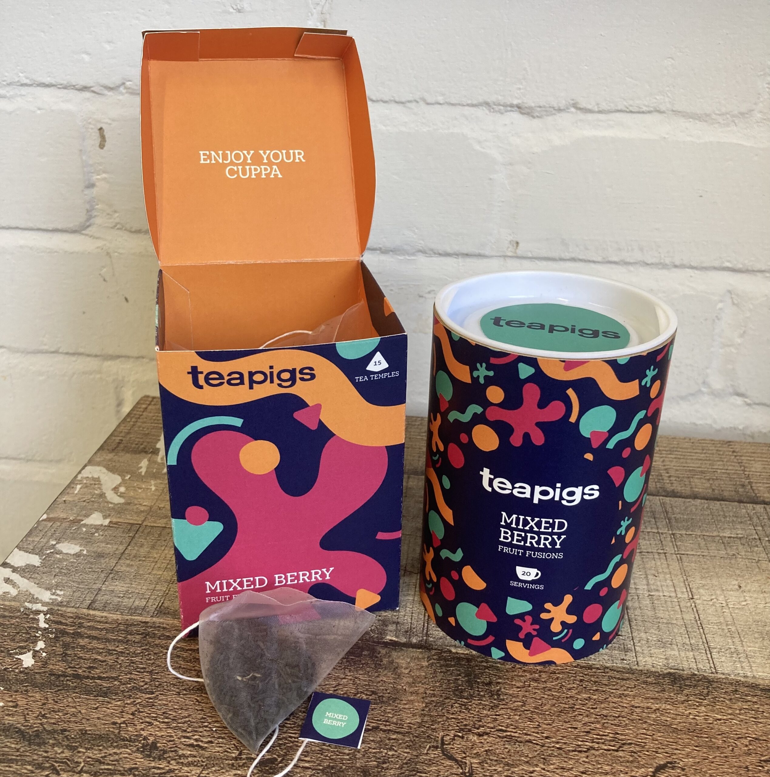
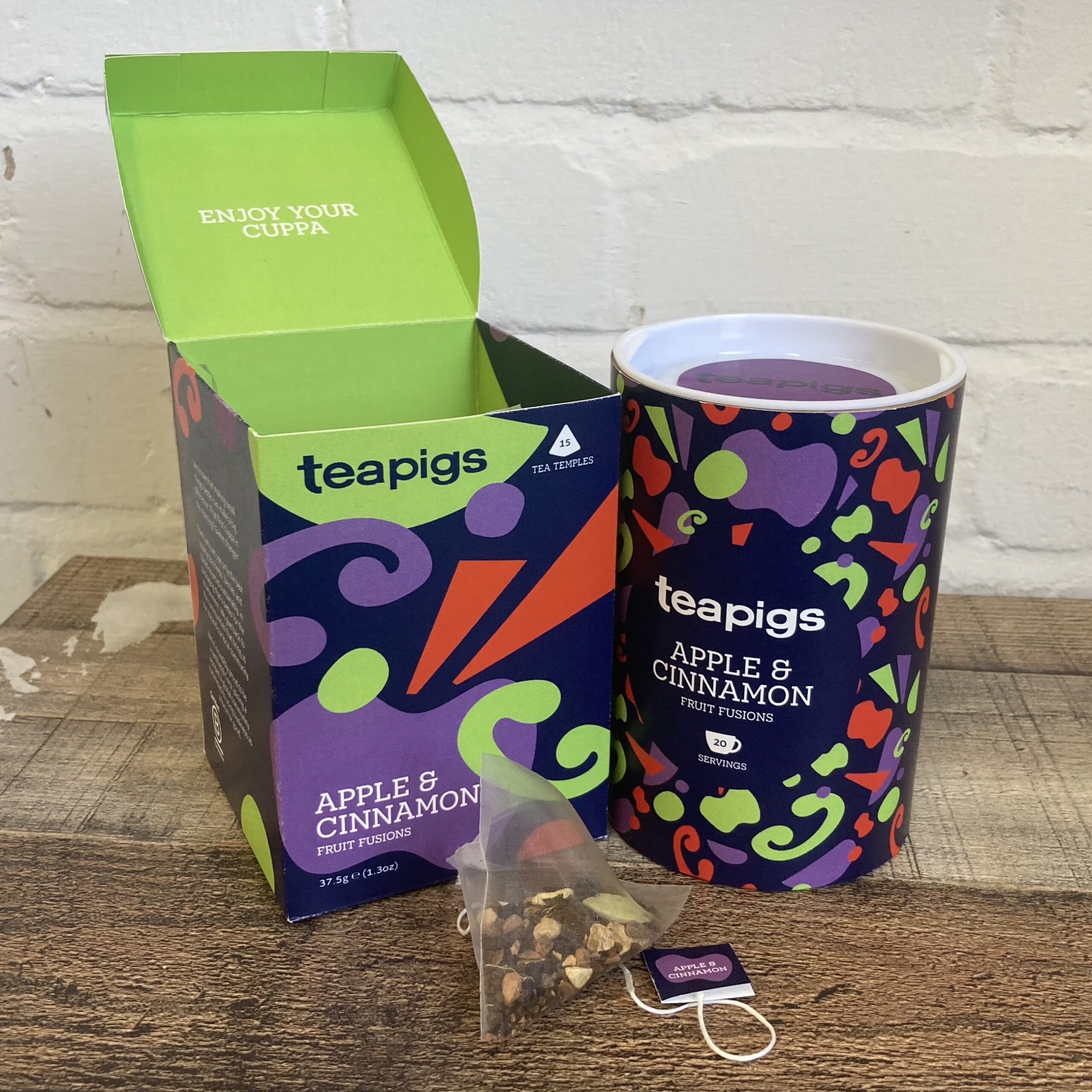
Teapigs packaging
Teapigs is recognised for prioritising big flavours and new ways to make their products sustainable. For this packaging project, I wanted my designs to reflect Teapigs’ joyful brand identity and their mission of making tea fun again when you’re having your morning brew. I illustrated cartoon pigs relating to the theme of this collection of well-being teas to create a recognisable brand identity, and to reflect Teapigs’ uniqueness.
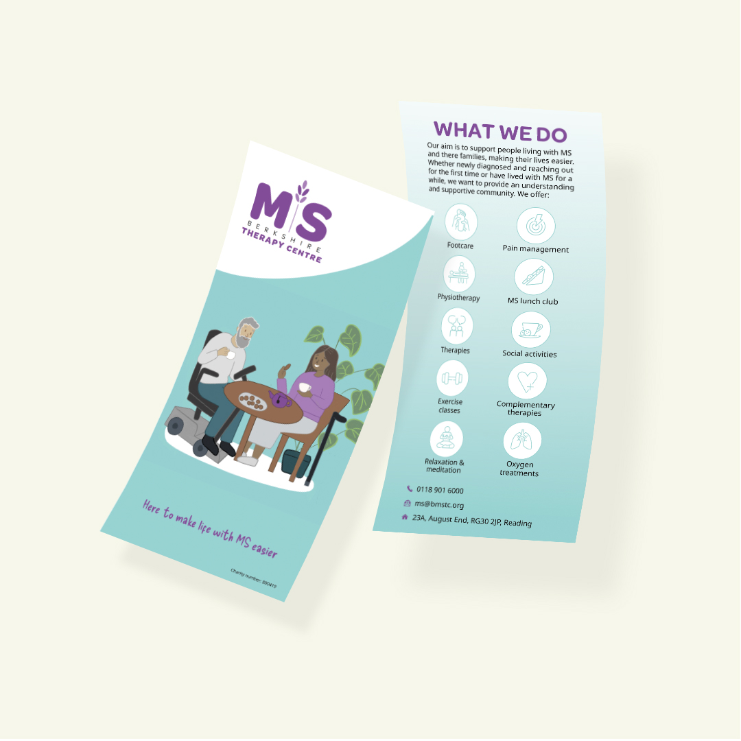
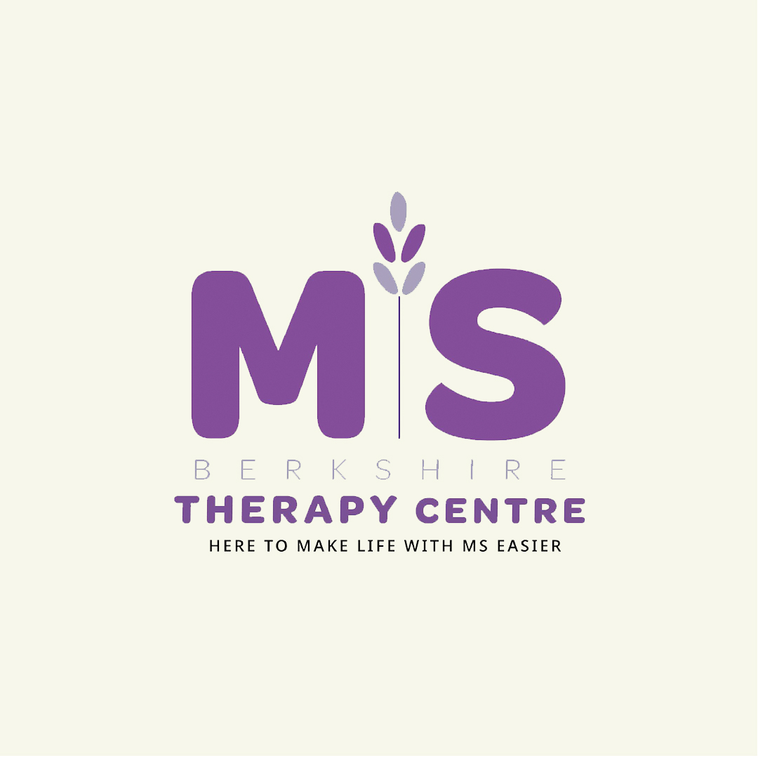
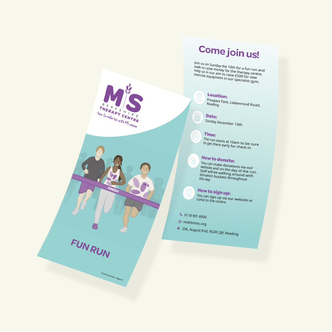
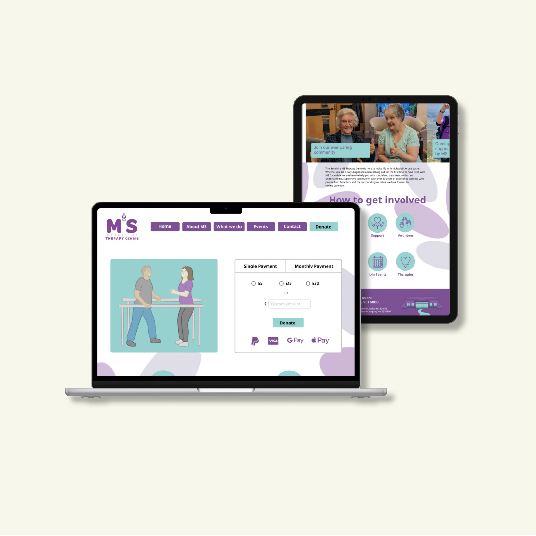
Berkshire MS Therapy Centre branding
Berkshire MS Therapy Centre was created by people who have a personal experience with MS for people with MS. This centre not only cares for their members physical health but also their mental and emotional well- being, and that of their loved ones. For this rebrand, it was important for my group to make our designs represent the centres compassionate and supportive services. We redesigned their collateral advertisement, logo, and their online presence. I designed the leaflets with an illustrative style and the lavender embedded logo, to give the brand a friendly and calming visual identity.
Hi, I’m Nelly! I have had a passion for creativity from an early age. My 3 years at Reading have been a transformative experience offering me the chance to develop and build on my skills. Above all, the Real Jobs Scheme has provided me with a number of opportunities to gain professional experience with real clients. This has given me an insight into the creative challenges of delivering a brief and a wider understanding of the overall dynamics within the industry. I pride myself on my attention to detail. I’m quick to adapt and eager to learn. I’m constantly seeking new opportunities and pushing myself to explore new things.
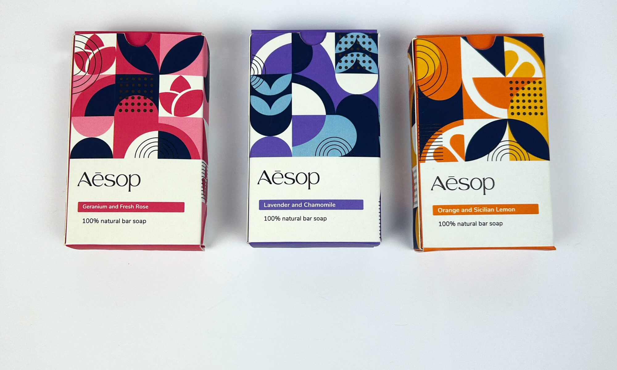
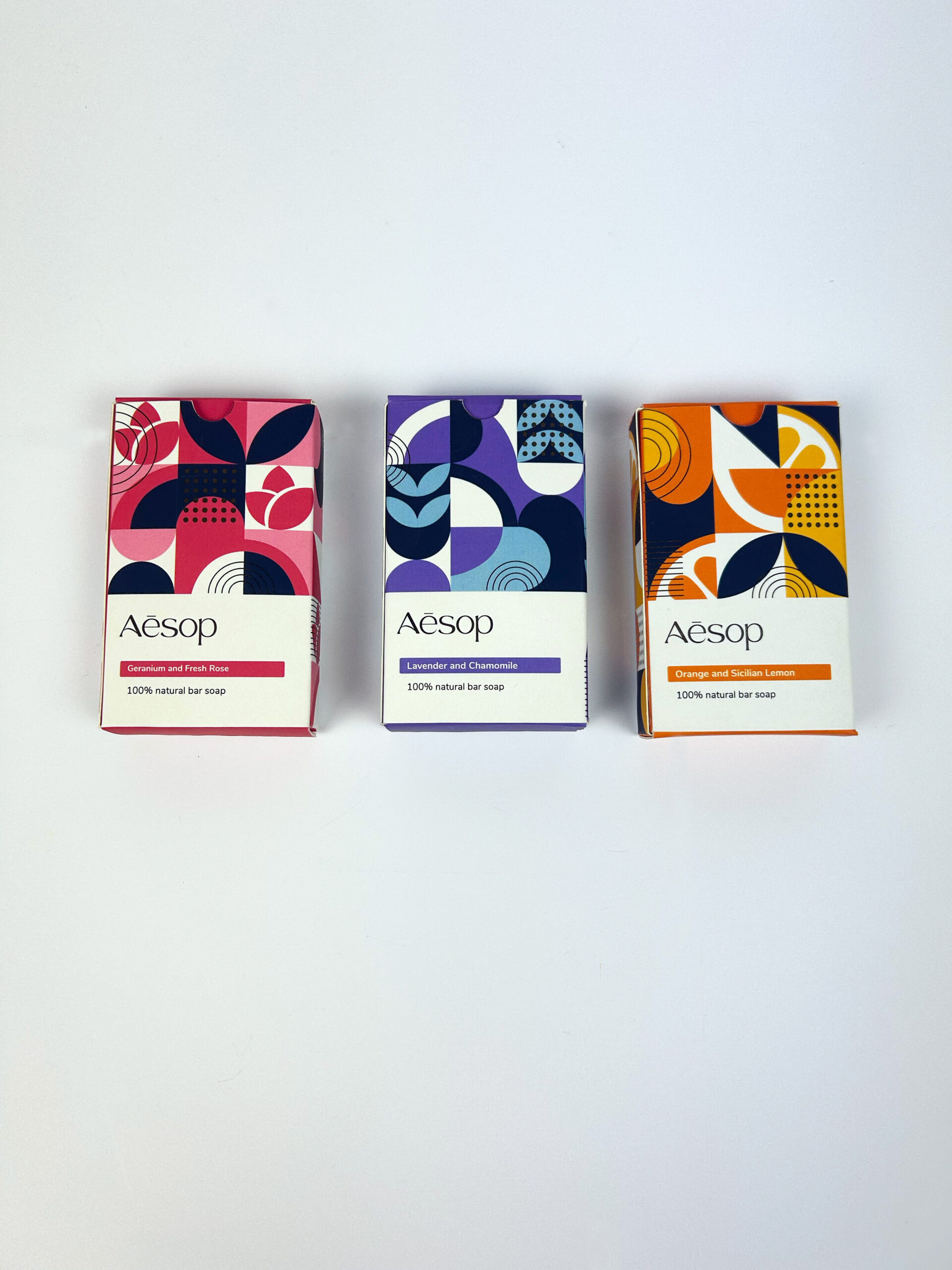
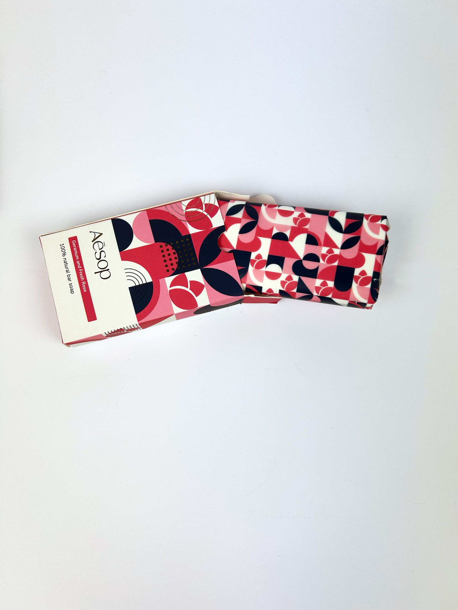
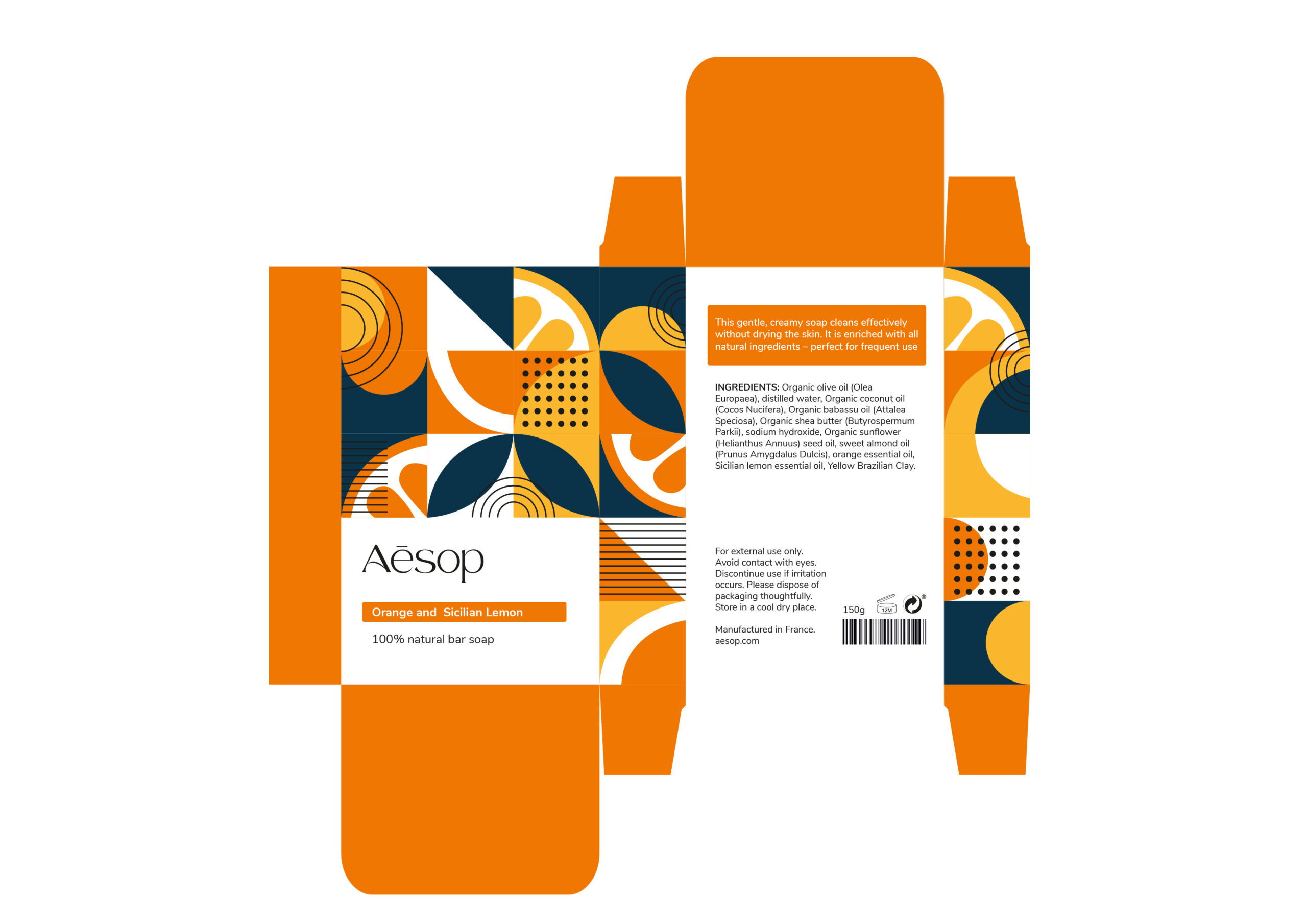
I undertook the challenge of redesigning Aesop's packaging with a specific focus on their bar soaps. The current packaging, whilst functional, lacks character. For this packaging project, I proposed a redirection for the brand to commit to using all-natural ingredients and work towards sustainability. The new packaging design embodies this shift through the use of geometric style patterns that evoke natural elegance. Each soap bar features refined gold foiling details to highlight the brand’s luxury.
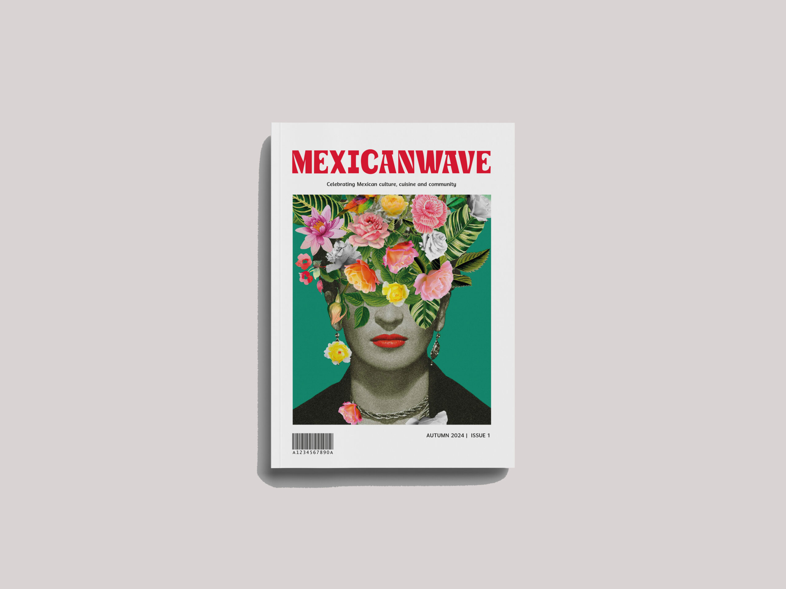
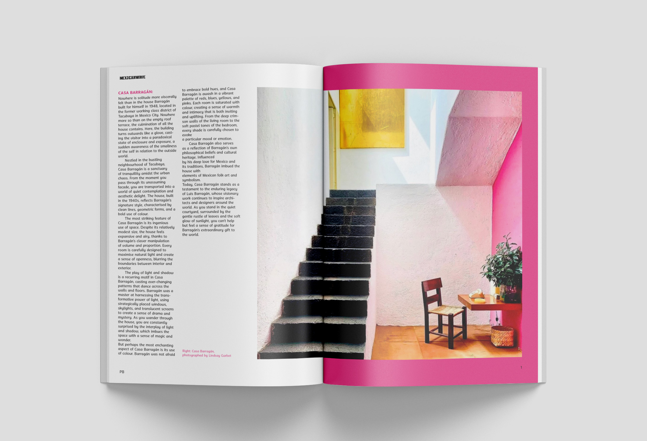
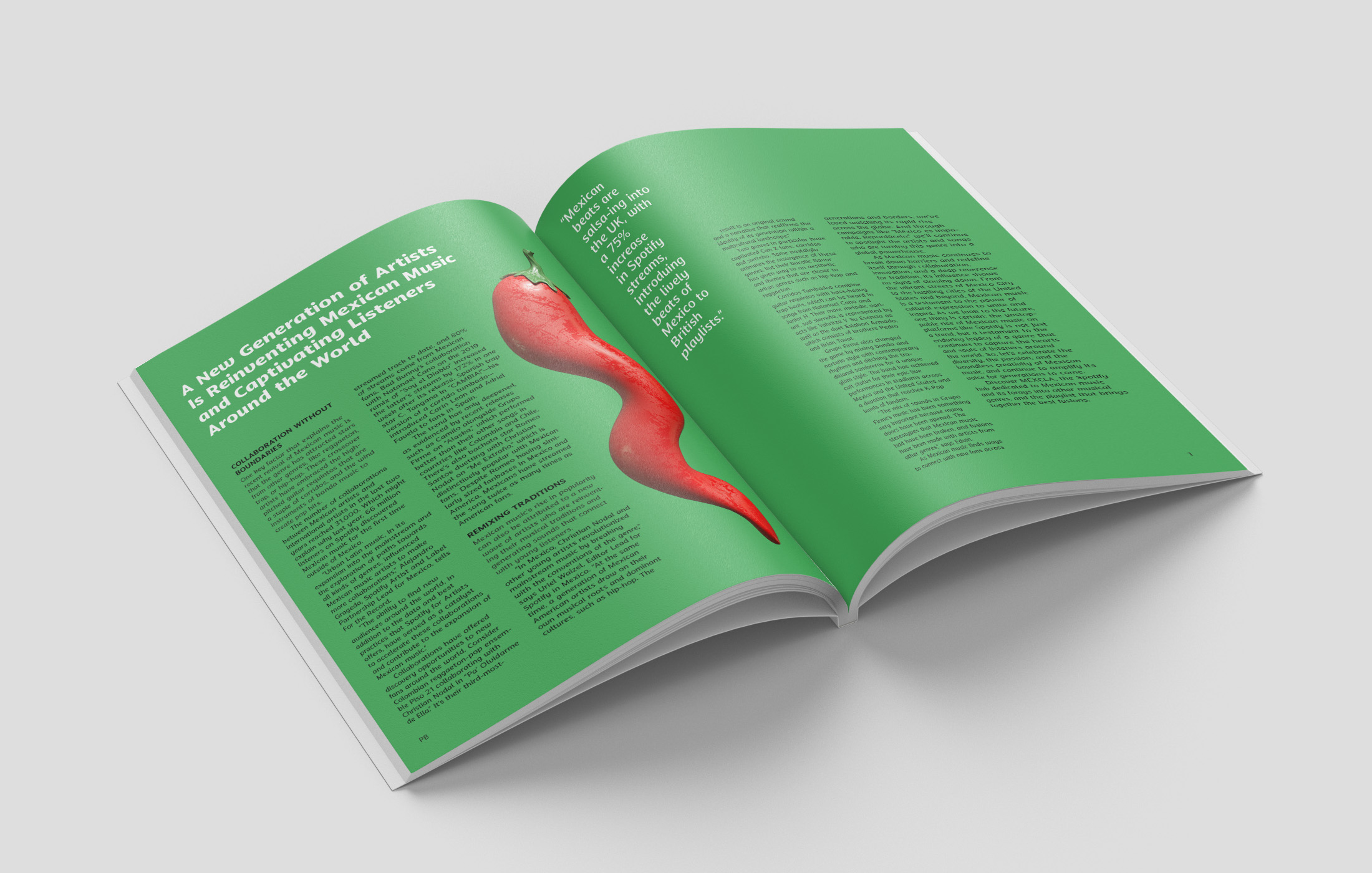
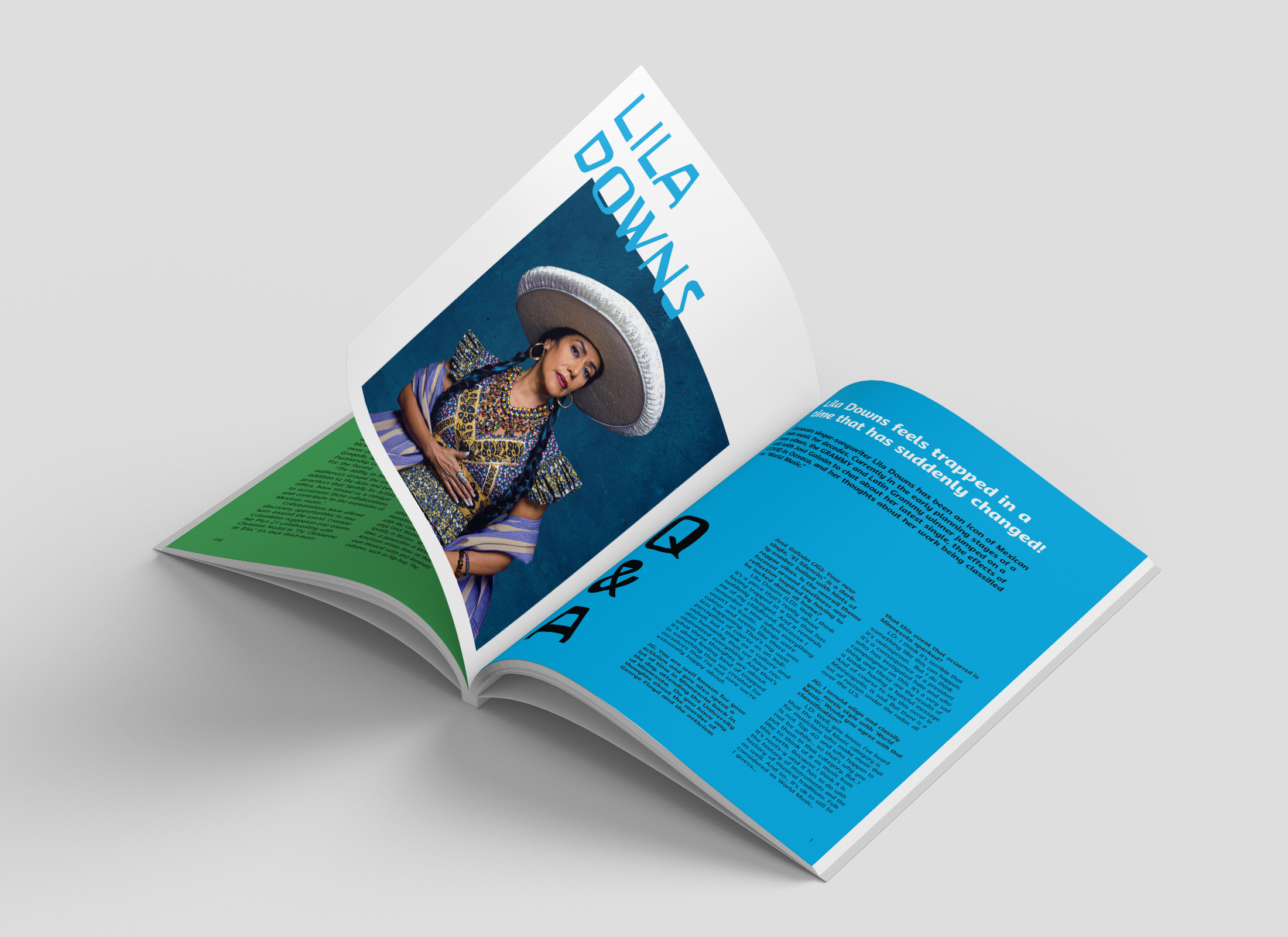
Mexicanwave magazine
Mexicanwave is an independent magazine that celebrates Mexican culture, cuisine, and community. It is driven by a desire to share the wonders that Mexico has to offer by immersing readers into the colourful world of Mexico and highlighting appreciation for its people and culture. Mexicanwave is designed for the culturally curious and for those who have a taste for authenticity.
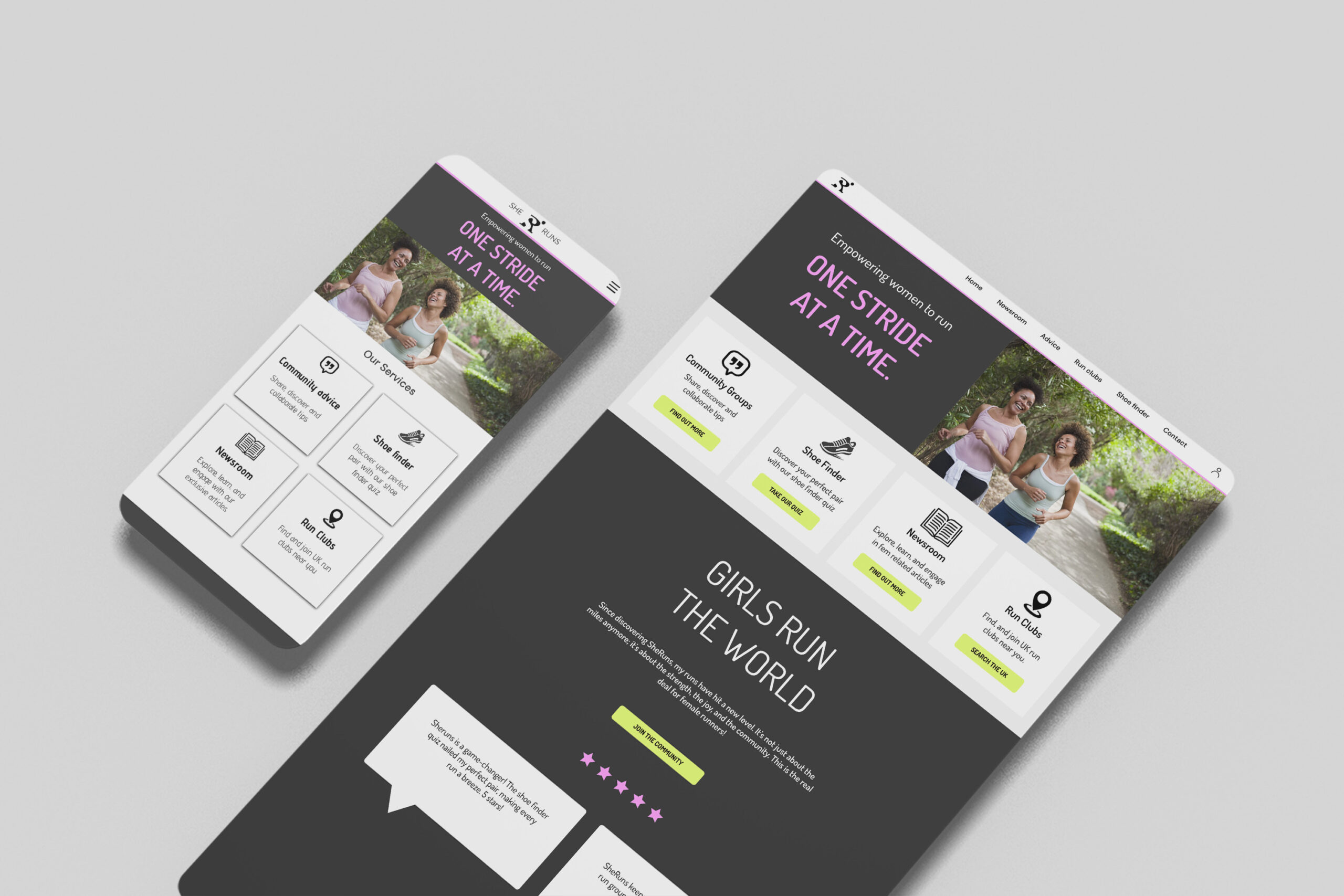
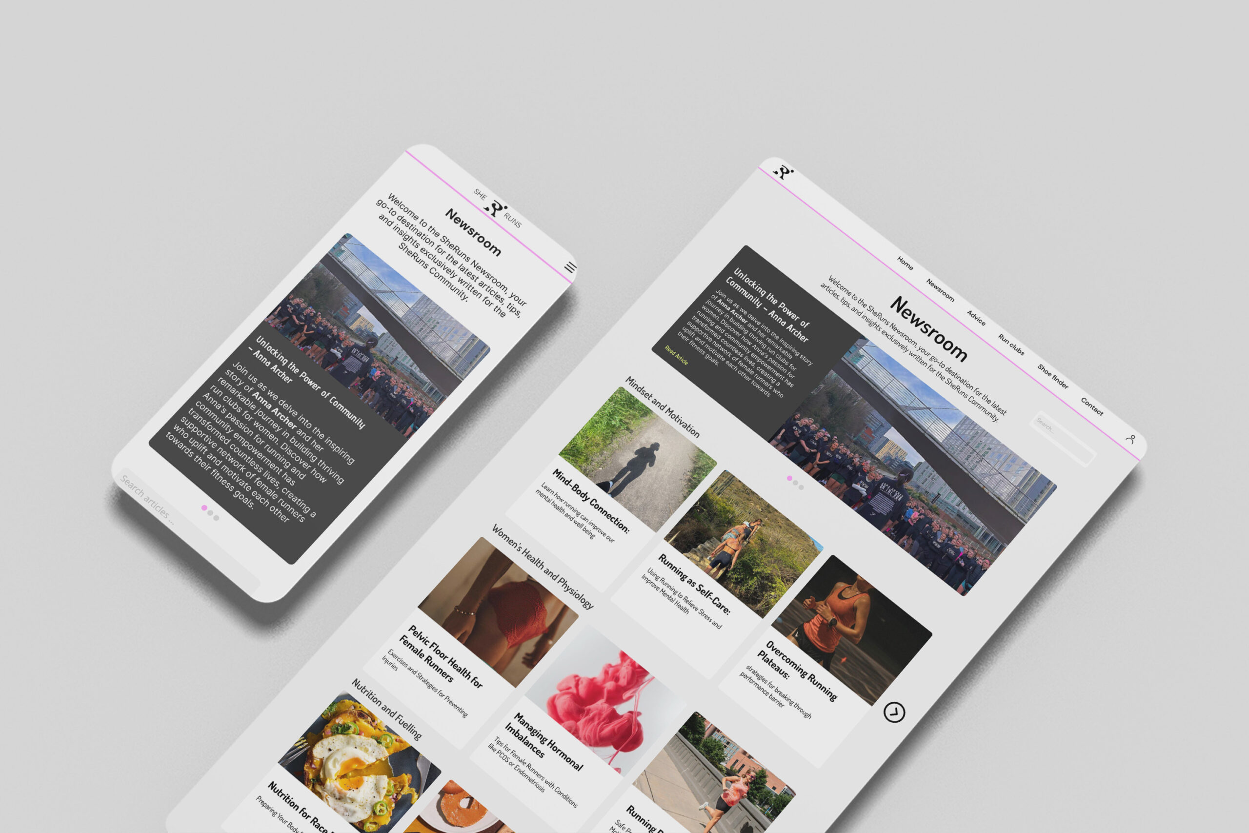
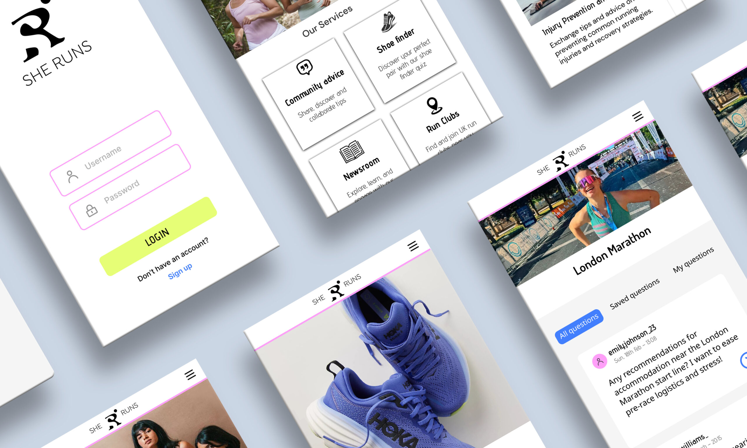
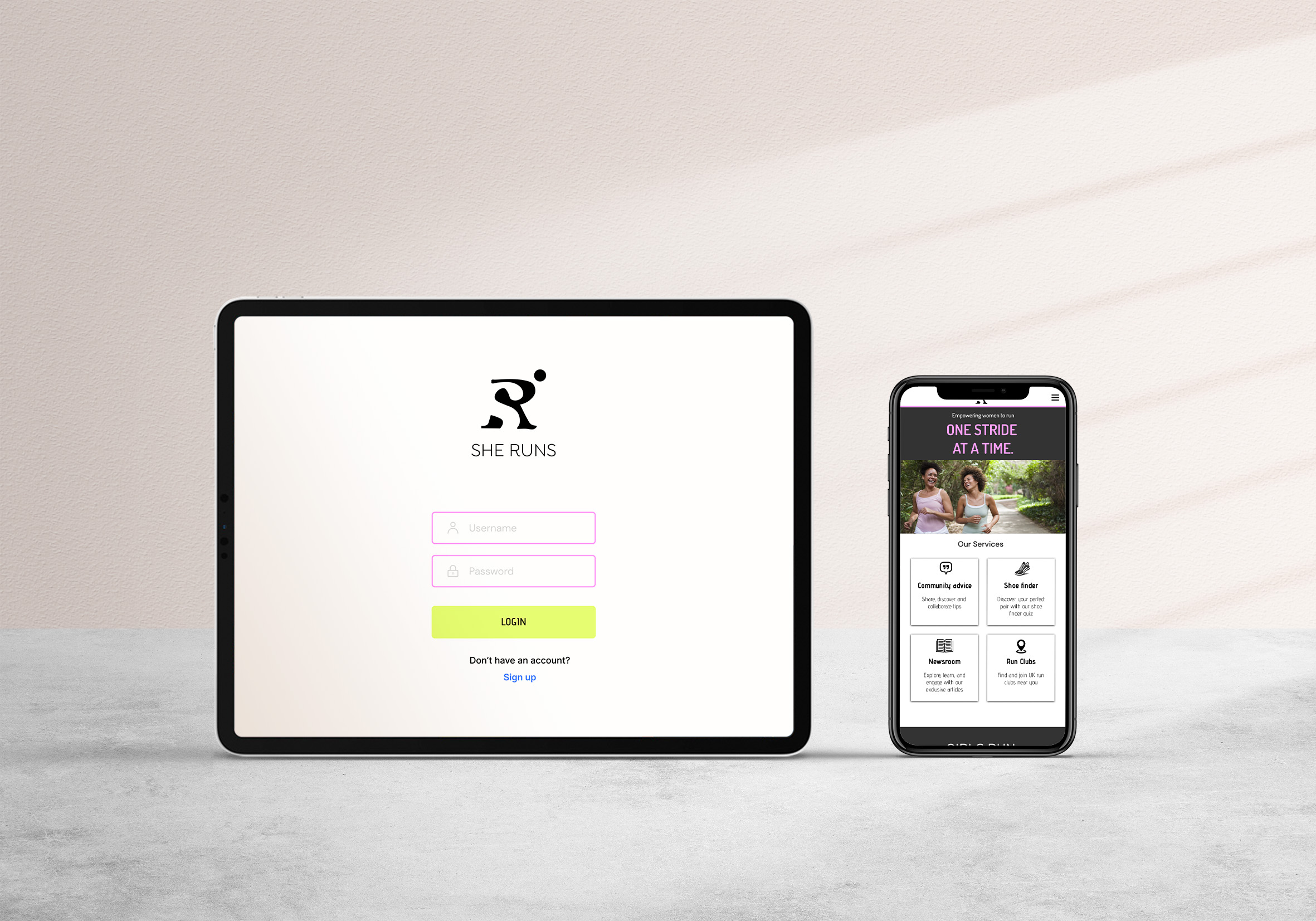
SheRuns web app
SheRuns is a web app designed specifically for female runners, it focuses on inspiring and empowering women to run. It was prevalent from research into the current market of running apps, that many do not cater to or consider the unique needs of female runners. SheRuns is the missing female-only platform that provides all sorts of features that female runners need. It has been created to fill this void by addressing these needs and creating a more supportive environment for women.
Hi, I’m Natalie. I consider myself as a patient and driven person, constantly pushing boundaries and seeking out new sparks of inspiration. I have particular passions for publication and typography design, UI Design, and packaging design, where I enjoy infusing diversity into my work to connect with a wide range of audiences. I believe that effective design goes beyond aesthetics, prioritising functionality and enhancing user experience. In my future career, I’m eager to contribute my skills to projects that demand both creative ingenuity and practical problem-solving, striving to make a meaningful impact with every endeavour.
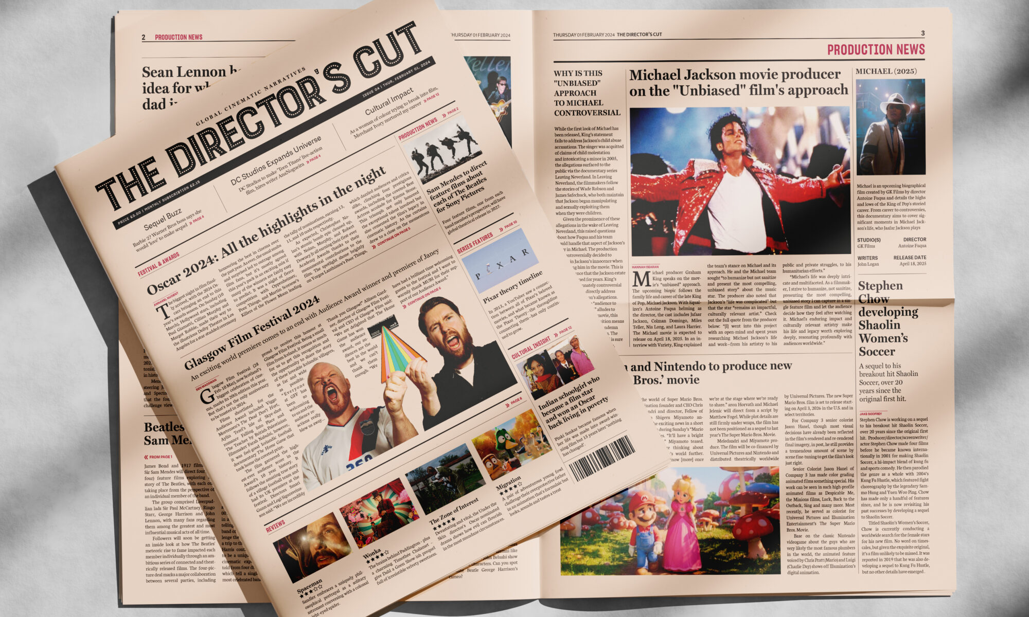
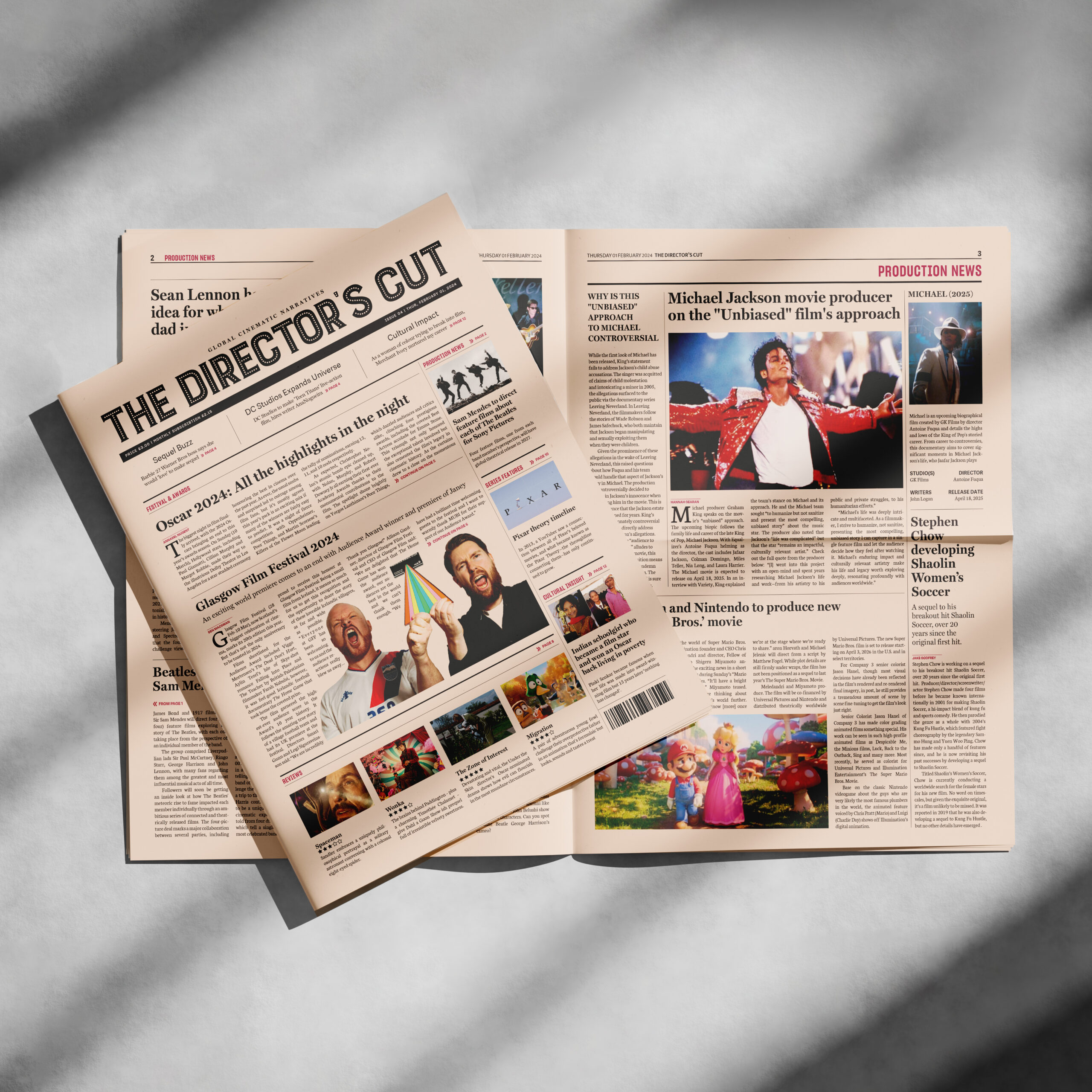
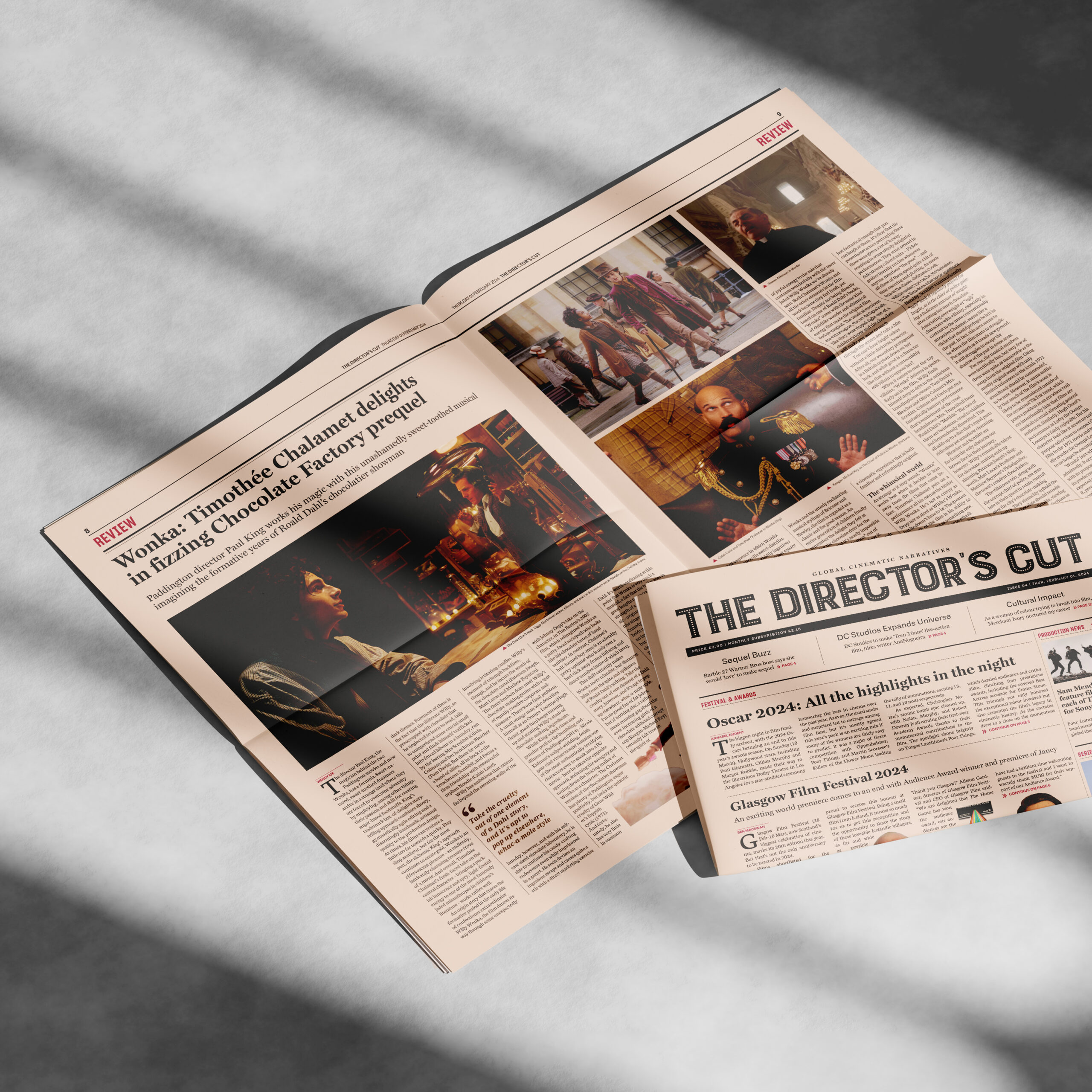
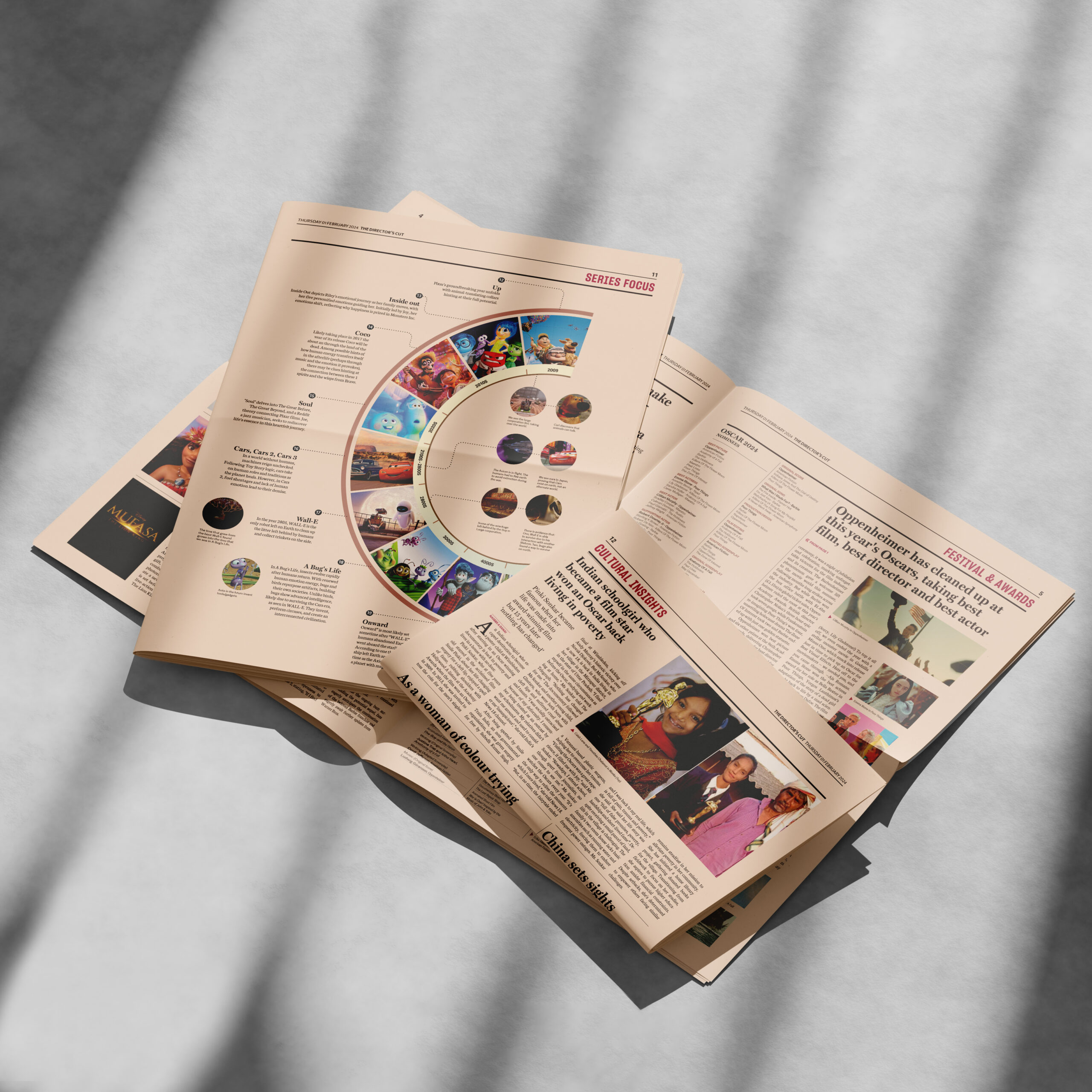
The Director's Cut is a proposed newspaper publication designed as a celebration of the silver screen. With the latest film awards, news, reviews, and narratives, it allows audiences and readers worldwide to immerse themselves in the dynamic film industry. This project was in our Advanced Editorial module, which allowed me to create a professional newspaper, and understand the details of typographic decisions for newspapers. The most challenging part was to make the piece distinctive in a way that fits the theme of film.
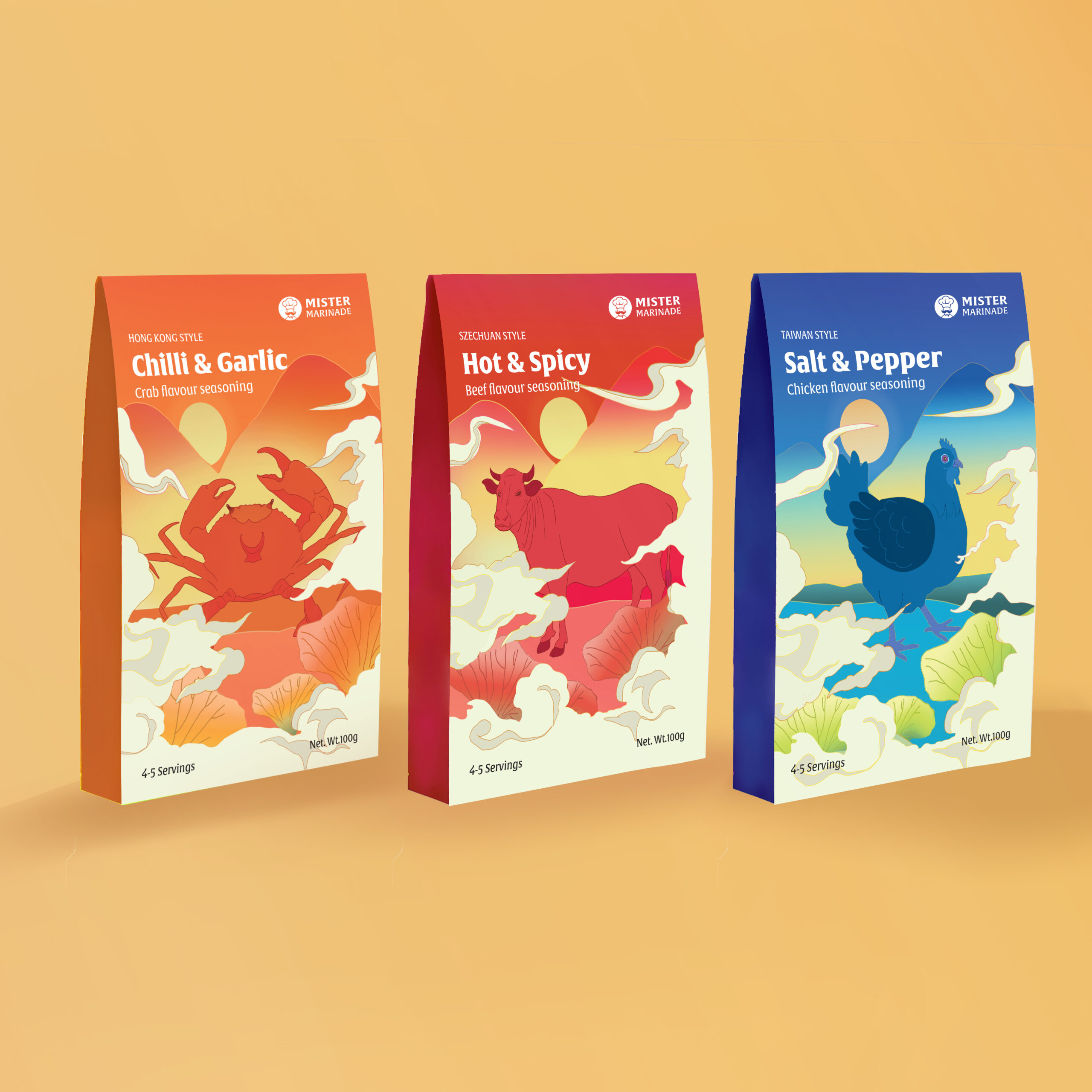
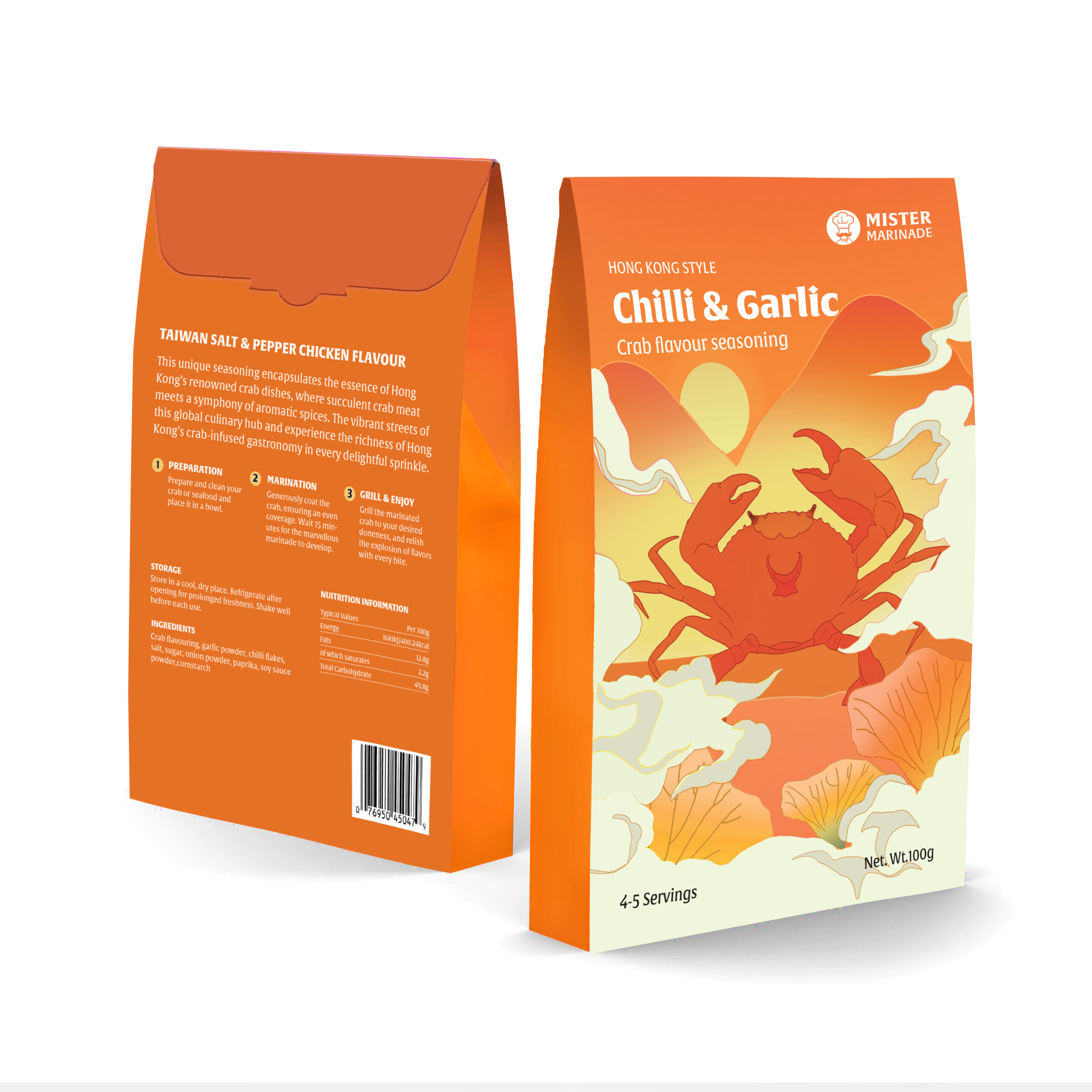
Mister Marinade packaging
This is a re-packaging project for Mister Marinade, an online brand that sells marinades and seasonings in the UK. The brand is committed to inviting both novice and experienced home cooks to explore diverse flavours. The re-packaging design suggests a new series of Chinese regional flavours seasoning, aiming to create a new and fresh appeal for the brand. The redesign tells the story of home cooking and Chinese taste through an engaging storytelling approach. It features the three regional Chinese authentic flavours of Sichuan, Hong Kong, and Taiwan, encouraging experimentation, and savouring the joy of new seasoning flavours for culinary.
Better Sleep web app
Better Sleep is a web application for people suffering from persistent insomnia or who struggle with sleeping problems, who lack motivation, and who want to take control of their sleep problems. Unlike common insomnia websites that involve complicated and overwhelming textual information, our website provides four-week sleep courses to encourage behaviour change and guide the user through the designated journey of better sleep. With practical bedtime resources such as video practices and audio, the sleep course will guide users to empower and visualise the milestones of progress, keeping track of progress through features like sleep diary entries.
I am an analytical designer focussed on solving problems in a dynamic, exciting way. My strengths are design thinking and creative direction: I enjoy experimenting and being intentional in my design approach, creating meaning with each decision, and find visual analysis at the core of my process. I am detail oriented and enjoy projects such as packaging, campaign work and editorial design. I am confident in Photoshop, Figma and After effects but primarily in InDesign and Illustrator. I have a passion for typography and illustration with a growing interest in motion graphics, but I am always looking to learn and grow my skillset.
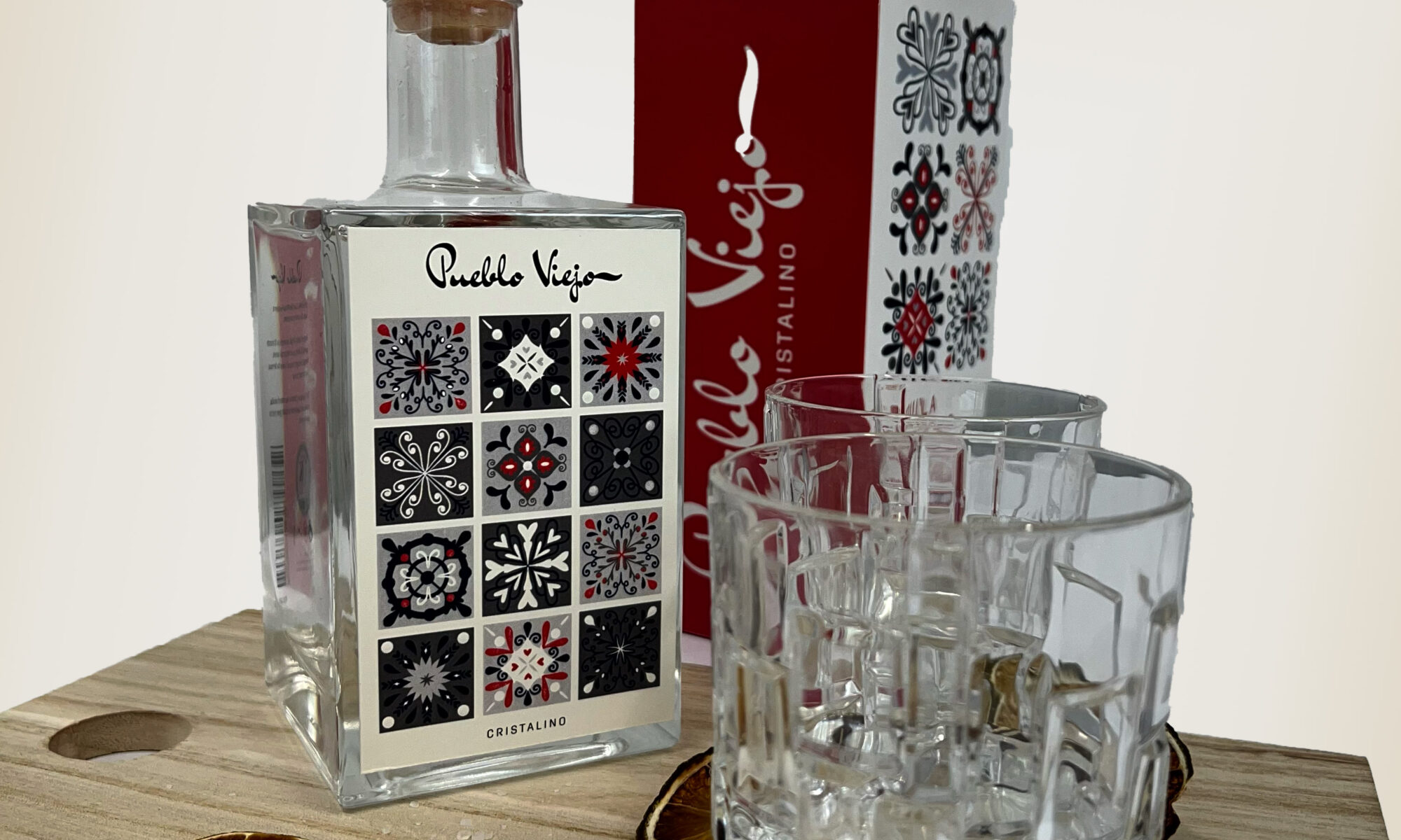
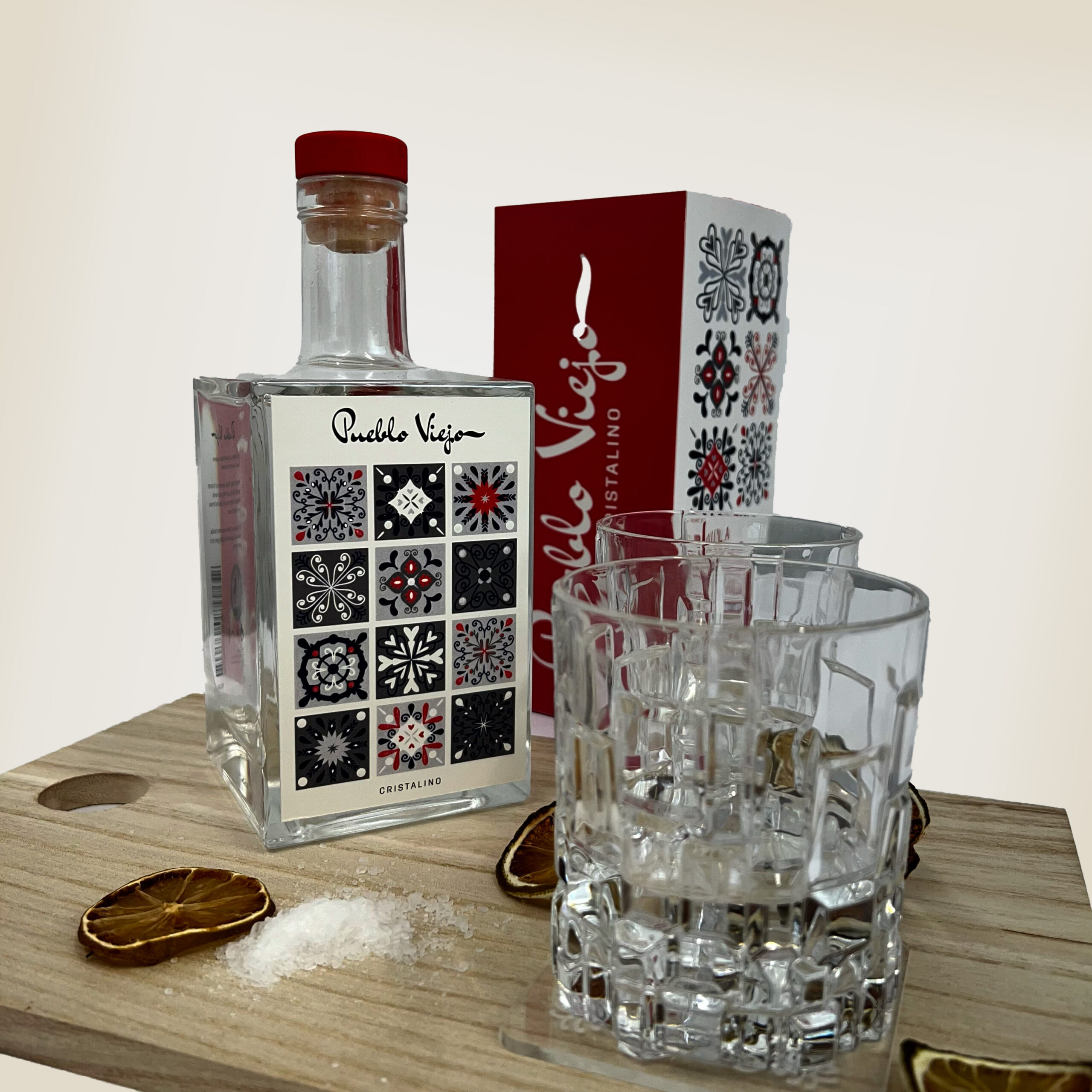
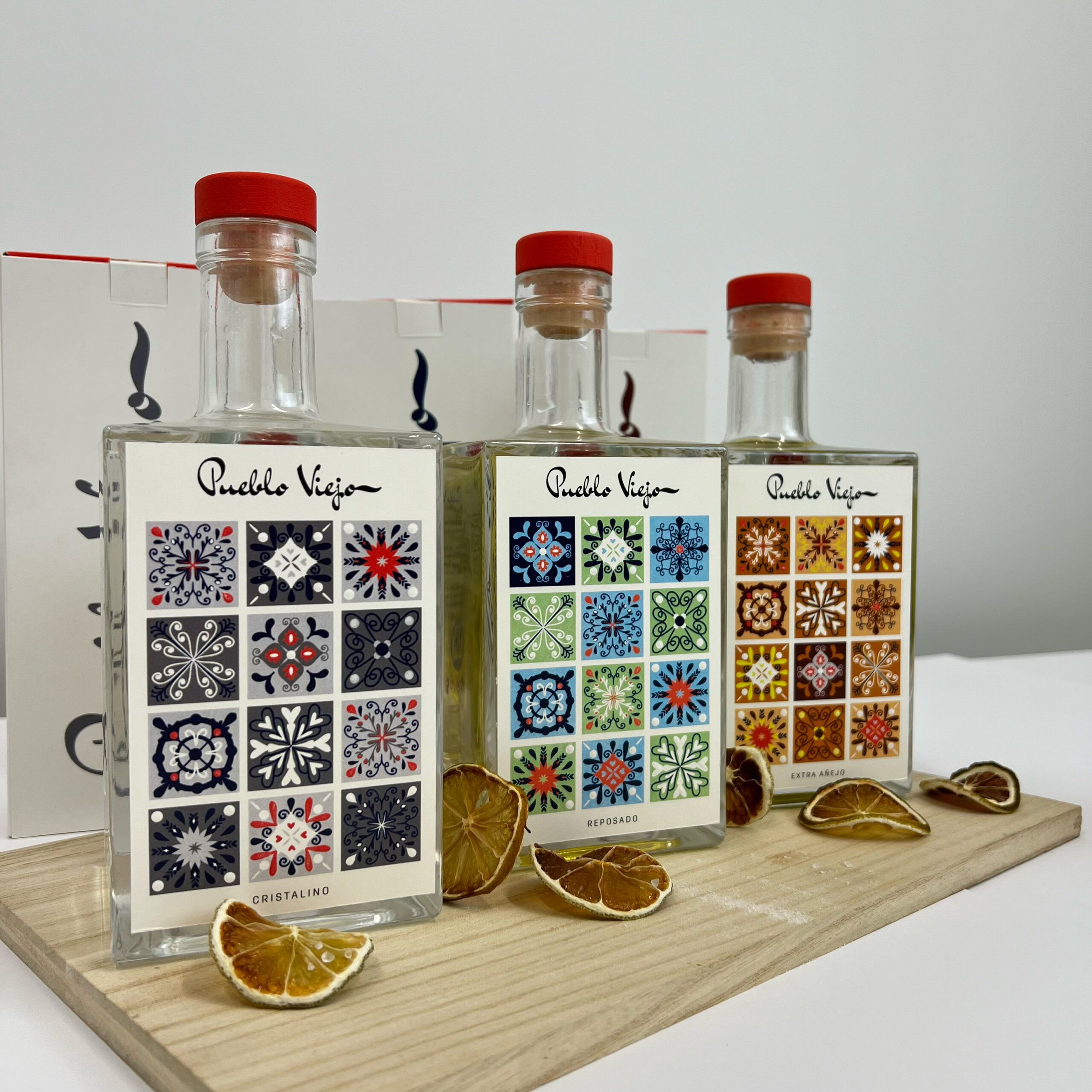
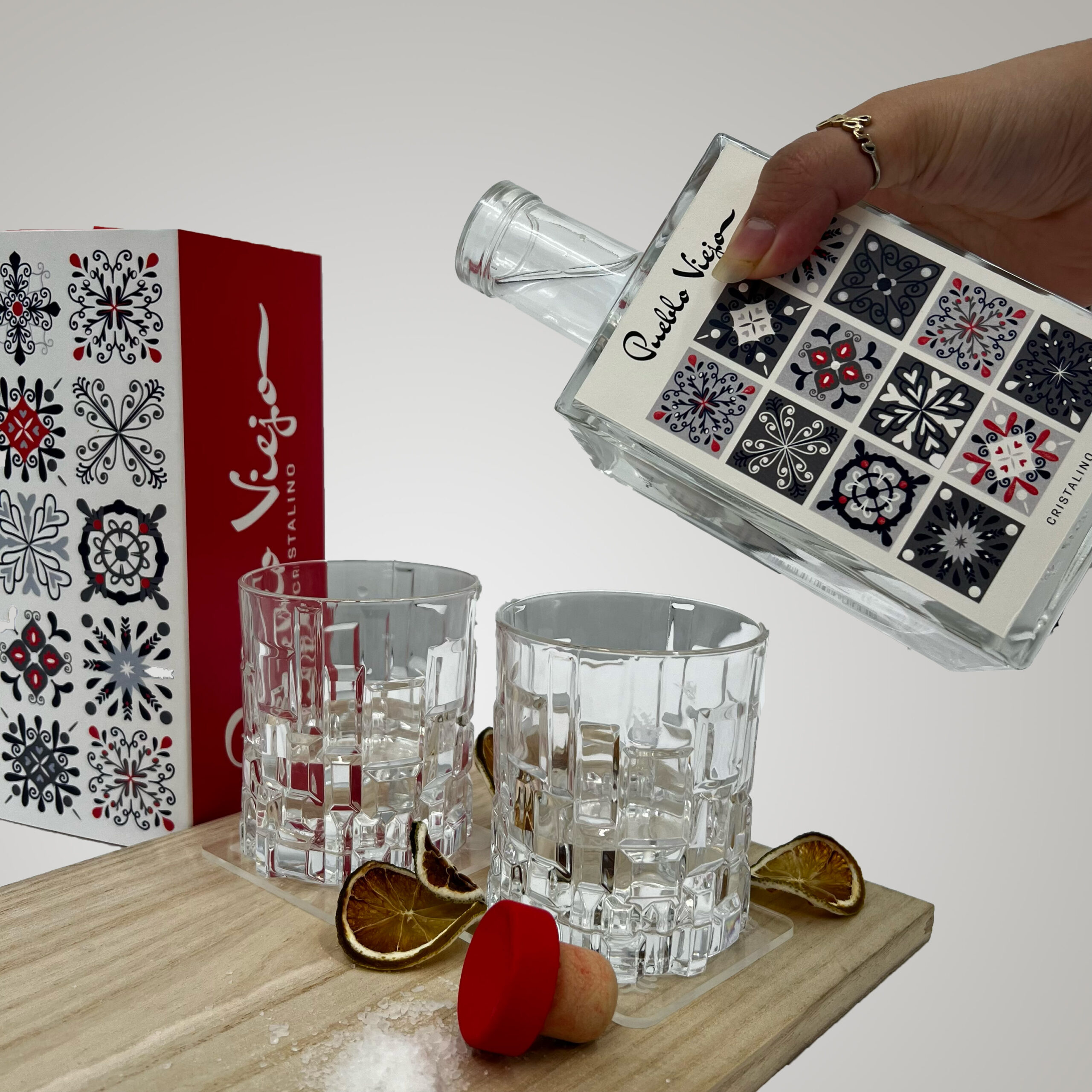
Pueblo Viejo is a Mexican tequila brand, who focus on their authentic production and traditional methods. This relaunch brings Pueblo Viejo to the premium market, using Mexican inspired motifs of Talavera tiles and hand-lettering typography to represent the company values. Each tequila has colours to represent the processes involved in the production or ingredients used.
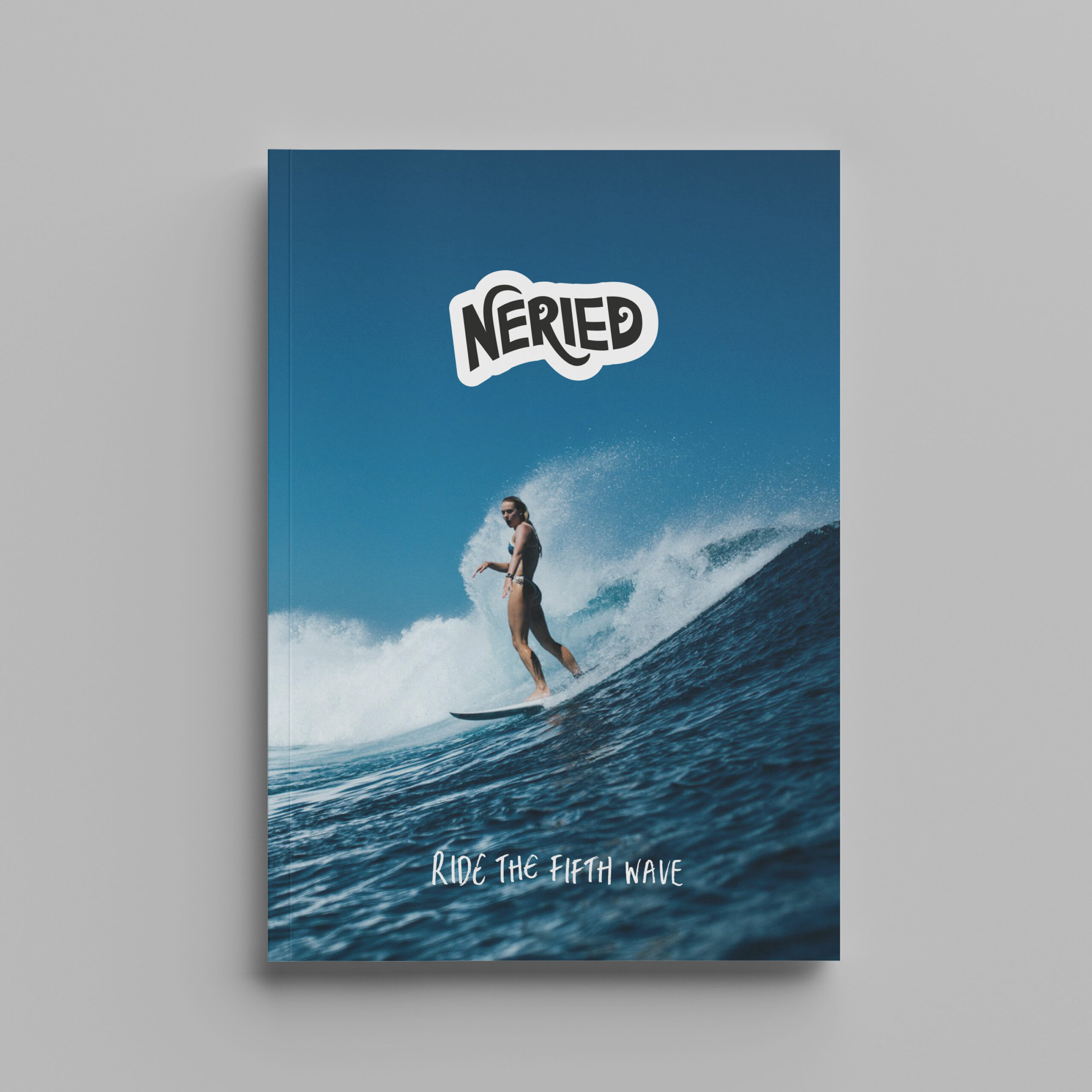
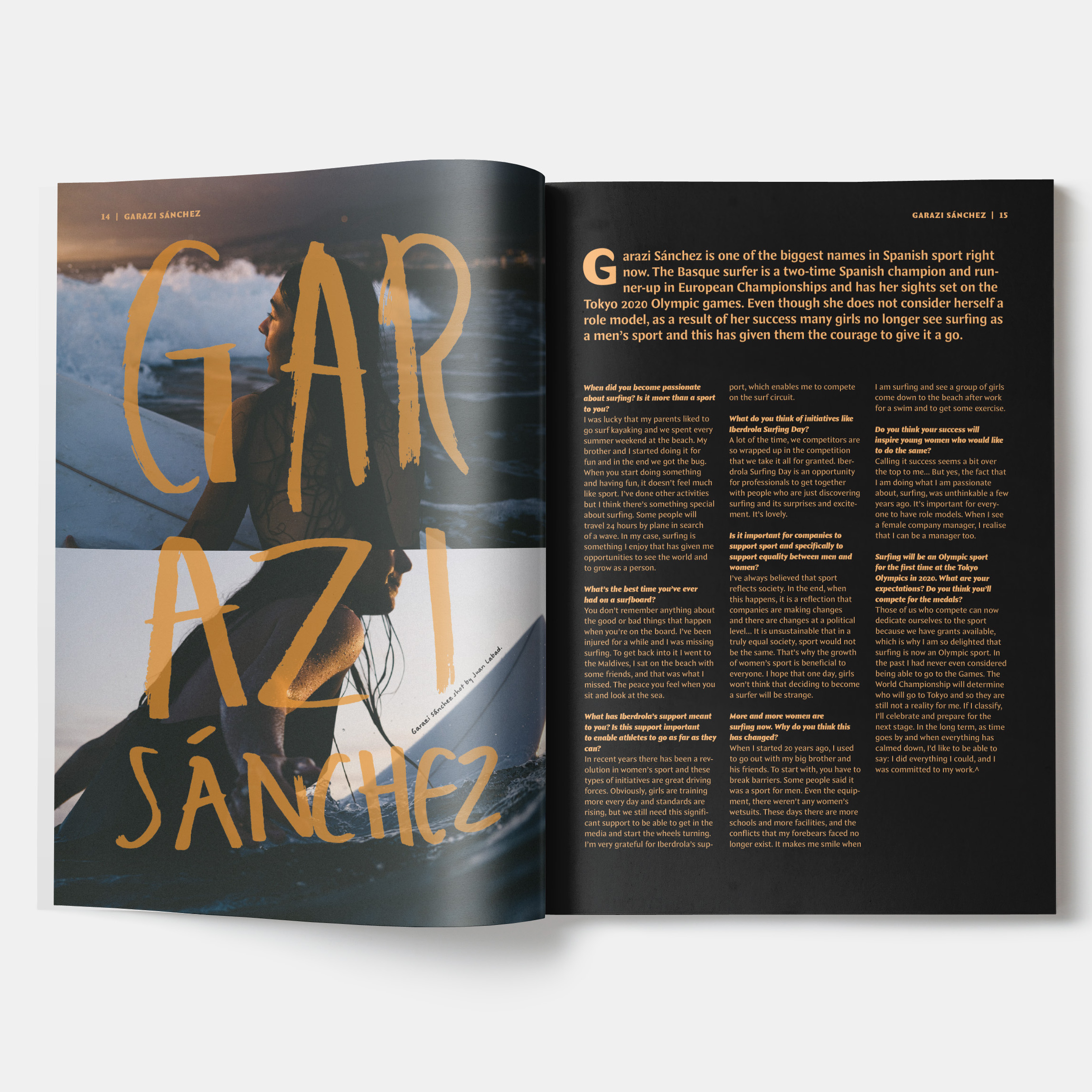
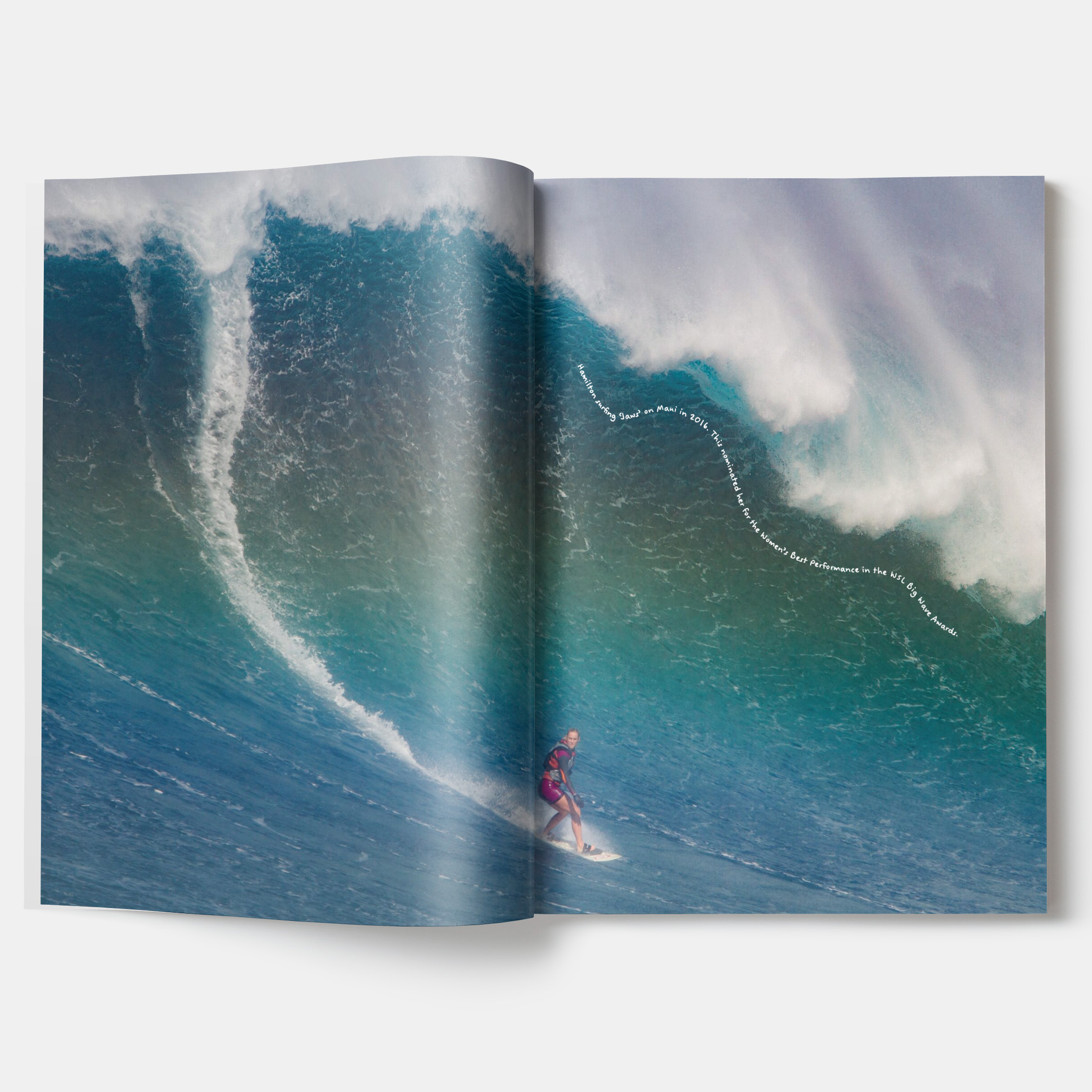
Neried magazine
Neried magazine is an independent, female-focussed, surf magazine. Created by and for women, Neried aims to create a space where women and other minorities can feel comfortable and valued within the surfing community. Inspired by the Ancient Greek ‘Nerieds’ (daughters of the sea God, Nereus), the magazines play on feminism in the waves, amplifying voices across different skillsets and backgrounds. Working with the European seasons, Neried is a quarterly magazine. Although based in Europe, the magazines share stories from global events and individuals to build an international community.
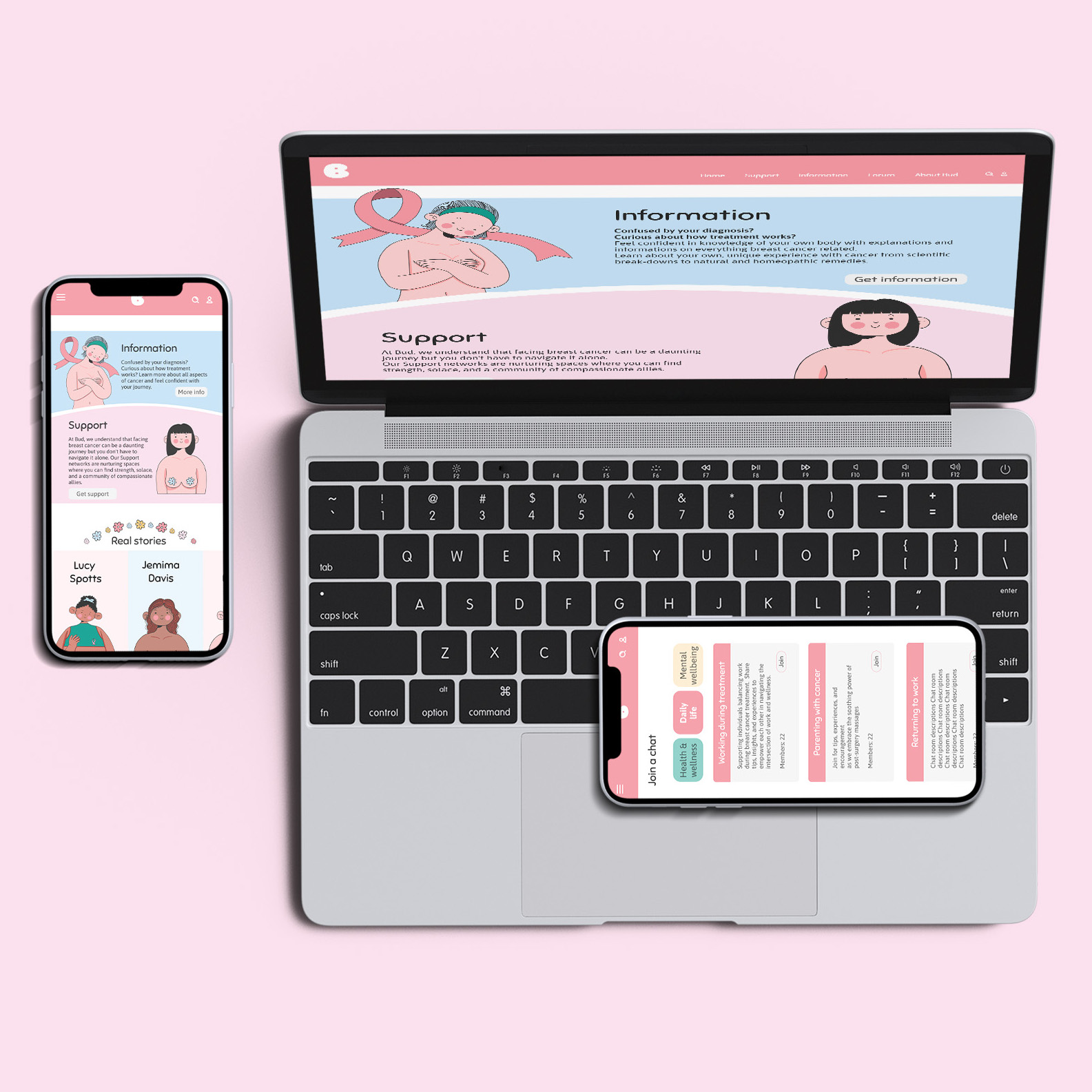
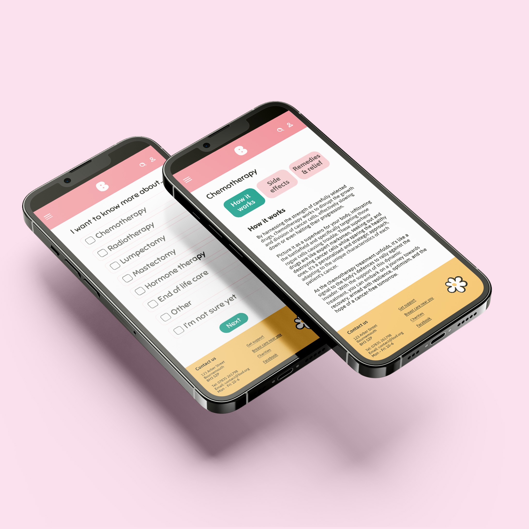
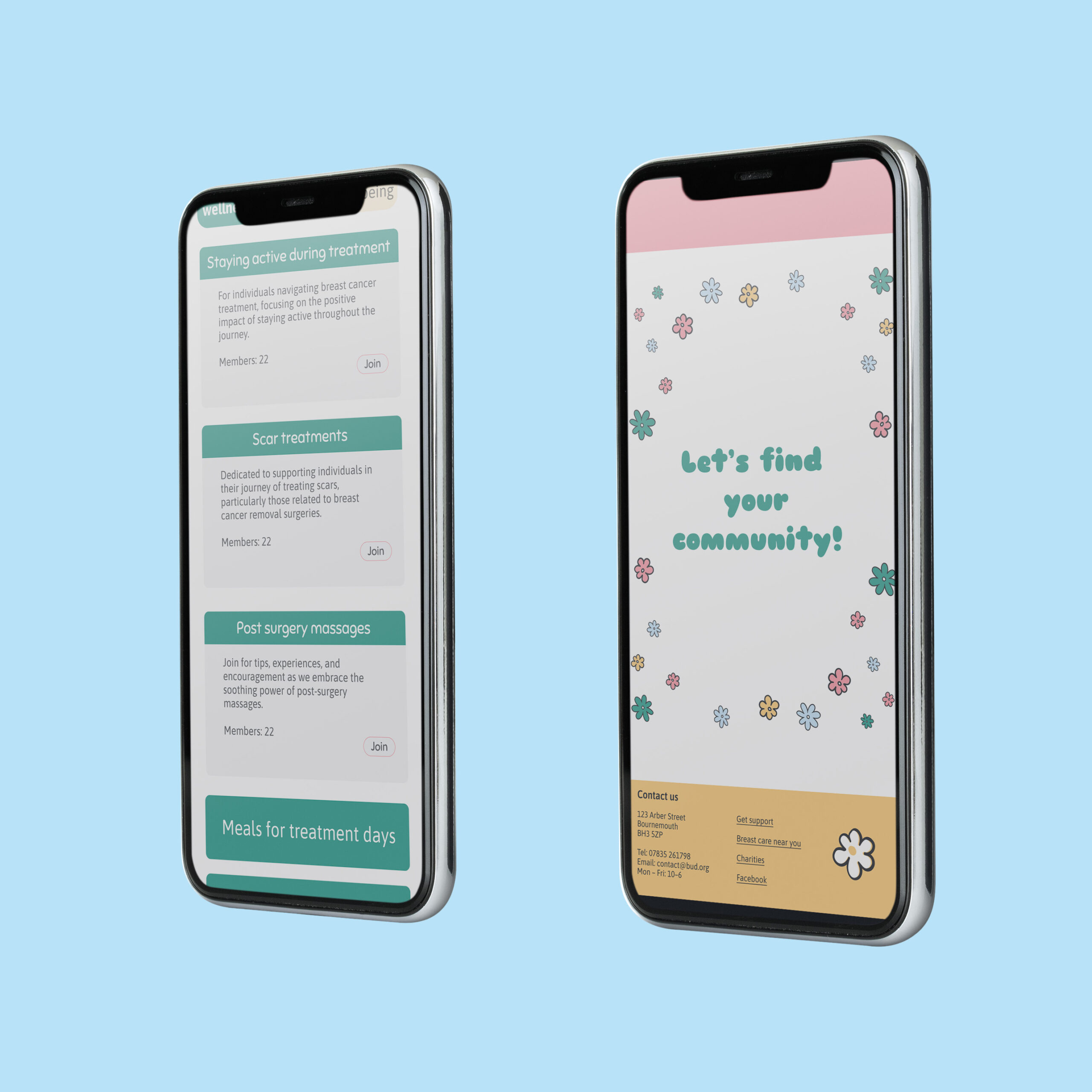
Bud website
Bud focusses on providing a softer, more personable source of breast cancer information and support. Many cancer information websites are clinical and overwhelming or draining to read at the best of times, let alone when concerned about breast health or dealing with cancer. Bud aims to resolve this by breaking information down into more palatable and simpler formats. Bud aims to be accessible from home, to help people wherever and whenever they may need it.
Hi, I’m Matt, an ambitious designer with an eye for detail. I enjoy being able to create innovative and creative solutions to design projects, particularly within advertising, packaging, and branding. My experience completing a variety of freelance projects, from branding businesses to merchandise for international musicians, has allowed me to work closely with clients, giving me an array of real-world experiences. These opportunities have allowed me to be a proactive and versatile creative, being able to learn new software and skills to best complete these projects and meet client’s needs. Having skills in communication and time management, developed through my university studies and freelance design work, allows me to work as an effective and professional designer. My motivation to grow and improve, both as an individual and as a professional, leads me to create innovative, engaging, and successful designs.
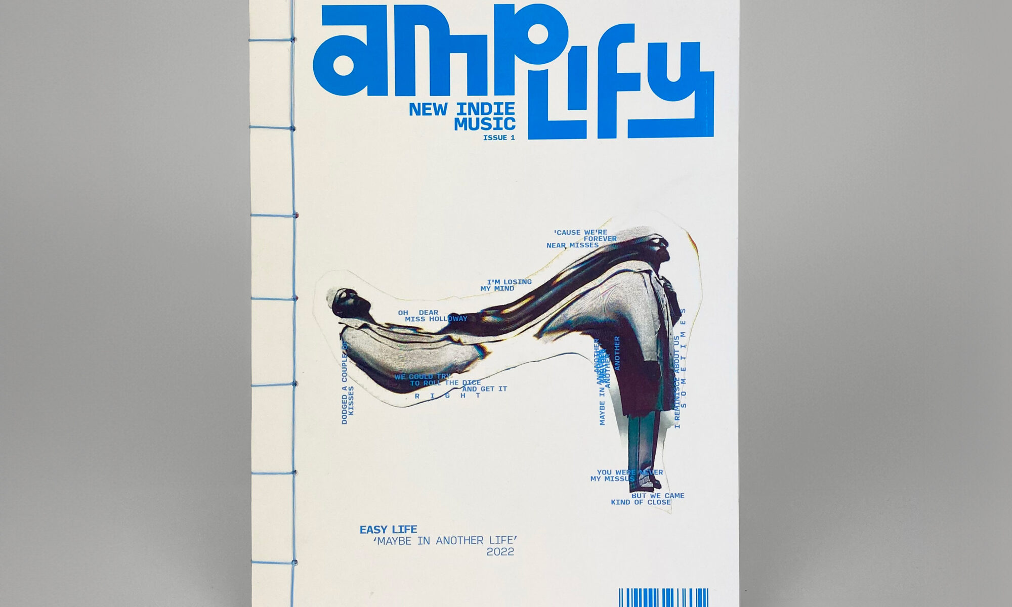
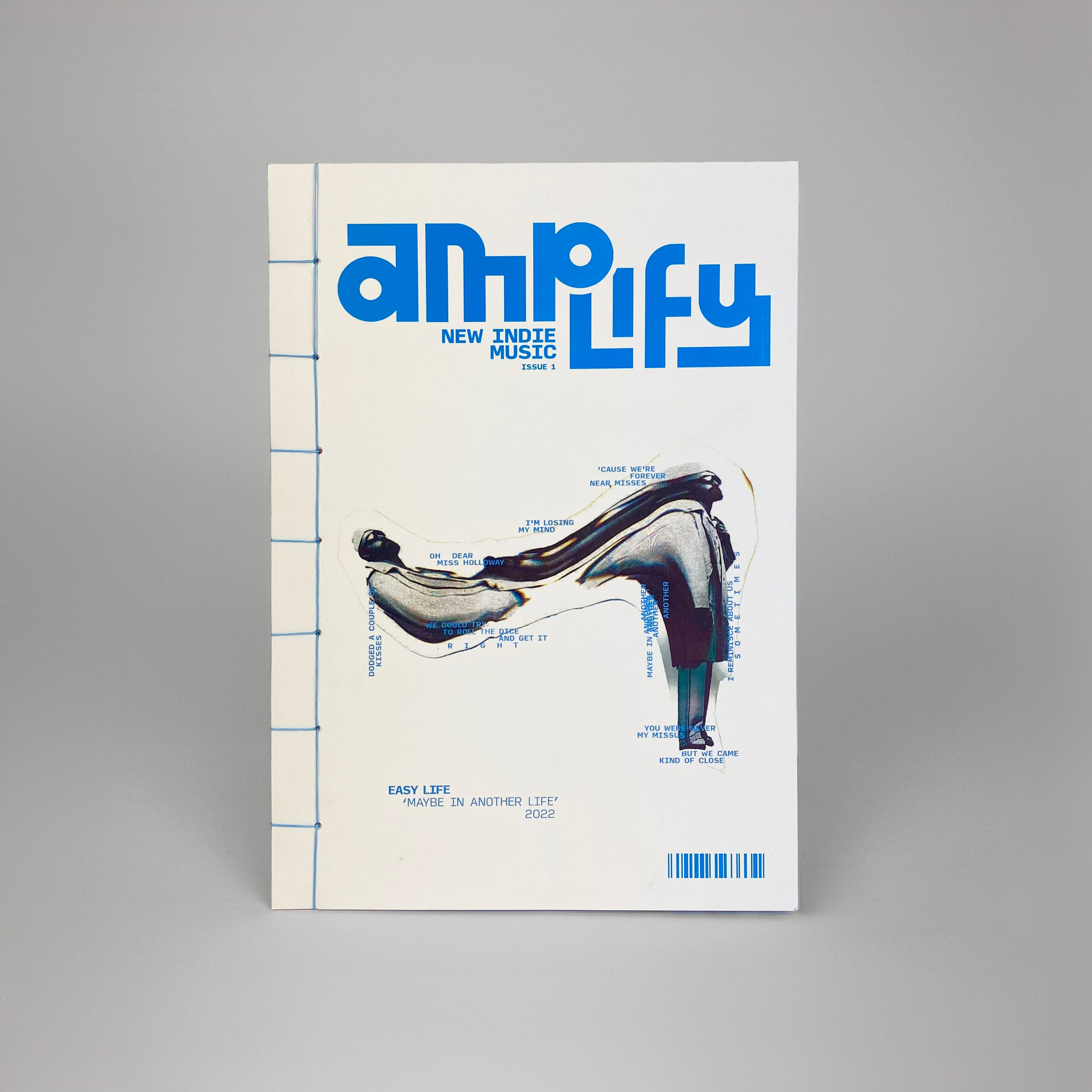
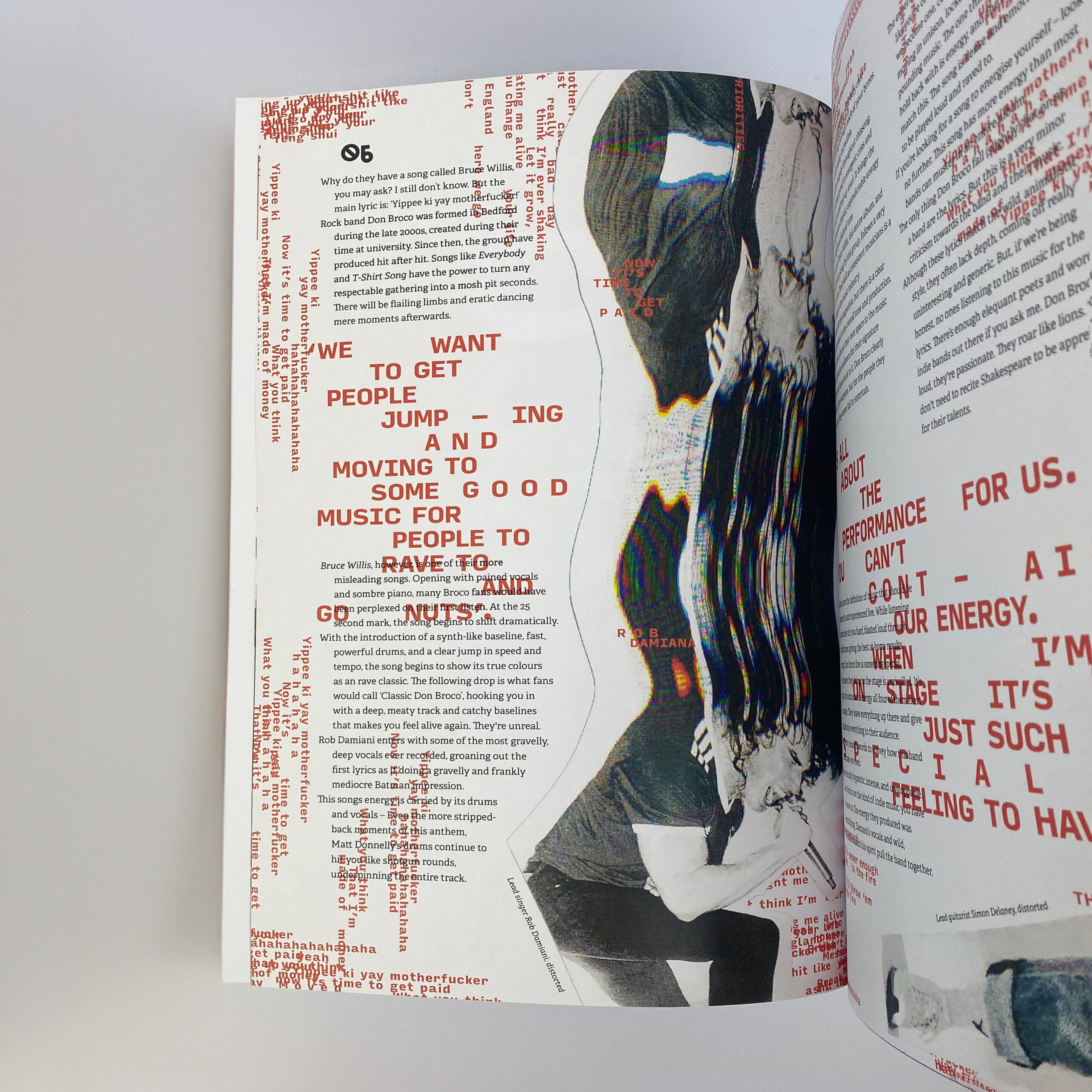
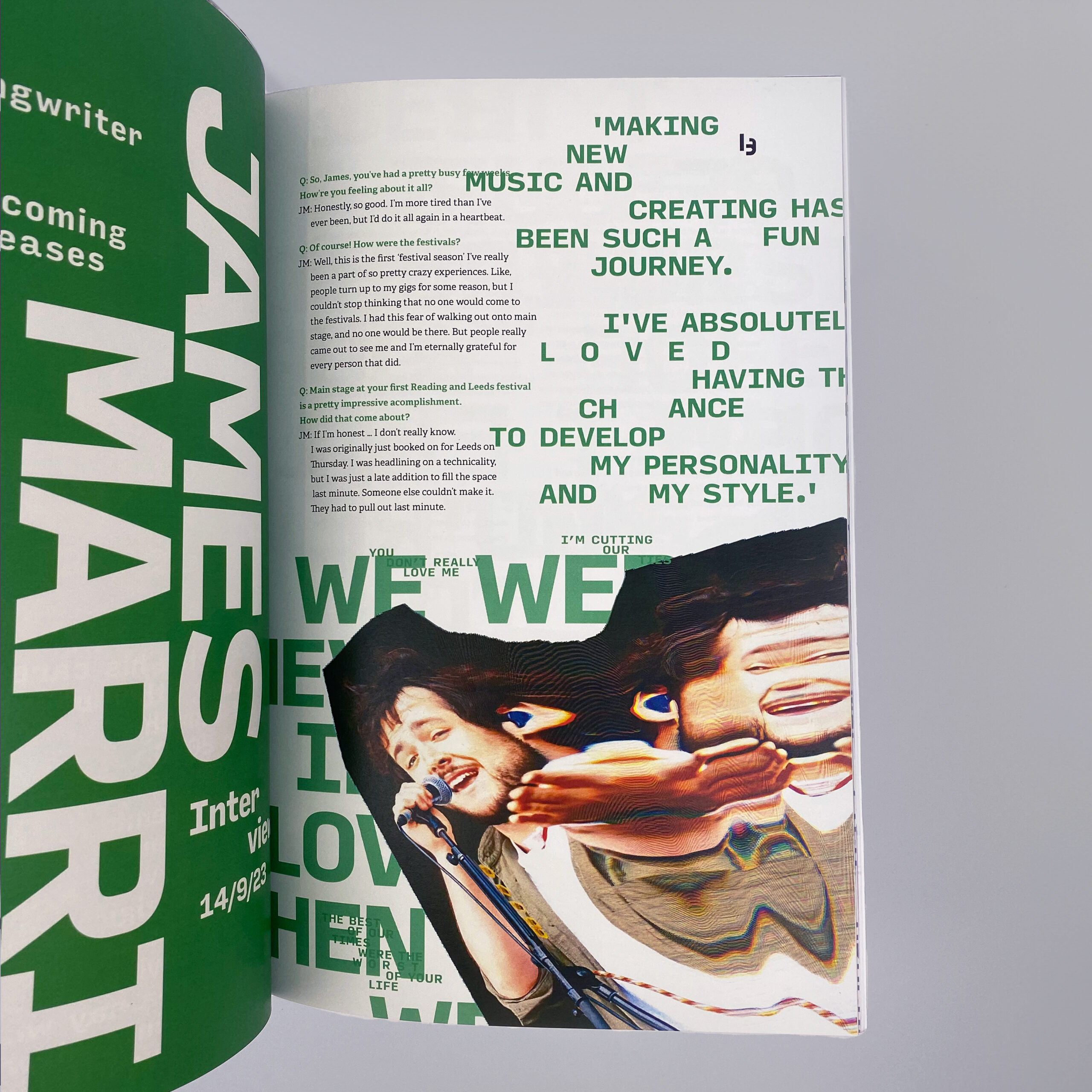
Creating Amplify, a new indie music magazine focussed on connecting small artists with passionate fans. This product and its brand are centred around being independent and standing out. Using a photocopier to distort images creates an incredibly distinctive image treatment, with each article’s style being reflective of the artists and their music. The format itself aims to be tactile and exciting – The stab-stitched binding embodies the personality of indie music, with the dynamic, experimental structure keeping this periodical dynamic and fresh.
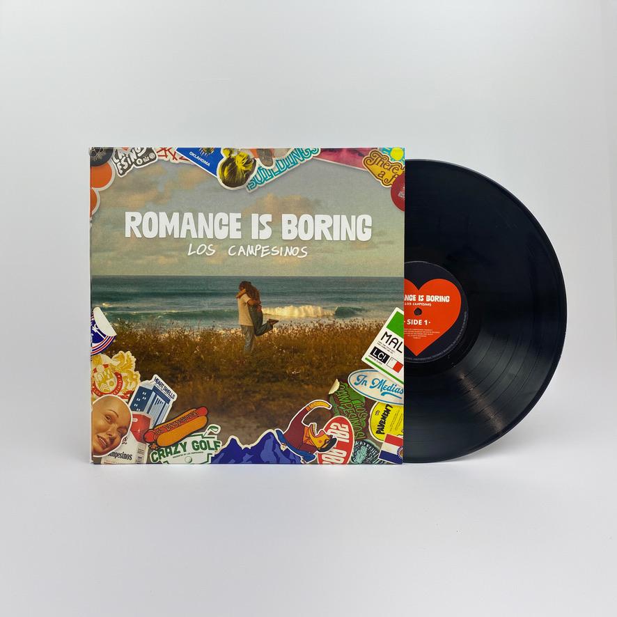
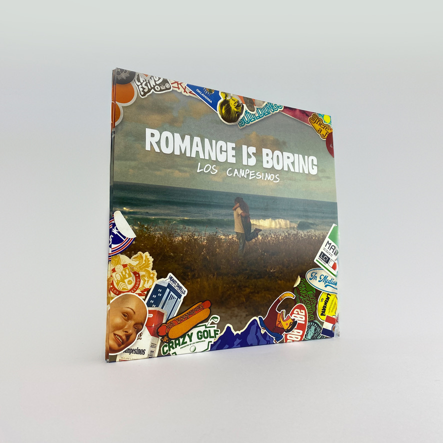
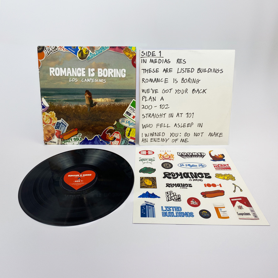
Romance is Boring Album design
Redesigning an existing vinyl record cover for ‘Romance is Boring’ by Los Campesinos. This project focussed on visually representing the album’s unique blend of pessimism and sentimentality, while adhering to conventions of indie music. The sticker elements used throughout this work have heavy links to touring musicians, with each one connecting to the band or songs on this album. This process has been incredibly rewarding, giving me time to consider every aspect of a user’s journey and the physicality of this product to make a more successful response to the brief.
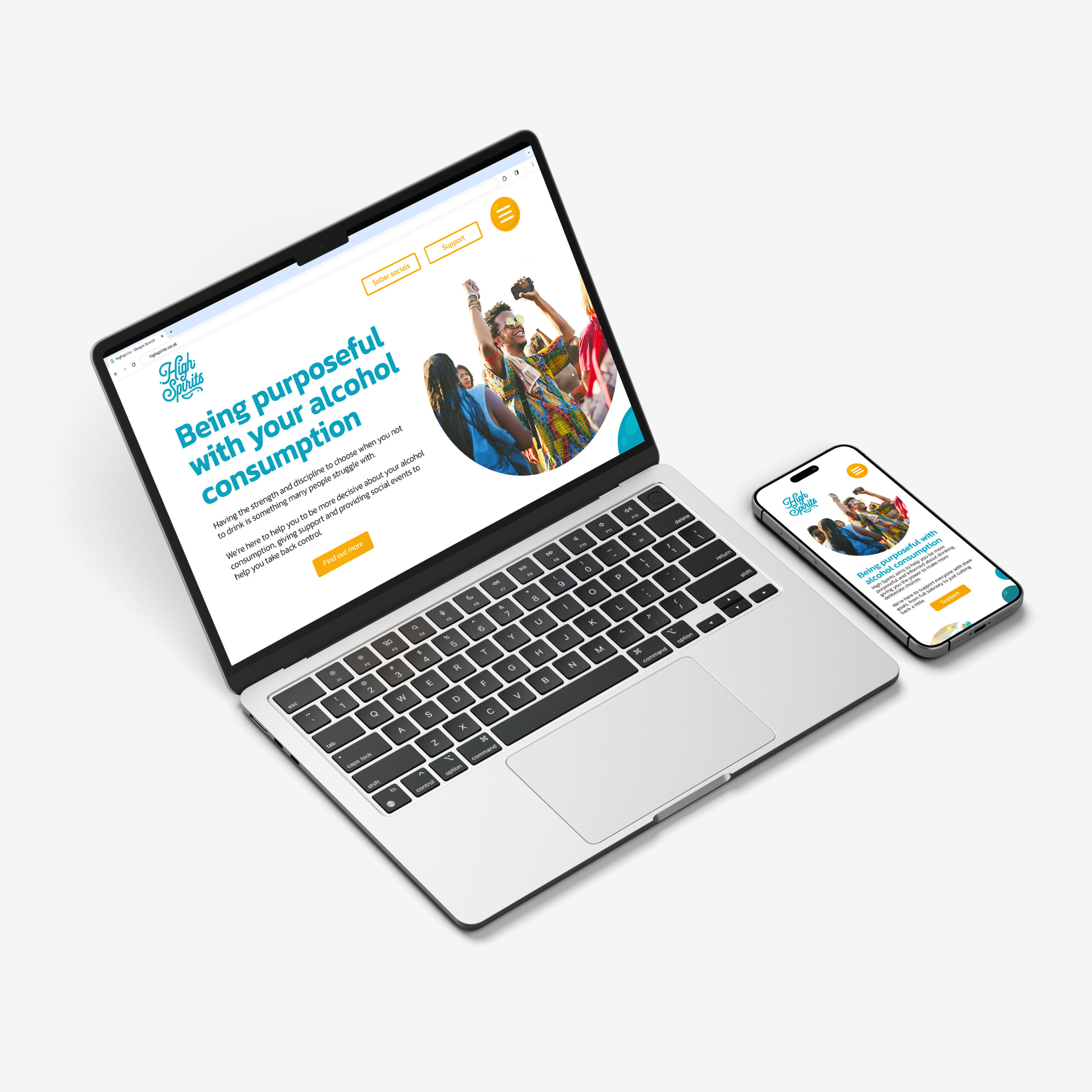
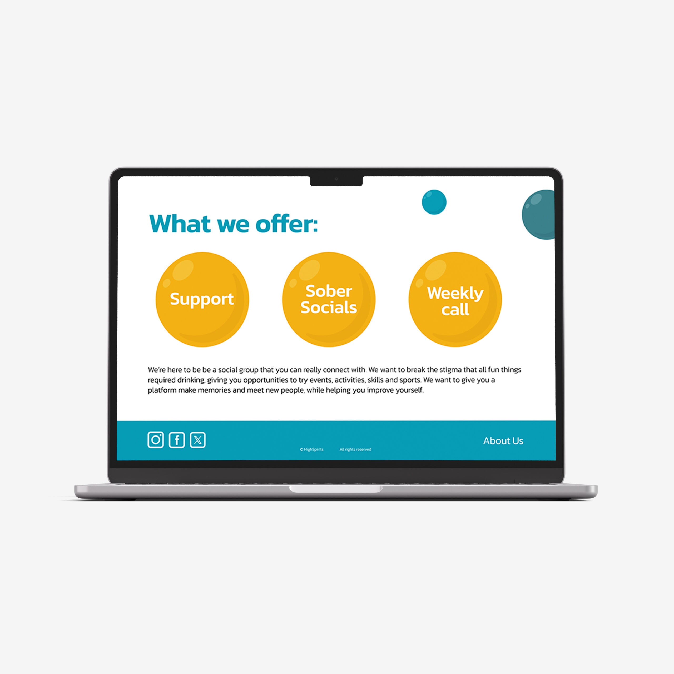
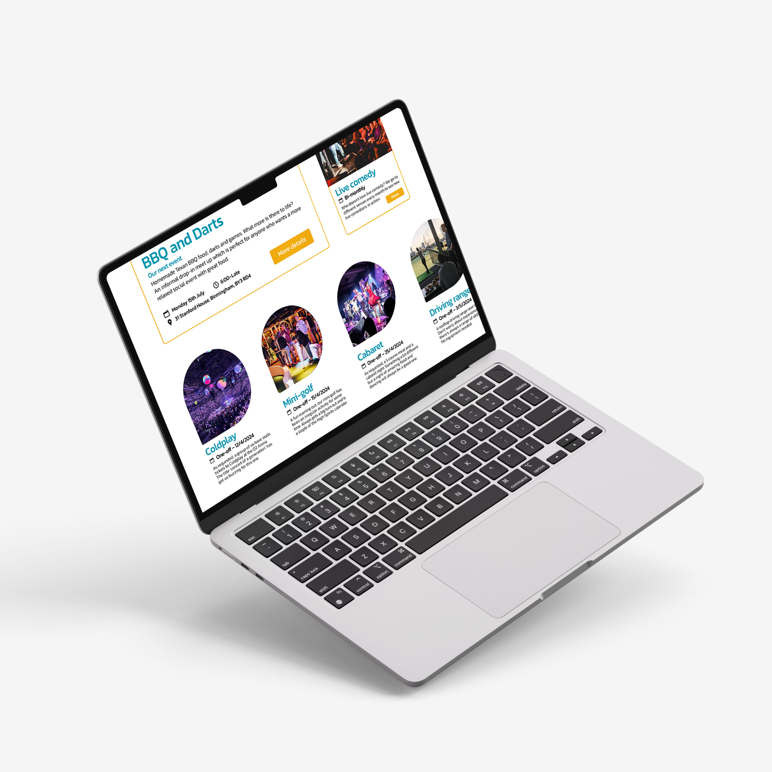
High Spirits website
High Spirits is a social group dedicated to promoting alcohol moderation and removing the pressure of other anti-drinking organisations, focussing on consuming less rather than becoming sober. The branding and style are much more dynamic, taking a positive approach to the often-sombre topic, benefitting the personable nature of High Spirits. The energetic imagery and vibrant colours keep this website fresh and inviting, helping to create a supportive community and help people connect through their shared ambitions.
Hello! I’m Lydia, a recent graduate from University of Reading, who has a particular passion for editorial design. I am a detail-focused designer who takes great joy in working in a systematic way. I have a great enthusiasm for typography; enjoy learning more about the broad field of graphic design and am an empathic communicator.
The brief for this project was to redesign the Teapigs packaging, with a focus on quality, sustainability, and an element of fun. The chosen approach was using a series of abstract shapes which represent the flavours and ingredients present in the tea. This approach answers best to the fun part of the brief. It can also be directed towards a younger audience of tea drinkers, and excite them with unique packaging (compared to the rest of the tea genre).
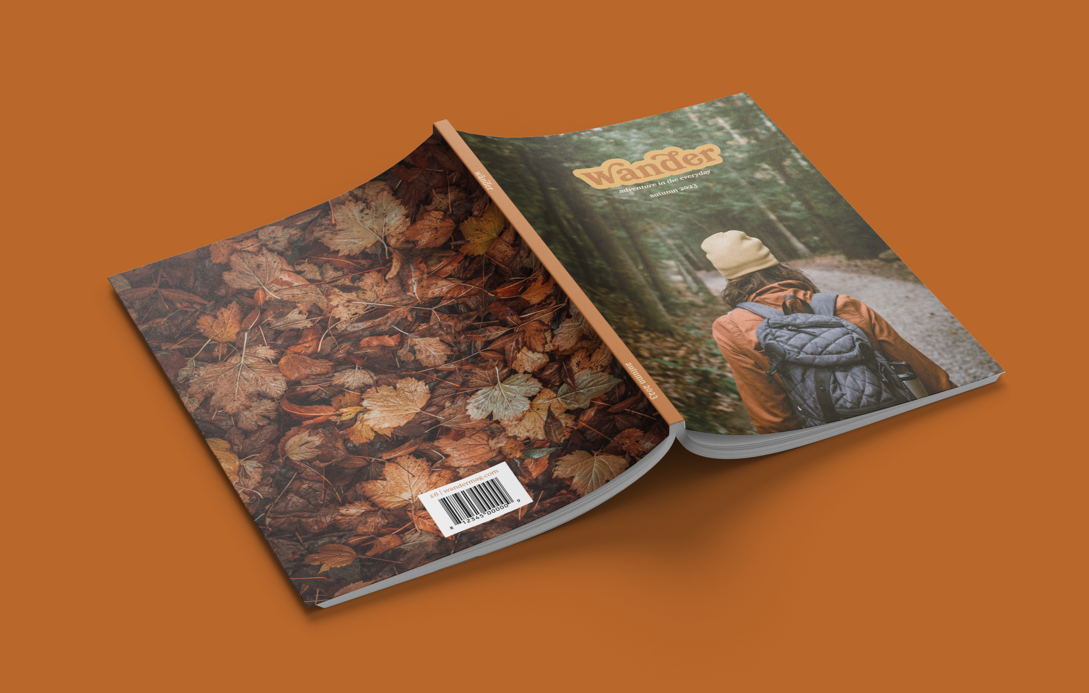
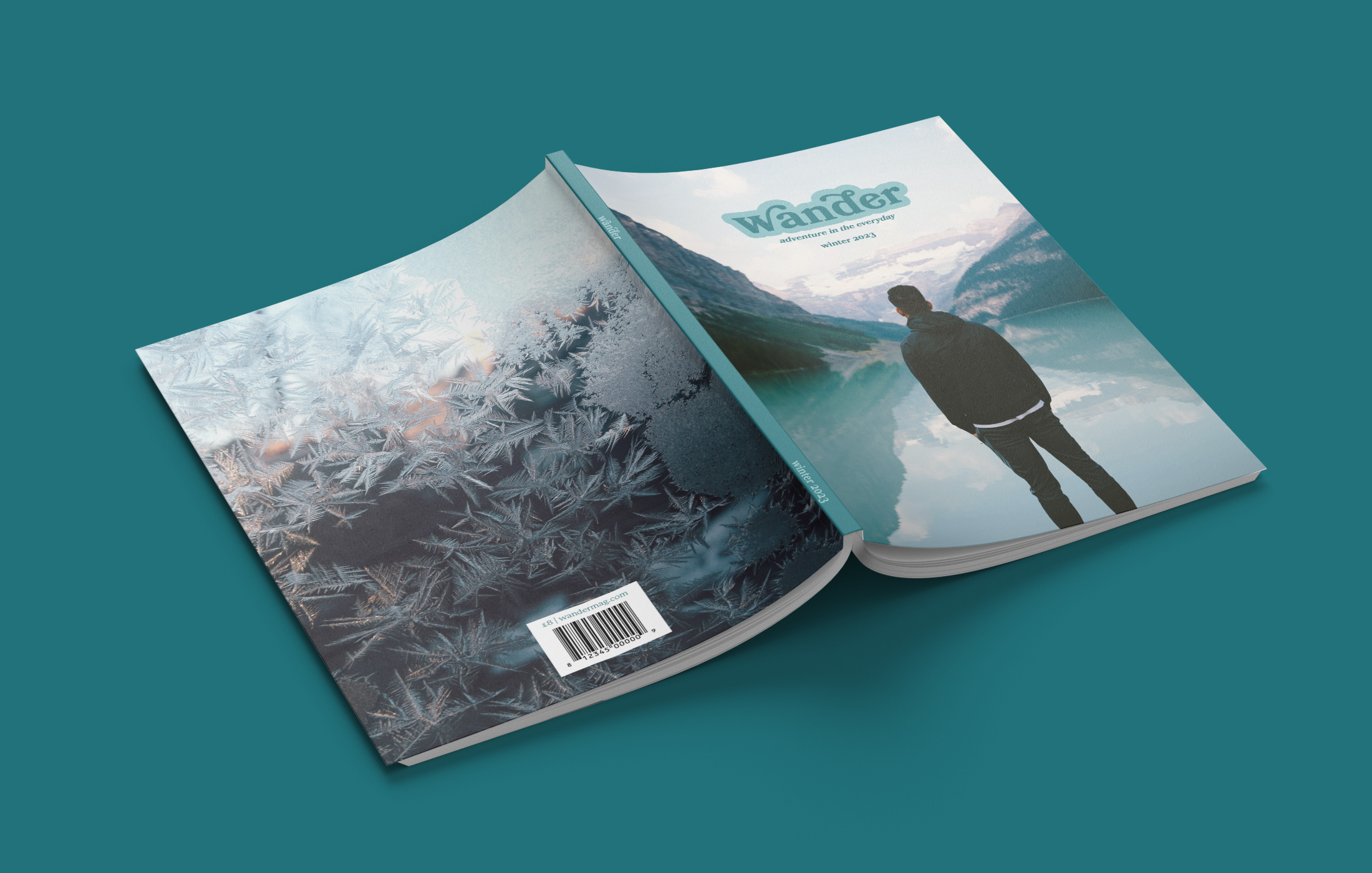
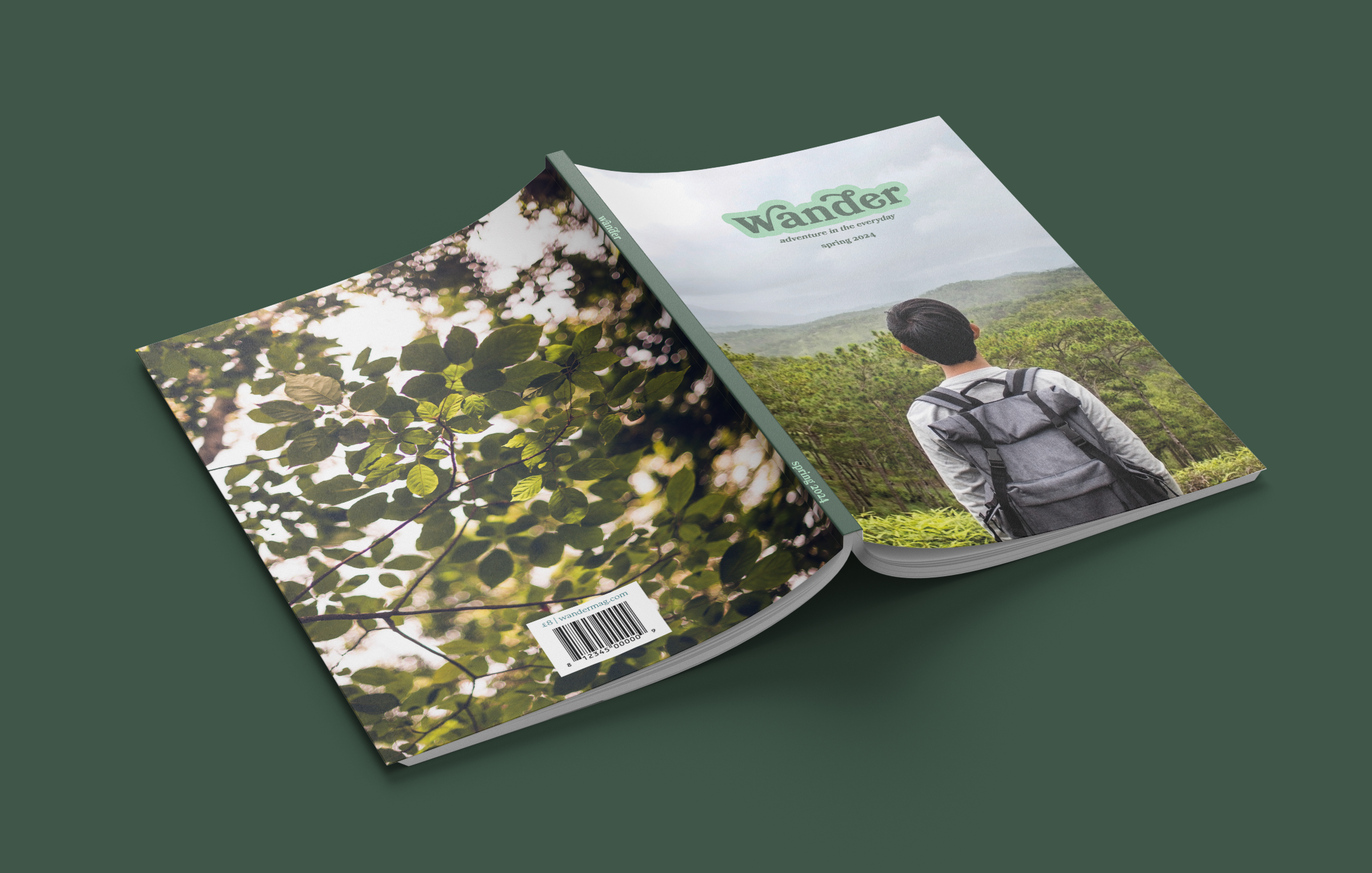
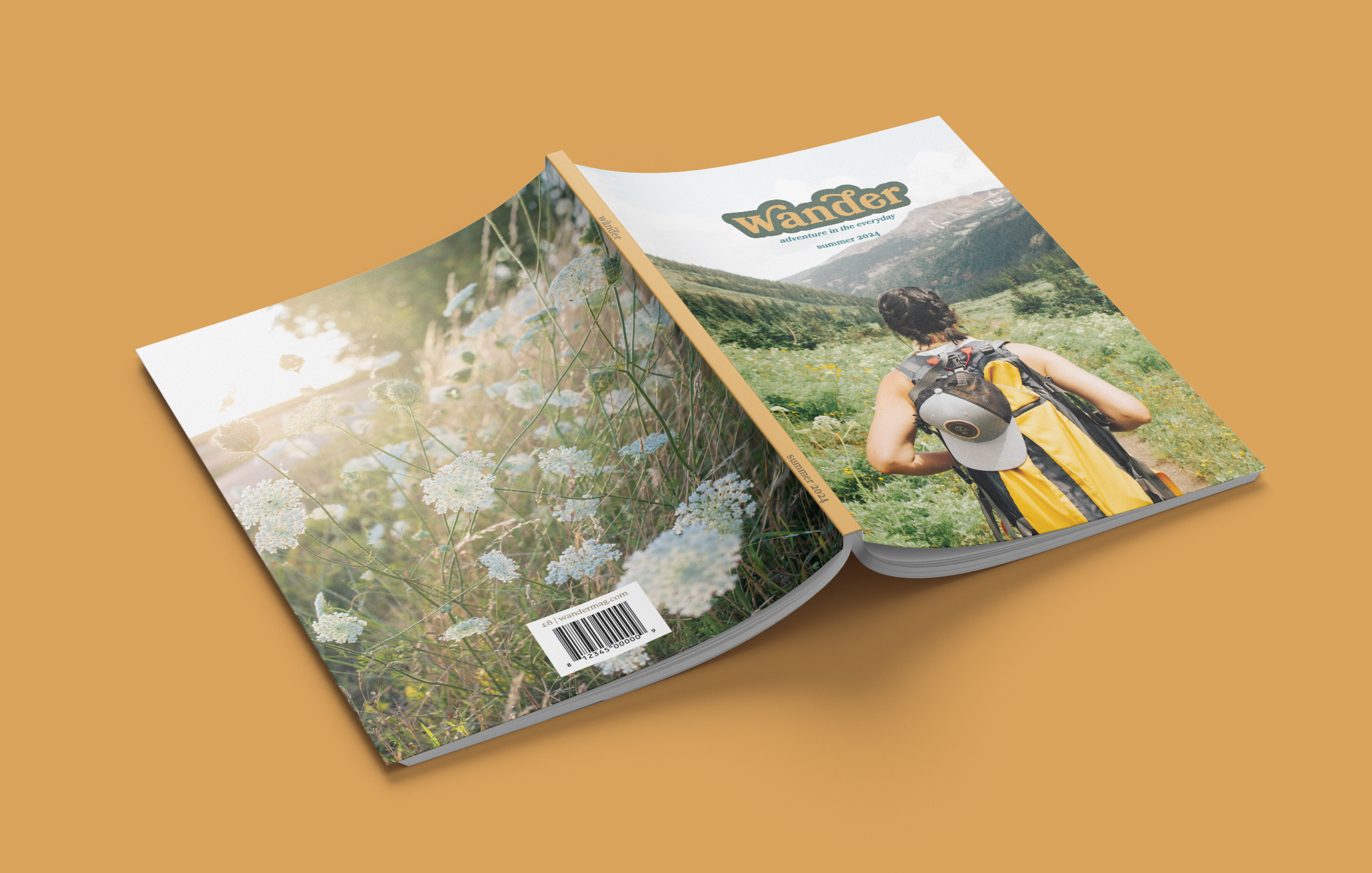
Wander magazine
'Wander' is a travel magazine that showcases the beauty of the Earth, in particular the everyday or overlooked places. It is aimed at young adults who have a desire to travel, and may well be setting out on their first solo trip. 'Wander' is all about slowing down to enjoy the adventure and excitement in every day, and so it was appropriate to complement this theme with a slow, bookish design. Each magazine has four coloured sections: destinations, gear & gadgets, travel trends, and seasonal.
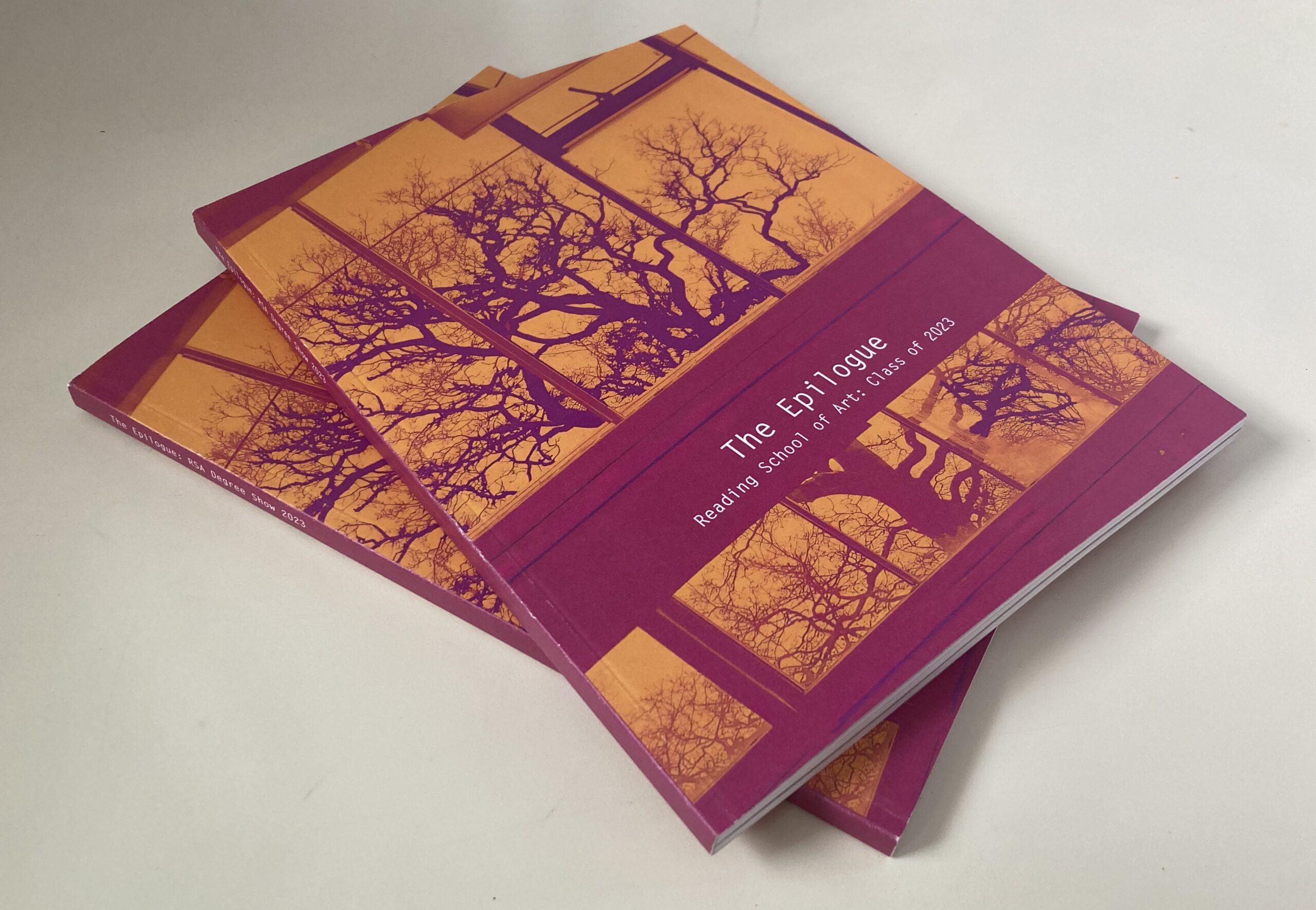
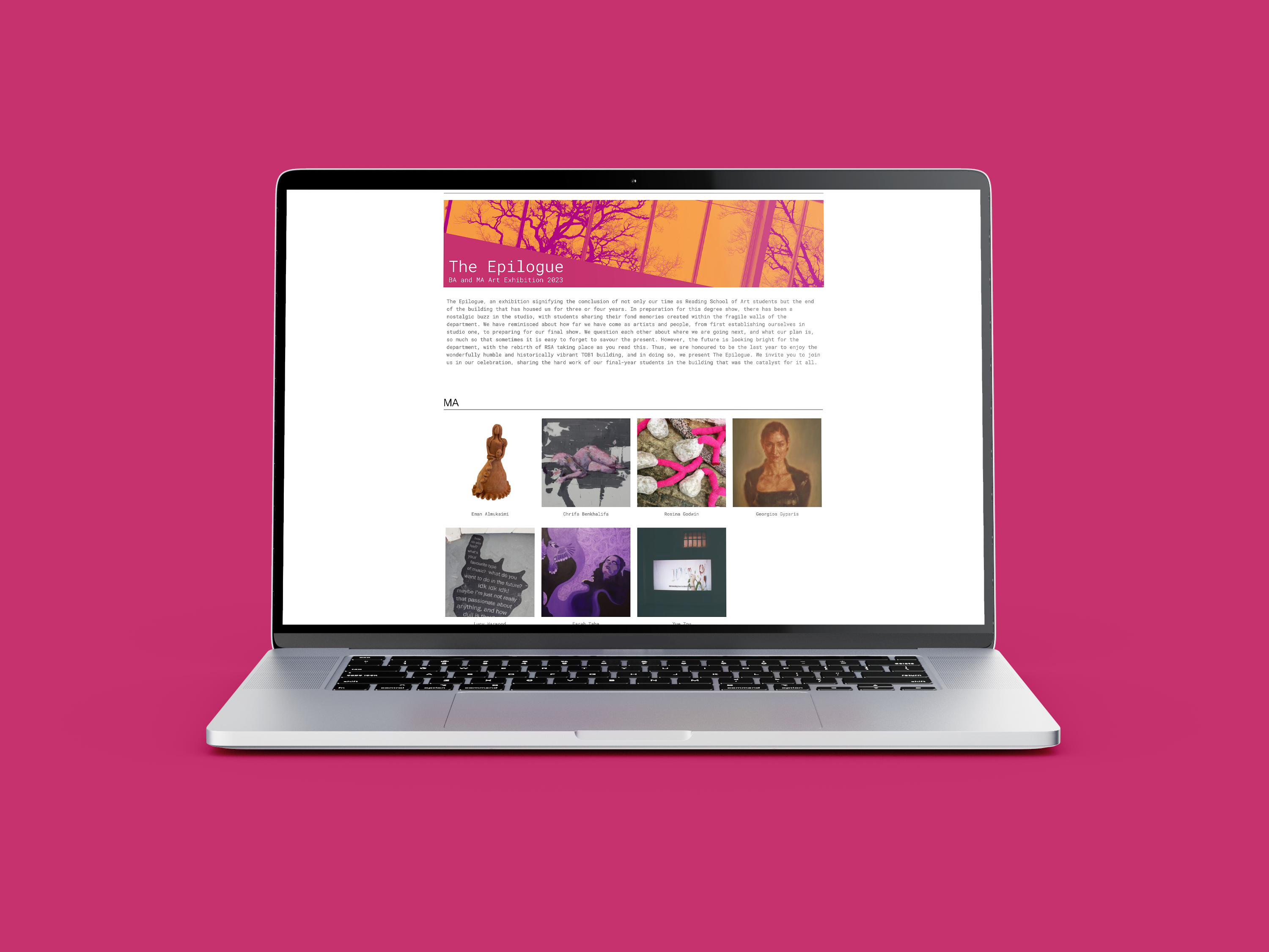
Reading School of Art Degree Show branding
The brief for this project was to design the branding for the Reading School of Art Degree Show, which included an art catalogue and website. The catalogue showcases the 60 students' artwork by grouping the pieces by colour and mood, creating a subtle colour gradient when flicked through. To go alongside the art catalogue, a website was created to display the students' individual work. This was created on WordPress and allowed each student to have a page for their work.
Hi, I’m Lewis. A meticulous designer who prides myself on a strong eye for detail which has allowed the art of storytelling to shine through in my layouts, typography, and visual elements. While studying at the University of Reading, I developed a keen interest in editorial design. My gung-ho attitude allows every piece of work I take on to be an opportunity to develop my skills while also furthering my knowledge.
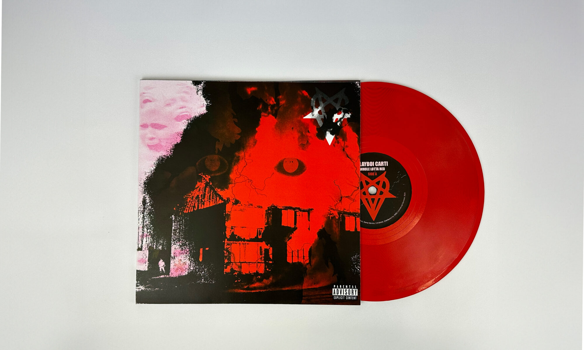
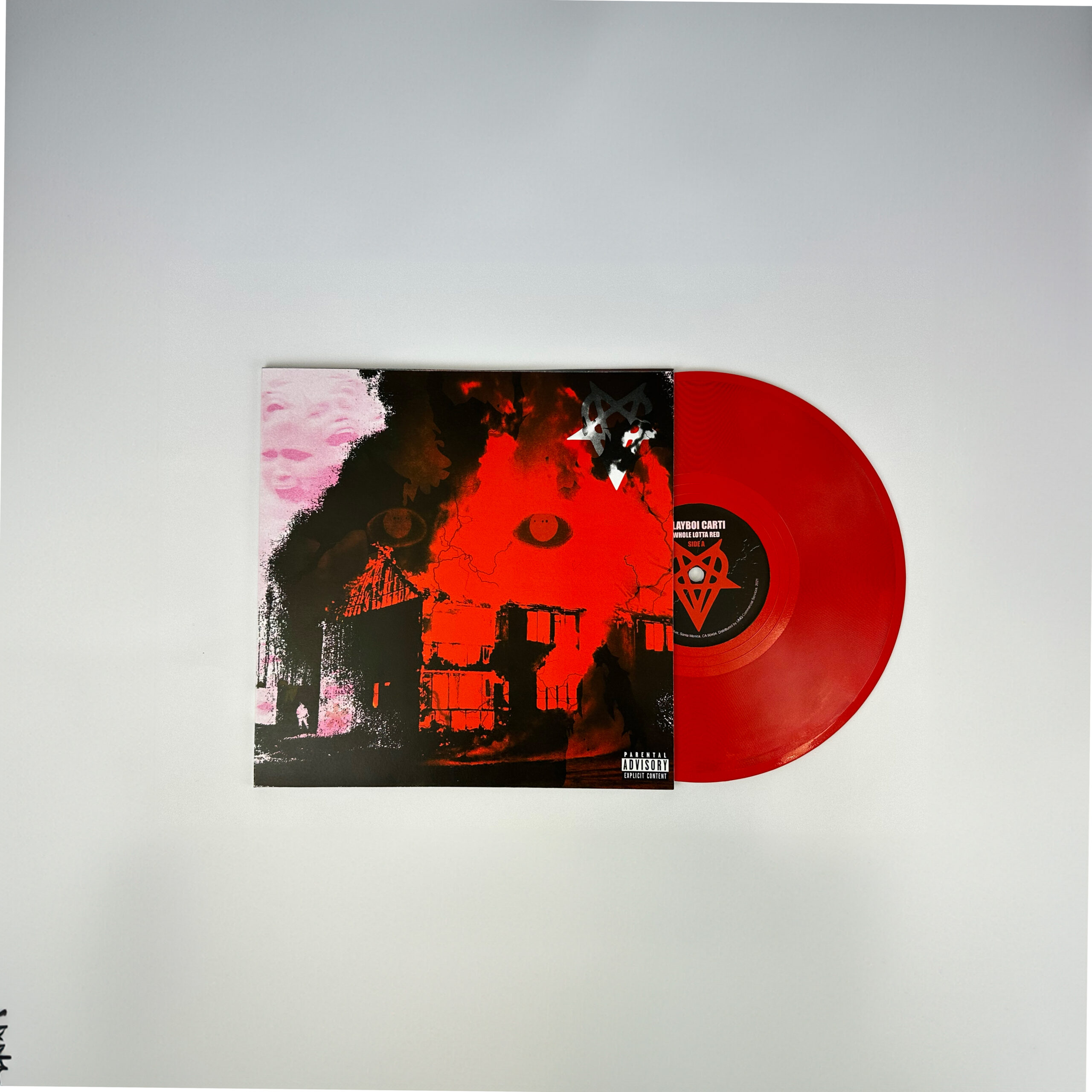
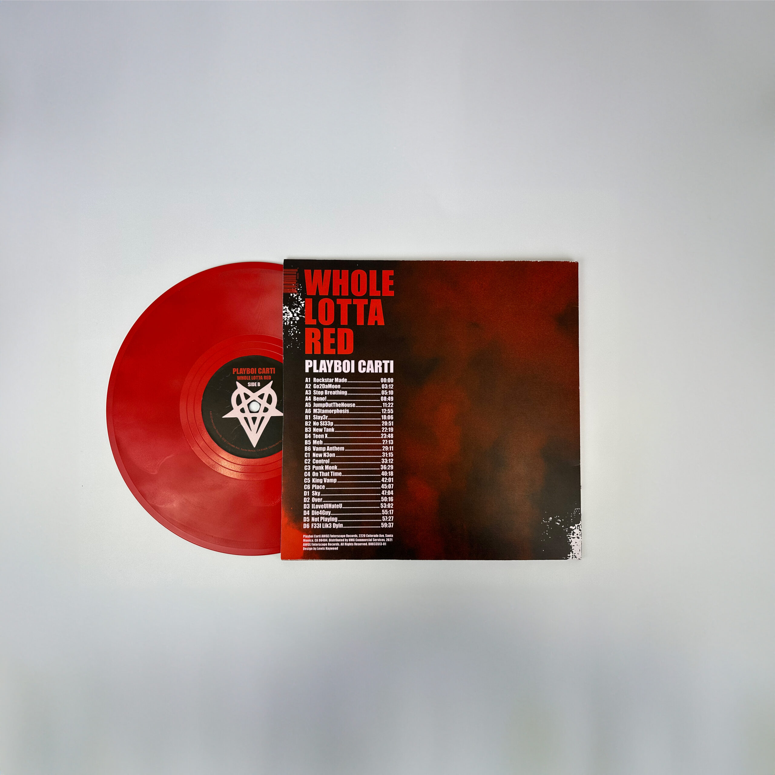
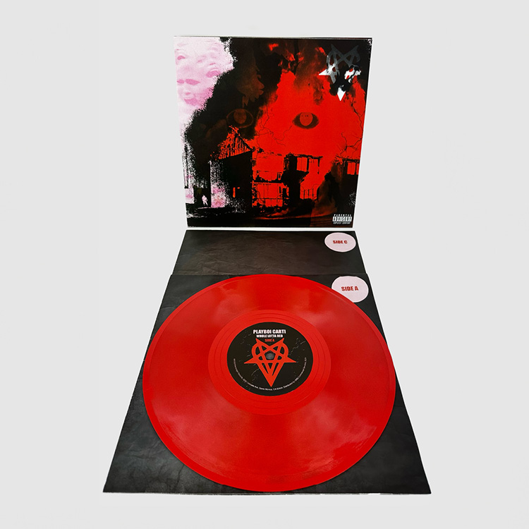
This record cover design embraces the new form of punk-rap with a redesign of Playboi Carti's 'WHOLE LOTTA RED'. To create strong visual links to the music on this record, the design aims to showcase themes of infectious energy, noise/distortion, and relentlessness.
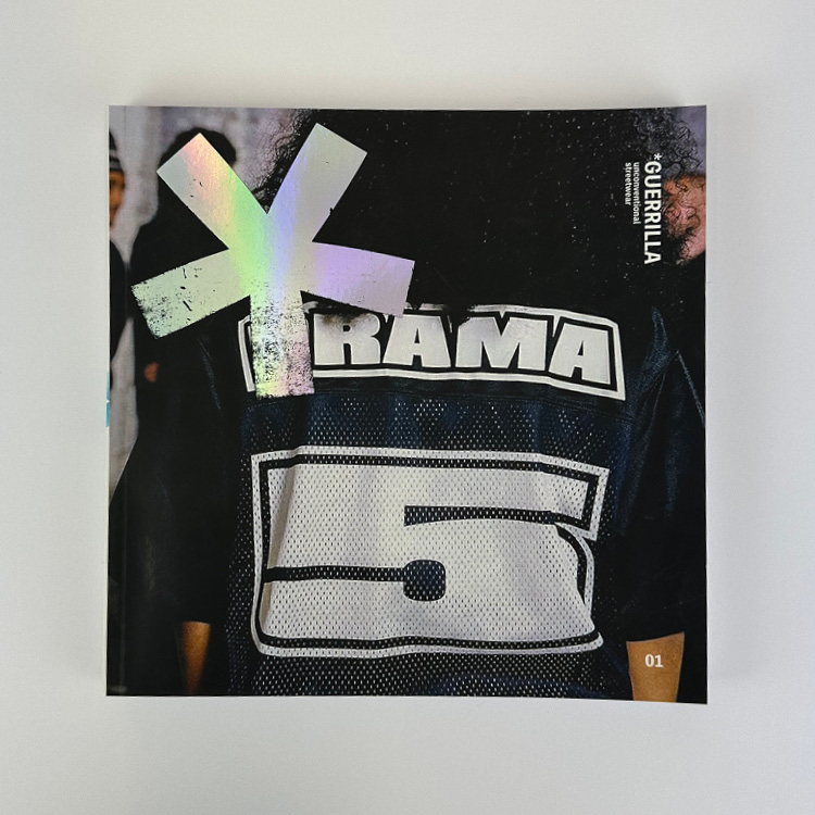
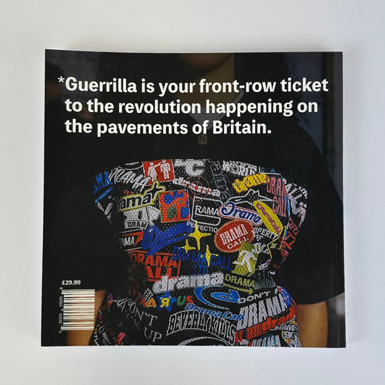
*GUERRILLA magazine
This is *GUERRILLA, an independent UK streetwear magazine, that focuses on underground clothing brands in the UK. The magazine analyses the UK underground streetwear game differently. Unlike conventional fashion magazines that look at the best of the best, there is a conscious effort to focus on brands that are on the rise, not those who are already at the top.
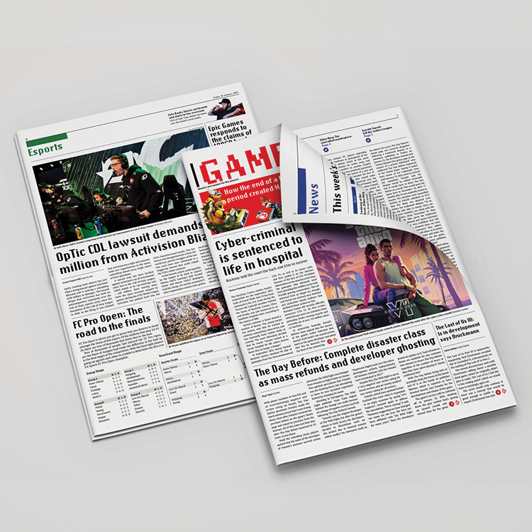
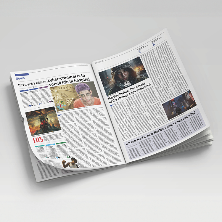
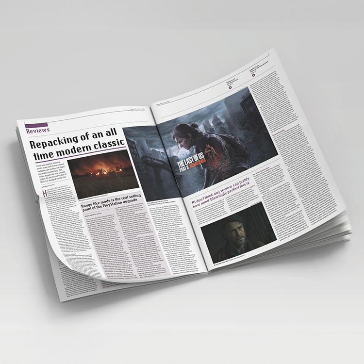
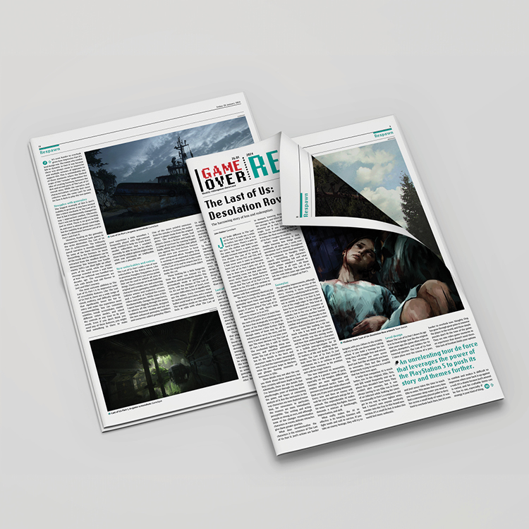
Game Over newspaper
Game Over is a weekly newspaper that focuses on video games. This weekly newspaper features news, reviews, statistics on games, and esports. Within the newspaper is a pullout, Game Over Respawn? which focuses on one particular game accompanied by a double page spread of a breathtaking piece of artwork from said game.


