Hello! I’m Lydia, a recent graduate from University of Reading, who has a particular passion for editorial design. I am a detail-focused designer who takes great joy in working in a systematic way. I have a great enthusiasm for typography; enjoy learning more about the broad field of graphic design and am an empathic communicator.
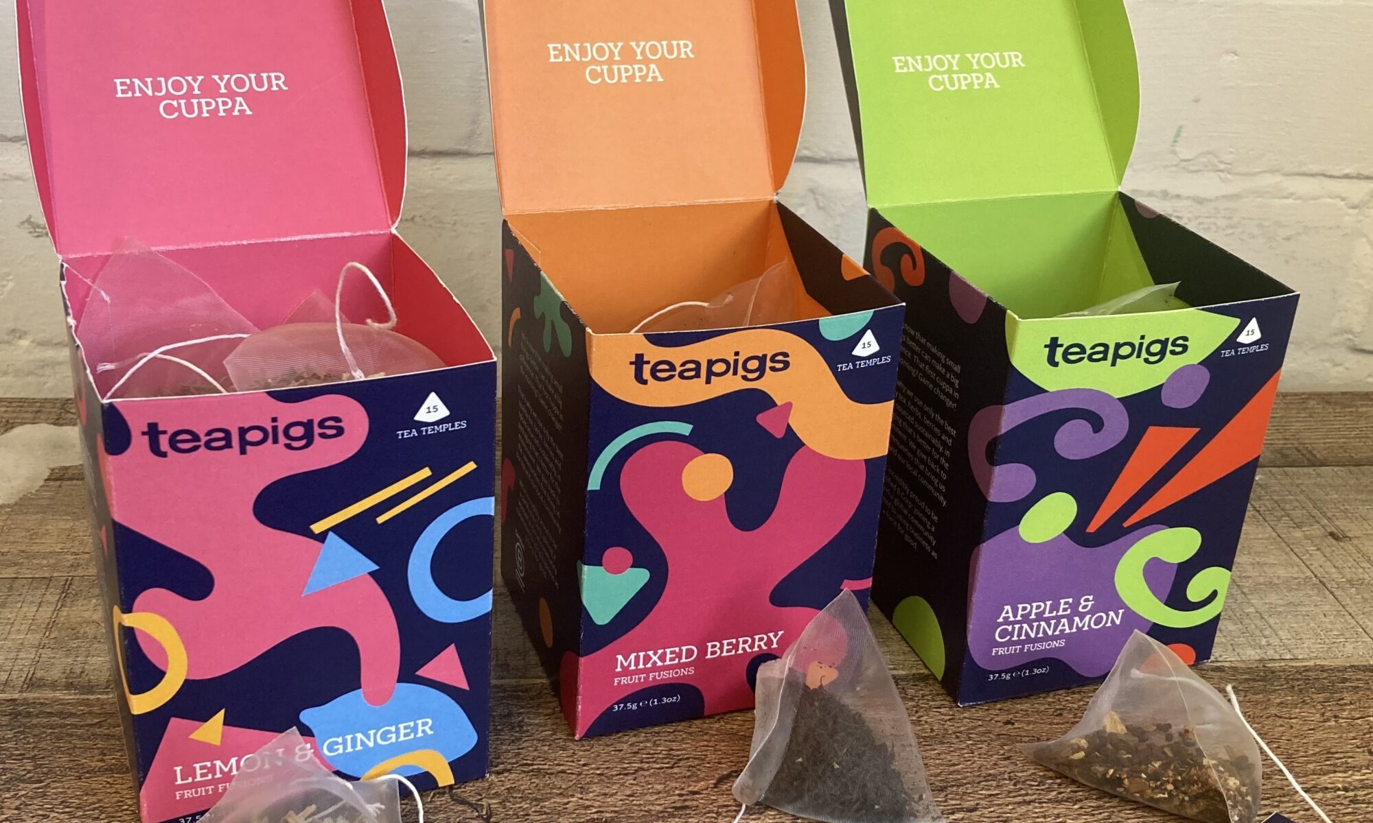
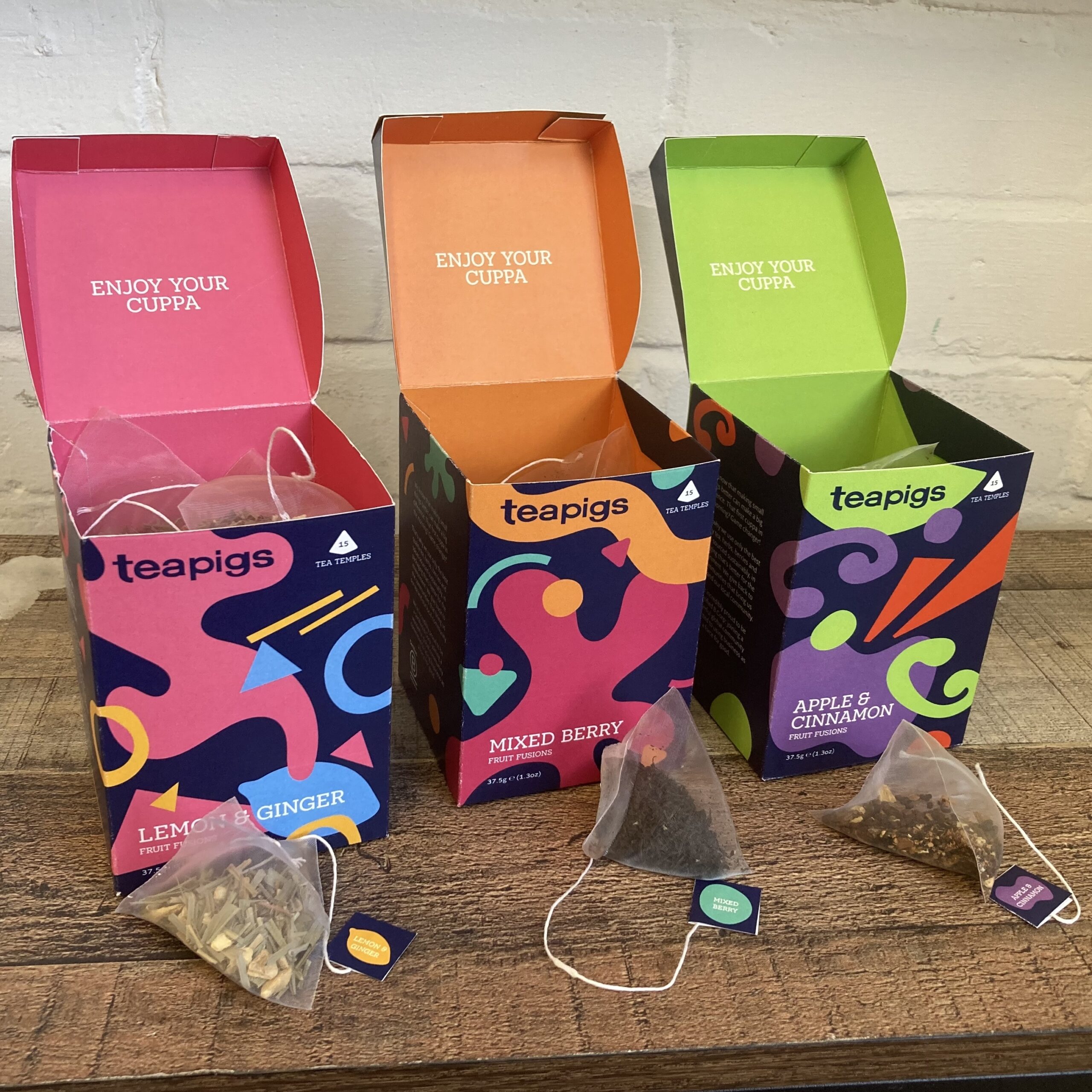
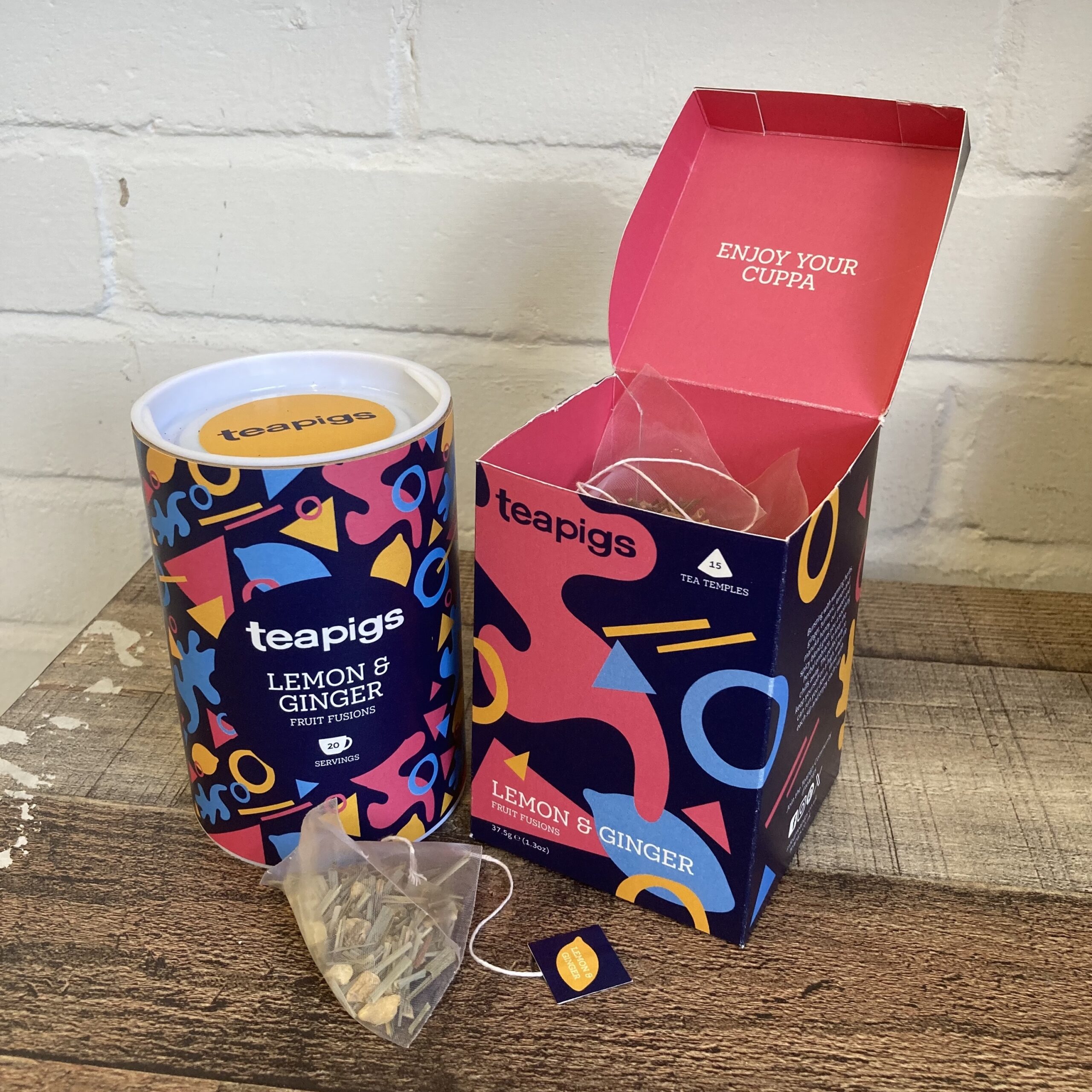
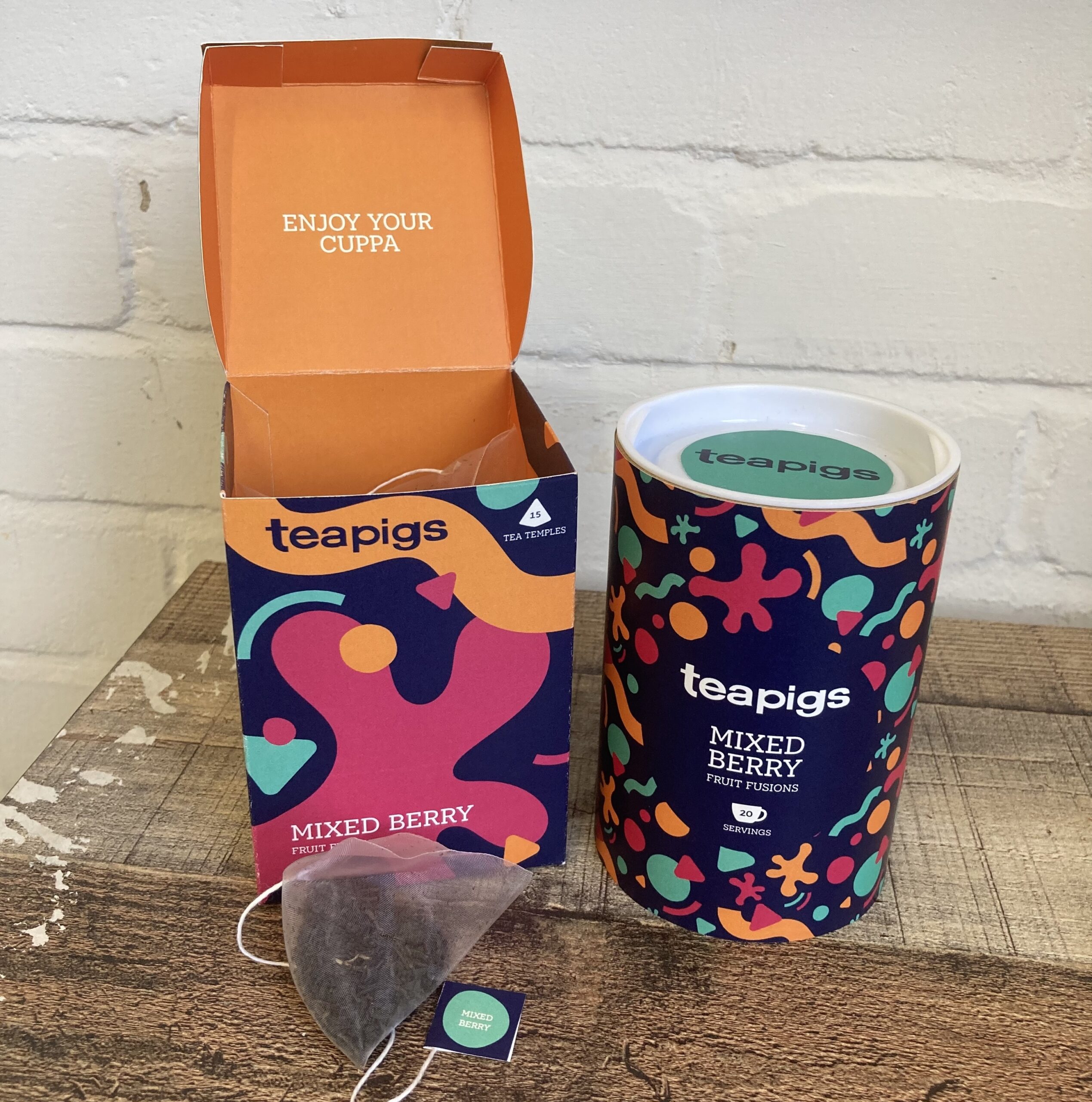
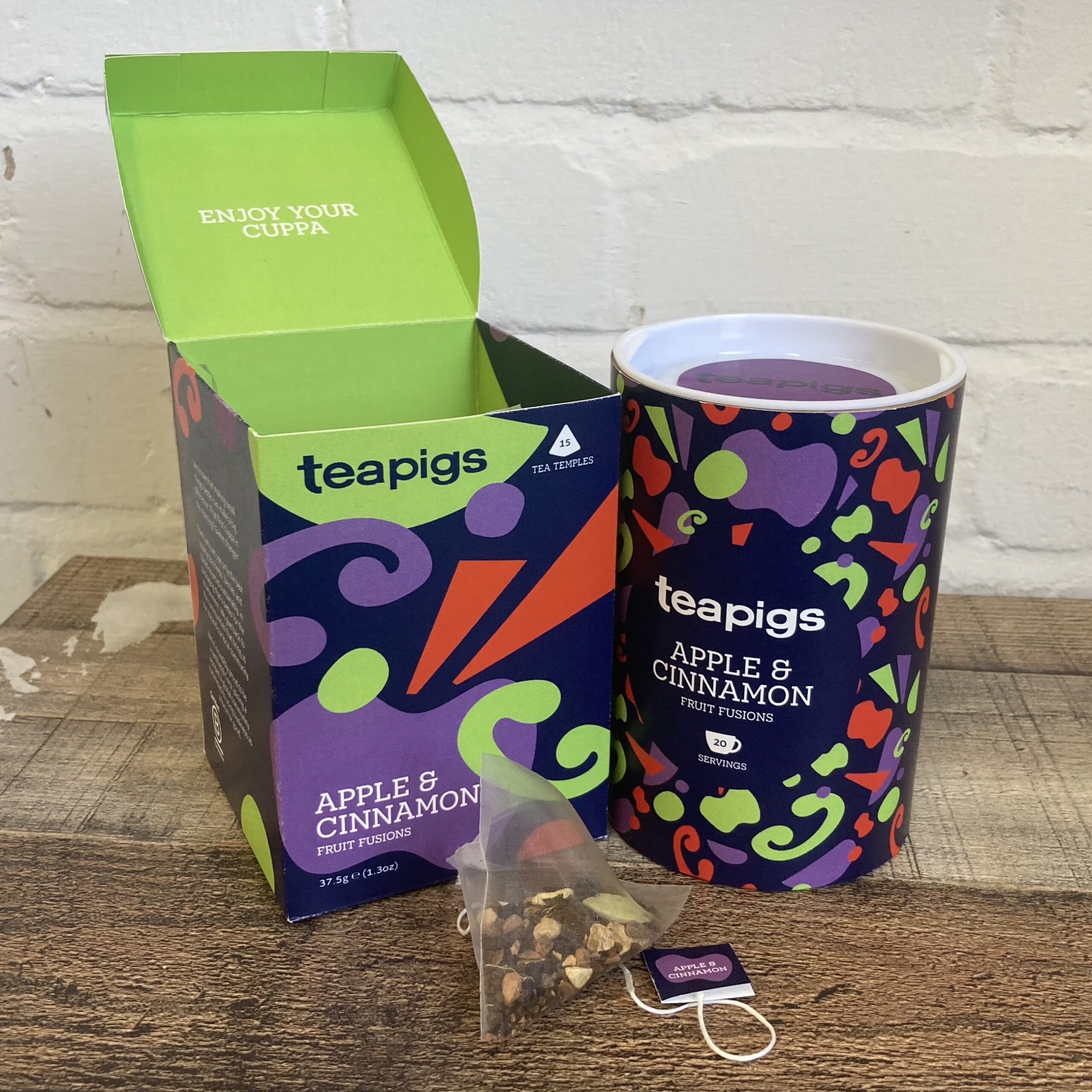
The brief for this project was to redesign the Teapigs packaging, with a focus on quality, sustainability, and an element of fun. The chosen approach was using a series of abstract shapes which represent the flavours and ingredients present in the tea. This approach answers best to the fun part of the brief. It can also be directed towards a younger audience of tea drinkers, and excite them with unique packaging (compared to the rest of the tea genre).
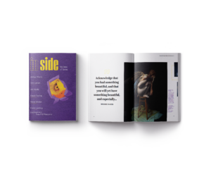
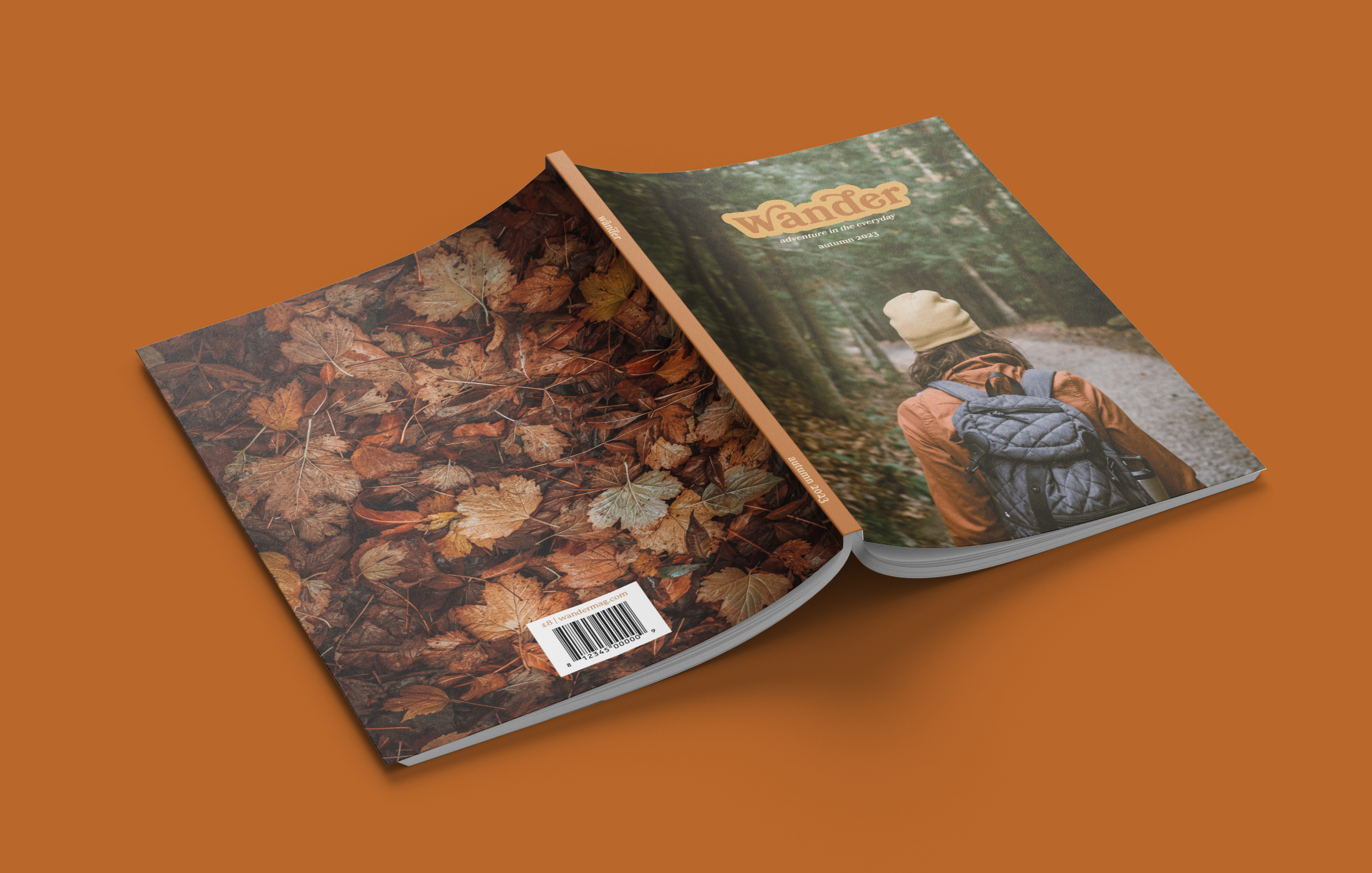
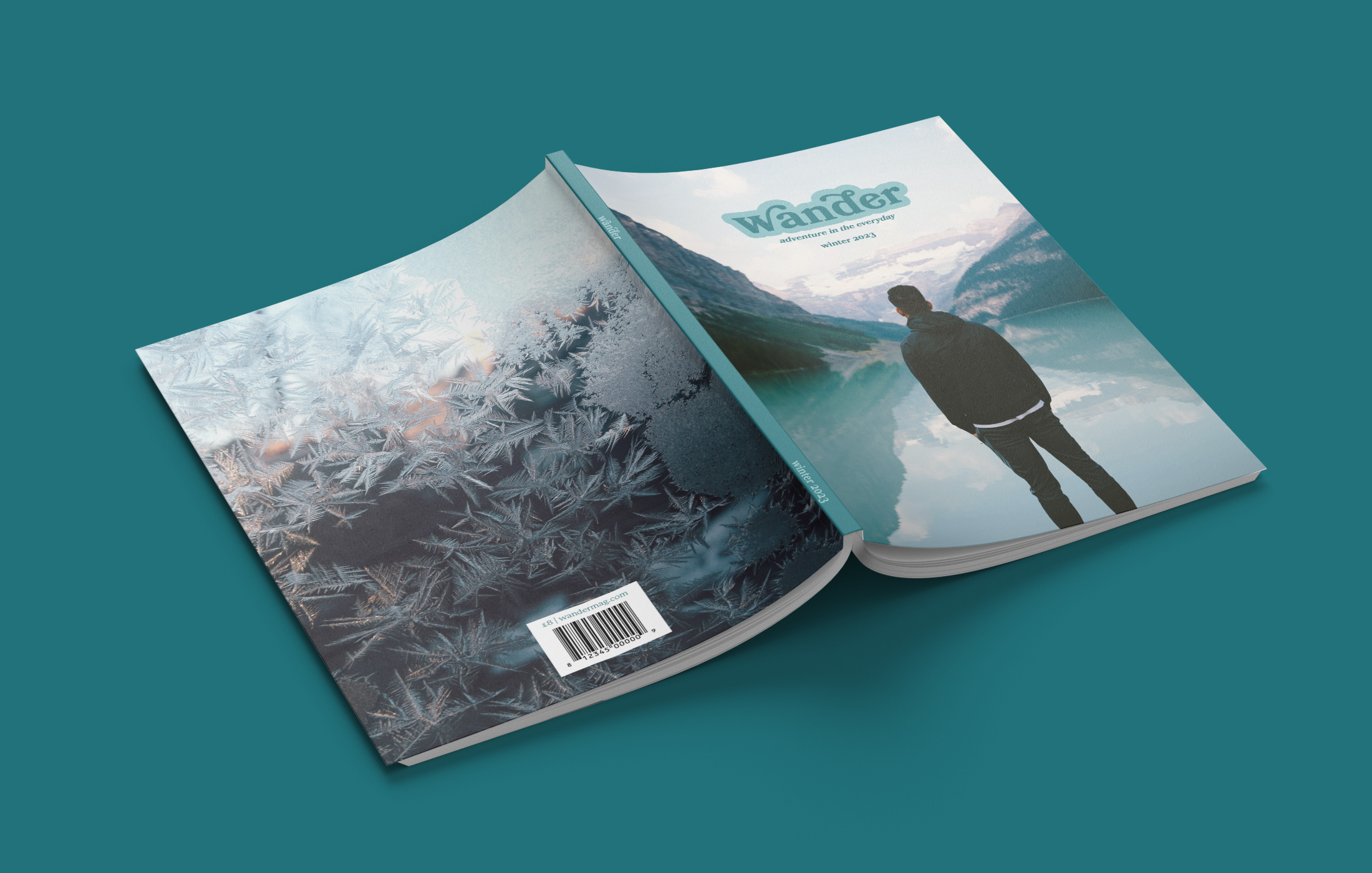
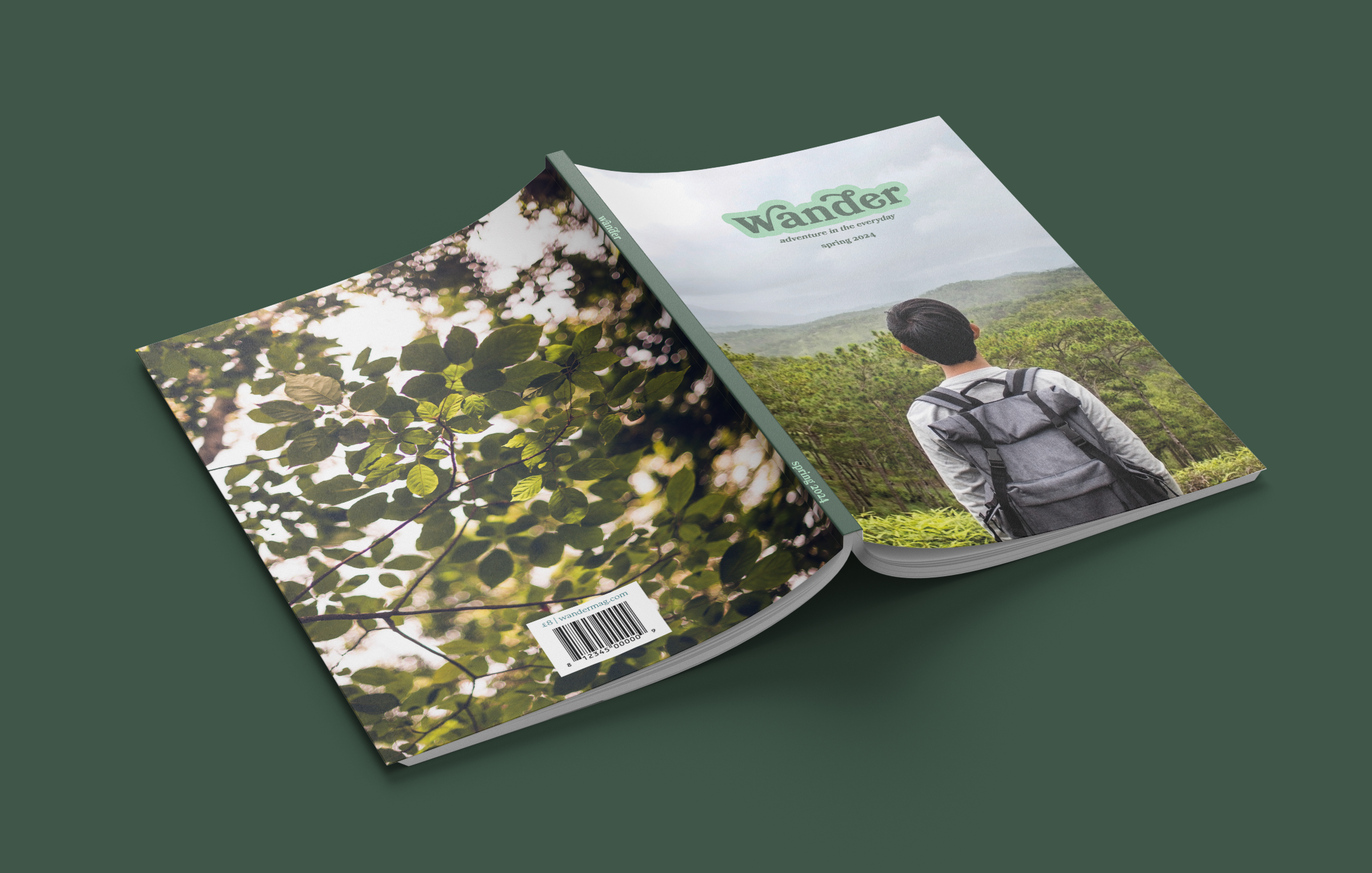
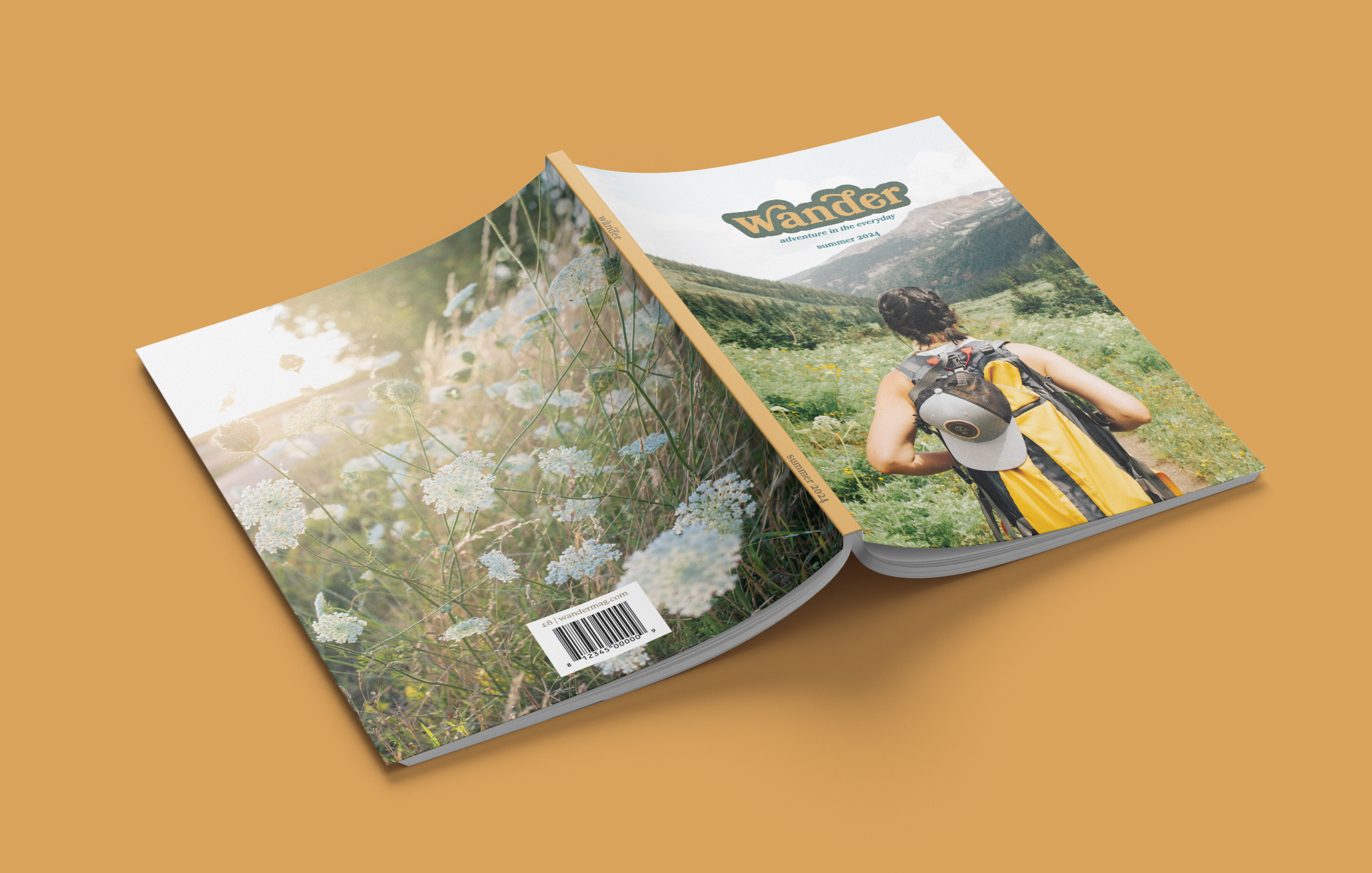
Wander magazine
'Wander' is a travel magazine that showcases the beauty of the Earth, in particular the everyday or overlooked places. It is aimed at young adults who have a desire to travel, and may well be setting out on their first solo trip. 'Wander' is all about slowing down to enjoy the adventure and excitement in every day, and so it was appropriate to complement this theme with a slow, bookish design. Each magazine has four coloured sections: destinations, gear & gadgets, travel trends, and seasonal.
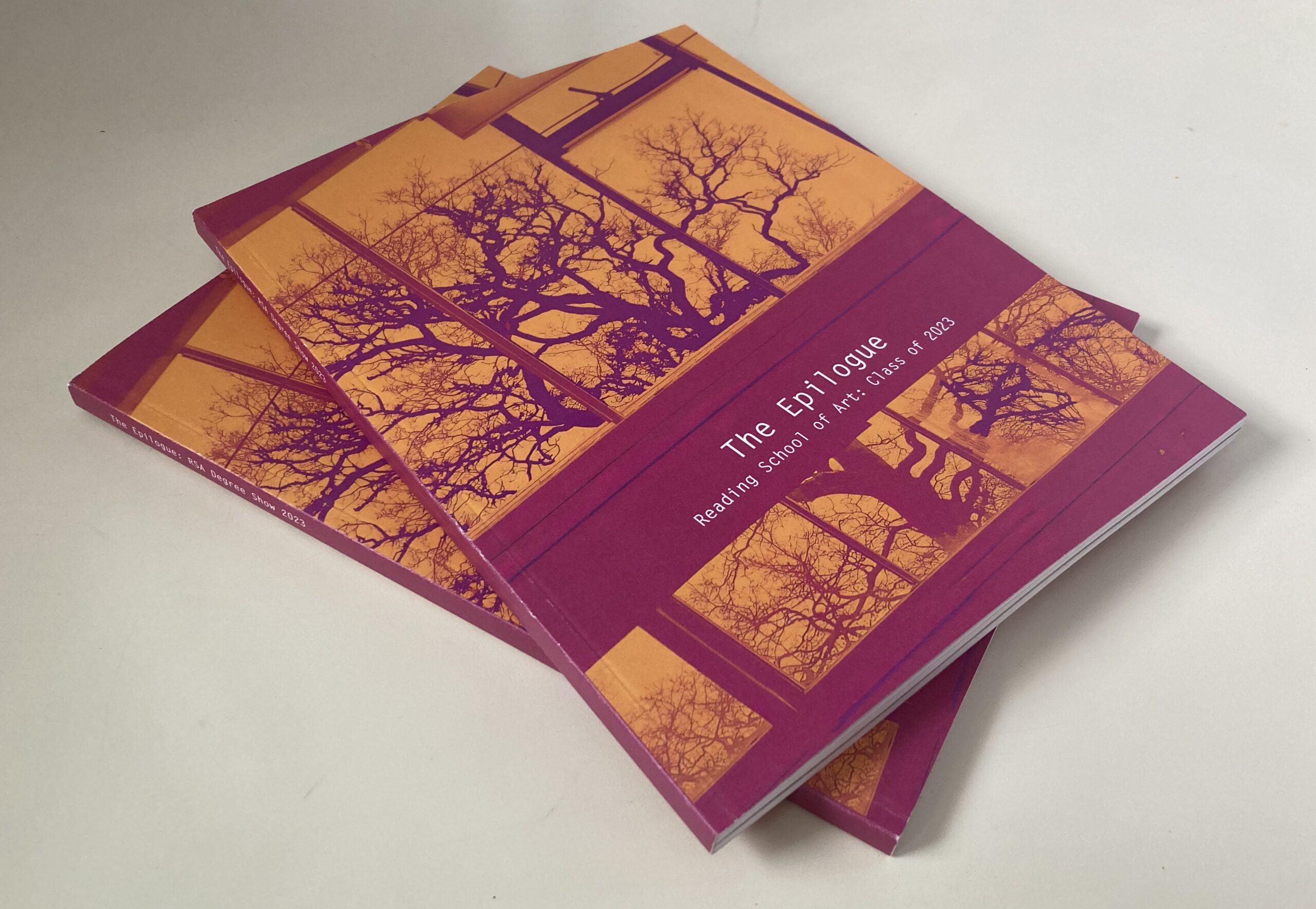
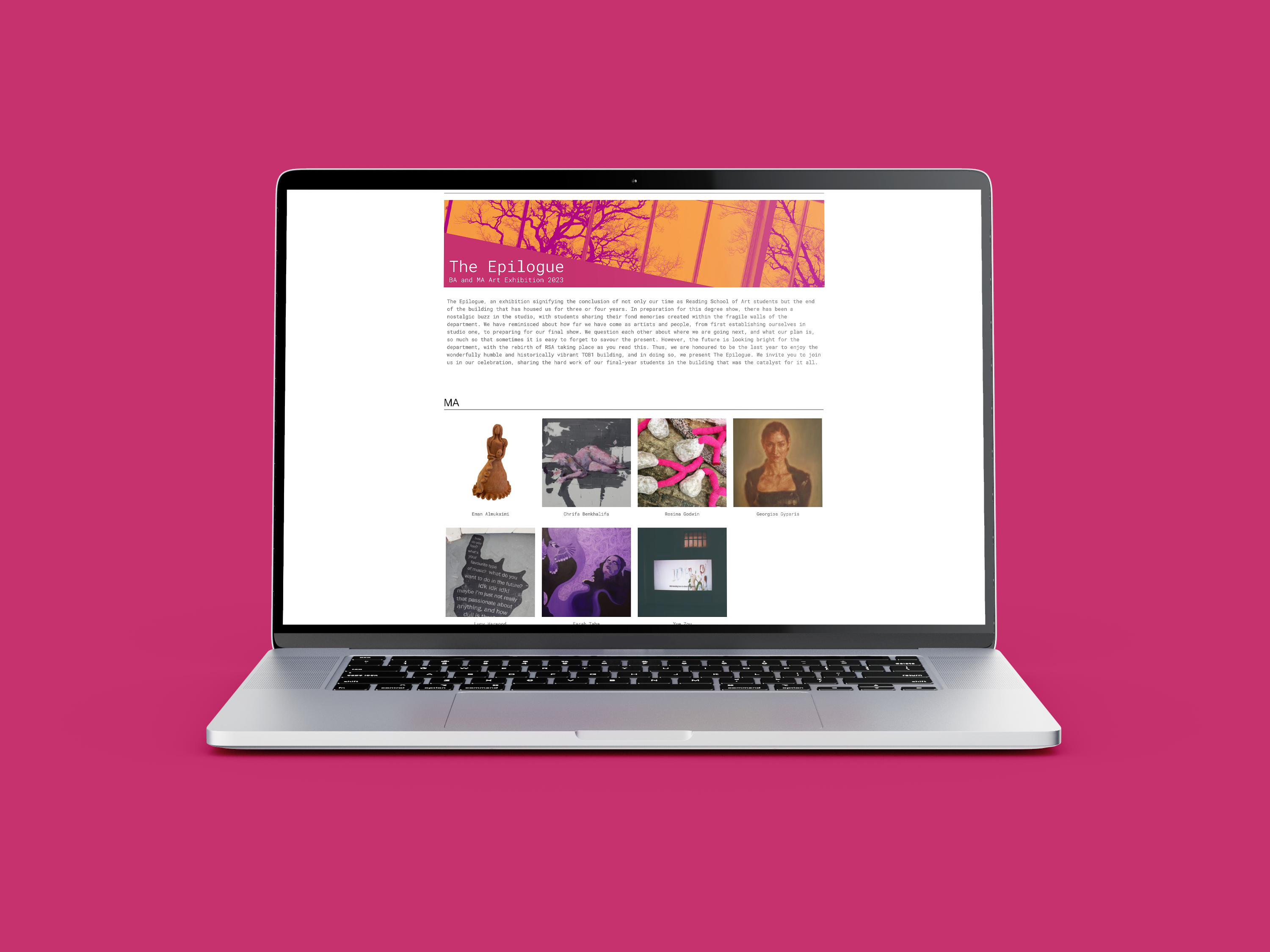
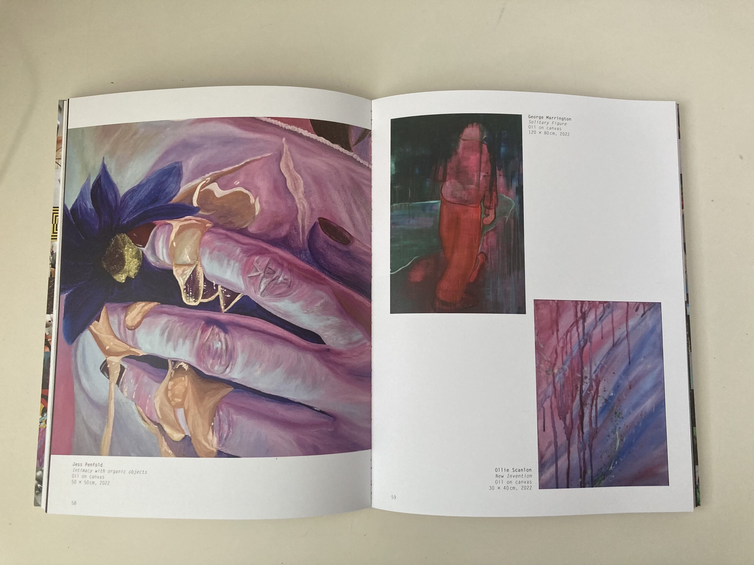
Reading School of Art Degree Show branding
The brief for this project was to design the branding for the Reading School of Art Degree Show, which included an art catalogue and website. The catalogue showcases the 60 students' artwork by grouping the pieces by colour and mood, creating a subtle colour gradient when flicked through. To go alongside the art catalogue, a website was created to display the students' individual work. This was created on WordPress and allowed each student to have a page for their work.
Hi, I’m Lewis. A meticulous designer who prides myself on a strong eye for detail which has allowed the art of storytelling to shine through in my layouts, typography, and visual elements. While studying at the University of Reading, I developed a keen interest in editorial design. My gung-ho attitude allows every piece of work I take on to be an opportunity to develop my skills while also furthering my knowledge.
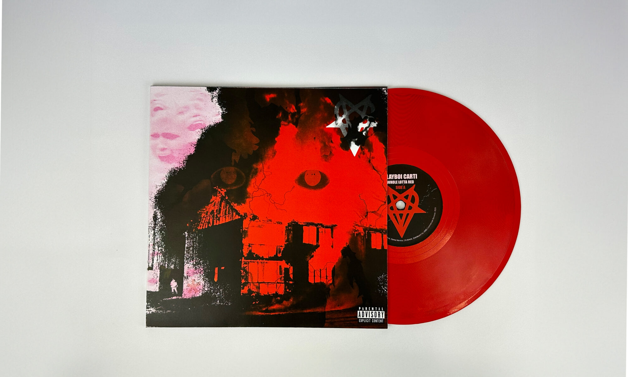
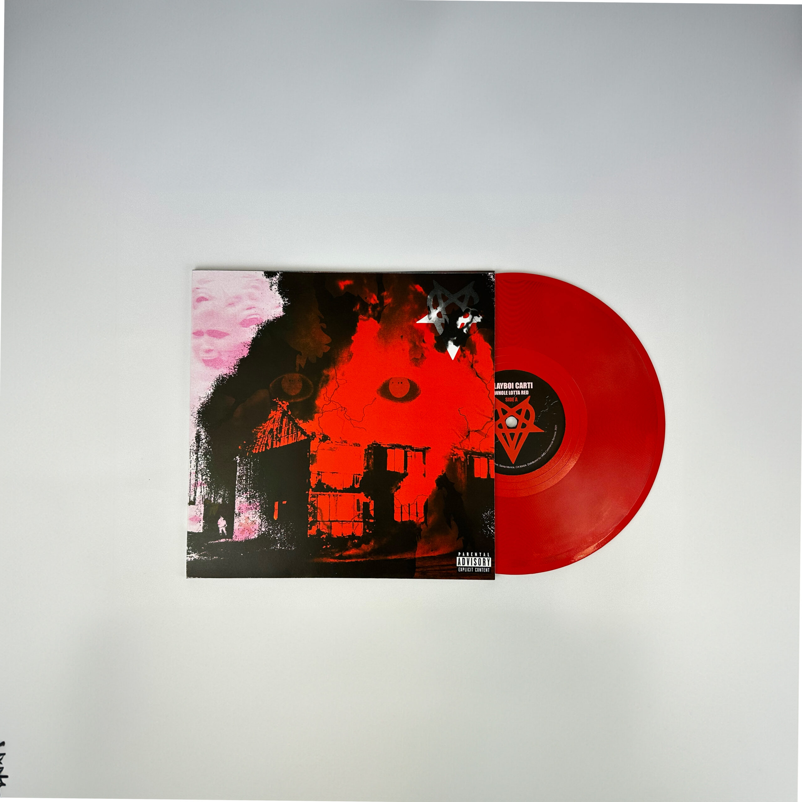
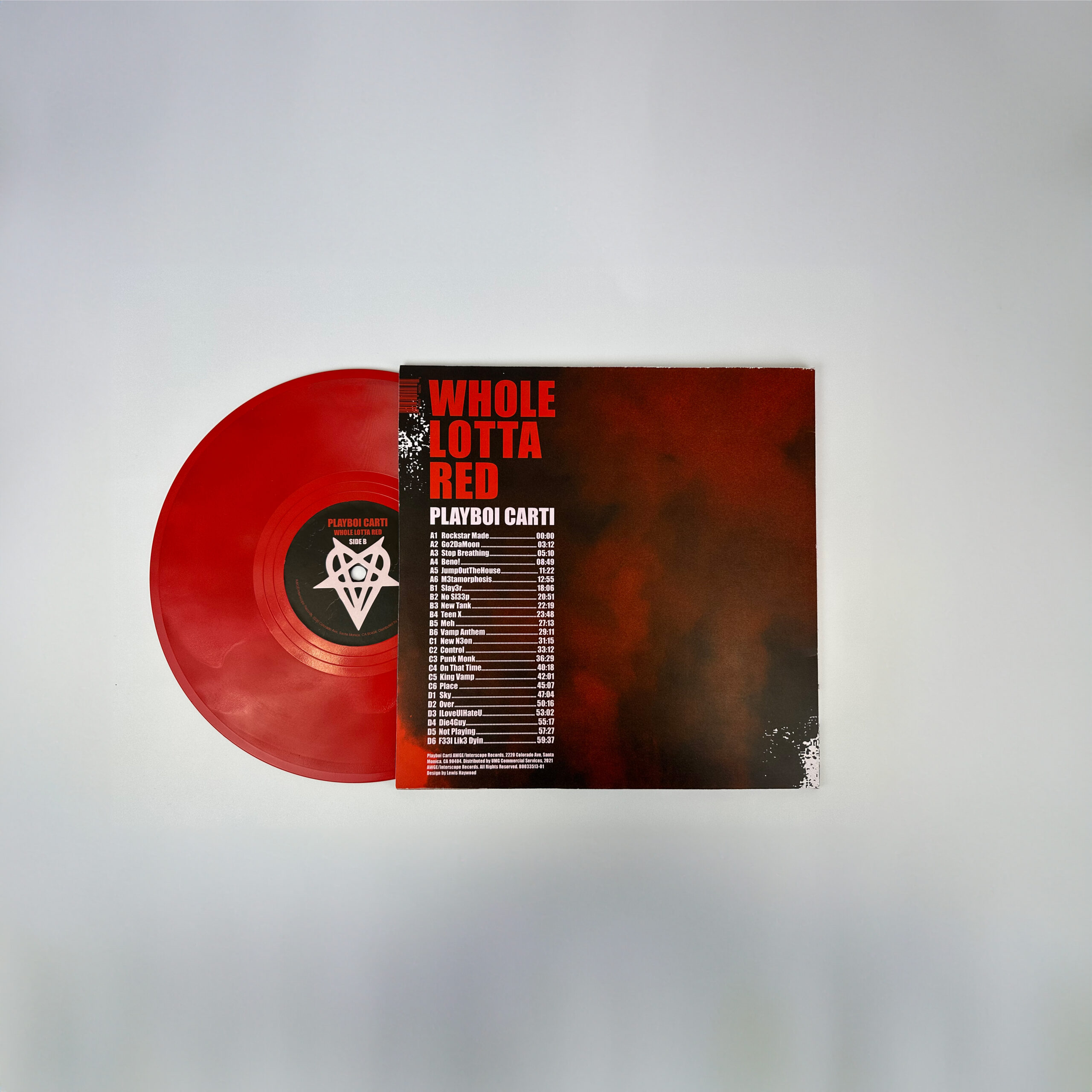
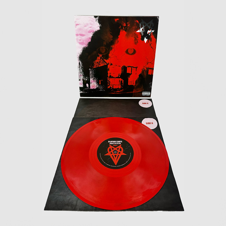
This record cover design embraces the new form of punk-rap with a redesign of Playboi Carti's 'WHOLE LOTTA RED'. To create strong visual links to the music on this record, the design aims to showcase themes of infectious energy, noise/distortion, and relentlessness.
*GUERRILLA magazine
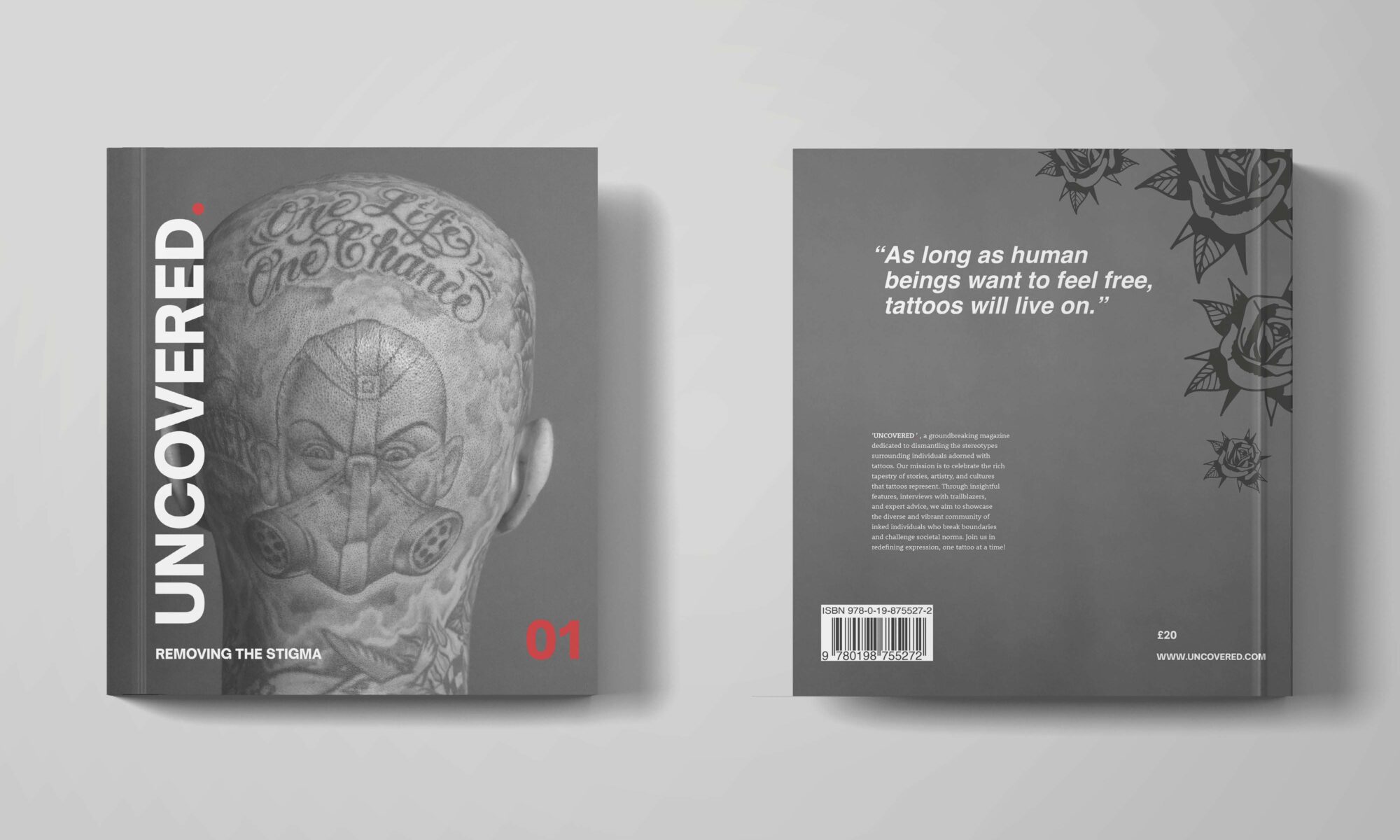
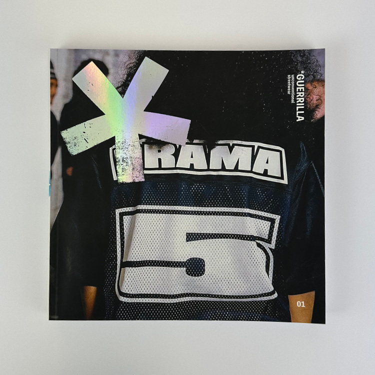
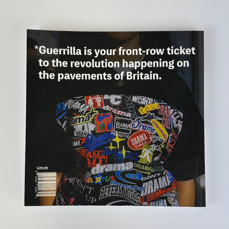
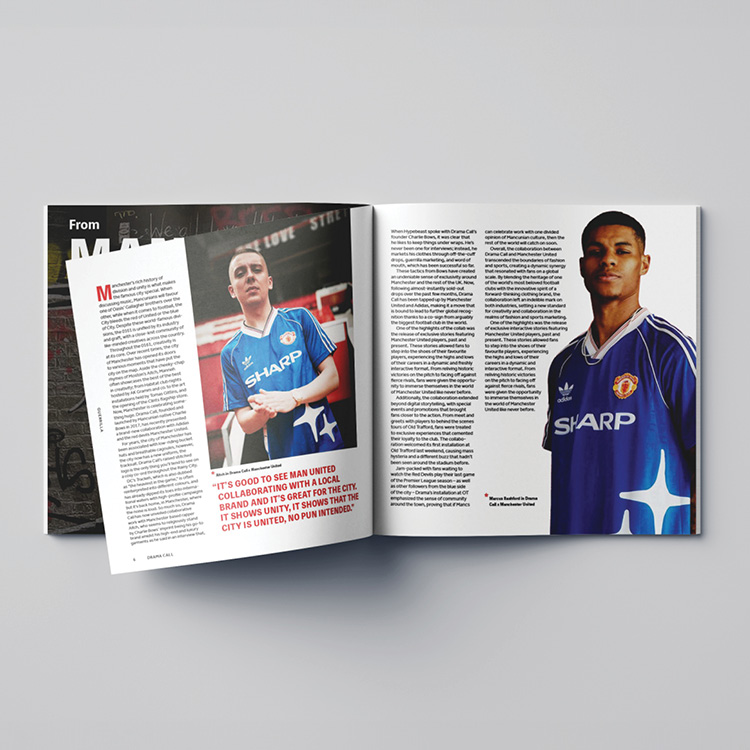
This is *GUERRILLA, an independent UK streetwear magazine, that focuses on underground clothing brands in the UK. The magazine analyses the UK underground streetwear game differently. Unlike conventional fashion magazines that look at the best of the best, there is a conscious effort to focus on brands that are on the rise, not those who are already at the top.
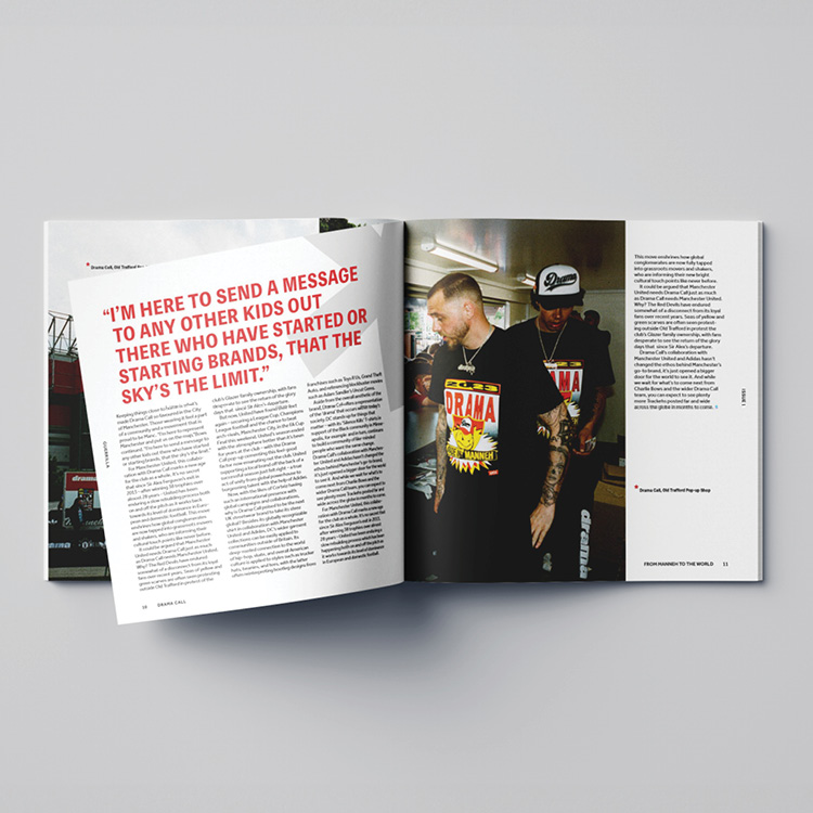
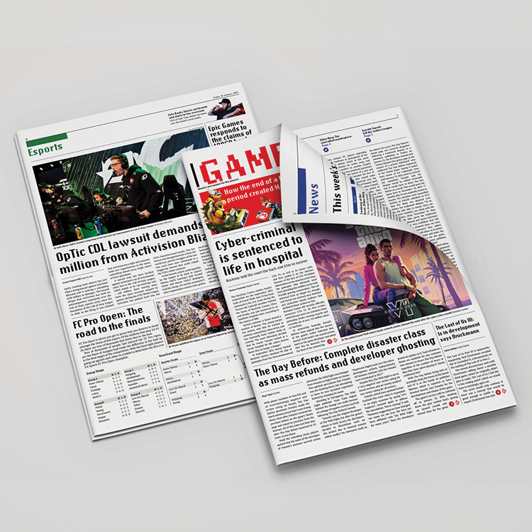
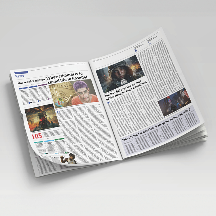
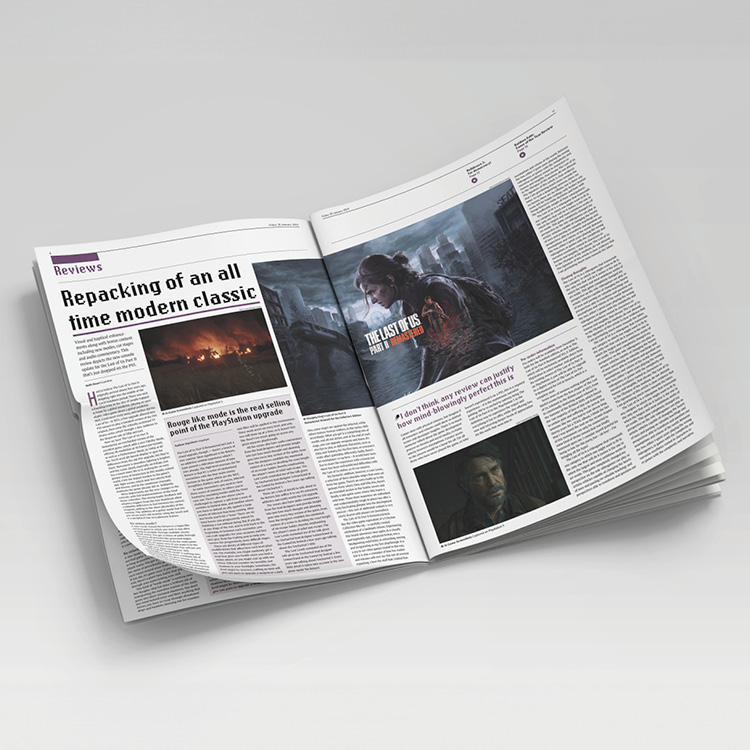
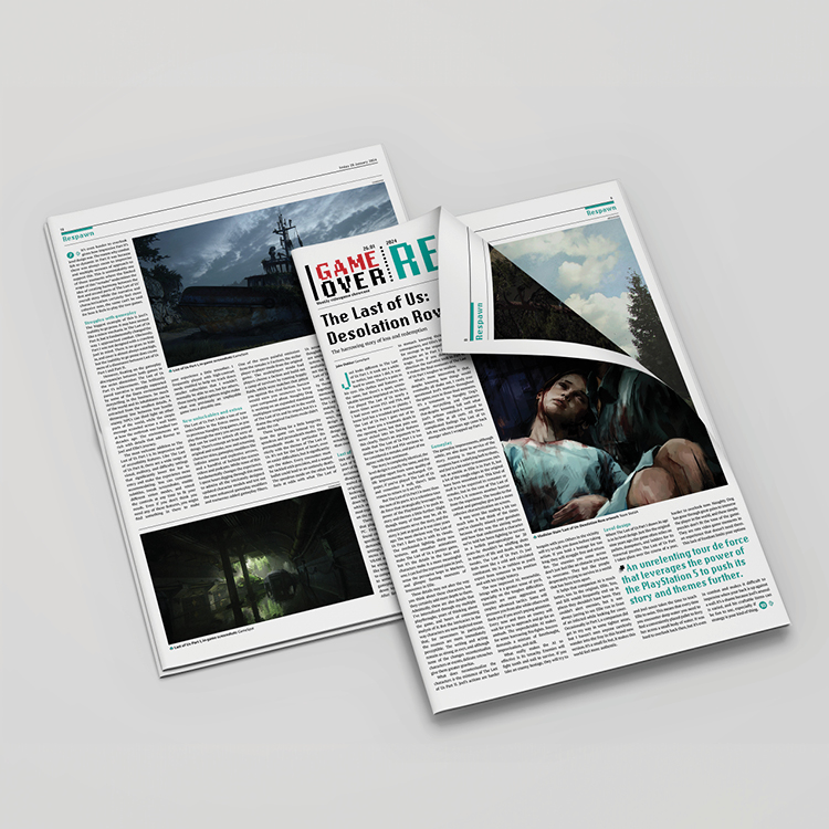
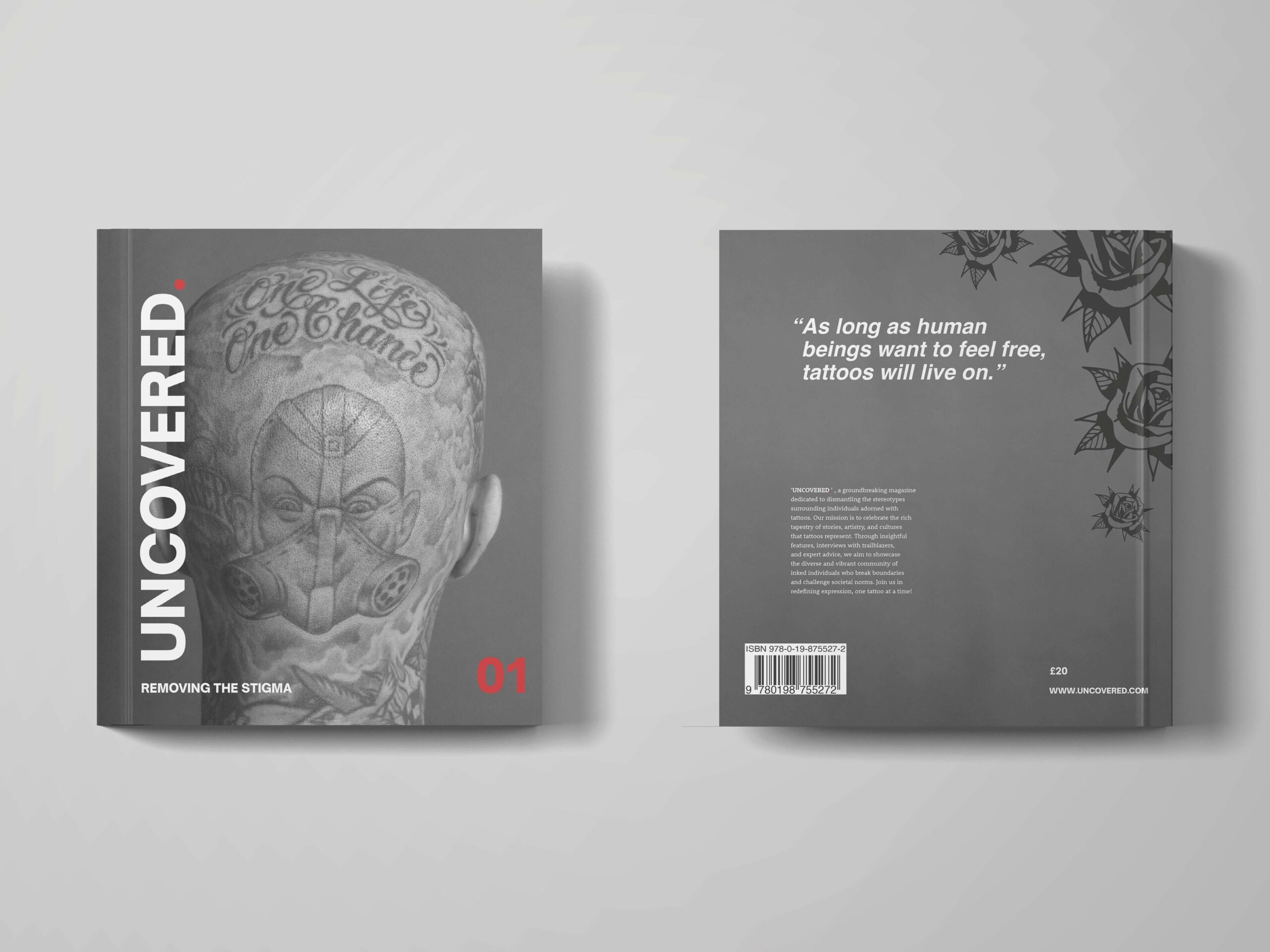
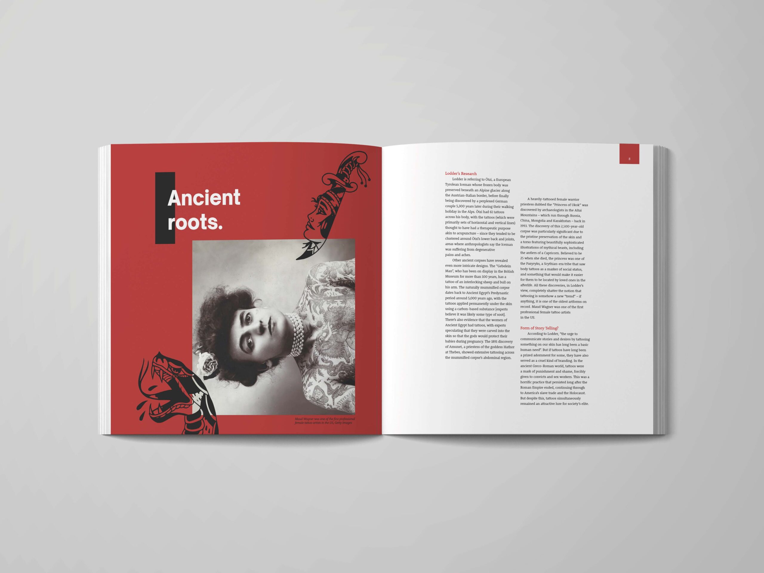
Game Over newspaper
Game Over is a weekly newspaper that focuses on video games. This weekly newspaper features news, reviews, statistics on games, and esports. Within the newspaper is a pullout, Game Over Respawn? which focuses on one particular game accompanied by a double page spread of a breathtaking piece of artwork from said game.
Hi, I’m Jaflenur! I consider myself to be a creative and passionate individual willing to learn new skills and expand my knowledge. During my last three years of studying, I have developed and broadened my understanding of design and its importance in functionality and inclusivity. Throughout my degree, I have learnt skills in a number of software including Adobe InDesign, Illustrator, Photoshop and Figma, but most importantly I discovered my interest in editorial design, packaging and anything print related. I enjoy working on projects that involve getting to create physical deliverables and getting to use and experiment with different materials.
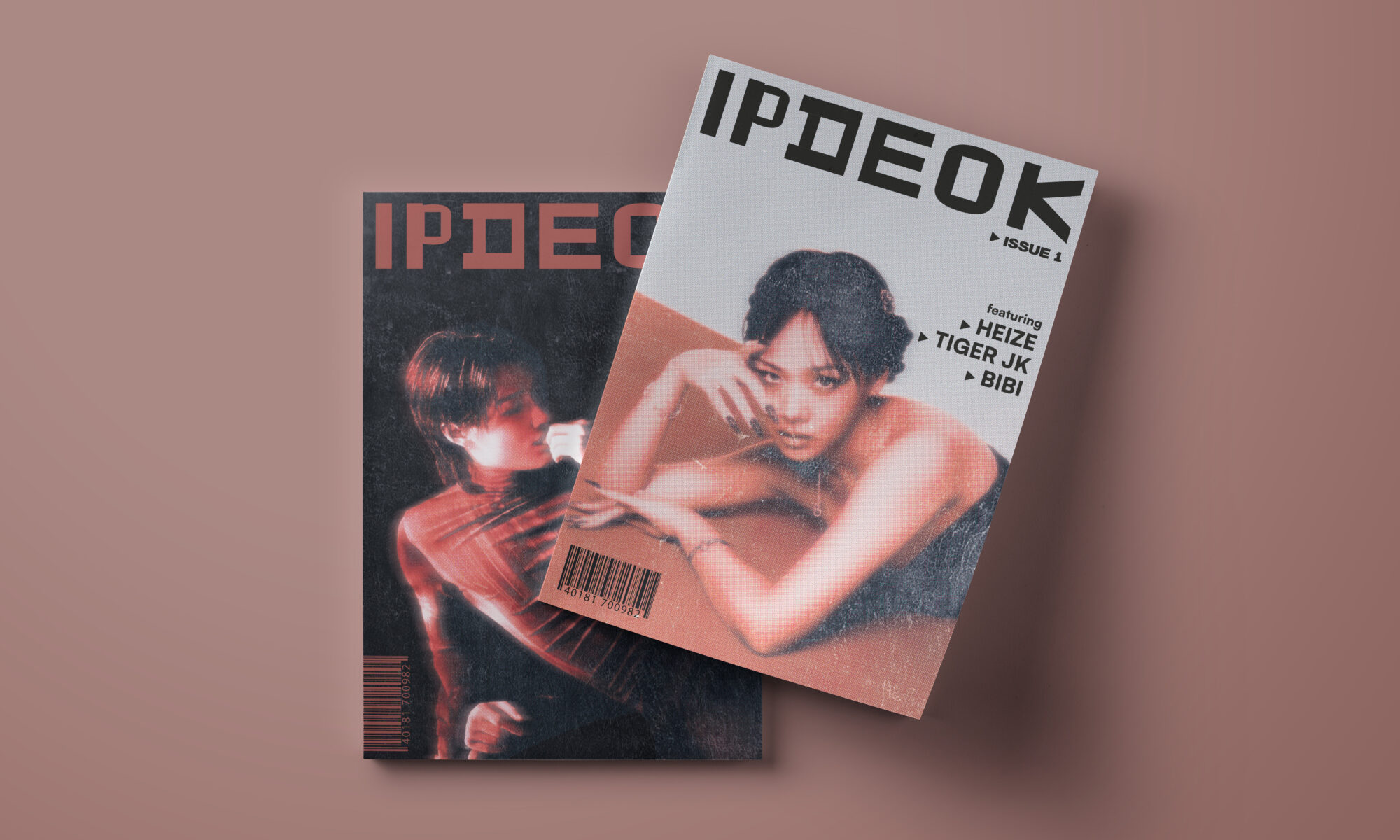
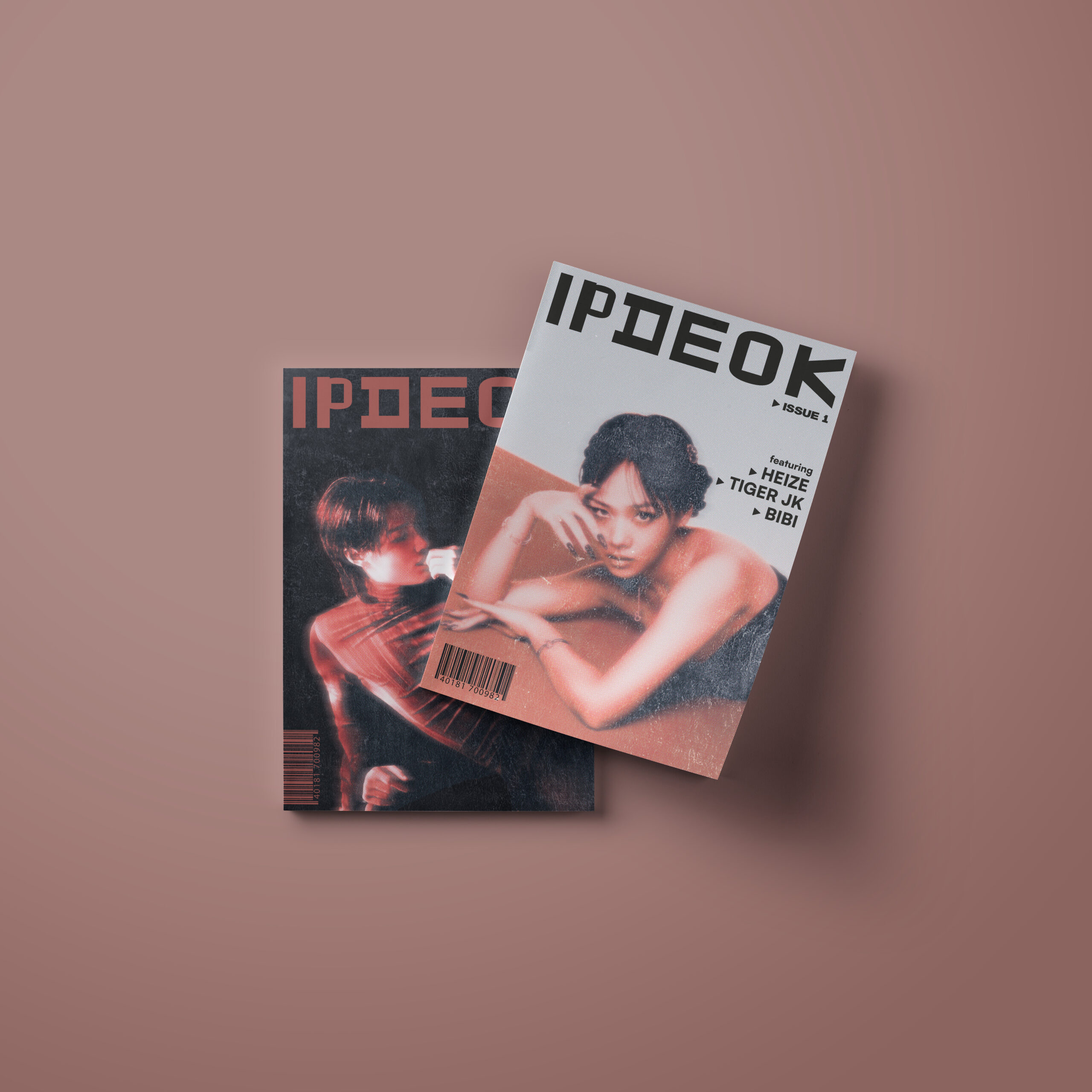
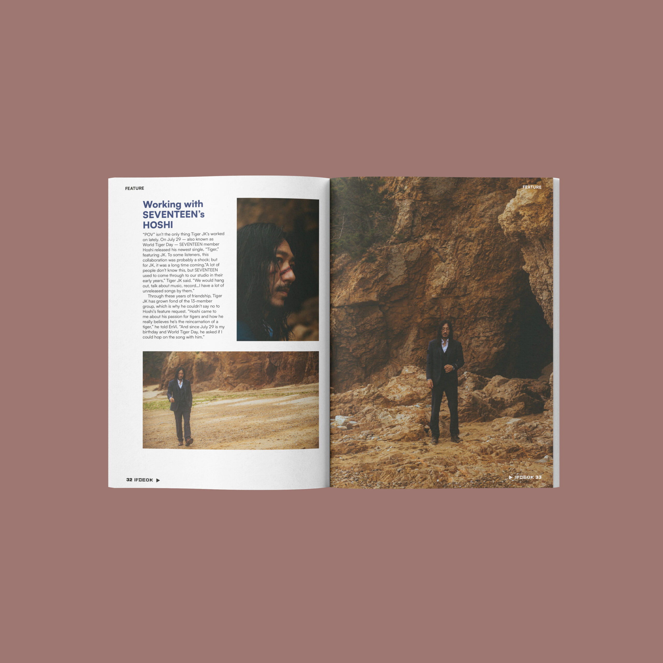
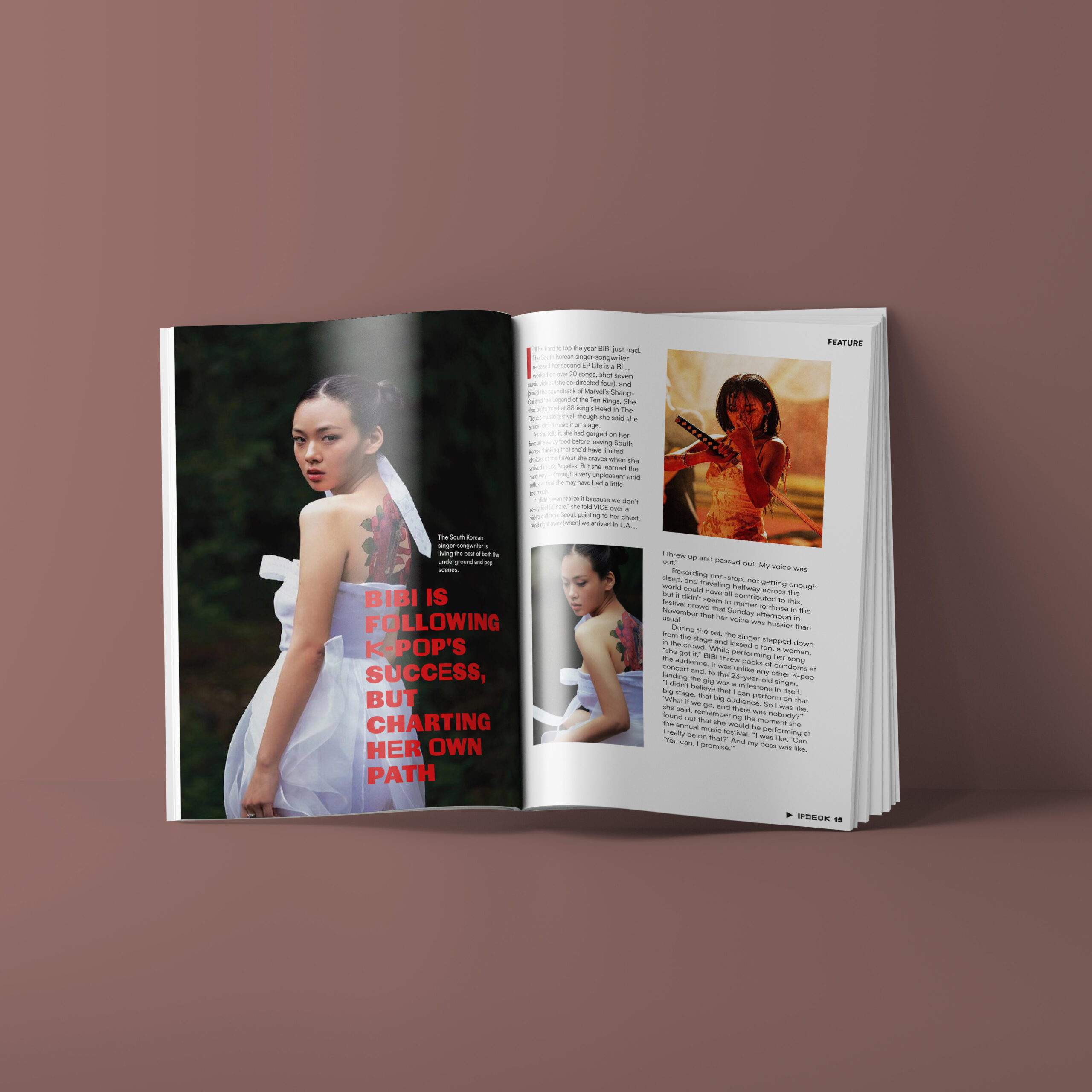
IPDEOK introduces upcoming and indie Korean artists, ranging in genres such as R&B, rock, hip-hop and many more! Each issue focuses on artists that deserve more recognition and could gain more listeners from around the world. IPDEOK celebrates the artists’ recent music and their influence in the Korean music industry, as well as globally. Packed with interviews, articles and recommendations of different artists, IPDEOK shows rising creatives and offers a different genre of Korean music to try. A playlist for each issue is included for readers to listen to while reading, packed with songs from the featured artists.
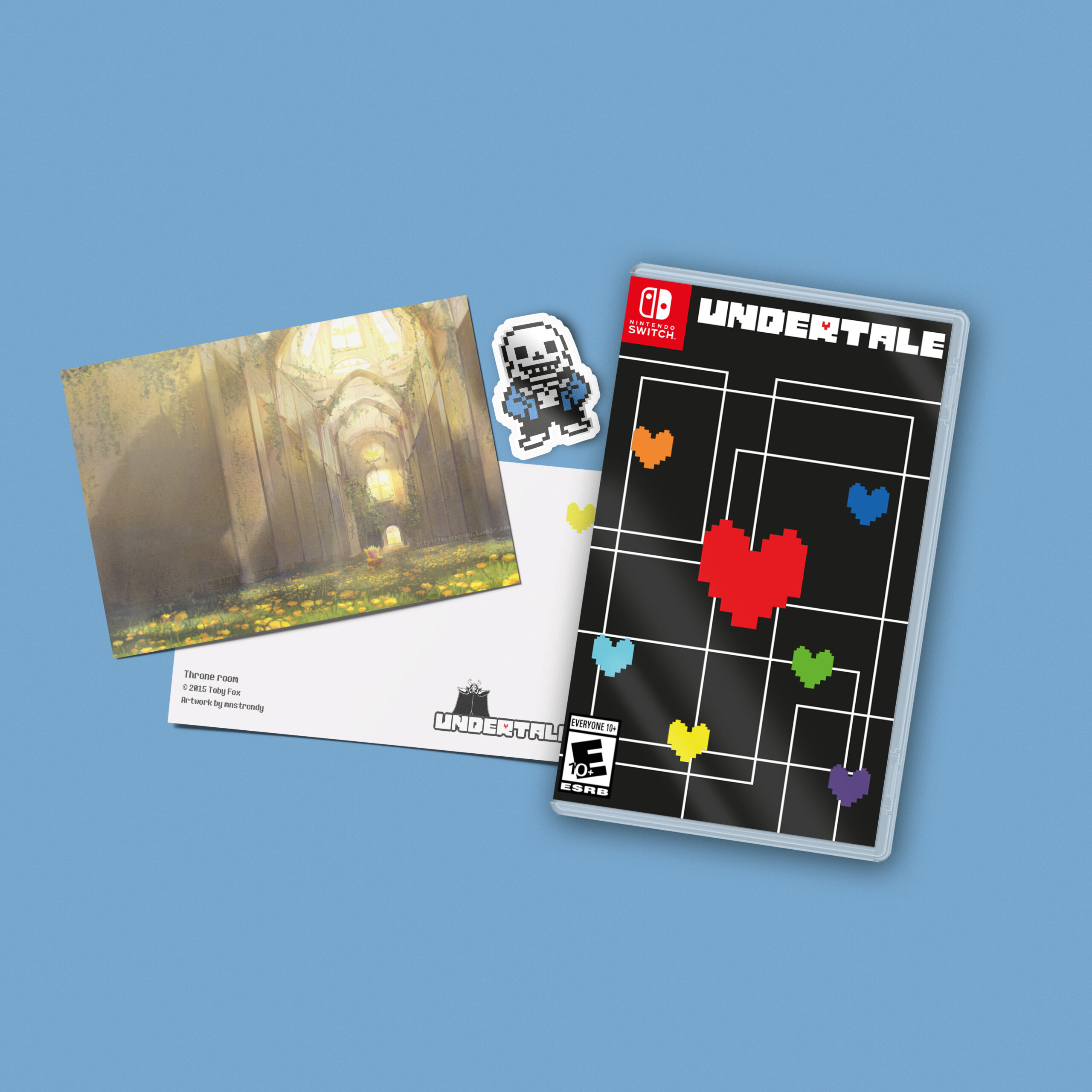
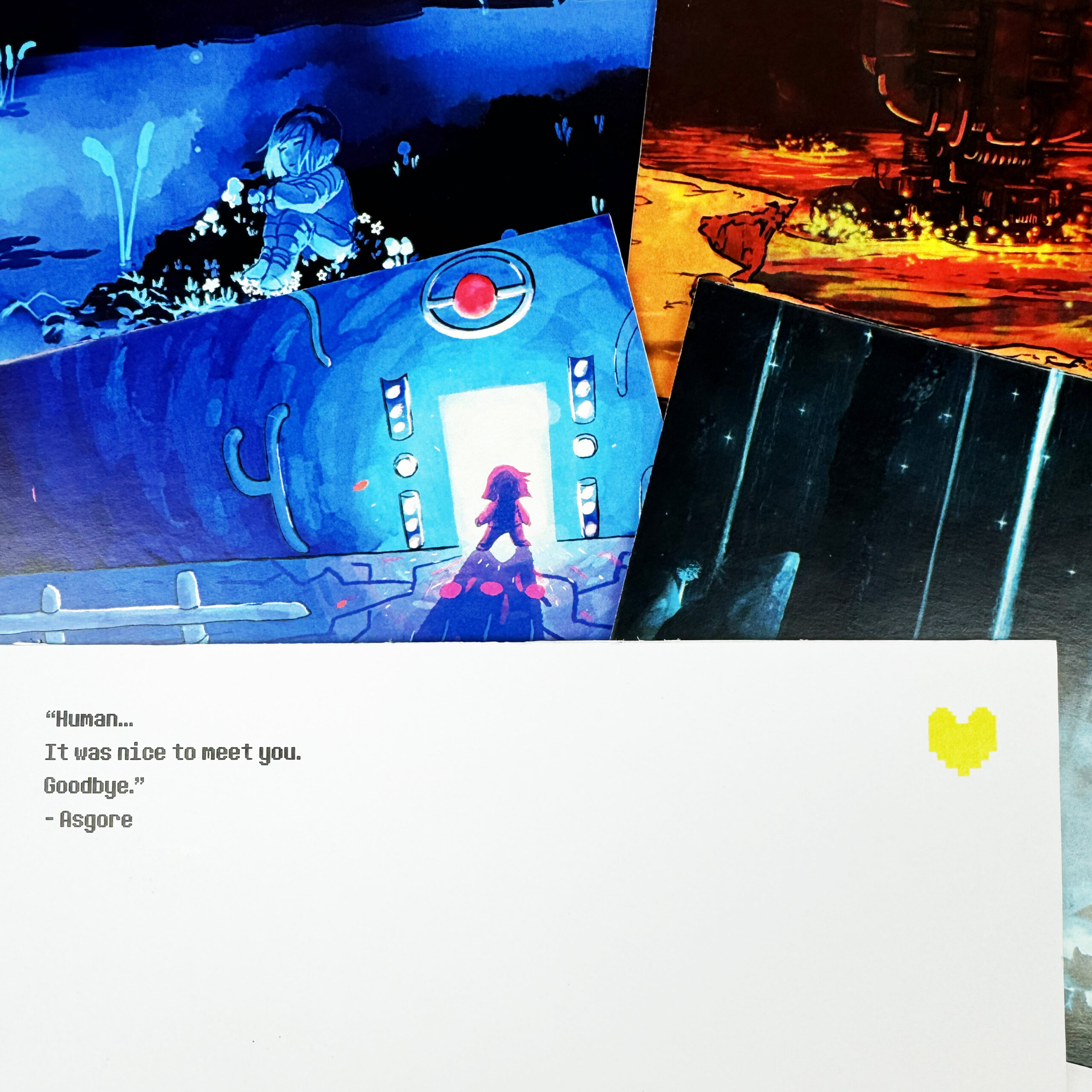
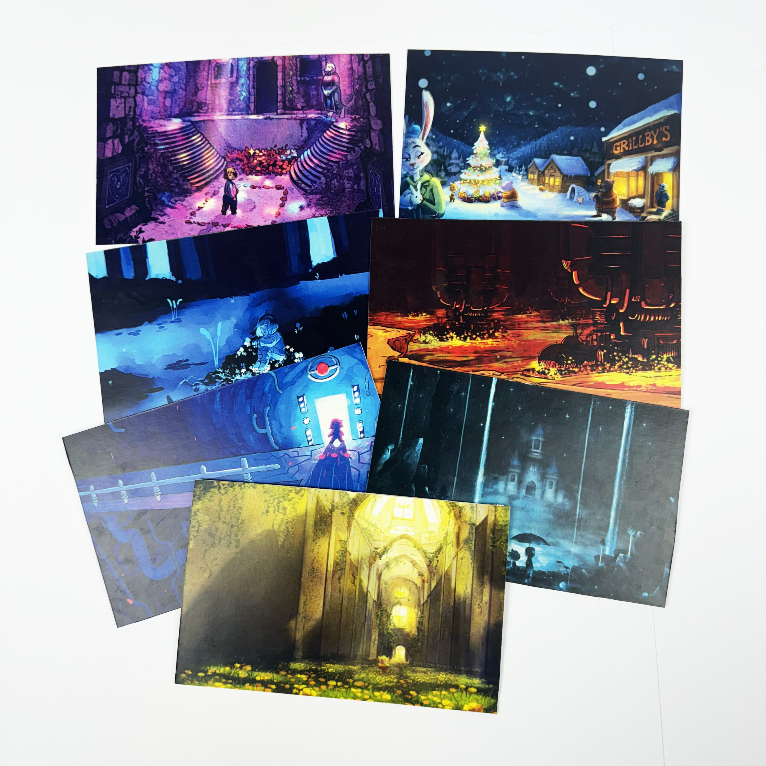
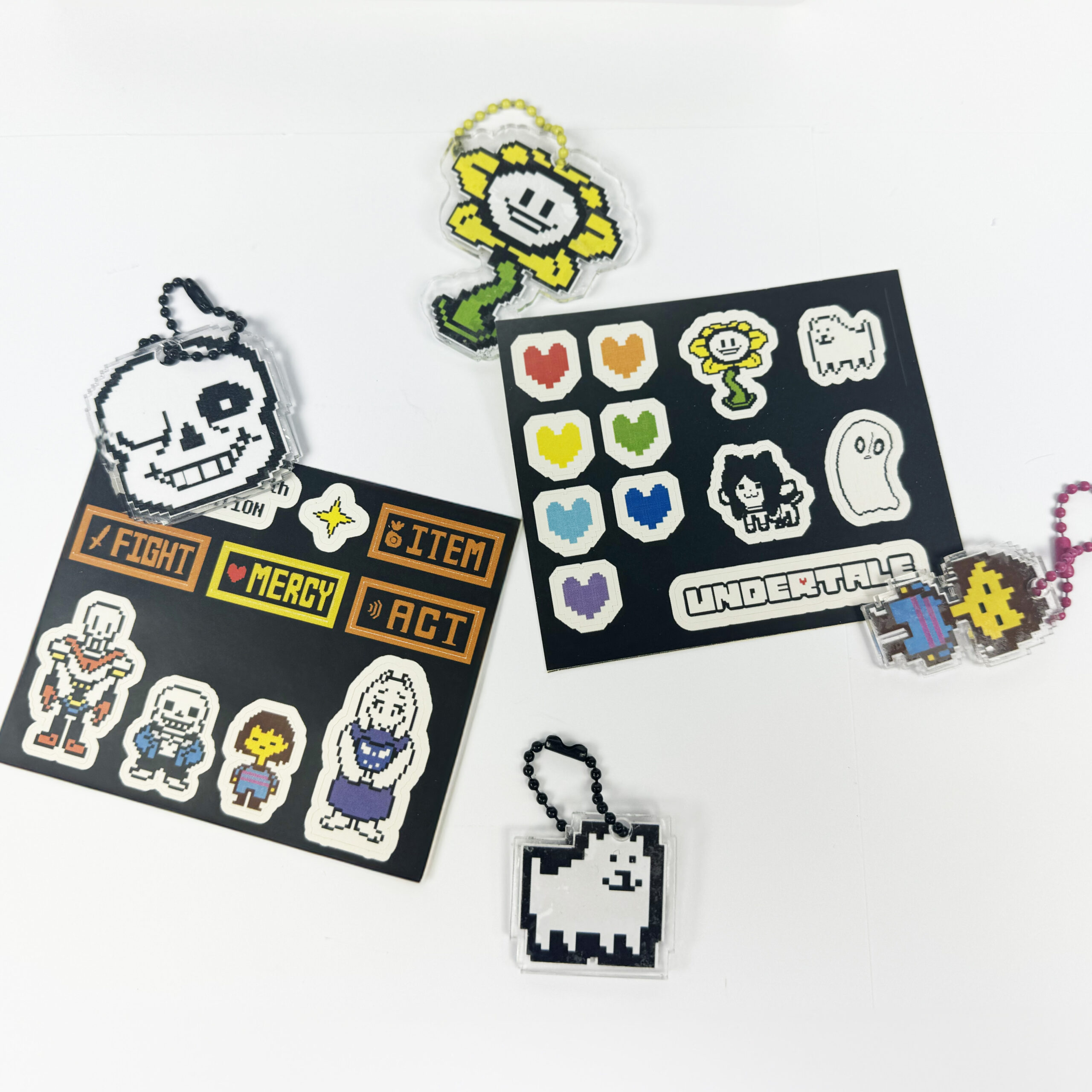
Undertale Switch packaging
For this project, I re-designed the packaging for UNDERTALE’s Switch version. I aimed to create a collector’s edition version with inclusions such as keychains, stickers, postcards and a Switch skin. The design for the game case was inspired by the pixel art style of the game, specifically the heart symbol that is seen throughout. While confronting a monster, the frame that surrounds the protagonist’s heart expands and shrinks depending on the attacks. I wanted to reflect this on the cover and included the heart in the centre of the design to emphasise its importance and continued motif throughout the game.
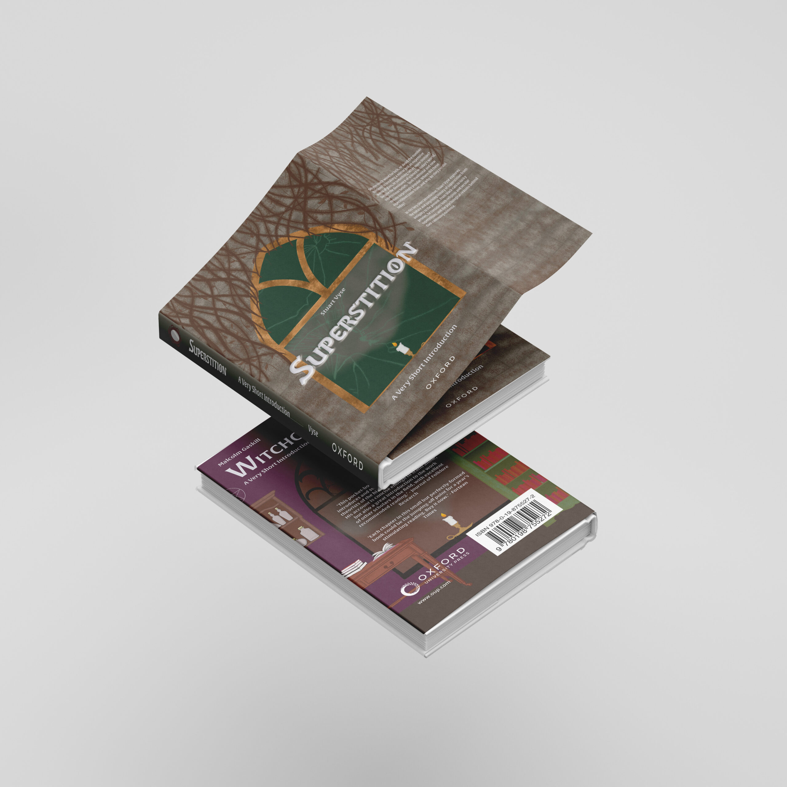
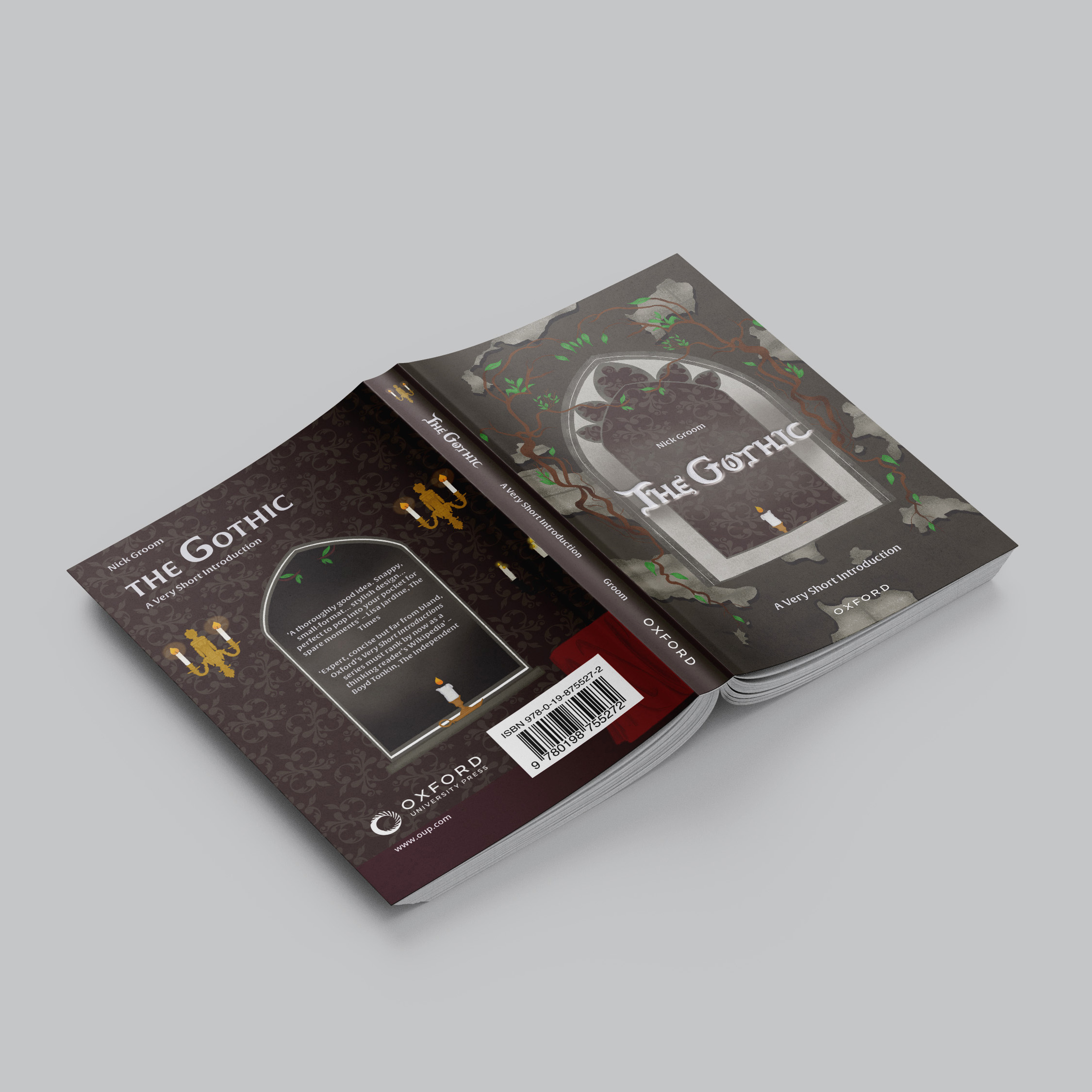
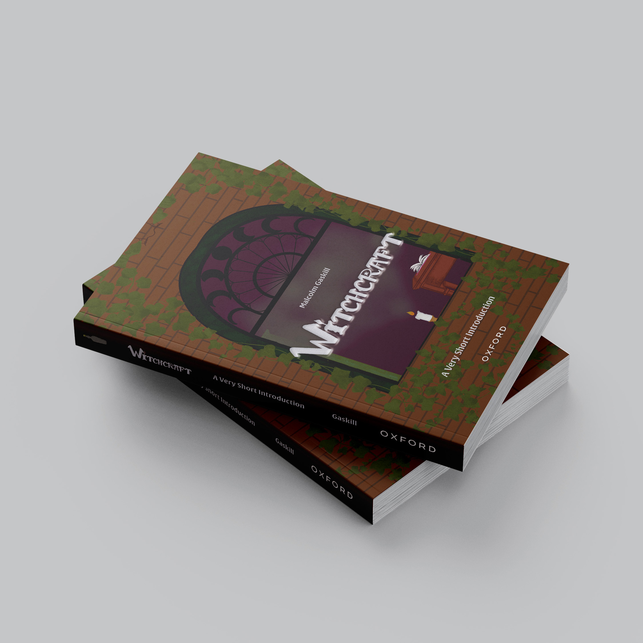
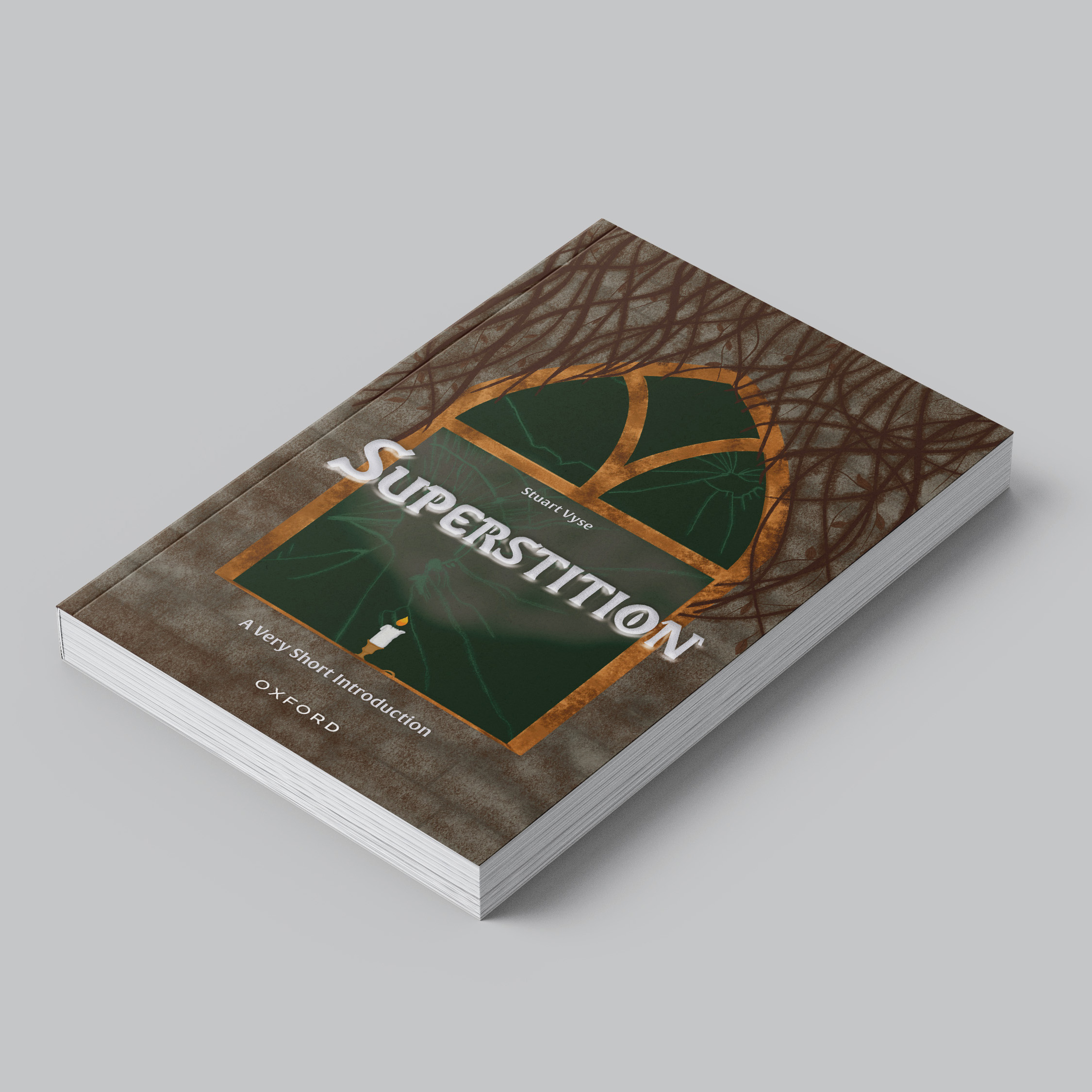
Oxford University Press book cover series
This project involved working with Oxford University Press (OUP) and re-designing the book jackets from their Very Short Introductions series. The aim was to make the jackets look more appealing and adhere to the topic of the book itself. I chose ‘The Gothic,’ ‘Witchcraft’ and ‘Superstition’. In my own designs, I took an illustrative approach to the book jackets. The concept of the illustrations involved the motif of windows, with each cover reflecting the topic. The jackets were enhanced by adding a white foil finish along with embossing to elevate the title and make it stand out when displayed.
Coming from a sales background and having an understanding in the importance of upholding a positive identity, I have an ever-growing interest in the relationship between design and branding, social media impact and advertisement. I pride myself on doing my research for a full insight to ensure I create something that is bespoke and built for purpose.
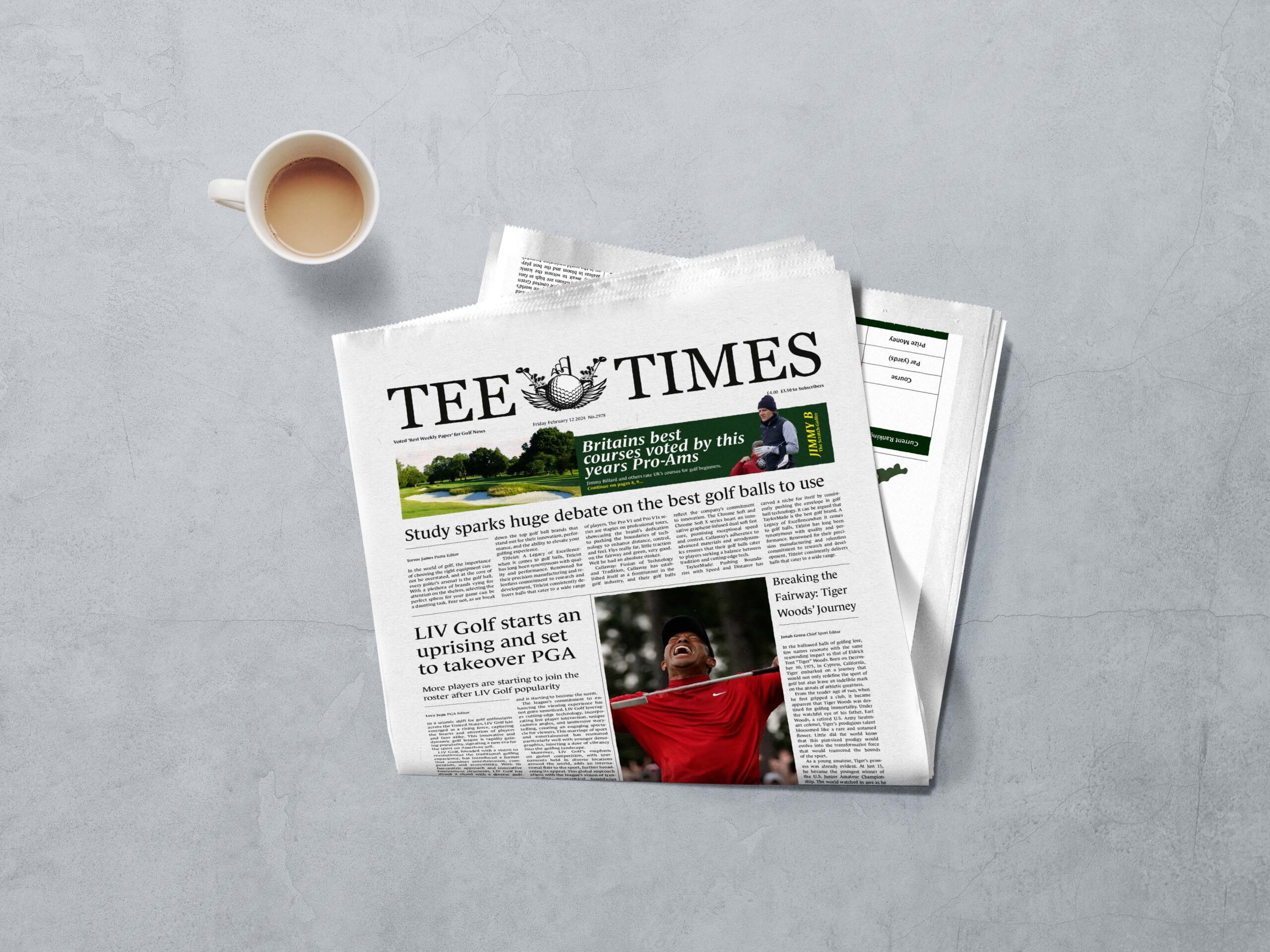
Tee Times is a prominent source for all things golf. Whether you’re a seasoned pro, an enthusiastic amateur, or a curious newcomer, our newspaper is dedicated to bringing you the latest news, best tips, and wide coverage within the golfing world.
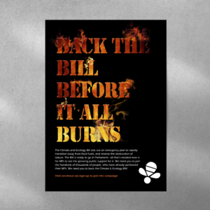
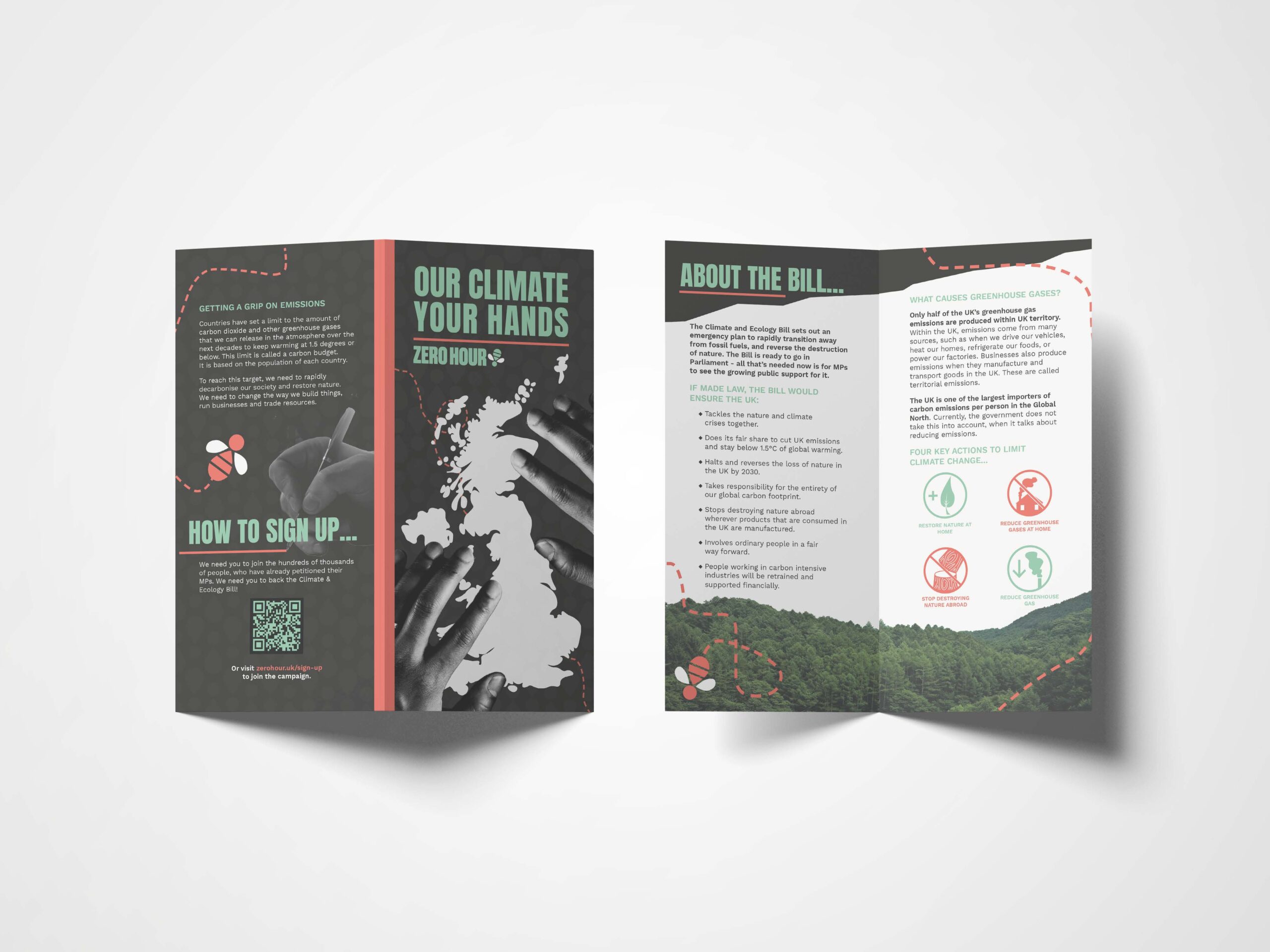
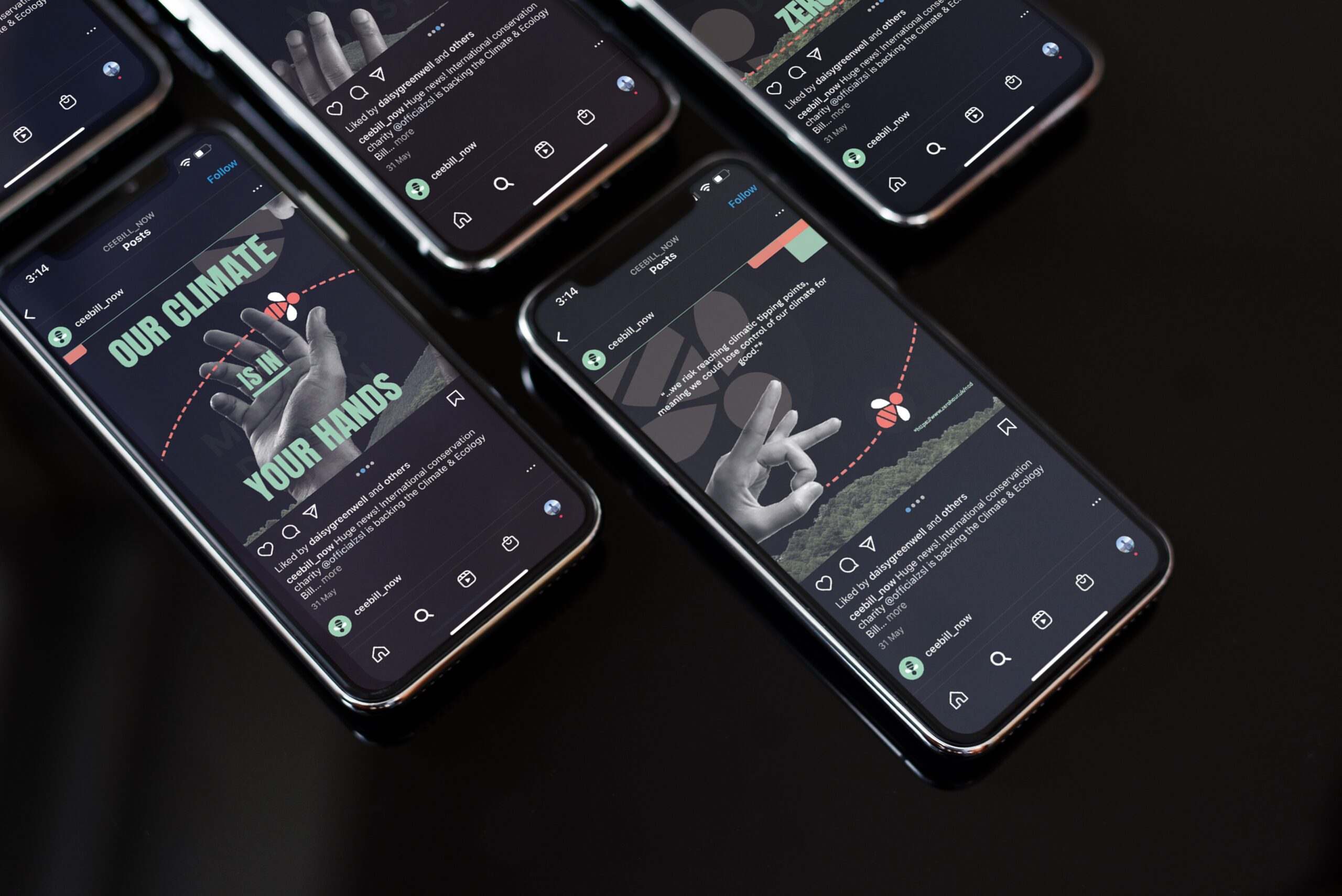
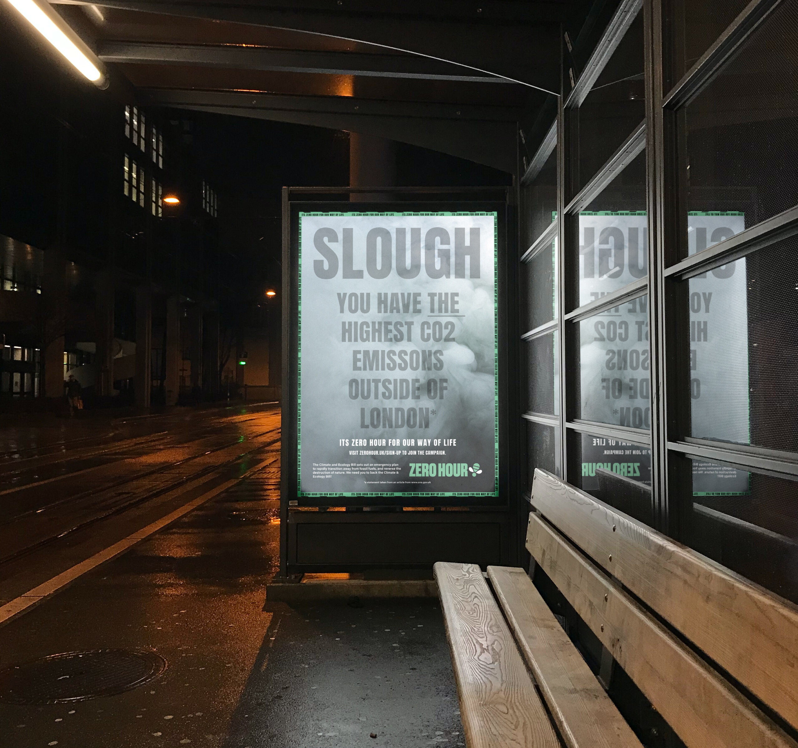
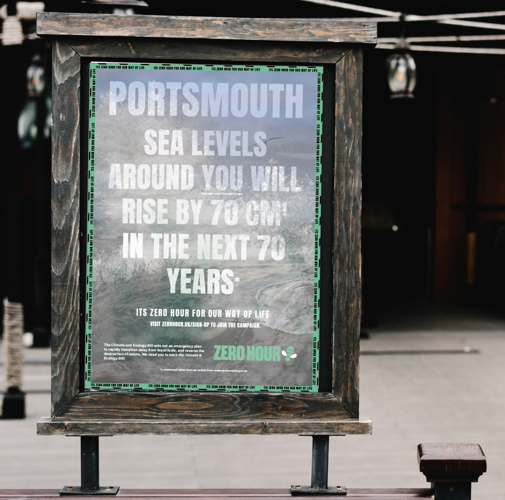
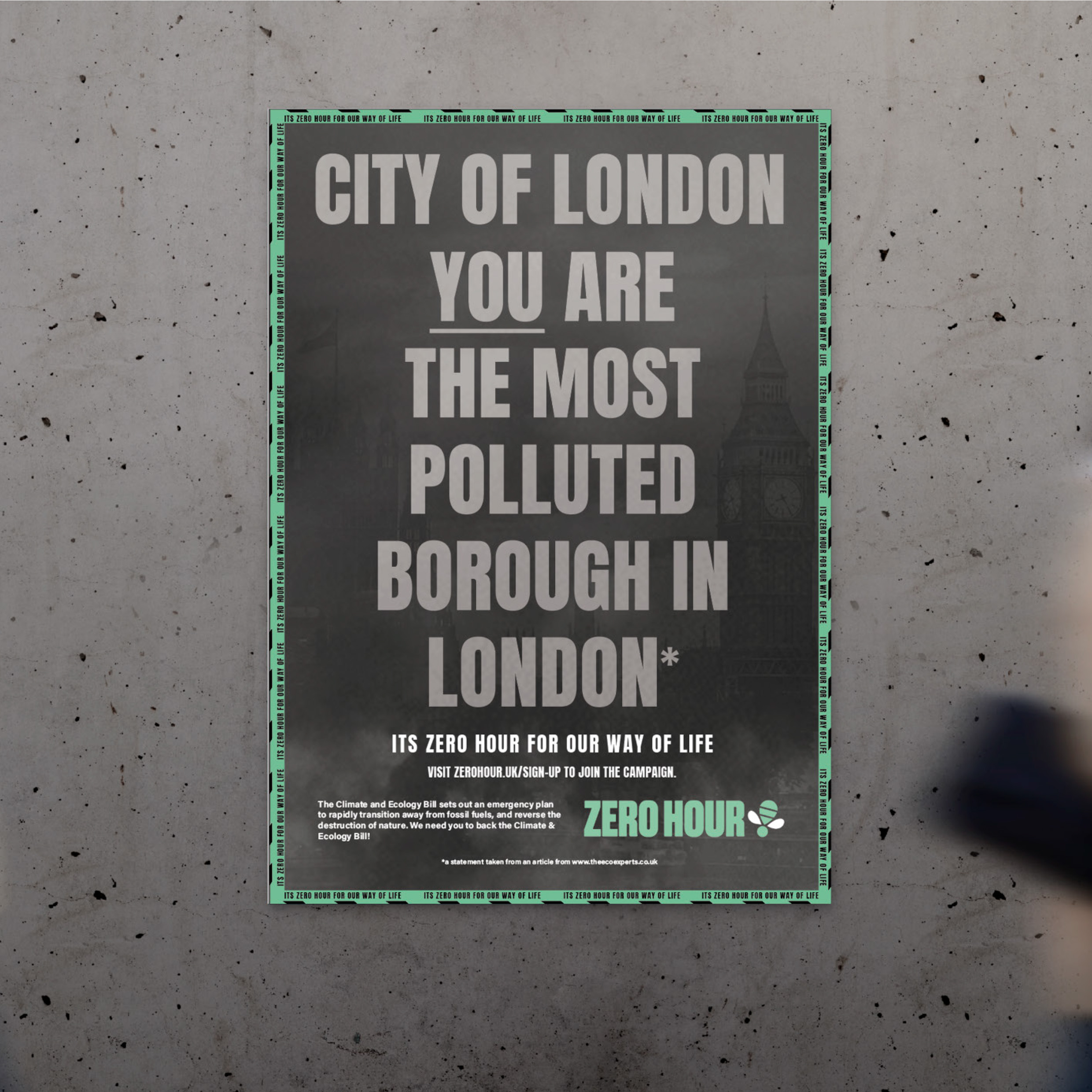
Zero Hour campaign
This project was to produce an effective branding campaign through the use of multiple different outputs to convey Zero Hour’s message. Remaining cohesive across all outputs is vital for representing a brand’s identity and utilising brand guidelines made this possible.
Social media marketing, advertising, communications
Hey, I’m Habibah! I’m an enthusiastic designer and aspiring marketer, passionate about illustration, branding and creating promotional material. My love for design stems from a creative background, surrounded by various arts and cultures. This has taught me new ways of communication and strengthened my ability to design for different audiences. After completing multiple projects and Real Jobs including Baseline Shift, I have found myself to be a confident speaker as well as working well under pressure and as part of a team. Alongside this, I have broadened my knowledge of design softwares such as Adobe InDesign, Illustrator and Photoshop and I’m excited to expand my skills and grow further within a professional environment.
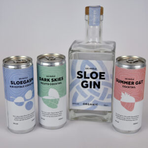
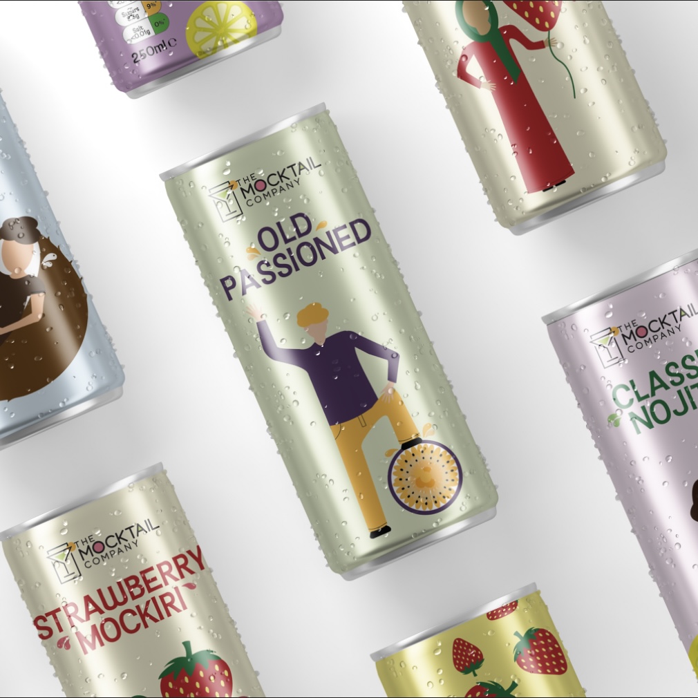
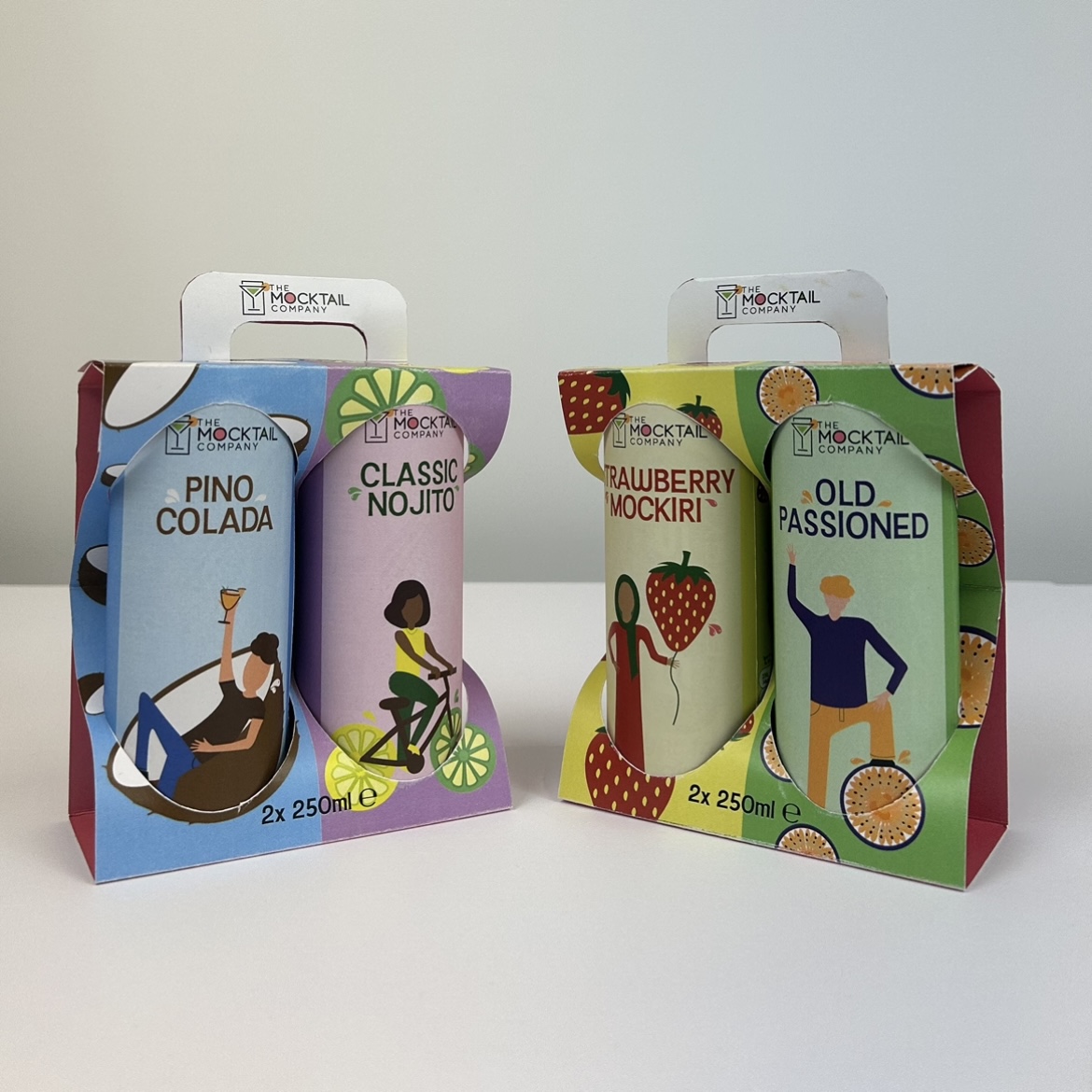
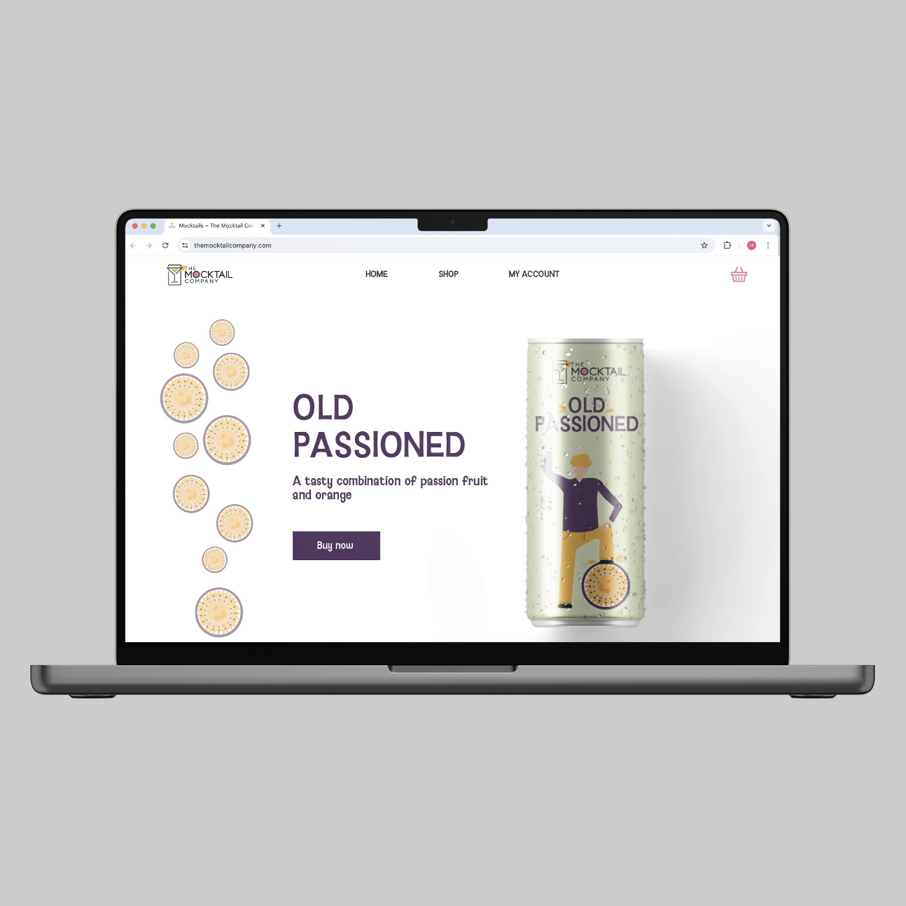
The brief for this project was to re-design existing packaging for a company which needed more attention. I selected The Mocktail Company and instead of existing bottles, opted for cans for improved practicality. The aim of this design was to visualise 'fun', 'fruity' and 'refreshing' to appear attractive to everyone through the use of diverse illustrations and vibrant colours. The cans (sold separately) are also available in boxes of two, both online, using their independent website or in selected retailers.
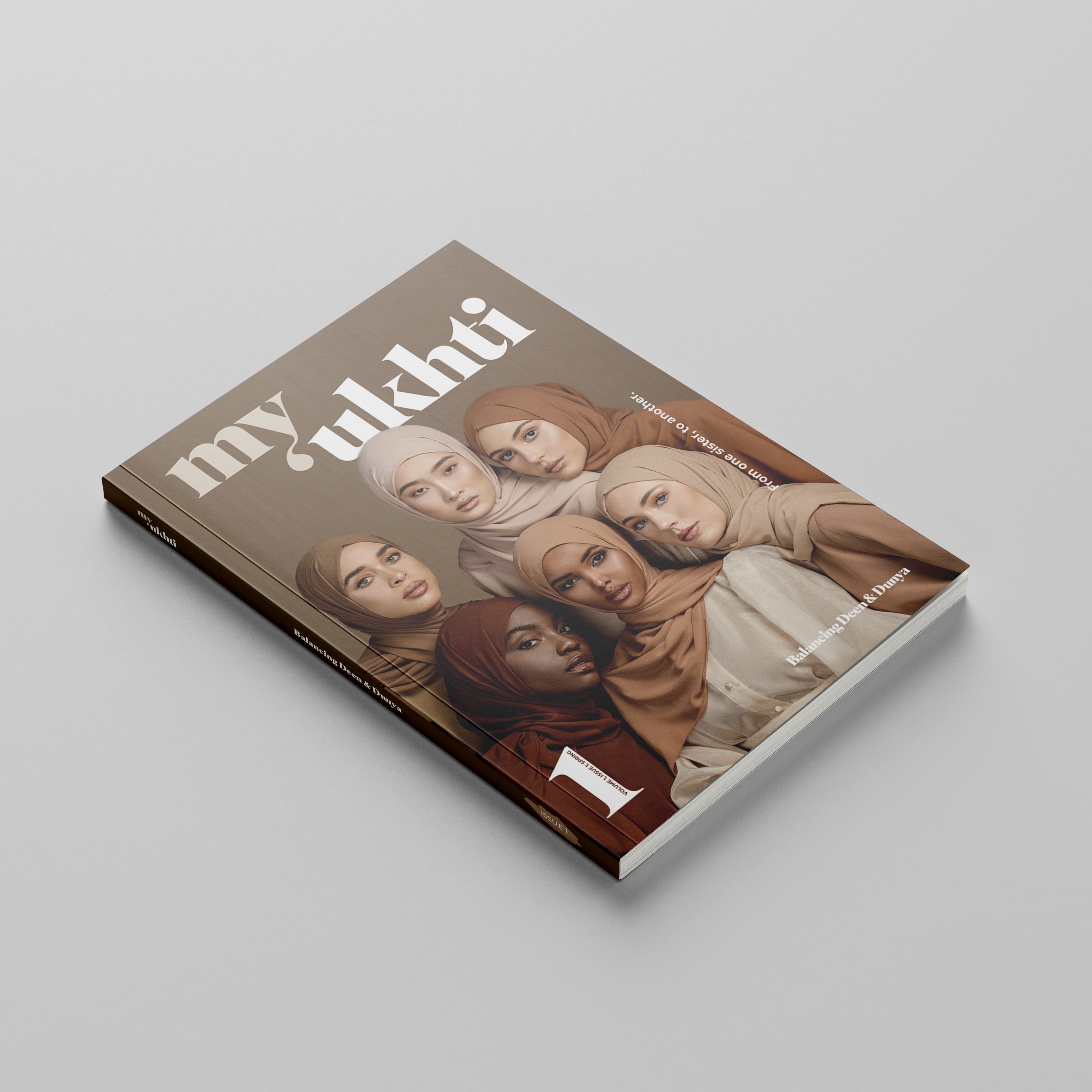
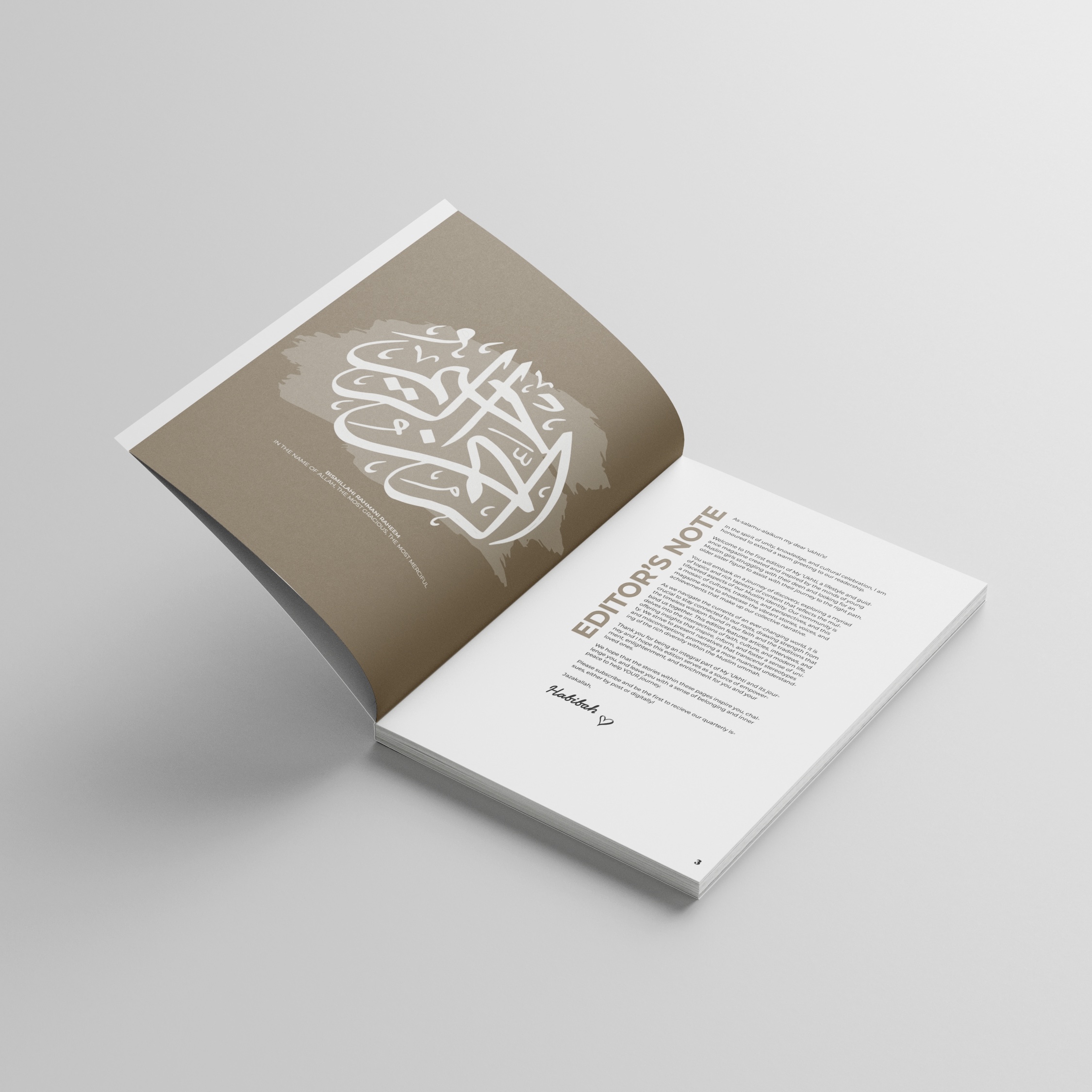
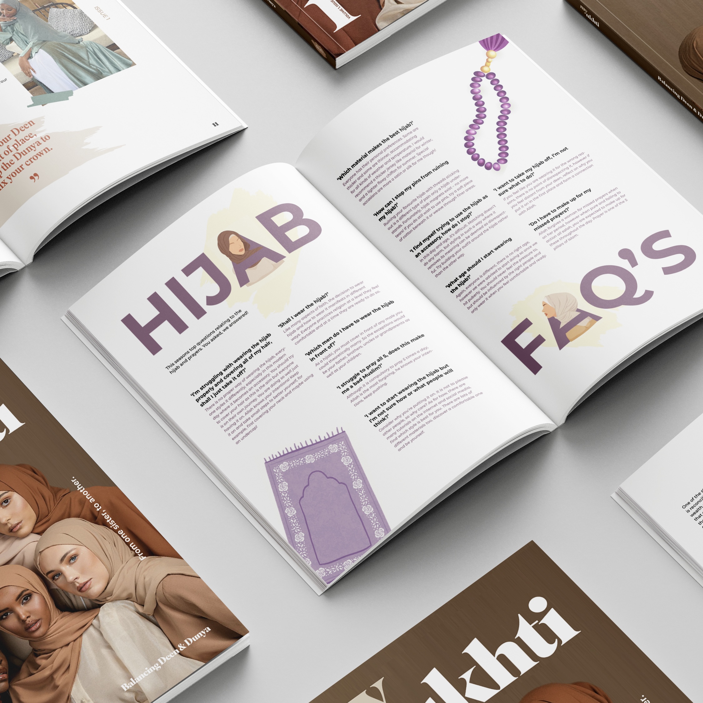
My Ukhti magazine
The brief for this project was to produce a proposal for a magazine based on visual culture. ‘My Ukhti’ translating to ‘My Sister’ from Arabic is a religion based lifestyle and guidance magazine exclusively tailored for young Muslim girls struggling with their deen (religion) or looking for advice. The quarterly issues will embark on a journey to both inspire and educate the Muslim community through questions, articles, interviews and seasonal shop.
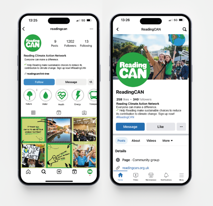
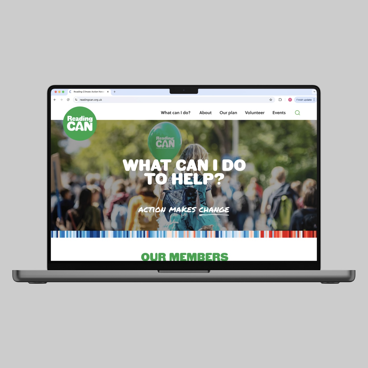
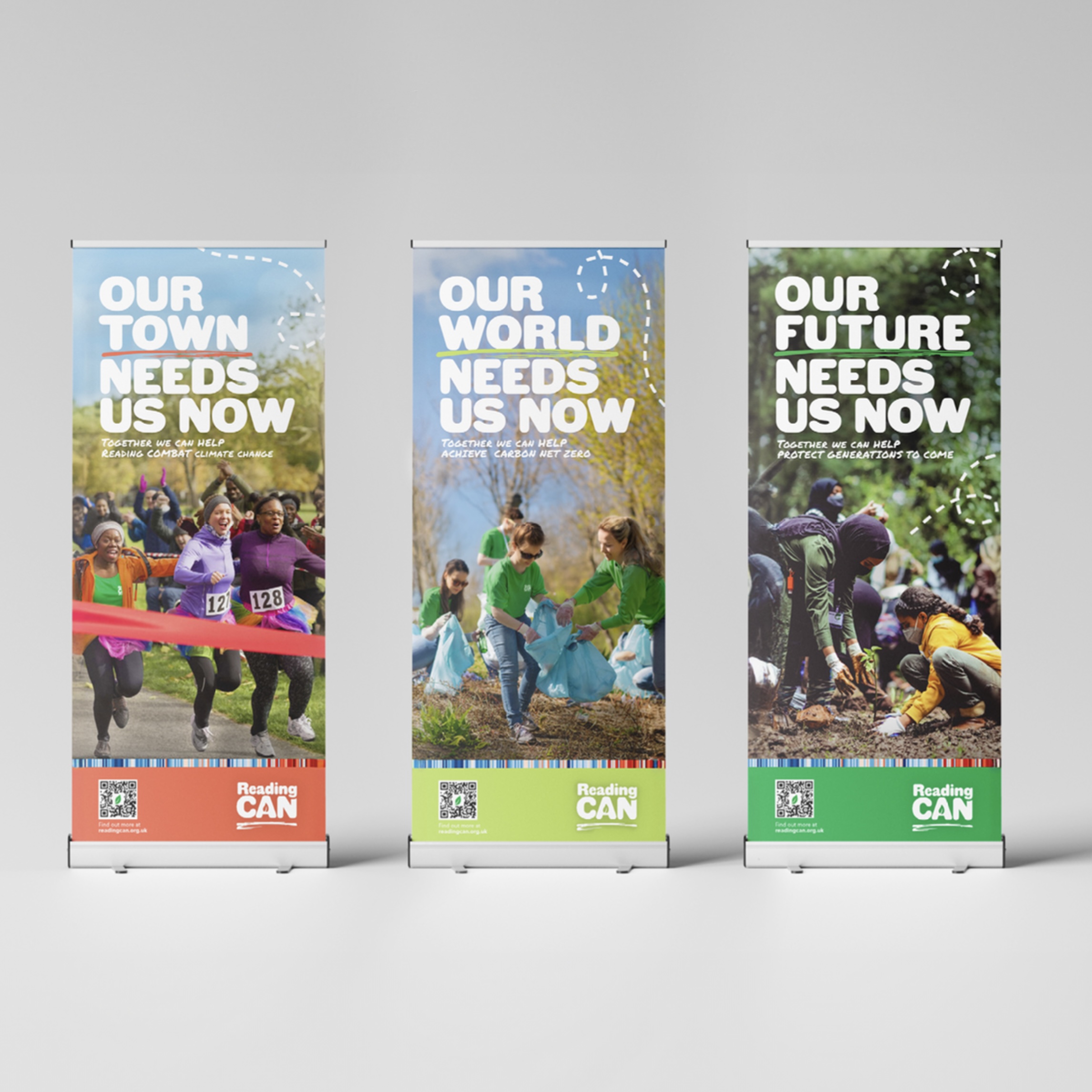
Reading CAN branding
The brief for this group project was to re-brand an existing charity. Our client was Reading Climate Action Network - an organisation designed to assist companies and individuals make changes to achieve net zero by 2030. We updated their vision, mission and values to redefine their goals as an organisation, as well as comparing competitors and creating potential users to craft a new logo, tagline, colour palette, typography, imagery and style. This enabled us to design a new website, social media posts and event collateral including banners, postcards and clothing to promote their brand and lead to further engagement.
Hi, I’m Georgina, and I have an interest in campaign design and designing to make a difference. I enjoy creating innovative design concepts and using my design skills to educate myself on new topics. During my time at the University of Reading, I’ve learnt that design is more than a visual aesthetic. Instead, design is a tool that can be used to positively impact the world and make a difference. As I enter the professional industry, I look forward to developing new skills and growing as a designer.
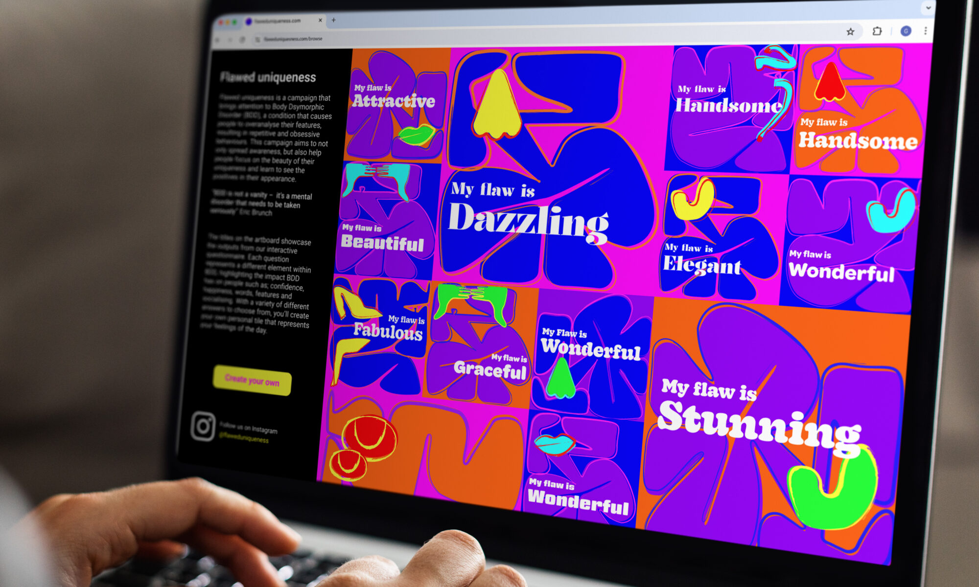
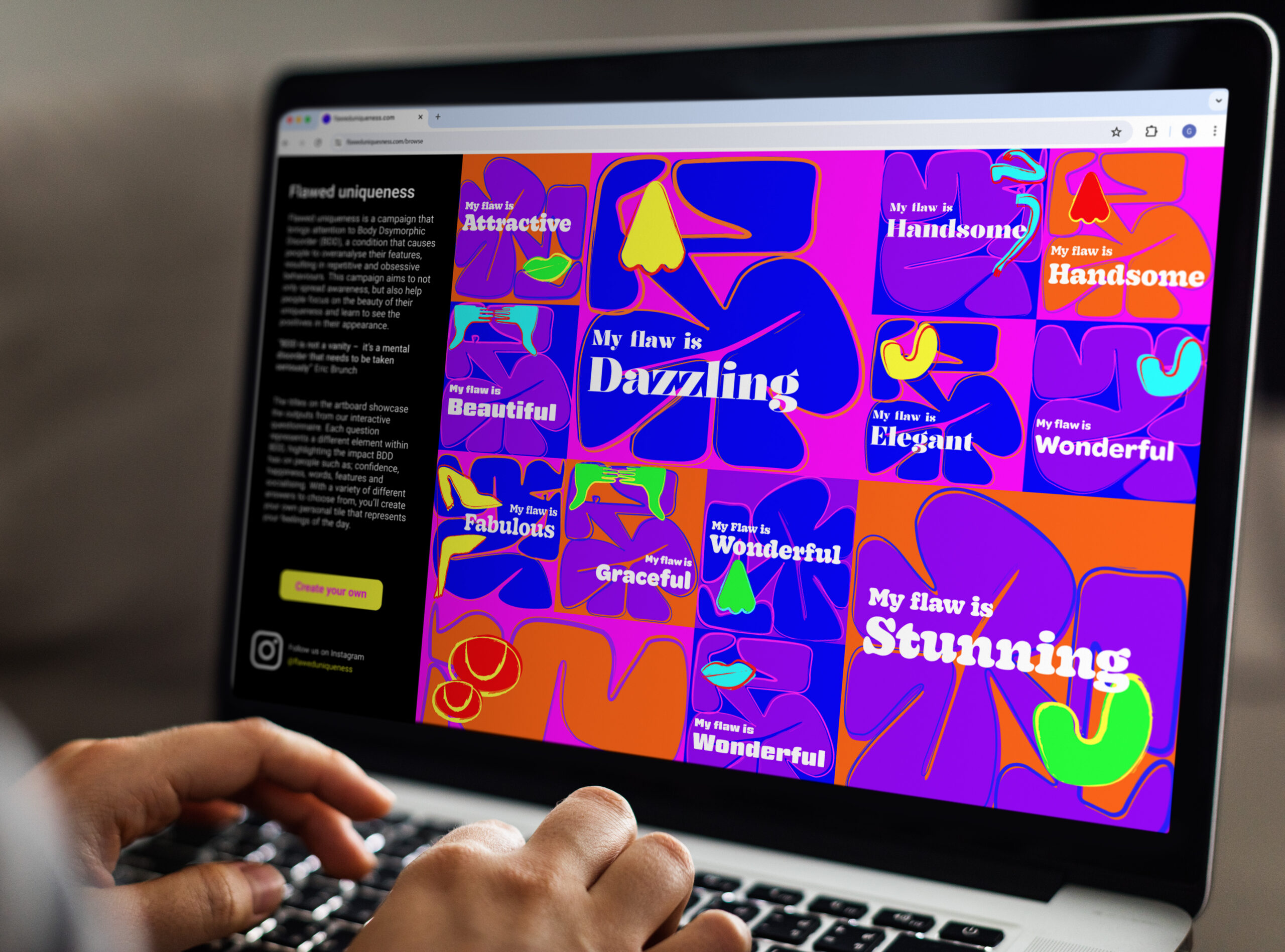
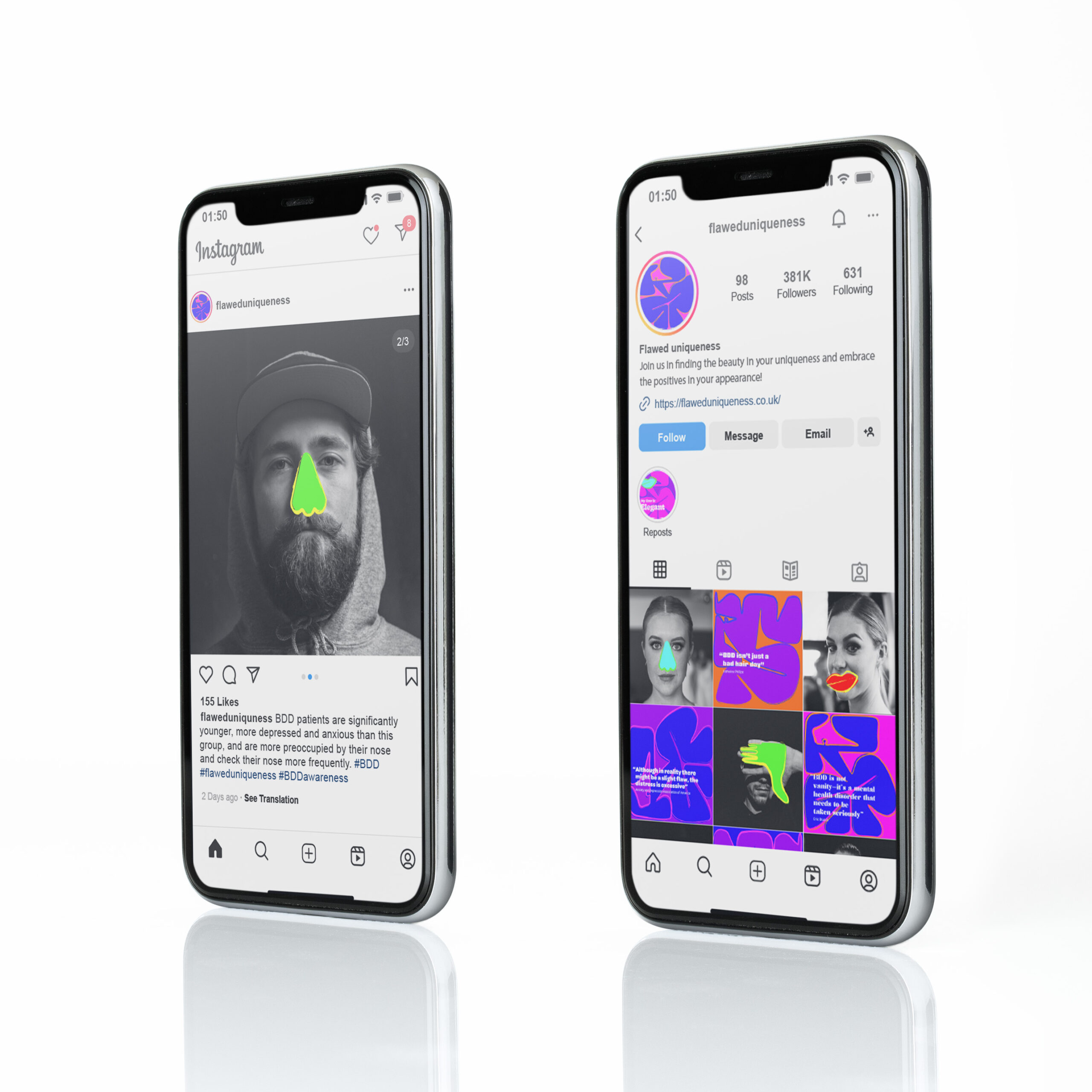
Flawed Uniqueness is an interactive campaign that brings attention to Body Dysmorphic Disorder (BDD), a condition that causes people to overanalyse their features, resulting in repetitive and obsessive behaviours. The campaign is made up of an underlying matrix, determined by the users' chosen answers, making each answer tile unique to that individual.
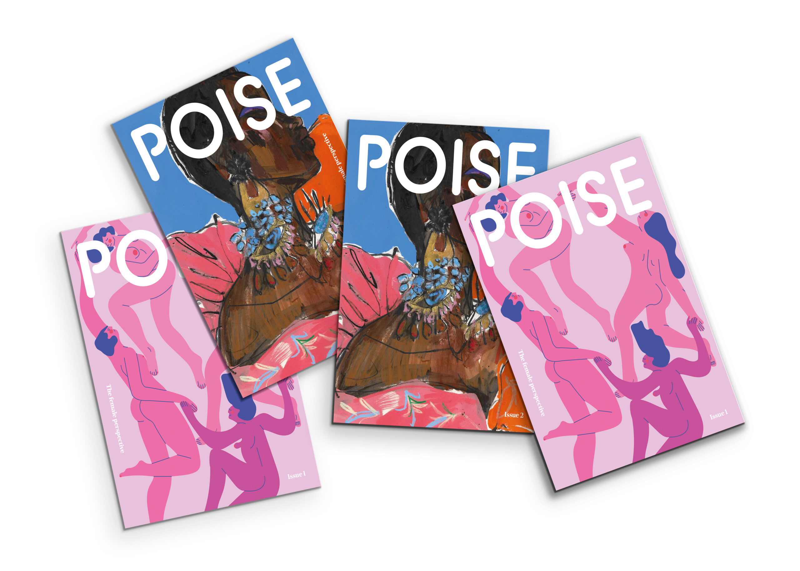
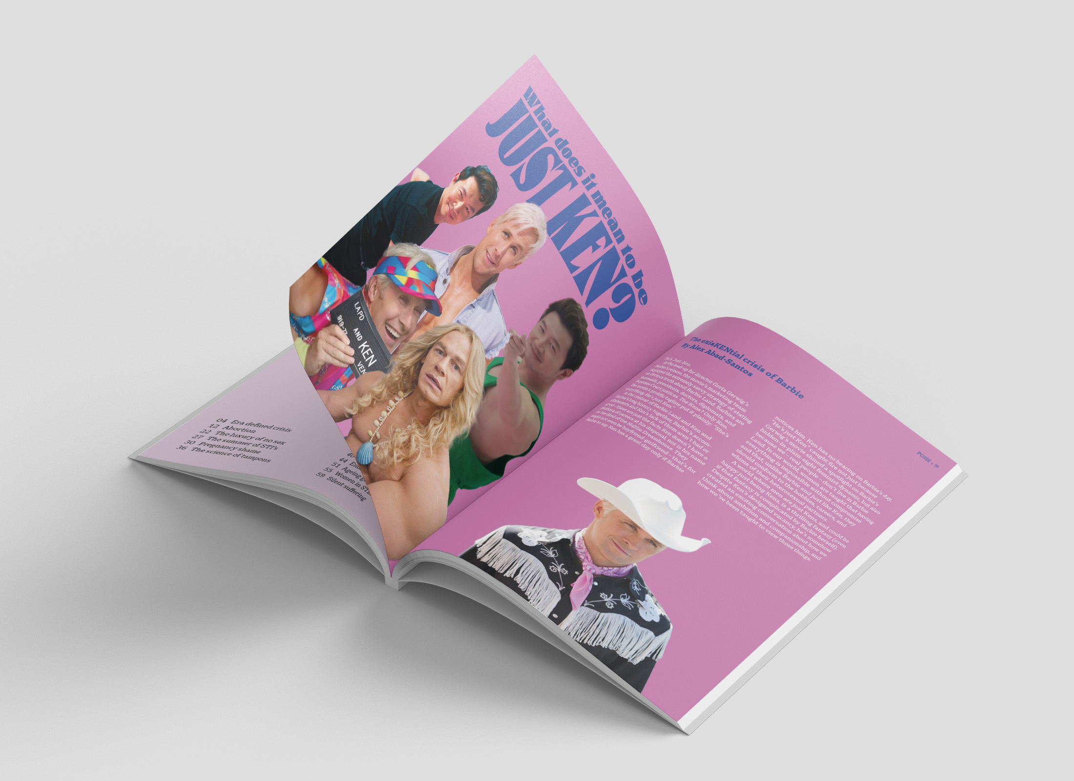
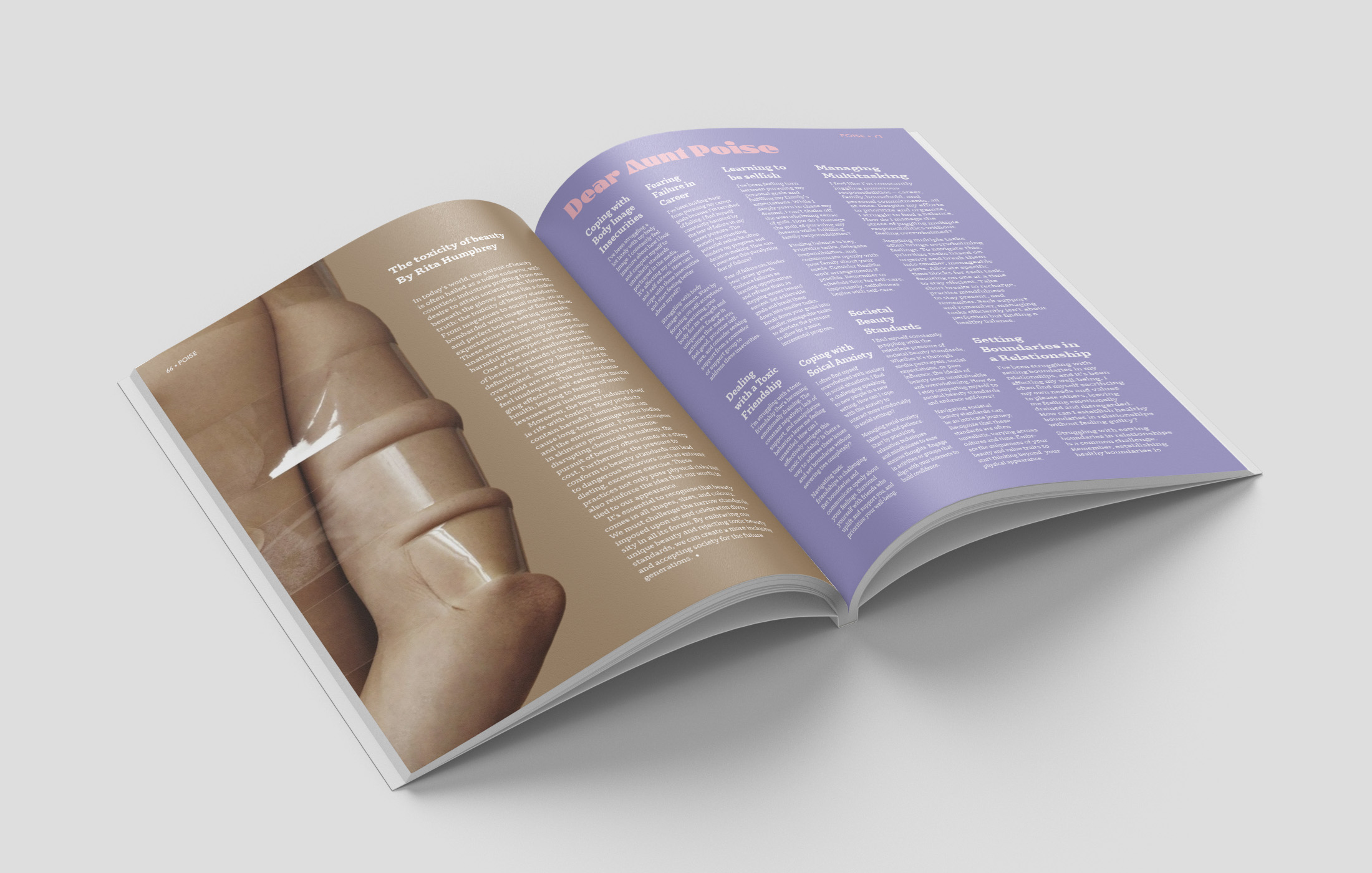
POISE magazine
POISE is an independent female-led magazine, written and designed from the female’s perspective. The magazine is issued quarterly on historic days for women, covering topics written by both POISE team members and the audience to create more diverse and inclusive perspectives.
Zen web app
Zen is a responsive web app for people with anxiety. Whether its social or generalised anxiety, Zen aims to help users find suitable coping strategies. Users are accompanied by Zen’s mascot, Theo the Triangle, throughout the website helping the users emotionally connect with the website.
Editorial design, digital design, packaging design
Growing up, creativity has always been a passion of mine and it has continued to grow over the past 3 years at university. Throughout my degree, I have gained a broad skillset in a range of different platforms and have explored design in various different avenues from print to digital design. I have developed a good understanding about using design as an approach to solving social and environmental issues, but most importantly ensuring that the final outcome is functional and serves its purpose. As I enter the professional industry, I look forward to applying my skills and knowledge in real-life projects as well as learn from other educated designers.
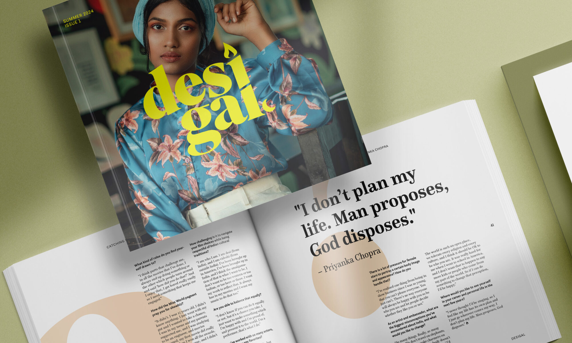
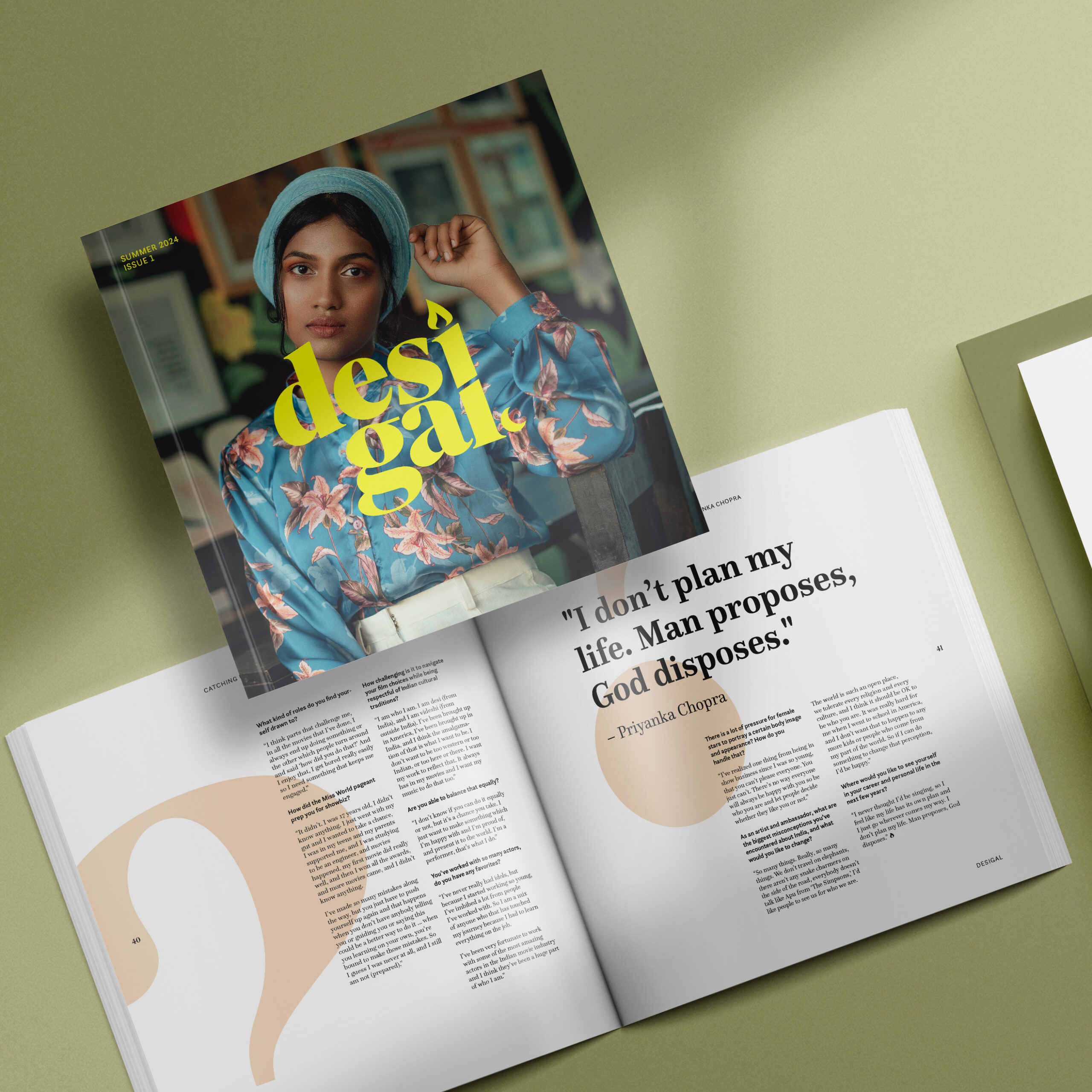
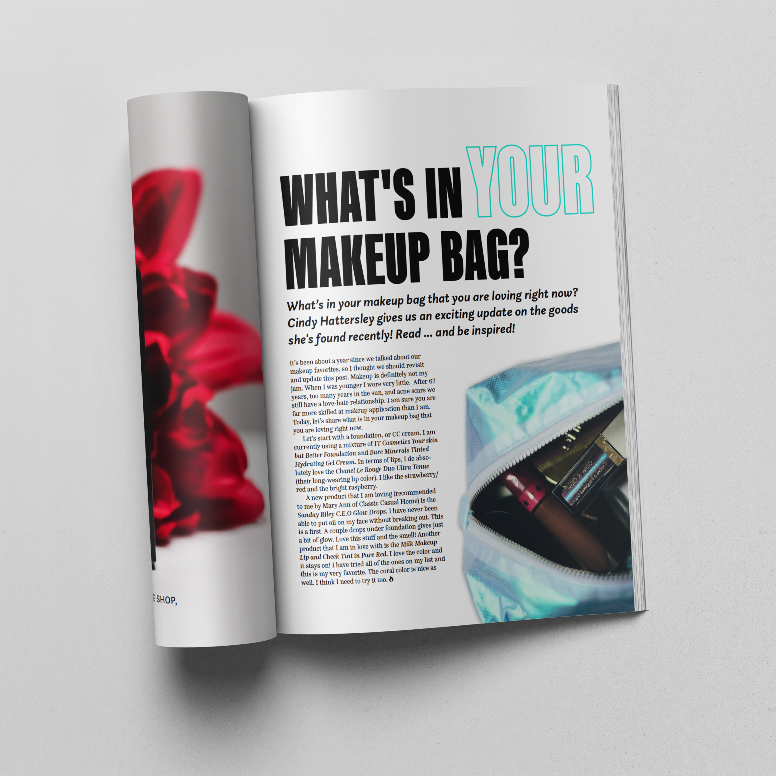
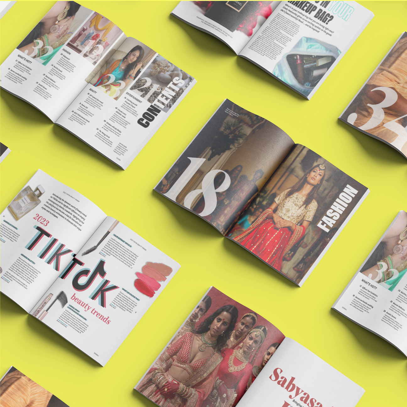
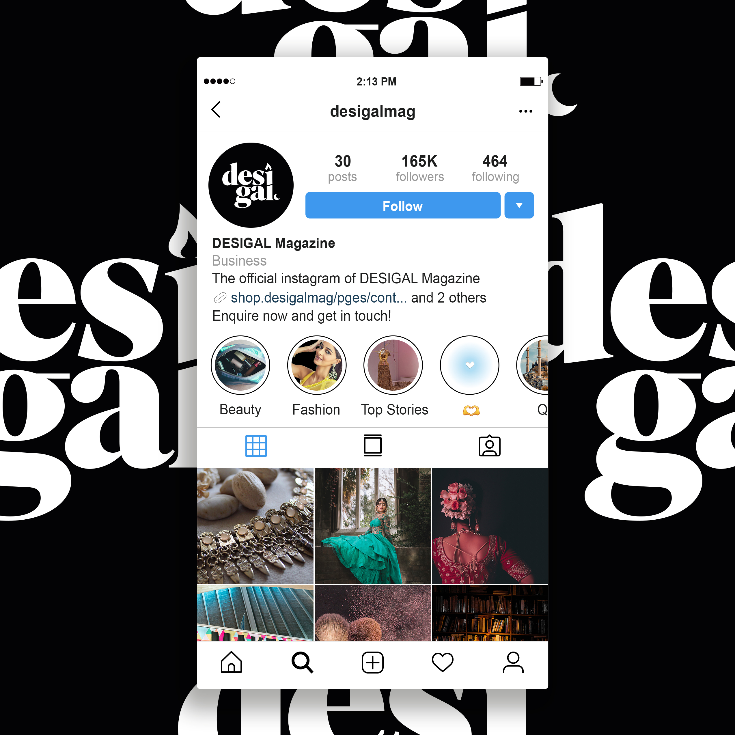
Desigal is an independent magazine with a fashion, beauty and lifestyle focus. The read is jam packed full of tips, tricks and advice from leading individuals and brands in the South Asian community, as well as shedding light to new and upcoming individuals! The overall tone of the magazine is to reflect the persona of every South Asian girl out there. The aim is to not confuse the audience with extravagant words, but act as though they are talking to one of their close friends. This is how the publication seeks to instil a stronger bond with the readers.
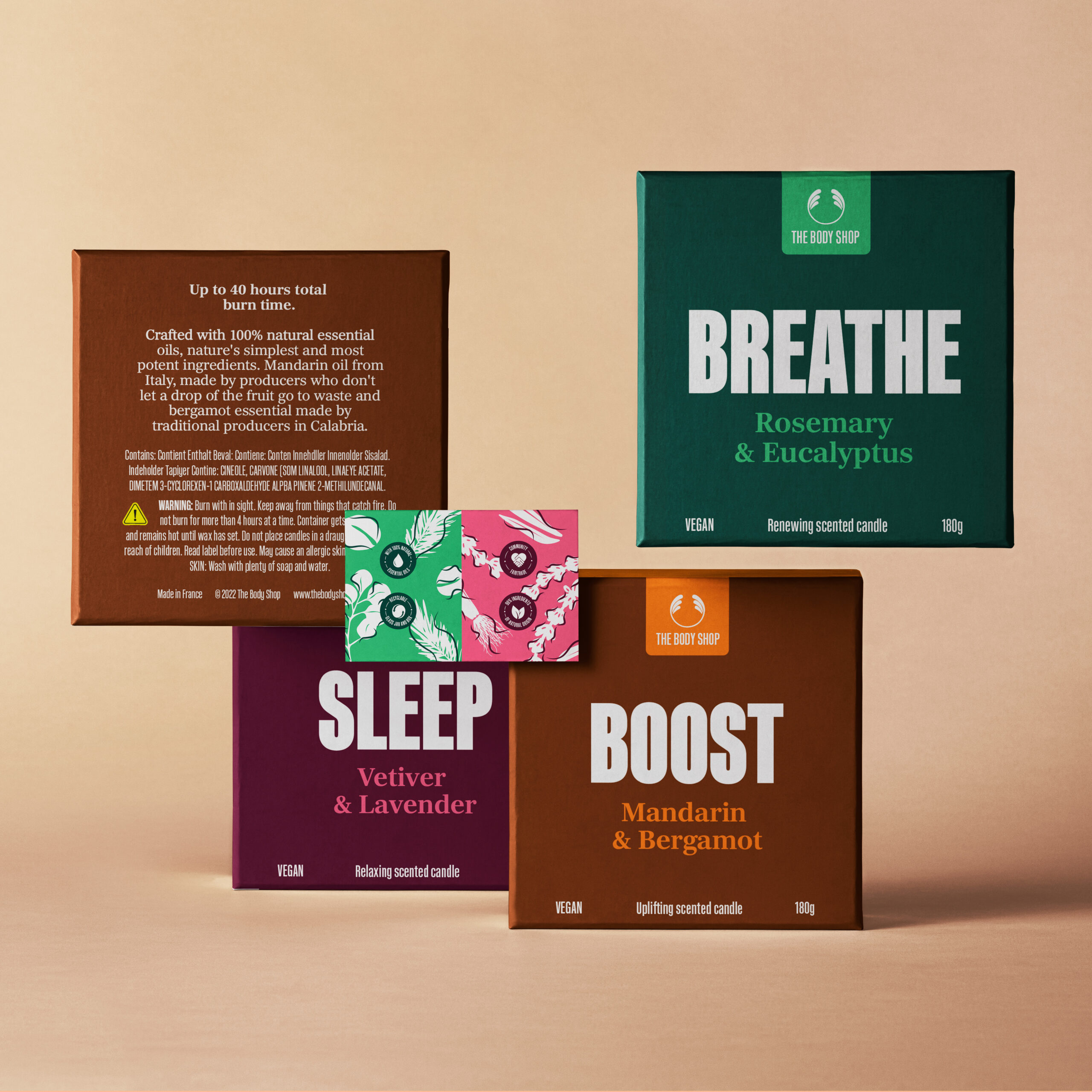
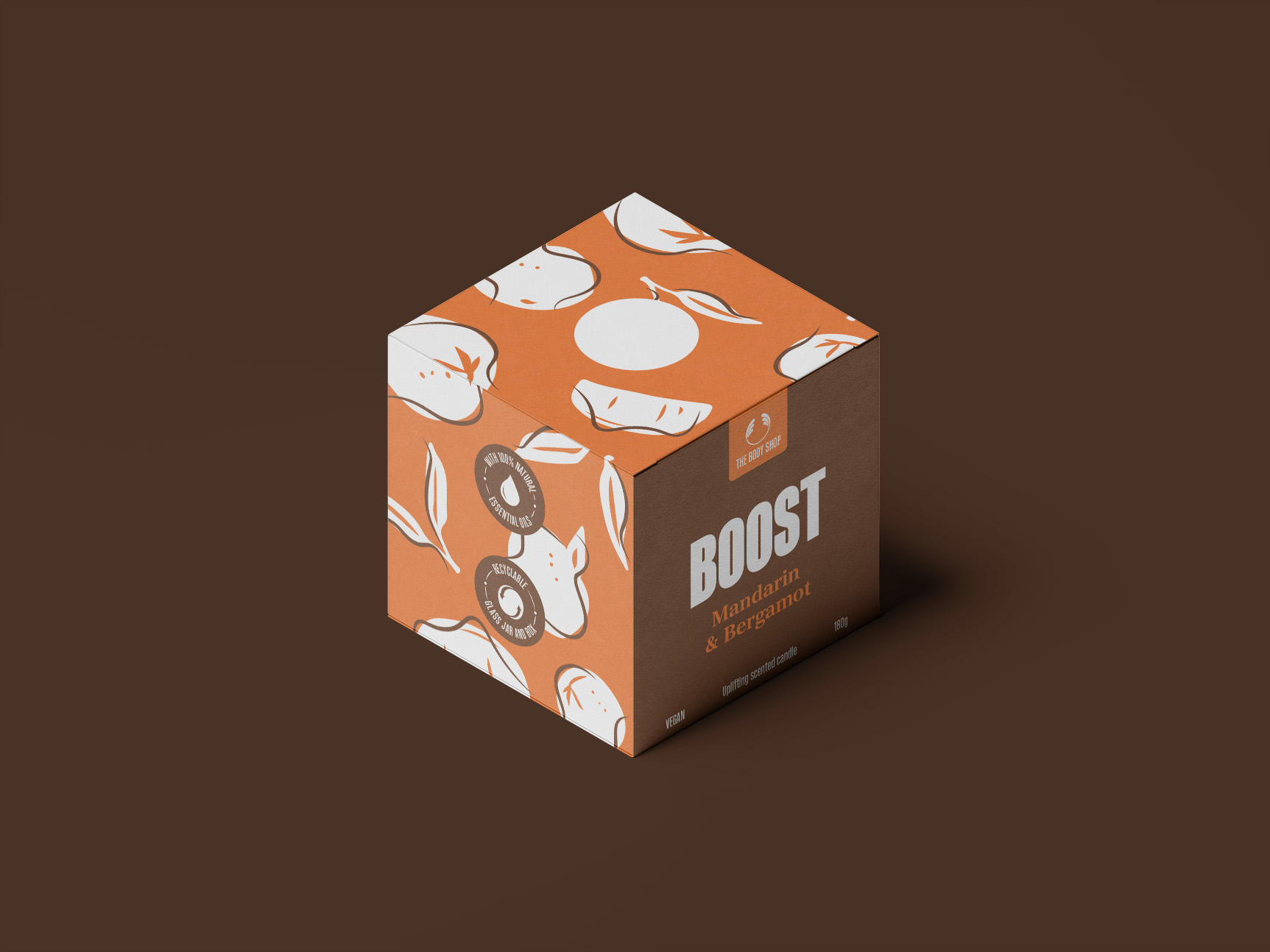
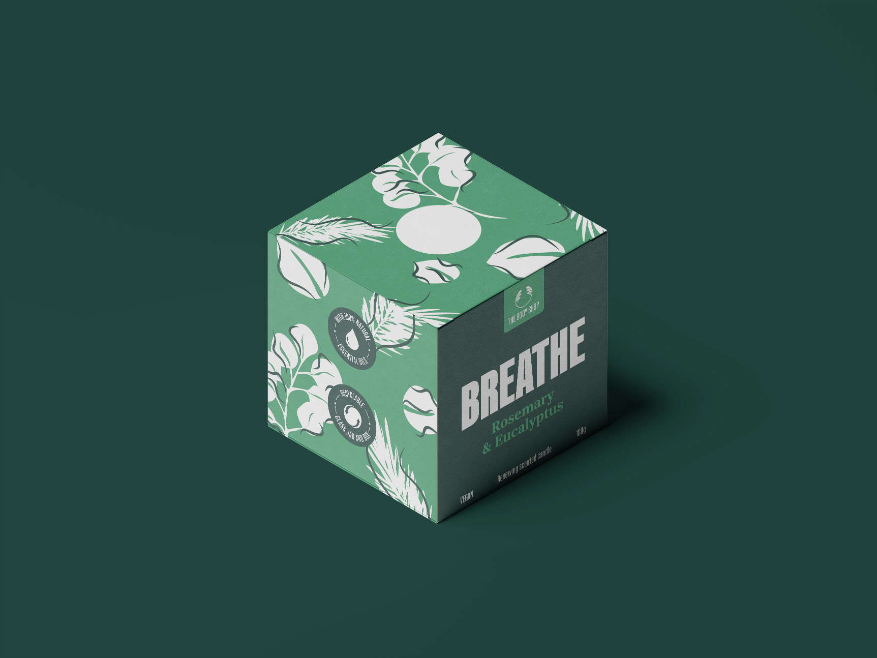
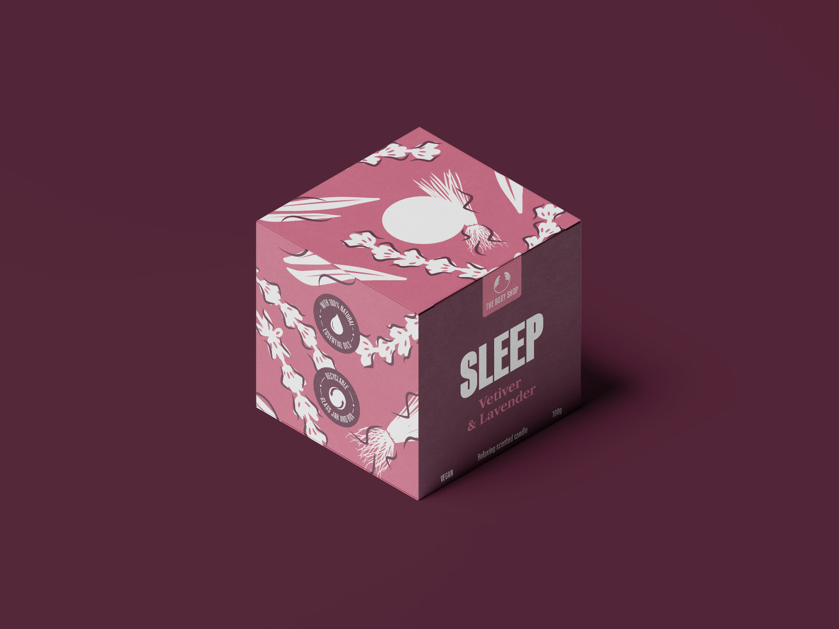
Body Shop packaging
The existing Body Shop candles hold a different design identity compared to the other items in-store, in the sense it is less vibrant and eye-catching. The new iteration of the candle box packaging exhibits a lively and colourful approach. The design represents the brand’s core values of being natural, bold and sustainable. There are three different scents in the range. The illustrations developed during the design process, alongside the colour choices, reflect the natural ingredients used in the essence of the candles. Boldness is the product of the colour palette used, coupled up with the large and impactful typography.
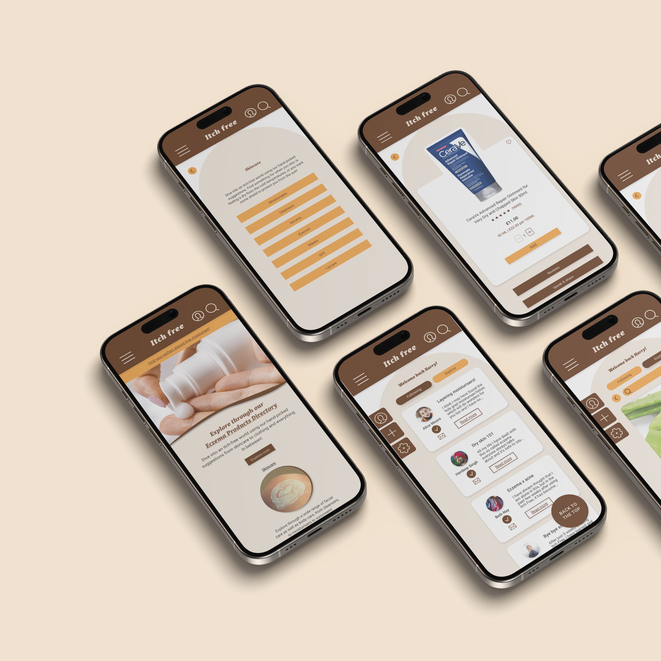
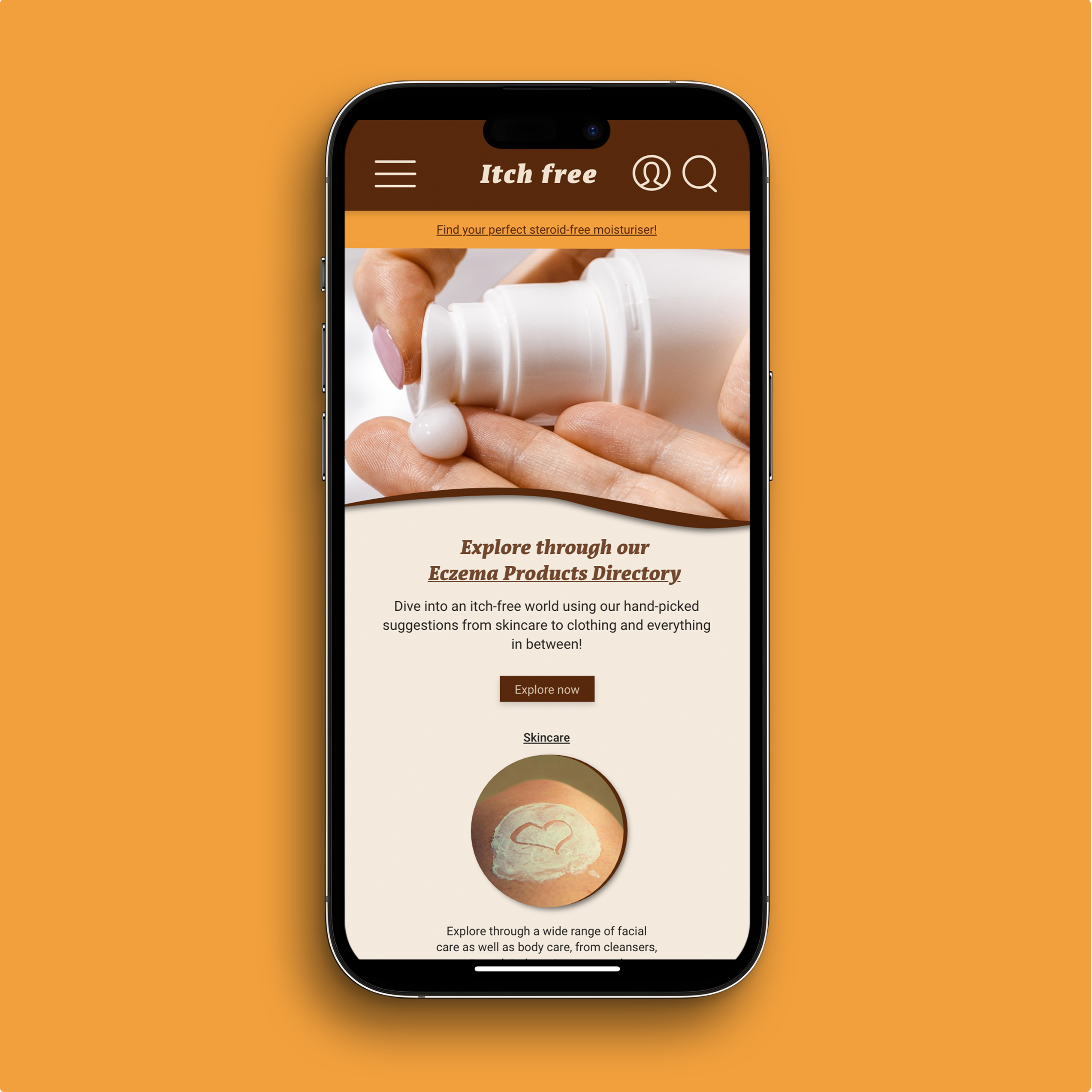
Itch Free website
Itch free is a website/web app which targets users who suffer from Atopic Eczema, commonly known as Eczema. As the user enters the site, they are welcomed with a link to browse through an Eczema Product Directory page all catered for eczema patients, which covers everything from skincare, to haircare, to even what laundry detergent to use for clothing. The core features aid the three users established in the earlier design process, Anjali, Poppy and Ana. Their pain points have informed the UI/UX design of both the mobile and desktop website.
I have always had a strong interest in design, particularly graphics and branding. The course at the University of Reading has enabled me to explore many avenues of the world of graphic design. I have enjoyed the learning process and value the skills I have developed, enjoying the opportunity to work independently and as a team, problem solving and creating different design projects. Throughout my time on the course, I have developed a keen interest in branding. I was lucky enough to have the opportunity of work experience at Honey Creative in London, where I was able to develop my design skills and knowledge, that has given me the confidence and abilities to go into a career in branding. I enjoy the challenge of creating and redeveloping brands, to help clients achieve their ambitions and goals for their businesses.
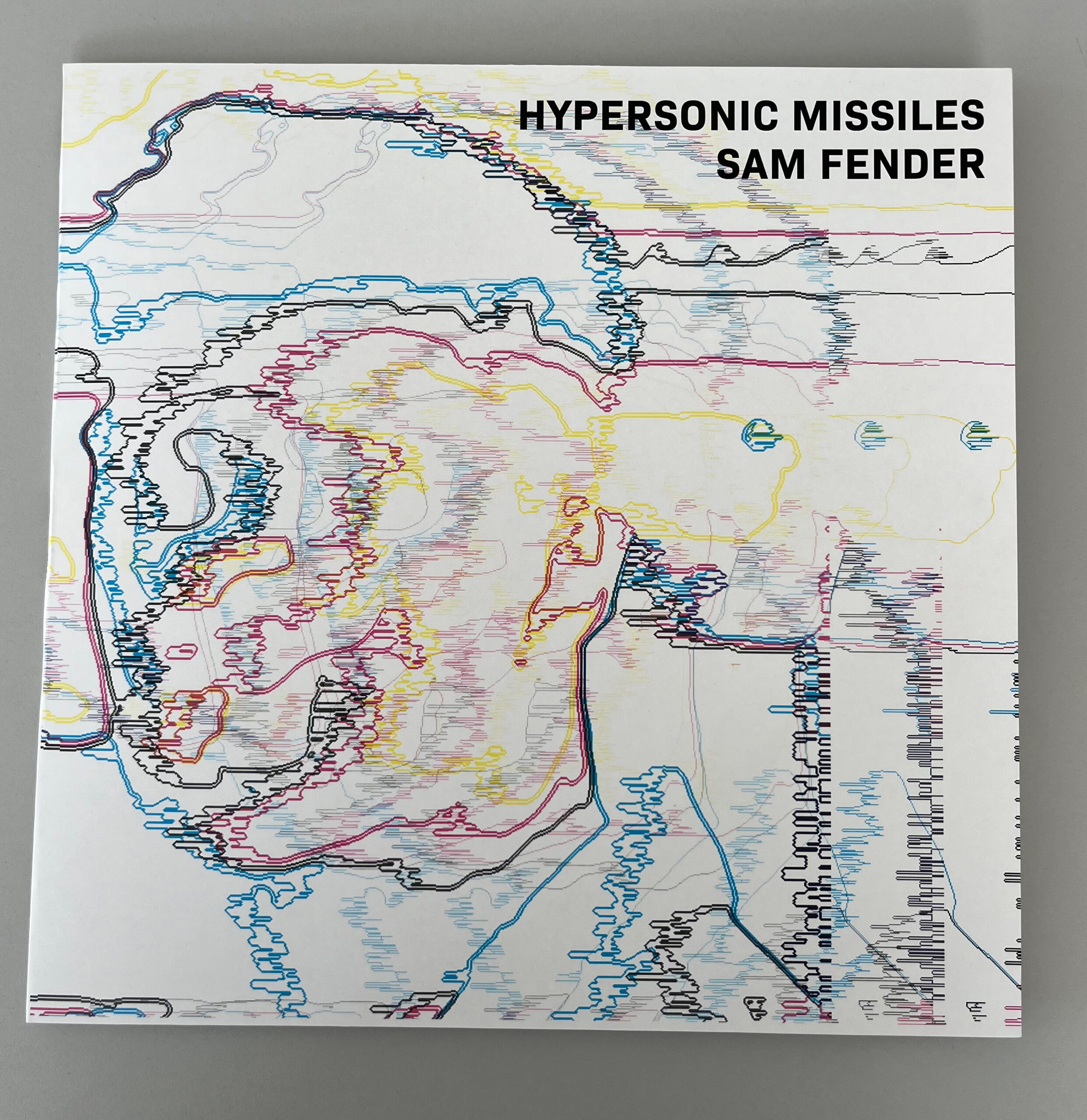
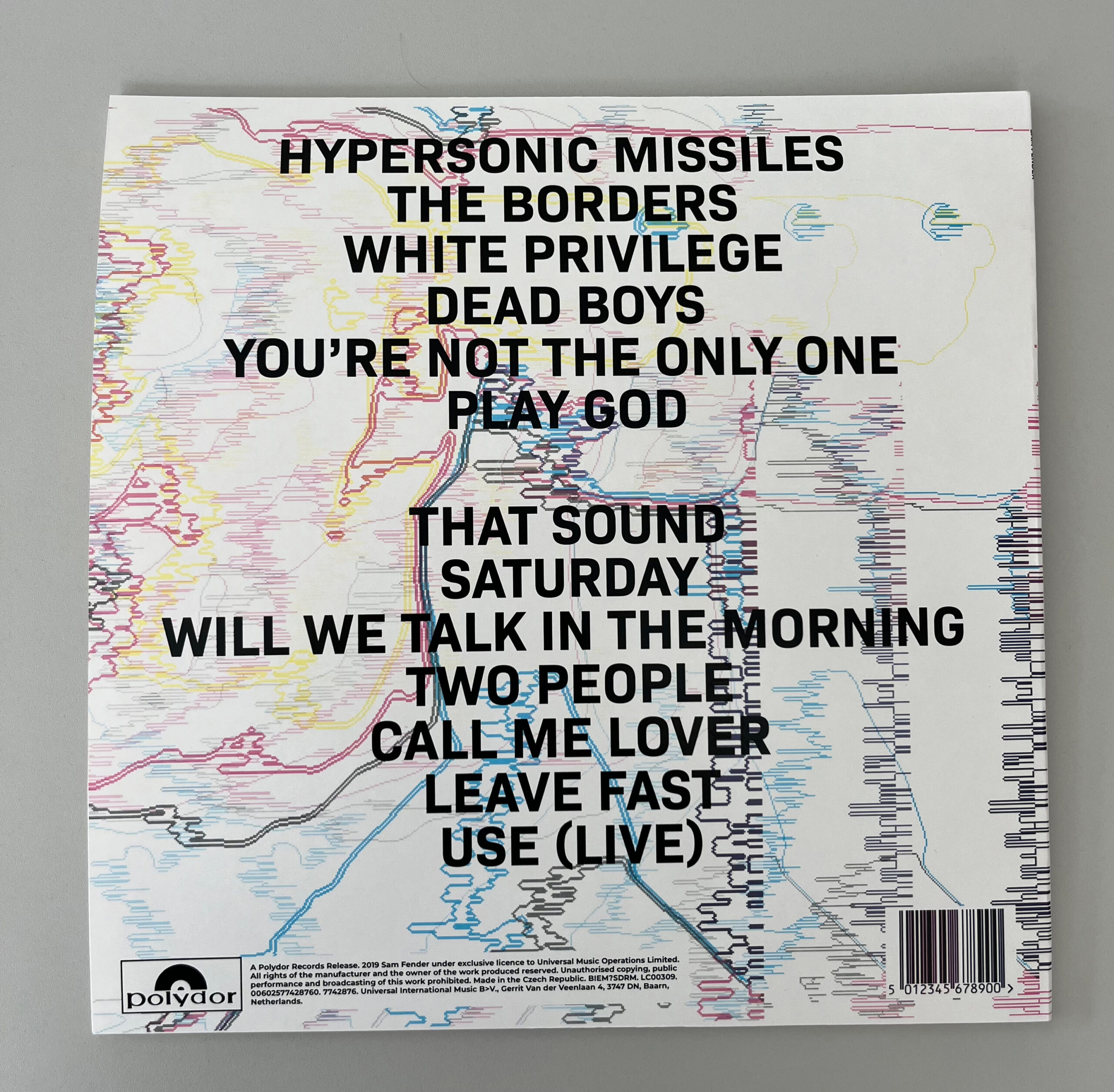
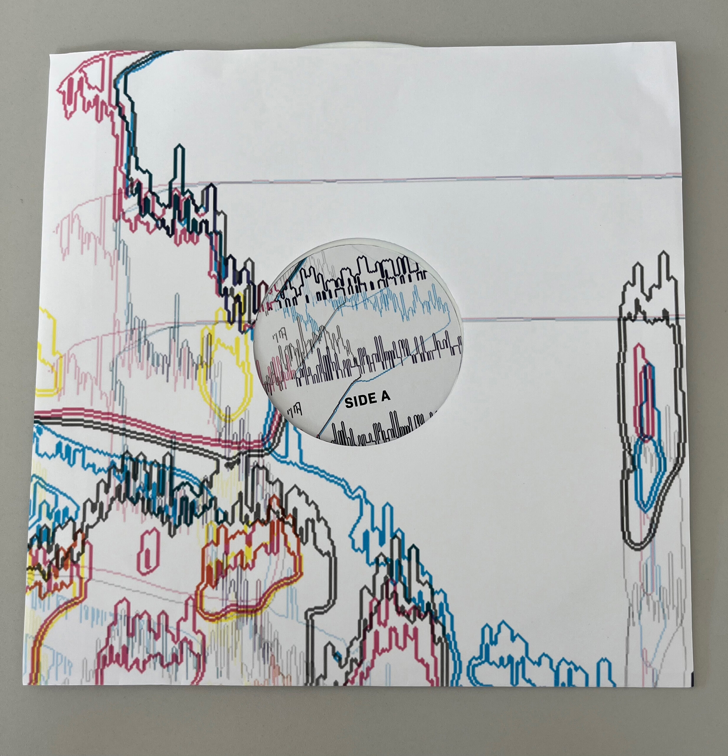
Delving into the social injustice and dysfunction in society, this packaging redesign project explores how the world appears to Sam Fender in his album Hypersonic Missiles. It uses a combination of bold typography and imagery that reflects the mess the world is in around Fender, from his beloved Newcastle, to the world as a whole. The design shows disruption, lines that reflect the climate and the damage of war, and also the mind of someone who is feeling suicidal. Ultimately, it's a reflection of how Fender views society, a complete mess caused by its own dysfunctions.
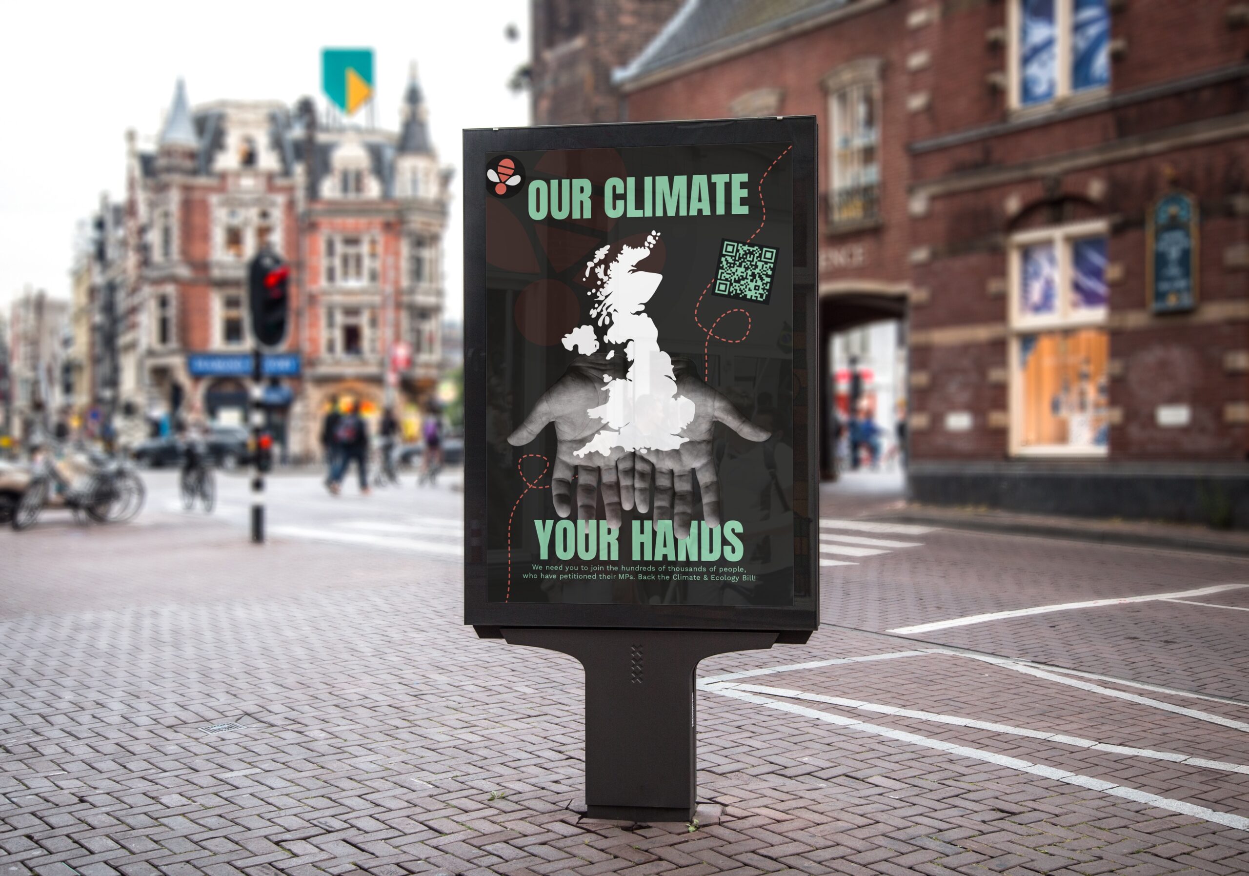
Zero Hour campaign
Zero Hour: A youth-led organisation demanding climate action. For this project I was tasked with designing key assets for a small travelling exhibition stand. Creating posters specific to each place the exhibition would travel to, I felt it would create a more personal approach to each location.
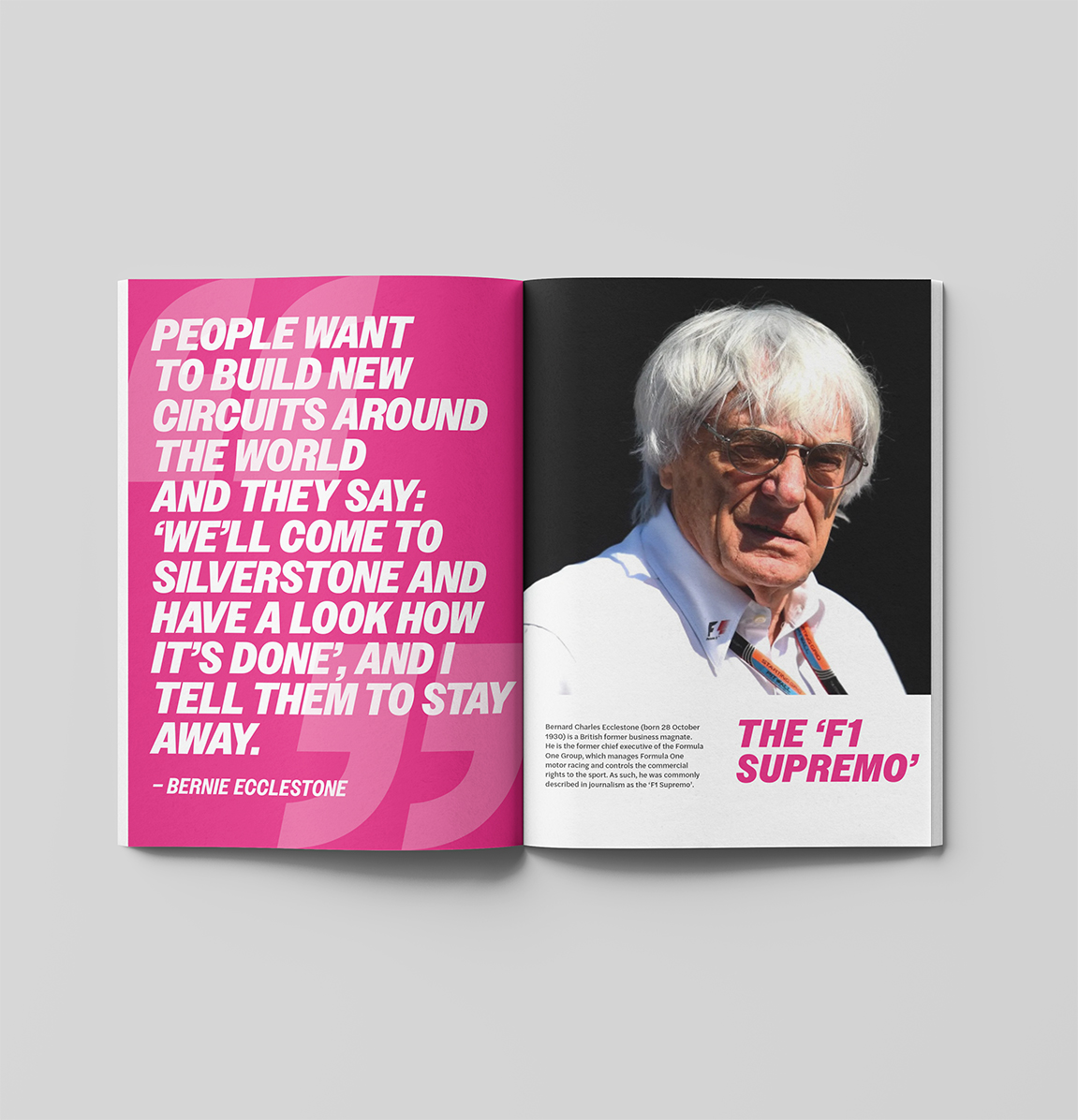
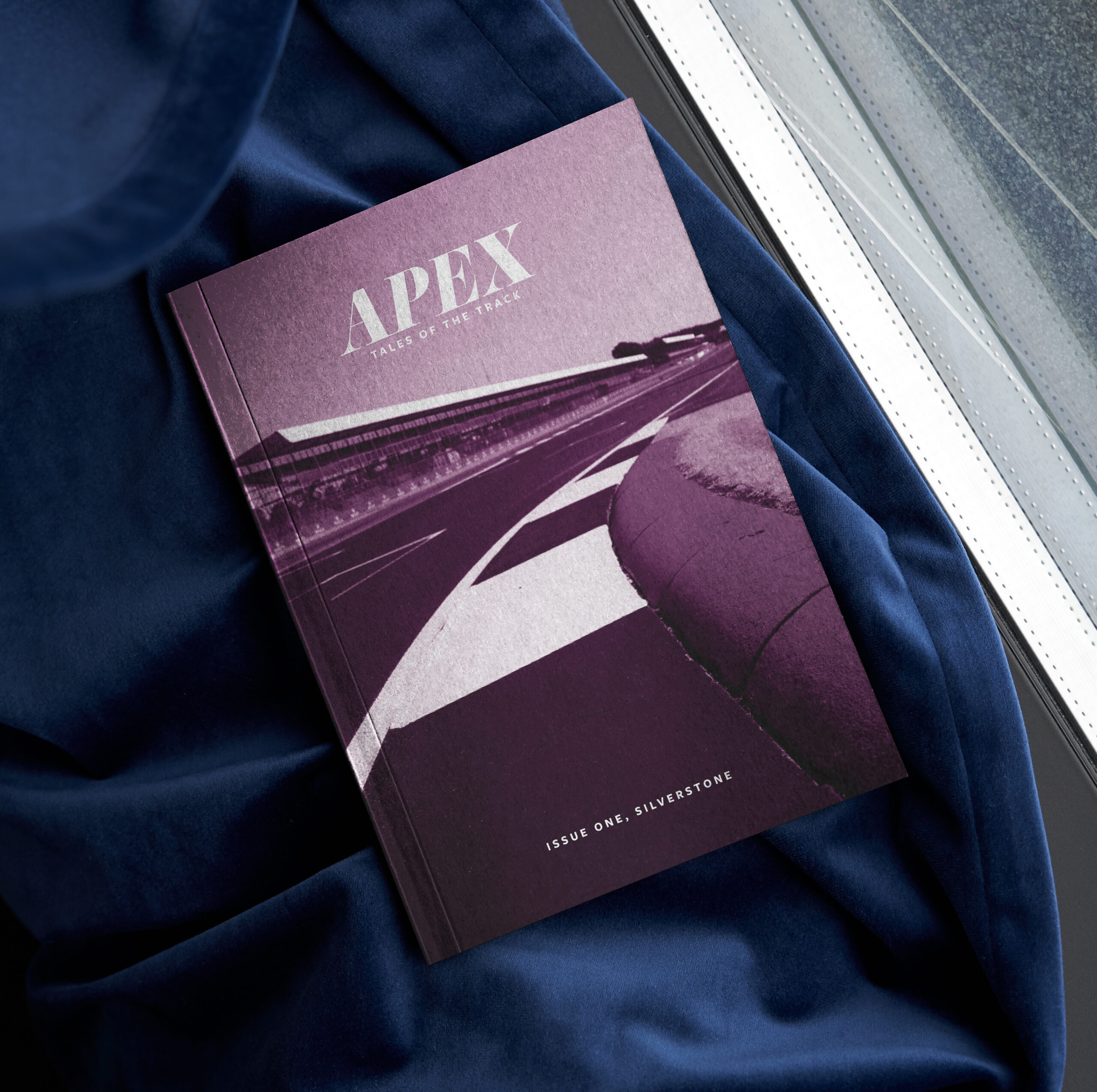
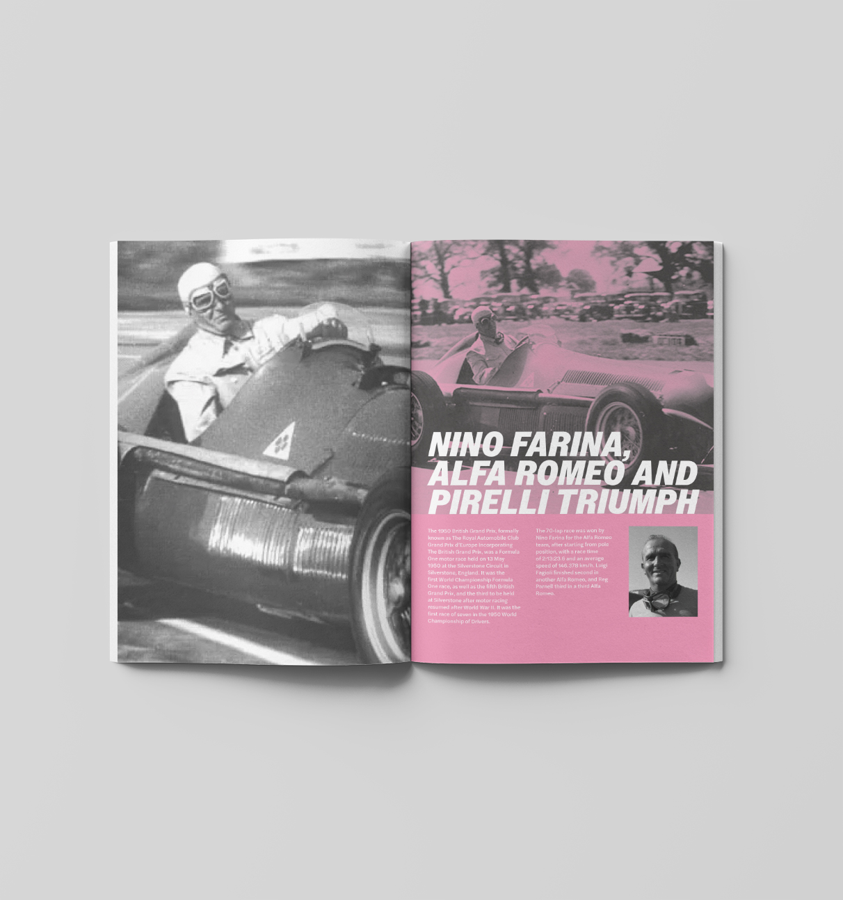
Apex magazine
Tracks, cars, drivers. Each issue of Apex magazine features a different Formula One track. Including articles about the history of the track, famous races and crashes and an interview with people connected to the track.
Hi! I’m Drew. I’m a passionate and creative designer with an interest in all aspects of design, especially branding and editorial design. My time at the University of Reading has not only helped me develop my skills and deepen my understanding of design, but it has also taught me how to centre design around users and what they want and need. I want to continue developing my skills and learn how I can make a difference to the world around me through my designs.
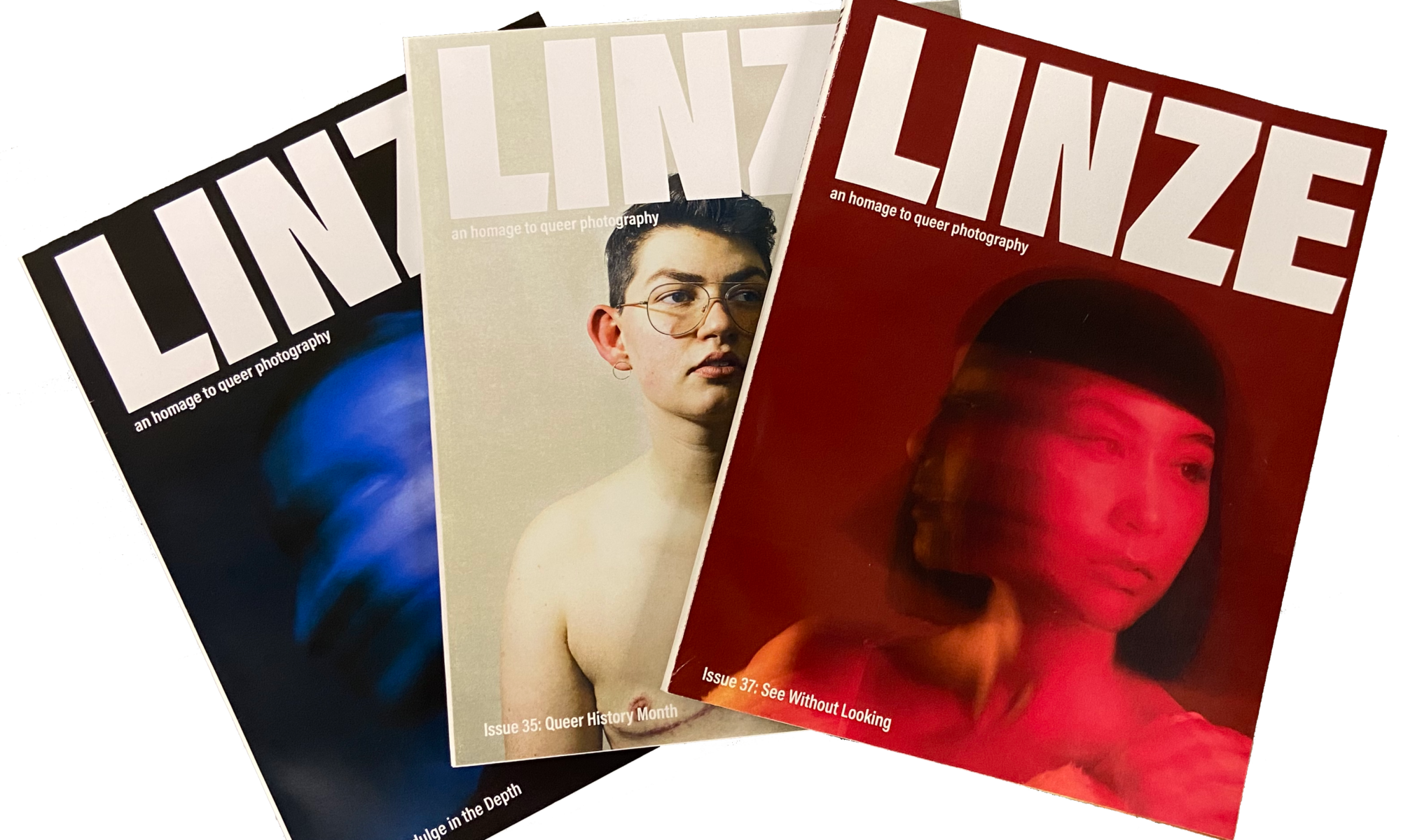
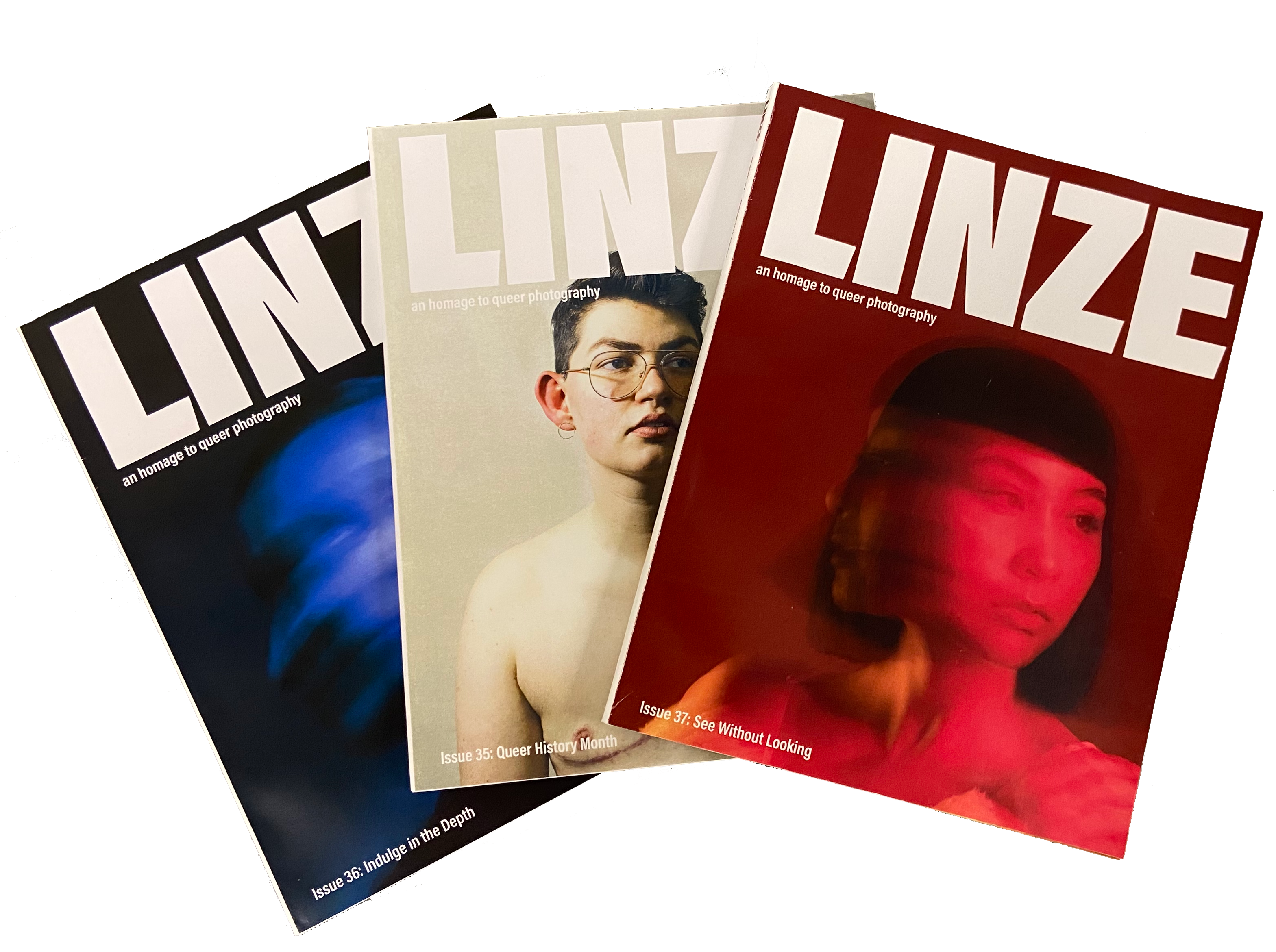
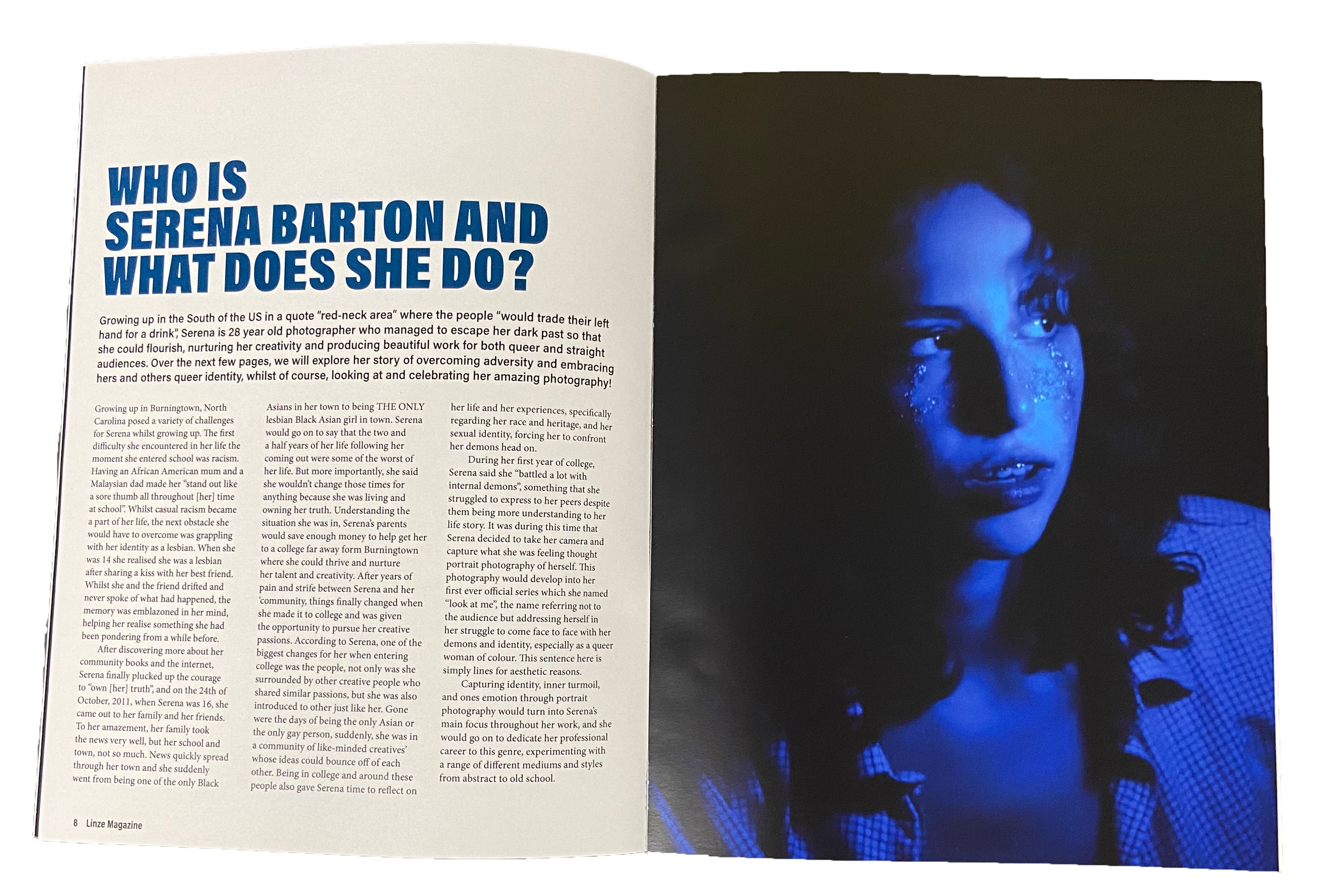
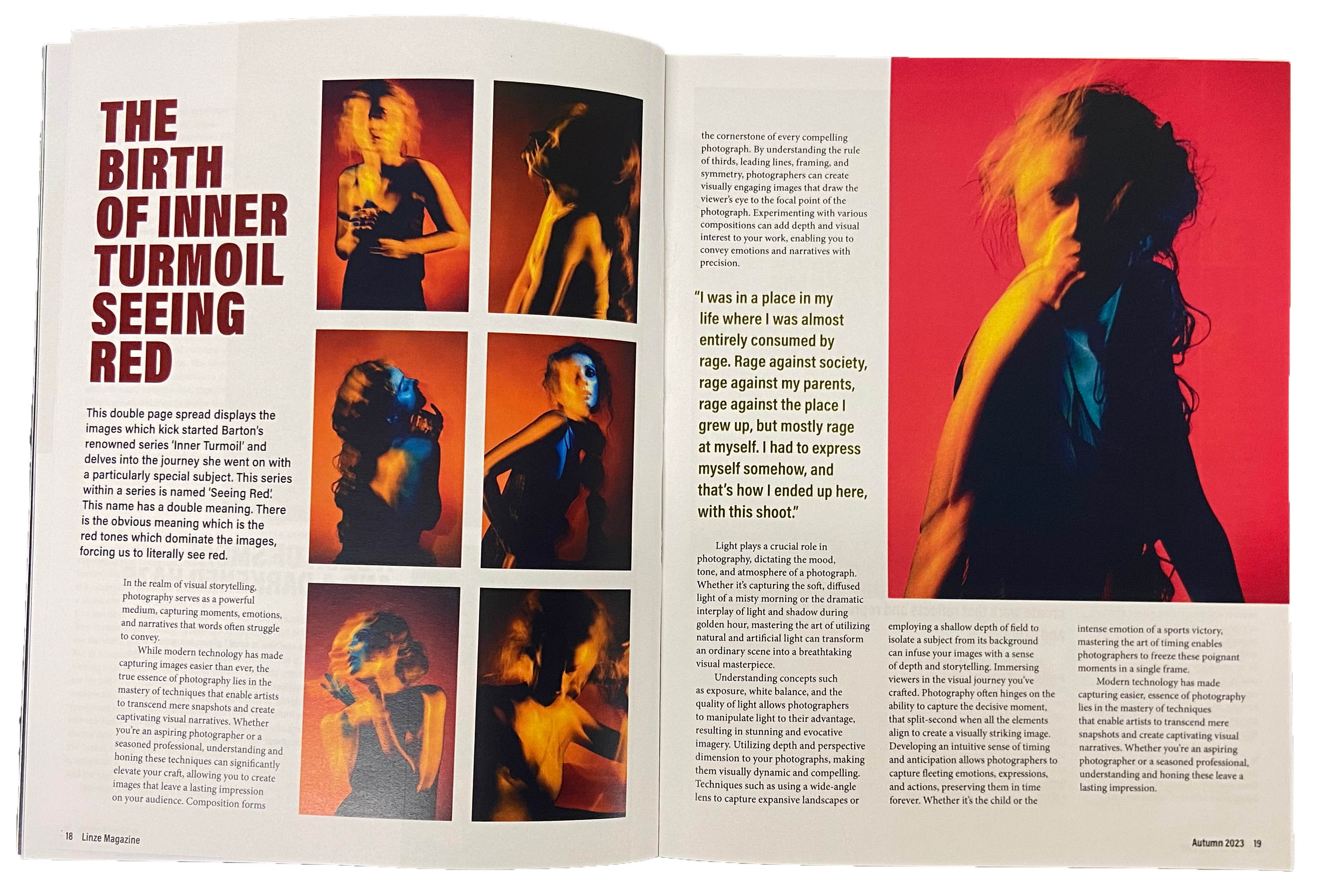
Linze magazine
Linze is a magazine for those with a passion for photography and who are part of or connected to the queer community, with the content serving as an homage to queer photography. This seasonally released magazine contains a variety of content ranging from interviews to reader competitions to long articles about queer photographers and their work. Using a simplistic and limited colour scheme and keeping the typographic variation to a minimum, I ensured that regardless of the contents of the magazine, the imagery would always be the centre of attention, as Linze is after all, dedicated to the work of these photographers.
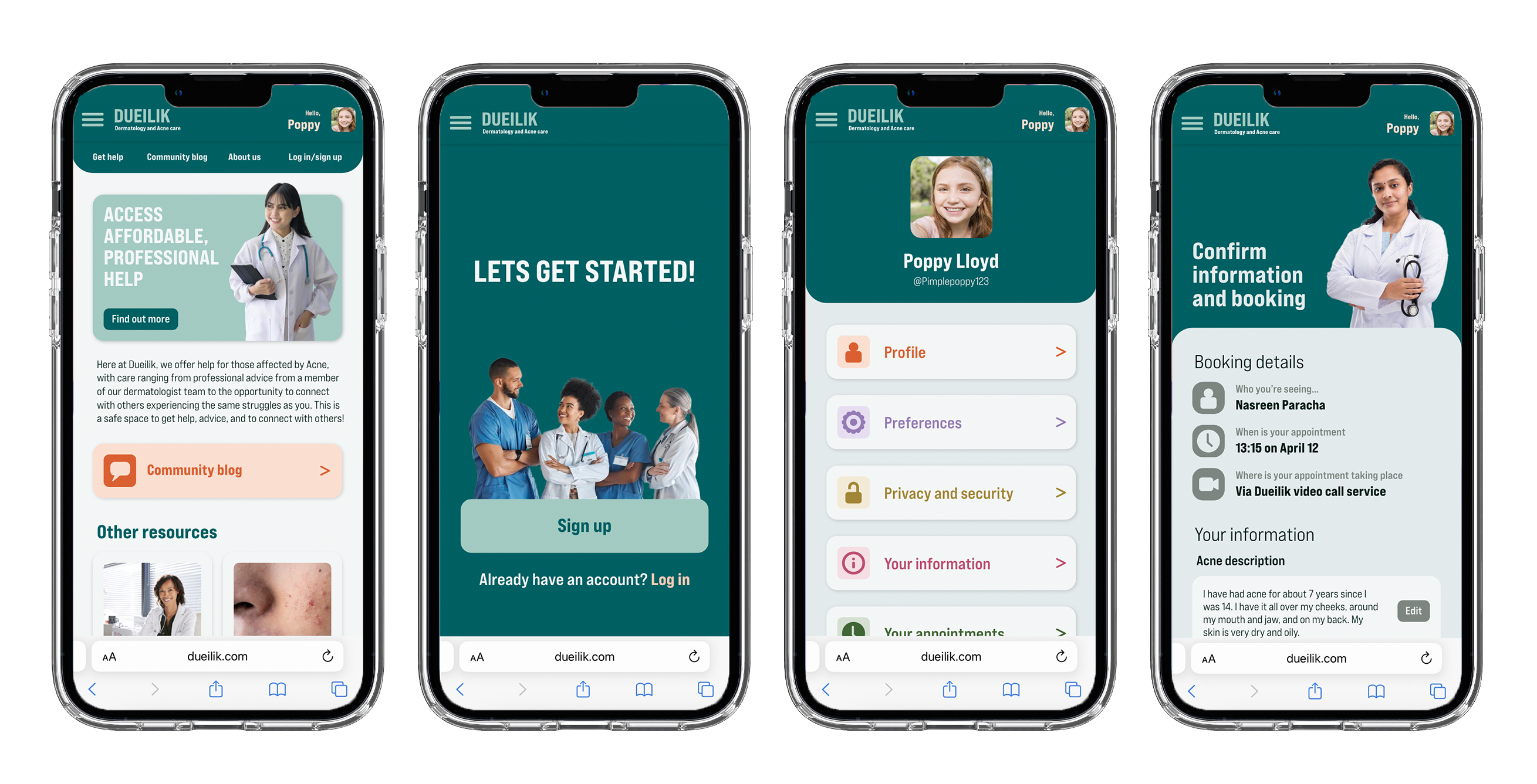
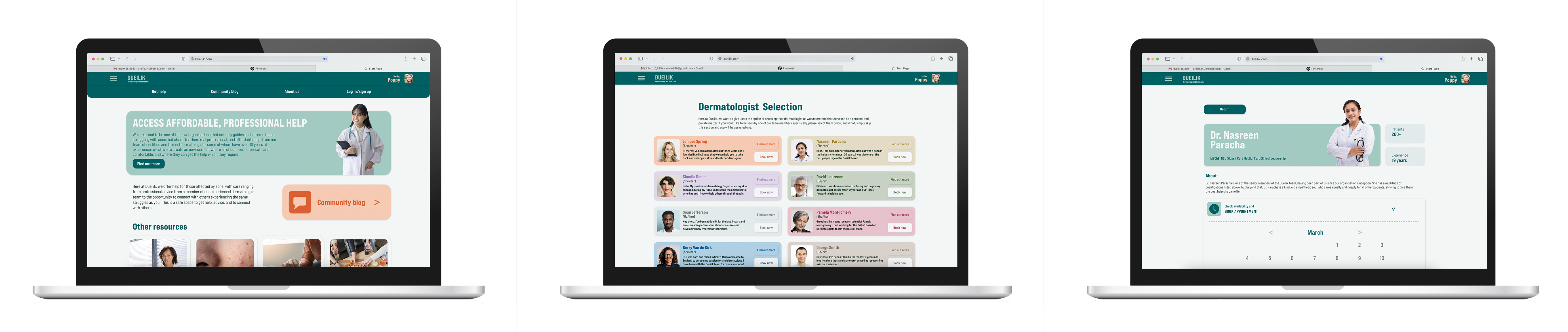
Dueilik web app
My web app ‘Dueilik’ targets users who struggle with acne and getting access to professional and affordable care for it. My web app helps users access professional and affordable care for their acne. It gives them an opportunity to speak with experts and get proper treatment at an affordable rate and with little hassle. Not only this but it will provide a platform and space for users to connect with others facing the same struggles as them and share advice, stories, and more, easing the mental burden caused by acne. Dueilik uses soft shapes and visuals containing happy medical professionals to create a less harsh and medical atmosphere, helping to ease the users stress and anxiety around seeking help.
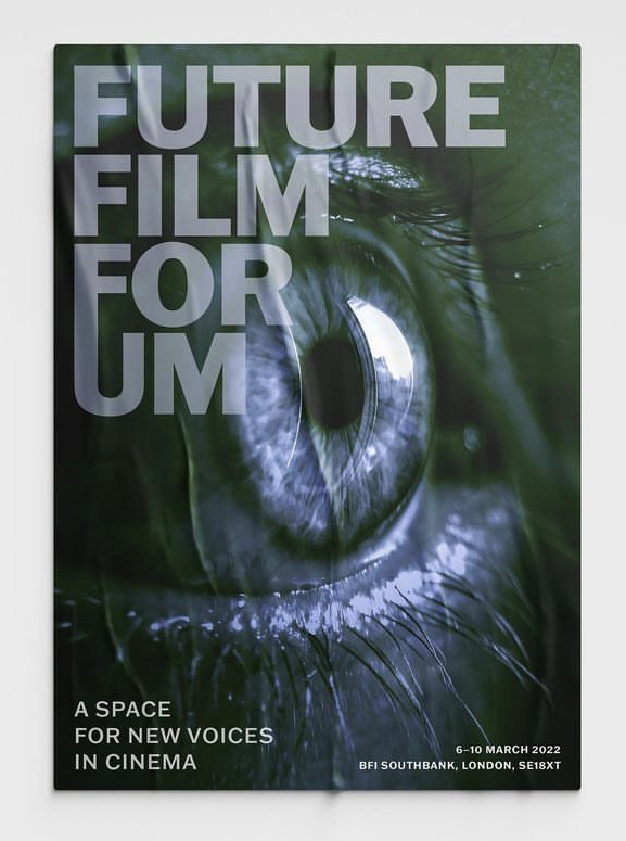
Film festival poster
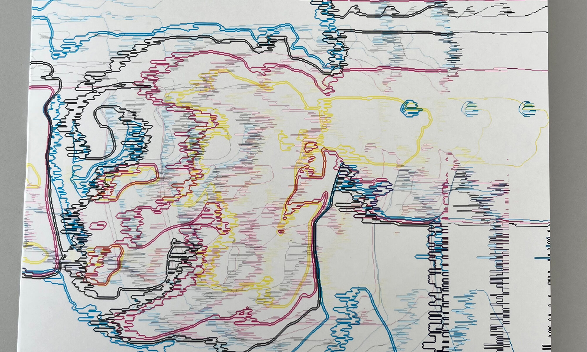
This poster was one that I created in second year for our Design Practice module. The film festival was meant to primarily feature niche and underground directors who create indie films, with many of them depicting the darker and less commonly viewed parts of the human experience. Initially setting out to capture the themes of the films in my poster, I eventually decided to use an eye for my main visual instead. I chose this because I felt a close up of a human eye captured the rawness, exposure, and emotional intimacy that the films depicted, thus capturing the essence of the films and directors.
I am a versatile designer with a passion for crafting compelling visual narratives through campaign design, editorial design, and illustrations, driven by a keen eye for detail. Throughout my time at University of Reading, I’ve had the opportunity to work with real clients, fuelling my passion for creating meaningful and impactful designs. This hands-on experience has honed my technical skills and deepened my understanding of client needs and preferences. Real-world projects has instilled in me a commitment to delivering solutions that not only meet but exceed expectations, while also fostering strong client relationships built on trust and collaboration.
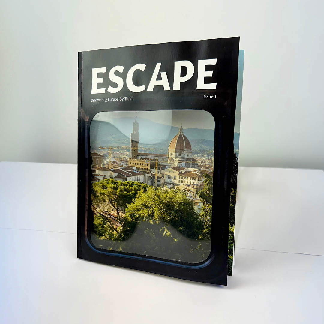
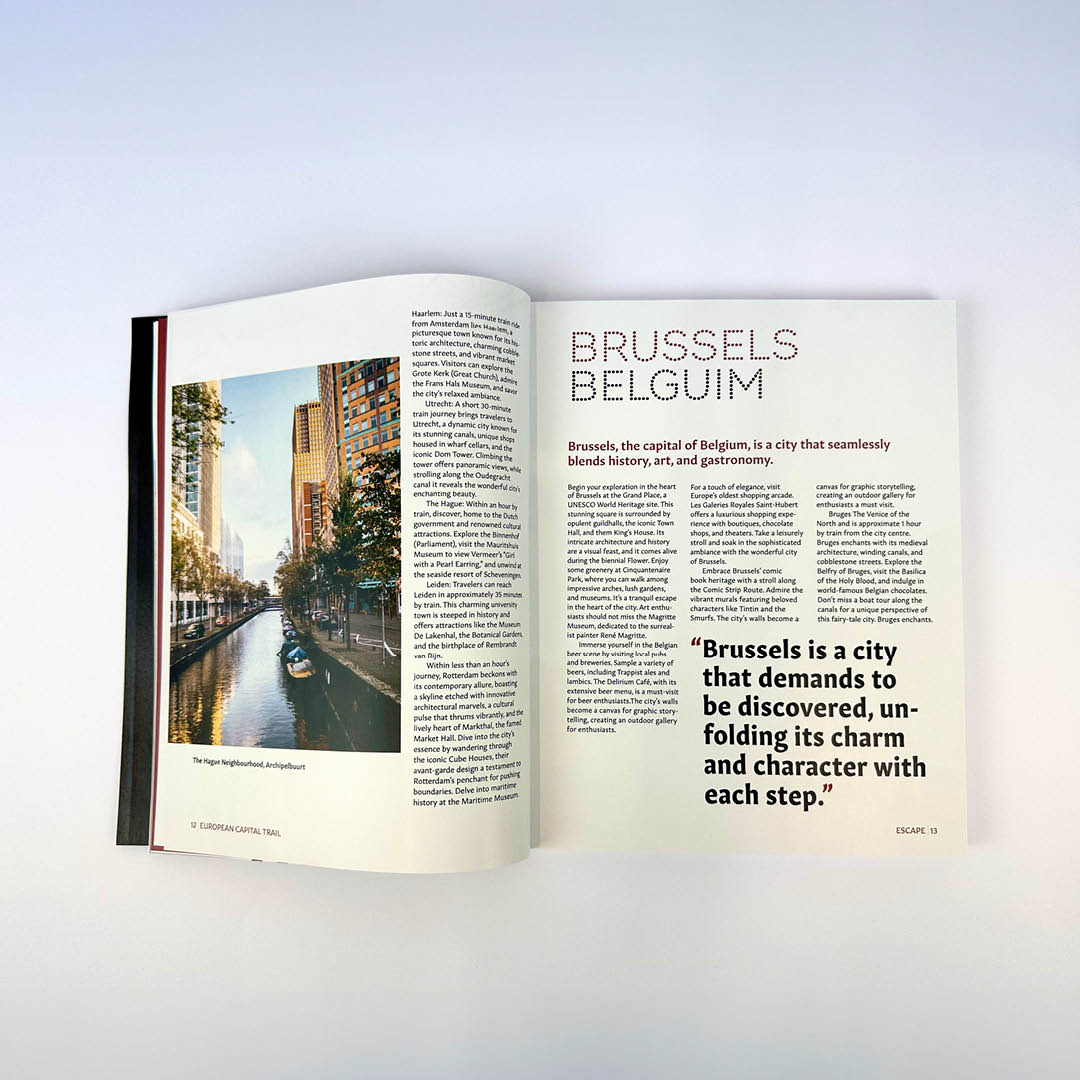
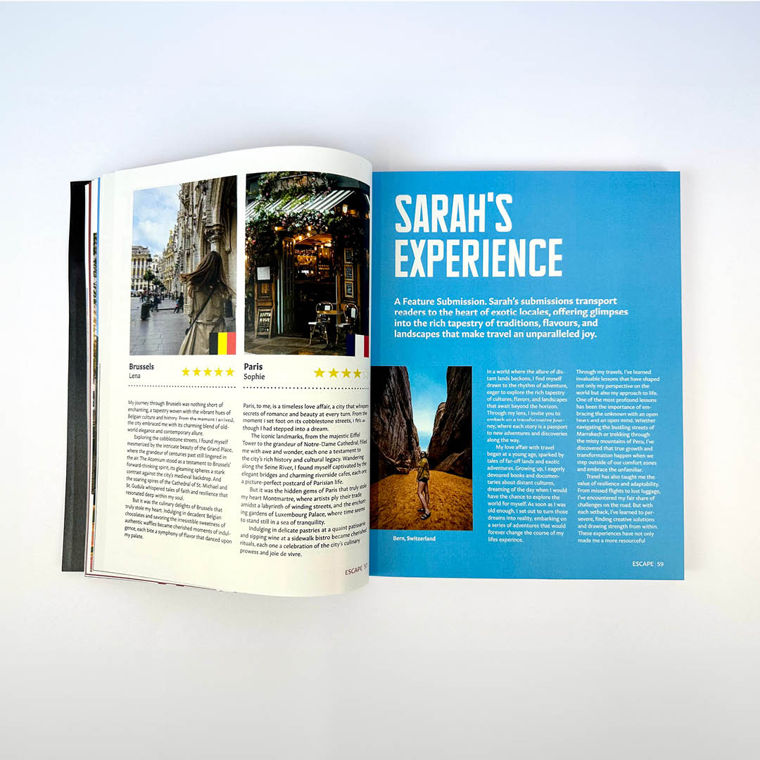
Escape is an interrail magazine where each issue focuses on different routes, exploring the wonders of different countries. It enables readers to submit their travel experiences, tips and tricks through the website with the chance of having a featured article in the magazine's biannual release.
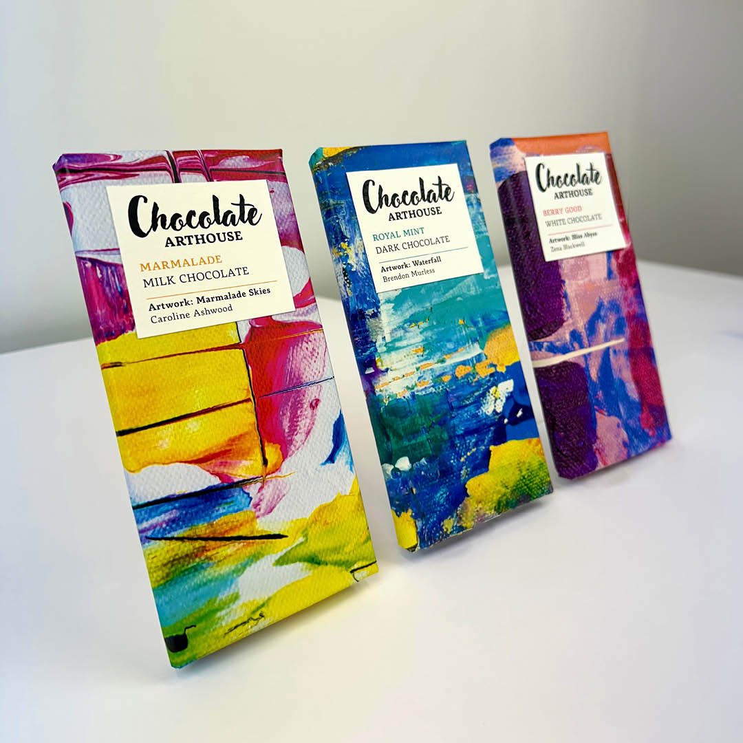
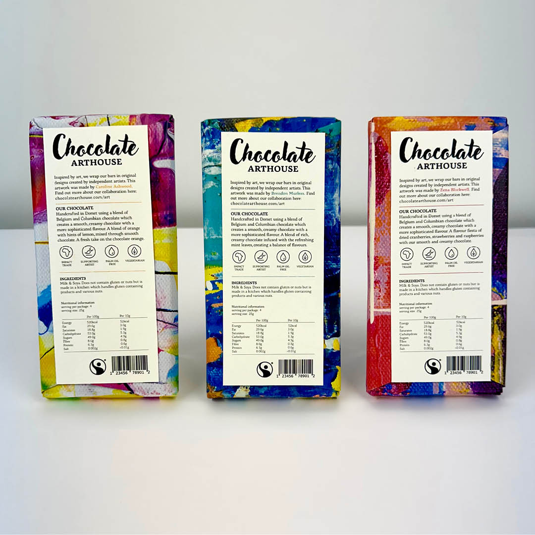
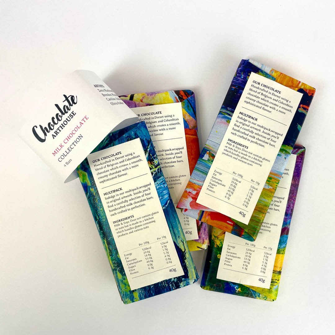
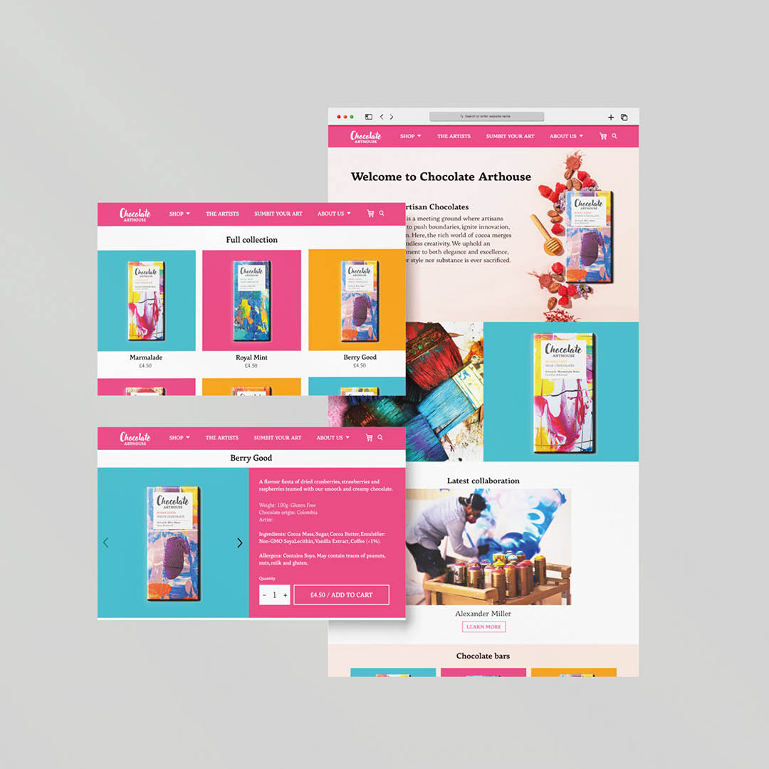
Chocolate Arthouse packaging
This is a redesign of Chocolate Arthouse packaging. To represent the brand's identity, I have used local artists’ work to wrap the chocolate bars, with the artists’ name and work displayed on the front.
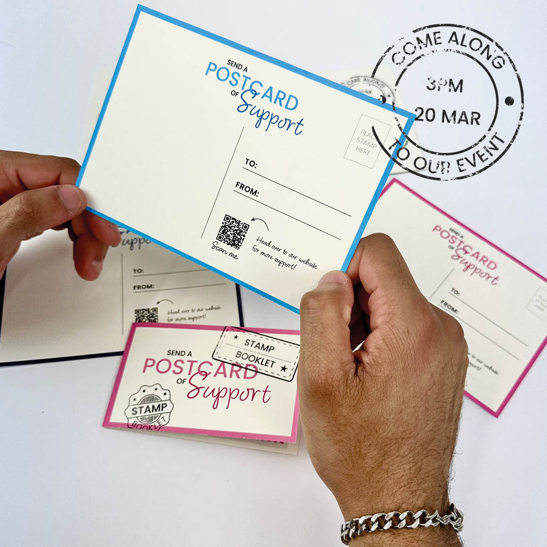
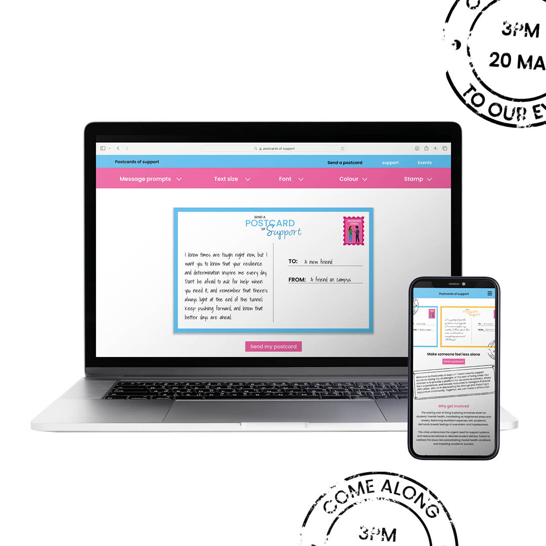
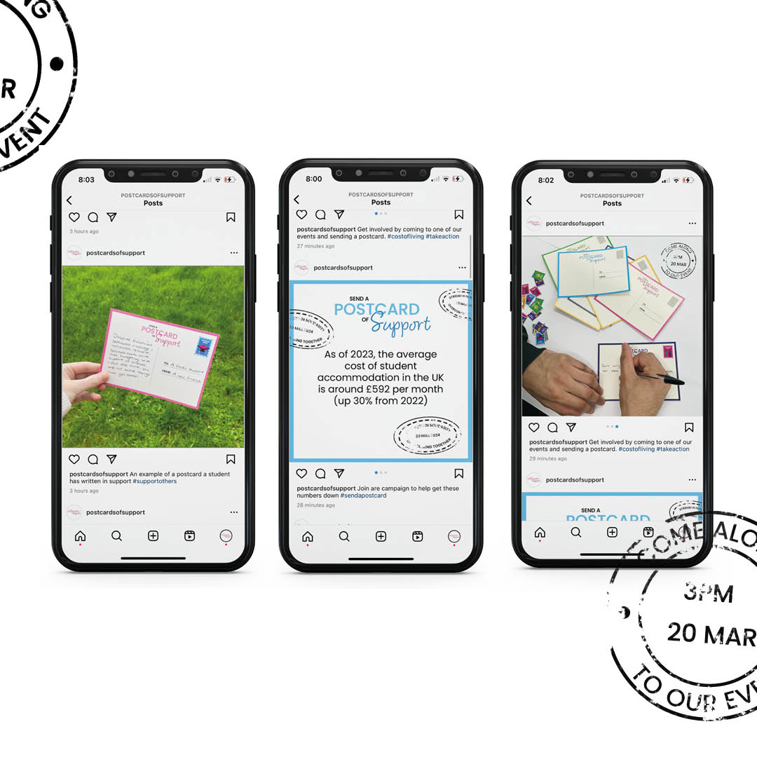
Postcard of Support
Postcard of Support is a campaign that helps bring students together during the current cost of living crisis. The campaign allows students to send both virtual and physical postcards to one other in hopes of creating a space to connect, emphasise and find strength in solidarity. I want my campaign to show students they are not alone in their experiences with the end goal of creating an event workshop providing practical guidance and equipping students with the tools they need.