Hi, I’m Matt, an ambitious designer with an eye for detail. I enjoy being able to create innovative and creative solutions to design projects, particularly within advertising, packaging, and branding. My experience completing a variety of freelance projects, from branding businesses to merchandise for international musicians, has allowed me to work closely with clients, giving me an array of real-world experiences. These opportunities have allowed me to be a proactive and versatile creative, being able to learn new software and skills to best complete these projects and meet client’s needs. Having skills in communication and time management, developed through my university studies and freelance design work, allows me to work as an effective and professional designer. My motivation to grow and improve, both as an individual and as a professional, leads me to create innovative, engaging, and successful designs.
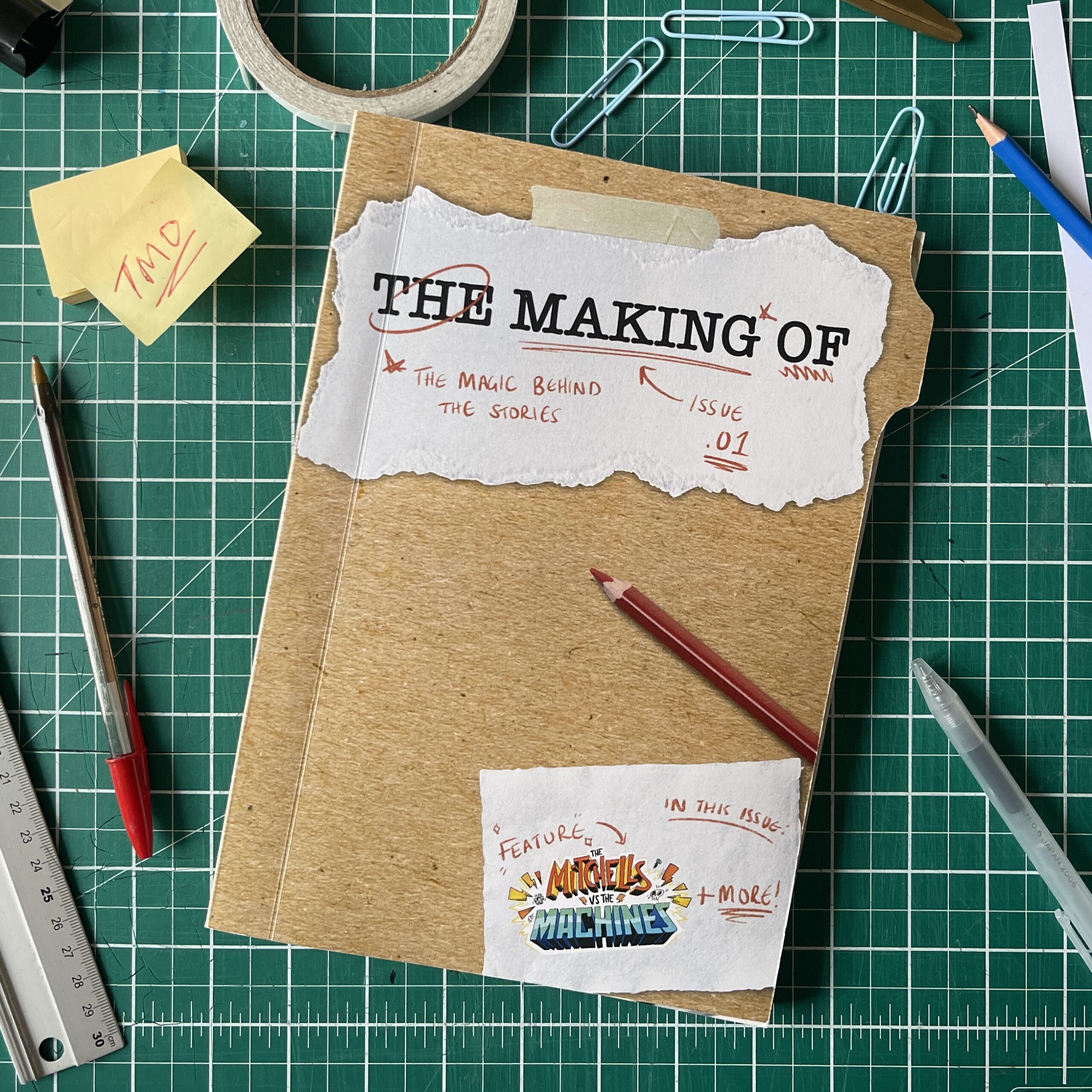
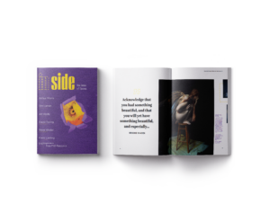
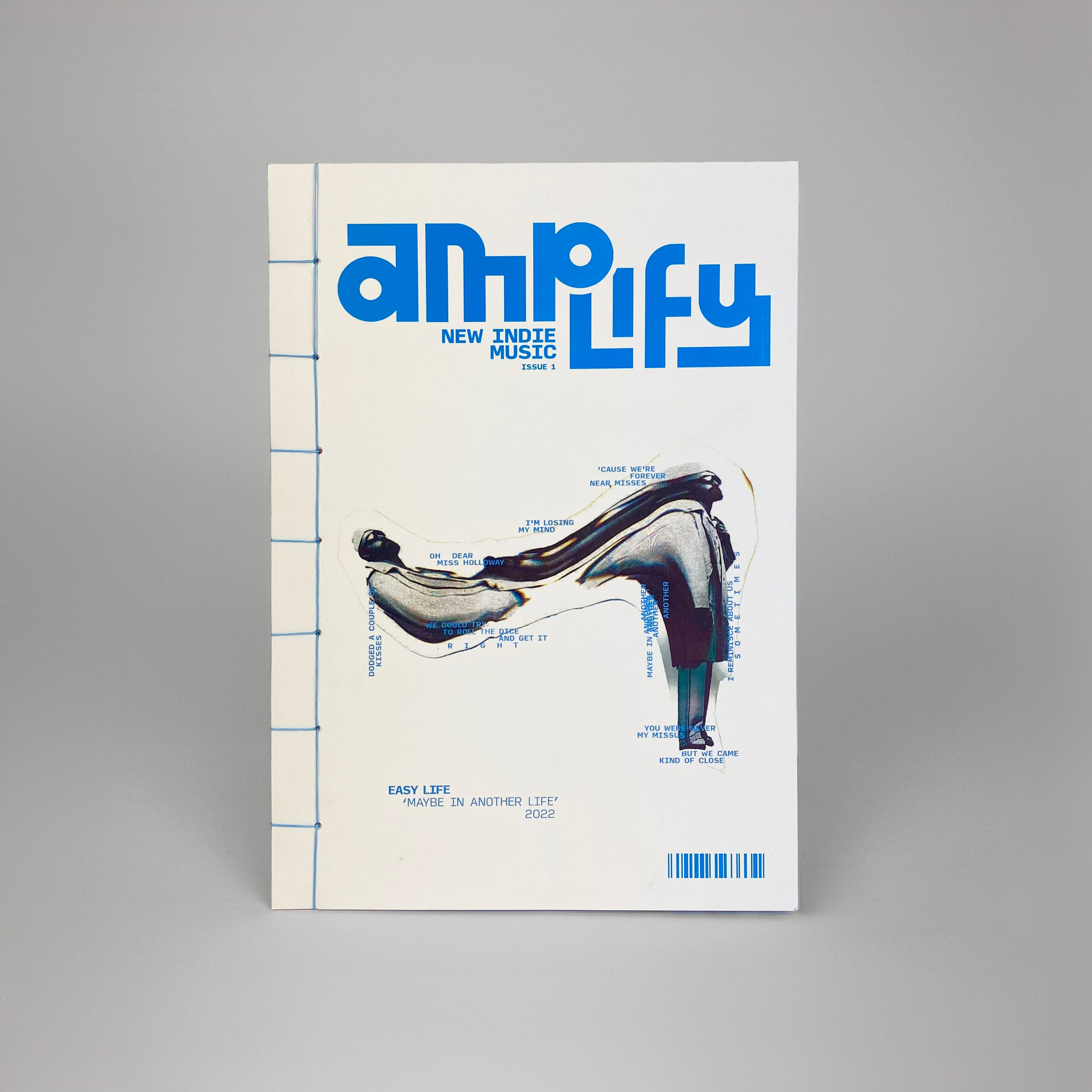
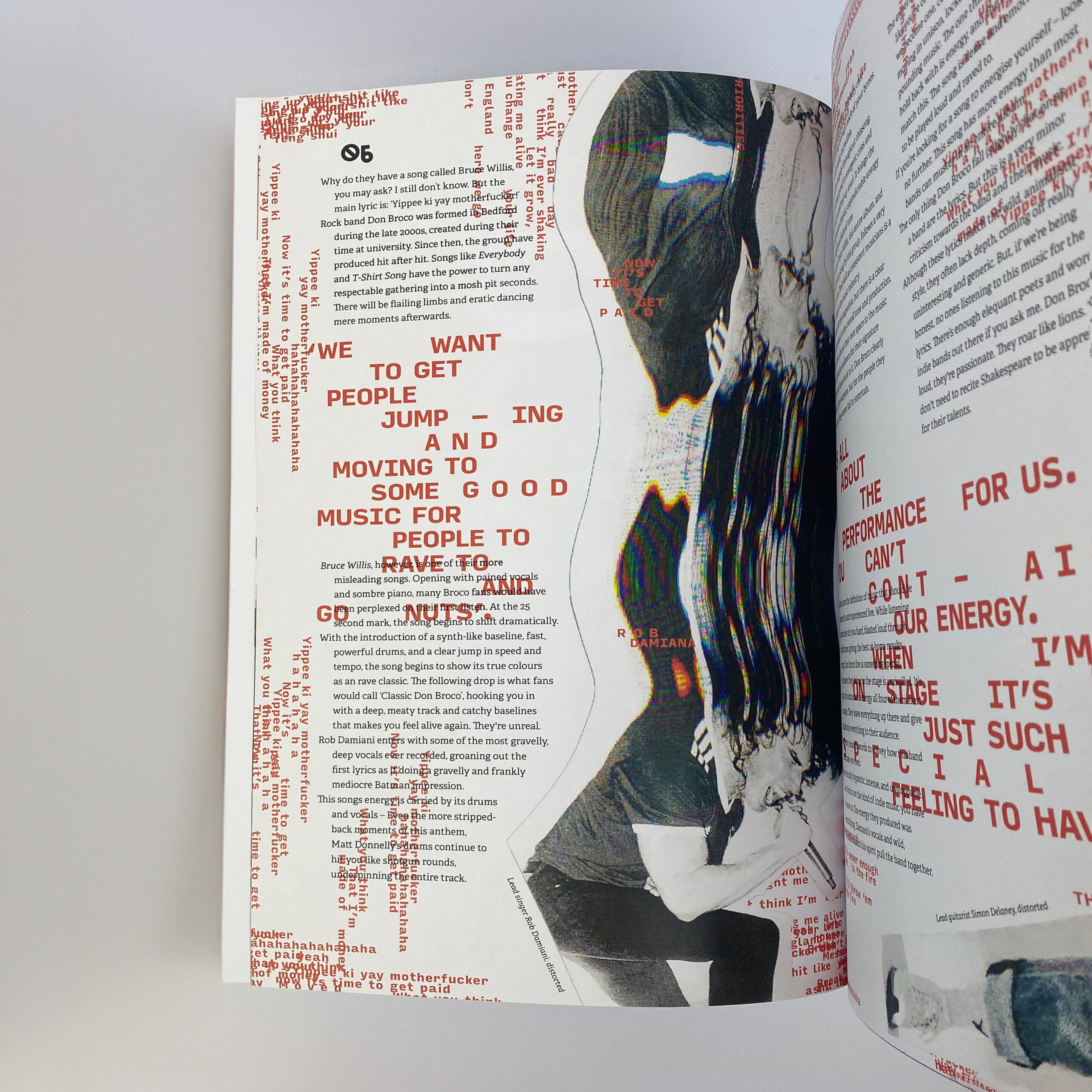
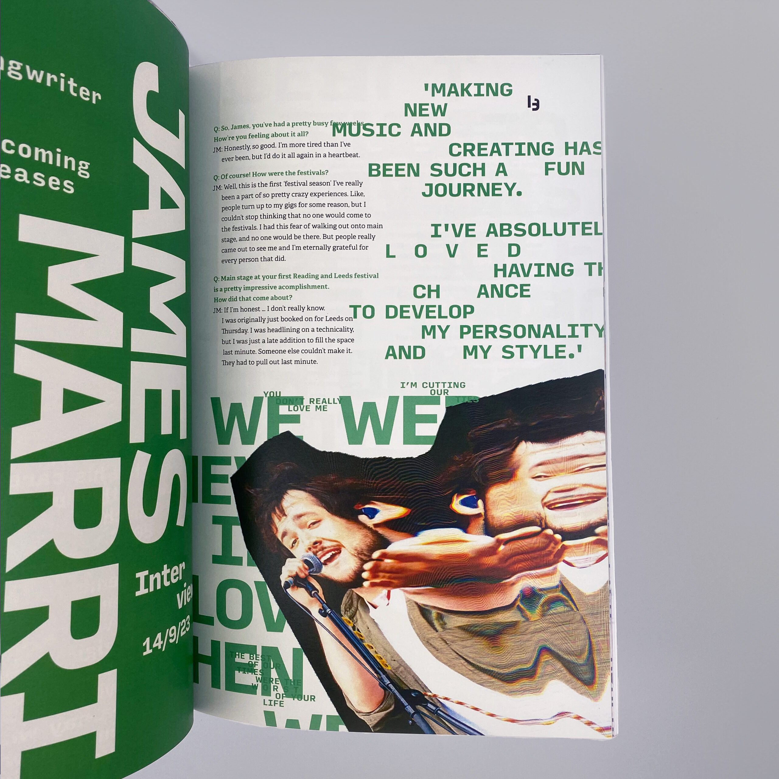
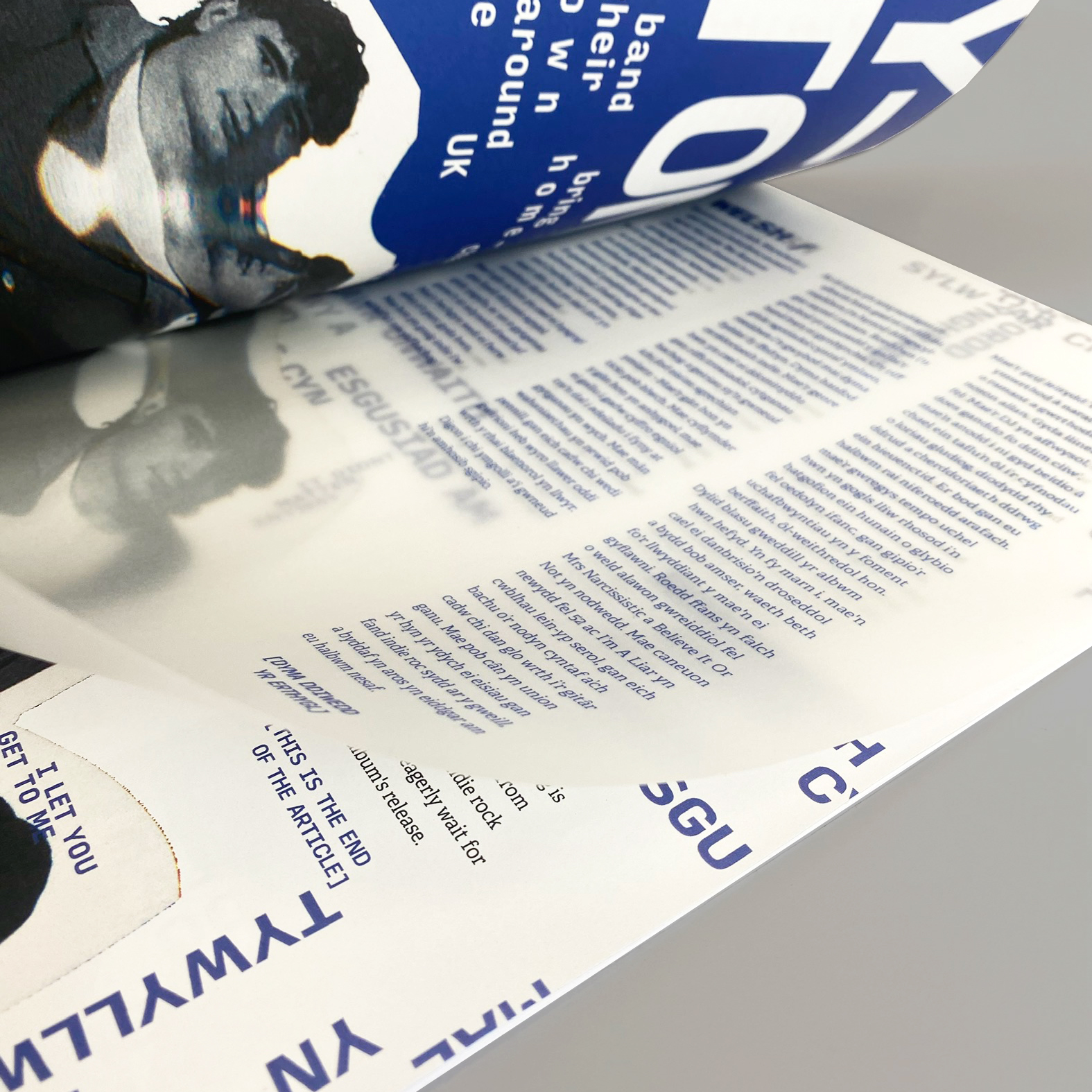
Creating Amplify, a new indie music magazine focussed on connecting small artists with passionate fans. This product and its brand are centred around being independent and standing out. Using a photocopier to distort images creates an incredibly distinctive image treatment, with each article’s style being reflective of the artists and their music. The format itself aims to be tactile and exciting – The stab-stitched binding embodies the personality of indie music, with the dynamic, experimental structure keeping this periodical dynamic and fresh.
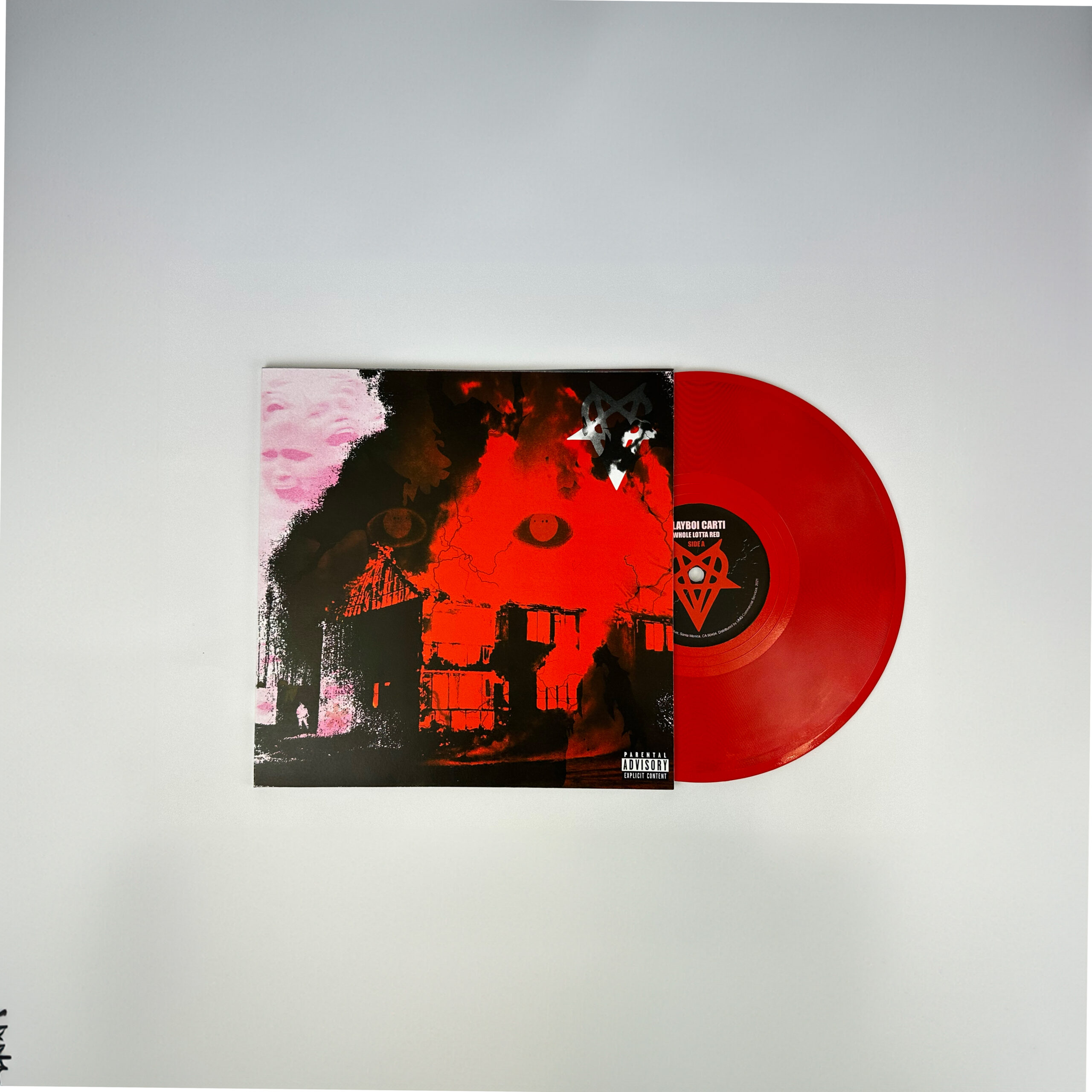
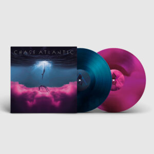
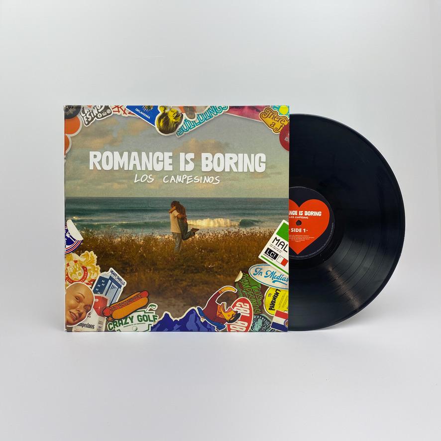
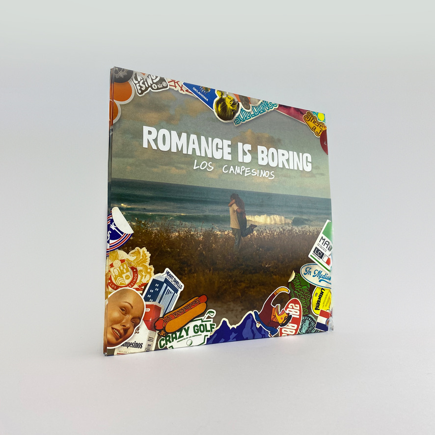
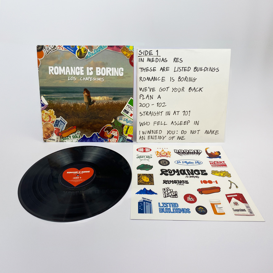
Romance is Boring Album design
Redesigning an existing vinyl record cover for ‘Romance is Boring’ by Los Campesinos. This project focussed on visually representing the album’s unique blend of pessimism and sentimentality, while adhering to conventions of indie music. The sticker elements used throughout this work have heavy links to touring musicians, with each one connecting to the band or songs on this album. This process has been incredibly rewarding, giving me time to consider every aspect of a user’s journey and the physicality of this product to make a more successful response to the brief.
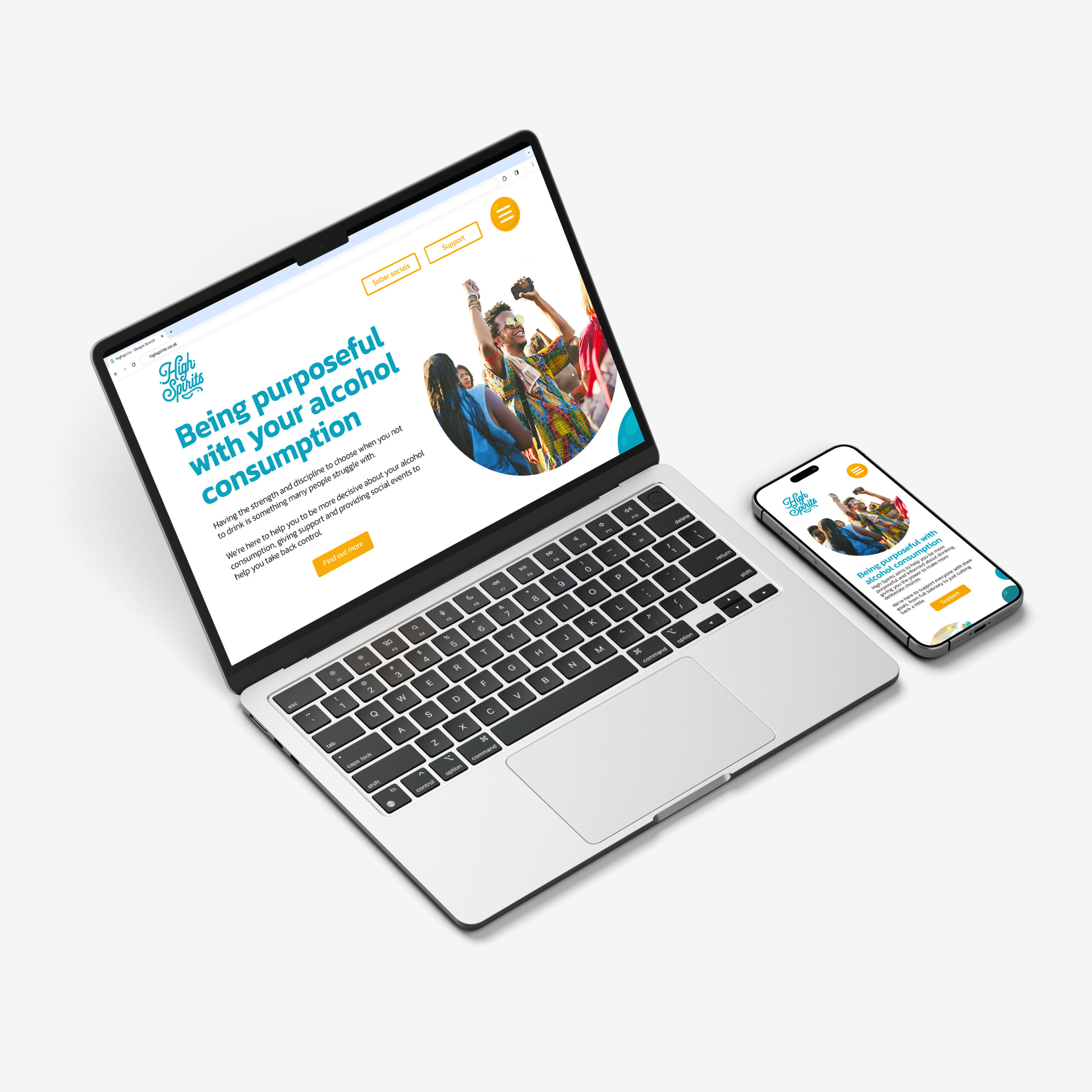
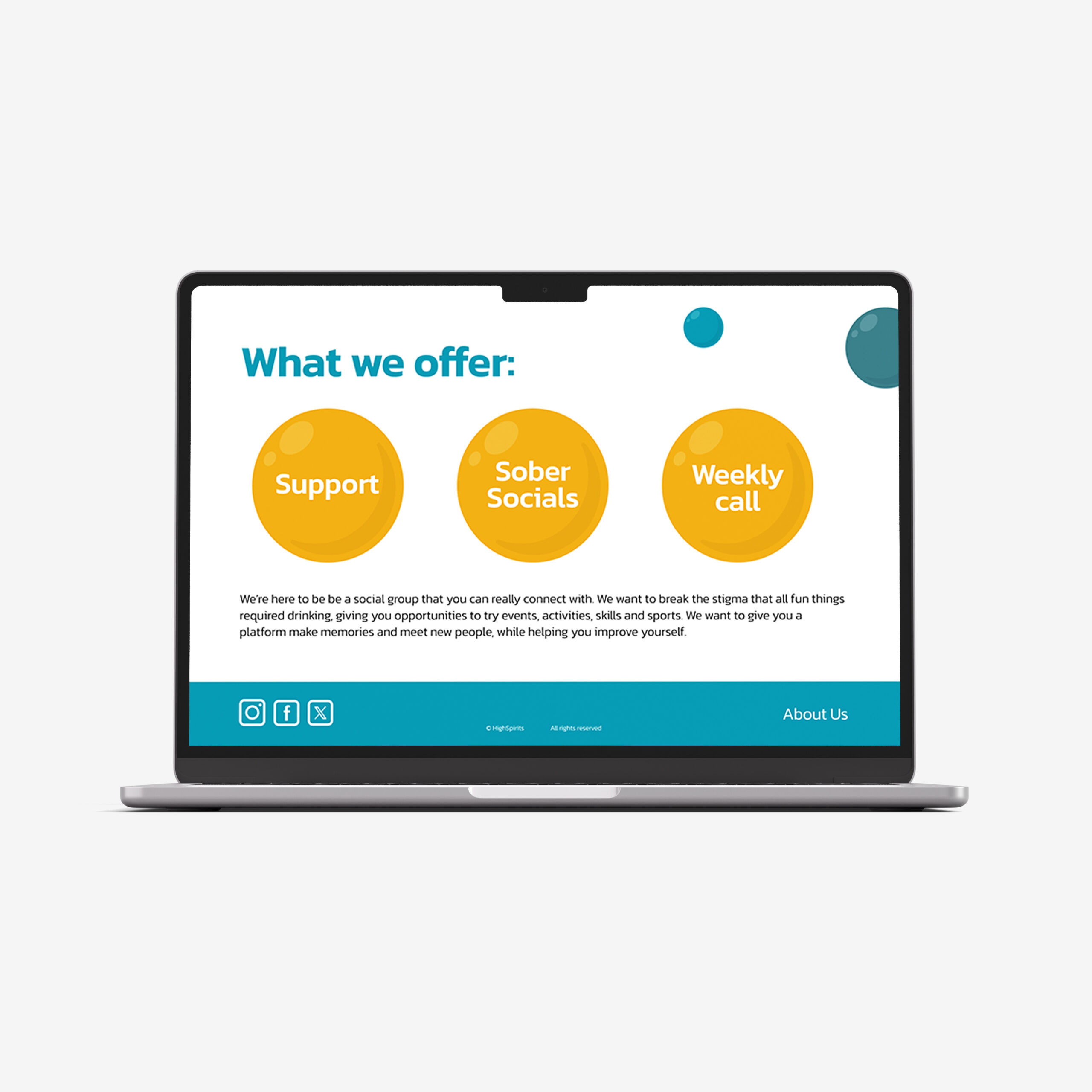
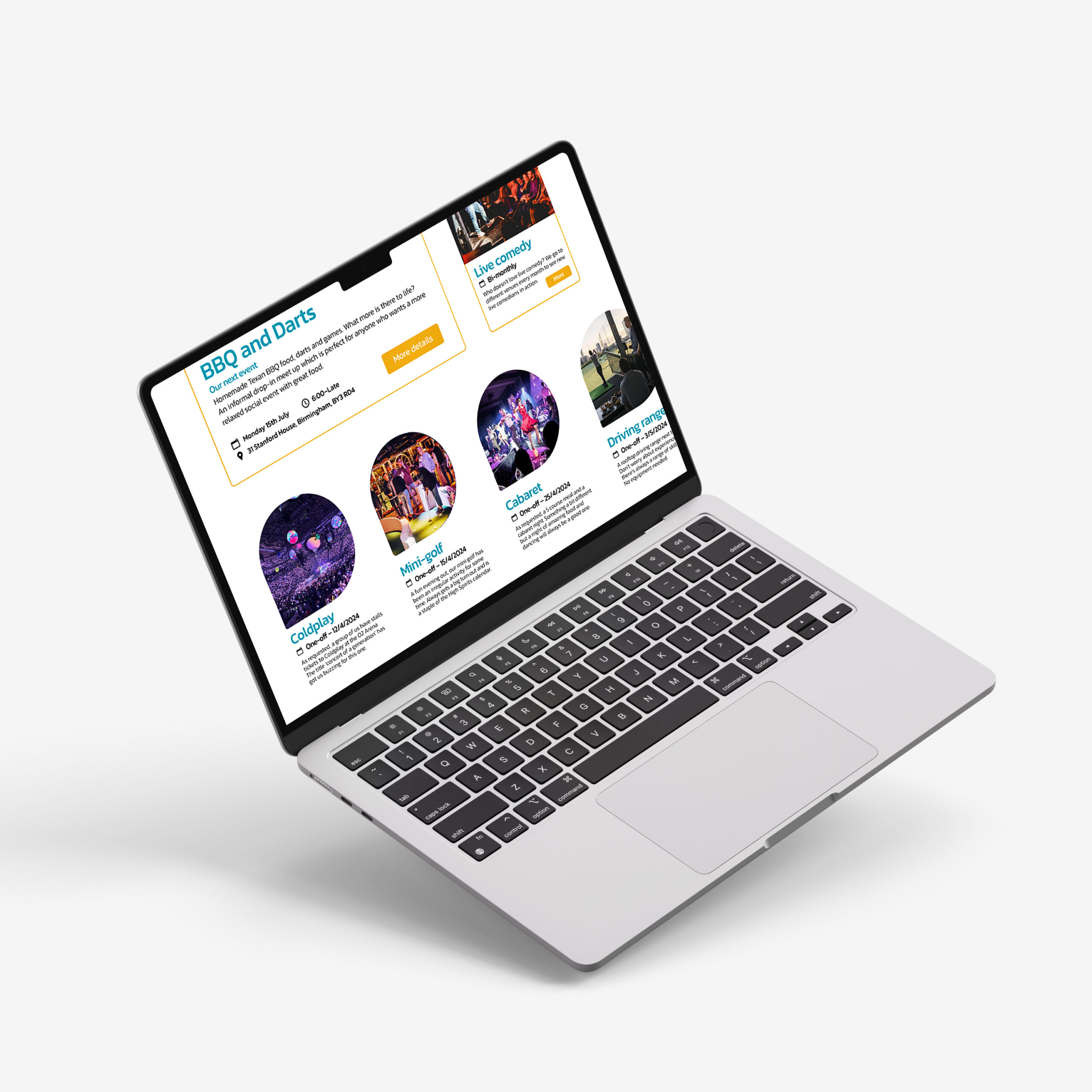
High Spirits website
High Spirits is a social group dedicated to promoting alcohol moderation and removing the pressure of other anti-drinking organisations, focussing on consuming less rather than becoming sober. The branding and style are much more dynamic, taking a positive approach to the often-sombre topic, benefitting the personable nature of High Spirits. The energetic imagery and vibrant colours keep this website fresh and inviting, helping to create a supportive community and help people connect through their shared ambitions.