Hi, I’m Tristan and over the past 3 years I’ve loved being part of such a dedicated community of designers where I’ve been able to develop many of my visual design skills over a range of fascinating software’s – from Adobe softwares like InDesign to Figma. Being able to develop both a keen eye for striking visuals and a strong understanding of function and purpose throughout my design process was an integral part of learning the craft of graphic design and a skill I intend to take forward into my career. Throughout my time in the Reading design community, I have also been able to develop my client-facing skills through a range of client-based projects. Organising face to face meetings to understand the clients core needs, to successfully pitching entire re-brands for existing organisations. It always feels great for both parties when the designer can truly understand the client’s needs.
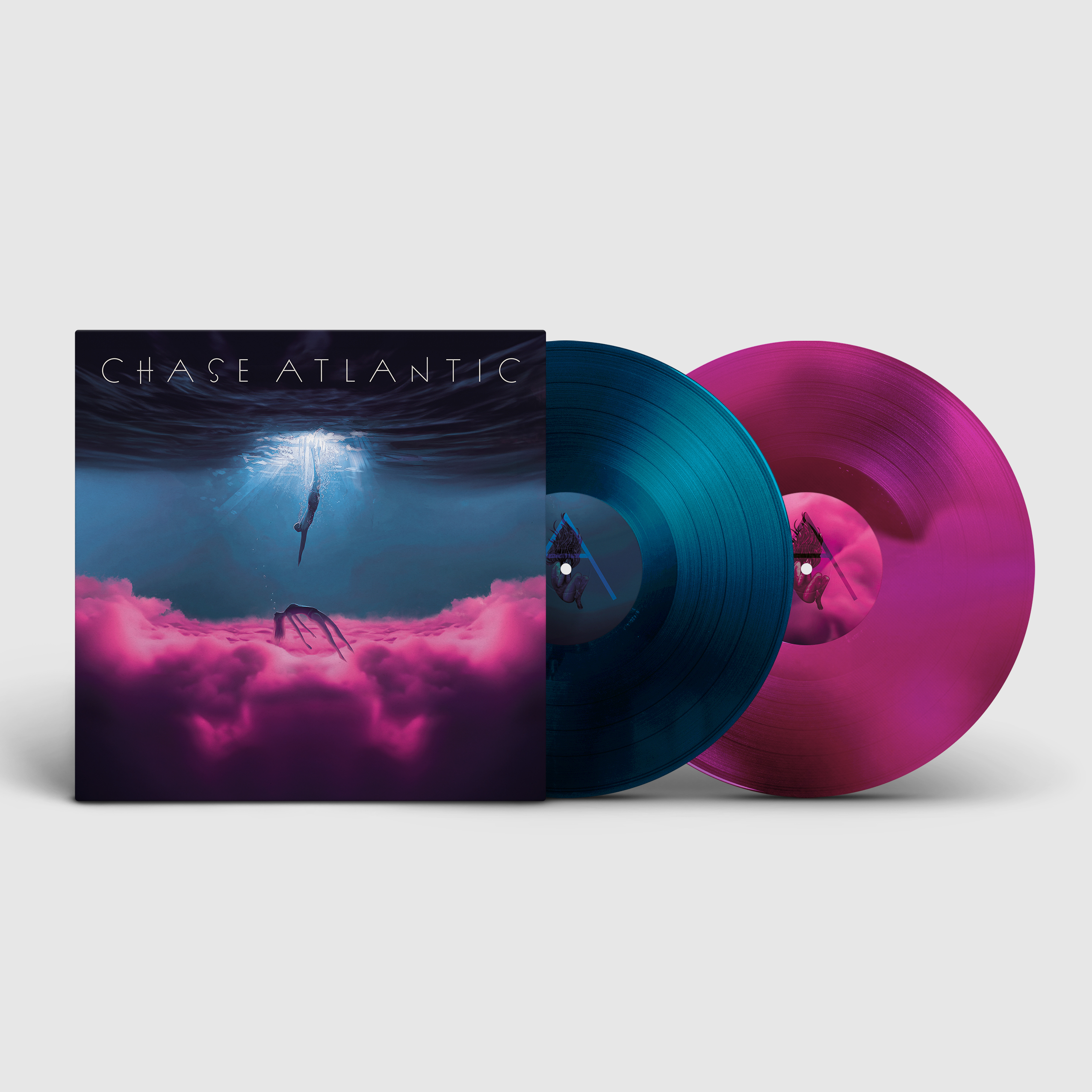
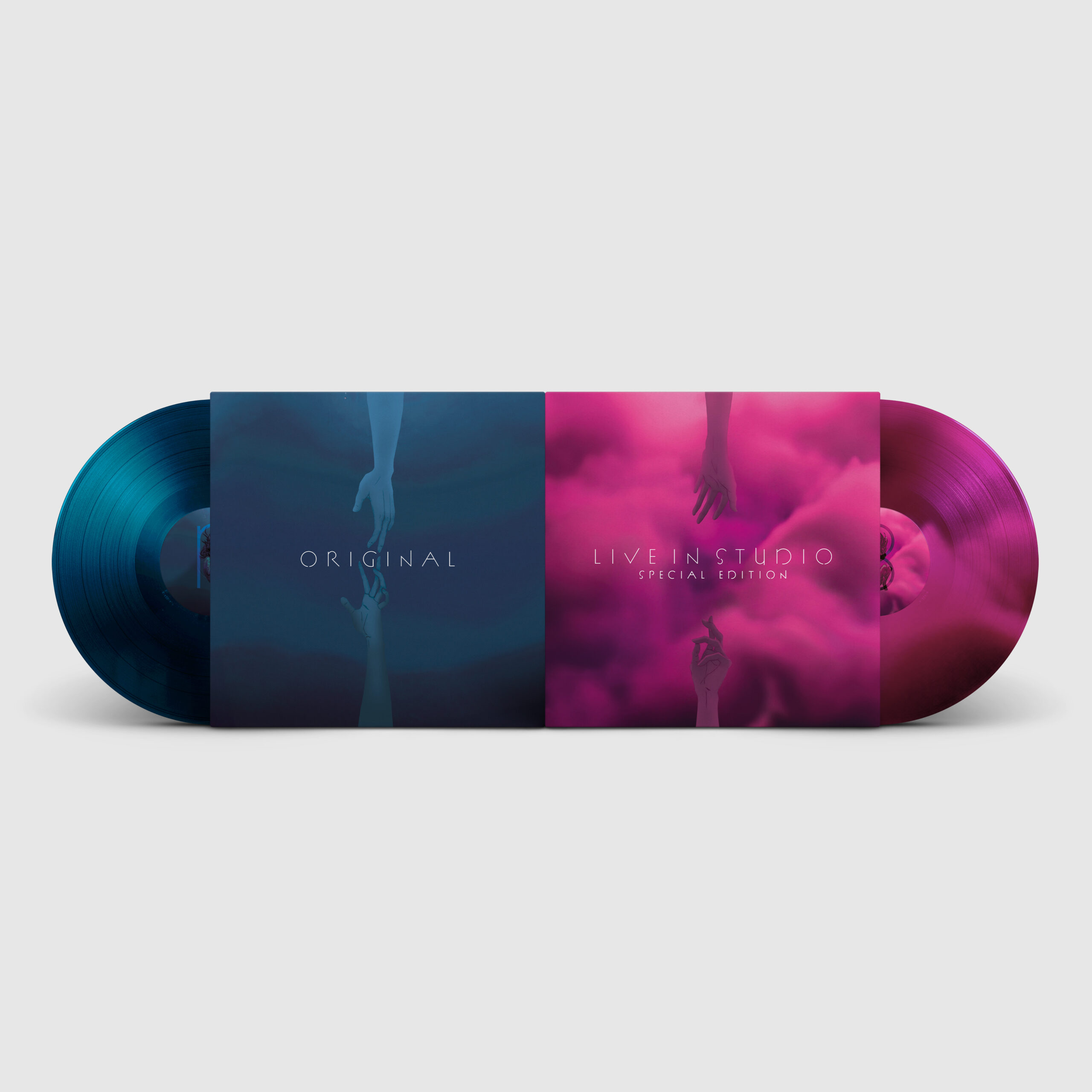
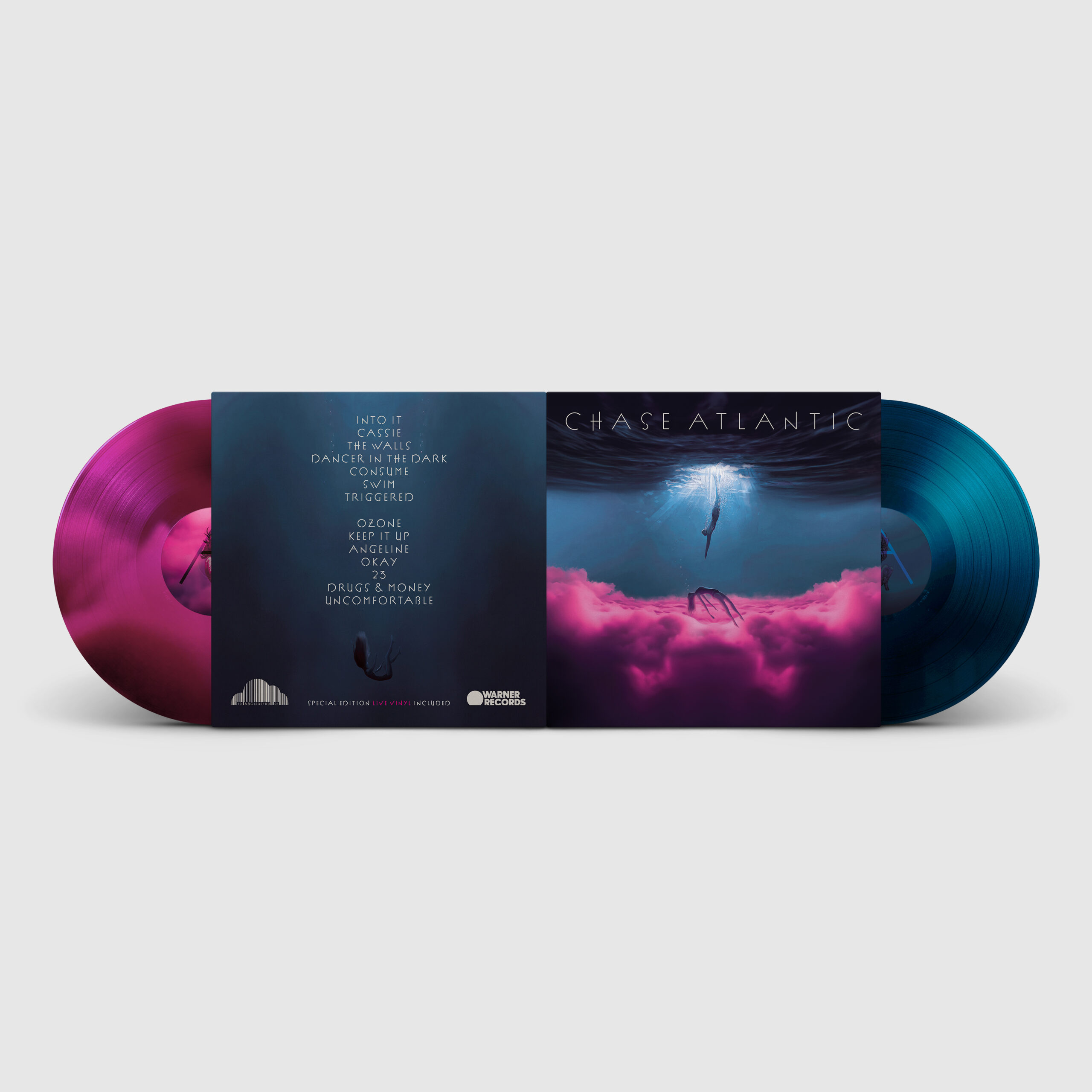
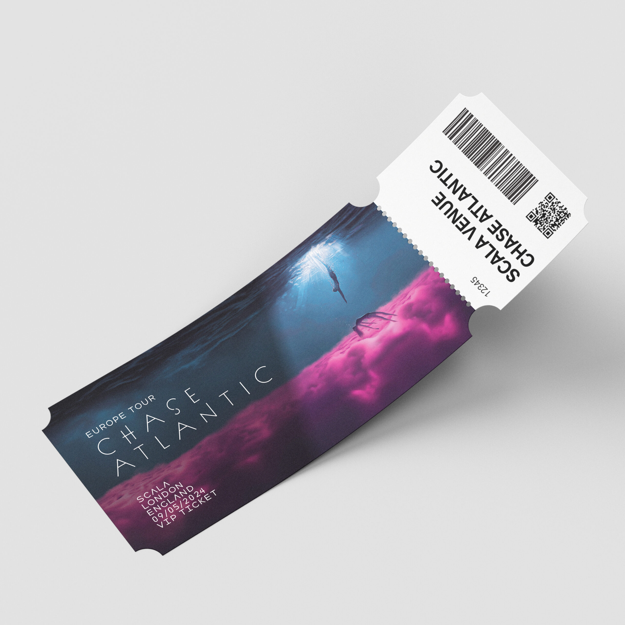
Here is my redesign of Chase Atlantic’s 2017 album. The album contains the vulnerable storytelling of themes such as over-indulgence, pleasure, and self-destruction as the characters fall into the depths of substance abuse. For the redesign, I wanted to encapsulate the raw and emotional storytelling of this album using the visual metaphor of drowning. My designs story follows two main characters becoming further and further apart from each other while the female character drowns in a blissful pink cloud of pleasure, eventually becoming unreachable. The story is expanded upon throughout, from the inside spread to the back cover.
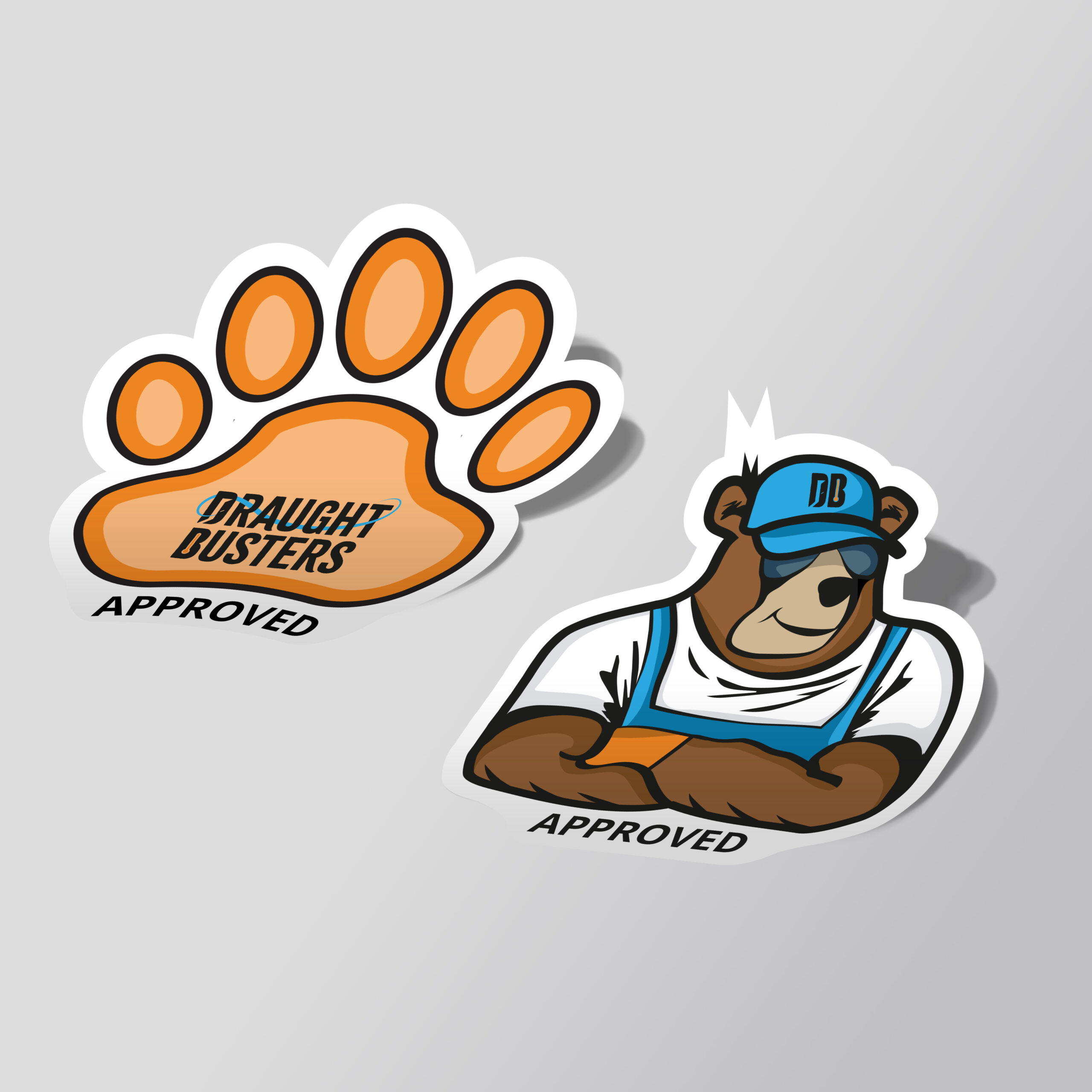
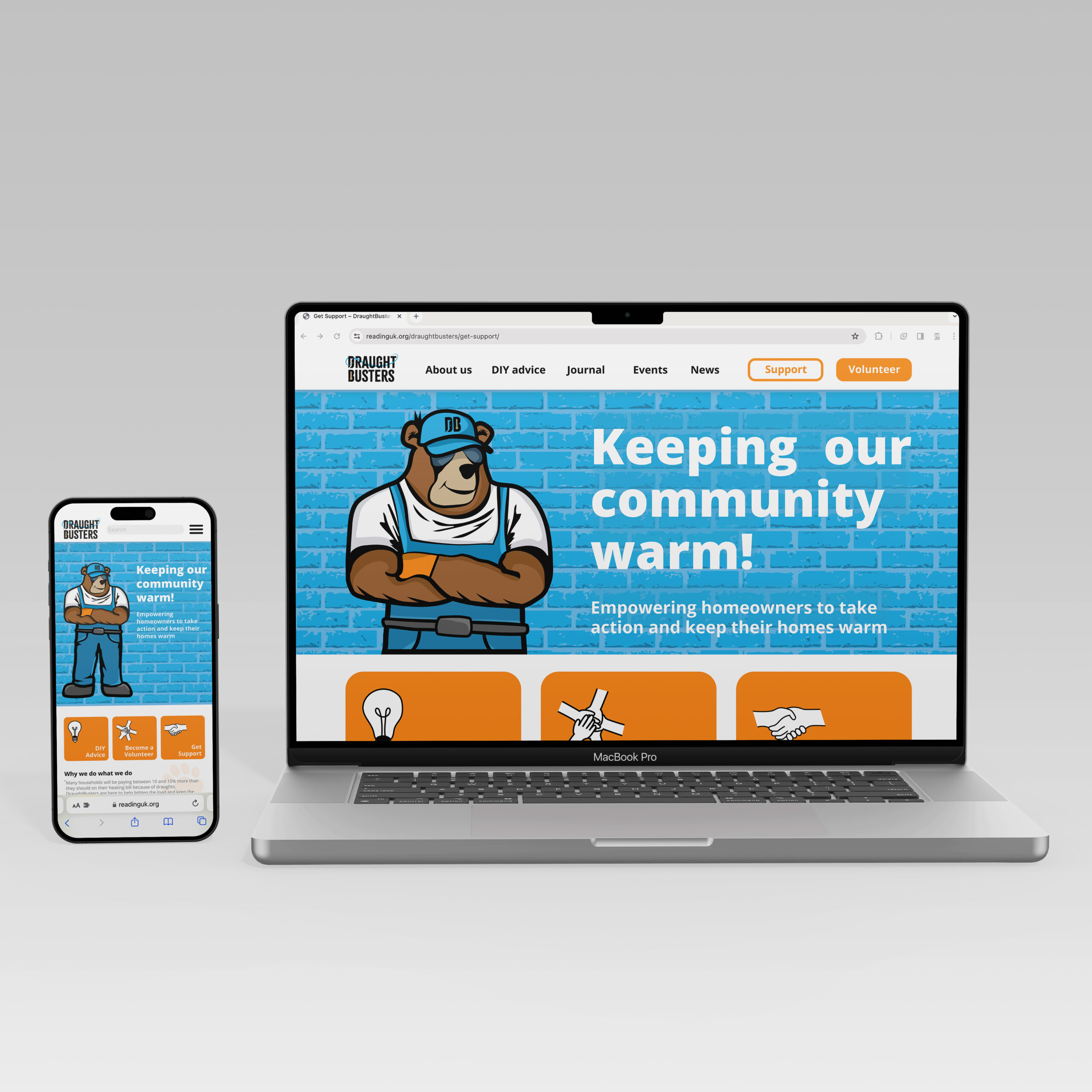
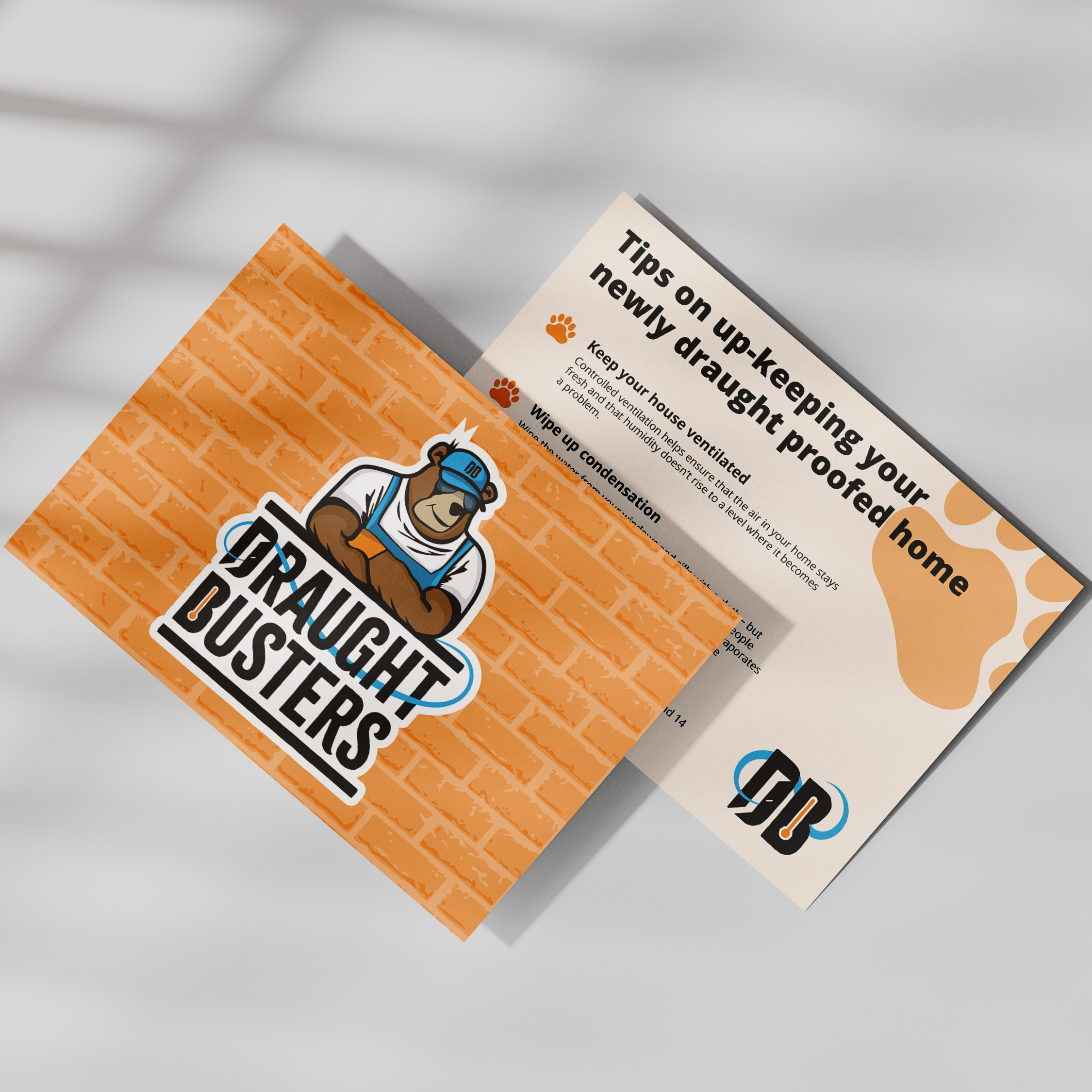
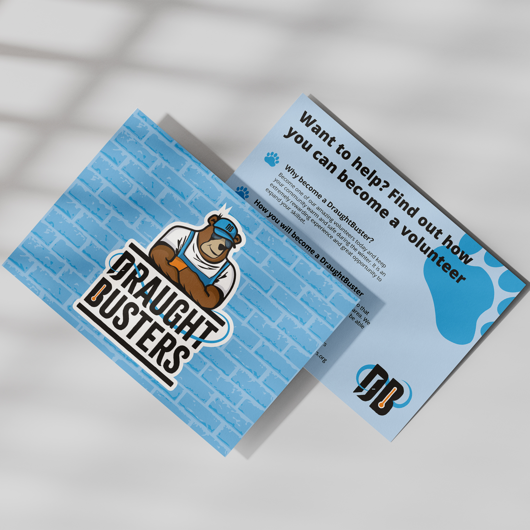
DraughtBusters branding
Here is the rebrand of DraughtBusters– a Reading based non-profit organisation that aims to keep everyone warm and comfortable in their own home. The main charm of this rebrand is the mascot ‘Buster the Bear’, a friendly ‘handy man next door’ character who wants nothing more than to keep the cold out and the community warm. The logo sports a strong, rugged typeface with swirled wind like serifs and a large gust of wind exiting the door in the ‘D’. These decisions tie nicely into DraughtBusters fight against cold windy draughts.
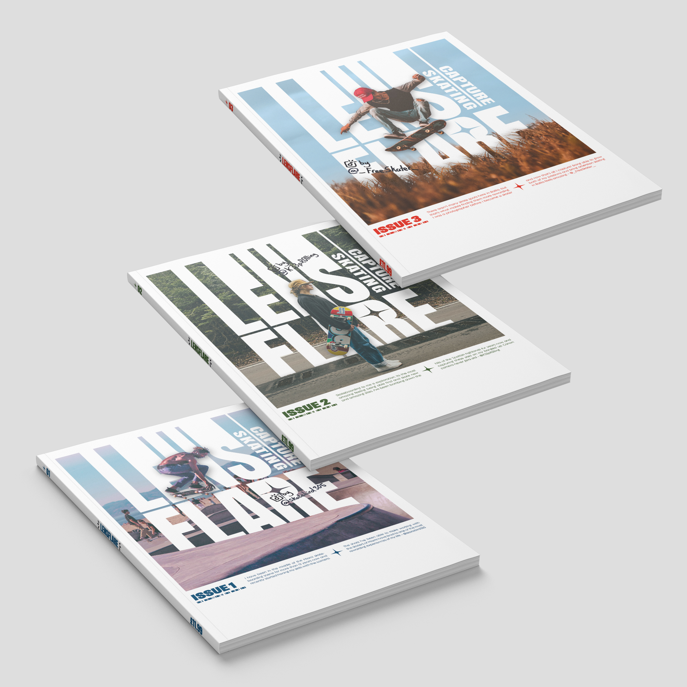
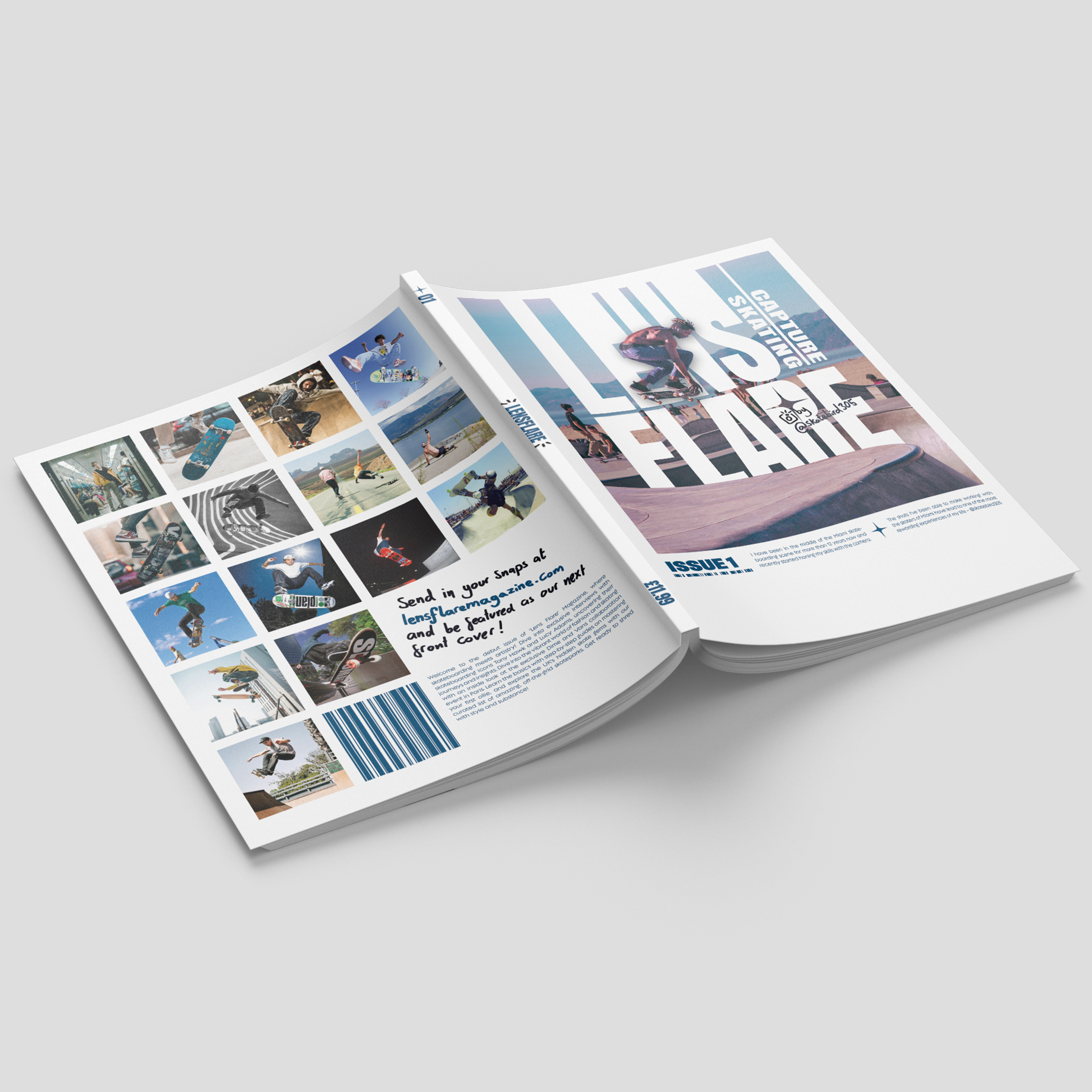
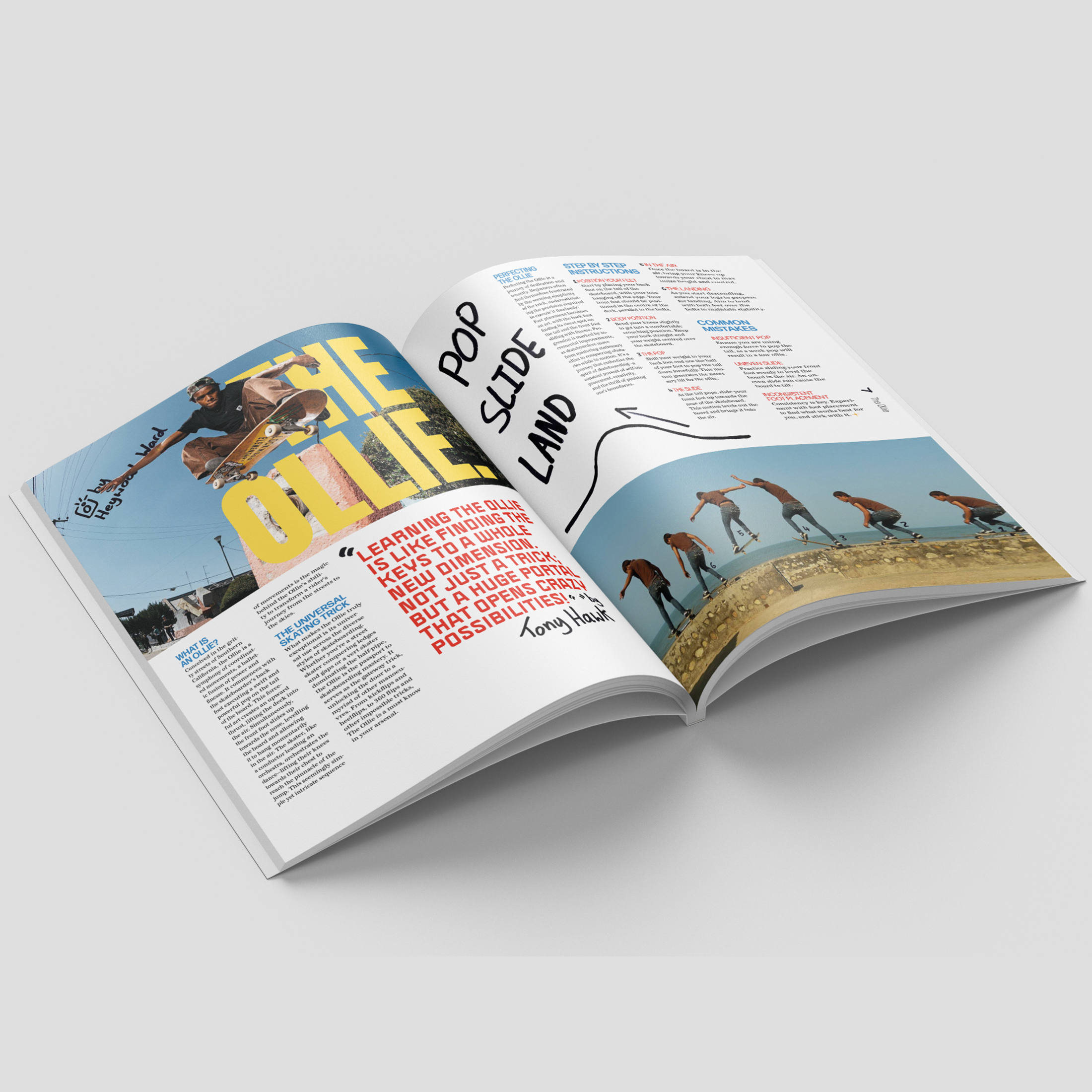
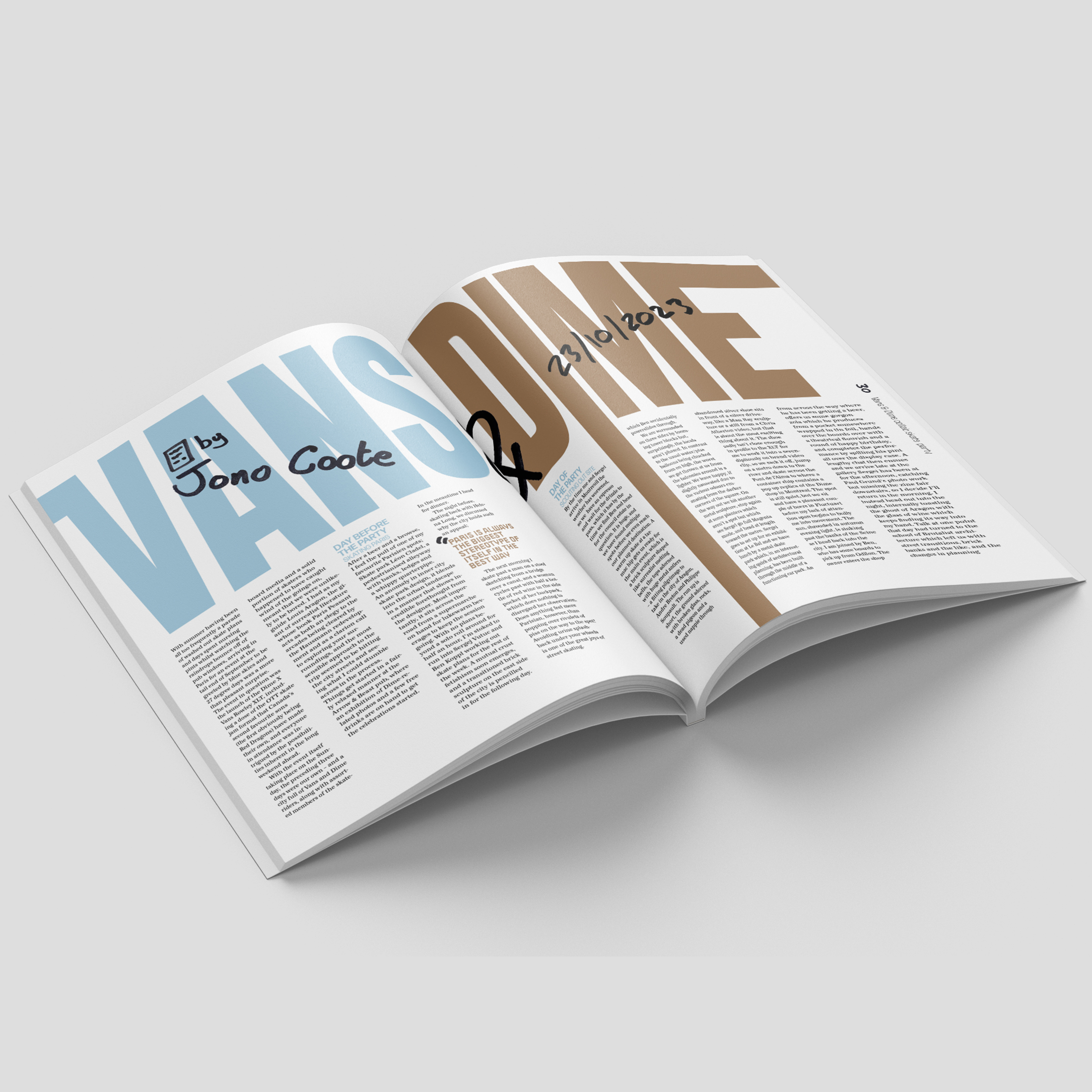
Lens Flare magazine
Lens Flare Magazine aims to capture both the Lens of the camera and the Flare of the trick. The concept of this magazine simultaneously promotes the unique aesthetic of skate culture whilst merging photography and typography into an exciting and dynamic visual feel. The contrast between heavy sans serif type and hand-written Sharpie emphasises the creative individuality within the subculture of skaters. This creative individuality is further pushed through the concept of reader involvement with the photography for each of the covers – sharing the same dimensions as a Polaroid – being sourced through audience submissions.
