/*! elementor – v3.21.0 – 26-05-2024 */
.elementor-widget-image{text-align:center}.elementor-widget-image a{display:inline-block}.elementor-widget-image a img[src$=”.svg”]{width:48px}.elementor-widget-image img{vertical-align:middle;display:inline-block} ![]()
/*! elementor – v3.21.0 – 26-05-2024 */
body.elementor-page .elementor-widget-menu-anchor{margin-bottom:0}
/*! elementor – v3.21.0 – 26-05-2024 */
.elementor-widget-divider{–divider-border-style:none;–divider-border-width:1px;–divider-color:#0c0d0e;–divider-icon-size:20px;–divider-element-spacing:10px;–divider-pattern-height:24px;–divider-pattern-size:20px;–divider-pattern-url:none;–divider-pattern-repeat:repeat-x}.elementor-widget-divider .elementor-divider{display:flex}.elementor-widget-divider .elementor-divider__text{font-size:15px;line-height:1;max-width:95%}.elementor-widget-divider .elementor-divider__element{margin:0 var(–divider-element-spacing);flex-shrink:0}.elementor-widget-divider .elementor-icon{font-size:var(–divider-icon-size)}.elementor-widget-divider .elementor-divider-separator{display:flex;margin:0;direction:ltr}.elementor-widget-divider–view-line_icon .elementor-divider-separator,.elementor-widget-divider–view-line_text .elementor-divider-separator{align-items:center}.elementor-widget-divider–view-line_icon .elementor-divider-separator:after,.elementor-widget-divider–view-line_icon .elementor-divider-separator:before,.elementor-widget-divider–view-line_text .elementor-divider-separator:after,.elementor-widget-divider–view-line_text .elementor-divider-separator:before{display:block;content:””;border-block-end:0;flex-grow:1;border-block-start:var(–divider-border-width) var(–divider-border-style) var(–divider-color)}.elementor-widget-divider–element-align-left .elementor-divider .elementor-divider-separator>.elementor-divider__svg:first-of-type{flex-grow:0;flex-shrink:100}.elementor-widget-divider–element-align-left .elementor-divider-separator:before{content:none}.elementor-widget-divider–element-align-left .elementor-divider__element{margin-left:0}.elementor-widget-divider–element-align-right .elementor-divider .elementor-divider-separator>.elementor-divider__svg:last-of-type{flex-grow:0;flex-shrink:100}.elementor-widget-divider–element-align-right .elementor-divider-separator:after{content:none}.elementor-widget-divider–element-align-right .elementor-divider__element{margin-right:0}.elementor-widget-divider–element-align-start .elementor-divider .elementor-divider-separator>.elementor-divider__svg:first-of-type{flex-grow:0;flex-shrink:100}.elementor-widget-divider–element-align-start .elementor-divider-separator:before{content:none}.elementor-widget-divider–element-align-start .elementor-divider__element{margin-inline-start:0}.elementor-widget-divider–element-align-end .elementor-divider .elementor-divider-separator>.elementor-divider__svg:last-of-type{flex-grow:0;flex-shrink:100}.elementor-widget-divider–element-align-end .elementor-divider-separator:after{content:none}.elementor-widget-divider–element-align-end .elementor-divider__element{margin-inline-end:0}.elementor-widget-divider:not(.elementor-widget-divider–view-line_text):not(.elementor-widget-divider–view-line_icon) .elementor-divider-separator{border-block-start:var(–divider-border-width) var(–divider-border-style) var(–divider-color)}.elementor-widget-divider–separator-type-pattern{–divider-border-style:none}.elementor-widget-divider–separator-type-pattern.elementor-widget-divider–view-line .elementor-divider-separator,.elementor-widget-divider–separator-type-pattern:not(.elementor-widget-divider–view-line) .elementor-divider-separator:after,.elementor-widget-divider–separator-type-pattern:not(.elementor-widget-divider–view-line) .elementor-divider-separator:before,.elementor-widget-divider–separator-type-pattern:not([class*=elementor-widget-divider–view]) .elementor-divider-separator{width:100%;min-height:var(–divider-pattern-height);-webkit-mask-size:var(–divider-pattern-size) 100%;mask-size:var(–divider-pattern-size) 100%;-webkit-mask-repeat:var(–divider-pattern-repeat);mask-repeat:var(–divider-pattern-repeat);background-color:var(–divider-color);-webkit-mask-image:var(–divider-pattern-url);mask-image:var(–divider-pattern-url)}.elementor-widget-divider–no-spacing{–divider-pattern-size:auto}.elementor-widget-divider–bg-round{–divider-pattern-repeat:round}.rtl .elementor-widget-divider .elementor-divider__text{direction:rtl}.e-con-inner>.elementor-widget-divider,.e-con>.elementor-widget-divider{width:var(–container-widget-width,100%);–flex-grow:var(–container-widget-flex-grow)}
/*! elementor – v3.21.0 – 26-05-2024 */
.elementor-heading-title{padding:0;margin:0;line-height:1}.elementor-widget-heading .elementor-heading-title[class*=elementor-size-]>a{color:inherit;font-size:inherit;line-height:inherit}.elementor-widget-heading .elementor-heading-title.elementor-size-small{font-size:15px}.elementor-widget-heading .elementor-heading-title.elementor-size-medium{font-size:19px}.elementor-widget-heading .elementor-heading-title.elementor-size-large{font-size:29px}.elementor-widget-heading .elementor-heading-title.elementor-size-xl{font-size:39px}.elementor-widget-heading .elementor-heading-title.elementor-size-xxl{font-size:59px}
Benjamin Brown
Branding, web design, editorial design
Over the past three years of studying at the University of Reading, I have learnt to visually communicate for a variety of design mediums. Exploring the capabilities of software and learning new skills has helped me in understanding the importance of adapting to challenges. Designing for diverse projects involving branding, editorial and web design has enhanced my capabilities in designing to solve problems and target client’s needs. Being able to express my passions and interests through projects has allowed me to demonstrate my creative mindset. I have had the pleasure of working as a team leader for Baseline Shift, which has expanded my communication skills and enabled me to collaborate with many talented individuals across the industry. I look forward to constantly growing as a designer, improving my abilities, and working with like-minded people.
Portfolio
/*! elementor – v3.21.0 – 26-05-2024 */
.elementor-widget-social-icons.elementor-grid-0 .elementor-widget-container,.elementor-widget-social-icons.elementor-grid-mobile-0 .elementor-widget-container,.elementor-widget-social-icons.elementor-grid-tablet-0 .elementor-widget-container{line-height:1;font-size:0}.elementor-widget-social-icons:not(.elementor-grid-0):not(.elementor-grid-tablet-0):not(.elementor-grid-mobile-0) .elementor-grid{display:inline-grid}.elementor-widget-social-icons .elementor-grid{grid-column-gap:var(–grid-column-gap,5px);grid-row-gap:var(–grid-row-gap,5px);grid-template-columns:var(–grid-template-columns);justify-content:var(–justify-content,center);justify-items:var(–justify-content,center)}.elementor-icon.elementor-social-icon{font-size:var(–icon-size,25px);line-height:var(–icon-size,25px);width:calc(var(–icon-size, 25px) + 2 * var(–icon-padding, .5em));height:calc(var(–icon-size, 25px) + 2 * var(–icon-padding, .5em))}.elementor-social-icon{–e-social-icon-icon-color:#fff;display:inline-flex;background-color:#69727d;align-items:center;justify-content:center;text-align:center;cursor:pointer}.elementor-social-icon i{color:var(–e-social-icon-icon-color)}.elementor-social-icon svg{fill:var(–e-social-icon-icon-color)}.elementor-social-icon:last-child{margin:0}.elementor-social-icon:hover{opacity:.9;color:#fff}.elementor-social-icon-android{background-color:#a4c639}.elementor-social-icon-apple{background-color:#999}.elementor-social-icon-behance{background-color:#1769ff}.elementor-social-icon-bitbucket{background-color:#205081}.elementor-social-icon-codepen{background-color:#000}.elementor-social-icon-delicious{background-color:#39f}.elementor-social-icon-deviantart{background-color:#05cc47}.elementor-social-icon-digg{background-color:#005be2}.elementor-social-icon-dribbble{background-color:#ea4c89}.elementor-social-icon-elementor{background-color:#d30c5c}.elementor-social-icon-envelope{background-color:#ea4335}.elementor-social-icon-facebook,.elementor-social-icon-facebook-f{background-color:#3b5998}.elementor-social-icon-flickr{background-color:#0063dc}.elementor-social-icon-foursquare{background-color:#2d5be3}.elementor-social-icon-free-code-camp,.elementor-social-icon-freecodecamp{background-color:#006400}.elementor-social-icon-github{background-color:#333}.elementor-social-icon-gitlab{background-color:#e24329}.elementor-social-icon-globe{background-color:#69727d}.elementor-social-icon-google-plus,.elementor-social-icon-google-plus-g{background-color:#dd4b39}.elementor-social-icon-houzz{background-color:#7ac142}.elementor-social-icon-instagram{background-color:#262626}.elementor-social-icon-jsfiddle{background-color:#487aa2}.elementor-social-icon-link{background-color:#818a91}.elementor-social-icon-linkedin,.elementor-social-icon-linkedin-in{background-color:#0077b5}.elementor-social-icon-medium{background-color:#00ab6b}.elementor-social-icon-meetup{background-color:#ec1c40}.elementor-social-icon-mixcloud{background-color:#273a4b}.elementor-social-icon-odnoklassniki{background-color:#f4731c}.elementor-social-icon-pinterest{background-color:#bd081c}.elementor-social-icon-product-hunt{background-color:#da552f}.elementor-social-icon-reddit{background-color:#ff4500}.elementor-social-icon-rss{background-color:#f26522}.elementor-social-icon-shopping-cart{background-color:#4caf50}.elementor-social-icon-skype{background-color:#00aff0}.elementor-social-icon-slideshare{background-color:#0077b5}.elementor-social-icon-snapchat{background-color:#fffc00}.elementor-social-icon-soundcloud{background-color:#f80}.elementor-social-icon-spotify{background-color:#2ebd59}.elementor-social-icon-stack-overflow{background-color:#fe7a15}.elementor-social-icon-steam{background-color:#00adee}.elementor-social-icon-stumbleupon{background-color:#eb4924}.elementor-social-icon-telegram{background-color:#2ca5e0}.elementor-social-icon-threads{background-color:#000}.elementor-social-icon-thumb-tack{background-color:#1aa1d8}.elementor-social-icon-tripadvisor{background-color:#589442}.elementor-social-icon-tumblr{background-color:#35465c}.elementor-social-icon-twitch{background-color:#6441a5}.elementor-social-icon-twitter{background-color:#1da1f2}.elementor-social-icon-viber{background-color:#665cac}.elementor-social-icon-vimeo{background-color:#1ab7ea}.elementor-social-icon-vk{background-color:#45668e}.elementor-social-icon-weibo{background-color:#dd2430}.elementor-social-icon-weixin{background-color:#31a918}.elementor-social-icon-whatsapp{background-color:#25d366}.elementor-social-icon-wordpress{background-color:#21759b}.elementor-social-icon-x-twitter{background-color:#000}.elementor-social-icon-xing{background-color:#026466}.elementor-social-icon-yelp{background-color:#af0606}.elementor-social-icon-youtube{background-color:#cd201f}.elementor-social-icon-500px{background-color:#0099e5}.elementor-shape-rounded .elementor-icon.elementor-social-icon{border-radius:10%}.elementor-shape-circle .elementor-icon.elementor-social-icon{border-radius:50%}
Instagram
/*! elementor-pro – v3.12.1 – 02-04-2023 */
.elementor-gallery__container{min-height:1px}.elementor-gallery-item{position:relative;overflow:hidden;display:block;text-decoration:none;border:solid var(–image-border-width) var(–image-border-color);border-radius:var(–image-border-radius)}.elementor-gallery-item__content,.elementor-gallery-item__overlay{height:100%;width:100%;position:absolute;top:0;left:0}.elementor-gallery-item__overlay{mix-blend-mode:var(–overlay-mix-blend-mode);transition-duration:var(–overlay-transition-duration);transition-property:mix-blend-mode,transform,opacity,background-color}.elementor-gallery-item__image.e-gallery-image{transition-duration:var(–image-transition-duration);transition-property:filter,transform}.elementor-gallery-item__content{display:flex;flex-direction:column;justify-content:var(–content-justify-content,center);align-items:center;text-align:var(–content-text-align);padding:var(–content-padding)}.elementor-gallery-item__content>div{transition-duration:var(–content-transition-duration)}.elementor-gallery-item__content.elementor-gallery–sequenced-animation>div:nth-child(2){transition-delay:calc(var(–content-transition-delay) / 3)}.elementor-gallery-item__content.elementor-gallery–sequenced-animation>div:nth-child(3){transition-delay:calc(var(–content-transition-delay) / 3 * 2)}.elementor-gallery-item__content.elementor-gallery–sequenced-animation>div:nth-child(4){transition-delay:calc(var(–content-transition-delay) / 3 * 3)}.elementor-gallery-item__description{color:var(–description-text-color,#fff);width:100%}.elementor-gallery-item__title{color:var(–title-text-color,#fff);font-weight:700;width:100%}.elementor-gallery__titles-container{display:flex;flex-wrap:wrap;justify-content:var(–titles-container-justify-content,center);margin-bottom:20px}.elementor-gallery__titles-container:not(.e–pointer-framed) .elementor-item:after,.elementor-gallery__titles-container:not(.e–pointer-framed) .elementor-item:before{background-color:var(–galleries-pointer-bg-color-hover)}.elementor-gallery__titles-container:not(.e–pointer-framed) .elementor-item.elementor-item-active:after,.elementor-gallery__titles-container:not(.e–pointer-framed) .elementor-item.elementor-item-active:before{background-color:var(–galleries-pointer-bg-color-active)}.elementor-gallery__titles-container.e–pointer-framed .elementor-item:before{border-color:var(–galleries-pointer-bg-color-hover);border-width:var(–galleries-pointer-border-width)}.elementor-gallery__titles-container.e–pointer-framed .elementor-item:after{border-color:var(–galleries-pointer-bg-color-hover)}.elementor-gallery__titles-container.e–pointer-framed .elementor-item.elementor-item-active:after,.elementor-gallery__titles-container.e–pointer-framed .elementor-item.elementor-item-active:before{border-color:var(–galleries-pointer-bg-color-active)}.elementor-gallery__titles-container.e–pointer-framed.e–animation-draw .elementor-item:before{border-left-width:var(–galleries-pointer-border-width);border-bottom-width:var(–galleries-pointer-border-width);border-right-width:0;border-top-width:0}.elementor-gallery__titles-container.e–pointer-framed.e–animation-draw .elementor-item:after{border-left-width:0;border-bottom-width:0;border-right-width:var(–galleries-pointer-border-width);border-top-width:var(–galleries-pointer-border-width)}.elementor-gallery__titles-container.e–pointer-framed.e–animation-corners .elementor-item:before{border-left-width:var(–galleries-pointer-border-width);border-bottom-width:0;border-right-width:0;border-top-width:var(–galleries-pointer-border-width)}.elementor-gallery__titles-container.e–pointer-framed.e–animation-corners .elementor-item:after{border-left-width:0;border-bottom-width:var(–galleries-pointer-border-width);border-right-width:var(–galleries-pointer-border-width);border-top-width:0}.elementor-gallery__titles-container .e–pointer-double-line .elementor-item:after,.elementor-gallery__titles-container .e–pointer-double-line .elementor-item:before,.elementor-gallery__titles-container .e–pointer-overline .elementor-item:before,.elementor-gallery__titles-container .e–pointer-underline .elementor-item:after{height:var(–galleries-pointer-border-width)}.elementor-gallery-title{–space-between:10px;cursor:pointer;color:#6d7882;font-weight:500;position:relative;padding:7px 14px;transition:all .3s}.elementor-gallery-title–active{color:#495157}.elementor-gallery-title:not(:last-child){margin-right:var(–space-between)}.elementor-gallery-item__title+.elementor-gallery-item__description{margin-top:var(–description-margin-top)}.e-gallery-item.elementor-gallery-item{transition-property:all}.e-gallery-item.elementor-animated-content .elementor-animated-item–enter-from-bottom,.e-gallery-item.elementor-animated-content .elementor-animated-item–enter-from-left,.e-gallery-item.elementor-animated-content .elementor-animated-item–enter-from-right,.e-gallery-item.elementor-animated-content .elementor-animated-item–enter-from-top,.e-gallery-item:hover .elementor-gallery__item-overlay-bg,.e-gallery-item:hover .elementor-gallery__item-overlay-content,.e-gallery-item:hover .elementor-gallery__item-overlay-content__description,.e-gallery-item:hover .elementor-gallery__item-overlay-content__title{opacity:1}a.elementor-item.elementor-gallery-title{color:var(–galleries-title-color-normal)}a.elementor-item.elementor-gallery-title.elementor-item-active,a.elementor-item.elementor-gallery-title.highlighted,a.elementor-item.elementor-gallery-title:focus,a.elementor-item.elementor-gallery-title:hover{color:var(–galleries-title-color-hover)}a.elementor-item.elementor-gallery-title.elementor-item-active{color:var(–gallery-title-color-active)}.e-con-inner>.elementor-widget-gallery,.e-con>.elementor-widget-gallery{width:var(–container-widget-width);–flex-grow:var(–container-widget-flex-grow)}
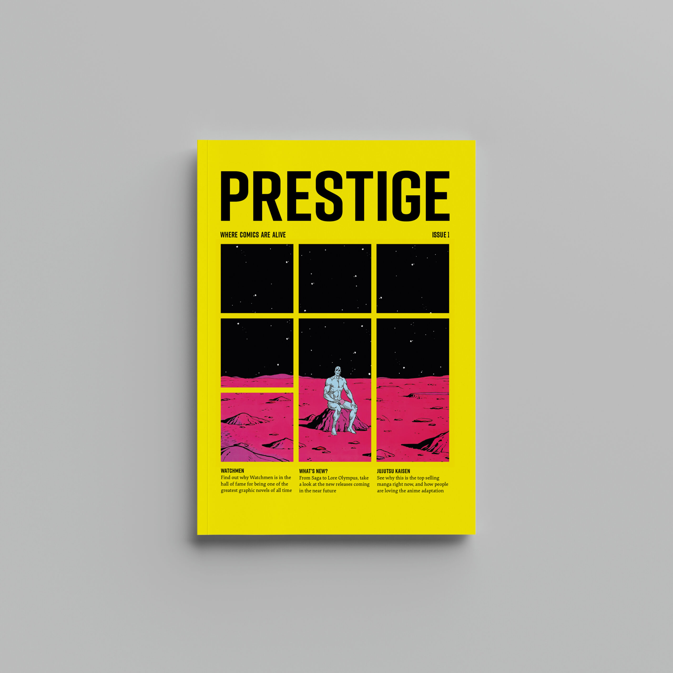
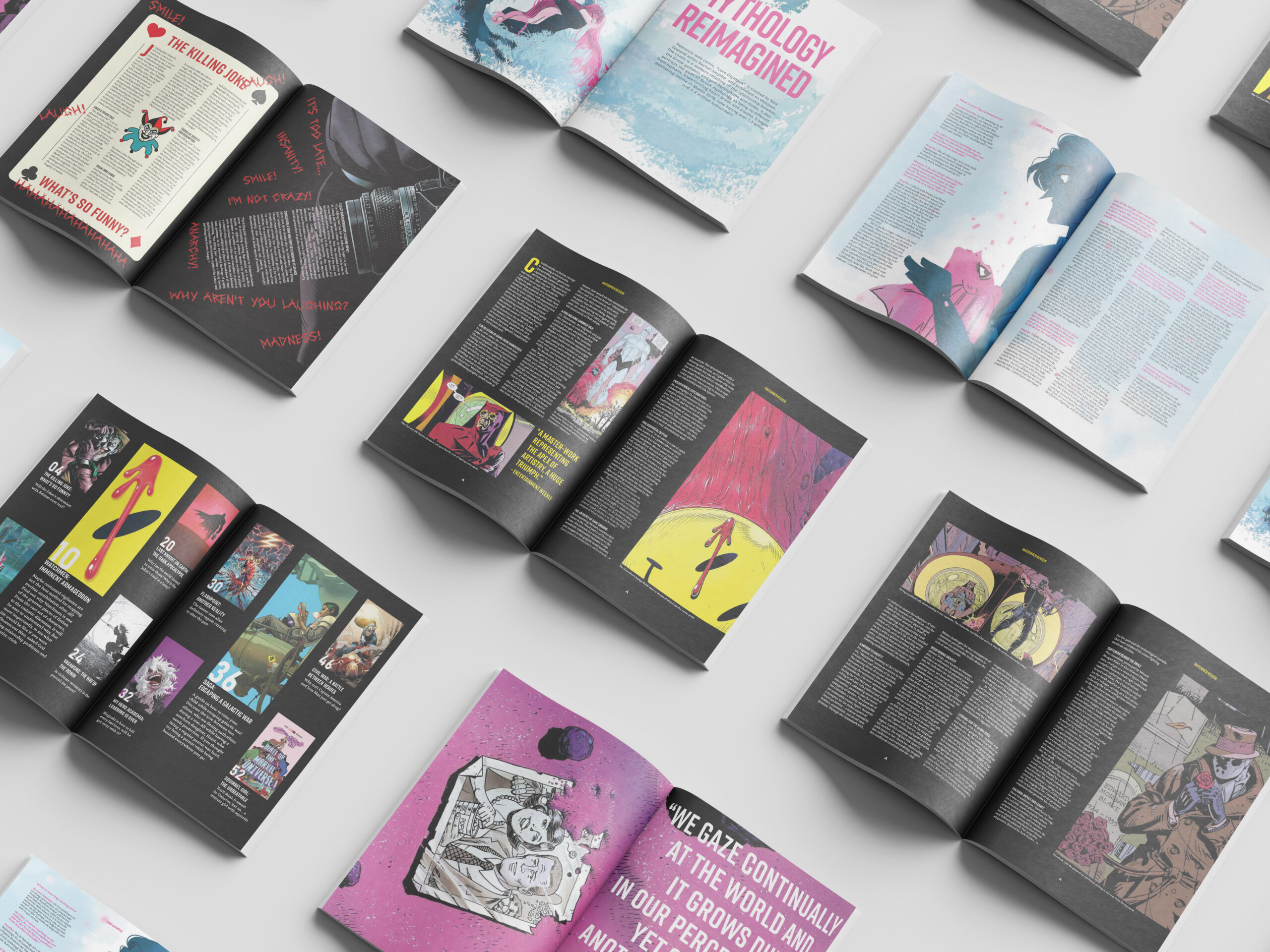
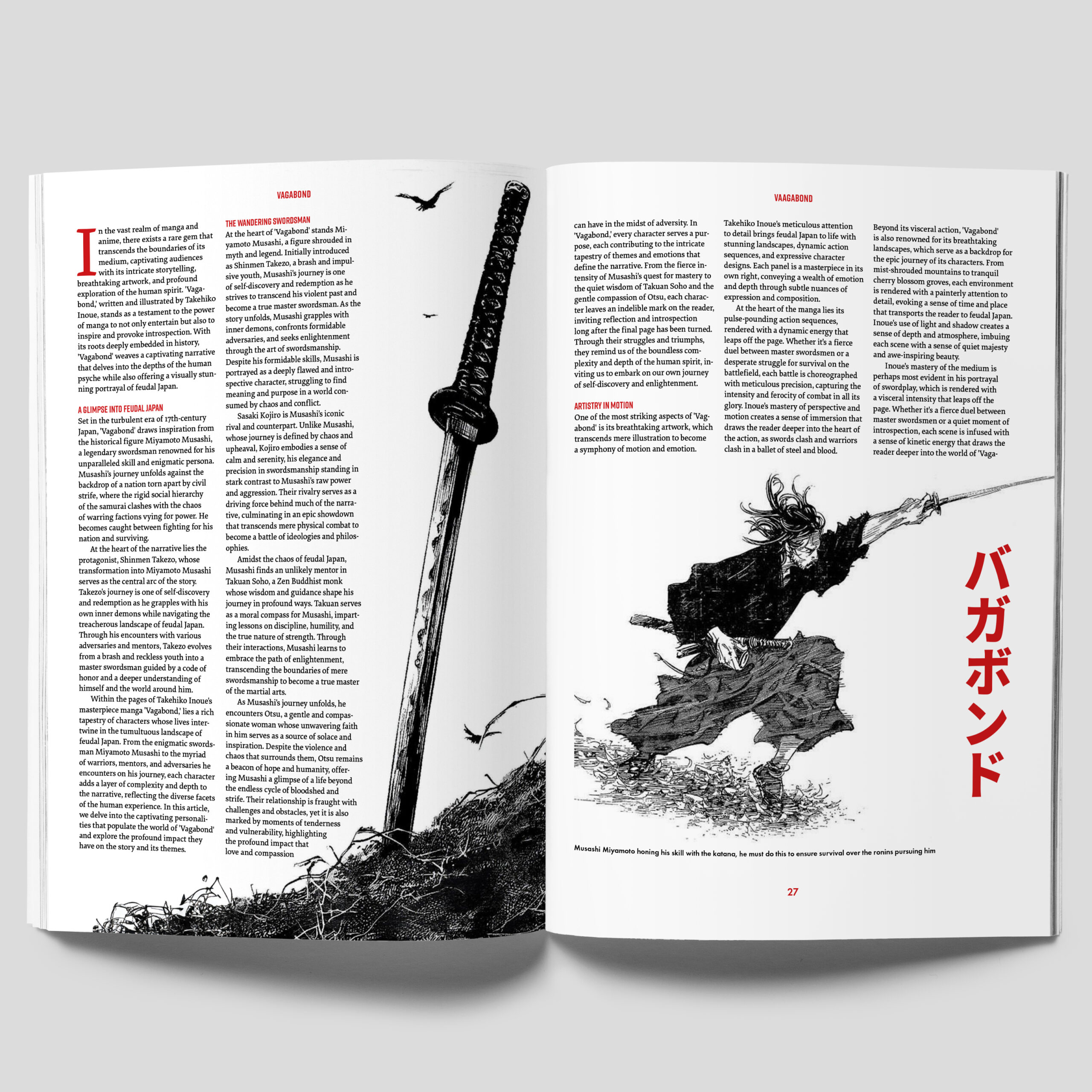
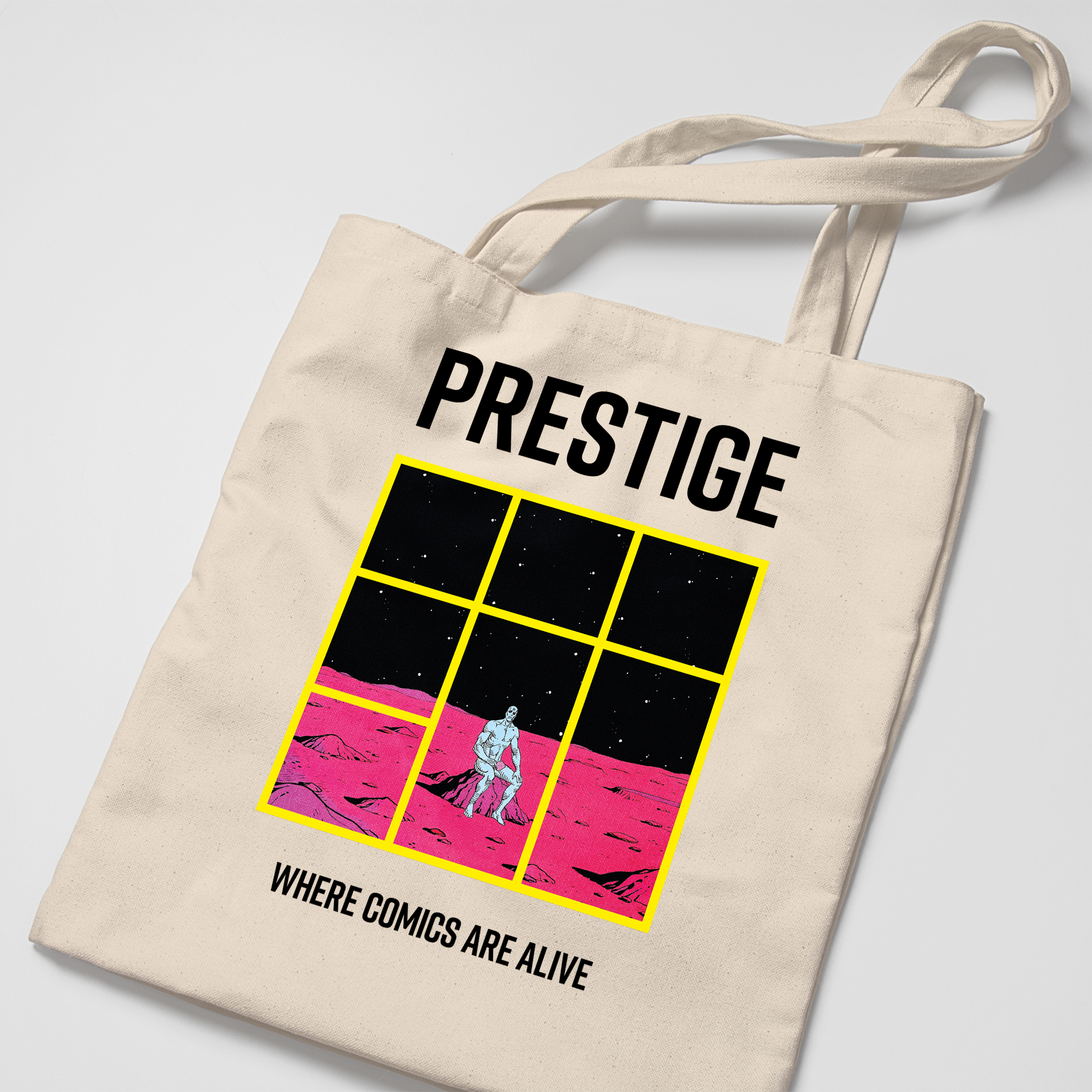
PRESTIGE magazine
PRESTIGE is a magazine that explores the beauty of comic books and graphic novels, respecting the medium’s artwork, storytelling, and creators. Each article is designed to show the style and content of each comic, through the integration of imagery and type, and the beautiful artwork pervading each spread. Designing the magazine encouraged me to produce merchandise that could expand the brand’s identity further. This project enabled me to design for one of my passions, whilst also having the opportunity to enhance my editorial abilities.
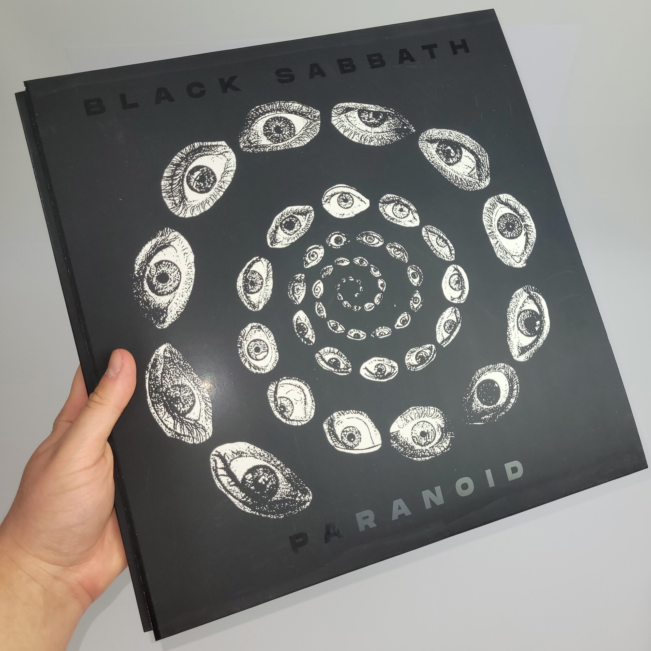
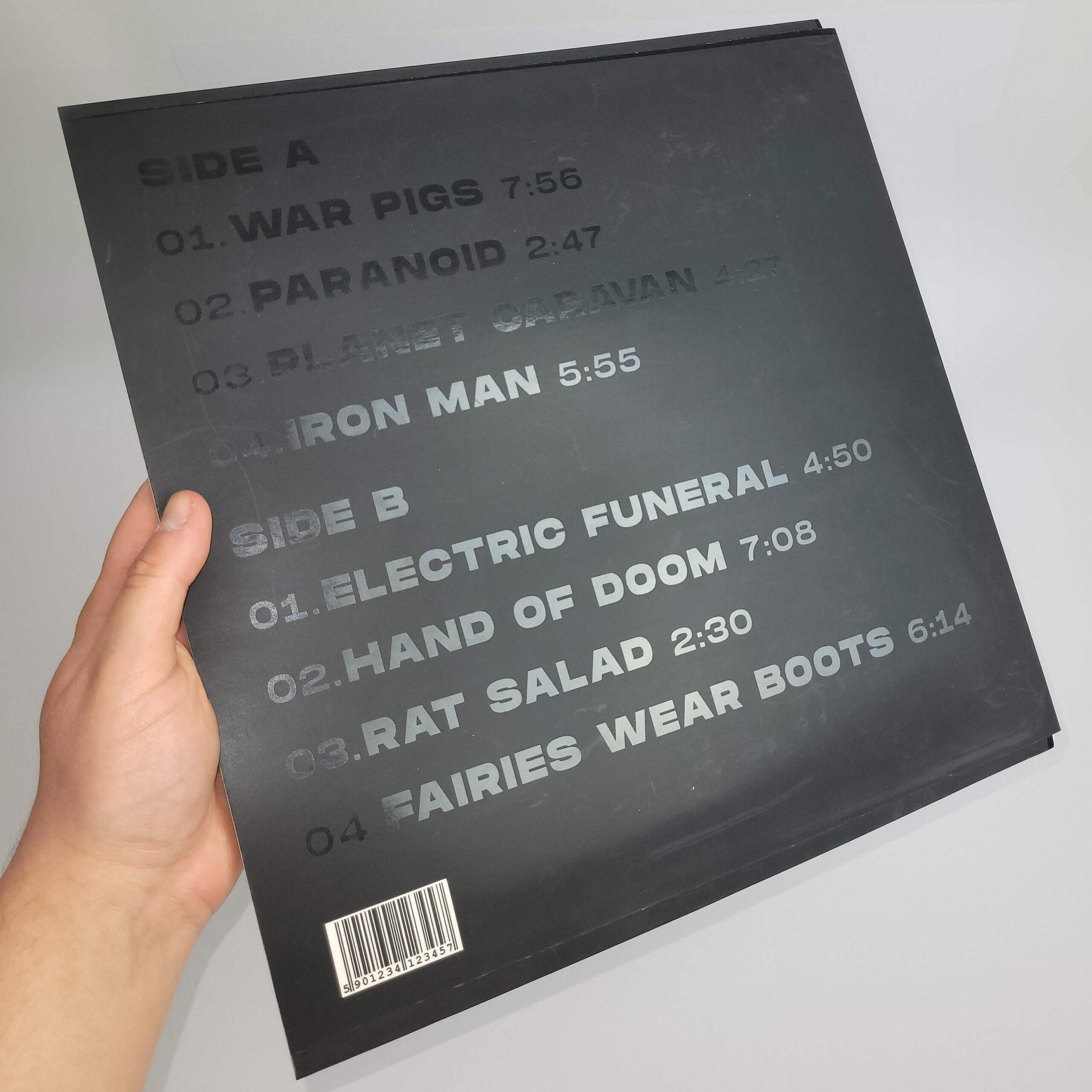
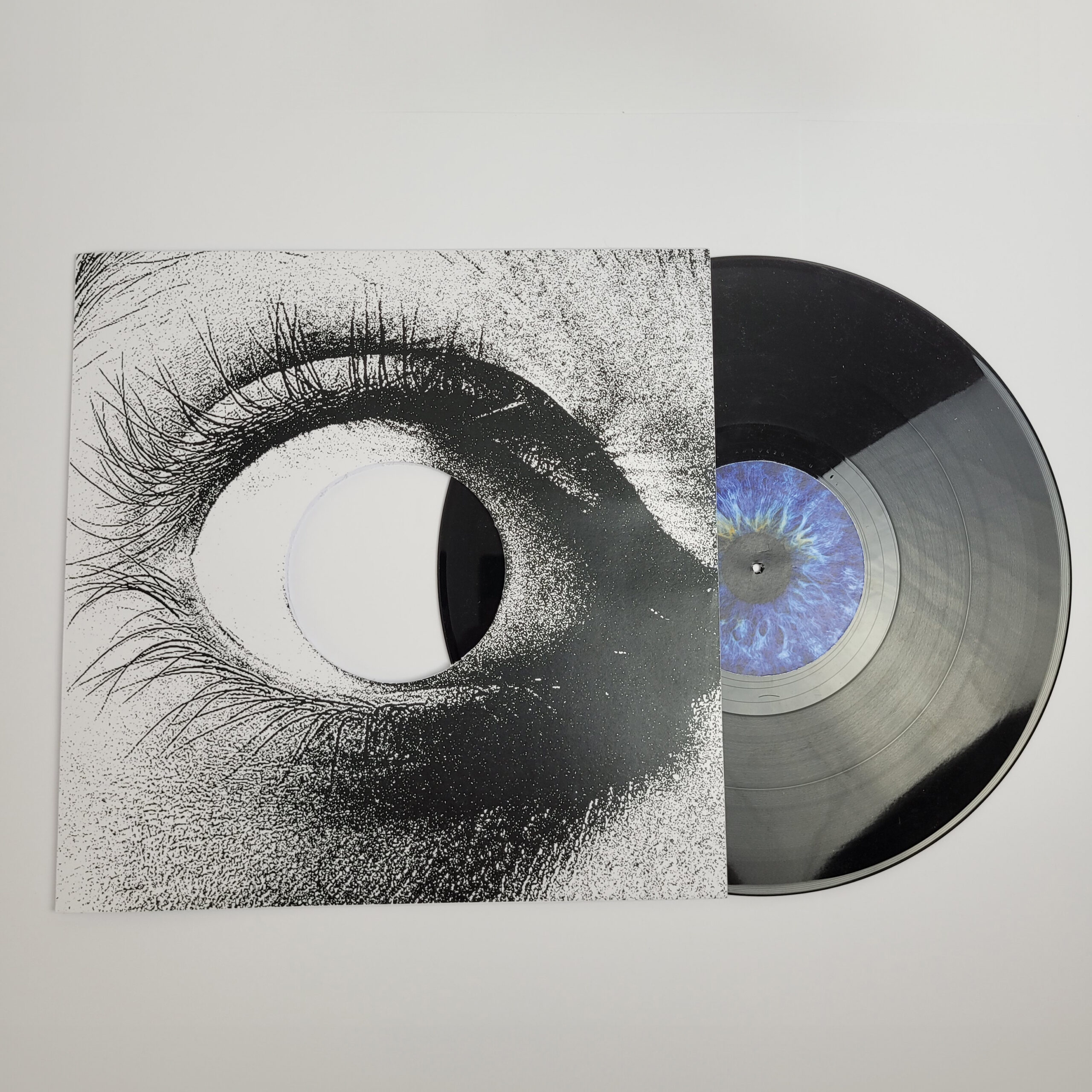
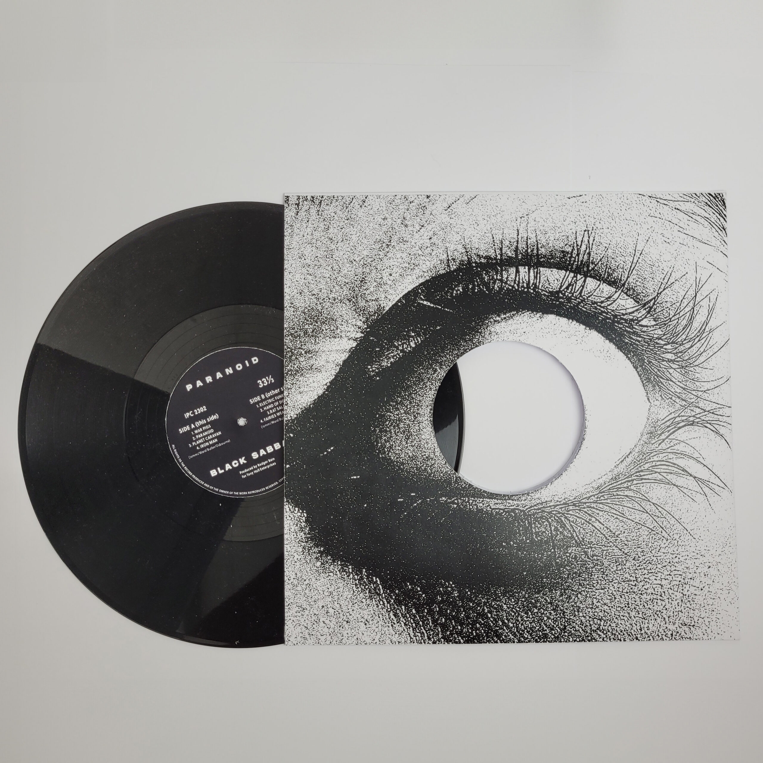
Black Sabbath record album packaging
I chose to re-design the existing packaging for Black Sabbath’s album, Paranoid. The band believes the name of the album does not link to the visuals or messages presented, so I decided to improve this disconnection. The re-design portrays a vortex of distorted eyes, reflecting the never-ending effect of mental health and one’s distorted sense of reality. Using several print finishes, the typography for the front and back cover become visible only under direct light; to add another level of interaction for audiences. Following the re-design, I designed merchandise and items that carry across the new identity.
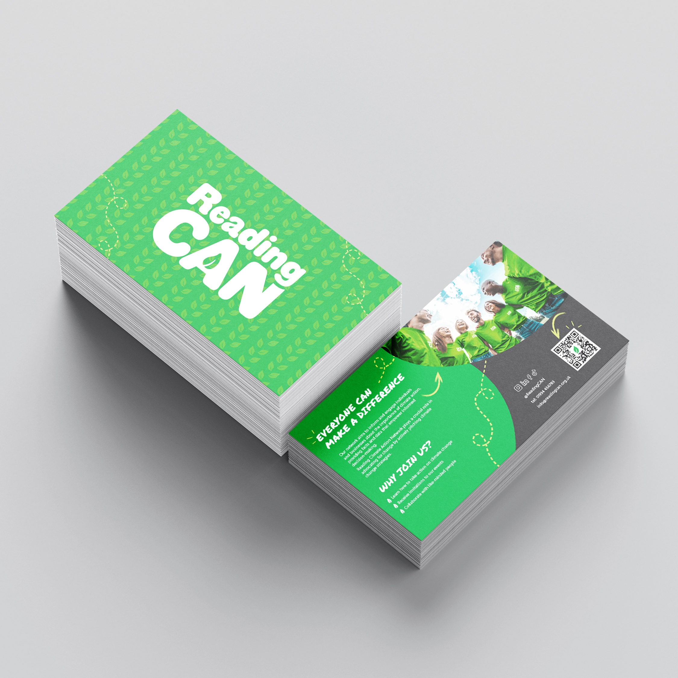
Reading CAN branding
Reading Climate Action Network (Reading CAN) is a non-profit organisation that work to combat climate change in Reading. They do this by offering support and advice to individuals, schools, and businesses, creating a community of climate conscious and actively empowered people. In this group project, I helped to design collateral and merchandise for the organisation to increase audience engagement with the brand. Collateral such as post cards and tote bags have the potential to be made from recycled material for the climate conscious events, benefitting the environment and the Reading CAN’s presence.